TOAST UK – AW2013 LOOK BOOK INSPIRED BY THE WILD WEST

12 November 2013

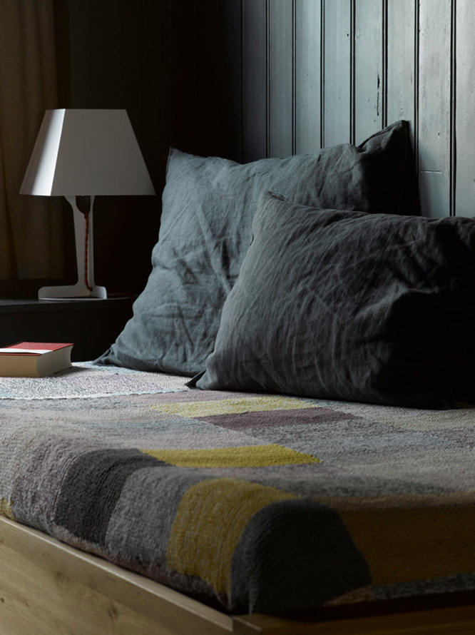
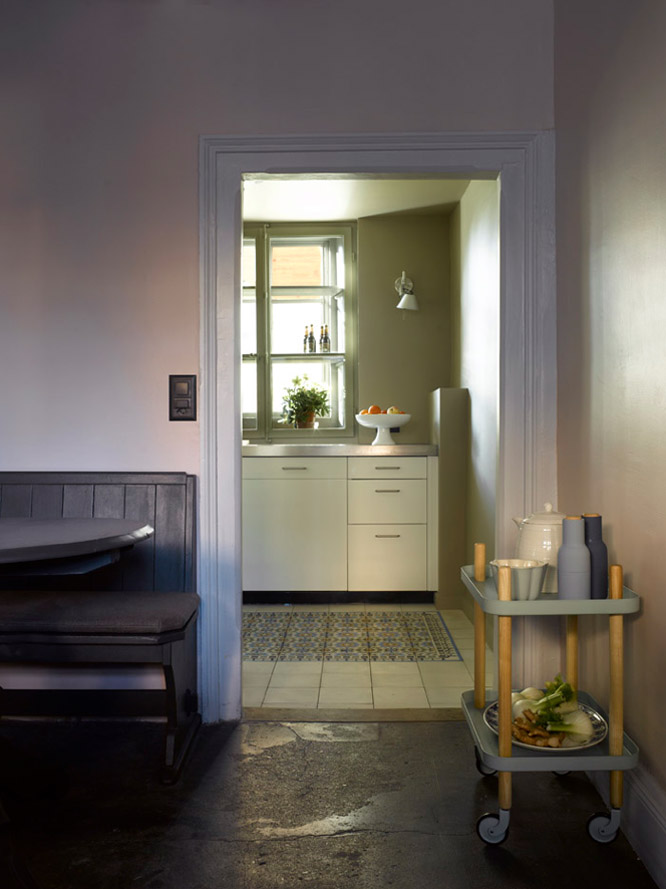
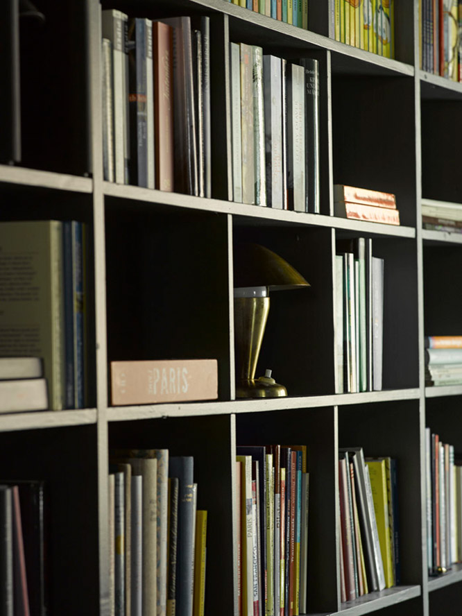
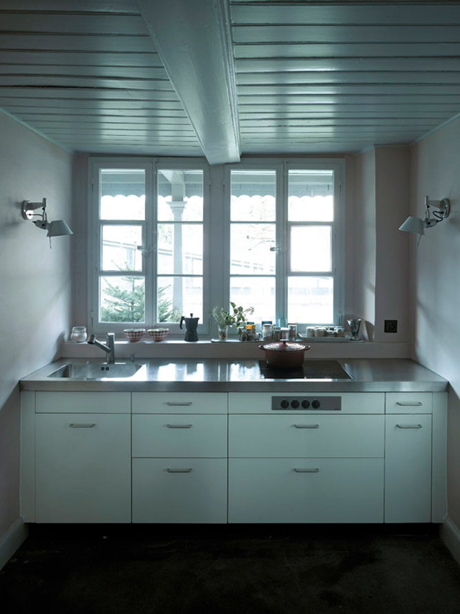
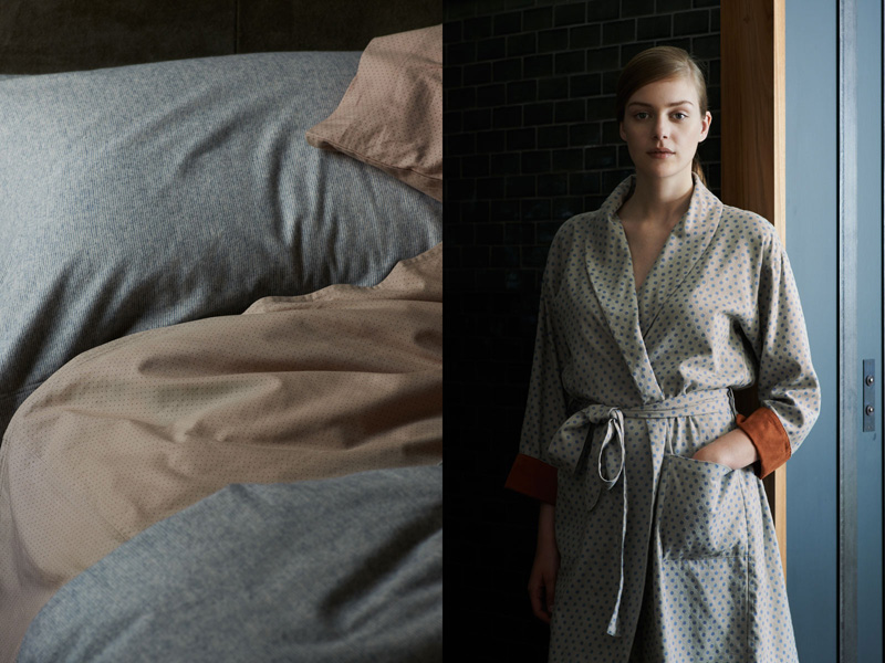
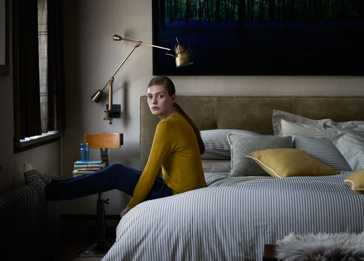
A warm hello dear readers on this rather damp autumn morning! I’m hoping to cheer you up with some snippets of UK fashion brand Toast’s AW collection.

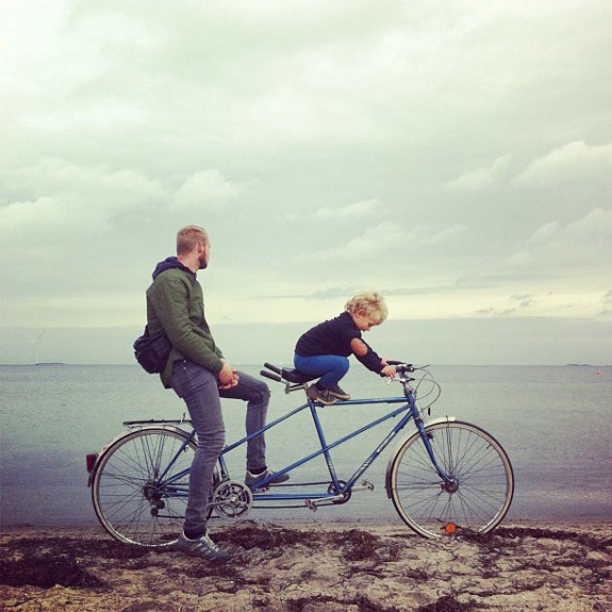
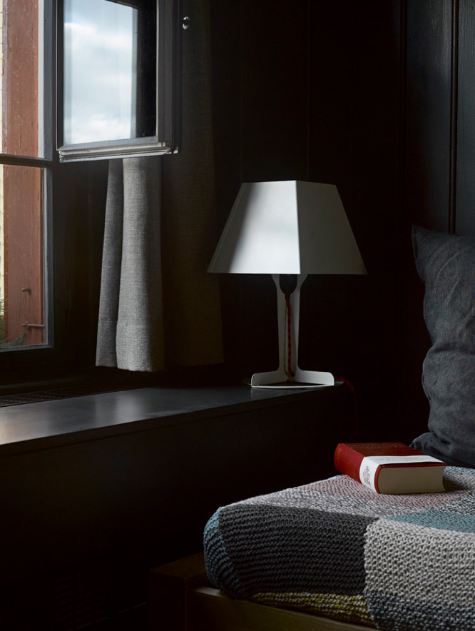
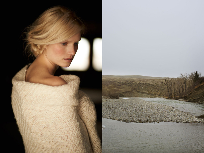
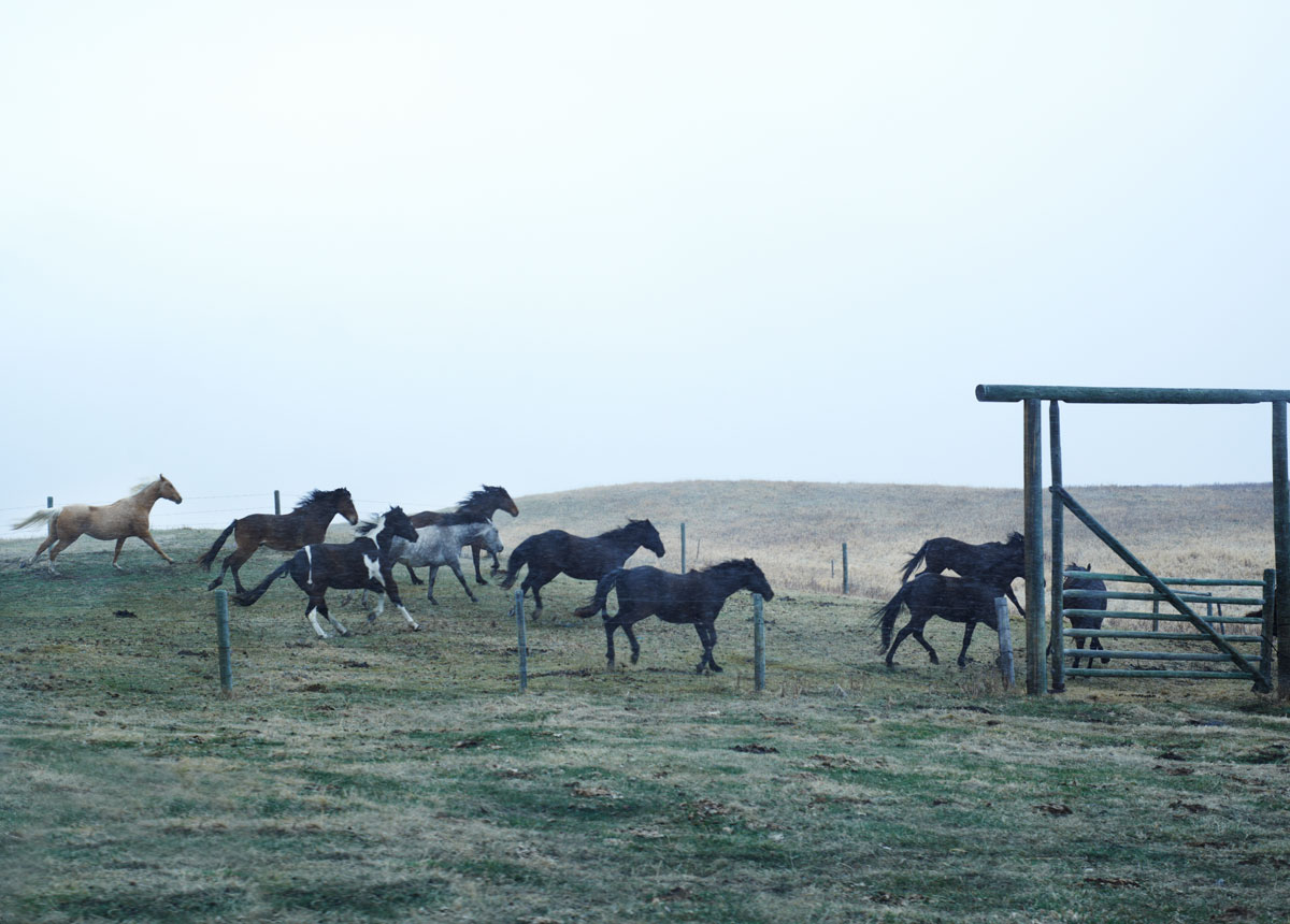
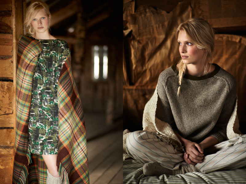
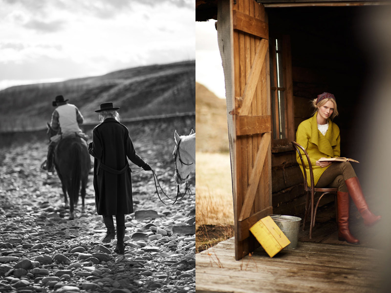
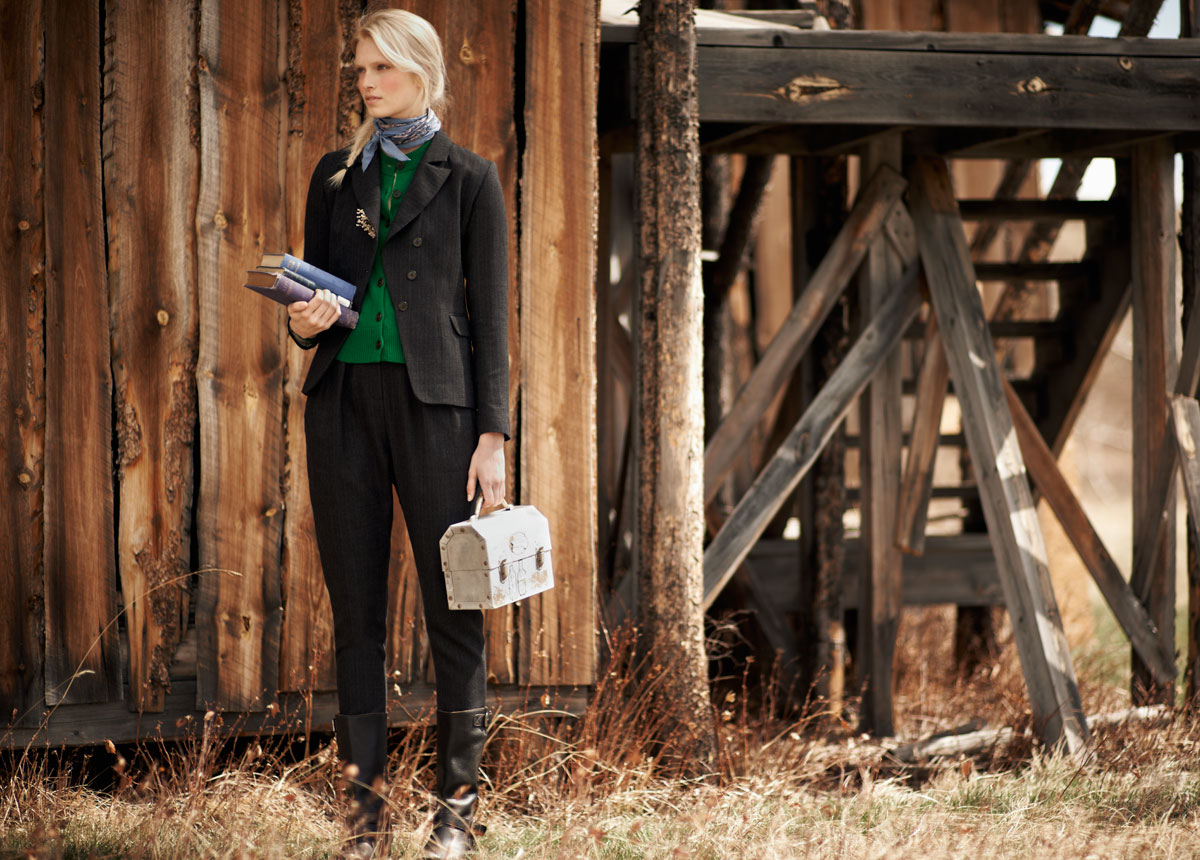
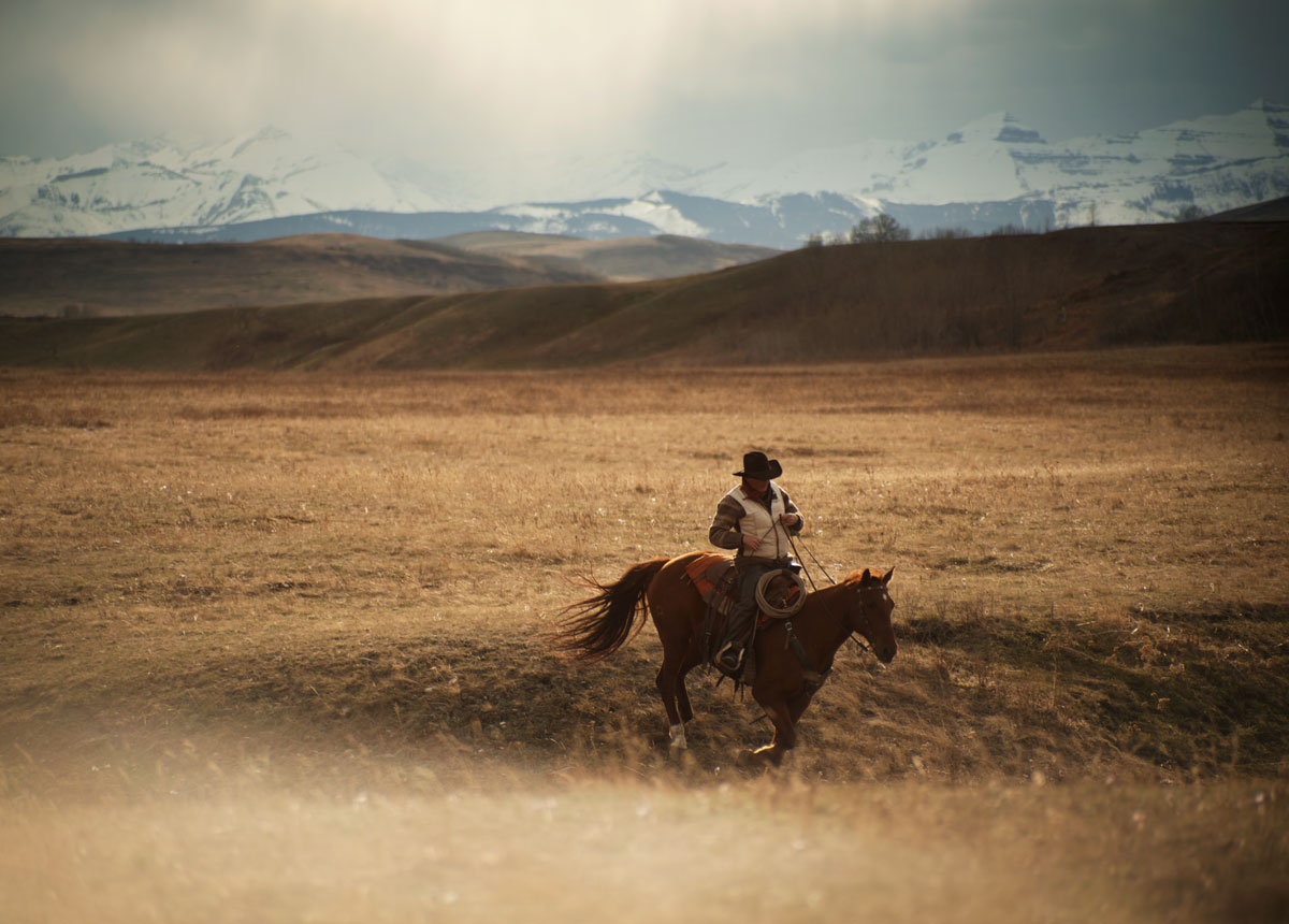
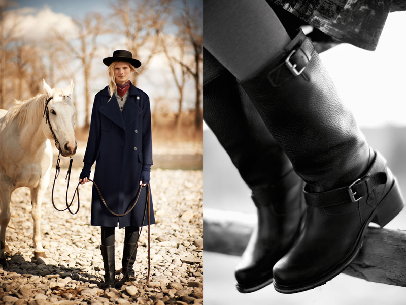
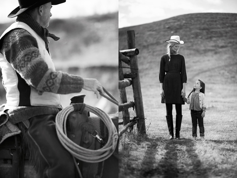
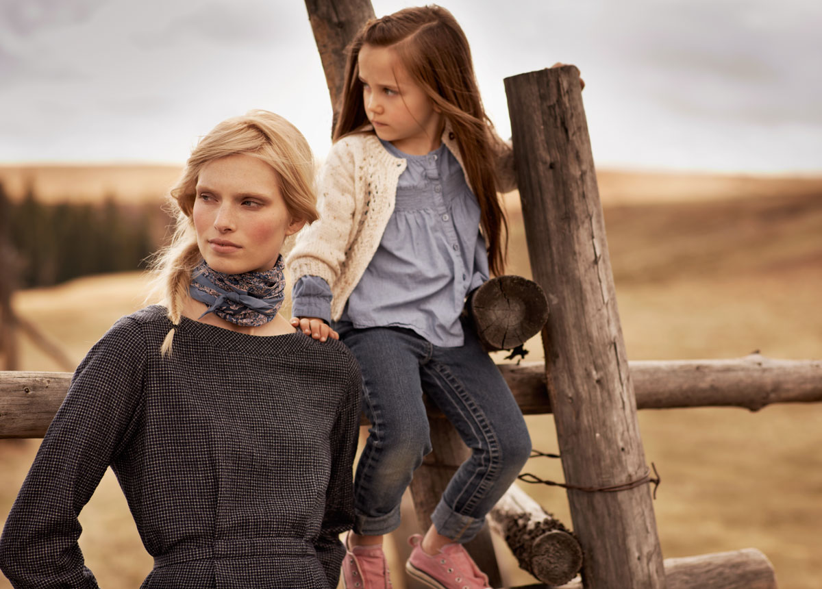
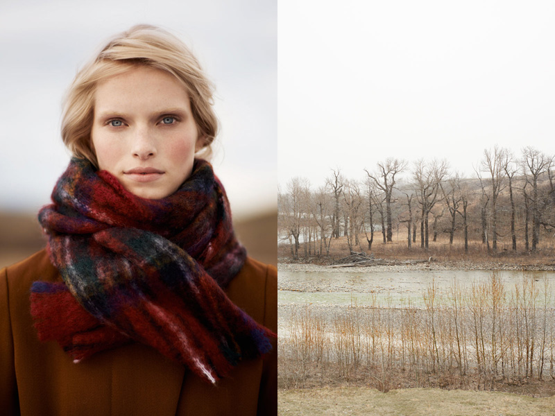
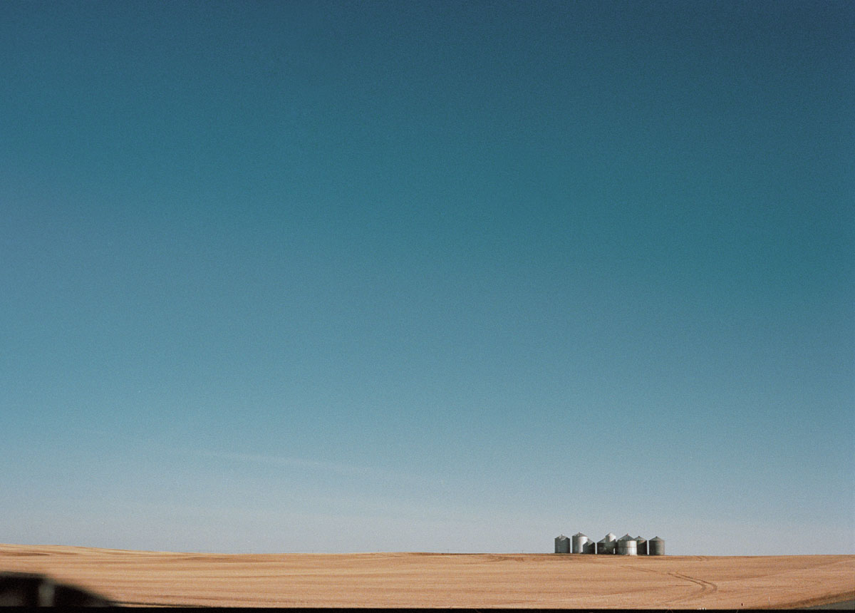
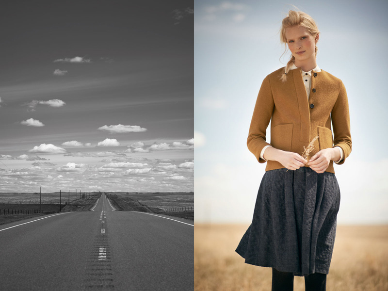
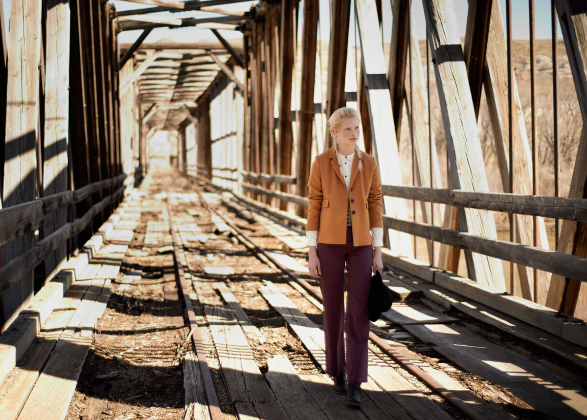
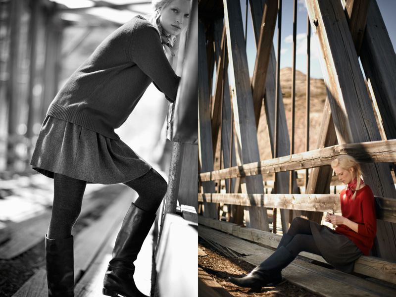
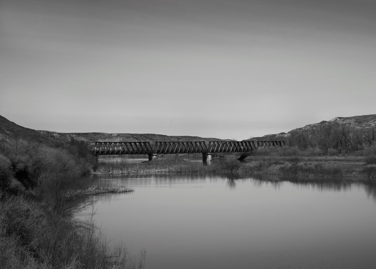
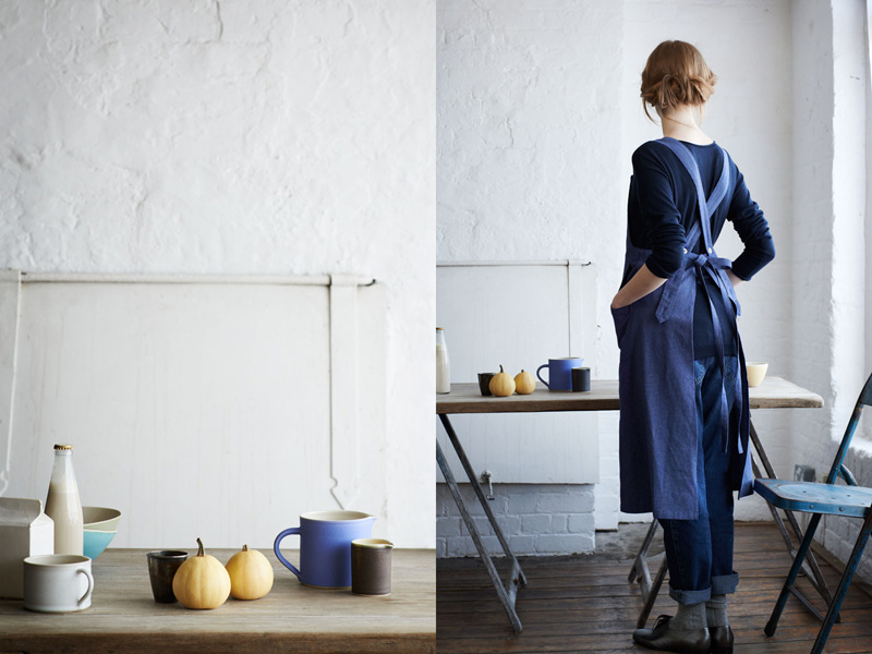
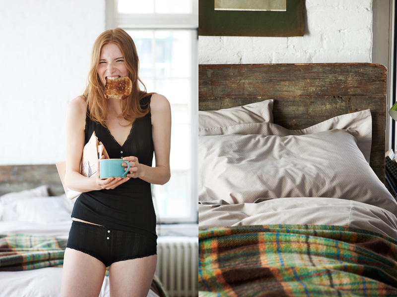
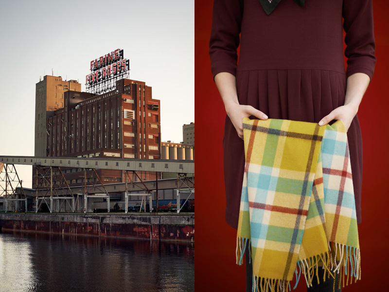
The photography by Nick Seaton is beautifully stimulating, taken in the Wild West and North American Prairie. A gorgeous backdrop with cowboys, horses, log cabins, stables and stunning scenery for the mostly soft colour palette, fine fabrics and classic patterns.

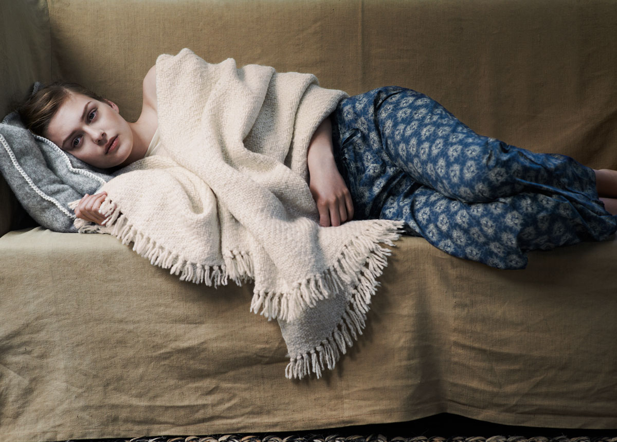
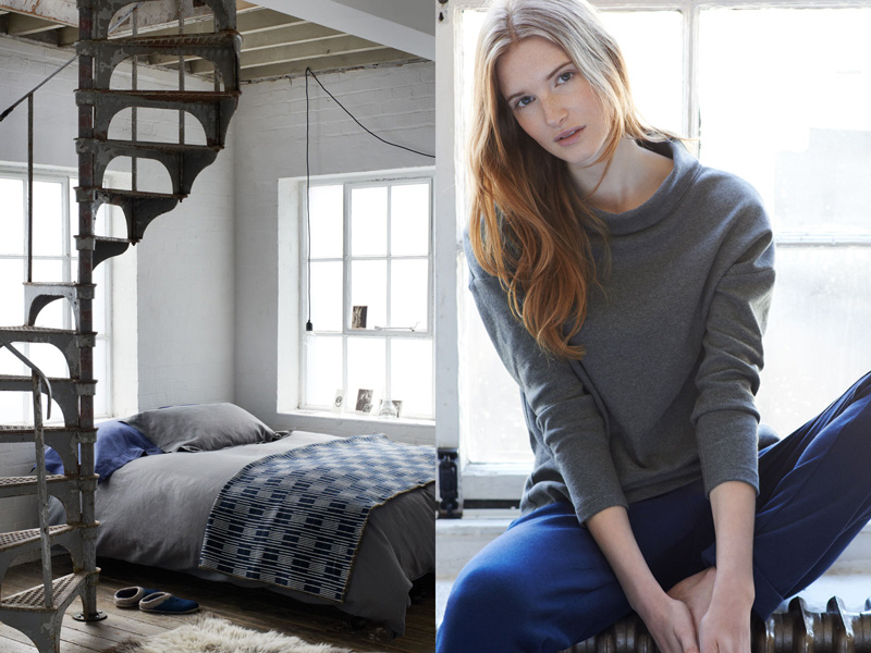
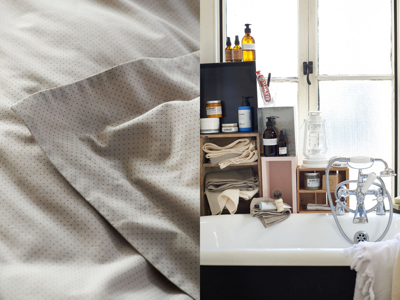
Toast is your ultimate lifestyle brand covering Womens and Menswear as well as House & Home including lotions, potions, candles, cookware and even storage to name but a few. Basically, you can live and breathe Toast… though I’d advise against eating too much of it.

They also did a clever thing on their website where you can click on the juicy lifestyle image and up pops “click to shop the look” which means that you can look just like the model in the picture! Perfect!

Note: The photo series reminds me a little of the Dude Ranch by Vanessa Jackman featured earlier this year. If you have a yearning for all things Wild West have a browse for some more inspirational photography.

TOAST-AW2013-via-Stylejuicer02

TOAST-AW2013-via-Stylejuicer01

TOAST-AW2013-via-Stylejuicer03

TOAST-AW2013-via-Stylejuicer04

TOAST-AW2013-via-Stylejuicer05

TOAST-AW2013-via-Stylejuicer06

TOAST-AW2013-via-Stylejuicer07

TOAST-AW2013-via-Stylejuicer08

TOAST-AW2013-via-Stylejuicer09

TOAST-AW2013-via-Stylejuicer10

TOAST-AW2013-via-Stylejuicer11

TOAST-AW2013-via-Stylejuicer12

TOAST-AW2013-via-Stylejuicer13

TOAST-AW2013-via-Stylejuicer14

TOAST-AW2013-via-Stylejuicer15

TOAST-AW2013-via-Stylejuicer16

TOAST-AW2013-via-Stylejuicer17

TOAST-AW2013-via-Stylejuicer18

TOAST-AW2013-via-Stylejuicer19

TOAST-AW2013-via-Stylejuicer20

TOAST-AW2013-via-Stylejuicer21

TOAST-AW2013-via-Stylejuicer22

TOAST-AW2013-via-Stylejuicer23

Toast AW2013 via Stylejuicer.com

Enjoy and I hope you’re inspired!

Annie Signature Stylejuicer

More information | TOAST
Photography | Nicholas James Seaton

IDA LAERKE INTERVIEW VIA BUNGALOW 5

8 November 2013

I couldn’t finish this subtle week on Stylejuicer without introducing you to one of my NBF via Instagram:
IDA LAERKE HANSEN.

I see her almost daily or at least I get a glimpse of her and see what moves and inspires her. I feel we are on the same wave length and if she’s happy or sad I can feel her mood through her photos. I think of her as part of my ‘gang’ but of course I’ve never even met her – and probably won’t – but such is the power of a simple idea like Instagram that it lures you into thinking you’ve found a soulmate. Strange, dangerous, harmless or simply fun whichever way you look at it, Instagram is a magical tool.

I was therefore delighted to find an interview with my NBF on uebercool Danish blog Bungalow5 and got permission from the founder himself to re-post it here on Stylejuicer. [Thanks Allan, you’re the man!] For more inspiring designer interviews pop over to Bungalow5 and get lost in it’s stylish content.

Bungalow5 Ida Laerke Interview via Stylejuicer

A picture from my newsfeed on Instagram has just ticked in, while I am writing this. It is from Ida Lærke Hansen, who just posted a new cool picture of pieces of fruit in a glass filled with water. The other day it was four horses on a field chewing grass. Ida takes pictures of her everyday life. And everybody loves it. Ida has almost 300.000 followers (including me). If you like me are curios as to why people follow her and how much time she is actually using on styling her pictures, read on.

What is your background?

I have a master in history from the University of Copenhagen. I handed in my thesis spring 2013, and the subject was sexual and body education for women 1890-1950.

And how did you start instagramming?

A friend showed me Instagram in September 2011. The immediacy appealled to me: Take a picture with your iPhone, use a filter to edit the picture and share. Easy and quick.

How do your 300.000 followers affect you?

For me Instagram is a complex tool. It is a social network but I can also use Instagram to express myselv creatively. I am happy that so many like what I do and express their positive opinions of my pictures. My many followers have motivated me to keep taking pictures but for me taking pictures has to be about me wanting to take them. As long as I think it is fun to take pictures and post them on Instagram, I will keep doing it.

Ida-Laerke-via-Stylejuicer01

Bungalow5 Ida Laerke Interview via Stylejuicer

How long time do you spend taking pictures?

Some days several hours, some five minutes. It depends on my mood and inspiration that day. A lot of my pictures are from where I am at at the moment. For instant at Amager Strandpark with my husband and son. In that sense Instagram is a visual diary which I always cary with me.

A lot of your pictures look like still lifes. Why?

Because I feel like it. I have an interest for compositions and colours and I love having fun arranging a picture. My still lifes create or recreate moods and feelings. Or it simply looks beautiful.

What apps are your favorite?

I am a big fan of Amaro on Instagram. Lately I have started using VSCO CAM.

The other day you posted a picture of four hourses on a field. The picture currently has 6768 likes. What makes this particular picture great?

The best pictures on Instagram are about much more than just the specific object or lighting. It is about how the picture move the person who sees it.

bungalow5-ida-laerke-4

Ida-Laerke-via-Stylejuicer

Bungalow5 Ida Laerke Interview via Stylejuicer

Why do you think people follow you?

I like to think that people follow me because my pictures represents something in our time: The esthetic and the ordenary of our everyday life. Like a cup of coffee, a flower, family or a beautiful sunbeam in my kitchen. My everyday is being interpreted through a simple, esthetic universe that I think appeals to a lot of people.

Enjoy and I hope you’re inspired!

Annie Signature Stylejuicer

Photography | Ida Laerke on Instagram
Interview | Bungalow 5
Stylejuicer on Instagram

CLASSICALLY SUBTLE DANISH DESIGN BY FERM LIVING

7 November 2013

This SUBTLE week on Stylejuicer seems to be filled with real life fairy tales and to warm your heart just a little more and get your entrepreneurial spirit going I’m going to present you Ferm Living, another example of great style and taste coupled with impeccable timing and a dash of… luck!?

I’m hesitating to call Trine Andersen “lucky” as I firmly believe we all create our own lucky breaks but I won’t get too philosophical about it or you’ll have an essay on your hands.

So, the story goes that when graphic designer Trine couldn’t find the wallpaper she wanted for her new home she decided to design and print it herself. So far, so extravagant but her timing back in 2004 (ish) turned out to be impeccable as she had stumbled across a niche in the market for quality graphic wallpaper and founded Ferm Living in 2005.

FermLiving-via-Stylejuicer-22

Wallpaper still being at the heart of it she has transferred her designs to homewares ranging from cushions and throws to kitchen and bathroom accessories as well as fabulous kid’s designs, toys and textiles.

The beauty of her designs is the fact that each new collection integrates perfectly with previous ones and subtly evolves your home. Her colour palette is mostly subdued and her designs incorporate strong graphic shapes and prints. I can see how once you’ve experienced her collection in your home you’d want to update it season by season.

To me Ferm’s aesthetic is classically Danish: understated, casual, approachable, mostly minimalist but oh, so strong with a little twinkle in the eye.

A nice strategy and one that has recently made her a success in the US, a notoriously tough market to crack but I suspect her Danish twinkle won them over.

NOTE: If you’d like to read more about Trine and how Ferm came to feature a bird as it’s logo, pop over to Bungalow5 for a small interview with the founder and designer.

FermLiving-via-Stylejuicer-23

FermLiving-via-Stylejuicer-26

FermLiving-via-Stylejuicer-24

FermLiving-via-Stylejuicer-25

FermLiving-via-Stylejuicer-10

FermLiving-via-Stylejuicer-12

FermLiving-via-Stylejuicer-15

FermLiving-via-Stylejuicer-01

FermLiving-via-Stylejuicer-28

FermLiving-via-Stylejuicer-13

FermLiving-via-Stylejuicer-29

FermLiving-via-Stylejuicer-02

FermLiving-via-Stylejuicer-03

FermLiving-via-Stylejuicer-09

FermLiving-via-Stylejuicer-06

FermLiving-via-Stylejuicer-04

FermLiving-via-Stylejuicer-08

FermLiving-via-Stylejuicer-07

FermLiving-via-Stylejuicer-05

FermLiving-via-Stylejuicer-14

FermLiving-via-Stylejuicer-18

FermLiving-via-Stylejuicer-16

FermLiving-via-Stylejuicer-11

FermLiving-via-Stylejuicer-19

Ferm Living via Stylejuicer

Enjoy and I hope you’re inspired!

Annie Signature Stylejuicer

Photography & more information | Ferm Living

CEREAL MAGAZINE IS IN PURSUIT OF FOOD AND TRAVEL

6 November 2013

Oh, how I love to hold a beautifully produced, perfect bound, matt laminated, weighty magazine. Printed on tactile uncoated stock with text that doesn’t crowd the page but gives my eye a rest and images that inspire and make me day dream.

CEREAL is just that! A designers idea of spacial heaven, where section headers take up double page spreads, photos bleed to the edge in abundance and space is not at a premium. There’s no client demanding for the logo to be made bigger and more copy to be crammed in. The typography is outstanding with a perfect mix of serif and sans. For me it feels like a meal at a Michelin star restaurant with a perfect combination of flavours and textures. Every ingredient considered and never overbearing. But enough lyrical waxing now.

Cereal Magazine via Stylejuicer

The editor Rosa Park describes CEREAL as:

… a magazine rooted in our passions – for food, for travel. And for books too, with all the wonderful things they can teach us. Each quarterly volume of CEREAL contains details expositions of edible topics, travel destinations, as well as profiles on products, people and places – chosen because they’re relevant, interesting, or have simply caught our attention.

The Bristol based quarterly publication was launched late in 2012 with huge success and their first volume was a sell-out. I suspect a lot of the success can be attributed to designer Rich Stapleton’s minimal approach, subtle grey colour palette, infographics and maps that make the reading experience such a delight.

Topics are explored in great depth and in their current fourth volume range – seemingly random – from a photo essay on grains to Krakow and British watch manufacturers, to Californian residential architecture and sushi, finishing off with the UK’s New Forest. An eclectic selection which let’s you discover interesting facts about topics you never thought you’d be interested in. In my case I found myself fascinated by the analysis of the Polish language by Richard Aslan. Who would have thought!?

CEREAL has also launched a capsule collection of stationery items that appeal to the closet OCD-er and might be an idea for the end of year consumer extravaganza commonly known as “Christmas”! Hohoho!

Cereal-Mag-via-Stylejuicer02

Cereal-Mag-via-Stylejuicer03

Cereal-Mag-via-Stylejuicer04

Cereal-Mag-via-Stylejuicer05

Cereal-Mag-via-Stylejuicer06

Cereal-Mag-via-Stylejuicer07

Cereal-Mag-via-Stylejuicer13

Cereal-Mag-via-Stylejuicer09

Cereal-Mag-via-Stylejuicer10

Cereal Magazine via Stylejuicer

Enjoy and I hope you’re inspired!

Annie Signature Stylejuicer

More information | CEREAL magazine
Photography | Annie Kruse

GENTLE RENOVATION OF A SWISS CHALET

5 November 2013

Today’s story of the gentle renovation of an old Swiss chalet is a bit of a fairy tale so let me start by saying:
In a land far, far away…

Mirko Beetschen and Stéphane Houlmann of Berdorf Agency discovered the old house in Interlaken and sensed that this was the beginning of a wonderful liaison. With their trained and sensitive eye the two interior experts immediately saw the treasures which came to light during the sensitive renovation process.

Chalet Interlaken by Bergdorf 25

Though modestly looking from the outside the house oozes with original features from the 19th century like the wooden panelling in the parlours, the parquet floors, the old staircase or the fabulous fireplace in the library. It took a while to find the right team of experts who had the skills, knowledge and vision for this renovation project but one by one the craftsmen came together each giving their best to bring the vision to life.

Interestingly, the team found English newspapers from 1895 under the old linoleum flooring and a dog-eared copy of a Charles Dickens novel in one of the closets which points to previous British or American owners during the time when the Alpine tourism in Interlaken really took off.

As with all old buildings one of the major problems was insulation. Each room, from the cellar to the attic, had to be looked at individually for the best possible energy efficiency. The building still had to be able to ‘breathe’ and the solution was to stuff the roof with soft sheep wool creating a natural warmth that gives an exceedingly comfortable atmosphere. As a visitor you feel like taking a good book and a mug of something hot snuggling into the nearest corner straight away.

I love the fact the owners used forty different, finely tuned hues of paint which perfectly harmonise with the antique features of the house and add to their beauty, as if it has always been like this.

Chalet Interlaken by Bergdorf 26

The chalet, that can sleep no less than 13 people, is a rare success of contemporary living coupled with historic charm which Mirko and Stéphane now share with friends and family.

Their talent for gentle but creative renovations has since attracted owners of similar properties in the area who have instructed them to work their magic on their own historic chalets.

…and they lived happily ever after. The End.

Chalet Interlaken by Bergdorf 27

Chalet Interlaken by Bergdorf 28

Chalet Interlaken by Bergdorf 03

Chalet Interlaken by Bergdorf 04

Chalet Interlaken by Bergdorf 05

Chalet Interlaken by Bergdorf 06

Chalet Interlaken by Bergdorf 11

Chalet Interlaken by Bergdorf 12

Chalet Interlaken by Bergdorf 13

Chalet Interlaken by Bergdorf 14

Chalet Interlaken by Bergdorf 15

Chalet Interlaken by Bergdorf 16

Chalet Interlaken by Bergdorf 17

Chalet Interlaken by Bergdorf 18

Chalet Renovation by Bergdorf

Chalet Interlaken by Bergdorf 20

Chalet Interlaken by Bergdorf 21

Chalet Interlaken by Bergdorf 22

Chalet Interlaken by Bergdorf 24

Chalet Renovation by Bergdorf

Enjoy and I hope you’re inspired!

Annie Signature Stylejuicer

More information | Bergdorf Agency for Concepts and Communication
Photography | Martin Guggisberg