
Oh, how I love to hold a beautifully produced, perfect bound, matt laminated, weighty magazine. Printed on tactile uncoated stock with text that doesn’t crowd the page but gives my eye a rest and images that inspire and make me day dream.
CEREAL is just that! A designers idea of spacial heaven, where section headers take up double page spreads, photos bleed to the edge in abundance and space is not at a premium. There’s no client demanding for the logo to be made bigger and more copy to be crammed in. The typography is outstanding with a perfect mix of serif and sans. For me it feels like a meal at a Michelin star restaurant with a perfect combination of flavours and textures. Every ingredient considered and never overbearing. But enough lyrical waxing now.
The editor Rosa Park describes CEREAL as:
… a magazine rooted in our passions – for food, for travel. And for books too, with all the wonderful things they can teach us. Each quarterly volume of CEREAL contains details expositions of edible topics, travel destinations, as well as profiles on products, people and places – chosen because they’re relevant, interesting, or have simply caught our attention.
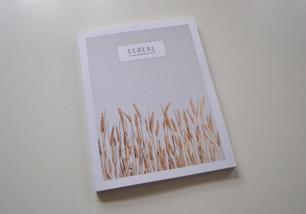
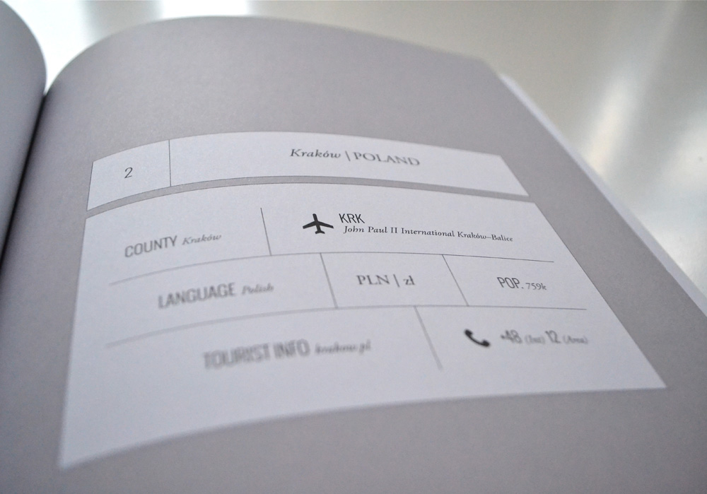
The Bristol based quarterly publication was launched late in 2012 with huge success and their first volume was a sell-out. I suspect a lot of the success can be attributed to designer Rich Stapleton’s minimal approach, subtle grey colour palette, infographics and maps that make the reading experience such a delight.
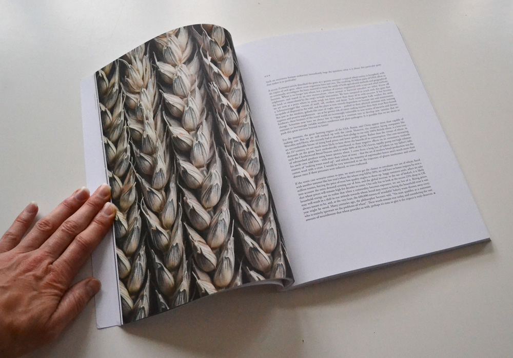
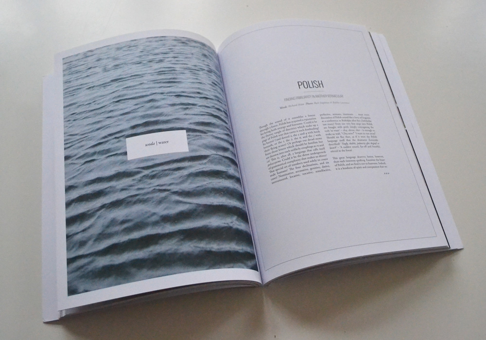
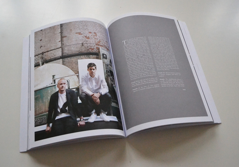
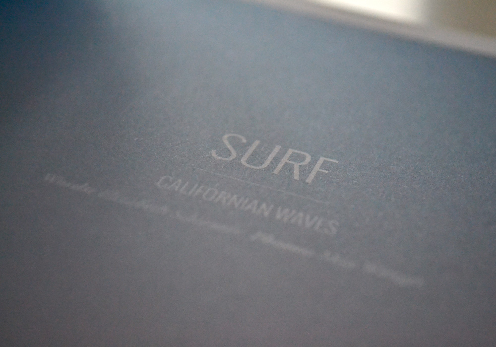
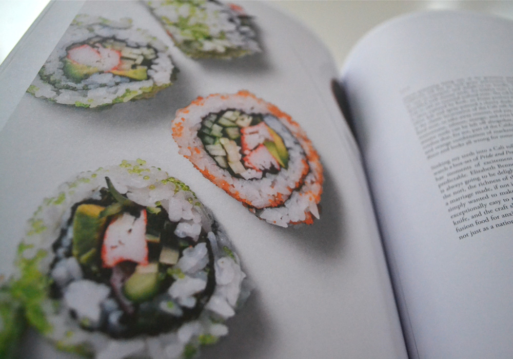
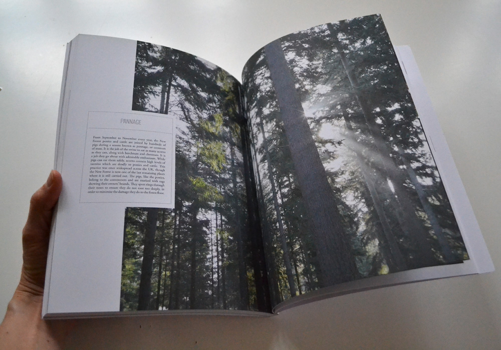
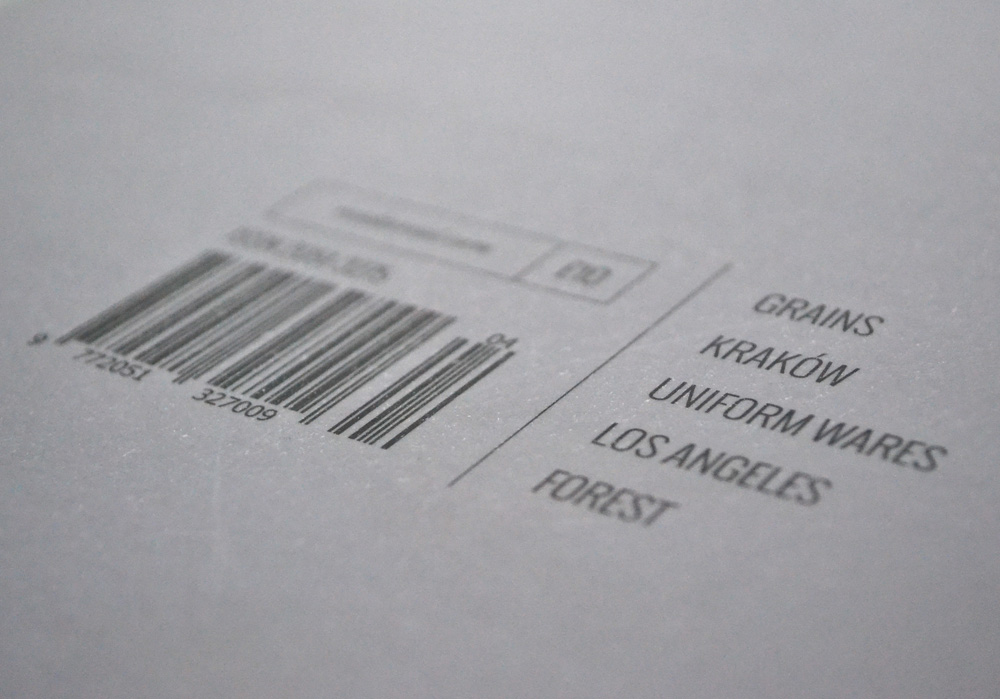
Topics are explored in great depth and in their current fourth volume range – seemingly random – from a photo essay on grains to Krakow and British watch manufacturers, to Californian residential architecture and sushi, finishing off with the UK’s New Forest. An eclectic selection which let’s you discover interesting facts about topics you never thought you’d be interested in. In my case I found myself fascinated by the analysis of the Polish language by Richard Aslan. Who would have thought!?
CEREAL has also launched a capsule collection of stationery items that appeal to the closet OCD-er and might be an idea for the end of year consumer extravaganza commonly known as “Christmas”! Hohoho!
Enjoy and I hope you’re inspired!
![]()
More information | CEREAL magazine
Photography | Annie Kruse
thanks for making my day with this comment: “There’s no client demanding for the logo to be made bigger and more copy to be crammed in.”
story of my life…………..
visiting from BYW. wonderful blog!
Haha! Yes, story of my life too… There’s another great post about a design consultancy like no other coming up which I think you’ll enjoy. Stay tuned! x [BYWers rock!]
Looks gorgeous. Well designed. Great paper. But those monolithic columns of type, many lines deep, are probably unreadable. No doubt the designer wanted a clean rectangle for esthetic reasons, and s/he got it. But also got dense possibly unhyphenated text no one would read.