Category Archives: Design & Illustration

DESIGN INSPIRATION | HOTEL TROFANA ALPIN BRANDING

21 February 2014

copyright-Trofana-Alpin-Branding-Rabensteiner01

I’ve confessed my love for Austrian design studio Bureau Rabensteiner previously when they took pride of place as my very first post almost a year ago.

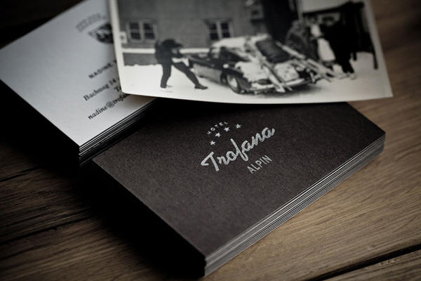
It seems that every project they take on turns into a master class in branding and since winter is not quite over yet it seemed only right to feature their branding project for Hotel Trofana Alpin in Ischgl, a ski resort in the Tyrolean mountains.

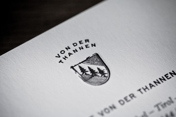
The hotel is family owned and therefore represents the very foundation of the Von der Thannen family history. [Ops, I almost wrote Von Trapp there as I can’t help singing ‘The Hills Are Alive… ‘]

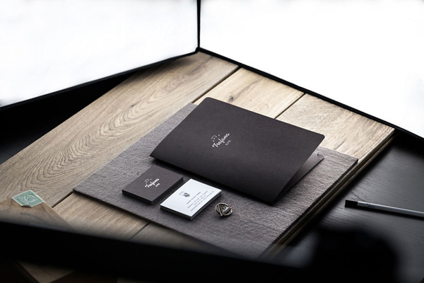
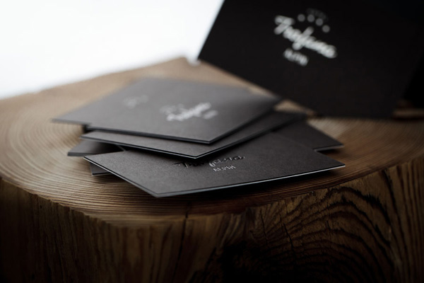
Projects for family businesses are always very personal and can be a bit tricky as passions run deep and opinions can turn heated. However Bureau Rabensteiner not only seems to have great client liaison skills but have managed to capture the Von der Thannen essence which is their “exemplary ability to balance tradition with modern convenience and understated luxury.”

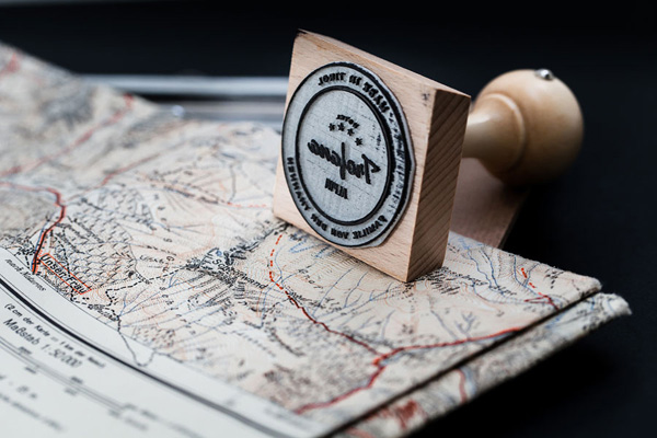
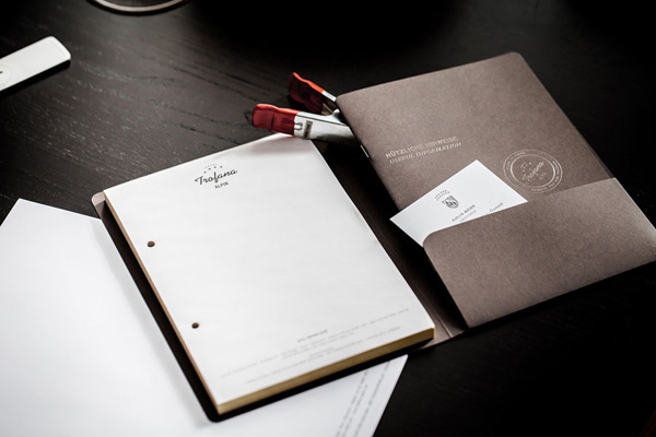
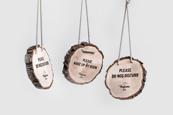
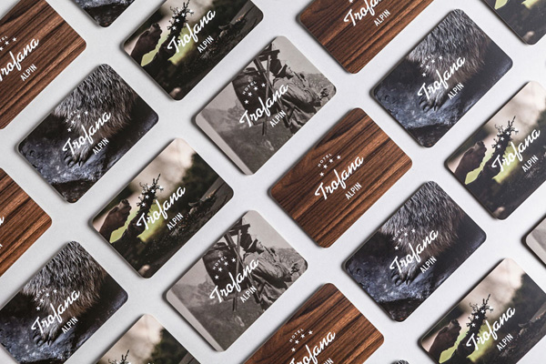
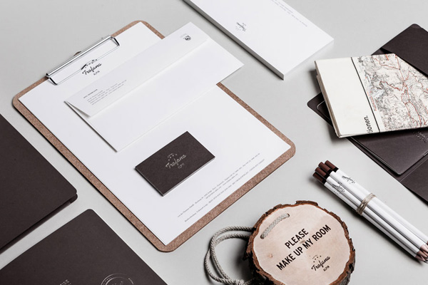
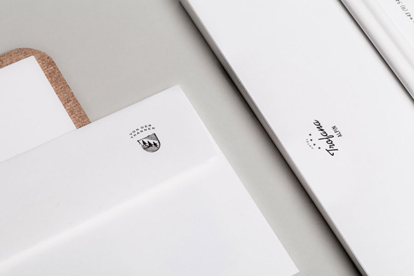
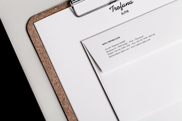
I love the use of vintage ski photographs in combination with the rich, dark chocolate brown and silver as their colour palette. The handwritten style of the logo also hints back at those days when alpine skiing became popular and is topped discreetly by four stars. The brand is very tactile and the handmade ‘Do Not Disturb’ signs made from literally branded wooden discs are a cute detail.

Alpine charm with contemporary classiness at it’s best. Hands up who’s coming with me!?
 
copyright-Trofana-Alpin-Branding-Rabensteiner02

copyright-Trofana-Alpin-Branding-Rabensteiner03

copyright-Trofana-Alpin-Branding-Rabensteiner04

copyright-Trofana-Alpin-Branding-Rabensteiner05

copyright-Trofana-Alpin-Branding-Rabensteiner06

copyright-Trofana-Alpin-Branding-Rabensteiner07

copyright-Trofana-Alpin-Branding-Rabensteiner08

copyright-Trofana-Alpin-Branding-Rabensteiner09

copyright-Trofana-Alpin-Branding-Rabensteiner10

Design Inspiration, Branding, Hotel Trofana Alpin, Austria, Tyrol, Bureau Rabensteiner, Design Studio

 
MORE INFORMATION & PHOTOGRAPHY | Bureau Rabensteiner
 
Follow Stylejuicer with Bloglovin

CHINESE NEW YEAR STAMPS | YEAR OF THE HORSE

31 January 2014

chinese new year stamps by paprika via stylejuicer

Happy Chinese New Year to around 1.3 billion -ish people and all of their relations around the world! The world largest population has their own calendar, the Han calendar, which usually begins on the second dark moon after the winter solstice, occasionally the third dark moon. Get it? Me neither. It is also called the Spring festival and the most important social and economic event of the year.

Canadian design studio Paprika designed these beautiful stamps to mark the Year Of The Horse and I love the stylised horses and the rich red and gold colour used. Red in particular is highly symbolic for the Chinese and associated with good fortune and joy as well as fire, warding off evil. During Chinese New Year or special occasions people give out red envelopes with money and I’m sure they appreciate the stamps to tie in with the Year Of The Horse.

The seal in the shape of a horseshoe is a neat little touch and since Paprika is located in Quebec, the French speaking part of Canada, they’ve incorporated both the French and English word for horse on the stamps as well as the Chinese symbol. Ok, my Mandarin is a bit rusty but I’m taking an educated guess here so feel free to correct me in the comments. Let me finish by wishing you:

Happiness, Prosperity, Longevity
福禄寿 fú lù shòu

To find out more about Chinese New Year traditions check out the International Business Times.


chinese-new-year-stamps-by-paprika-via-stylejuicer05

chinese-new-year-stamps-by-paprika-via-stylejuicer01

chinese-new-year-stamps-by-paprika-via-stylejuicer02

chinese-new-year-stamps-by-paprika-via-stylejuicer04

chinese-new-year-stamps-by-paprika-via-stylejuicer03

chinese-new-year-stamps-by-paprika-via-stylejuicer06

chinese-new-year-stamps-by-paprika-via-stylejuicer09

chinese-new-year-stamps-by-paprika-via-stylejuicer08

chinese new year stamps by paprika via stylejuicer
 
DESIGN & PHOTOGRAPHY | Paprika
 

DESIGN INSPIRATION | ONLINE FOOD JOURNAL FOOD&_

28 January 2014

copyright-foodand_via-stylejuicer-19

Now this is one of those seriously cool successful projects you don’t see very often.

Food&_ was only set up in the summer of 2013 which gives credit to the fact that great design and even greater content are perfect partners. But let me start from the beginning as the story behind this genius concept is encouragement to all perfectionists and procrastinators alike. Ahem… and yes, I do count myself into both those categories.

copyright-foodand_via-stylejuicer-09

Founder Ross Featherstone is a keen home cook, an obsessive collector of cookery books and one of those annoying people who take pictures of their meals before picking up a fork – his words not mine. Furthermore he designs and builds websites for a living, so you would think that setting up a blog would be a walk in the park for him. Not so, as I found out when reading up about the concept behind Food&_ on The Culture Vulture.

After years of false starts, getting hung up on design and fussing about detail he finally got the push he needed by signing up to Blog North #4, a food bloggers workshop, where he didn’t want to show up with a handful of undercooked website designs. Getting loads of advice and encouragement during the workshop was the turning point for him and he realised that he wanted his food blog to be a collaborative online food journal.

Bringing together an ever-growing mix of foodies, writers, growers and producers with photographers, illustrators and designers to collectively showcase and promote each individual’s talent. They all share a love food and the stories behind the food, their passions and recipes.

foodand_ online food journal via stylejuicer.com

As a graphic designer I’m in love with the fresh approach he and his partners took on the branding and as a fellow blogger I’m insanely jealous of the concept and rocketing success the site has experienced since it’s launch. Let me say at this point that Ross is one of five founding partners, others including Katy Lanceley, Jonathan Finch, Rosalind Stoughton and Christopher Nunn.

The branding is classic and modern at the same time with the use of serif Calendar Plus as a primary headline font and Apercu as a secondary modern sans serif for body copy. The colour palette has been kept neutral and ranges from black and white to beige and grey making the colourful photography appropriately the hero.

All of the collateral has got a lovingly handmade, crafty touch not dissimilar to cooking itself and I like the little details like actual pressed herbs stuck to the covers and the fine, almost botanical black and white illustrations. It’s a utilitarian brand with an earthy character that perfectly compliments food, cooking and dining. A lovingly designed concept that has stand out and longevity. Jamie Oliver eat your heart out.

foodand_ online food journal via stylejuicer.com

copyright-foodand_via-stylejuicer-02

copyright-foodand_via-stylejuicer-01

copyright-foodand_via-stylejuicer-10

copyright-foodand_via-stylejuicer-22

copyright-foodand_via-stylejuicer-21

copyright-foodand_via-stylejuicer-20

copyright-foodand_via-stylejuicer-16

copyright-foodand_via-stylejuicer-15

copyright-foodand_via-stylejuicer-25

copyright-foodand_via-stylejuicer-11

copyright-foodand_via-stylejuicer-06

copyright-foodand_via-stylejuicer-27

copyright-foodand_via-stylejuicer-08

foodand_ online food journal via stylejuicer.com

 
Annie Signature Stylejuicer
 

WEBSITE | Design by Passport. Build by Refresh Interactive
RECIPE BOOKS | Design by Passport. Illustrations by Liz Ibbotson
LAUNCH EVENT | Creative Direction by Lord Whitney, Passport, Ross Featherstone & Katy Lanceley
STYLING | Lord Whitney
PRINT & PROMOTION DESIGN | Passport
PHOTOGRAPHY | Victoria Harley

DESIGN INSPIRATION | NORDIC HOUSE BRANDING BY ANAGRAMA

19 January 2014

Morning everyone! Hope you all had good weekends. We took the kids to the Science Museum in London on Saturday and everyone had a ball. So much to discover and learn but try dragging two under three away from the interactive water garden… The cowboy and I thought we might come back a deux on a nerdy date as there are so many cool shows and exhibits which are impossible to take in if you’re looking after small kids.

Another great find this weekend was this branding job by Mexican agency Anagrama. You’d be forgiven to think that Nordic House was a Scandinavian brand which is part of the reason it caught my eye. In fact Anagrama approached the yet to be launched dry-cleaning service brand just with those nordic design values in mind. Combining simple geometric forms with a clean, sharp, well-distributed logotype and an icy, cold colour palette from snowy white, chilly grey and pine needle green to fresh salmon.

It all combines to create a cool nordic landscape complete with its pure, immaculate and undisguised scents.

I love the stark, reductionist style which captures the brand’s emphasis on honesty, clarity and above all, quality. Bull’s eye values for a dry-cleaning company, beautifully executed and communicated in their overall appearance and I’m excited to hear that they will also sell exclusive, quality items such as scented soap and undershirts.

Calling all Bay Area residents, make sure to get in line for this premium service when it opens.

Nordic House Cleaning Business Branding by Anagrama via Stylejuicer.com

Nordic-House-ID-copyright-Anagrama-2

Nordic-House-ID-copyright-Anagrama-3

Nordic-House-ID-copyright-Anagrama-4

Nordic-House-ID-copyright-Anagrama-5

Nordic-House-ID-copyright-Anagrama-6

Nordic-House-ID-copyright-Anagrama-7

Nordic-House-ID-copyright-Anagrama-8

Nordic-House-ID-copyright-Anagrama-9

Nordic-House-ID-copyright-Anagrama-10

Nordic-House-ID-copyright-Anagrama-11

Nordic-House-ID-copyright-Anagrama-12

Nordic-House-ID-copyright-Anagrama-13

Nordic House Cleaning Business Branding by Anagrama via Stylejuicer.com

Annie Signature Stylejuicer

MORE INFORMATION & PHOTOGRAPHY | Anagrama

DESIGN INSPIRATION | BRAND IDENTITY MARTINA SPERL

6 January 2014

Let’s kick off the year properly and start with a project that combines two of my great passions: Design and Craftsmanship. Well, actually it should be craftswomanship in this case as Martina Sperl is a talented lady who started her own upholstery business last year in the gorgeous town of Graz in Austria.

Graz is a small town (by London standard) and also home to Brand ID studio Moodley whom I’ve featured before with Hotel Daniel and Next Liberty Youth Theatre. I’m a big fan of their work and Martina did the smart thing by commissioning them for her new brand identity.

copyright-Moodley.at-Martina-Sperl-via-Stylejuicer-01

The slogan ‘Ewig schöne Möbel’ translates to ‘beautiful furniture, always’ [or literally ‘always beautiful furniture’] and the infinity sign as an icon cleverly visualises the claim with Martina’s initials discreetly added in the gaps.

Upholstery is as much of an art as it is a traditional craft and takes years of training. A solid and often messy business that culminates in a beautiful, sturdy and timeless piece of furniture. Putting the master craftswoman Martina Sperl at the centre of the communication gives the personal touch that clients long for when they commission a new piece or the re-upholstery of an old and loved one.

Moodley translated the essence of the brand beautifully into the printed and online suite of communication with thoughtful little details that make the overall appearance such a joy to see. Printing the stationery on letterpress may be an obvious and currently trendy choice but the classic layout should withstand all future design fads. I love the invites that resemble fabric swatches and the beautiful clean and modern photography by Michael Königshofer. Using the measuring tape and typewriter as a prop or fabric and wood as a backdrop for his shots shows how much thought and love has gone into this project.

The online appearance follows the clean, contemporary look and feel with the usage of large evocative photography. The site is easy to navigate and there are beautiful detail shots of each piece to show the exquisite quality and finish. No surprise the site has won numerous awards already.

A solid design job and top marks again for Moodley!

copyright-Moodley.at-Martina-Sperl-via-Stylejuicer-02

copyright-Moodley.at-Martina-Sperl-via-Stylejuicer-03

copyright-Moodley.at-Martina-Sperl-via-Stylejuicer-04

copyright-Moodley.at-Martina-Sperl-via-Stylejuicer-05

copyright-Moodley.at-Martina-Sperl-via-Stylejuicer-06

copyright-Moodley.at-Martina-Sperl-via-Stylejuicer-07

copyright-Moodley.at-Martina-Sperl-via-Stylejuicer-08

copyright-Moodley.at-Martina-Sperl-via-Stylejuicer-09

copyright-Moodley.at-Martina-Sperl-via-Stylejuicer-10

copyright-Moodley.at-Martina-Sperl-via-Stylejuicer-11

copyright-Moodley.at-Martina-Sperl-via-Stylejuicer-12

copyright-Moodley.at-Martina-Sperl-via-Stylejuicer-13

copyright-Moodley.at-Martina-Sperl-via-Stylejuicer-14

copyright-Moodley.at-Martina-Sperl-via-Stylejuicer-15

copyright-Moodley.at-Martina-Sperl-via-Stylejuicer-16

copyright-Moodley.at-Martina-Sperl-via-Stylejuicer-17

copyright-Moodley.at-Martina-Sperl-via-Stylejuicer-18

copyright-Moodley.at-Martina-Sperl-via-Stylejuicer-19

copyright-Moodley.at-Martina-Sperl-via-Stylejuicer-20

copyright-Moodley.at-Martina-Sperl-via-Stylejuicer-21

copyright-Moodley.at-Martina-Sperl-via-Stylejuicer-23

copyright-Moodley.at-Martina-Sperl-via-Stylejuicer-24

copyright-Moodley.at-Martina-Sperl-via-Stylejuicer-26

copyright-Moodley.at-Martina-Sperl-via-Stylejuicer-28

copyright-Moodley.at-Martina-Sperl-via-Stylejuicer-30

copyright-Moodley.at-Martina-Sperl-via-Stylejuicer-31

copyright-Moodley.at-Martina-Sperl-via-Stylejuicer-33

copyright-Moodley.at-Martina-Sperl-via-Stylejuicer-34

copyright-Moodley.at-Martina-Sperl-via-Stylejuicer-35

copyright-Moodley.at-Martina-Sperl-via-Stylejuicer-36

copyright Moodley.at Brand Identity Martina Sperl via Stylejuicer


Annie Signature Stylejuicer


MORE INFORMATION | Martina Sperl
CREATIVE DIRECTION | Mike Fuisz
ART DIRECTION & GRAPHIC DESIGN | Sabine Kernbichler
BRAND CONSULTING | Sarah Posch
PHOTOGRAPHY | Michael Königshofer