Category Archives: Design & Illustration

BEST OF INSTAGRAM 2013

30 December 2013

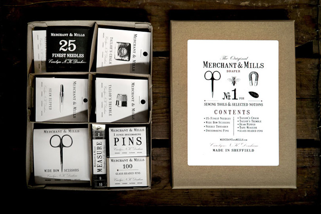
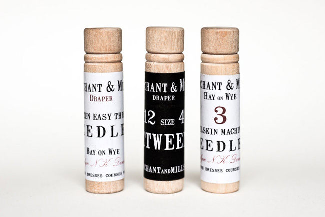
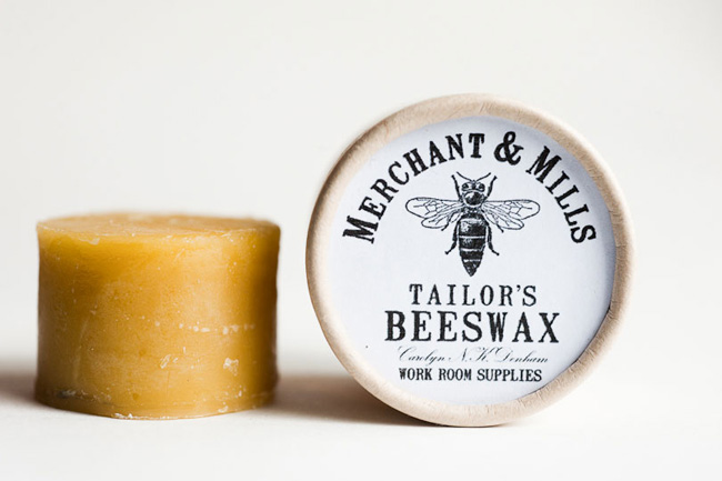
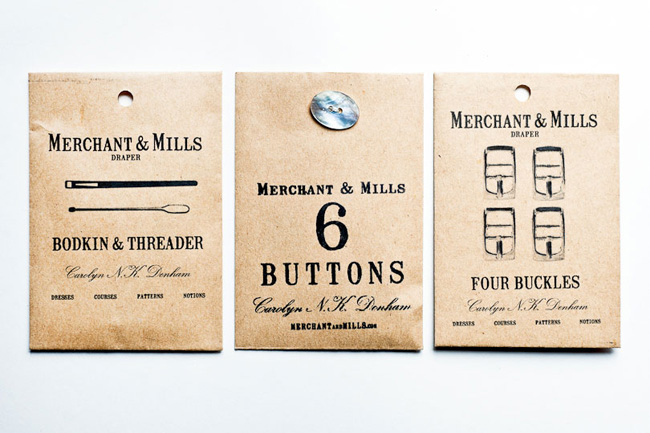
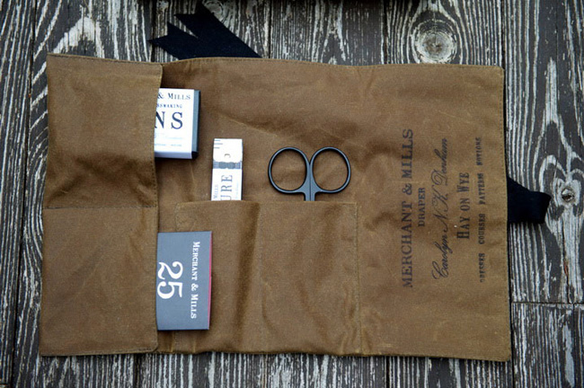
Wow, what a year it has been! Mainly another year of firsts for me, this time venturing out into the blogosphere, joining social media properly and therefore opening myself up to being judged, analysed and sometimes criticised. Initially it was scary and there have been some trolls but overall I’ve received so much positive and encouraging feedback that I’m excited to continue my social media journey.

A big part of that is Instagram for me. At the beginning I was like an excited puppy playing with a new squeaky toy but after exploring all the filters, frames and blur options I’m slowly moving towards a more considerate approach. I’m starting to think more about composition and colours and want my grid to be more cohesive and harmonious. Still telling a story and documenting special moments but always with the intention of showing beauty in the everyday and (hopefully) bringing inspiration to my followers.

I’ve blogged about the phenomenon before when I introduced Ida Laerke, a favourite Instagrammer of mine. It’s a powerful tool as it makes you feel so close to somebody who you’ve never met and probably never will but yet you know what their newborn looks like, what colour their front door is painted and that their partner liked his stripy socks for Christmas. It’s strange and you could call it voyeurism but I ask myself what’s the difference to buying gossip magazines? Only this time you’re peeking into somebody’s life who isn’t famous.

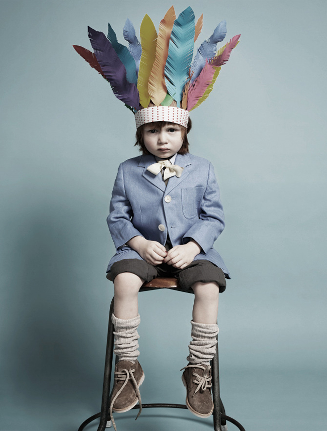
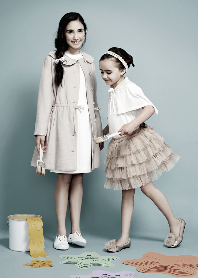
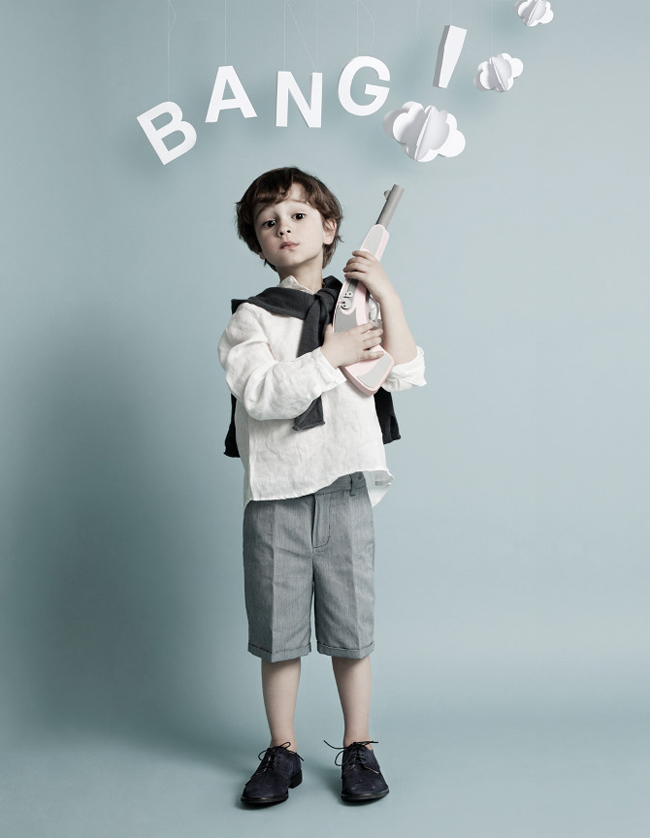
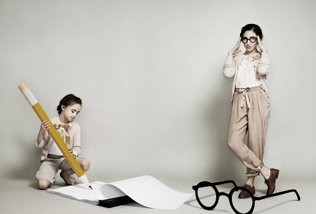
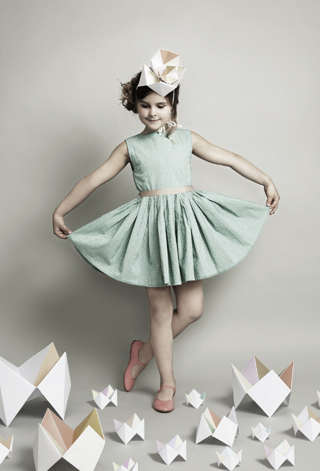
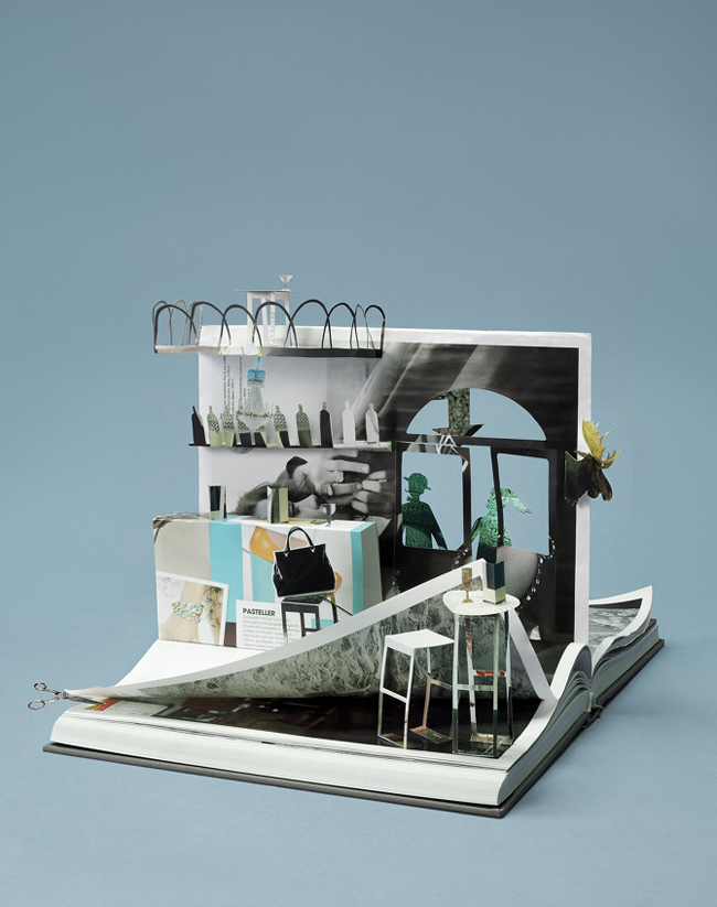
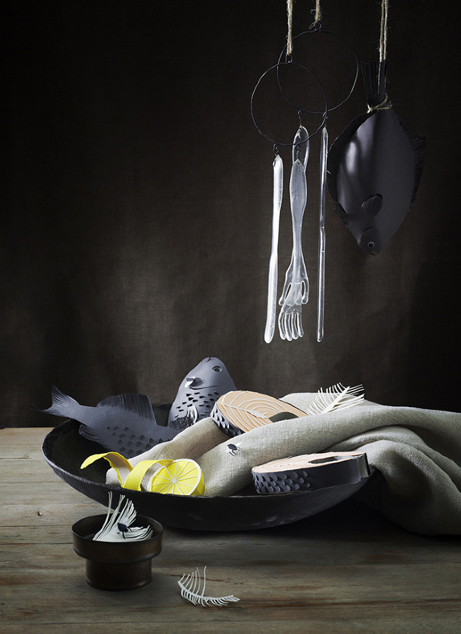
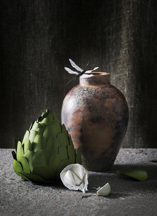
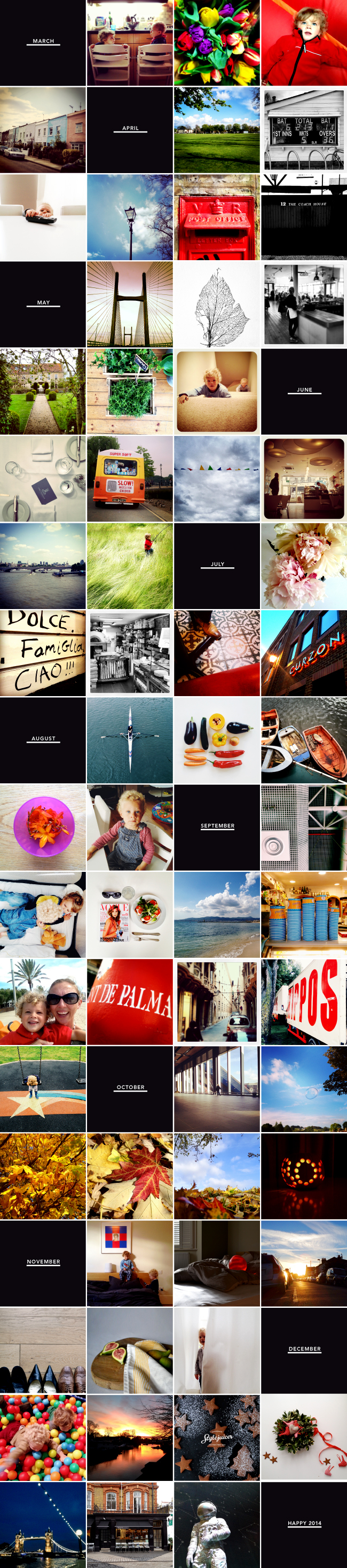
So, whether you love it or hate it here is my selection of special moments from 2013 and already I can’t wait to compose next year’s round up.

I’m wondering… Are you on Instagram? Who do you think is worth following and why?

Best of Instagram 2013 Stylejuicer

Here’s to an exciting 2014!
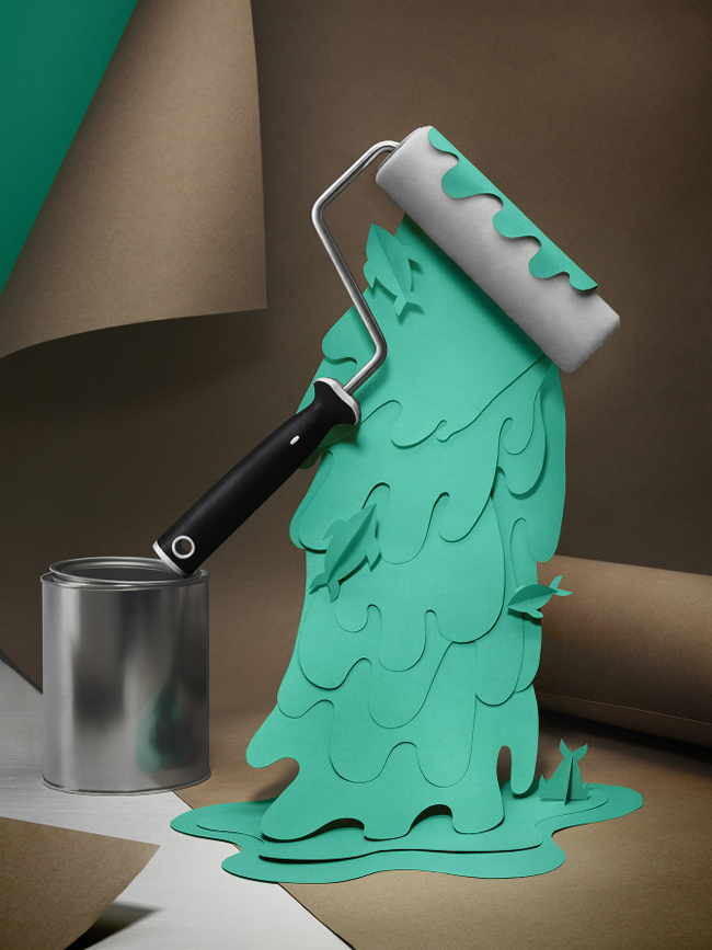
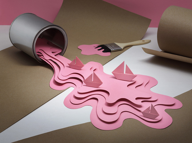
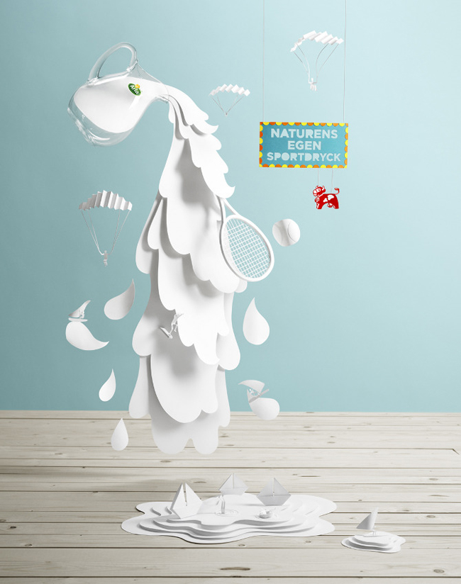
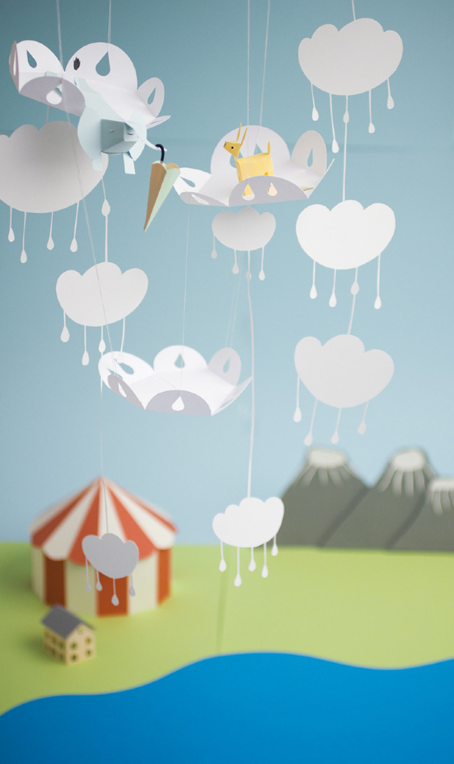
Annie Signature Stylejuicer

Photography | Annie Kruse (mostly iPhone and VSCOcam)

PAPER ARTIST AND IMAGE MAKER FIDELI SUNDQVIST

6 December 2013

One of the things I fondly remember about winter when I was small, especially in the run up to Christmas, was staying inside and doing lovely crafty things with coloured and textured paper. I loved making little objects and playing with them or cutting out pretty shapes and sticking them together as presents for family members. The more real I could make a little dolly rucksack look, the better.

I’m sure Swedish graphic designer and illustrator Fideli Sundqvist did the same when she was little but over the years has taken the ‘cutting and sticking’ to a new level and become a master in her art. She goes by the seriously cool and unique name of Agnes Cecilia Fideli Siri Charlotte Sundqvist and has recently published a book called ‘I Love Paper’ where she demonstrates her whimsical technique, starting with the basics and showing how her art can be integrated in other imagery. A great example of which is the cute series of shots for a children’s fashion brand where they play with her objects from pencils and paint to pistols – all made out of her favourite medium: paper.

Papper_omslag_skiss.indd

copyright-Book-Fideli-Sundqvist-via-Stylejuicer26

copyright-Book-Fideli-Sundqvist-via-Stylejuicer27

copyright I Love Paper Book by Fideli Sundqvist via Stylejuicer

You’ve probably gathered by now that I like to champion a bit of craftiness to counterbalance all the super smooth, sleek, photoshopped, glossy and totally unreal imagery that surrounds us and to me Fideli’s work is a breath of fresh air.

I love the fact that her unique style of photographed paper silhouettes and actual objects makes you stop in your tracks and question – even just for a split second – what’s real and what isn’t. I guess the kid in me is reminded of my own ‘cutting and sticking’ days.

copyright-Fideli-Sundqvist-via-Stylejuicer09

copyright-Fideli-Sundqvist-via-Stylejuicer20

copyright-Fideli-Sundqvist-via-Stylejuicer11

copyright-Fideli-Sundqvist-via-Stylejuicer21

copyright-Fideli-Sundqvist-via-Stylejuicer22

copyright-Fideli-Sundqvist-via-Stylejuicer17

copyright-Fideli-Sundqvist-via-Stylejuicer23

copyright-Fideli-Sundqvist-via-Stylejuicer24

copyright-Fideli-Sundqvist-via-Stylejuicer16

copyright-Fideli-Sundqvist-via-Stylejuicer15

copyright-Fideli-Sundqvist-via-Stylejuicer02

copyright-Fideli-Sundqvist-via-Stylejuicer05

copyright-Fideli-Sundqvist-via-Stylejuicer08

copyright-Fideli-Sundqvist-via-Stylejuicer01

copyright-Fideli-Sundqvist-via-Stylejuicer03

copyright-Fideli-Sundqvist-via-Stylejuicer06

copyright by Fideli Sundqvist via Stylejuicer

Enjoy and I hope you’re inspired!

Annie Signature Stylejuicer

More information | Fideli Sundqvist
‘I Love Paper’ is available through Fideli’s website

VIEWERS LIKE YOU – A DESIGN CONCERN OF ELSNER & SHIELDS

25 November 2013

I’ve be umming and ahhing about how to tackle this post purely because Viewers Like You is a design consultancy like no other and they are not just good at designing, they are great at selling themselves! So, I’ve been a little hesitant worrying about doing them a disservice. But hey, I’m writing a blog about everything that’s new and inspiring and I really want you and the world to know about them.

So, let me try and capture why Viewers Like You are different. Firstly, they are a small firm, founded by Jennifer Elsner and David Shields, who frankly are picky about who they work with. If you already know what your website/logo/packaging should look like, working with them will ultimately frustrate you because they don’t approach your project just as an idea needing to be illustrated.

Secondly, once you’ve entered into a contract with them they will obsess over your project, push you out of your comfort zone and even strategically become your friend as they believe that being connected to their clients emotionally is the root of potent results and sets the stage to freely create, in a most integrated way.

Not what you’d call common practice but if I was a client reading that I’d be thrilled!

Thirdly, they get that long-term involvement is quite a commitment which is why they’re offering three levels of engagement to meet your needs and change your perception of how design can influence your business. The levels range from an “Inspired 1 month”, a “Comprehensive 12 month” to a “4 months Design Concierge” and this is the one I’m REALLY excited about.

The Concierge is for people who excel at their job and who are totally focussed on developing their business. They don’t want to get bogged down with decisions on design details, web hosting or stock selection. They are visionaries who want to continue driving their business forward and trust that Viewers Like You is on the same page and understand their brand 100%. Effectively the Design Concierge is gifting yourself a functional, strategic, potent, successful and delightful brand.

Wow, what a great service and one that was engaged by US health professional and TV personality Holli Thompson. Her business cards below show glimpses of the fabulous brand VLY created for her.

Viewers-Like-You-via-Stylejuicer07

Viewers-Like-You-via-Stylejuicer05

Viewers-Like-You-via-Stylejuicer04

Viewers-Like-You-via-Stylejuicer06

Another great project and example of VLY’s understanding of branding are the business cards created for
Margarita McClure. Jennifer talks about them eloquently on the blog and explains the stock selection:

They’re dreamy, right? Triple-thick with a seam of colour. Premium Mohawk Superfine stock. And while the photos capture how incredible the cards look, they transcend that, and literally feel different. Which makes the world of difference for our client when passing one to her potential clients.

The extra investment required was worth it not only because the card is impressive to the receiver, but because the act of handing it out inspires a new posture from the giver. THAT is the point-of-difference of placing oneself at the crossroad of premium cost and value. You get taller when you stand up straight. You have more energy. You are slimmer-looking. Really.

For those who have read my $300 bathing suit post, you know that that intersection is not only where I encourage my clients to reside, but where I, too, choose to live. It’s loverly.

So, after that little introduction let me finish by encouraging all designers to go forth, stand tall and convince your clients to spend the proverbial $300 on a bathing suit! As Jennifer says:

When a seductive presentation of goods and services meets a holistic purchasing experience and results in “fit-me-like-a-glove” long-term satisfaction… I haven’t paid enough.

Couldn’t have put it better myself!

Viewers-Like-You-via-Stylejuicer09

Viewers-Like-You-via-Stylejuicer08

Viewers-Like-You-via-Stylejuicer

Viewers-Like-You-via-Stylejuicer13

Viewers-Like-You-via-Stylejuicer12

Viewers-Like-You-via-Stylejuicer11

Viewers-Like-You-via-Stylejuicer01

Enjoy and I hope you’re inspired!

Annie Signature Stylejuicer

More information & photography | Viewers Like You

BRAND NOSTALGIA WITH MERCHANT AND MILLS

20 November 2013

Continuing with my quintessentially English theme today I’d like to introduce you to fine graphic artist and gentleman Roderick Field. Brand creator and designer for the Merchant and Mills Sewing Company and all round good egg. A chap who by his own admission is troubled by the daily pitfalls of communicating ideas and sometimes uses words and pictures together.

I found him to be quite amusing when communicating via electronic mail and wanted you to see for yourself what a marvellous brand he created for this nostalgic company. Based in Rye, East Sussex, the shop sets you back in time and is a treasure trove for all things sewing related, offering fabrics, patterns and courses along with beautiful stationery and exquisite oil cloth duffle bags and totes.

As previously mentioned Roderick is quite good with words so I’ll let him explain his thinking behind the design and branding.

The Merchant & Mills brand is where my photography and writing first merged to make coveted packaging for our sewing company. It is the answer to a question; if Merchant & Mills were packaging, what would it look like?

As it turns out, it is stark black and white in a crumbling font with some simple, sketchy images and the occasional daring splash of deep red. Who knew?

Copyright-Merchant-And-Mills-via-Stylejuicer01

If, like me, you’re excited by what you’ve read and seen please frequent his gallery where you’ll find more pleasing, even funny ideas by this thoroughly modern gentleman.

And last but not least let me mention that such is the quality of the Merchant & Mills products they are now available in the V&A shop, Liberty and a host of retailers worldwide.

How splendid with the Yuletide festivities just around the corner!

Copyright-Merchant-And-Mills-via-Stylejuicer02

Copyright-Merchant-And-Mills-via-Stylejuicer03

Copyright-Merchant-And-Mills-via-Stylejuicer04

Copyright-Merchant-And-Mills-via-Stylejuicer05

Copyright-Merchant-And-Mills-via-Stylejuicer06

Copyright-Merchant-And-Mills-via-Stylejuicer07

Copyright-Merchant-And-Mills-via-Stylejuicer08

Copyright-Merchant-And-Mills-via-Stylejuicer09

Copyright-Merchant-And-Mills-via-Stylejuicer10

Copyright-Merchant-And-Mills-via-Stylejuicer11

Copyright-Merchant-And-Mills-via-Stylejuicer11b

Copyright-Merchant-And-Mills-via-Stylejuicer12

Copyright-Merchant-And-Mills-via-Stylejuicer13

Copyright-Merchant-And-Mills-via-Stylejuicer14

Copyright-Merchant-And-Mills-via-Stylejuicer15

Copyright-Merchant-And-Mills-via-Stylejuicer16

Copyright-Merchant-And-Mills-via-Stylejuicer17

Copyright-Merchant-And-Mills-via-Stylejuicer

Enjoy and I hope you’re inspired!

Annie Signature Stylejuicer

More information | Merchant & Mills
Design & photography | Roderick Field

CEREAL MAGAZINE IS IN PURSUIT OF FOOD AND TRAVEL

6 November 2013

Oh, how I love to hold a beautifully produced, perfect bound, matt laminated, weighty magazine. Printed on tactile uncoated stock with text that doesn’t crowd the page but gives my eye a rest and images that inspire and make me day dream.

CEREAL is just that! A designers idea of spacial heaven, where section headers take up double page spreads, photos bleed to the edge in abundance and space is not at a premium. There’s no client demanding for the logo to be made bigger and more copy to be crammed in. The typography is outstanding with a perfect mix of serif and sans. For me it feels like a meal at a Michelin star restaurant with a perfect combination of flavours and textures. Every ingredient considered and never overbearing. But enough lyrical waxing now.

Cereal Magazine via Stylejuicer

The editor Rosa Park describes CEREAL as:

… a magazine rooted in our passions – for food, for travel. And for books too, with all the wonderful things they can teach us. Each quarterly volume of CEREAL contains details expositions of edible topics, travel destinations, as well as profiles on products, people and places – chosen because they’re relevant, interesting, or have simply caught our attention.

The Bristol based quarterly publication was launched late in 2012 with huge success and their first volume was a sell-out. I suspect a lot of the success can be attributed to designer Rich Stapleton’s minimal approach, subtle grey colour palette, infographics and maps that make the reading experience such a delight.

Topics are explored in great depth and in their current fourth volume range – seemingly random – from a photo essay on grains to Krakow and British watch manufacturers, to Californian residential architecture and sushi, finishing off with the UK’s New Forest. An eclectic selection which let’s you discover interesting facts about topics you never thought you’d be interested in. In my case I found myself fascinated by the analysis of the Polish language by Richard Aslan. Who would have thought!?

CEREAL has also launched a capsule collection of stationery items that appeal to the closet OCD-er and might be an idea for the end of year consumer extravaganza commonly known as “Christmas”! Hohoho!

Cereal-Mag-via-Stylejuicer02

Cereal-Mag-via-Stylejuicer03

Cereal-Mag-via-Stylejuicer04

Cereal-Mag-via-Stylejuicer05

Cereal-Mag-via-Stylejuicer06

Cereal-Mag-via-Stylejuicer07

Cereal-Mag-via-Stylejuicer13

Cereal-Mag-via-Stylejuicer09

Cereal-Mag-via-Stylejuicer10

Cereal Magazine via Stylejuicer

Enjoy and I hope you’re inspired!

Annie Signature Stylejuicer

More information | CEREAL magazine
Photography | Annie Kruse