
Now this is one of those seriously cool successful projects you don’t see very often.
Food&_ was only set up in the summer of 2013 which gives credit to the fact that great design and even greater content are perfect partners. But let me start from the beginning as the story behind this genius concept is encouragement to all perfectionists and procrastinators alike. Ahem… and yes, I do count myself into both those categories.
Founder Ross Featherstone is a keen home cook, an obsessive collector of cookery books and one of those annoying people who take pictures of their meals before picking up a fork – his words not mine. Furthermore he designs and builds websites for a living, so you would think that setting up a blog would be a walk in the park for him. Not so, as I found out when reading up about the concept behind Food&_ on The Culture Vulture.
After years of false starts, getting hung up on design and fussing about detail he finally got the push he needed by signing up to Blog North #4, a food bloggers workshop, where he didn’t want to show up with a handful of undercooked website designs. Getting loads of advice and encouragement during the workshop was the turning point for him and he realised that he wanted his food blog to be a collaborative online food journal.
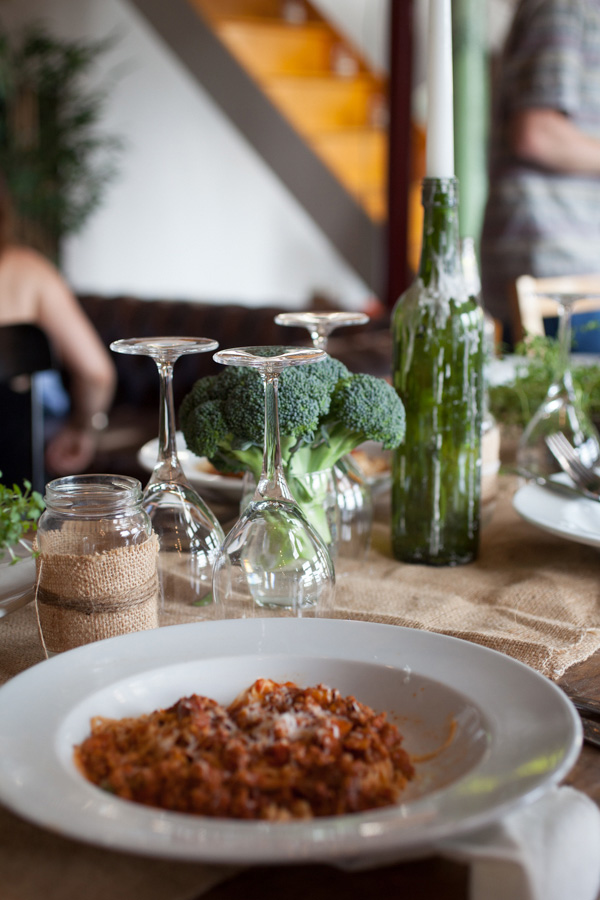
Bringing together an ever-growing mix of foodies, writers, growers and producers with photographers, illustrators and designers to collectively showcase and promote each individual’s talent. They all share a love food and the stories behind the food, their passions and recipes.
As a graphic designer I’m in love with the fresh approach he and his partners took on the branding and as a fellow blogger I’m insanely jealous of the concept and rocketing success the site has experienced since it’s launch. Let me say at this point that Ross is one of five founding partners, others including Katy Lanceley, Jonathan Finch, Rosalind Stoughton and Christopher Nunn.
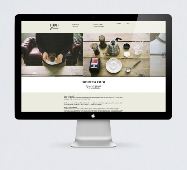
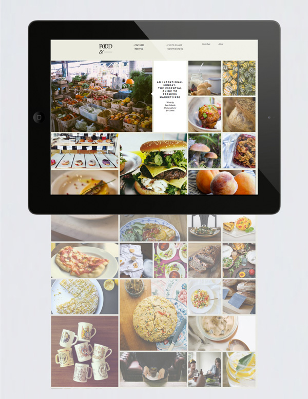
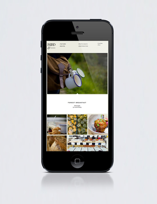
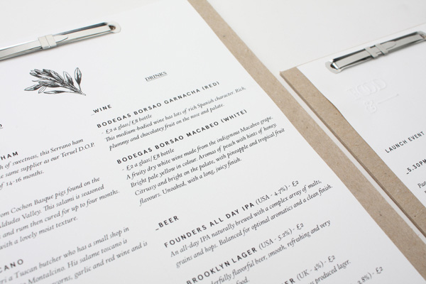
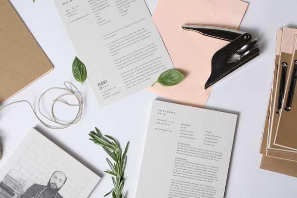
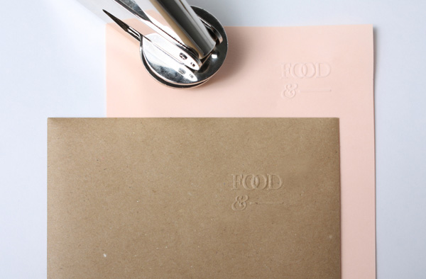
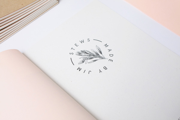
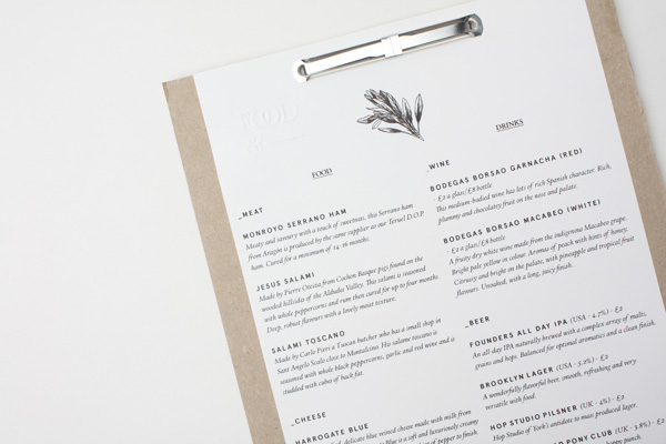
The branding is classic and modern at the same time with the use of serif Calendar Plus as a primary headline font and Apercu as a secondary modern sans serif for body copy. The colour palette has been kept neutral and ranges from black and white to beige and grey making the colourful photography appropriately the hero.
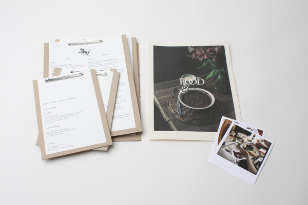
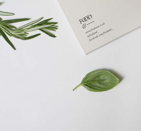
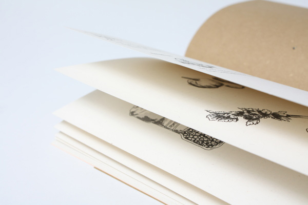
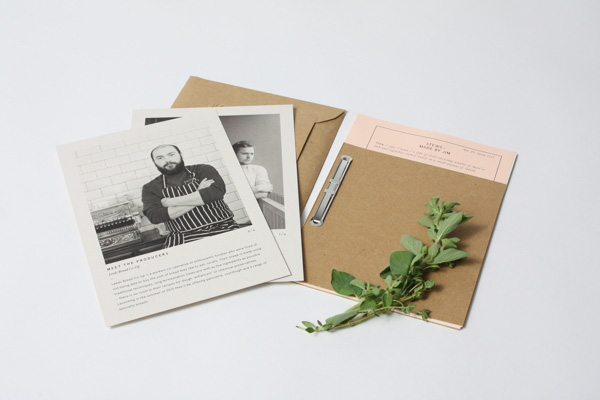
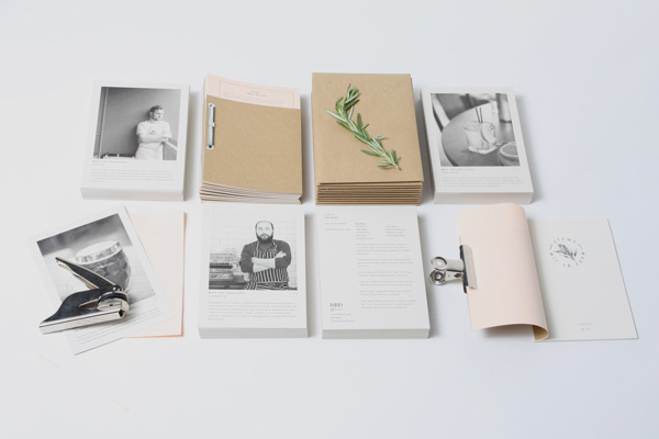
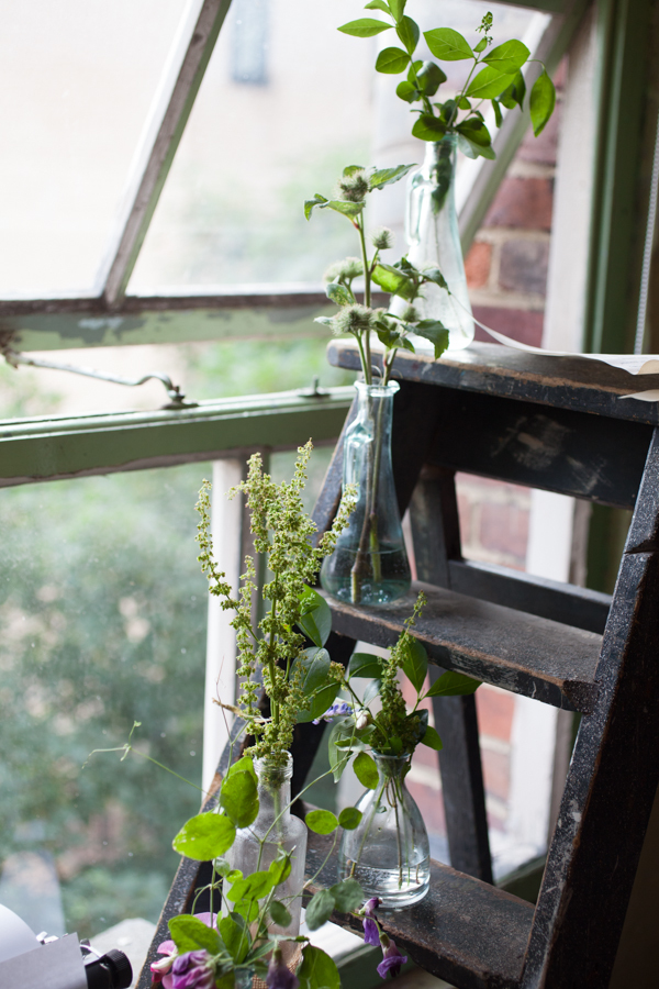
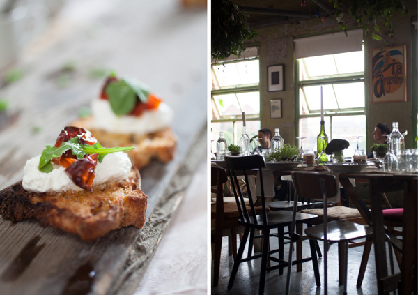
All of the collateral has got a lovingly handmade, crafty touch not dissimilar to cooking itself and I like the little details like actual pressed herbs stuck to the covers and the fine, almost botanical black and white illustrations. It’s a utilitarian brand with an earthy character that perfectly compliments food, cooking and dining. A lovingly designed concept that has stand out and longevity. Jamie Oliver eat your heart out.
![]()
WEBSITE | Design by Passport. Build by Refresh Interactive
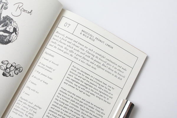
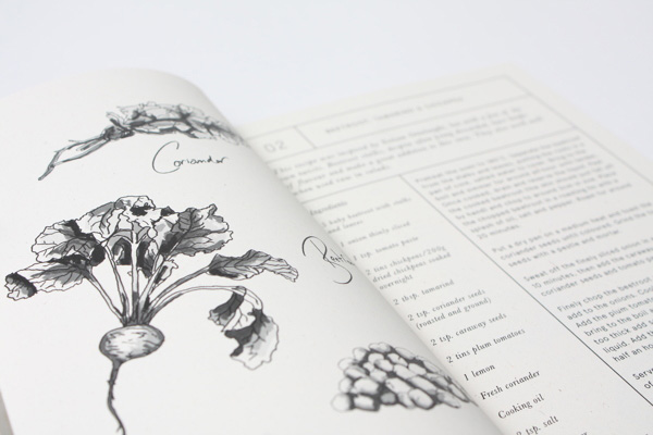
RECIPE BOOKS | Design by Passport. Illustrations by Liz Ibbotson
LAUNCH EVENT | Creative Direction by Lord Whitney, Passport, Ross Featherstone & Katy Lanceley
STYLING | Lord Whitney
PRINT & PROMOTION DESIGN | Passport
PHOTOGRAPHY | Victoria Harley