PEOPLE TO WATCH | CHARLIE BORROW BAGS

13 November 2017

people to watch, charlie borrow, london, bags, leather, leathergoods, traditional, organic, slow living, east end, locally sourced materials, high quality, repair for life guarantee, hand made, designer, maker, trend, fashion, style, bespoke
 

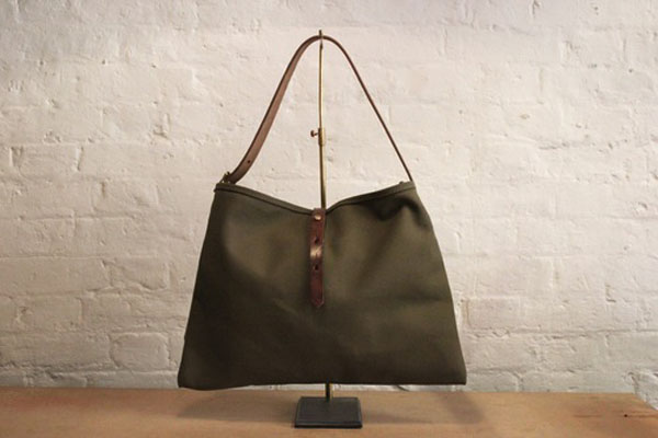
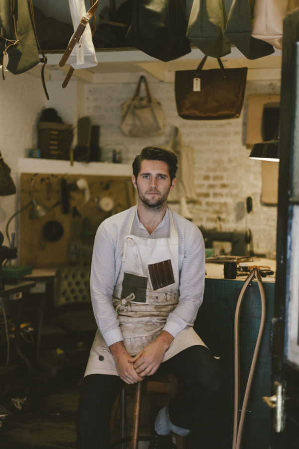
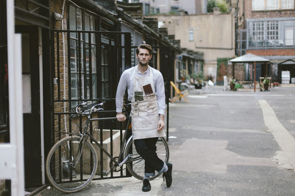
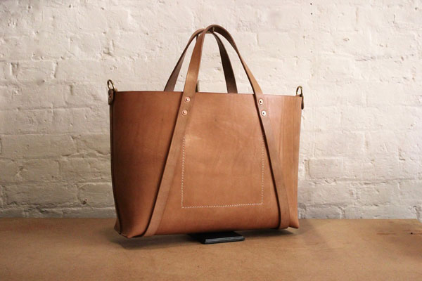
Meeting like-minded people is always a joy, even if it’s “just” by email. For me Charlie Borrow is one of those people that just hits the Zeitgeist. He gets it. The young designer maker from Brighton has managed over the past couple of years to establish a timeless British brand that concentrates on simple, functional design and traditional techniques using locally sourced materials and crafting his products until he is happy with the result.

He’s not interested in a deadline- and profit-driven copy cat business but is a craftsman through and through who started off studying bespoke tailoring at London College of Fashion before designing his first leather tote for a friend… and the rest is history as they say.

To find out more about his background, his passion, what drives him and what his future plans are I managed to sneak some questions into his busy schedule and discovered a humble designer / maker who wants to grow his business organically and give back to the community by taking on an apprentice in his future combined workspace and shop in the East End of London.

One of the things I found most fascinating was his description of the laborious 14-18 months process of getting his locally sourced West Country leather just right. If I was a cow which I may have been called on one or two occasions I’d be absolutely thrilled to continue life as a tote for the next couple of hundred years on the arm of a fashionable urbanite.

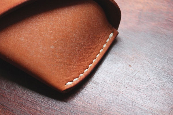
In fact, Charlie is so sure of the quality of his hand-made manufacturing technique that he offers repairs for life so make sure you mention this to your offspring when passing on one of his heirlooms.

Now, over to Charlie…

 
people to watch, charlie borrow, london, bags, leather, leathergoods, traditional, organic, slow living, east end, locally sourced materials, high quality, repair for life guarantee, hand made, designer, maker, trend, fashion, style, bespoke
 

What’s your background and how did you get to design / make bags?

I first studied, fashion and textiles from the age of 16-18 at college just outside my hometown of Brighton. After completing the course I moved to London to study bespoke tailoring at London College of Fashion. It was short lived, I dropped out after about 8 months. University didn’t quite click with me. I started working for the fashion brand Paul Smith in their suit department doing customer fittings and then later started doing some alteration work from my bedroom for friends and clients. The bags came out of nowhere really.

The first bag I made was a gift for a family member. A basic leather oversize tote bag made from some leather I found in a bargain bin in the basement of a shop on Brick Lane. It had a good reception so I decided to make another. Not long after I started making them for my parents shop in Brighton. And from their it kind of grew quite organically.

 
people to watch, charlie borrow, london, bags, leather, leathergoods, traditional, organic, slow living, east end, locally sourced materials, high quality, repair for life guarantee, hand made, designer, maker, trend, fashion, style, bespoke


I saw that you documented the process of turning raw hides into smooth leather on your Instagram. Could you talk us through this on here?

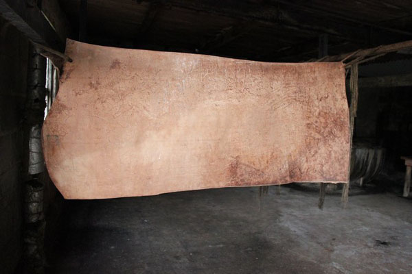
The process takes between 14 and 18 months. It starts with the raw hides. A waste product from the local meat industry. The cows are bred and culled in Somerset the neighbouring county, then delivered to the ancient tannery established around the time of the roman invasion with the hair on and salted to preserve and prevent rotting. The first step once arriving at the tannery is to lime the hides. This is a process where the raw hide is soaked in a lime solution to loosen the hair and excess flesh. Once this process is complete the leather can be de-haired and fleshed. A final de fleshing is done by hand with a final inspection.

The hides are now ready to be cut into their sections. A hide can consist of a few variations but the basic break down is a shoulder, a pair of butts (double butt) and a pair of bellies. Once the hides are cut they suspended from wooden rods and soaked in deep pits containing spring water from the local river and a sustainable source of oak bark chipping from the local countryside.

The tanning room consists of around 28 pits each with a different concentration of tanning fluid (oak bark and water). The batch of hides are moved from pit to pit on a monthly basis for 12 months, once complete they are left to dry and they can now be called leather.

The leather can now be selected for what it will be used for. Shoe soling, bridle leather, harness leather, heal blocks etc. The leather I use is the full grain bridle, meaning scars, growth marks and imperfections are present or what most will call natural characteristics.

The hides at this point will start the curing process. Each is hand stained to the preferred colour and left to dry, then a hot solution of bees wax and mutton tallow is applied by hand to protect the leather and increase strength in the fibres.

It’s then ready to dispatch.


people to watch, charlie borrow, london, bags, leather, leathergoods, traditional, organic, slow living, east end, locally sourced materials, high quality, repair for life guarantee, hand made, designer, maker, trend, fashion, style, bespoke

 
people to watch, charlie borrow, london, bags, leather, leathergoods, traditional, organic, slow living, east end, locally sourced materials, high quality, repair for life guarantee, hand made, designer, maker, trend, fashion, style, bespoke
 

What makes your bags different from others? Why do you chose to work with those particular hides? What other materials do you like working with?

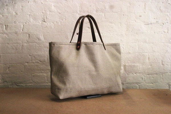
I think the process and the materials are the most unique thing, the products are pretty classic and simple. Many inspired by bags I’ve sourced at markets but adapted for modern day life or to feature a material or component I’ve sourced.

I only work with tradition UK manufacturers when sourcing my materials, I think the youngest company I work with was established around 1880, so not exactly a start up. The thing I love about them all is their devotion to manufacturing and producing high quality product in the traditional way, this can come at a high financial price but the end result is far better with a lower environmental impact.

I continue this ethos when the materials arrive on site at my small workshop in the east end of London. For example all the leather goods are cut by hand and stitched by hand, not one machine is used at any point in the process. I believe in making a product for life so I offer repairs for life. There’s a charm in something that has been used heavily, patched, repaired and continued it’s life rather then going to land fill. I want the things I make to be the products I love and admire that I get at antique markets regularly.

 
people to watch, charlie borrow, london, bags, leather, leathergoods, traditional, organic, slow living, east end, locally sourced materials, high quality, repair for life guarantee, hand made, designer, maker, trend, fashion, style, bespoke
 

I see that your bags are particularly popular in Japan? Why do you think that is?

I think part of this is what I’ve touched on above, the Japanese seen to have a keen interest in tradition and making things properly “the old way”. The story behind the product is of big interested to them. This paired with uninterrupted and simple design and allowing the materials to do the talking.

I’m sure you’re business is taking over your time but what do you enjoy doing in your spare time?

I’m quite stretched at the moment you’re right but I hope to grow the team in the near future to help this. I’m a big lover of antiques, markets are always good fun as you never know what you’ll find or you’ll be coming home with. But London has so much more to offer then just markets. There’s amazing restaurants and bar opening constantly. I recently worked with an amazing restaurant called Smokestak. I made a number of aprons and helped with furnishing for the interior. It’s a regular visit for me and a must try if you’re a meat eater.
 
people to watch, charlie borrow, london, bags, leather, leathergoods, traditional, organic, slow living, east end, locally sourced materials, high quality, repair for life guarantee, hand made, designer, maker, trend, fashion, style, bespoke
 
How would you describe your values?

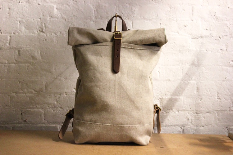
If I’m honest I’m not really sure how to describe them, but I believe in doing a job properly, if that’s making a product, make it from the best materials you can. Cutting corners normally means something is being sacrificed which happens a lot in this industry to keep costs down or make something faster. But some things are better made slowly with more care, ultimately you’re left with a nicer product at the end if you spend the time needed to make it, not to the deadline someone has set for you to make it.
 
people to watch, charlie borrow, london, bags, leather, leathergoods, traditional, organic, slow living, east end, locally sourced materials, high quality, repair for life guarantee, hand made, designer, maker, trend, fashion, style, bespoke
 
And what are your future plans?

For me I would love to grow the company slowly, employ someone who is driven and interested in making and working with the material. Before I started I wasn’t sure how to get into the industry of making without leaving London and working in a factory. So I’d love to give someone the opportunity to teach them what I’ve learnt since I’ve started and who knows maybe learn from them too.

I’m currently in the process of moving to a larger space, a retail space, local to where I currently am but nothing is official yet so touch wood! This has always been my ideal Scenario, workshop and shop in one place so clients can see the process, the tools and the raw material. It’s an interesting part so why not show the client. I think for now a shop is the next step but who knows what’s after that.


Thank you Charlie for your time and I’ll be in that shop as soon as it opens!

To discover more passionate designer / makers have a look at Danish furniture makers Overgaard and Dyrman.

 
people to watch, charlie borrow, london, bags, leather, leathergoods, traditional, organic, slow living, east end, locally sourced materials, high quality, repair for life guarantee, hand made, designer, maker, trend, fashion, style, bespoke


MORE INFORMATION & PRODUCT PHOTOGRAPHY | Charlie Borrow
PORTRAIT PHOTOGRAPHY | Corina Esquivel with thanks
 
Follow Stylejuicer with Bloglovin

GREAT JONES NOHO LOFT BY UNION STUDIO

24 October 2017

great jones noho loft, union studio, matthew bear, craftsmanship, bespoke, heirloom quality furniture, handcrafted architecture, interior design, style, styling, trend, industrial style, crittall, steel, modern, contemporary, vintage, characterful, textures, rich, designer lighting, furniture


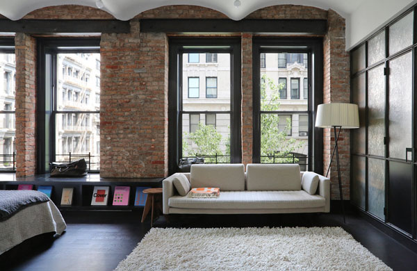
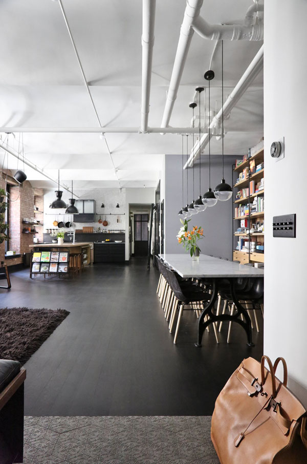
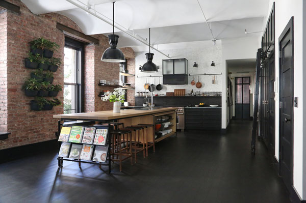
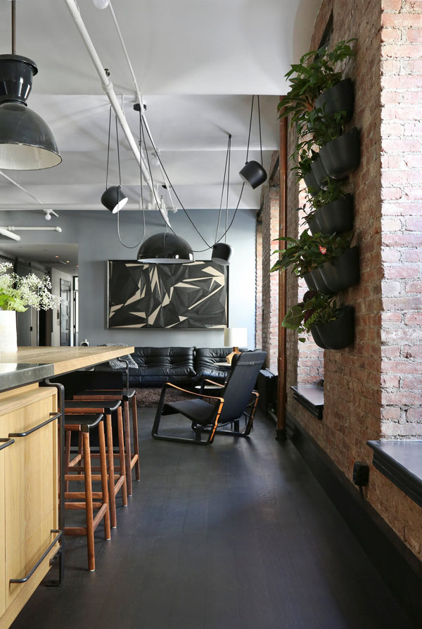
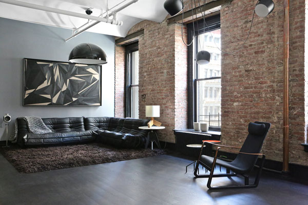
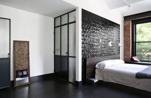
Another week – another loft! This time it’s the Great Jones NoHo loft in New York designed by California based furniture and interior design company Union Studio who created some exceptional pieces of bespoke furniture for the space.

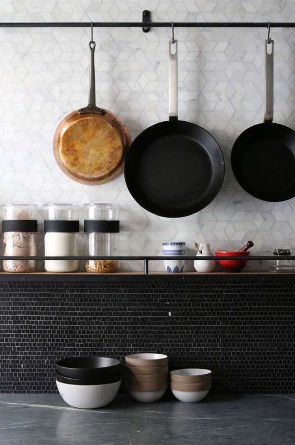
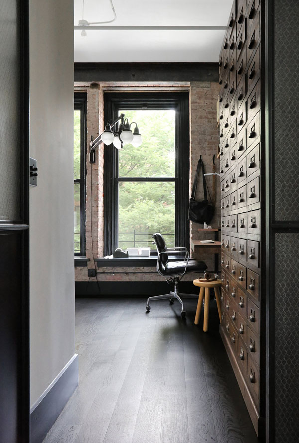
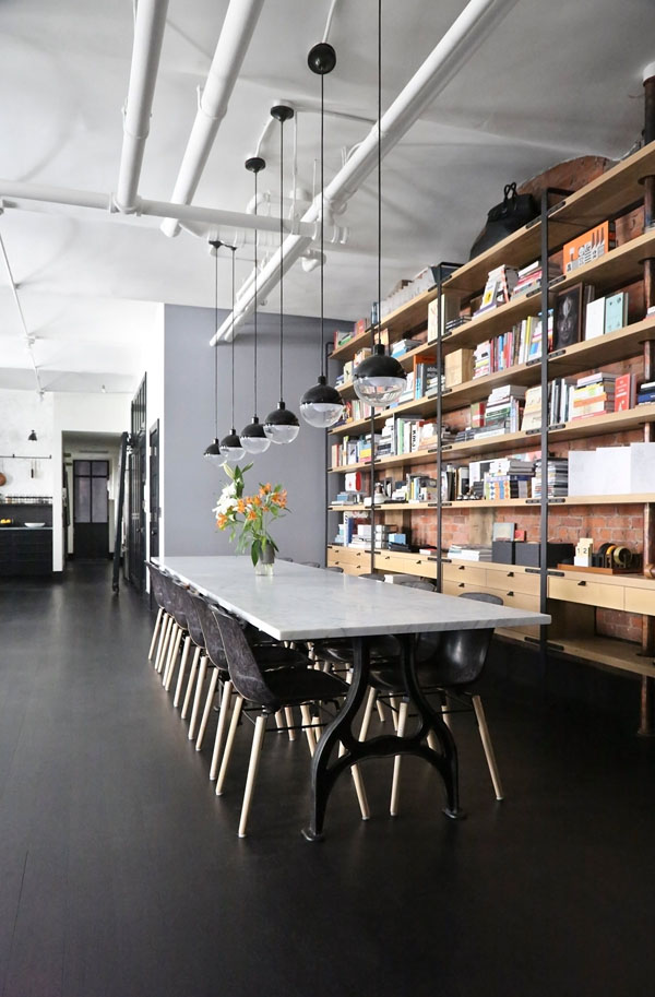
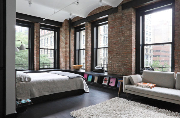
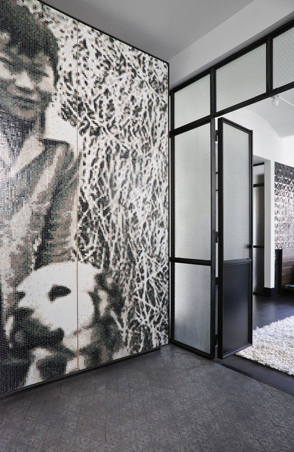
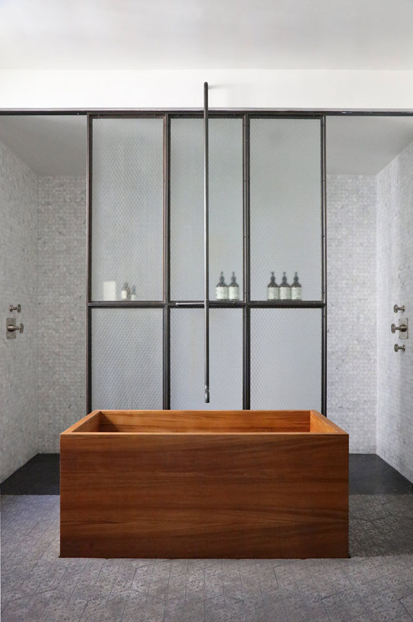
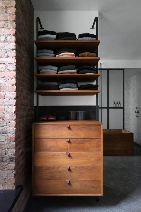
Their passion for craftsmanship and use of steel reminds me of Danes Overgaard & Dyrman and I love the rich contrasting colour palette of the loft from black floorboards and window frames to grey walls and white ceilings. Interesting textures are everywhere from exposed brick walls to a tiled black headboard, a bespoke mahogany bath tub as well as some carefully chosen vintage finds and contemporary designer lighting and furniture.

The Crittall style steel doors and exposed pipes and wires remind you of the loft’s industrial past as a factory which has now been perfectly adapted for modern living with a rich and characterful open plan layout. A wonderful project by Union Studio’s founder Matthew Bear who produces heirloom quality furniture and handcrafted architecture with selected craftspeople throughout the Bay area.

I can’t wait to see Union Studio’s next project.


great jones noho loft, union studio, matthew bear, craftsmanship, bespoke, heirloom quality furniture, handcrafted architecture, interior design, style, styling, trend, industrial style, crittall, steel, modern, contemporary, vintage, characterful, textures, rich, designer lighting, furniture

great jones noho loft, union studio, matthew bear, craftsmanship, bespoke, heirloom quality furniture, handcrafted architecture, interior design, style, styling, trend, industrial style, crittall, steel, modern, contemporary, vintage, characterful, textures, rich, designer lighting, furniture

great jones noho loft, union studio, matthew bear, craftsmanship, bespoke, heirloom quality furniture, handcrafted architecture, interior design, style, styling, trend, industrial style, crittall, steel, modern, contemporary, vintage, characterful, textures, rich, designer lighting, furniture

great jones noho loft, union studio, matthew bear, craftsmanship, bespoke, heirloom quality furniture, handcrafted architecture, interior design, style, styling, trend, industrial style, crittall, steel, modern, contemporary, vintage, characterful, textures, rich, designer lighting, furniture

great jones noho loft, union studio, matthew bear, craftsmanship, bespoke, heirloom quality furniture, handcrafted architecture, interior design, style, styling, trend, industrial style, crittall, steel, modern, contemporary, vintage, characterful, textures, rich, designer lighting, furniture

great jones noho loft, union studio, matthew bear, craftsmanship, bespoke, heirloom quality furniture, handcrafted architecture, interior design, style, styling, trend, industrial style, crittall, steel, modern, contemporary, vintage, characterful, textures, rich, designer lighting, furniture

great jones noho loft, union studio, matthew bear, craftsmanship, bespoke, heirloom quality furniture, handcrafted architecture, interior design, style, styling, trend, industrial style, crittall, steel, modern, contemporary, vintage, characterful, textures, rich, designer lighting, furniture

great jones noho loft, union studio, matthew bear, craftsmanship, bespoke, heirloom quality furniture, handcrafted architecture, interior design, style, styling, trend, industrial style, crittall, steel, modern, contemporary, vintage, characterful, textures, rich, designer lighting, furniture

great jones noho loft, union studio, matthew bear, craftsmanship, bespoke, heirloom quality furniture, handcrafted architecture, interior design, style, styling, trend, industrial style, crittall, steel, modern, contemporary, vintage, characterful, textures, rich, designer lighting, furniture

great jones noho loft, union studio, matthew bear, craftsmanship, bespoke, heirloom quality furniture, handcrafted architecture, interior design, style, styling, trend, industrial style, crittall, steel, modern, contemporary, vintage, characterful, textures, rich, designer lighting, furniture

great jones noho loft, union studio, matthew bear, craftsmanship, bespoke, heirloom quality furniture, handcrafted architecture, interior design, style, styling, trend, industrial style, crittall, steel, modern, contemporary, vintage, characterful, textures, rich, designer lighting, furniture

great jones noho loft, union studio, matthew bear, craftsmanship, bespoke, heirloom quality furniture, handcrafted architecture, interior design, style, styling, trend, industrial style, crittall, steel, modern, contemporary, vintage, characterful, textures, rich, designer lighting, furniture


MORE INFORMATION & PHOTOGRAPHY | Union Studio with thanks
 
Follow Stylejuicer with Bloglovin
BRANDING | JAPANESE RESTAURANT HOKKAIDON IN HONG KONG

20 October 2017

restaurant hokkaidon, branding, design, graphic design, a work of substance, agency, chirashi, traditional, japanese, hong kong, graphic, minimal, contemporary, elegant, clean, interior design, cypress wood, menu, dish, simple, trend, indigo, graphic, mural


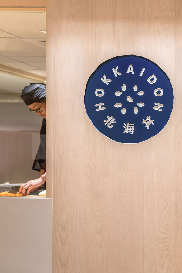
Japanese restaurant Hokkaidon in Hong Kong beautifully combines two of my loves, interior and graphic design. The stylish minimal identity was conceived by the creative dreamers mad people at A Work of Substance, an agency with studios in Stockholm, Paris and Hong Kong.

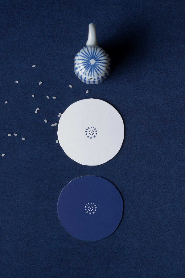
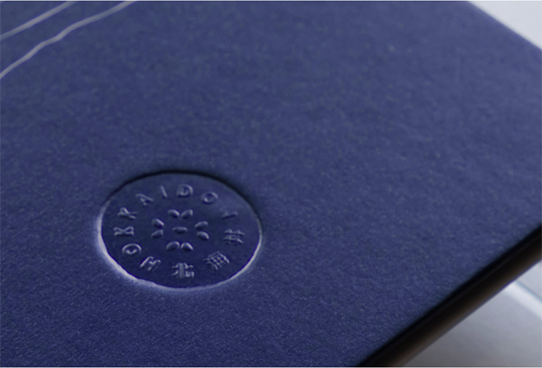
Hokkaidon serves sea-to-table Chirashi, a traditional Japanese dish of fish and rice that delivers a multitude of flavours and textures. The identity beautifully reflects the restaurant’s contemporary take on this traditional dish by depicting grains of rice at the core of it’s logo in combination with a strong indigo colour.

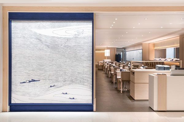
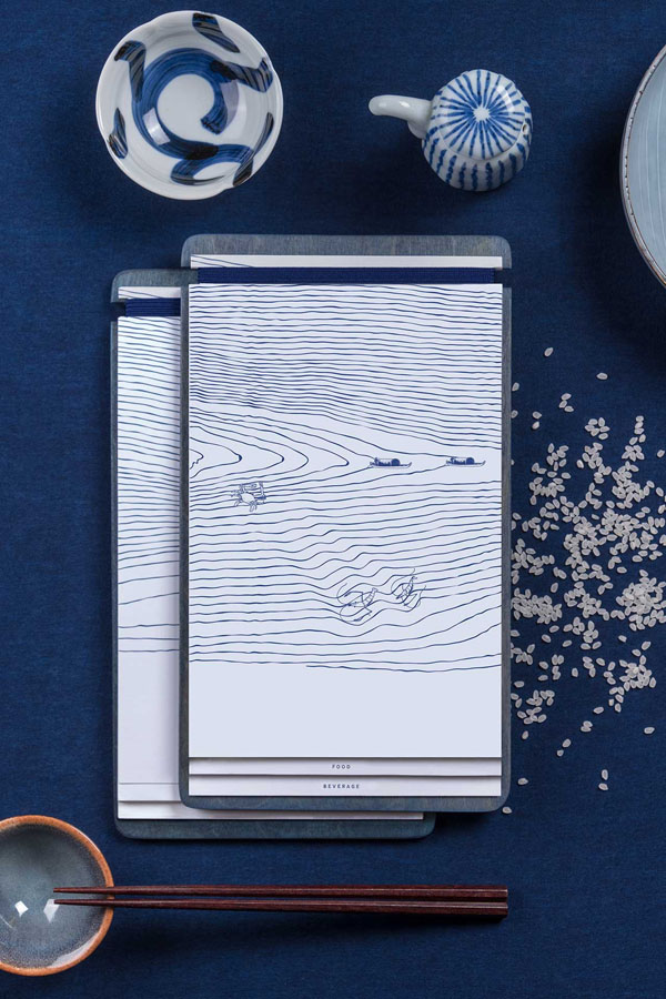
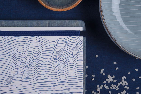
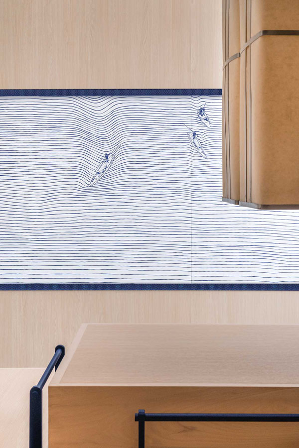
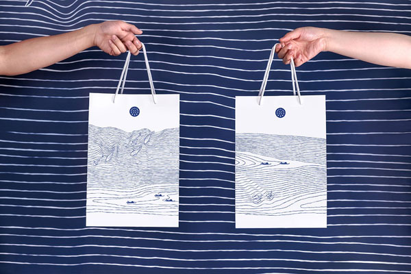
The striking graphic on the walls, menus and take away bags are inspired by the Japanese seigaiha motif which is a pattern of layered concentric circles creating arches, symbolic of waves or water representing surges of good luck. The graphic is interspersed with fish and fishing boats reminding the customer of the fresh ingredients.

The branding with it’s strong use of indigo blue works incredibly well for me in combination with the elegant, clean and minimal interior almost entirely kept in light cypress wood without any distraction from the dish and it’s fresh ingredients.

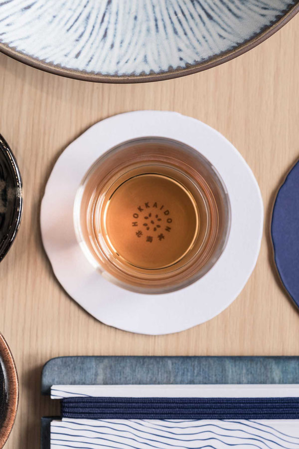
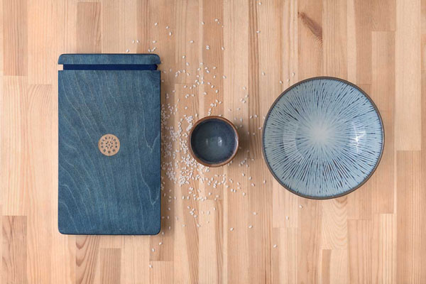
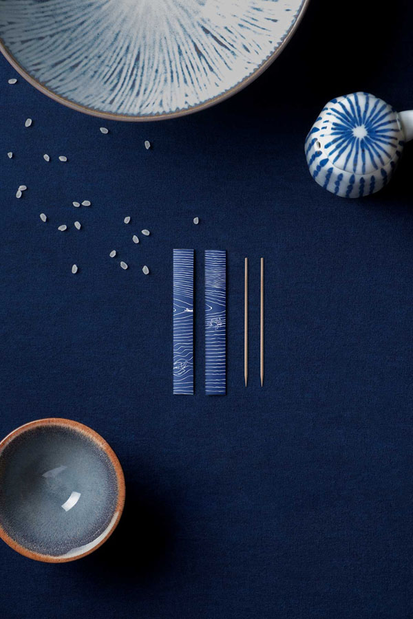
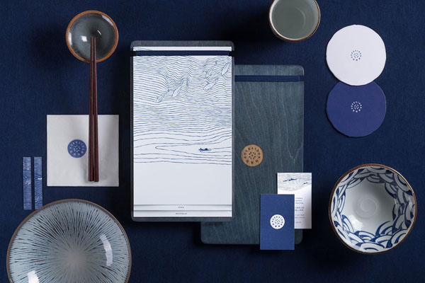
I must mention the tableware as well which is kept in indigo, white and brown tones with varying patterns of seigaiha and irregular shaped coasters subtly featuring the logo. The wooden menu boards are dyed to match the brand’s indigo blue and feature an easily exchangeable printed menu held by a strong blue elastic – simple, yet functional and completely on point.

Let’s hope Hokkaidon will open a London branch soon!

For more inspiring Branding head over to California cafe and bakery Voyageur du Temps and Austrian Hotel Trofana Alpin.


restaurant hokkaidon, branding, design, graphic design, a work of substance, agency, chirashi, traditional, japanese, hong kong, graphic, minimal, contemporary, elegant, clean, interior design, cypress wood, menu, dish, simple, trend, indigo, graphic, mural

restaurant hokkaidon, branding, design, graphic design, a work of substance, agency, chirashi, traditional, japanese, hong kong, graphic, minimal, contemporary, elegant, clean, interior design, cypress wood, menu, dish, simple, trend, indigo, graphic, mural

restaurant hokkaidon, branding, design, graphic design, a work of substance, agency, chirashi, traditional, japanese, hong kong, graphic, minimal, contemporary, elegant, clean, interior design, cypress wood, menu, dish, simple, trend, indigo, graphic, mural

restaurant hokkaidon, branding, design, graphic design, a work of substance, agency, chirashi, traditional, japanese, hong kong, graphic, minimal, contemporary, elegant, clean, interior design, cypress wood, menu, dish, simple, trend, indigo, graphic, mural

restaurant hokkaidon, branding, design, graphic design, a work of substance, agency, chirashi, traditional, japanese, hong kong, graphic, minimal, contemporary, elegant, clean, interior design, cypress wood, menu, dish, simple, trend, indigo, graphic, mural

restaurant hokkaidon, branding, design, graphic design, a work of substance, agency, chirashi, traditional, japanese, hong kong, graphic, minimal, contemporary, elegant, clean, interior design, cypress wood, menu, dish, simple, trend, indigo, graphic, mural

restaurant hokkaidon, branding, design, graphic design, a work of substance, agency, chirashi, traditional, japanese, hong kong, graphic, minimal, contemporary, elegant, clean, interior design, cypress wood, menu, dish, simple, trend, indigo, graphic, mural

restaurant hokkaidon, branding, design, graphic design, a work of substance, agency, chirashi, traditional, japanese, hong kong, graphic, minimal, contemporary, elegant, clean, interior design, cypress wood, menu, dish, simple, trend, indigo, graphic, mural

restaurant hokkaidon, branding, design, graphic design, a work of substance, agency, chirashi, traditional, japanese, hong kong, graphic, minimal, contemporary, elegant, clean, interior design, cypress wood, menu, dish, simple, trend, indigo, graphic, mural

restaurant hokkaidon, branding, design, graphic design, a work of substance, agency, chirashi, traditional, japanese, hong kong, graphic, minimal, contemporary, elegant, clean, interior design, cypress wood, menu, dish, simple, trend, indigo, graphic, mural

restaurant hokkaidon, branding, design, graphic design, a work of substance, agency, chirashi, traditional, japanese, hong kong, graphic, minimal, contemporary, elegant, clean, interior design, cypress wood, menu, dish, simple, trend, indigo, graphic, mural


BRANDING | A Work of Substance
PHOTOGRAPHY | Vita Mak with thanks
 
Follow Stylejuicer with Bloglovin
‘A ROOM FOR TWO’ | PLYWOOD STRUCTURE BY BEN ALLEN STUDIO

17 October 2017

a room for two, barbican, central london, brutalist, architecture, custom made, birch plywood, versatile, strong, contemporary, minimal, clean, function, form, style, trend, functional design, v and a museum, creative application, interior design, furniture
 

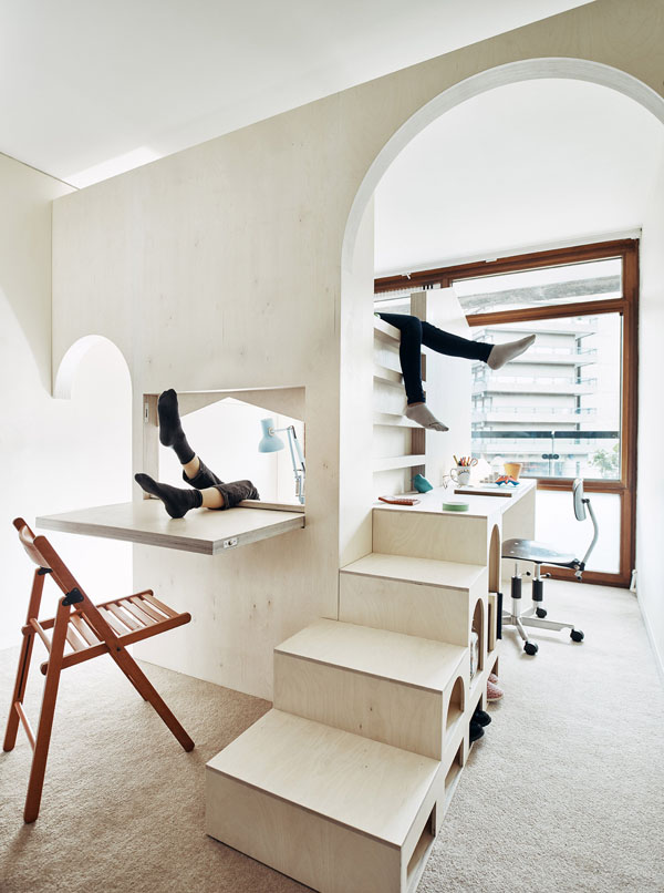
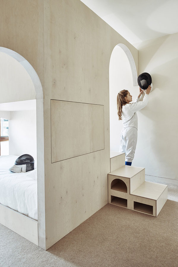
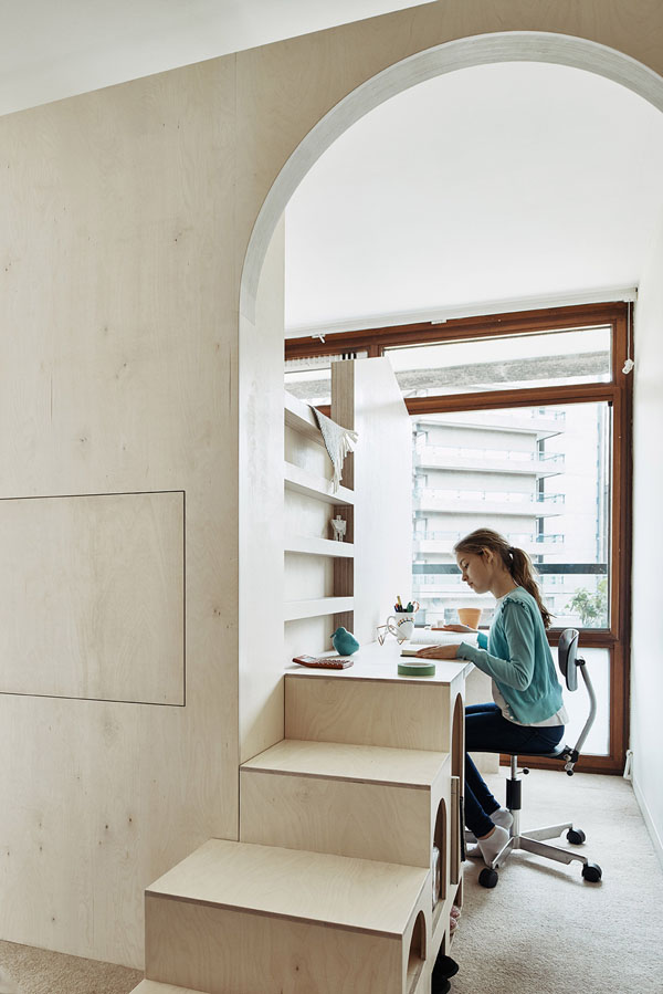
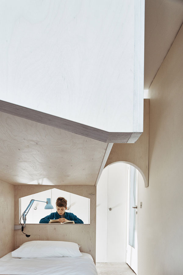
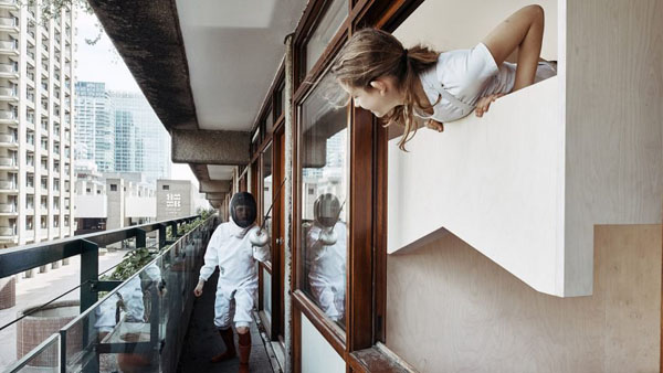
I absolutely adore Ben Allen’s latest project, ‘A room for two’ which is a plywood structure custom made for an apartment in the Barbican’s Defoe House in central London.

Pale birch plywood is a massive trend at the moment as the inexpensive material is light, strong and versatile and can be cut easily into any shape. The pale colour and subtle wood grain texture compliments the continuing trend for minimalism, creating clean lines and a contemporary uniform look as so often seen in Scandinavian design.

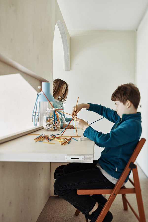
The purpose of this commission was to divide a single bedroom into a creative sleeping and working space for the owners two children making sure that every piece of the off-site prefabricated structure fitted through the standard Barbican apartment door.

Studio Ben Allen picked up on details like the arches of the Brutalist style estate and created two separate entrances to the kids spaces which feature a desk and a bed each. I adore the way that each piece of furniture serves a function like little cubby holes in the steps for slippers and in-built drawers for books to read in bed. My favourite bit is the fold down desk which cleverly reveals a house shaped window repeated on the opposite side ensuring a straight sightline out into the open courtyard.

A fabulous piece of functional design that nestles perfectly into the 1950ies apartment.

If you love plywood you can see more creative applications in this cafe and this stylists home or head over to the V&A’s current plywood exhibition.


a room for two, barbican, central london, brutalist, architecture, custom made, birch plywood, versatile, strong, contemporary, minimal, clean, function, form, style, trend, functional design, v and a museum, creative application, interior design, furniture

a room for two, barbican, central london, brutalist, architecture, custom made, birch plywood, versatile, strong, contemporary, minimal, clean, function, form, style, trend, functional design, v and a museum, creative application, interior design, furniture

a room for two, barbican, central london, brutalist, architecture, custom made, birch plywood, versatile, strong, contemporary, minimal, clean, function, form, style, trend, functional design, v and a museum, creative application, interior design, furniture

a room for two, barbican, central london, brutalist, architecture, custom made, birch plywood, versatile, strong, contemporary, minimal, clean, function, form, style, trend, functional design, v and a museum, creative application, interior design, furniture

a room for two, barbican, central london, brutalist, architecture, custom made, birch plywood, versatile, strong, contemporary, minimal, clean, function, form, style, trend, functional design, v and a museum, creative application, interior design, furniture


MORE INFORMATION | Studio Ben Allen
PHOTOGRAPHY | Michael Sinclair with thanks
 
Follow Stylejuicer with Bloglovin
OLD WINERY CONVERSION NEAR LISBON BY EXTRASTUDIO

13 October 2017

old winery conversion, lisbon, portugal, extrastudio architects, architecture, red house, mortar, humidity, orchard, sliding glass doors, external courtyard, double and triple height, style, styling, minimal, contemporary, trend


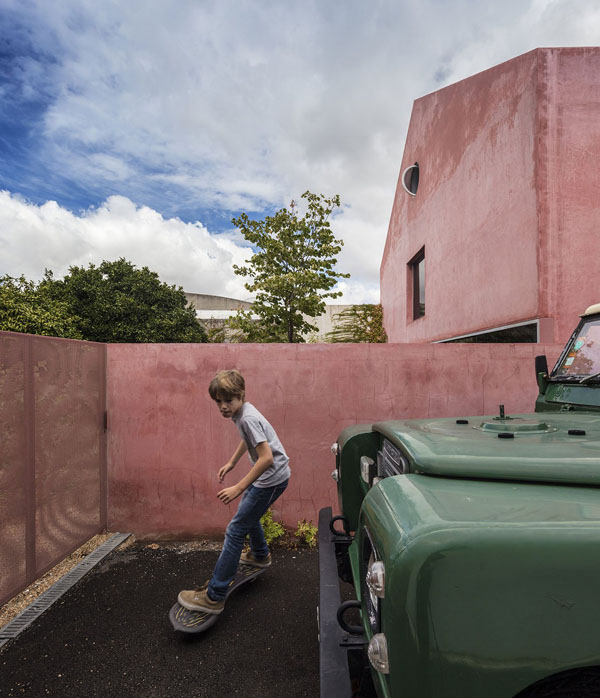
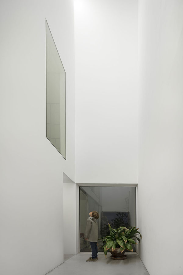
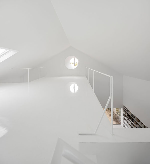
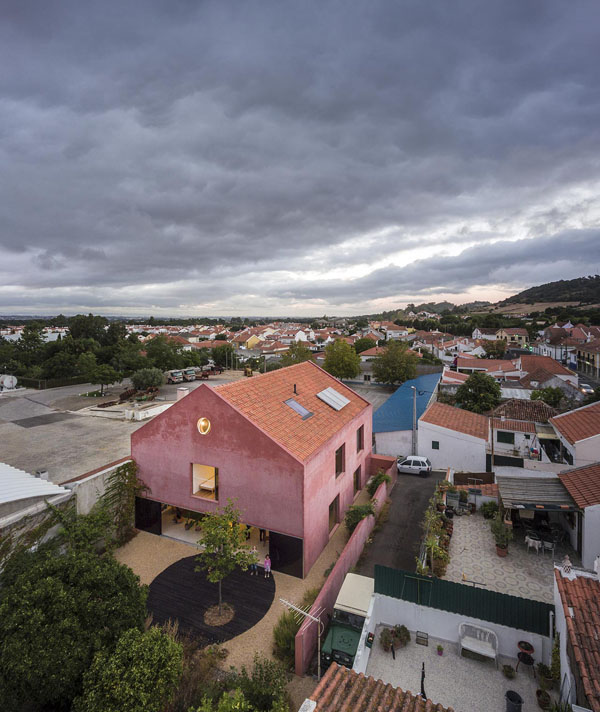
Residential conversions of old commercial buildings always inspire me and I particularly like what Portuguese architects extrastudio have done with this old winery south of Lisbon.

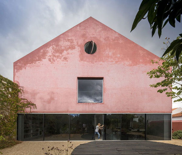
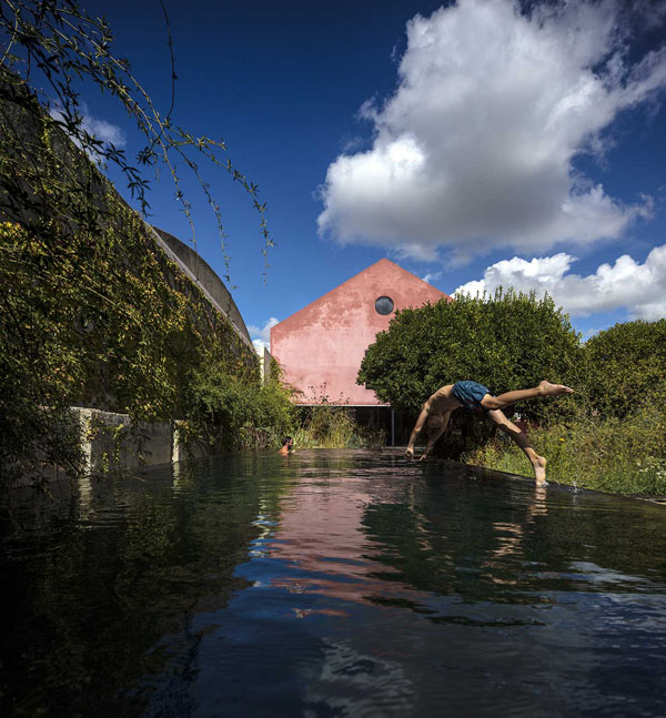
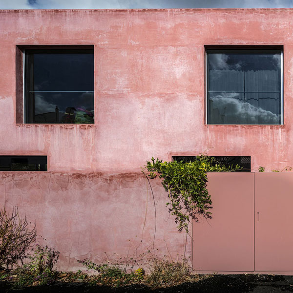
It’s called the Red House and I love the striking colour of the lime based mortar which changes according to humidity levels from blush pink in hot weather to almost black when wet.
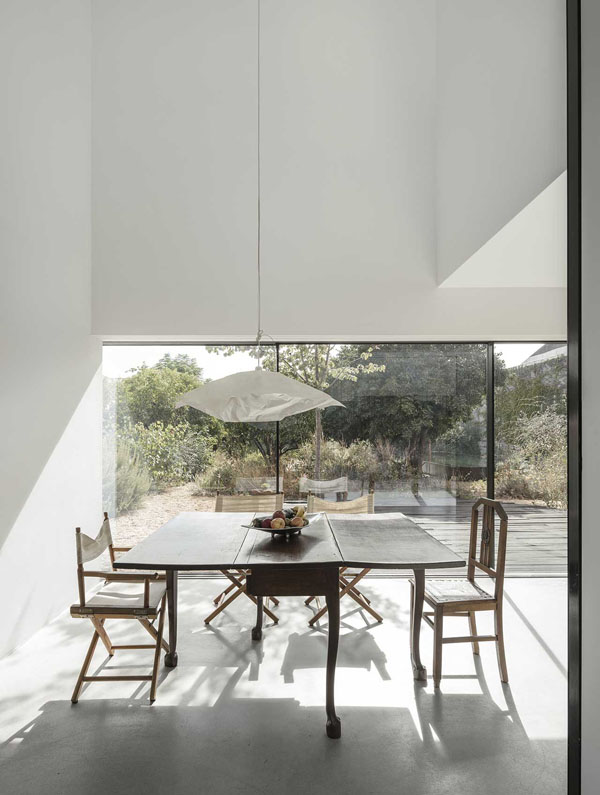
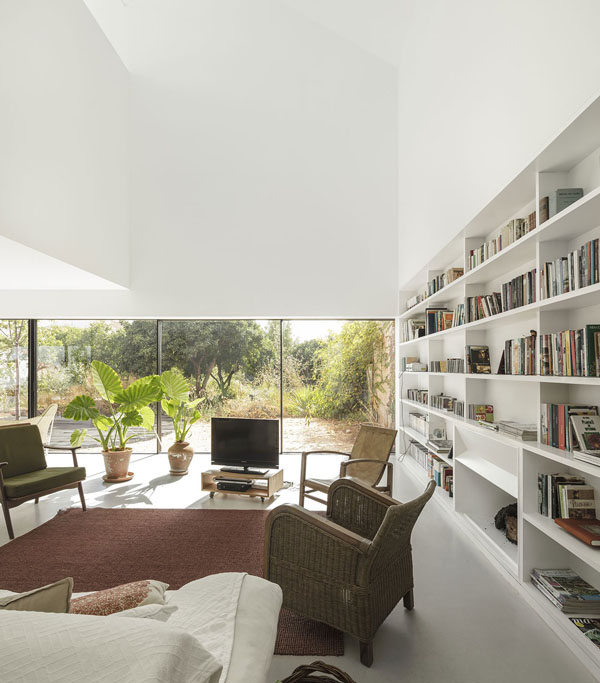
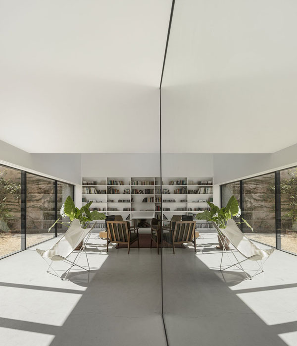
The former winery is adjacent to an orange tree orchard which dictated the landscaping and overall design of the house with large sliding glass doors across one side and a slim external courtyard letting in as much natural light as possible.

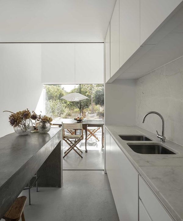
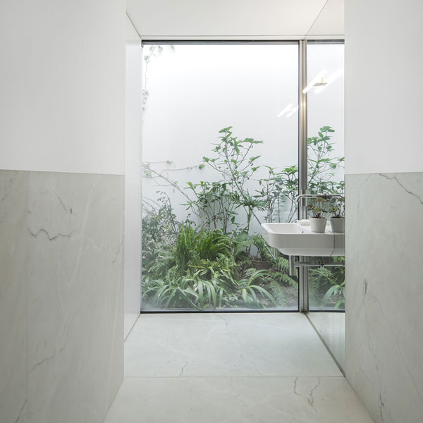
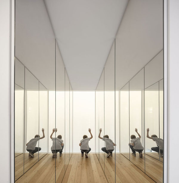
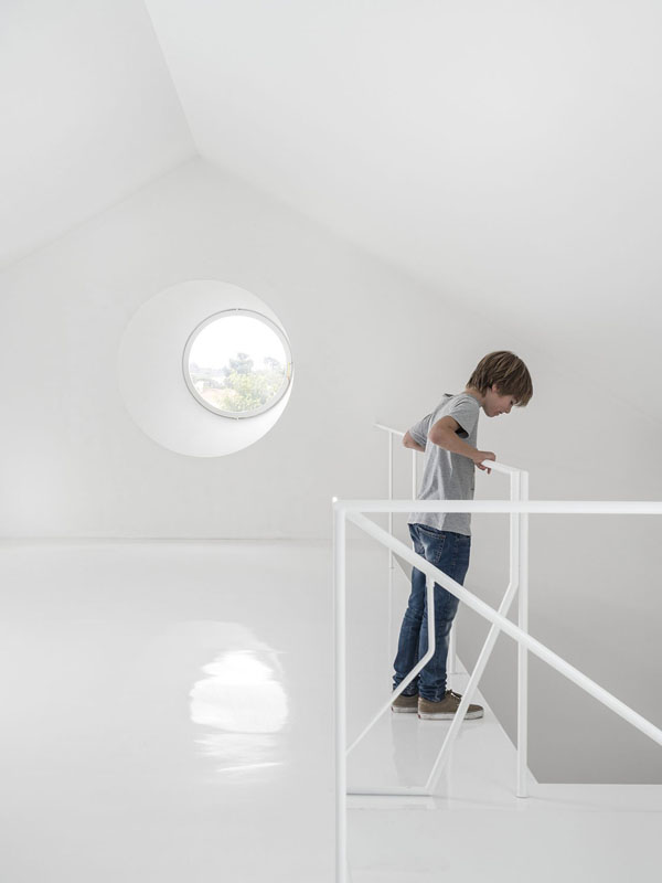
There are wonderful double and triple height spaces inside and floor to ceiling mirrors to bounce the light around all adding to that lovely feeling of space and contemporary minimalism. Spoilt for favourite features I’m going to pick the large bathroom window looking out onto the external courtyard with it’s lush vegetation – a view that would no doubt cheer me up every morning.

It’s projects like these that fire me up and inspire me to try harder and not pick the easy path.

PS: Check out these conversions of industrial spaces in Germany, Friesland and Sydney.


old winery conversion, lisbon, portugal, extrastudio architects, architecture, red house, mortar, humidity, orchard, sliding glass doors, external courtyard, double and triple height, style, styling, minimal, contemporary, trend

old winery conversion, lisbon, portugal, extrastudio architects, architecture, red house, mortar, humidity, orchard, sliding glass doors, external courtyard, double and triple height, style, styling, minimal, contemporary, trend

old winery conversion, lisbon, portugal, extrastudio architects, architecture, red house, mortar, humidity, orchard, sliding glass doors, external courtyard, double and triple height, style, styling, minimal, contemporary, trend

old winery conversion, lisbon, portugal, extrastudio architects, architecture, red house, mortar, humidity, orchard, sliding glass doors, external courtyard, double and triple height, style, styling, minimal, contemporary, trend

old winery conversion, lisbon, portugal, extrastudio architects, architecture, red house, mortar, humidity, orchard, sliding glass doors, external courtyard, double and triple height, style, styling, minimal, contemporary, trend

old winery conversion, lisbon, portugal, extrastudio architects, architecture, red house, mortar, humidity, orchard, sliding glass doors, external courtyard, double and triple height, style, styling, minimal, contemporary, trend

old winery conversion, lisbon, portugal, extrastudio architects, architecture, red house, mortar, humidity, orchard, sliding glass doors, external courtyard, double and triple height, style, styling, minimal, contemporary, trend

old winery conversion, lisbon, portugal, extrastudio architects, architecture, red house, mortar, humidity, orchard, sliding glass doors, external courtyard, double and triple height, style, styling, minimal, contemporary, trend

old winery conversion, lisbon, portugal, extrastudio architects, architecture, red house, mortar, humidity, orchard, sliding glass doors, external courtyard, double and triple height, style, styling, minimal, contemporary, trend

old winery conversion, lisbon, portugal, extrastudio architects, architecture, red house, mortar, humidity, orchard, sliding glass doors, external courtyard, double and triple height, style, styling, minimal, contemporary, trend

old winery conversion, lisbon, portugal, extrastudio architects, architecture, red house, mortar, humidity, orchard, sliding glass doors, external courtyard, double and triple height, style, styling, minimal, contemporary, trend

old winery conversion, lisbon, portugal, extrastudio architects, architecture, red house, mortar, humidity, orchard, sliding glass doors, external courtyard, double and triple height, style, styling, minimal, contemporary, trend

old winery conversion, lisbon, portugal, extrastudio architects, architecture, red house, mortar, humidity, orchard, sliding glass doors, external courtyard, double and triple height, style, styling, minimal, contemporary, trend


ARCHITECTS | extrastudio
PHOTOGRAPHY | Fernando Guerra with thanks
 
Follow Stylejuicer with Bloglovin