PLACES TO GO | LONDON TRAVEL GUIDE BY CEREAL

6 February 2014

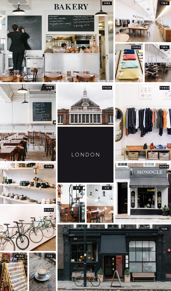
London Guide By Cereal via Stylejuicer


ONE | St John Bread & Wine | 94-96 Commercial Street, London, E1 6LZ

TWO | Margaret Howell | 34 Wigmore Street, London, W1U 2RS

THREE | Folk Clothing | 11 Dray Walk, London, E1 6QL

FOUR | Serpentine Gallery | Kensington Gardens, London, W2 3XA

FIVE | Folklore | 193 Upper Street, London, N1 1RQ

SIX | Corner Room | Town Hall Hotel, Patriot Square, London, E2 9NF

SEVEN | Monocle Shop | 2A George Street, London, W1U 3QS

EIGHT | Tokyo Bike | 87-89 Tabernacle Street, London, EC2A 4BA

NINE | Daunt Books | 83 Marylebone High Street, London, W1U 4QW

TEN | Workshop Coffee | 27 Clerkenwell Road, London, EC1M 5RN


Bristol-based Cereal Magazine are seriously taking over the world with their newly launched online travel guides, called Guided By Cereal. An annual subscription fee of £20 gives you full access to all travel guides as well as a Guided Travel Journal where outtakes and notes on each location are shared.

Currently there are 10 cities around the world including faves as London, Paris, Manhattan, LA and Hong Kong but also less common destinations like Charleston, Austin, Seoul, Vancouver and Bath (note for non-UK residents: Bath is a beautiful town in the west of England, slightly off the beaten track). I love the fact that each city has a local Cereal ambassador to ensure that everything is up to date and the recommended places keep up the good work.

The holistic approach that complements the magazine beautifully and the concept reminds me of Wallpaper* Magazine and their pocket sized travel guides. Nevertheless it’s a genius idea to give their design-hungry and individuality-craving niche market the insiders guide on where to stay, where to eat, what to see and where to shop. All with the Cereal seal of approval, vouching for their unique, understated, minimalist aesthetic, style and taste.

To get us all hooked they’ve given us access to the London travel guide and as a London-dweller and Cereal evangelist I’ve got to hand it to them: It’s an exquisite selection and I’ll soon report back on some of their recommendations.

 
MORE INFORMATION | Guided By Cereal
PHOTOGRAPHY | Cereal
 

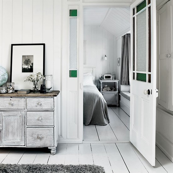
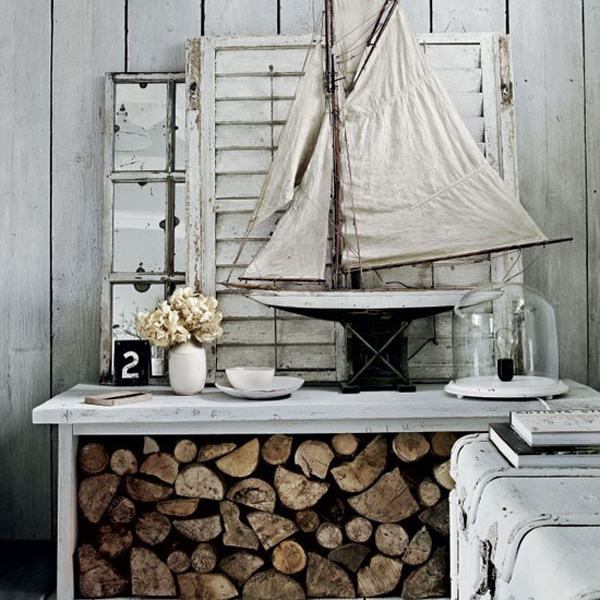
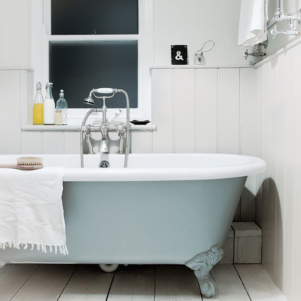
INTERIORS CRUSH | SHABBY CHIC COTTAGE IN CORNWALL

4 February 2014

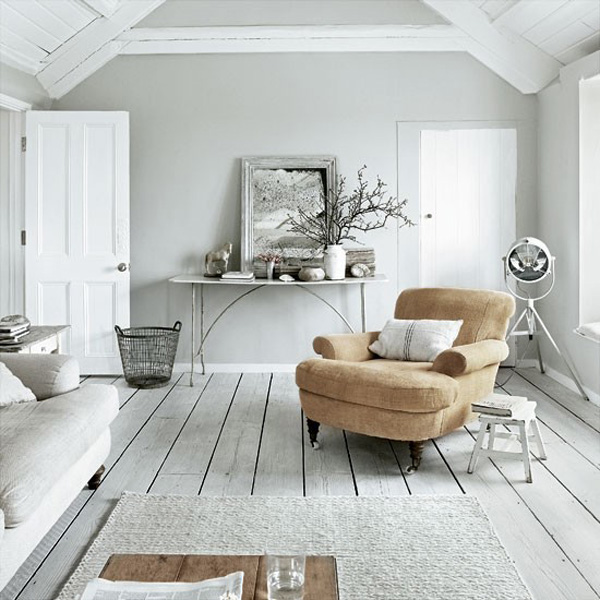
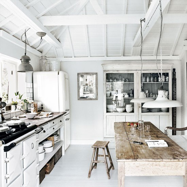
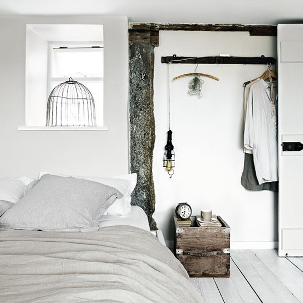
Shabby Chic Cornwall by Paul Massey via Stylejuicer

Here’s another reason why I love England: Quirky names for tiny villages, towns and places like Piddletrenthide, Puddletown, Ramsbottom, Affpuddle or Badger’s Mount. It sounds like something out of The Hobbit but I’m convinced J. R. R. Tolkien just took inspiration from reading a map of his native England.

You can imagine my delight when I found out that today’s interior inspiration, a converted fisherman’s net loft, is located in Mousehole, Cornwall. What a cute name and I’m totally crushing on that shabby chic coastal look by owner, serial renovator and interior photographer Paul Massey.

The loft was built in the 1800s and has an upside down layout with bed- and bathrooms on the ground floor and living and kitchen upstairs to take full advantage of the sea views as Mousehole is an attractive tourist destination and fishing port on the far south west coast of England.

The place has got a lovely modern coastal feel with sun bleached wood and eclectic finds from around the world collected during Paul’s travels. The colourpalette has been kept soft with neutral greys, stone and white and a clever layering paint method, applying a light shade over a dark shade before sanding, gives it a lived-in vintage look.

I love the exposed A-frame beams which remind you of the house’s former use as a fishing net loft. Interestingly the flooring throughout is made of cheap but tough scaffolding boards which were washed with white spirit before being sealed with wax oil. Hmm, I’m not sure how smooth this would be underfoot but who cares you’d probably walk around this place in nice thick felt slippers or sheepskin boots before curling up in front of that gorgeous wood burner reading about Middle Earth.

NOTE: If you’ve fallen in love with the place there’s good news! You can rent the adjacent holiday cottage via Unique Home Stays. Score!


House-Cornwall-via-Stylejuicer04

House-Cornwall-via-Stylejuicer03

House-Cornwall-via-Stylejuicer02

House-Cornwall-via-Stylejuicer07

House-Cornwall-via-Stylejuicer06

Shabby Chic Cornwall by Paul Massey via Stylejuicer

 
PHOTOGRAPHY | Paul Massey
 

“INTO THE WILD” BY LUKAS FURLAN

2 February 2014

copyright Lukas Furlan Photography Into The Wild via stylejuicer.com

Each year when it gets to February and we are properly stuck in winter and the cold, damp English weather creeps into my bones I get cravings to go skiing. Errr, I tell a lie, it actually starts around Christmas time – see post about the gorgeous boutique hotel Bruecke 49 in Switzerland back in December.

The clean white snow and bright blue skies are my perfect antidote to beat the winter blues and my usual out-of-control schuss-ing gives me a total legal high.

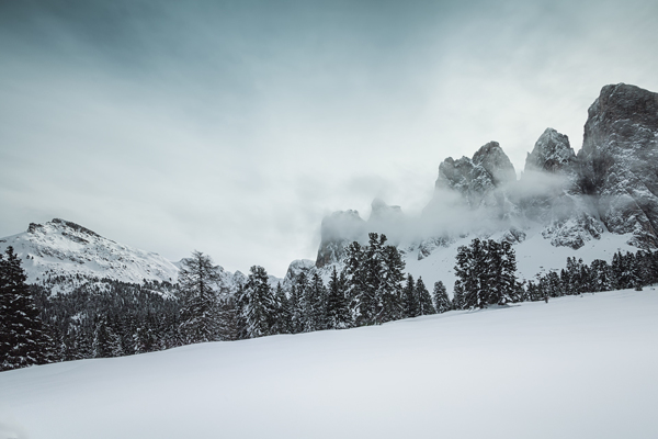
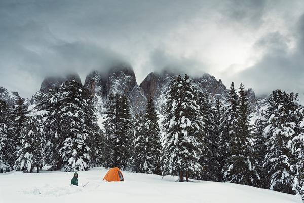
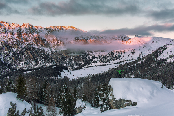
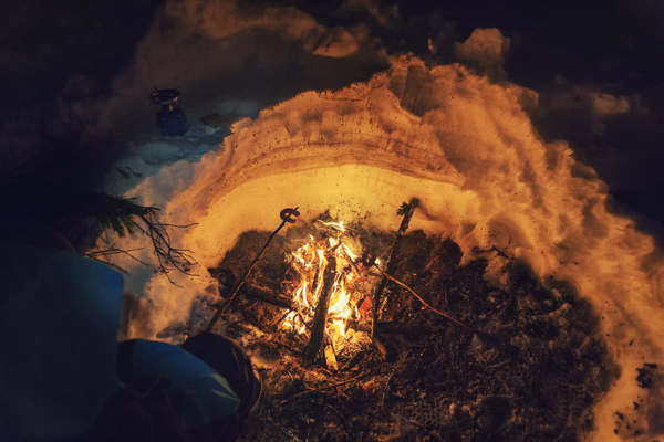
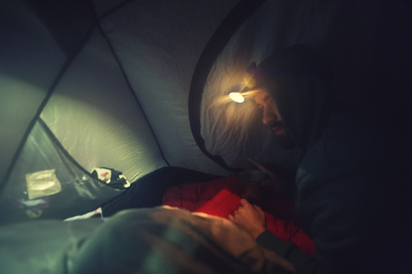
Bit of a bummer I’m stuck at home with two small kids and a cowboy then, eh!? Still, as you know I like to daydream and Lukas Furlan’s photography of his ‘Trip Into The Wild’ brings back fond memories of (aprés-)skiing in the Alps on this grey February morning in London.

His photos are stunning and illustrate his trip to south Tyrol through all weather conditions, night and day. When I contacted him I was surprised to find that he’s a laid back Austrian guy in his early twenties studying Media Informatics in Vienna. Photography is one of his hobbies and right now he doesn’t have any plans to go pro and just loves to shoot for fun. He tells me about his trip:

“As usually, it was a spontaneous trip into the back country. A pal and I had some school days off and decided to go for a short photography trip. We didn’t have the best camping gear for the conditions, so we were a bit nervous about spending the night in such a remote location. The weather was unsettled – the first day cloudy and foggy, but also blue sky and bright rays of sunlight. The second day started with heavy snowfall, which was also the reason we had to return home early.”

Lukas, you’ve made my day! Go wild!
 

copyright-Lukas-Furlan-via-stylejuicer-04

copyright-Lukas-Furlan-via-stylejuicer-12

copyright-Lukas-Furlan-via-stylejuicer-01

copyright-Lukas-Furlan-via-stylejuicer-13

copyright-Lukas-Furlan-via-stylejuicer-08

copyright-Lukas-Furlan-via-stylejuicer-06

copyright-Lukas-Furlan-via-stylejuicer-07

copyright-Lukas-Furlan-via-stylejuicer-14

copyright-Lukas-Furlan-via-stylejuicer-11

copyright-Lukas-Furlan-via-stylejuicer-10

copyright-Lukas-Furlan-via-stylejuicer-03

copyright-Lukas-Furlan-via-stylejuicer-02

copyright-Lukas-Furlan-via-stylejuicer-09

copyright Lukas Furlan Photography Into The Wild via stylejuicer.com

 
PHOTOGRAPHY | Lukas Furlan
 

CHINESE NEW YEAR STAMPS | YEAR OF THE HORSE

31 January 2014

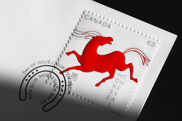
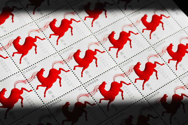
chinese new year stamps by paprika via stylejuicer

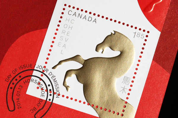
Happy Chinese New Year to around 1.3 billion -ish people and all of their relations around the world! The world largest population has their own calendar, the Han calendar, which usually begins on the second dark moon after the winter solstice, occasionally the third dark moon. Get it? Me neither. It is also called the Spring festival and the most important social and economic event of the year.

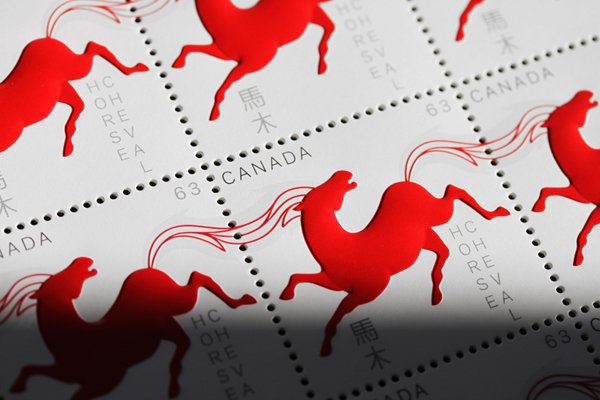
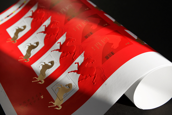
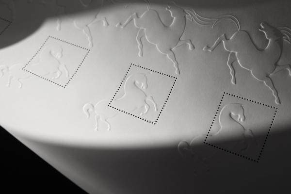
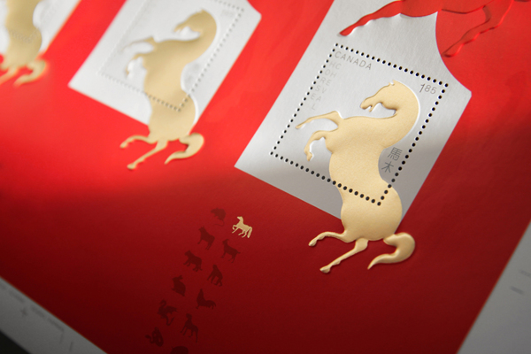
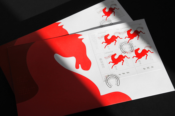
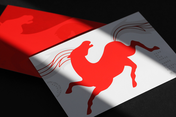
Canadian design studio Paprika designed these beautiful stamps to mark the Year Of The Horse and I love the stylised horses and the rich red and gold colour used. Red in particular is highly symbolic for the Chinese and associated with good fortune and joy as well as fire, warding off evil. During Chinese New Year or special occasions people give out red envelopes with money and I’m sure they appreciate the stamps to tie in with the Year Of The Horse.

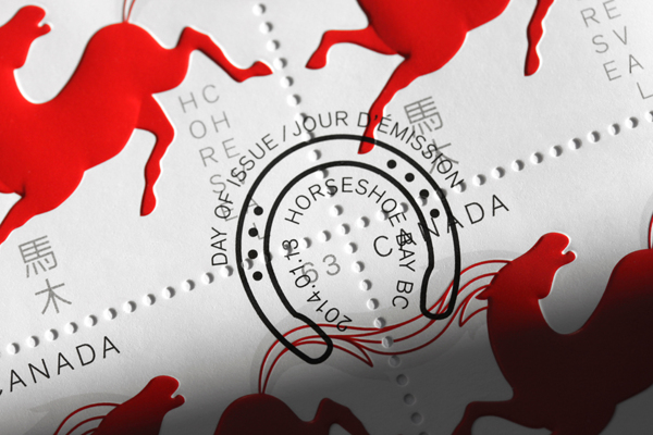
The seal in the shape of a horseshoe is a neat little touch and since Paprika is located in Quebec, the French speaking part of Canada, they’ve incorporated both the French and English word for horse on the stamps as well as the Chinese symbol. Ok, my Mandarin is a bit rusty but I’m taking an educated guess here so feel free to correct me in the comments. Let me finish by wishing you:
Happiness, Prosperity, Longevity
福禄寿 fú lù shòu

To find out more about Chinese New Year traditions check out the International Business Times.
 

chinese-new-year-stamps-by-paprika-via-stylejuicer05

chinese-new-year-stamps-by-paprika-via-stylejuicer01

chinese-new-year-stamps-by-paprika-via-stylejuicer02

chinese-new-year-stamps-by-paprika-via-stylejuicer04

chinese-new-year-stamps-by-paprika-via-stylejuicer03

chinese-new-year-stamps-by-paprika-via-stylejuicer06

chinese-new-year-stamps-by-paprika-via-stylejuicer09

chinese-new-year-stamps-by-paprika-via-stylejuicer08

chinese new year stamps by paprika via stylejuicer
 
DESIGN & PHOTOGRAPHY | Paprika
 

DESIGN INSPIRATION | ONLINE FOOD JOURNAL FOOD&_

28 January 2014

copyright-foodand_via-stylejuicer-19

Now this is one of those seriously cool successful projects you don’t see very often.
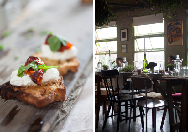
Food&_ was only set up in the summer of 2013 which gives credit to the fact that great design and even greater content are perfect partners. But let me start from the beginning as the story behind this genius concept is encouragement to all perfectionists and procrastinators alike. Ahem… and yes, I do count myself into both those categories.

copyright-foodand_via-stylejuicer-09

Founder Ross Featherstone is a keen home cook, an obsessive collector of cookery books and one of those annoying people who take pictures of their meals before picking up a fork – his words not mine. Furthermore he designs and builds websites for a living, so you would think that setting up a blog would be a walk in the park for him. Not so, as I found out when reading up about the concept behind Food&_ on The Culture Vulture.

After years of false starts, getting hung up on design and fussing about detail he finally got the push he needed by signing up to Blog North #4, a food bloggers workshop, where he didn’t want to show up with a handful of undercooked website designs. Getting loads of advice and encouragement during the workshop was the turning point for him and he realised that he wanted his food blog to be a collaborative online food journal.

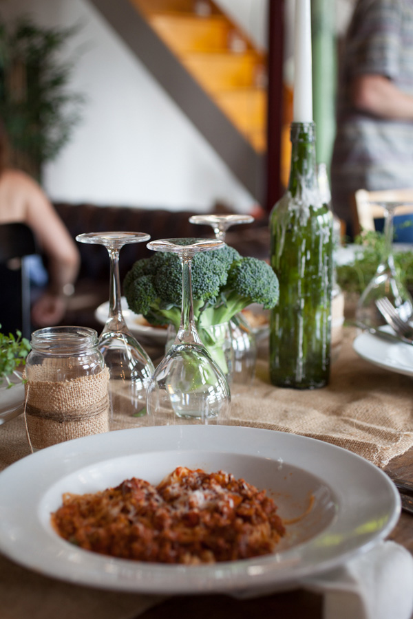
Bringing together an ever-growing mix of foodies, writers, growers and producers with photographers, illustrators and designers to collectively showcase and promote each individual’s talent. They all share a love food and the stories behind the food, their passions and recipes.

foodand_ online food journal via stylejuicer.com

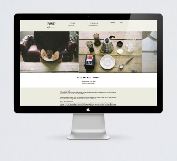
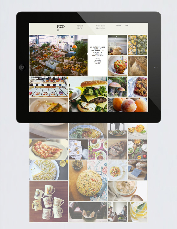
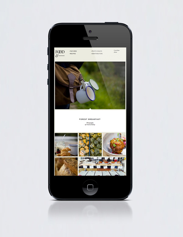
As a graphic designer I’m in love with the fresh approach he and his partners took on the branding and as a fellow blogger I’m insanely jealous of the concept and rocketing success the site has experienced since it’s launch. Let me say at this point that Ross is one of five founding partners, others including Katy Lanceley, Jonathan Finch, Rosalind Stoughton and Christopher Nunn.

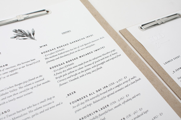
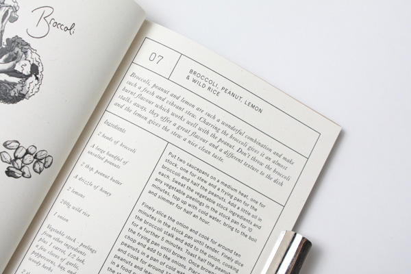
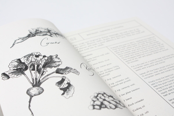
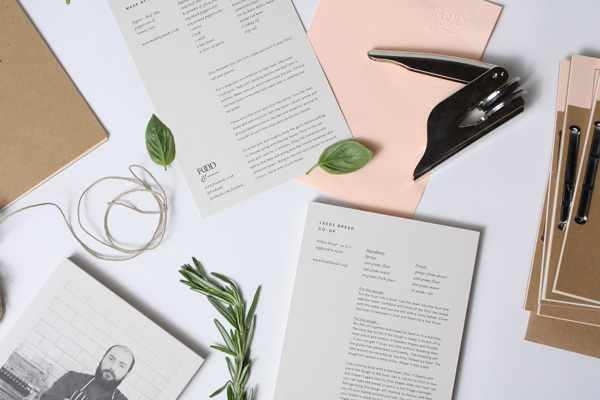
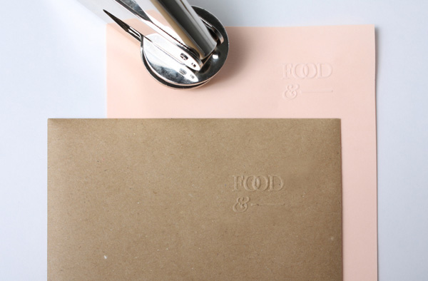
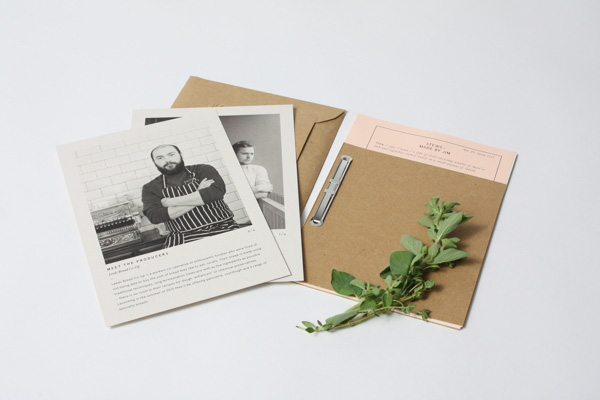
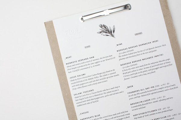
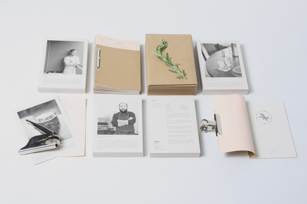
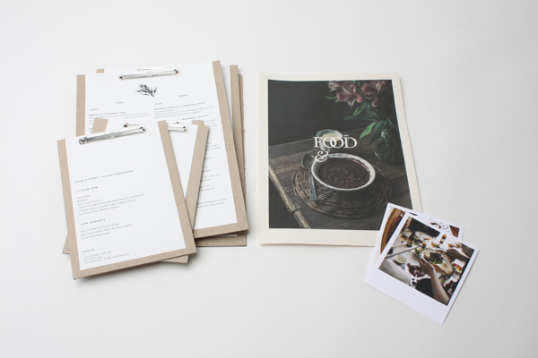
The branding is classic and modern at the same time with the use of serif Calendar Plus as a primary headline font and Apercu as a secondary modern sans serif for body copy. The colour palette has been kept neutral and ranges from black and white to beige and grey making the colourful photography appropriately the hero.

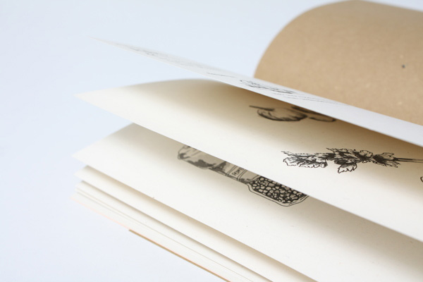
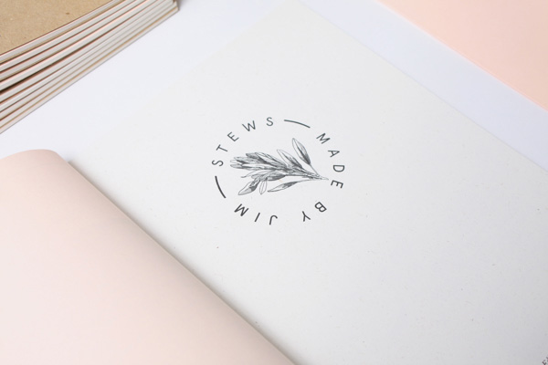
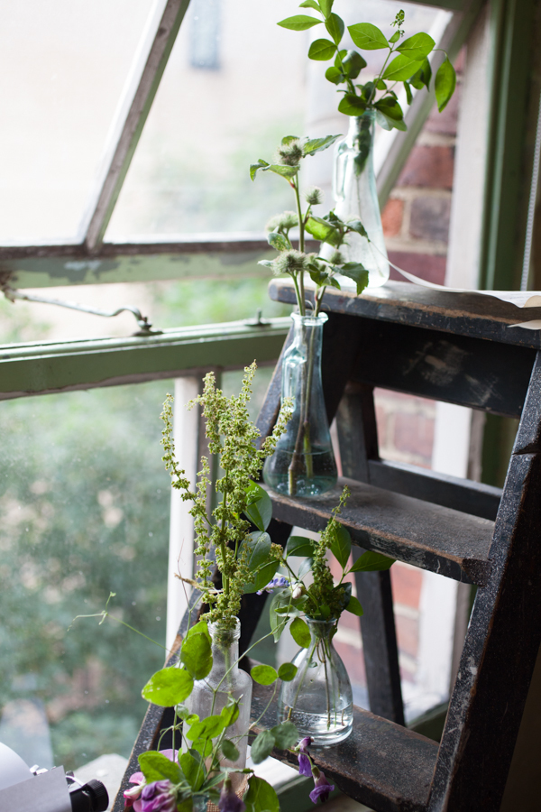
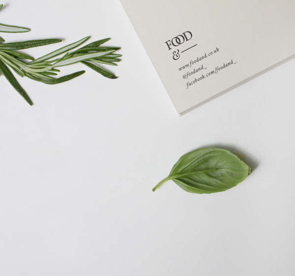
All of the collateral has got a lovingly handmade, crafty touch not dissimilar to cooking itself and I like the little details like actual pressed herbs stuck to the covers and the fine, almost botanical black and white illustrations. It’s a utilitarian brand with an earthy character that perfectly compliments food, cooking and dining. A lovingly designed concept that has stand out and longevity. Jamie Oliver eat your heart out.

foodand_ online food journal via stylejuicer.com

copyright-foodand_via-stylejuicer-02

copyright-foodand_via-stylejuicer-01

copyright-foodand_via-stylejuicer-10

copyright-foodand_via-stylejuicer-22

copyright-foodand_via-stylejuicer-21

copyright-foodand_via-stylejuicer-20

copyright-foodand_via-stylejuicer-16

copyright-foodand_via-stylejuicer-15

copyright-foodand_via-stylejuicer-25

copyright-foodand_via-stylejuicer-11

copyright-foodand_via-stylejuicer-06

copyright-foodand_via-stylejuicer-27

copyright-foodand_via-stylejuicer-08

foodand_ online food journal via stylejuicer.com

 
Annie Signature Stylejuicer
 

WEBSITE | Design by Passport. Build by Refresh Interactive
RECIPE BOOKS | Design by Passport. Illustrations by Liz Ibbotson
LAUNCH EVENT | Creative Direction by Lord Whitney, Passport, Ross Featherstone & Katy Lanceley
STYLING | Lord Whitney
PRINT & PROMOTION DESIGN | Passport
PHOTOGRAPHY | Victoria Harley