A MINIMALIST DREAM – RIDGE ROAD RESIDENCE BY STUDIO FOUR

10 September 2013

minimalist, architecture, australia, studio four, ridge road residence, melbourne, black timber, rugged landscape, terraced, decks, sustainability, green credentials, space, sanctuary, enclosure, comfort, calm, trend, style

This dramatic minimalist home on the edge of a golf course outside Melbourne caught my eye on Pinterest a while ago. It was designed by architects Studio Four and I love the stark contrast of black timber against the rugged landscape of grasses, gnarled old trees and brooding skies.

The design of Ridge Road Residence spills down the slope and ends in a series of terraced decks which makes it blend into the landscape rather than being elevated out of it. It also has fabulous sustainability credentials with the use of renewable timber, underground water storage, water saving fixtures, low VOC paints and materials. The site is also being re-vegetated with native species endemic to the local area.


minimalist, architecture, australia, studio four, ridge road residence, melbourne, black timber, rugged landscape, terraced, decks, sustainability, green credentials, space, sanctuary, enclosure, comfort, calm, trend, style


A beautiful and sensitive approach by architects Studio Four who say in their own words:

We sought to create a quality of space that provides a sense of sanctuary, enclosure and comfort. Emphasis was placed upon capturing the varying qualities of light, the scale and proportions of space, and providing a tangible connection with the building’s surrounds, both in topography and landscape.

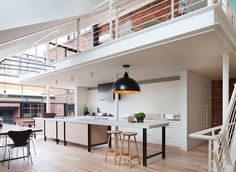
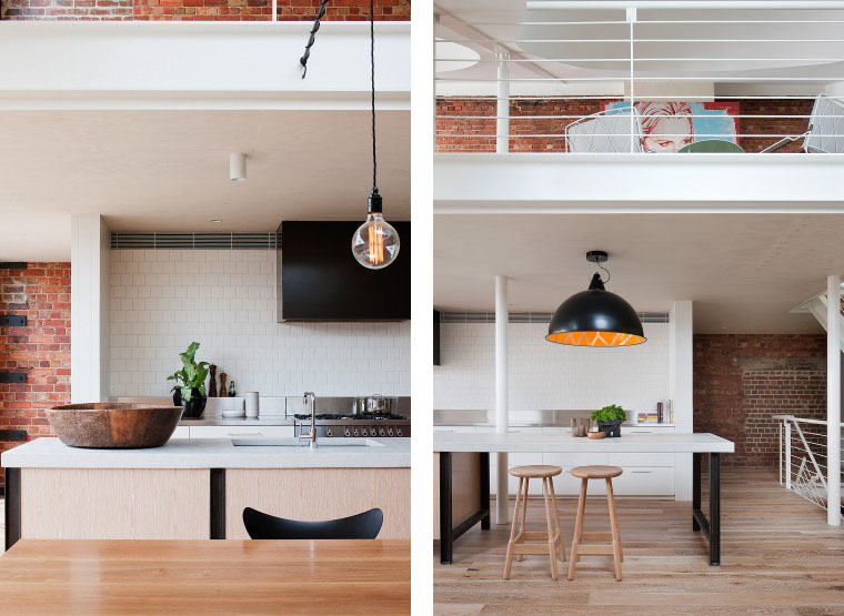
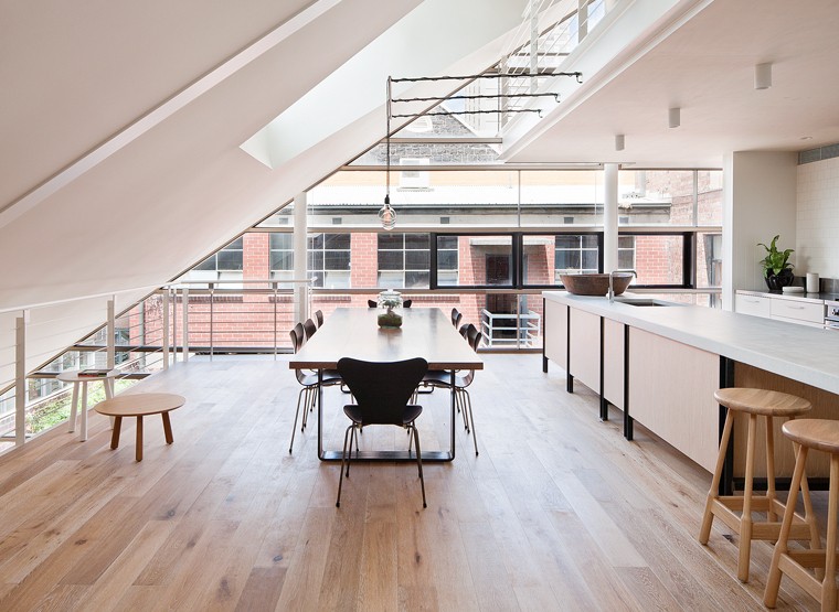
The form of the building was also driven by the desire to separate the public and private zones of the residence. The kitchen, dining and living spaces are combined to create a single, fluid area, delineated only by a gentle level change and a fireplace / storage element. These elements provide the level of intimacy required by the client whilst also allowing the advantages provided by open planning.

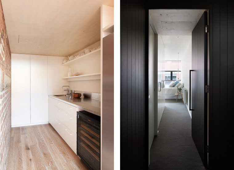
The panelised matte black wall to the kitchen conceals a powder room, laundry and butler’s pantry, providing the high level of functionality required, while maintaining the calm qualities of the open plan space.


minimalist, architecture, australia, studio four, ridge road residence, melbourne, black timber, rugged landscape, terraced, decks, sustainability, green credentials, space, sanctuary, enclosure, comfort, calm, trend, style

minimalist, architecture, australia, studio four, ridge road residence, melbourne, black timber, rugged landscape, terraced, decks, sustainability, green credentials, space, sanctuary, enclosure, comfort, calm, trend, style

minimalist, architecture, australia, studio four, ridge road residence, melbourne, black timber, rugged landscape, terraced, decks, sustainability, green credentials, space, sanctuary, enclosure, comfort, calm, trend, style

minimalist, architecture, australia, studio four, ridge road residence, melbourne, black timber, rugged landscape, terraced, decks, sustainability, green credentials, space, sanctuary, enclosure, comfort, calm, trend, style

minimalist, architecture, australia, studio four, ridge road residence, melbourne, black timber, rugged landscape, terraced, decks, sustainability, green credentials, space, sanctuary, enclosure, comfort, calm, trend, style

minimalist, architecture, australia, studio four, ridge road residence, melbourne, black timber, rugged landscape, terraced, decks, sustainability, green credentials, space, sanctuary, enclosure, comfort, calm, trend, style

minimalist, architecture, australia, studio four, ridge road residence, melbourne, black timber, rugged landscape, terraced, decks, sustainability, green credentials, space, sanctuary, enclosure, comfort, calm, trend, style

minimalist, architecture, australia, studio four, ridge road residence, melbourne, black timber, rugged landscape, terraced, decks, sustainability, green credentials, space, sanctuary, enclosure, comfort, calm, trend, style

minimalist, architecture, australia, studio four, ridge road residence, melbourne, black timber, rugged landscape, terraced, decks, sustainability, green credentials, space, sanctuary, enclosure, comfort, calm, trend, style

minimalist, architecture, australia, studio four, ridge road residence, melbourne, black timber, rugged landscape, terraced, decks, sustainability, green credentials, space, sanctuary, enclosure, comfort, calm, trend, style


MORE INFORMATION | Studio Four
PHOTOGRAPHY | Shannon McGrath

AUTUMN 2013 FASHION TRENDS

9 September 2013

I love the beginning of a new season and working my way through bulky September issues and Sunday fashion supplements. Having had a picture book summer here in the UK the thought of putting on winter woollies sounds quite appealing and I’m looking forward to updating my Autumn wardrobe with a few key pieces.

The current trend of ‘any colour as long as it’s pink’ sounds fabulous to me and combining it with soft luxurious fabrics in shades of grey or denim is a winning combination for the office or at home. I’m also totally sold on the tomboy look which can so easily be given a feminine edge by adding heels, skirt and tights or a smart handbag. Checks [or plaid to my American friends] are also a must-have for me this season and I might just nab that classic red tartan scarf from the boyf. Good job he never reads my posts!

Finally, I’ve picked up a cool trend from fashion oracle Vogue who claim dots and stripes are a ‘successful merger’, see for yourself on my moodboard below.

And if you can’t get enough of fashion trends at the moment, pop back later this week for a post on French cool by an American label who’ve got it sussed this season. Plus you can draw more inspiration from my ever expanding WOMEN’S FASHION & STYLE board on Pinterest.

Fashion Autumn2013 Moodboard copyright Stylejuicer

Enjoy and I hope you’re inspired!

Annie Signature Stylejuicer

Credits | I’d like to give credit to all the photographers and designers whose work is featured on this board. Sadly, most of the originators can’t be identified anymore so if you recognise your work here please email me and I’ll happily credit you and add your link.

MOOR STREET APARTMENT BY CLARE COUSINS ARCHITECTS

4 September 2013

My heart skipped a beat when I saw Clare Cousins fit-out for this combined creative office space and private residence. Designers ideas should be flowing freely when working in these light flooded open-plan surroundings in Melbourne’s trendy Fitzroy area.

Clare_Cousins_Moor_Street_12_760_555_90

Clean lines and a restrained colour palette let’s the focus shift to fine detailing and highly textured surfaces like the exposed brick walls and white-washed wooden flooring. I particularly like the way Clare has echoed the exposed brick in the tiled splash back pattern in the kitchen. The pendant lights are another focal point and work really well for the space with their semi-industrial look.

The private quarters remind me of a smart minimalist hotel with thick grey carpets and smooth white panels sitting next to black vertical tongue and groove doors and entryways. A cool, smart and contemporary look that won’t date and should create a calm and peaceful environment after a day’s work playing with colour, fabrics and textures.

The commission of a large scale artwork by prominent local artist Rowena Martinich forms a colourful backdrop to the meeting room. Clare says

The project respects the iconic nature of the existing building by Rijavec Architecture while creating a strong visual identity for the design studio within.

I could see myself happily doing overtime here.

Clare_Cousins_Moor_Street_14_370_555_90

Clare_Cousins_Moor_Street_15a_760_555_90

Clare_Cousins_Moor_Street_15c_370_555_90

Clare_Cousins_Moor_Street_16_760_555_90

Clare_Cousins_Moor_Street_17_760_555_90

Clare_Cousins_Moor_Street_18_760_555_90

CREATE THE LOOK WITH STYLEJUICER AND POLYVORE

Like the lightbulbs and pendant lights of this interior project? You can find similar ones on my LIGHTING collection on Polyvore.

Stylejuicer Polyvore LIGHTING Collection

Enjoy and I hope you’re inspired!

Annie Signature Stylejuicer

More information | Clare Cousins Architects
Artwork | Rowena Martinich
Photography | Shannon McGrath

SAVILE ROW TAILOR PATRICK GRANT FOR DEBENHAMS

3 September 2013

I have to admit that I’ve had a soft spot for Patrick Grant ever since I saw him in the 2009 BBC documentary about Savile Row, London’s quintessential English mecca of gentlemen’s tailoring and bespoke clothing since the 18th century. At 6ft something he is quite a dish and the owner of Norton & Sons, one of the oldest tailors on Savile Row. He’s also fabulously British and won’t name living customers but past ones include Edward VII, Winston Churchill, Cary Grant and Alexander McQueen.

copyright Chad & Paul Patrick Grant via Stylejuicer.com

Patrick calls himself a bearded bicyclist and bird-lover on Twitter but recently has come to more mainstream fame through judging the ‘Great British Sewing Bee’ competition, another BBC programme. Norton & Sons’ house style is two-button, single-breasted and a handmade two piece suit will cost you upwards of £3,600 depending on the cloth.

His reason for joining the ranks of designers like Matthew Williamson and Henry Holland at Debenhams is that he wants to make clothes for urban professional guys who are not earning the big bucks. He claims his target market wants a great suit to wear to work, a sports jacket, a shawl neck knit, jeans and a classic looking shoe. Patrick himself would have bought these clothes 15 years ago if they existed but instead he had to save up for a year to buy a Prada suit. He says

I think young men are seeing a return to dressing in a more elegant way.

A welcome trend which should support his range of knitwear, suits, shirts, ties, chunky leather shoes, belts, wallets and handkerchiefs. His attention to detail is impressive and rumour has it that only after countless prototypes would he give each garment his seal of approval. He fiercely supports British industry and insisted on using British cloth which he considers the best in the world by a ‘country mile’ though he claims Italians did a much better job of telling the world they were cool.

Needless to say I love his style, attitude and his AW 2013 collection for Debenhams and fully support him in his quest for more TV programmes about fashion history and style.

There are a lot of people who think fashion is too frivolous for somewhere like the BBC, but clothing is serious. It’s important. It says a lot about who we are.

Ok, now all I need to do is convince my American dude to buy into the look and grow a beard.

copyright-ChadPaul-Patrick-Grant-via-Stylejuicer.com-06

copyright-ChadPaul-Patrick-Grant-via-Stylejuicer.com-02

copyright Chad & Paul Patrick Grant via Stylejuicer.com

Enjoy and I hope you’re inspired!

Annie Signature Stylejuicer

More information | Hammond & Co. by Patrick Grant for Debenhams
Photography | Chad & Paul

BEURRE & SEL BRANDING FOR GOURMET COOKIE MONSTERS

2 September 2013

As design briefs go they don’t come any sweeter than designing an identity for a gourmet cookie brand. Designers and close friends Kyle Poff and Casey Martin had the arguably not so tough task to sample the product before starting work on the branding.

Beurre & Sel is a New York based bakery space and store by mother and son Dorie and Josh Greenspan who have been baking cookies together for years using local butter and hand-harvested sea salt which give the brand its name and goodness. Josh says:

Cookies are our family’s way of holding on to memories and they’re our way of creating new memories for you, ones you can treasure and share.

copyright Kyle Poff Martin Casey BeurreSel via stylejuicer

Dorie is an accomplished chef and baker who has been writing and reviewing recipes and food critiques for Bon Appetite magazine for the past 18 years. She is also a cookbook author and four-times James Beard Award-winner. She and her team wanted a fresh, simple brand identity to help launch their online and in-store experience and specified a bold logotype with a distinct ampersand.

The Greenspan’s sound like a lovely client to work with as they totally trusted Casey’s and Kyle’s design eye and let them do exactly what they wanted. Kyle tells me that it was a fast turn-around as they were still coming up with the recipes whilst designing the brand. In the end it all came together for them and the store opened to great acclaim in New York’s Essex Street Market.

This is a great example of a client choosing a design expert and having faith in their expertise which clearly shows in the end result. Kyle and Casey came up with a clean, confident and contemporary brand identity reflected in the minimalist packaging of clear tubes with colourful stickers and a mainly white in-store design where the product is displayed in a wall of holes with just the colourful tops showing. Beurre & Sel’s website was designed by Casey who translated the brand’s personality online and kept the navigation simple and the layout uncluttered. My favourite part is the online gallery which shows some beautiful shots of the cookie kitchen and the team behind Dorie and Josh Greenspan.

Such has been Beurre & Sel’s success that they are opening a new bakery and store front at La Marqueta, in East Harlem at the end of 2013. If you’re in the area make sure to pay them a visit and send me a few cookies to sample – I’m an expert and cookie monster.

copyright-kylepoff-BeurreSel-via-stylejuicer-14

copyright-kylepoff-BeurreSel-via-stylejuicer-13

copyright-kylepoff-BeurreSel-via-stylejuicer-11

copyright-kylepoff-BeurreSel-via-stylejuicer-04

copyright-kylepoff-BeurreSel-via-stylejuicer-12

copyright-kylepoff-BeurreSel-via-stylejuicer-01

copyright-kylepoff-BeurreSel-via-stylejuicer-03

copyright-kylepoff-BeurreSel-via-stylejuicer-02

copyright-kylepoff-BeurreSel-via-stylejuicer-05

copyright-kylepoff-BeurreSel-via-stylejuicer-06

copyright-kylepoff-BeurreSel-via-stylejuicer-07

copyright-kylepoff-BeurreSel-via-stylejuicer-08

copyright-kylepoff-BeurreSel-via-stylejuicer-09

Beurre and Sel Kyle Poff Martin Casey via Stylejuicer.com

Enjoy and I hope you’re inspired!

Annie Signature Stylejuicer

More information | Beurre & Sel
Design & photography | Kyle Poff & Casey Martin