Monthly Archives: February 2014

AEON ROCKET LAMP BY MORTEN VOSS

23 February 2014

Aeron-Rocket-Pendant-Lamp-4

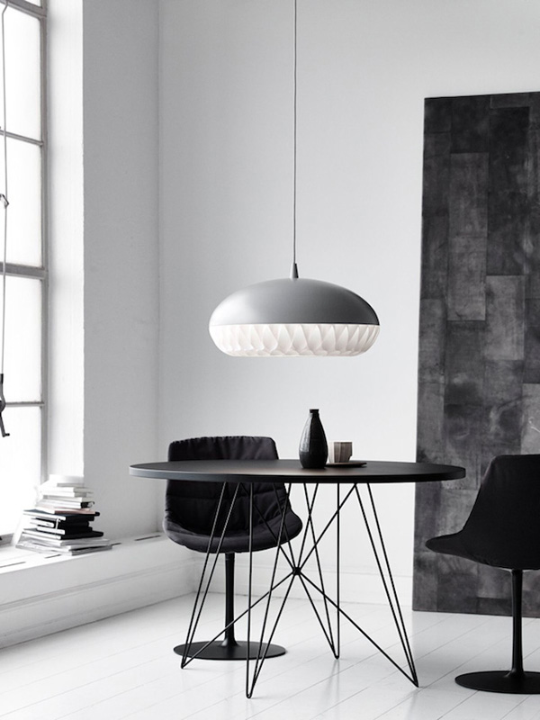
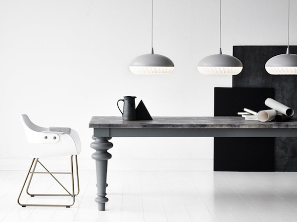
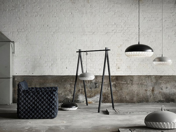
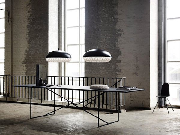
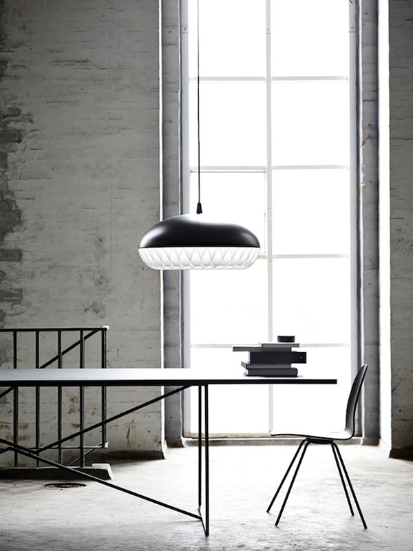
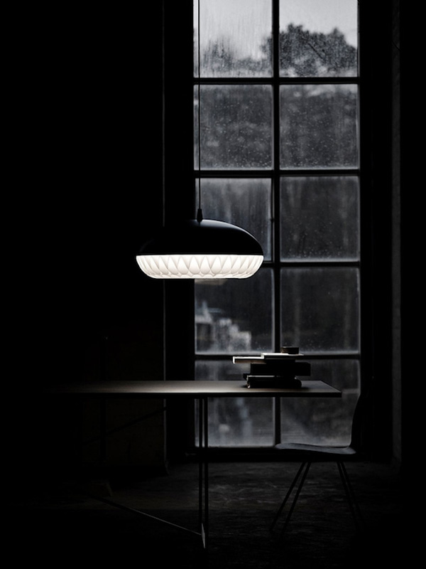
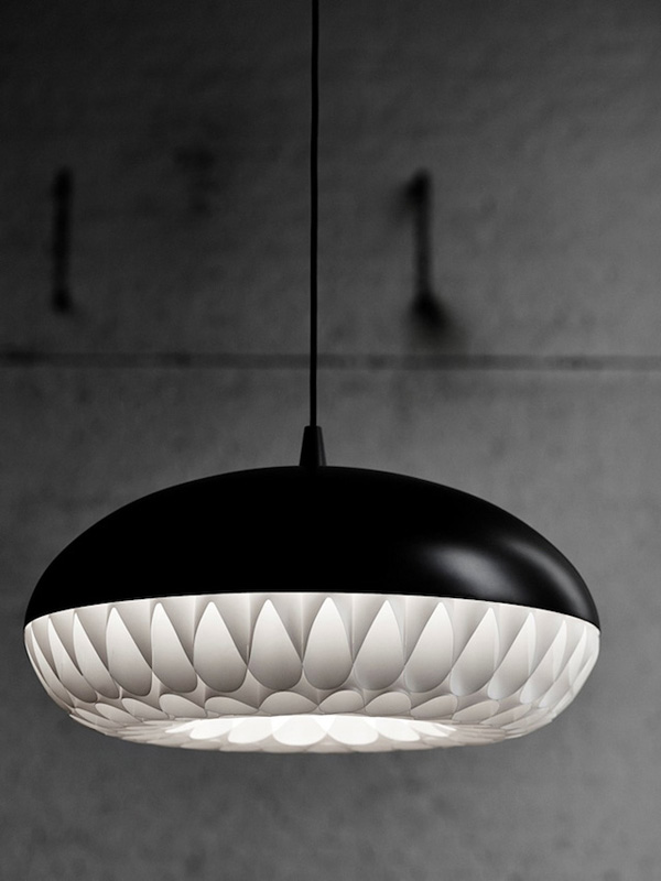
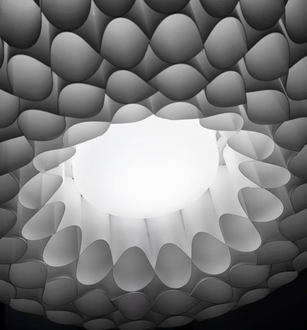
More Danish design indulgence today with Morten Voss’ Aeon Rocket pendant lamp.

The Danish designer loves to use innovative materials for his products and by combining metal and polypropylene his beautiful design takes full advantage of their luminous qualities. I’m smitten with his photography too.

Interestingly, Morten Voss used to be a surf dude and quite a decent boxer, but is heralded today as one of the spearheads of a new generation of Danish design talents introducing his innovative coffee table FlightDeck back in 1994.

His ambition is to create design that both challenges and moves the traditional preconceptions and at the same time appeals to our sense of humour and imagination.

He says,

“I do everything I can to break the normal rules within design; as a designer you have to introduce something new – or else there’s no reason to be a designer.”

Aeron-Rocket-Pendant-Lamp-5

Aeron-Rocket-Pendant-Lamp-3

Aeron-Rocket-Pendant-Lamp-2

Aeron-Rocket-Pendant-Lamp-1

Aeron-Rocket-Pendant-Lamp-6

Aeron-Rocket-Pendant-Lamp-7

Aeon Rocket, Pendant Lamp, Morton Voss, Lighting, Denmark, Danish Design

 
MORE INFORMATION & PHOTOGRAPHY | Morten Voss
 
Follow Stylejuicer with Bloglovin

DESIGN INSPIRATION | HOTEL TROFANA ALPIN BRANDING

21 February 2014

copyright-Trofana-Alpin-Branding-Rabensteiner01

I’ve confessed my love for Austrian design studio Bureau Rabensteiner previously when they took pride of place as my very first post almost a year ago.

It seems that every project they take on turns into a master class in branding and since winter is not quite over yet it seemed only right to feature their branding project for Hotel Trofana Alpin in Ischgl, a ski resort in the Tyrolean mountains.

The hotel is family owned and therefore represents the very foundation of the Von der Thannen family history. [Ops, I almost wrote Von Trapp there as I can’t help singing ‘The Hills Are Alive… ‘]

Projects for family businesses are always very personal and can be a bit tricky as passions run deep and opinions can turn heated. However Bureau Rabensteiner not only seems to have great client liaison skills but have managed to capture the Von der Thannen essence which is their “exemplary ability to balance tradition with modern convenience and understated luxury.”

I love the use of vintage ski photographs in combination with the rich, dark chocolate brown and silver as their colour palette. The handwritten style of the logo also hints back at those days when alpine skiing became popular and is topped discreetly by four stars. The brand is very tactile and the handmade ‘Do Not Disturb’ signs made from literally branded wooden discs are a cute detail.

Alpine charm with contemporary classiness at it’s best. Hands up who’s coming with me!?
 
copyright-Trofana-Alpin-Branding-Rabensteiner02

copyright-Trofana-Alpin-Branding-Rabensteiner03

copyright-Trofana-Alpin-Branding-Rabensteiner04

copyright-Trofana-Alpin-Branding-Rabensteiner05

copyright-Trofana-Alpin-Branding-Rabensteiner06

copyright-Trofana-Alpin-Branding-Rabensteiner07

copyright-Trofana-Alpin-Branding-Rabensteiner08

copyright-Trofana-Alpin-Branding-Rabensteiner09

copyright-Trofana-Alpin-Branding-Rabensteiner10

Design Inspiration, Branding, Hotel Trofana Alpin, Austria, Tyrol, Bureau Rabensteiner, Design Studio

 
MORE INFORMATION & PHOTOGRAPHY | Bureau Rabensteiner
 
Follow Stylejuicer with Bloglovin

INTERIORS CRUSH | LONDON LOFT DESIGN

20 February 2014

William-Tozer-Loft-in-London-01

Hey, that’s me! There at the desk! What you didn’t recognize me? Well, a girl can dream, can’t she. What a fabulous space for a home office!? I’m sure I’d produce much better work in such an environment or maybe I’d just get distracted stroking the beautiful cupboards and desk.

I love the fact that even though this is a big industrial loft in London’s East End architect William Tozer has managed to create intimate cosy spaces for the needs of a modern lifestyle. Artworks are deliberately placed and fit perfectly with the sourroundings. Where else would you be able to display a 2x2m painted street sign but in a space that’s reminscent of a gallery.

You’ve probably guessed but the home office is my favourite spot. It’s a great example of how in-built custom made furniture in sexy, smooth, dark wood and rough, exposed concrete can sit happily together creating a special atmosphere of luxury urban living.

Kitchen, dining and living area are all open-plan and expose more industrial details like pipework and open shelving. But the best bit has to be the panoramic views of the city and the wrap-around terrace connecting to the outside and the urban environment.

A proper Interiors Crush!

William-Tozer-Loft-in-London-02

William-Tozer-Loft-in-London-03

William-Tozer-Loft-in-London-05

William-Tozer-Loft-in-London-07

William-Tozer-Loft-in-London-06

William-Tozer-Loft-in-London-08

London Loft Design by William Tozer

 
MORE INFORMATION & PHOTOGRAPHY | William Tozer Architect
 
Follow Stylejuicer with Bloglovin

ZARA SS14 MINI COLLECTION

18 February 2014

Kids, Zara, Mini, Baby, Collection, Spring, SS14, Fashion

Isn’t the latest Zara SS14 Mini Collection adorable? I could go mad over those tiny little clothes and love the way blogging buddies Jantine Vaartjes and Vivian Hoebe, aka April & May have styled the shots.

I’ve featured Zara Kids on here before and was excited to hear of the collaboration between the two Dutch stylists and the Spanish fashion house. The collection is beautiful with soft greys, pinks and blues and I love the quirky cuddly toy people that go with it. The prints feature some modern graphic clouds and stars and as usual Zara take great care with their detailing, like buttons, pockets and ruche details.

It’s all just too cute for words and I might just have to sneak in another moodboard in the coming months to satisfy all the yummy-mummy readers.

 
MORE INFORMATION | Zara
PHOTOGRAPHY | James Stokes
STYLING | April & May
 
Follow Stylejuicer with Bloglovin

PARISIAN CHIC BY GILLES ET BOISSIER

Gilles-et-Boissier-Paris-interior-design-via-yatzer-07

Interior design duo Gilles et Boissier created this phenomenally beautiful apartment giving us a masterclass in contemporary Parisian Chic.

When the ‘bone structure’ of a place is so special it comes with great responsibility to create something extraordinary. It’s actually the designers Patrick Gilles and Dorothee Boissier’s own apartment and they managed to give a cool sophisticated air by keeping the colour palette neutral and letting the beautiful baroque period features and sheer dimensions speak for themselves.

I was first drawn to those fabulous herringbone floors in combination with the minimalist palette of mostly white, cream and black. Of course no Parisian apartment is complete without a touch of gold and the mix of antique mirrors and modern pieces of art and furniture gives this space the wow factor.

Magnifique!

 
Gilles-et-Boissier-Paris-interior-design-via-yatzer-02

Gilles-et-Boissier-Paris-interior-design-via-yatzer-01

Gilles-et-Boissier-Paris-interior-design-via-yatzer-09

Gilles-et-Boissier-Paris-interior-design-via-yatzer-06

Gilles-et-Boissier-Paris-interior-design-via-yatzer-08

Gilles-et-Boissier-Paris-interior-design-via-yatzer-03

Gilles-et-Boissier-Paris-interior-design-via-yatzer-05

Gilles et Boissier, Interior, Design, Paris, Chic, Ornate, Minimal

 
MORE INFORMATION | Gilles et Boissier
PHOTOGRAPHY VIA YATZER | Sisters Agency, Birgitta Wolfgang Drejer
 
Follow Stylejuicer with Bloglovin