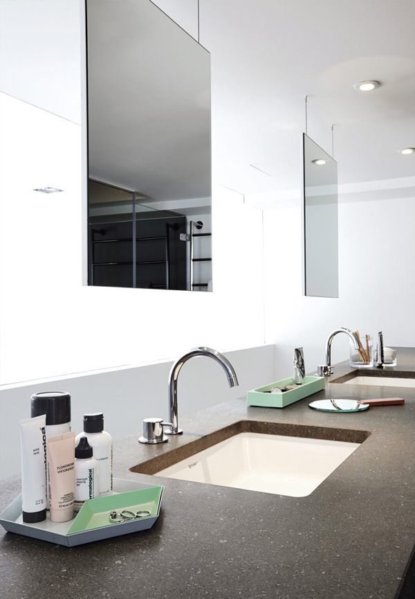
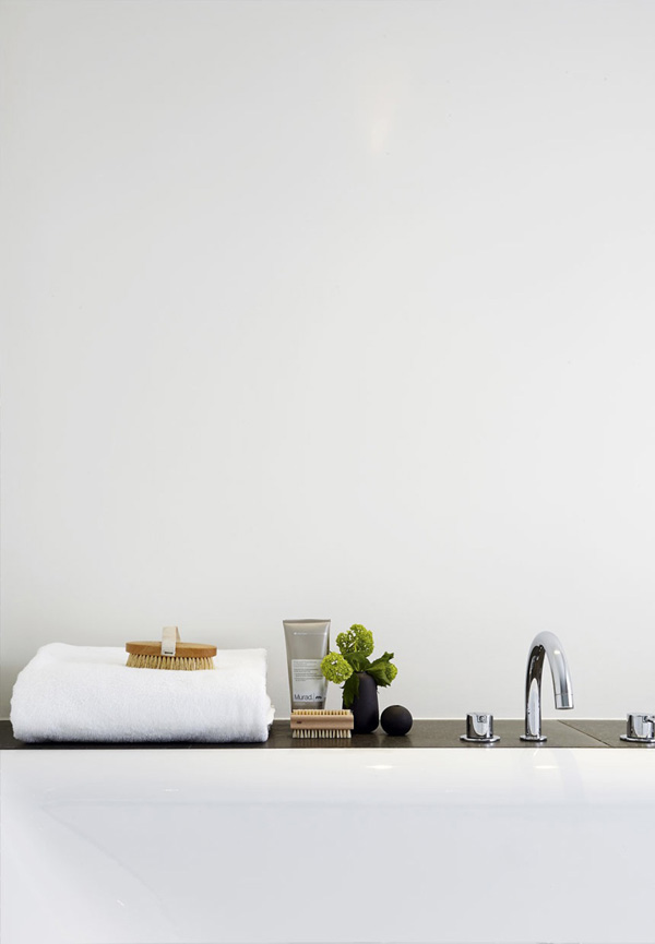
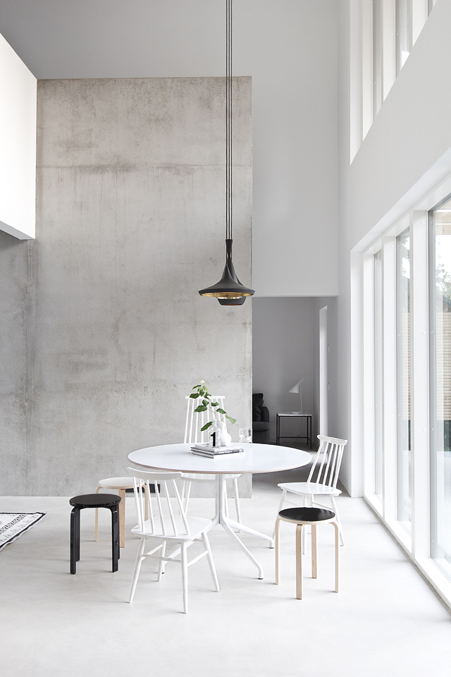
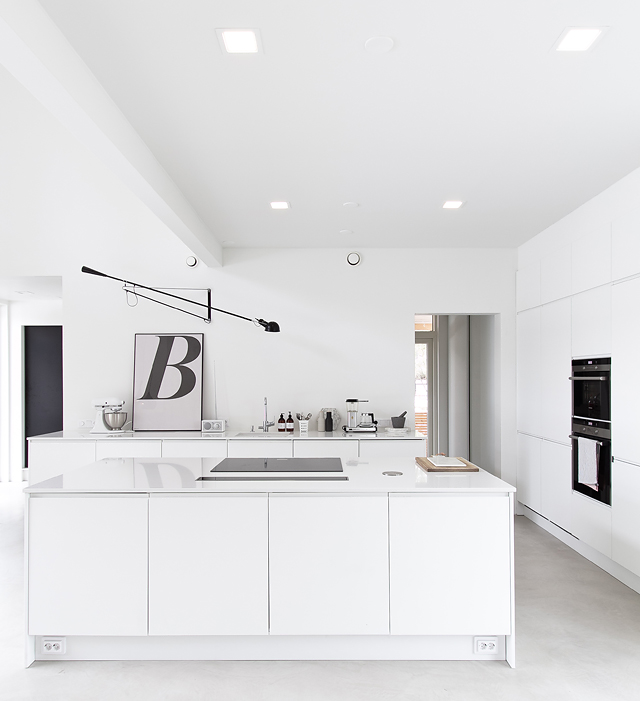
Tag Archives: light

TIMELESS BY REX KRALJ

5 February 2016

rex kralj, furniture brand, visual identity, slovenia, simplicity, nature, heritage, timeless, catalogue, craftmanship, details, light, look book, art direction, photography, Wendy van Woudenberg, Beeldsteil, Naomi, pretty unexpected, NU Interior Ontwerp, interior, style, trend, iconic, industrial design
 

I’m so excited to introduce you to furniture brand Rex Kralj and their new visual identity today. It’s a collaboration between some of my favourite photographers, designers and conceptual thinkers for a brand that is exceptional in it’s heritage and forward thinking.

Rex Kralj was founded by Niko Kralj in 1952 in Slovenia and has become known for it’s contribution to 20th century industrial design with pieces being exhibited in some of the worlds most renowned museums – MoMA, Designmuseum in Copenhagen, MAK Vienna, Pinakothek Munich and Museum for International Design in Prague.

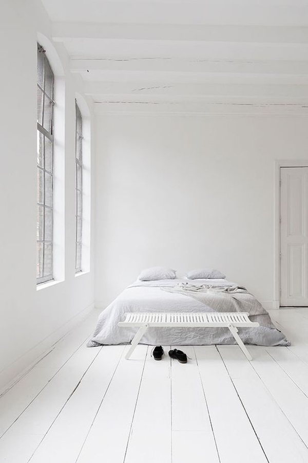
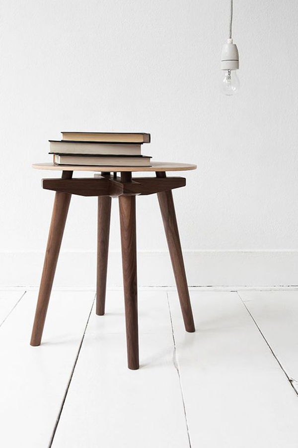
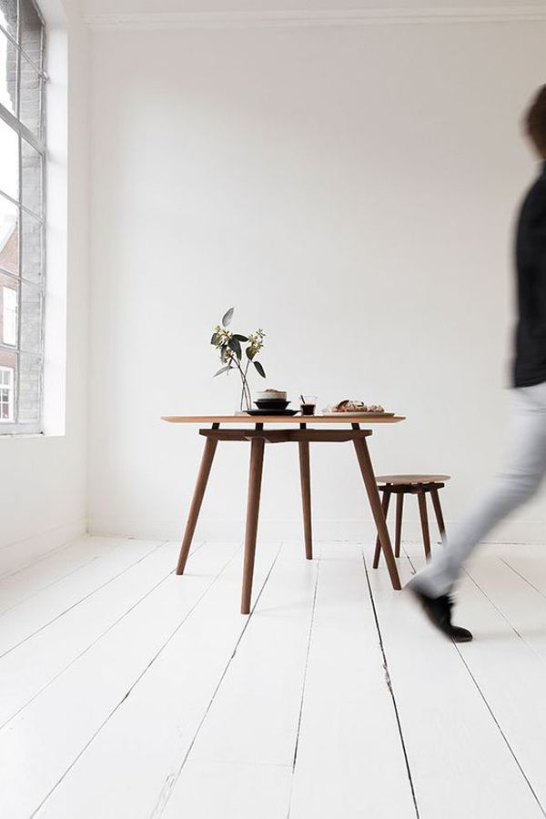
The key words for the new visual brand identity were ‘simplicity, nature, heritage, craftmanship, details and light’ according to NU Interior Ontwerp who came up with the theme of light and dark for the new catalogue called ‘Timeless’, referencing the future and heritage of the brand.

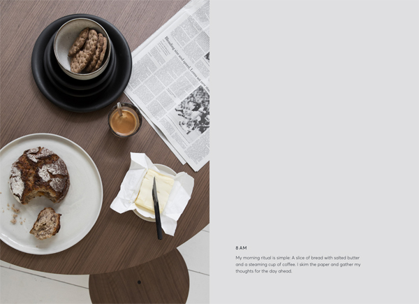
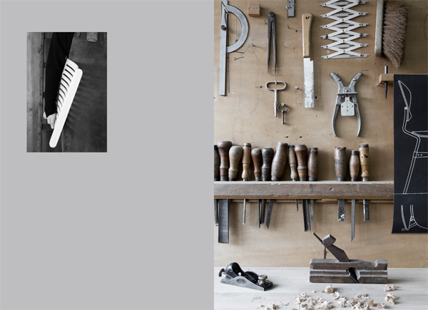
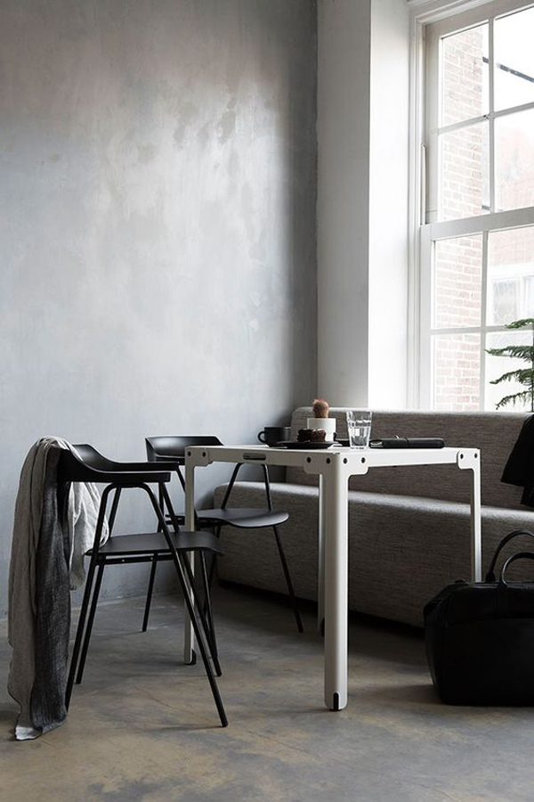
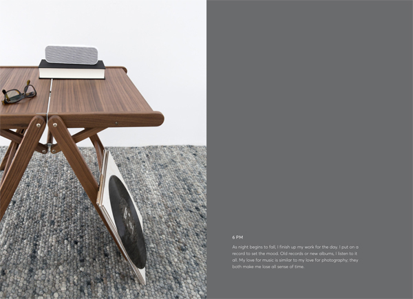
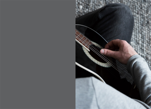
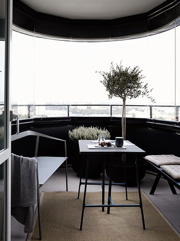
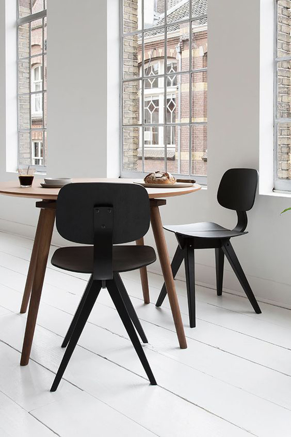
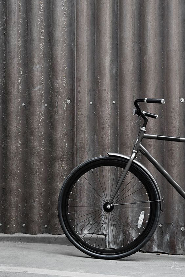
I love the simplicity and mood of the photography and looking forward to holding a printed copy in my hands. This is more like a lookbook or even picture book bringing the furniture to life and into play by narrating the story of an imaginary protagonist from morning / light to evening / dark. So subtle and oh so beautiful with minimal styling, sensitive art direction and crisp photography by Wendy van Woudenberg from Beeldsteil. Graphic designer Naomi from Pretty Unexpected put the layout together and you can see a PDF version of it if you register your email on the Rex Kralj website.

In the meantime enjoy these wonderful shots from their ‘Timeless’ catalogue.

 
rex kralj, furniture brand, visual identity, slovenia, simplicity, nature, heritage, timeless, catalogue, craftmanship, details, light, look book, art direction, photography, Wendy van Woudenberg, Beeldsteil, Naomi, pretty unexpected, NU Interior Ontwerp, interior, style, trend, iconic, industrial design

rex kralj, furniture brand, visual identity, slovenia, simplicity, nature, heritage, timeless, catalogue, craftmanship, details, light, look book, art direction, photography, Wendy van Woudenberg, Beeldsteil, Naomi, pretty unexpected, NU Interior Ontwerp, interior, style, trend, iconic, industrial design

rex kralj, furniture brand, visual identity, slovenia, simplicity, nature, heritage, timeless, catalogue, craftmanship, details, light, look book, art direction, photography, Wendy van Woudenberg, Beeldsteil, Naomi, pretty unexpected, NU Interior Ontwerp, interior, style, trend, iconic, industrial design

rex kralj, furniture brand, visual identity, slovenia, simplicity, nature, heritage, timeless, catalogue, craftmanship, details, light, look book, art direction, photography, Wendy van Woudenberg, Beeldsteil, Naomi, pretty unexpected, NU Interior Ontwerp, interior, style, trend, iconic, industrial design

rex kralj, furniture brand, visual identity, slovenia, simplicity, nature, heritage, timeless, catalogue, craftmanship, details, light, look book, art direction, photography, Wendy van Woudenberg, Beeldsteil, Naomi, pretty unexpected, NU Interior Ontwerp, interior, style, trend, iconic, industrial design

rex kralj, furniture brand, visual identity, slovenia, simplicity, nature, heritage, timeless, catalogue, craftmanship, details, light, look book, art direction, photography, Wendy van Woudenberg, Beeldsteil, Naomi, pretty unexpected, NU Interior Ontwerp, interior, style, trend, iconic, industrial design

rex kralj, furniture brand, visual identity, slovenia, simplicity, nature, heritage, timeless, catalogue, craftmanship, details, light, look book, art direction, photography, Wendy van Woudenberg, Beeldsteil, Naomi, pretty unexpected, NU Interior Ontwerp, interior, style, trend, iconic, industrial design

rex kralj, furniture brand, visual identity, slovenia, simplicity, nature, heritage, timeless, catalogue, craftmanship, details, light, look book, art direction, photography, Wendy van Woudenberg, Beeldsteil, Naomi, pretty unexpected, NU Interior Ontwerp, interior, style, trend, iconic, industrial design

rex kralj, furniture brand, visual identity, slovenia, simplicity, nature, heritage, timeless, catalogue, craftmanship, details, light, look book, art direction, photography, Wendy van Woudenberg, Beeldsteil, Naomi, pretty unexpected, NU Interior Ontwerp, interior, style, trend, iconic, industrial design

 
MORE INFORMATION | Rex Kralj
PHOTOGRAPHY | Wendy van Woudenberg, Beeldsteil
CONCEPT | Nu Interior Ontwerp
 
Follow Stylejuicer with Bloglovin

LOFT LOVE | THE PIPER BUILDING, LONDON

13 May 2015

loft love, london loft, dinesen floors, flooring, pine floor, wooden floor, double height, open plan, kitchen living dining area, work space, light, airy, dimensions, minimalist, custom made, quality, furniture, design classics, style, trend, interior design, decor, the piper building

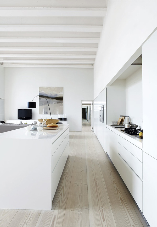
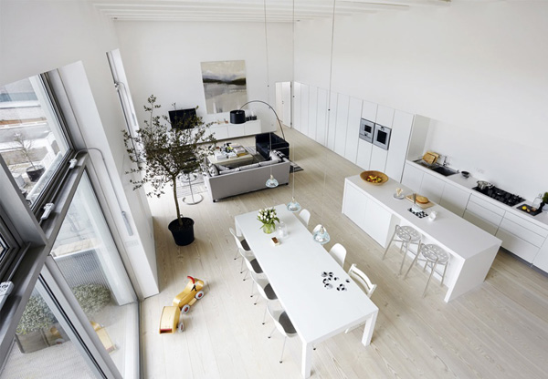
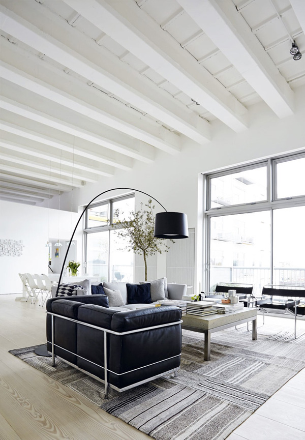
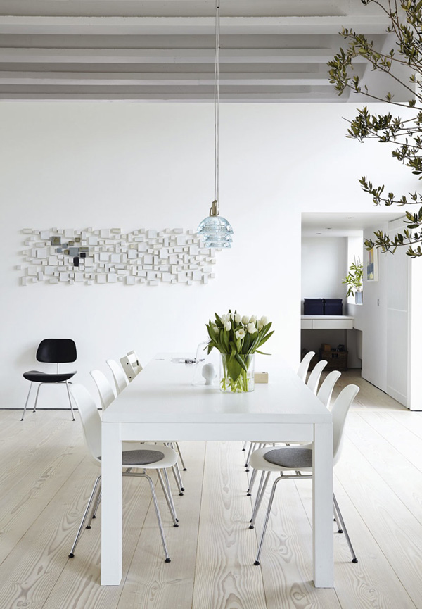
This loft in London’s Piper Building should really be sponsored by Dinesen as their floors come into their own in the 12m long open-plan kitchen/living/dining area. The uninterrupted floor lines and wide planks give the room grand dimensions and the large double-height windows flood the space with light.

When architectural elements are this strong you don’t want to clutter the space and take away from the drama so the couple have stuck to a minimalist theme with clean lines, custom-made and quality furniture with some design classics that will stand the test of time.

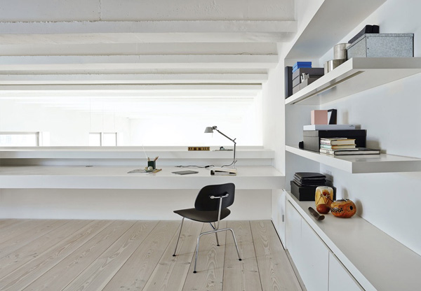
My favourite part has to be the work space overlooking the central kitchen/dining area. A perfect ‘control tower’ for working mums keeping an eye on little rascals racing up and down on their scooters.


loft love, london loft, dinesen floors, flooring, pine floor, wooden floor, double height, open plan, kitchen living dining area, work space, light, airy, dimensions, minimalist, custom made, quality, furniture, design classics, style, trend, interior design, decor, the piper building

loft love, london loft, dinesen floors, flooring, pine floor, wooden floor, double height, open plan, kitchen living dining area, work space, light, airy, dimensions, minimalist, custom made, quality, furniture, design classics, style, trend, interior design, decor, the piper building

loft love, london loft, dinesen floors, flooring, pine floor, wooden floor, double height, open plan, kitchen living dining area, work space, light, airy, dimensions, minimalist, custom made, quality, furniture, design classics, style, trend, interior design, decor, the piper building

loft love, london loft, dinesen floors, flooring, pine floor, wooden floor, double height, open plan, kitchen living dining area, work space, light, airy, dimensions, minimalist, custom made, quality, furniture, design classics, style, trend, interior design, decor, the piper building

loft love, london loft, dinesen floors, flooring, pine floor, wooden floor, double height, open plan, kitchen living dining area, work space, light, airy, dimensions, minimalist, custom made, quality, furniture, design classics, style, trend, interior design, decor, the piper building

loft love, london loft, dinesen floors, flooring, pine floor, wooden floor, double height, open plan, kitchen living dining area, work space, light, airy, dimensions, minimalist, custom made, quality, furniture, design classics, style, trend, interior design, decor, the piper building

loft love, london loft, dinesen floors, flooring, pine floor, wooden floor, double height, open plan, kitchen living dining area, work space, light, airy, dimensions, minimalist, custom made, quality, furniture, design classics, style, trend, interior design, decor, the piper building

loft love, london loft, dinesen floors, flooring, pine floor, wooden floor, double height, open plan, kitchen living dining area, work space, light, airy, dimensions, minimalist, custom made, quality, furniture, design classics, style, trend, interior design, decor, the piper building

loft love, london loft, dinesen floors, flooring, pine floor, wooden floor, double height, open plan, kitchen living dining area, work space, light, airy, dimensions, minimalist, custom made, quality, furniture, design classics, style, trend, interior design, decor, the piper building


PHOTOGRAPHY | Andreas Mikkel Hansen with thanks
 
Follow Stylejuicer with Bloglovin
BLOG CRUSH | MUSTA OVI

6 May 2015

blog crush, musta ovi, marja wickman, Finland, Finnish, art director, stylist, blogger, blog, minimalist, architecture, photography, diy, trend, style, light, bright, Scandinavian style, form and function

I’m a blog junkie. There I’ve said it. I’ve got my nerdy little folders on Bloglovin and there’s one for ‘most favourites’ so I don’t miss a breath of the folks whom I truly admire amongst all the other 100something blogs I follow.

It’s mostly the photography, style and aesthetics that get me day-dreaming and I usually follow them on Instagram and Pinterest too. Kind of a style stalker – maybe I should think about re-naming my blog, though I’m sure somebody has already bought the domain.

So, today I’m going to introduce you to one of my blog crushes: Marja Wickman. She’s a Finnish art director and has been documenting the renovation of her new home on Instagram as well as her blog Musta Ovi – which means ‘black door’ for all non-Finnish speakers. Whenever I need peace and calm I just hop over and delight in her stunningly minimalist home where even the smallest detail is considered and deliberately styled to fit in with the overall aesthetic.

I’m sure she and her partner eat pizza out of card board boxes and watch Netflix like the rest of us but it sure won’t get captured on camera. And why should it!? Marja is not saying that dishes don’t pile up in her kitchen at times she’s just choosing not to show that side to the world. Some might say that this heavily edited version of her life makes her unauthentic but I’d disagree. For me she’s actually very authentic in showing us what she’s truly passionate about which is architecture, DIY, minimalism, Scandinavian style and photography.

If you like minimalism you’ll love Musta Ovi.


blog crush, musta ovi, marja wickman, Finland, Finnish, art director, stylist, blogger, blog, minimalist, architecture, photography, diy, trend, style, light, bright, Scandinavian style, form and function

blog crush, musta ovi, marja wickman, Finland, Finnish, art director, stylist, blogger, blog, minimalist, architecture, photography, diy, trend, style, light, bright, Scandinavian style, form and function

blog crush, musta ovi, marja wickman, Finland, Finnish, art director, stylist, blogger, blog, minimalist, architecture, photography, diy, trend, style, light, bright, Scandinavian style, form and function

blog crush, musta ovi, marja wickman, Finland, Finnish, art director, stylist, blogger, blog, minimalist, architecture, photography, diy, trend, style, light, bright, Scandinavian style, form and function

blog crush, musta ovi, marja wickman, Finland, Finnish, art director, stylist, blogger, blog, minimalist, architecture, photography, diy, trend, style, light, bright, Scandinavian style, form and function

 
MORE INFORMATION & PHOTOGRAPHY | Marja Wickman | Musta Ovi with thanks
 
Follow Stylejuicer with Bloglovin
STUDIO ENVY | KATRIN BAATH

22 April 2015

sweden, swedish, Jönköpping, art director, stylist, katrin baath, skapha, studio envy, work space, homeware, brand, fashion, lifestyle, aesthetics, light, airy, vintage accents, sleek, modern, furniture, display cabinet, decor, trend, style, photography, sara Landstedt
I don’t even know where to begin gushing about this fabulous studio belonging to Swedish art director and stylist Katrin Bååth who coincidentally was part of the duo that shot Monday’s post about Swedish homeware brand Skapha.
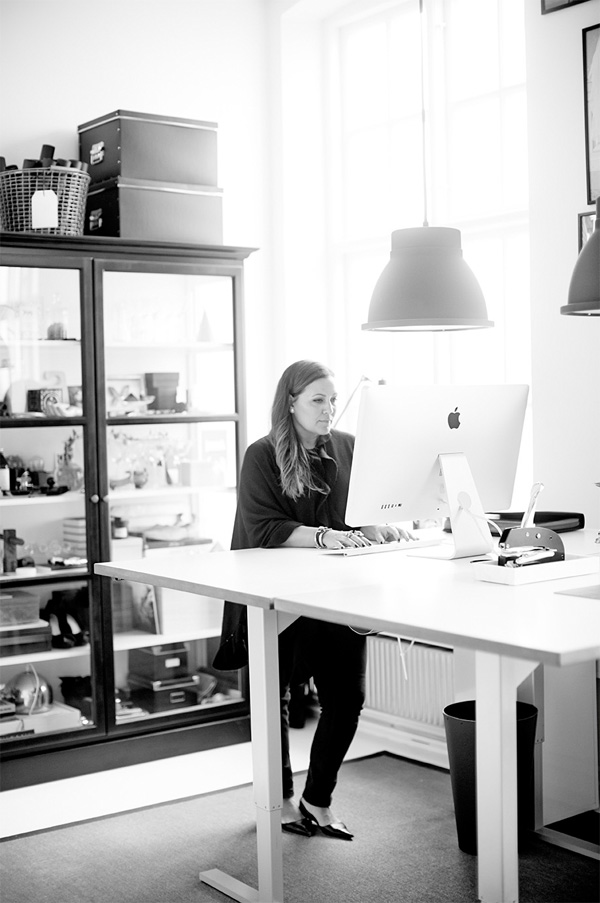
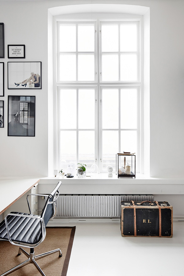
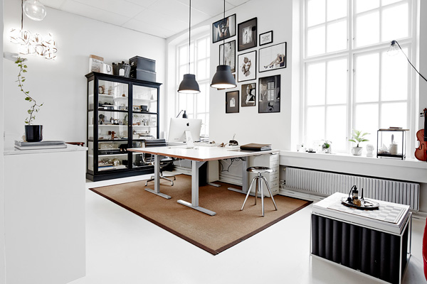
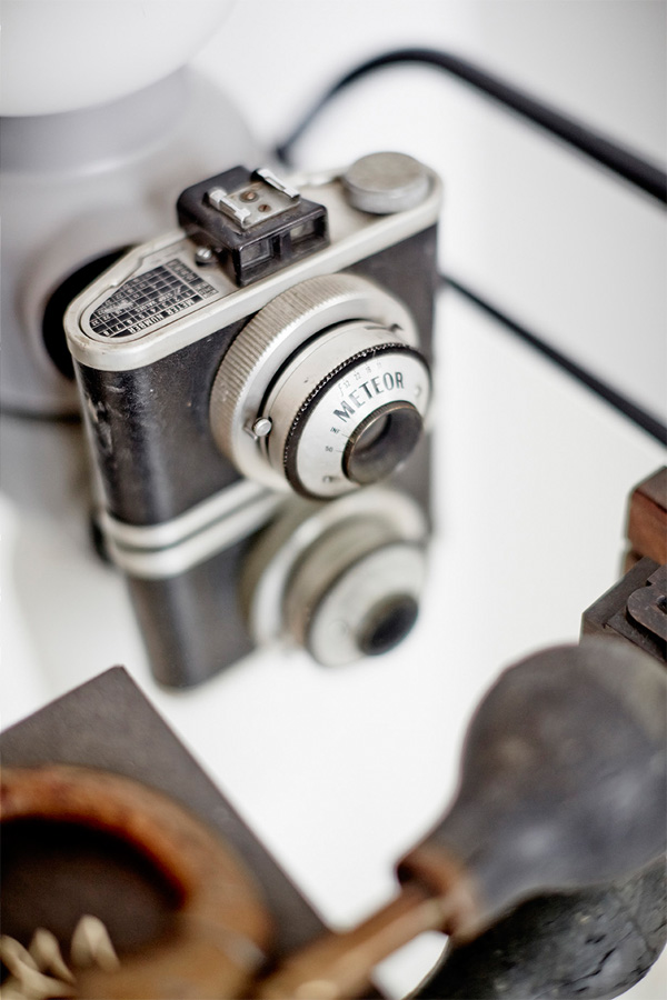
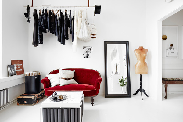
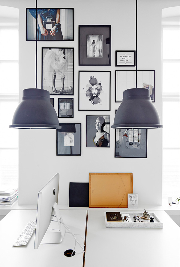
Another Jönköpping resident her work for mostly fashion and lifestyle brands is clean and classy and her studio reflects her professional aesthetics. A light and airy space in what looks like an old period building with high ceilings and large windows she’s kept the space mostly white with a few vintage accents mixed with sleek, modern and functional furniture.

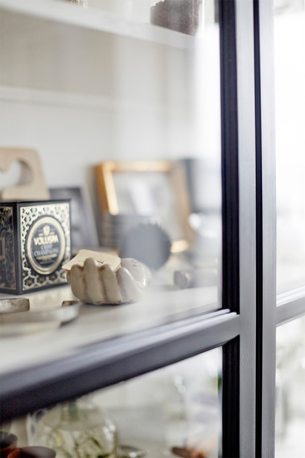
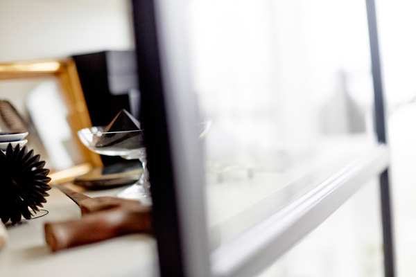
My favourite piece has to be her black display cabinet which makes me feel like a kid in a sweet shop. So many gorgeous things to look at and no sticky hands in sight!

Enjoy the fabulous photography by Sara Landstedt and I’m sorry if I’ve inflicted studio envy!


sweden, swedish, Jönköpping, art director, stylist, katrin baath, skapha, studio envy, work space, homeware, brand, fashion, lifestyle, aesthetics, light, airy, vintage accents, sleek, modern, furniture, display cabinet, decor, trend, style, photography, sara Landstedt

sweden, swedish, Jönköpping, art director, stylist, katrin baath, skapha, studio envy, work space, homeware, brand, fashion, lifestyle, aesthetics, light, airy, vintage accents, sleek, modern, furniture, display cabinet, decor, trend, style, photography, sara Landstedt

sweden, swedish, Jönköpping, art director, stylist, katrin baath, skapha, studio envy, work space, homeware, brand, fashion, lifestyle, aesthetics, light, airy, vintage accents, sleek, modern, furniture, display cabinet, decor, trend, style, photography, sara Landstedt

sweden, swedish, Jönköpping, art director, stylist, katrin baath, skapha, studio envy, work space, homeware, brand, fashion, lifestyle, aesthetics, light, airy, vintage accents, sleek, modern, furniture, display cabinet, decor, trend, style, photography, sara Landstedt

sweden, swedish, Jönköpping, art director, stylist, katrin baath, skapha, studio envy, work space, homeware, brand, fashion, lifestyle, aesthetics, light, airy, vintage accents, sleek, modern, furniture, display cabinet, decor, trend, style, photography, sara Landstedt

sweden, swedish, Jönköpping, art director, stylist, katrin baath, skapha, studio envy, work space, homeware, brand, fashion, lifestyle, aesthetics, light, airy, vintage accents, sleek, modern, furniture, display cabinet, decor, trend, style, photography, sara Landstedt

sweden, swedish, Jönköpping, art director, stylist, katrin baath, skapha, studio envy, work space, homeware, brand, fashion, lifestyle, aesthetics, light, airy, vintage accents, sleek, modern, furniture, display cabinet, decor, trend, style, photography, sara Landstedt

sweden, swedish, Jönköpping, art director, stylist, katrin baath, skapha, studio envy, work space, homeware, brand, fashion, lifestyle, aesthetics, light, airy, vintage accents, sleek, modern, furniture, display cabinet, decor, trend, style, photography, sara Landstedt

sweden, swedish, Jönköpping, art director, stylist, katrin baath, skapha, studio envy, work space, homeware, brand, fashion, lifestyle, aesthetics, light, airy, vintage accents, sleek, modern, furniture, display cabinet, decor, trend, style, photography, sara Landstedt


MORE INFORMATION | Katrin Bååth
PHOTOGRAPHY | Sara Landstedt with thanks

INTERIORS CRUSH | PERFECT COLOUR PALETTE

15 April 2015

Perfect-Colour-Palette-via-Hitta-Hem-01

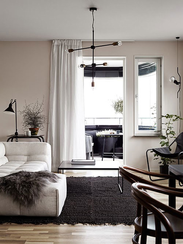
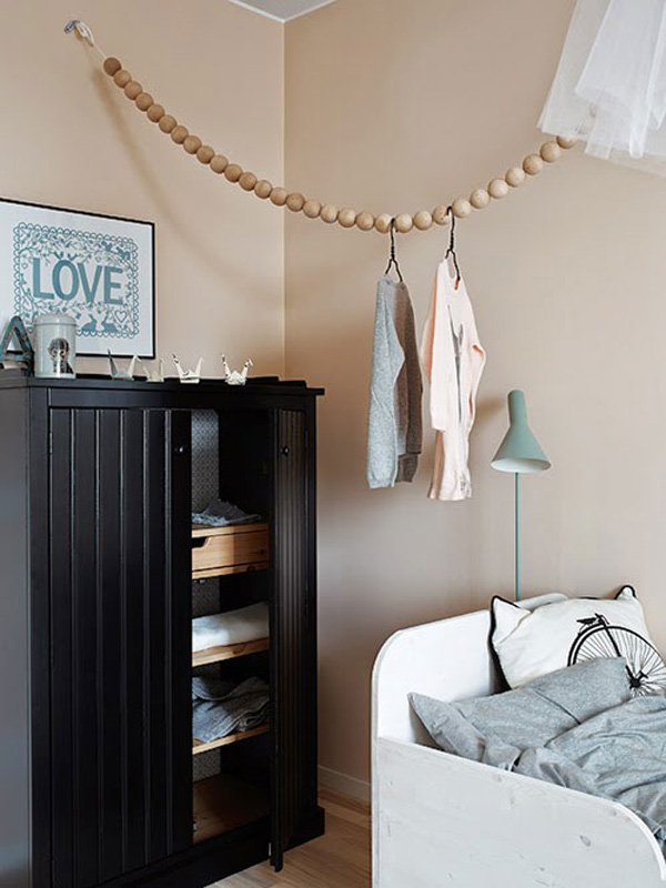
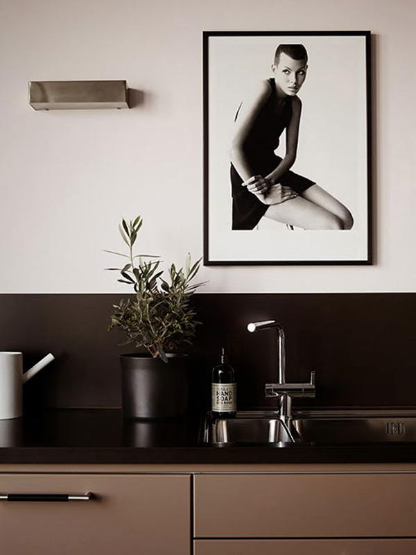
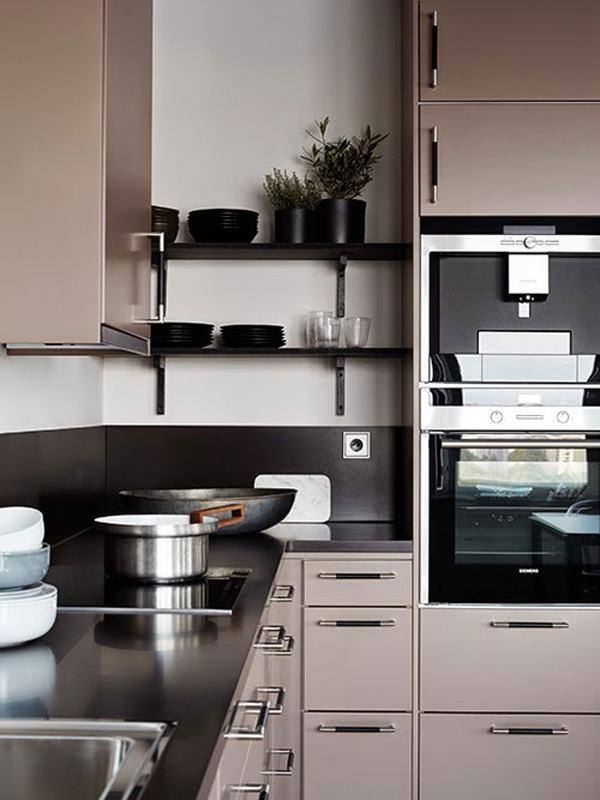
I’ve written about the trend for nude colours and pastel shades on here before and this gorgeous Swedish city apartment fits right into my current obsession with this perfect colour palette.

It’s no secret that I’m not a huge fan of the use of lots of colour in the home, at least if it’s not counter balanced with neutrals, preferably white, but I do like soft tones like nudes, chalky blues and greens, greys and brown shades and especially contrasts.

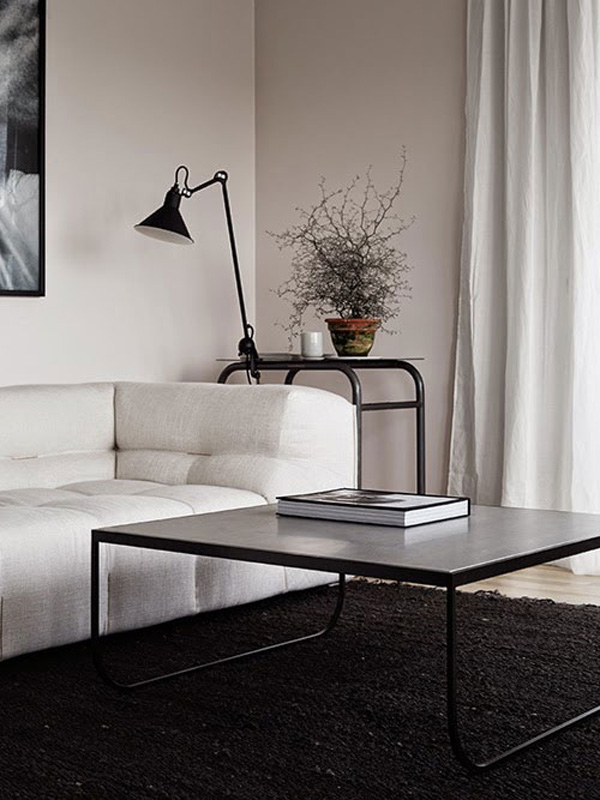
Dark and light, black and white, rough and smooth, old and new – for me it creates pace, an interest for the eye and this apartment has plenty of it.

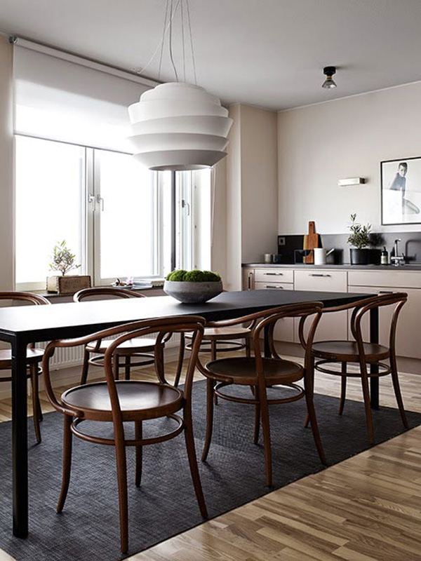
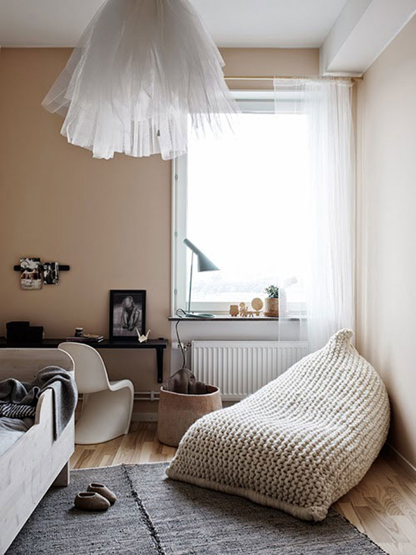
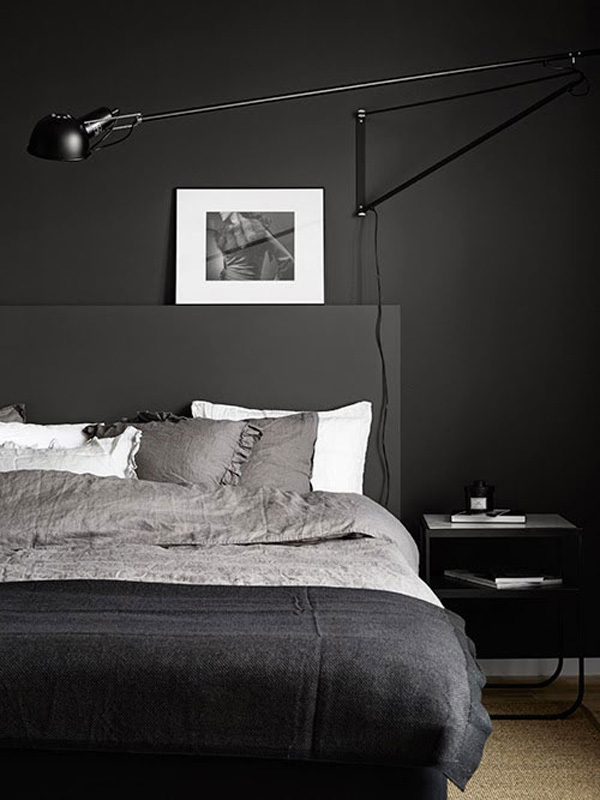
Be it the vintage Bistro chairs paired with a sleek black dining table, the dark grey bedroom with white accents in the skirting, pillows and wall art or the knitted beanbag and tulle lamp shade in the kids bedroom. There are subtle contrasts everywhere which makes for an enjoyable viewing.

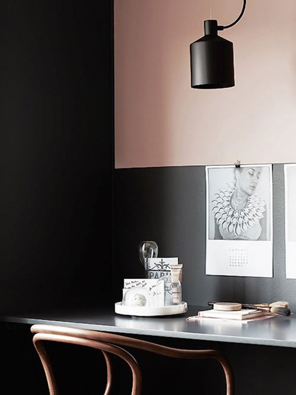
And I just LOVE the pale pink and dark grey desk space – smooth, sexy and cool. All styled by the talented duo that is Pella Hedeby and Marie Ramse. Mwah!
 

Perfect-Colour-Palette-via-Hitta-Hem-02

Perfect-Colour-Palette-via-Hitta-Hem-03

Perfect-Colour-Palette-via-Hitta-Hem-04

Perfect-Colour-Palette-via-Hitta-Hem-05

Perfect-Colour-Palette-via-Hitta-Hem-06

Perfect-Colour-Palette-via-Hitta-Hem-07

Perfect-Colour-Palette-via-Hitta-Hem-08

Perfect-Colour-Palette-via-Hitta-Hem-09

Perfect-Colour-Palette-via-Hitta-Hem-10

 
STYLING | Pella Hedeby & Marie Ramse
PHOTOGRAPHY | Kristofer Johnsson
 
Follow Stylejuicer with Bloglovin