
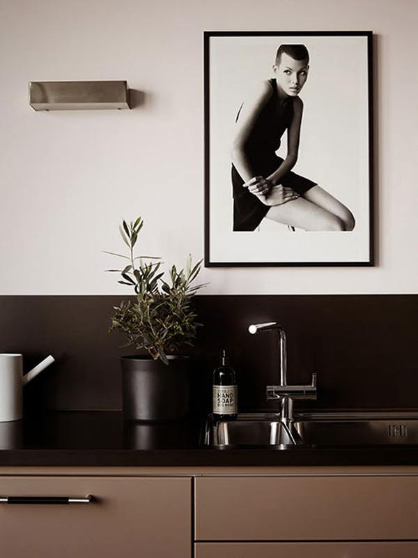
I’ve written about the trend for nude colours and pastel shades on here before and this gorgeous Swedish city apartment fits right into my current obsession with this perfect colour palette.
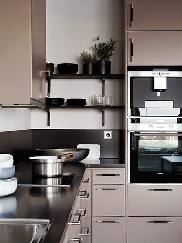
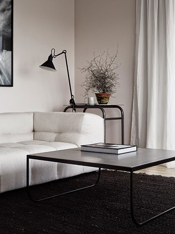
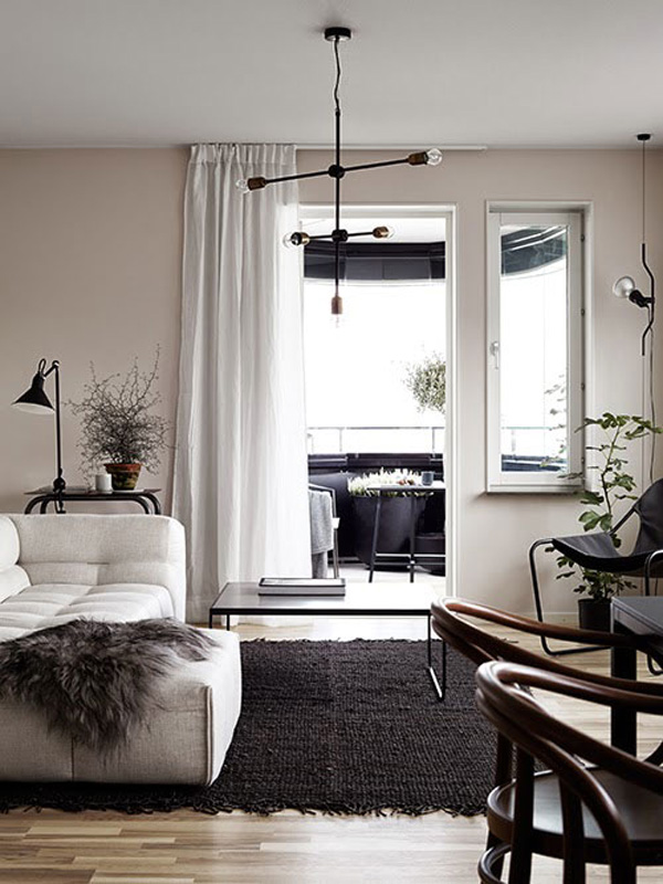
It’s no secret that I’m not a huge fan of the use of lots of colour in the home, at least if it’s not counter balanced with neutrals, preferably white, but I do like soft tones like nudes, chalky blues and greens, greys and brown shades and especially contrasts.
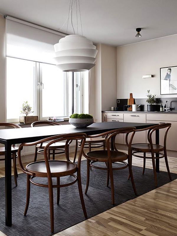
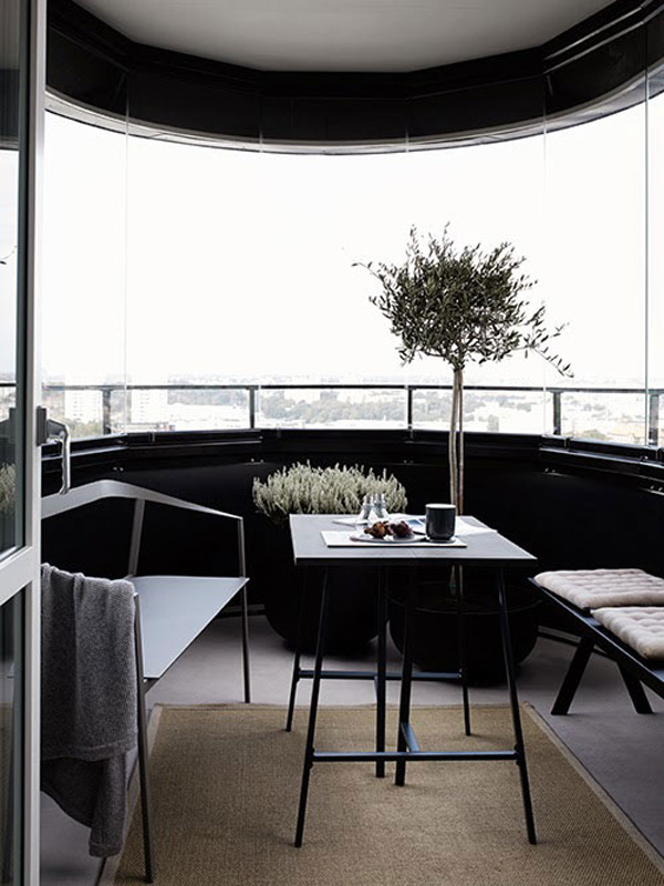
Dark and light, black and white, rough and smooth, old and new – for me it creates pace, an interest for the eye and this apartment has plenty of it.
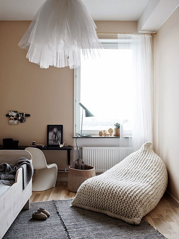
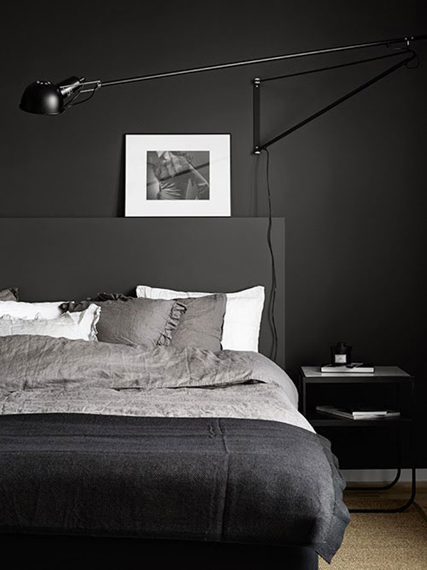
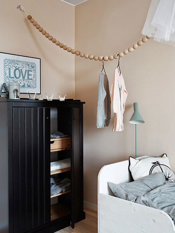
Be it the vintage Bistro chairs paired with a sleek black dining table, the dark grey bedroom with white accents in the skirting, pillows and wall art or the knitted beanbag and tulle lamp shade in the kids bedroom. There are subtle contrasts everywhere which makes for an enjoyable viewing.
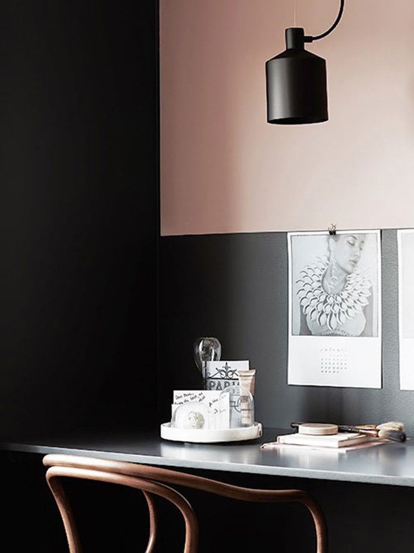
And I just LOVE the pale pink and dark grey desk space – smooth, sexy and cool. All styled by the talented duo that is Pella Hedeby and Marie Ramse. Mwah!
STYLING | Pella Hedeby & Marie Ramse
PHOTOGRAPHY | Kristofer Johnsson
Follow Stylejuicer with Bloglovin