Tag Archives: Home

COOL STUFF | EASTER BY FERM LIVING

15 April 2014

ferm-LIVING-Easter-2014-via-Stylejuicer-03

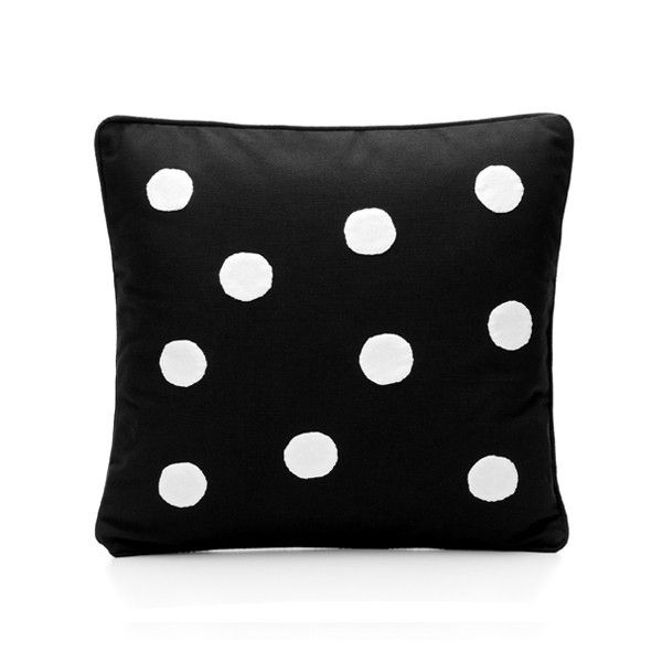
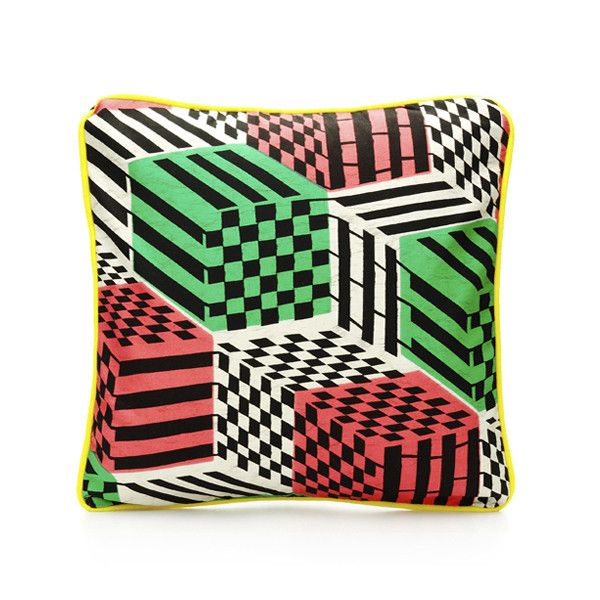
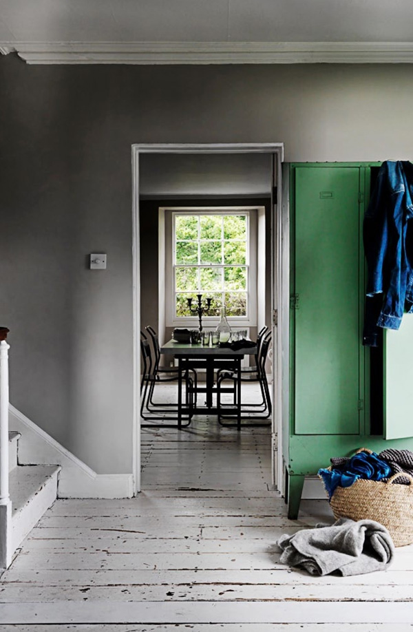
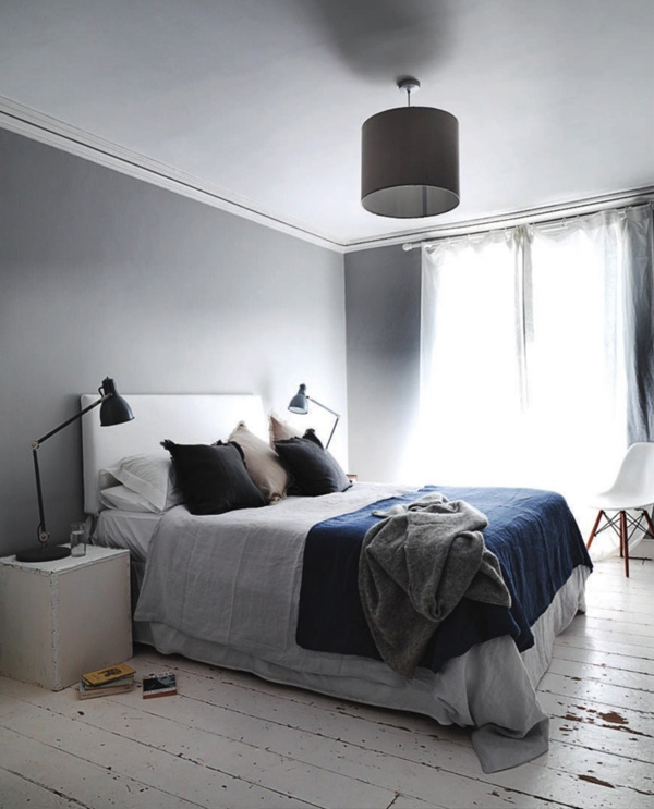
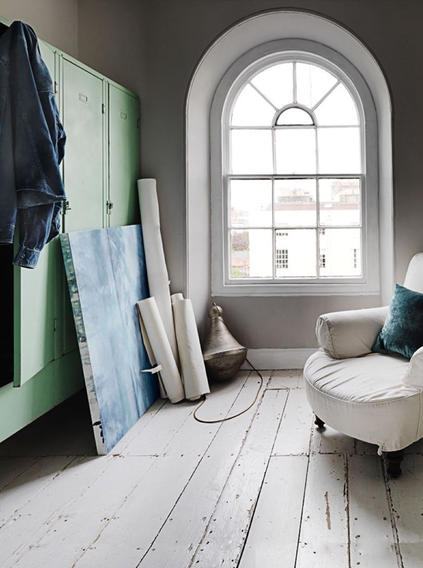
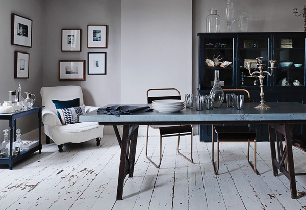
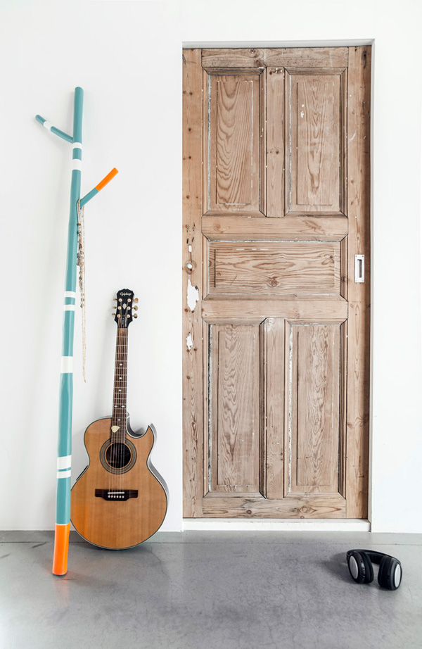
I’ve long been a fan of Danish home decor & accessories company ferm Living and have an unexplained affinity with founder and owner Trine Andersen. Read my previous post here.

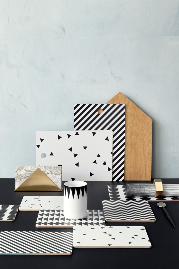
Maybe because she’s a graphic designer like me or maybe because she takes everyday life as inspiration for her products or maybe it’s just all clever marketing and I shouldn’t be so bloomin’ naive as the cowboy would tell me. But still… I can’t help but being drawn to ferm’s Scandinavian design traditions and retro charm and their distinctive graphic edge.

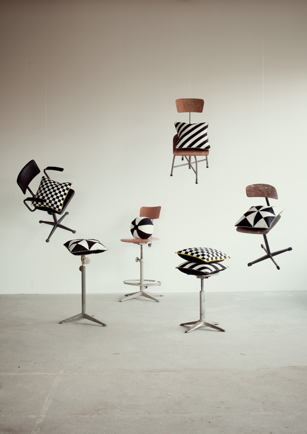
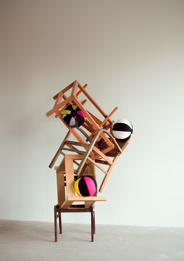
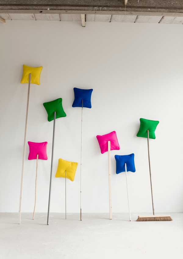
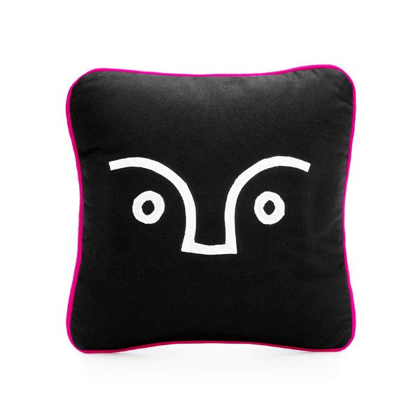
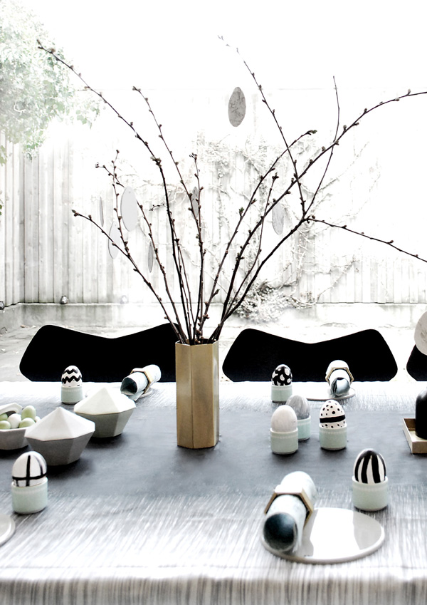
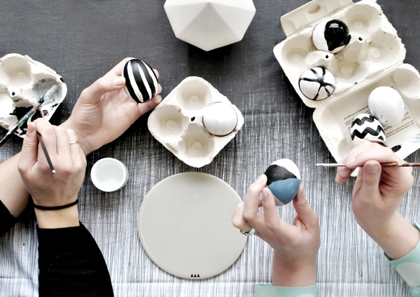
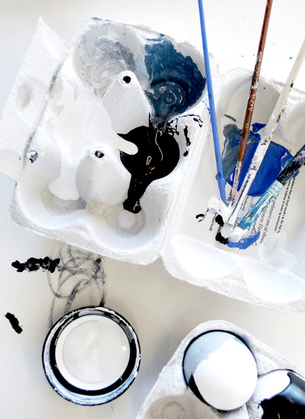
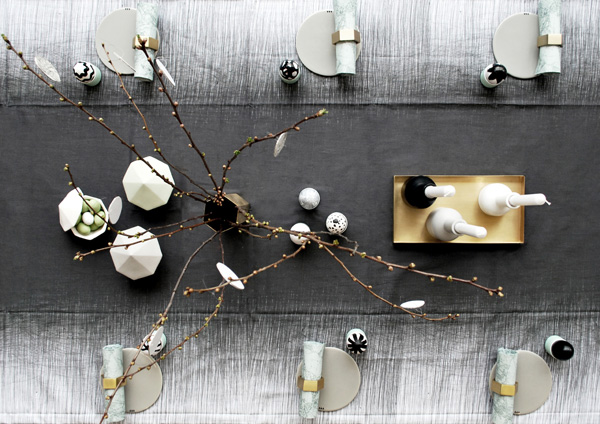
Now, since we’re about to embark on copious amounts of chocolate bunnies and eggs I’d like to share ferm Living’s playful take on Easter with you today. I love the way they’ve styled the photos and incorporated some old school egg painting. I bet that was a fun shoot taking the models back to their childhoods.

You can see more in their online magazine and shop the collection on their website.


ferm-LIVING-Easter-2014-via-Stylejuicer-02

ferm-LIVING-Easter-2014-via-Stylejuicer-01

ferm-LIVING-Easter-2014-via-Stylejuicer-04

Ferm Living, Easter, Decor, Decoration, Interior, Home, Accessories, Entertaining, Egg, Painting, Denmark

 
MORE INFORMATION & PHOTOGRAPHY | ferm Living
 
Follow Stylejuicer with Bloglovin

INTERIORS CRUSH | AMSTERDAM WAREHOUSE

7 April 2014

Amsterdam-Warehouse-via-Milk-Magazine-08

Hello to you! Did you all have a nice weekend? It seems ages that I shared an Interiors Crush with you so today’s feature is extra special. There are of course many, many gorgeous lofts out there – remember the London loft or the one in Barcelona I recently featured?

Hold on to your hats as today’s original Amsterdam warehouse is particularly impressive with it’s boho industrial vibe beautifully captured by Louise Desrosiers.

The space centres around an unusual enclosed patio garden from which light filters into the rest of the house through huge industrial style windows. A ginormous exposed brick wall sets the tone for the mix-and-match interior with antiques and flea market finds giving a relaxed atmosphere.

The colour palette is all earthy with emphasis on natural textures like rough, old wood, animal hides and weathered metal. Interestingly, there are no pops of colour, hardly any painted surfaces and no bling to speak of with the only concession being the polished concrete floor. A totally harmonious space, befitting of the arty Jordaan neighbourhood where Rembrandt spent the last few years of his life.

I’m rather envious of the owners work/life set up as interior designer Marius runs his business Flow from one side of the building while wife Emily designs beautiful organic kids clothes for Gray Label in her studio on the other side. I imagine they romantically meet for lunch on the patio or in the open-plan kitchen under the impressive black clay chandelier, handmade in Africa, to share a spot of organic goodies. *Sigh*

I bet the kids are having a ball in this space chasing each other, bike racing and hiding in their tipee.

Amsterdam-Warehouse-via-Milk-Magazine-02

Amsterdam-Warehouse-via-Milk-Magazine-07

Amsterdam-Warehouse-via-Milk-Magazine-03

Amsterdam-Warehouse-via-Milk-Magazine-04

Amsterdam-Warehouse-via-Milk-Magazine-01

Amsterdam-Warehouse-via-Milk-Magazine-06

Amsterdam, Warehouse, Family, Home, Exposed Brickwork, Chandelier, Bohemian, Industrial, Interior Design, Architecture, Statement, Loft

 
MORE INFORMATION | Flow & Gray Label
VIA | Milk Magazine
PHOTOGRAPHY | Louise Desrosiers
 
Follow Stylejuicer with Bloglovin

COOL STUFF | SCENERYLABEL ACCESSORIES

2 April 2014

Africa, 80s, Bold, Graphic, Pattern, Beth Oladipo, Scenerylabel, Home, Fashion, Accessories, Dutch, Inspiration, Cool Stuff

Happy Tuesday y’all and let’s continue with some 80s inspired living.

Equally bold and graphic as yesterday’s interior stylist Susanna Vento, it’s fashion and home accessories by Dutch brand SCENERYLABEL today. To be truthful to owner and creator Beth Oladipo her designs are mainly inspired by the crafts and cultures of tropical lands. Think Central and West Africa with a hint of 80s art and music, bold pops of colour, dynamic vintage prints and lots of black and white patterning and before you know it you’ll be humming Toto’s Africa (my god, I love that song!).

Beth was brought up in a theatrical household and watched her mother make all manner of props and costumes from scraps of fabrics and wire coat hangers which initiated her own creative journey. Starting with an illustration degree in London, on to window dressing and styling for magazines, to designing prints for fashion and finally starting her own label in 2011.

Her attention to detail is outstanding and every product is meticulously hand-made. She uses a mix of techniques like genuine wax batik, patchwork, embroidery and applique that make every piece totally unique.

I was taken by Giorgos Gripeos creative photography that sums up the point of her accessories which is to serve as zingy, imaginative and inspiring props for everyday life and a stance against our homes becoming too bland.

Scenerylabel-Amsterdam-via-Stylejuicer02

Scenerylabel-Amsterdam-via-Stylejuicer01

Scenerylabel-Amsterdam-via-Stylejuicer04

Scenerylabel-Amsterdam-via-Stylejuicer12

Scenerylabel-Amsterdam-via-Stylejuicer07

Scenerylabel-Amsterdam-via-Stylejuicer13

Scenerylabel-Amsterdam-via-Stylejuicer09

Africa, 80s, Bold, Graphic, Pattern, Beth Oladipo, Scenerylabel, Home, Fashion, Accessories, Dutch, Inspiration, Cool Stuff

 
MORE INFORMATION | Scenerylabel
PHOTOGRAPHY | Giorgos Gripeos (lifestyle) & Maarten Wouters (product shots)
 
Follow Stylejuicer with Bloglovin

INTERIORS CRUSH | ELEGANT INTERIOR DESIGN IN BRISTOL

12 March 2014

Gabrielle-Blackman-Bristol-Home-via-ElleDeco-06

This is the home of Gabrielle Blackman, UK TV presenter on DIY SOS and interior designer. For her period home in Bristol she chose to combine a raw, almost unfinished look with some elegant pieces of furniture in accent colours like the gorgeous mustard yellow sofa and chair.

A dominant feature is the deliberately roughly painted white wooden floor reflecting light and giving it a real arty bohemian studio feel. I almost expect to see an easel surrounded by pots of paint and a muse lounging on one of those inviting period armchairs.

Her soft colour palette of different shades of grey is complimented by vintage furniture and flea market finds, some of which are painted (never perfectly) in complimenting colours like navy and green. Her decorating solution suits the period style of the property perfectly and her elegant interior design makes the space feel much loved and lived-in. A lovely bohemian family home.

Gabrielle-Blackman-Bristol-Home-via-ElleDeco-07

Gabrielle-Blackman-Bristol-Home-via-ElleDeco-05

Gabrielle-Blackman-Bristol-Home-via-ElleDeco-04

Gabrielle-Blackman-Bristol-Home-via-ElleDeco-03

Gabrielle-Blackman-Bristol-Home-via-ElleDeco-02

Rustic, Elegance, Vintage, Bristol, Home, Gabrielle Blackman, TV Presenter, Interior Design, Shabby Chic, Elegant

 
MORE INFORMATION | Gabrielle Blackman
PHOTOGRAPHY | Michael Paul
 
Follow Stylejuicer with Bloglovin

COOL STUFF | HK LIVING 2014

6 March 2014

HKLIVING-via-Stylejuicer07

Happy Thursday peeps! How are you? My week has just gone crazy. I’m working on a catalogue for a client with print deadlines approaching fast and still soooo much to do. Think I’ll be working all weekend. The life of a designer, eh!? Nevertheless, the sunny weather and warmer temperatures are giving me a spring in my step and when I came across HK Living I just knew I had to share their products with you. The photography is quite masculine which I really don’t mind as there’s also a great hidden sense of humour! Bold, tough and cool I feel the collection is a bit like a big burly guy who’s a total softie on the inside. I should know, I’ve dated a few of them in my time.

HK Living was founded in the Netherlands in 2009 and their Dutch aesthetic shows through in the purity and originality of the items they design and develop. The main focus for their current collection was the addition of trendy colours as well as giving a more contemporary look.

They are cool and tough items inspired by the past and given an eclectic twist.

I love the shabby chic metal furniture and the teak bar stools with neon ‘feet’ – a neat little twist to set them apart from the mainstream.

More Dutch design coming up next week. Stay tuned!

 
HKLIVING-via-Stylejuicer06

HKLIVING-via-Stylejuicer02

HKLIVING-via-Stylejuicer03

HKLIVING-via-Stylejuicer09

HKLIVING-via-Stylejuicer13

HKLIVING-via-Stylejuicer10

HKLIVING-via-Stylejuicer12

HKLIVING-via-Stylejuicer04

HKLIVING-via-Stylejuicer14

HKLIVING-via-Stylejuicer15

Netherlands, Living, Home, Decor, Furniture, Lighting, Textile, Accessories, HK, Catalogue, 2014, Eclectic, Online Shop

 
MORE INFORMATION & PHOTOGRAPHY | HK Living
 
Follow Stylejuicer with Bloglovin