Tag Archives: Fashion

TOAST UK AW14 | BLACK SAND AND ICE

12 November 2014

toast uk, AW14, campaign, collection, fabrics, textures, fashion, design, brand, label, nick seaton, iceland, black sand, ice, sophisticated, calm, alina skirt, silk ikat scarf, tall spats boot, madli cropped sweater, geir coat, ritte top, refelective, trend, mood, look book, photography, styling

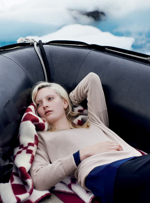
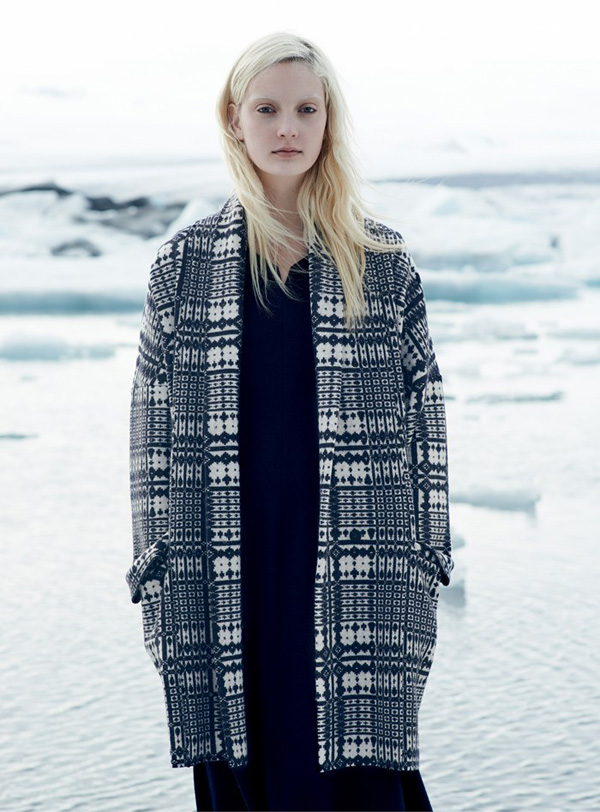
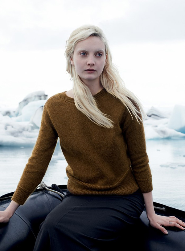
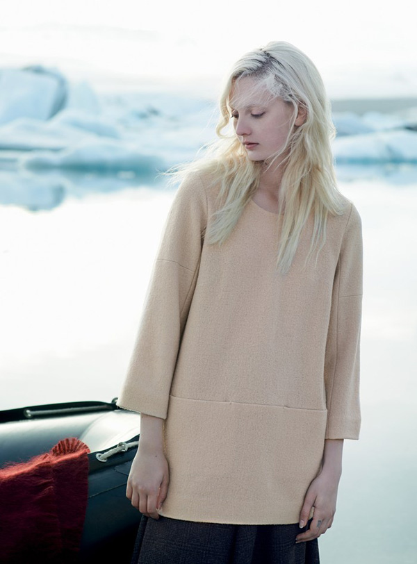
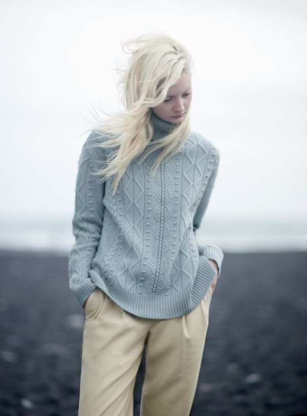
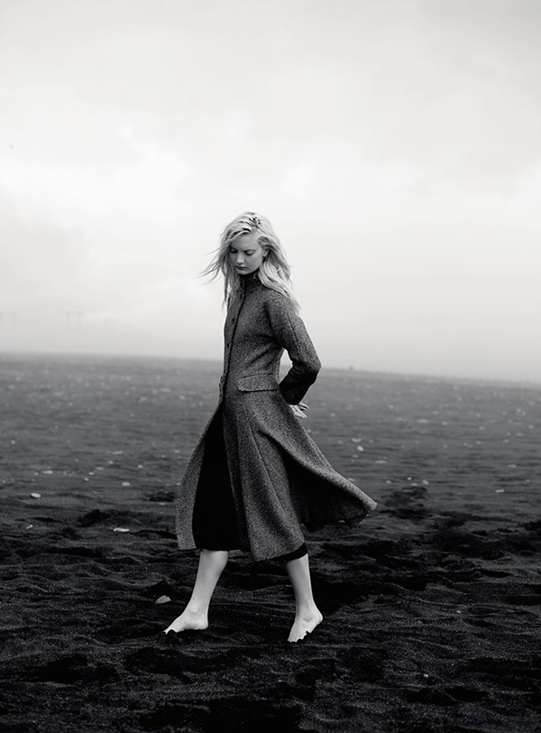
Toast UK have done it again for me this AW! I’m just drooling over their latest photo series shot in Iceland and titled ‘black sand and ice’.

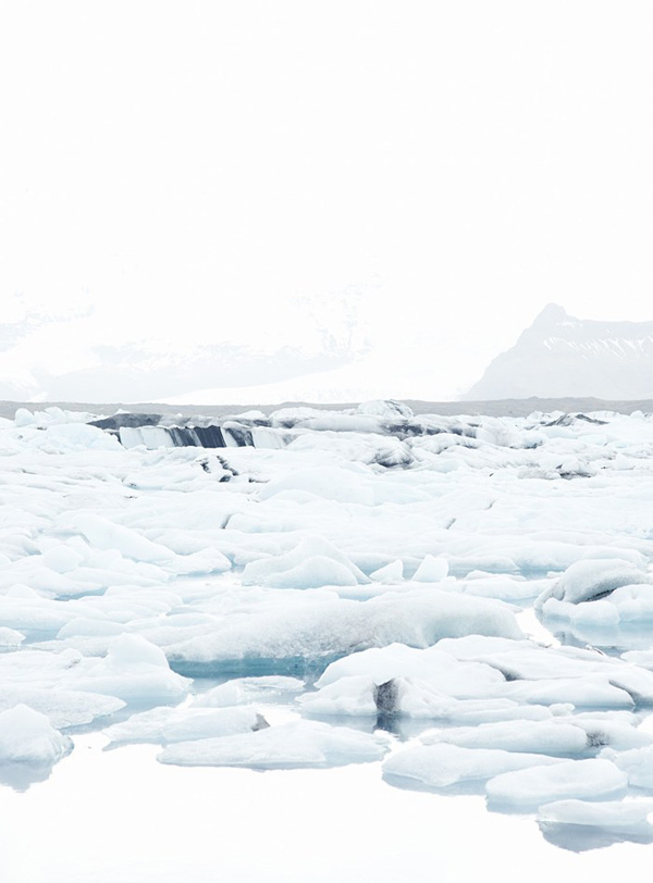
The stark contrast of soft winter fabrics against black sand and ice in the eerie Icelandic landscape is just beautiful and I love the choice of model. The colours and textures conjure up a sophisticated, calm and reflective mood for me that makes me want to go out and buy their whole collection.

Cue evil laugh by the Toast marketing department but I’ve got to hand it to Nick Seaton and the team. A great campaign and wonderful AW14 collection. For more inspiration check out their look book online.

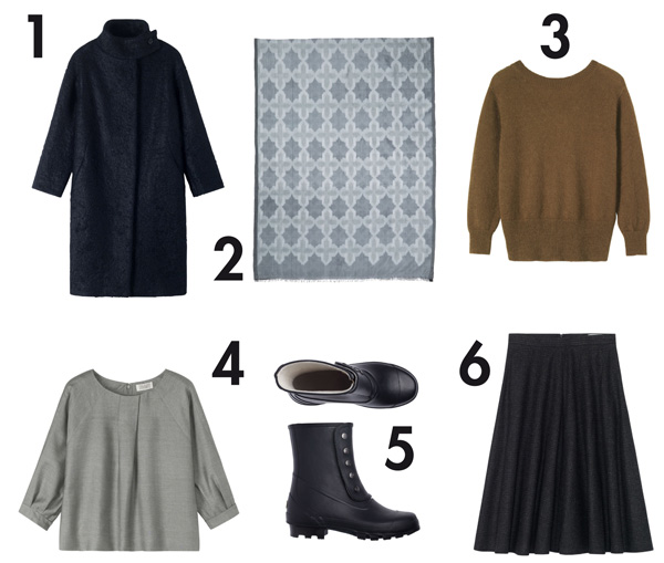
To satisfy my shopping urge I’ve selected a few pieces below that would be just perfect for me – and Christmas is just around the corner.
toast uk, AW14, campaign, collection, fabrics, textures, fashion, design, brand, label, nick seaton, iceland, black sand, ice, sophisticated, calm, alina skirt, silk ikat scarf, tall spats boot, madli cropped sweater, geir coat, ritte top, refelective, trend, mood, look book, photography, styling

toast uk, AW14, campaign, collection, fabrics, textures, fashion, design, brand, label, nick seaton, iceland, black sand, ice, sophisticated, calm, alina skirt, silk ikat scarf, tall spats boot, madli cropped sweater, geir coat, ritte top, refelective, trend, mood, look book, photography, styling

toast uk, AW14, campaign, collection, fabrics, textures, fashion, design, brand, label, nick seaton, iceland, black sand, ice, sophisticated, calm, alina skirt, silk ikat scarf, tall spats boot, madli cropped sweater, geir coat, ritte top, refelective, trend, mood, look book, photography, styling

toast uk, AW14, campaign, collection, fabrics, textures, fashion, design, brand, label, nick seaton, iceland, black sand, ice, sophisticated, calm, refelective, trend, alina skirt, silk ikat scarf, tall spats boot, madli cropped sweater, geir coat, ritte top, mood, look book, photography, styling

toast uk, AW14, campaign, collection, fabrics, textures, fashion, design, brand, label, nick seaton, iceland, black sand, ice, sophisticated, calm, refelective, alina skirt, silk ikat scarf, tall spats boot, madli cropped sweater, geir coat, ritte top, trend, mood, look book, photography, styling

toast uk, AW14, campaign, collection, fabrics, textures, fashion, design, brand, label, nick seaton, iceland, black sand, ice, sophisticated, calm, alina skirt, silk ikat scarf, tall spats boot, madli cropped sweater, geir coat, ritte top, refelective, trend, mood, look book, photography, styling

toast uk, AW14, campaign, collection, fabrics, textures, fashion, design, brand, label, nick seaton, iceland, black sand, ice, sophisticated, calm, alina skirt, silk ikat scarf, tall spats boot, madli cropped sweater, geir coat, ritte top, refelective, trend, mood, look book, photography, styling

toast uk, AW14, campaign, collection, fabrics, textures, fashion, design, brand, label, nick seaton, iceland, black sand, ice, sophisticated, calm, alina skirt, silk ikat scarf, tall spats boot, madli cropped sweater, geir coat, ritte top, refelective, trend, mood, look book, photography, styling

toast uk, AW14, campaign, collection, fabrics, textures, fashion, design, brand, label, nick seaton, iceland, black sand, ice, sophisticated, calm, refelective, alina skirt, silk ikat scarf, tall spats boot, madli cropped sweater, geir coat, ritte top, trend, mood, look book, photography, styling

toast uk, AW14, campaign, collection, fabrics, textures, fashion, design, brand, label, nick seaton, iceland, alina skirt, silk ikat scarf, tall spats boot, madli cropped sweater, geir coat, ritte top
black sand, ice, sophisticated, calm, refelective, trend, mood, look book, photography, styling
 
1 // GEIR COAT
2 // SILK IKAT SCARF
3 // MADLI CROPPED SWEATER
4 // RITTE TOP
5 // TALL SPATS BOOT
6 // ALINA SKIRT

 
MORE INFORMATION | Toast UK
PHOTOGRAPHY | Nicholas Seaton
 

Please vote for Stylejuicer at the UK Blog Awards 2014! [Apologies for the garish logo… hey ho, not my design.]

MOOD BOARD | AW14 TREND

17 October 2014

fashion, aw14, oversize, long sleeves, sweater, coat, fabric, cozy, layers, hip, trend, zara, cos, andotherstories, wool, cashmere, alpaca, natural, muted colours, design, high street, skinny straight

What’s nicer than to wrap up in an oversize sweater or coat when you’re chilly!? It’s like a warm blanket that comforts and protects you and I just love this AW14 trend which inspired me to put a little mood board together all courtesy of my Pinterest feed.

I recently read somewhere that you’re only as cool as your sleeves are long this season – or words to the effect – and I for one am very happy to embrace this trend. Being taller and longer limbed than the average female I’m delighted to see there are lots of tall (as well as petite) sections now on the high street and some of my favourite brands like Zara, COS and &otherstories have always cut their clothes with extra long sleeves. Or if you want designer pop over to Joseph and ACNE – did you spot their divine sweater top left!?

I’m not a big fan of the cold so it’s fair to say that autumn and winter aren’t my favourite seasons but I do enjoy putting on lots of cosy layers and playing with different textures and colours. Naturally soft yarns like wool, cashmere and alpaca are my wardobe staple for the coming months and I mostly stick to muted colours from off whites to greys, navy and black with some dark forest greens and plum shades. Mix that with some skinny straight trousers and hip sneakers and you’re all set for the coming months.

Cold? Who’s cold now?

 
NOTE | All via my Pinterest boards
 
Follow Stylejuicer with Bloglovin

MOOD BOARD | WEEKEND VIBES #04

11 October 2014

bed, white, monochrome, bed linen, fashion, style, isabel marant, pre-fall, aprilandmay blogspot, blog, music, typography, type, interior design, nordic design, stan smith, anna pirkola, trend, black and white, weekend, vibes, adidas, mood board, oversized sweaters, belted jacket, cargo pants, AW 14


With the weather turning more autumnal there’s a great excuse to stay in bed, listen to some cool tunes and chill out in style this weekend.
Isabel Marant is currently one of my favourite designers and I love the oversized sweaters, belted jacket and cargo pants she has designed for AW 14. Casual but chic, gorgeous fabrics beautifully made. Pity I can only afford the Stan Smith trainers the model is wearing.

Wishing you all some boho weekend vibes.
 
BACK TO BED //
TYPOGRPAHY //
FASHION //
INTERIOR //

 
NOTE | All via my Pinterest boards
 
Follow Stylejuicer with Bloglovin

PLACES TO GO | GRAANMARKT 13 ANTWERP

7 October 2014

graanmarkt 13, antwerp, belgium, penthouse, apartment, restaurant, shop, gallery, design, fashion, art, culture, vincent van duysen, architecture, concrete, townhouse, industrial, home, attention to detail, trend, style, frederik vercruysse, photography

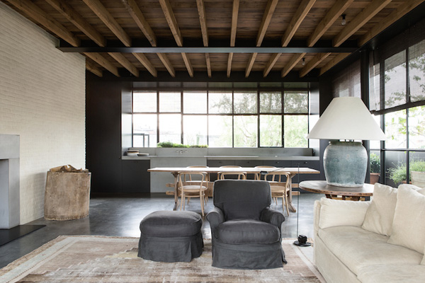
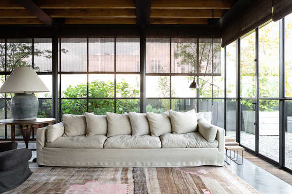
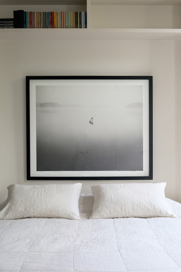
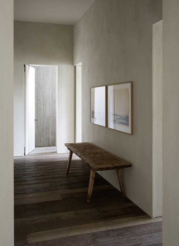
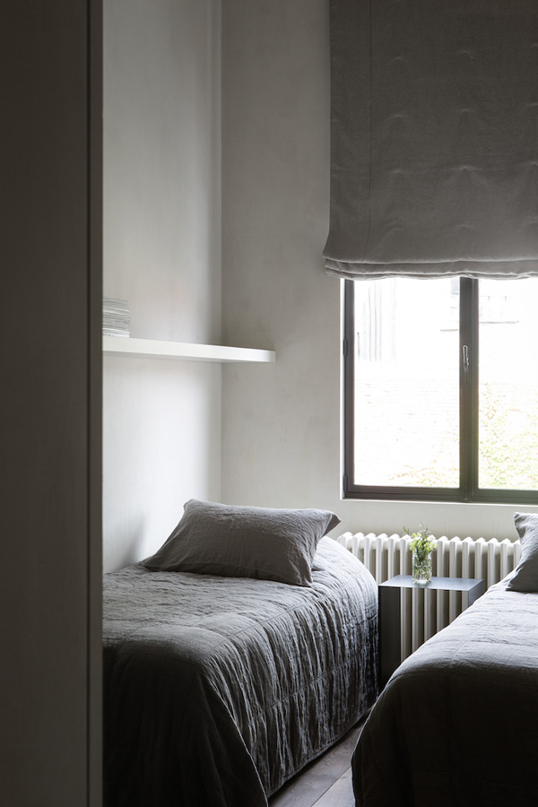
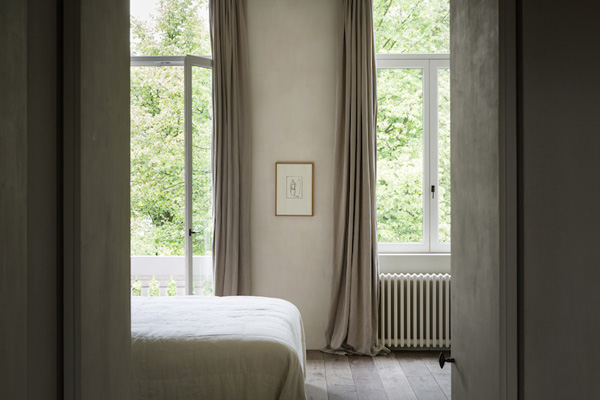
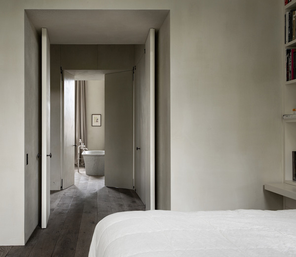
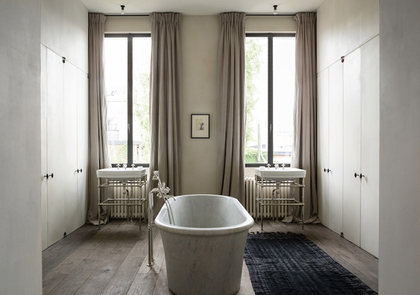
As promised here comes the second dose of Belgian cool, a penthouse apartment to die for and it’s for rent!

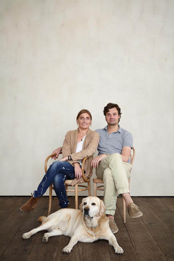
But let me rewind and give you the full picture. Graanmarkt 13 is a restaurant, a shop, a gallery and an apartment all under one roof. Tim and Ilse fell in love with the house and transformed it into a haven for those in search of special things with a soul and everything on display has its own story.

It’s a special concept where you can enjoy design, fashion, art, culture and gastronomic delights but it’s also a welcoming and warm home where the owners would like everyone to feel at ease.

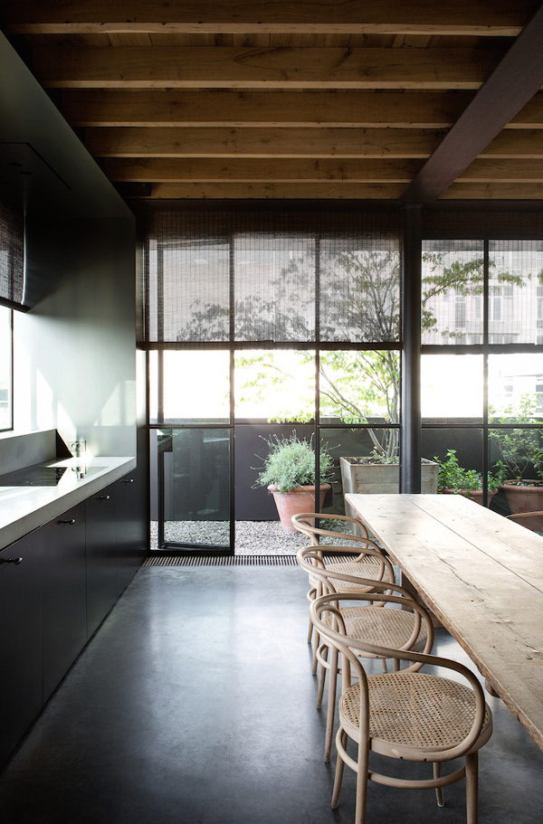
The traditional building was reworked by famous Belgian architect Vincent Van Duysen who created an industrial look throughout with rough concrete, exposed beams and wiring and beautiful large scale black frame windows. The owners initially wanted to run a B&B on the top floor of the townhouse but as they saw the space develop they decided to keep it as one large luxurious apartment which is now for rent accommodating up to six adults.

It’s an amazing space and Tim and Ilse have clearly invested a lot of love and attention to detail. No wonder they describe the space as ‘their best kept secret’.


Graanmarkt13-Apartment-Frederik-Vercruysse-02

Graanmarkt13-Apartment-Frederik-Vercruysse-03

Graanmarkt13-Apartment-Frederik-Vercruysse-04

Graanmarkt13-Apartment-Frederik-Vercruysse-06

Graanmarkt13-Apartment-Frederik-Vercruysse-07

Graanmarkt13-Apartment-Frederik-Vercruysse-08

Graanmarkt13-Apartment-Frederik-Vercruysse-09

graanmarkt 13, antwerp, belgium, penthouse, apartment, restaurant, shop, gallery, design, fashion, art, culture, vincent van duysen, architecture, concrete, townhouse, industrial, home, attention to detail, trend, style, frederik vercruysse, photography

graanmarkt 13, antwerp, belgium, penthouse, apartment, restaurant, shop, gallery, design, fashion, art, culture, vincent van duysen, architecture, concrete, townhouse, industrial, home, attention to detail, trend, style, frederik vercruysse, photography
ABOVE | Owners Ilse and Tim


MORE INFORMATION | Graanmarkt 13
PHOTOGRAPHY | Frederik Vercruysse with thanks
 
Follow Stylejuicer with Bloglovin

ALMOST… MEETING VICTORIA BECKHAM

29 September 2014

victoria beckham, store, london, dover street, vb, collection, label, fashion, style, trend, quality, luxury, detail, exquisite, fabrics, polished concrete, mirror, walnut, farshid moussavi, architecture, interior design, design, mayfair

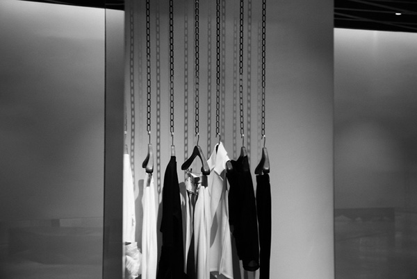
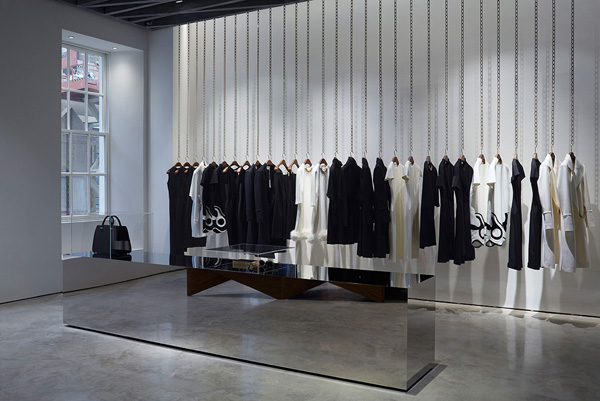
I’d read a few interviews with Victoria Beckham in the run up to her new store opening in London’s Dover St and was curious to see for myself the alleged attention to detail that had gone into everything from the designs of the hanging rails to the generous size of the changing rooms allowing yummy mummies to bring their brood and get changed in comfort.

To be honest I wish I’d had my brood with me when I went to see the store last Saturday. It would have been a good ice breaker to start chatting to Victoria who actually arrived at the store with a few pals whilst us commoners waited patiently in line.

I have to say the experience was slightly surreal but also strangely normal. Maybe because she was surrounded by what looked like a bunch of good mates, or maybe because of her media exposure I felt as if I’d met her a dozen times before or maybe because I’m just super cool. Yeah… right!

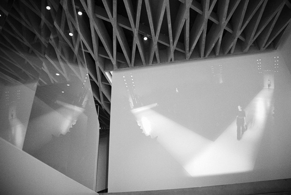
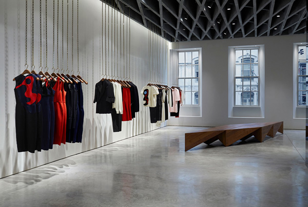
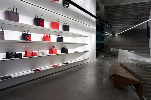
What did blow my mind though was the interior design by Farshid Moussavi currently one of the most successful female architects around. I read that VB worked closely with her and I have to say that the minimalist design compliments her collection beautifully, showing off the designs and quality fabrics.

Victoria-Beckham-Store-London-05

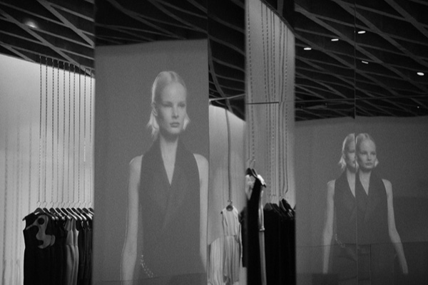
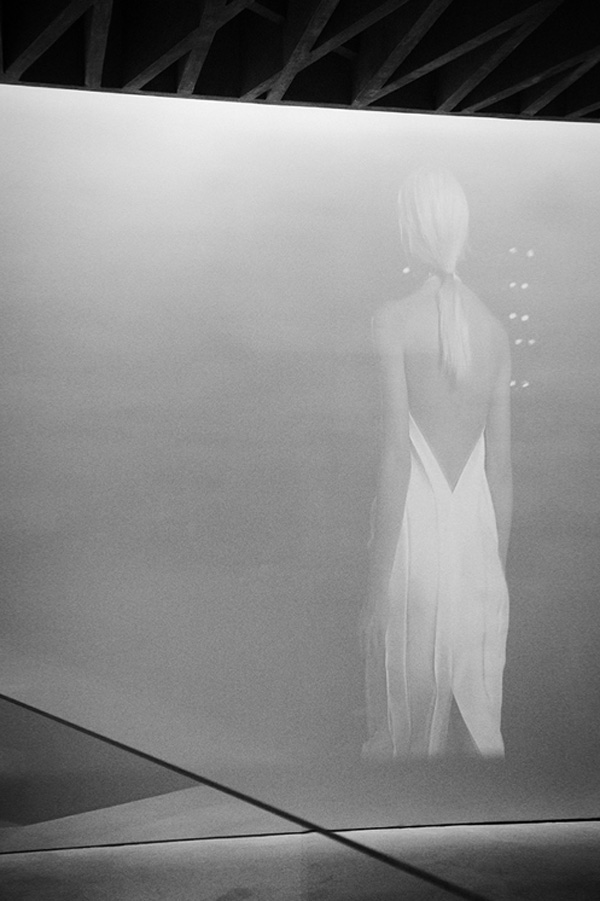
I was surprised how the classic Mayfair facade hides an almost warehouse like interior with polished concrete floors, mirrored walls and a concrete zigzag ceiling on the first floor that cleverly hides the grooves and runners for the free hanging chain rails. Walking up the almost sculptural concrete staircase you can see the latest runway collection being projected on to the wall ahead of you before entering a world of luxurious materials, beautiful cuts and exquisite details.

It’s a fabulous shopping experience and one that I gather VB has put her heart and soul into. For me the piece de resistance was the scent of Diptyque’s Feu de Bois which was subtle but distinctly present and left me feeling as if I’d just been to a luxury spa.

Victoria-Beckham-Store-London-08

Last but not least I have to mention the amazing sales staff. One thing that always bugs me about high end fashion stores are the often snooty assistants who seem to judge you the minute you walk in. Something unlikely to happen at VB who I hear hand selected the staff who could not have been more friendly and helpful. I genuinely felt welcome and not just because of the glass of champagne (or fizzy elderflower cordial) but I had a lovely chat with the store manager who also informed me politely not to take any photographs of VB – fair enough considering the hordes of paps outside.

I admit I was tempted to try a few things on but in the end I was afraid my Dutch courage would lead me to spend a months rent on a beautiful winter coat that would look lovely in a Mayfair restaurant but slightly unsuitable for my daily playground outing.

 
Victoria-Beckham-Store-London-02

Victoria-Beckham-Store-London-03

Victoria-Beckham-Store-London-04

Victoria-Beckham-Store-London-06

Victoria-Beckham-Store-London-07

Victoria-Beckham-Store-London-09

victoria beckham, store, london, dover street, vb, collection, label, fashion, style, trend, quality, luxury, detail, exquisite, fabrics, polished concrete, mirror, walnut, farshid moussavi, architecture, interior design, design, mayfair

 
PHOTOGRAPHY | Victoria Beckham with thanks
INTERIOR DESIGN & ARCHITECTURE | Farshid Moussavi Architecture
 
Follow Stylejuicer with Bloglovin