Japanese restaurant Hokkaidon in Hong Kong beautifully combines two of my loves, interior and graphic design. The stylish minimal identity was conceived by the creative dreamers mad people at A Work of Substance, an agency with studios in Stockholm, Paris and Hong Kong.
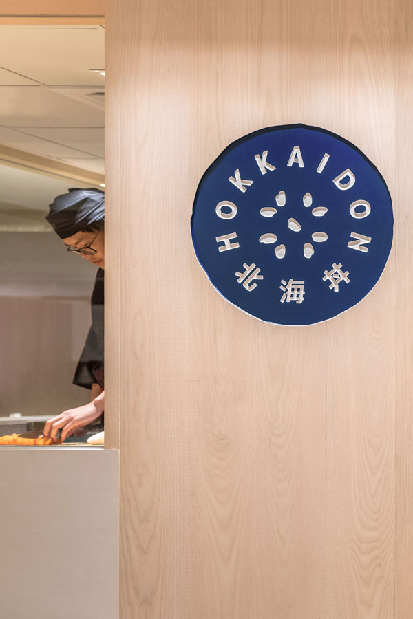
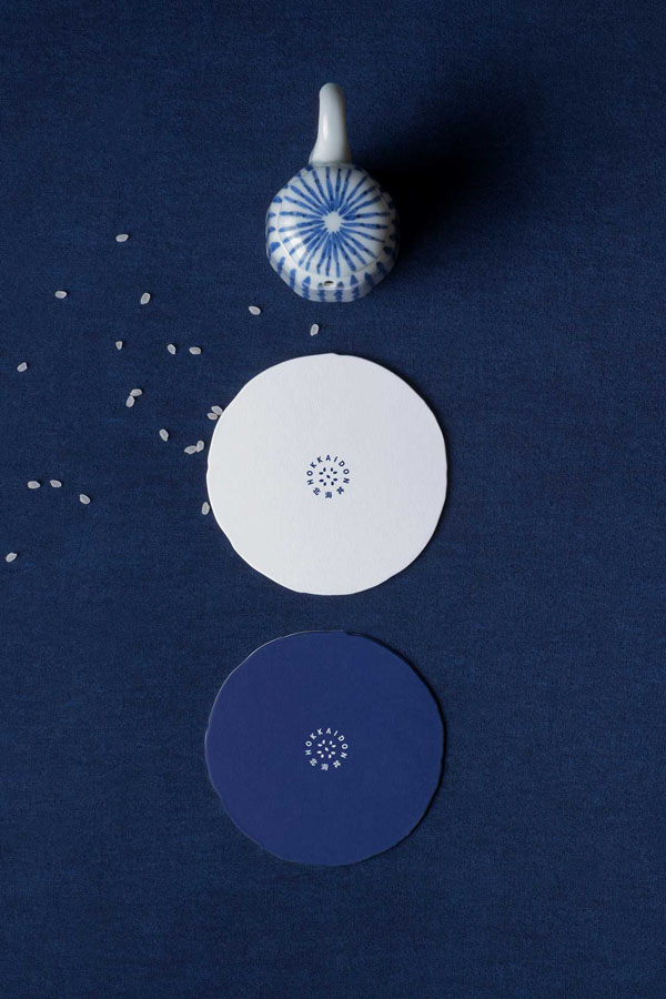
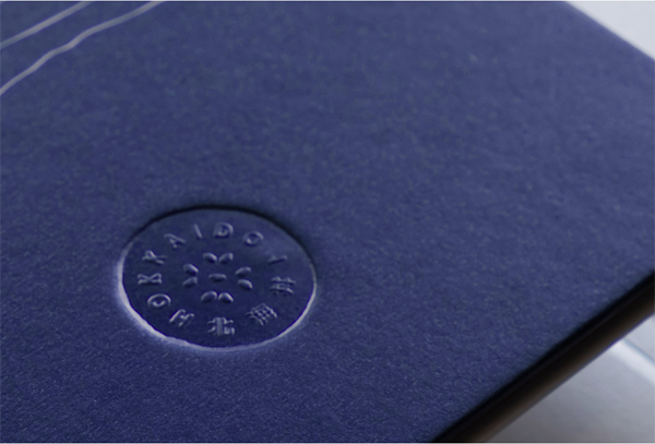
Hokkaidon serves sea-to-table Chirashi, a traditional Japanese dish of fish and rice that delivers a multitude of flavours and textures. The identity beautifully reflects the restaurant’s contemporary take on this traditional dish by depicting grains of rice at the core of it’s logo in combination with a strong indigo colour.
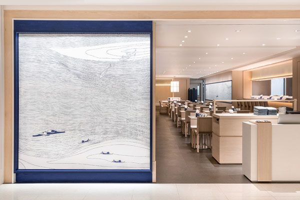
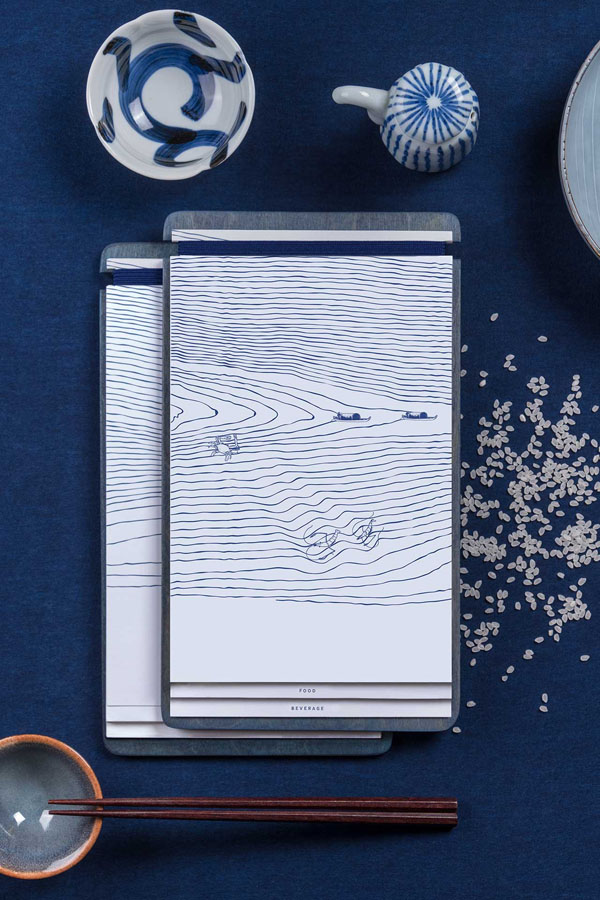
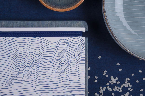
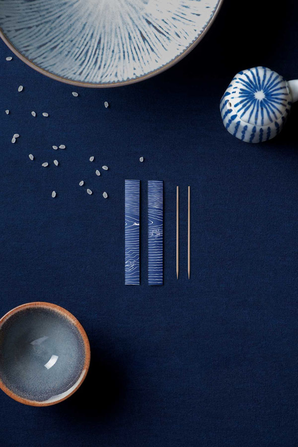
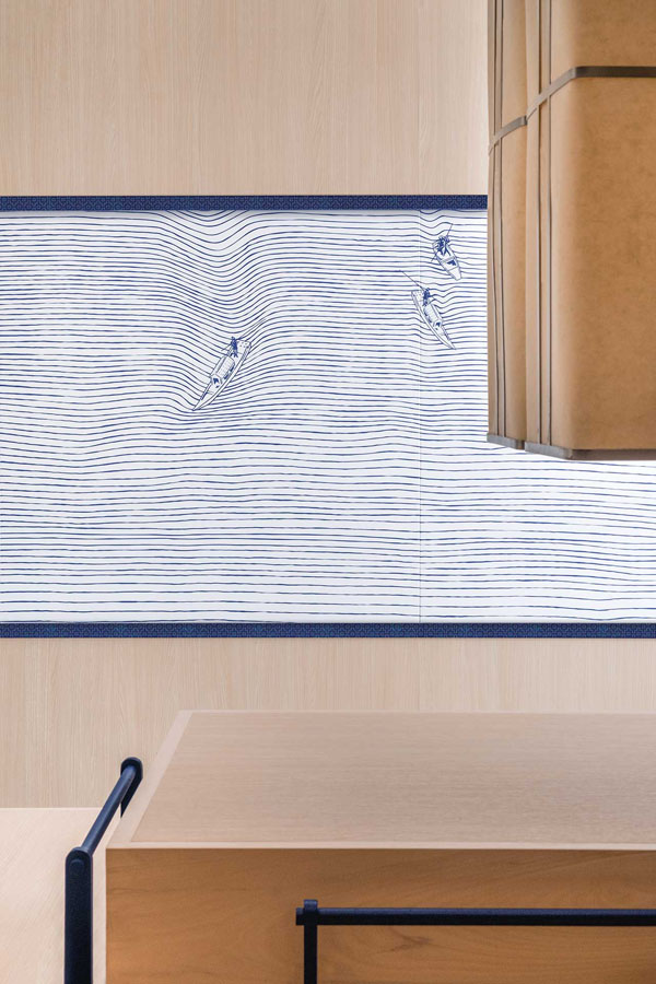
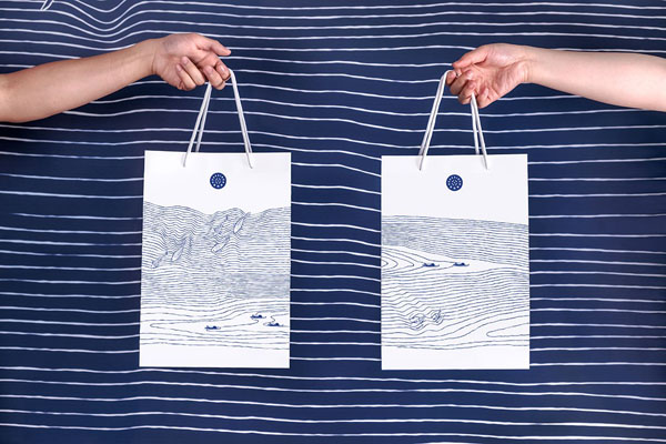
The striking graphic on the walls, menus and take away bags are inspired by the Japanese seigaiha motif which is a pattern of layered concentric circles creating arches, symbolic of waves or water representing surges of good luck. The graphic is interspersed with fish and fishing boats reminding the customer of the fresh ingredients.
The branding with it’s strong use of indigo blue works incredibly well for me in combination with the elegant, clean and minimal interior almost entirely kept in light cypress wood without any distraction from the dish and it’s fresh ingredients.
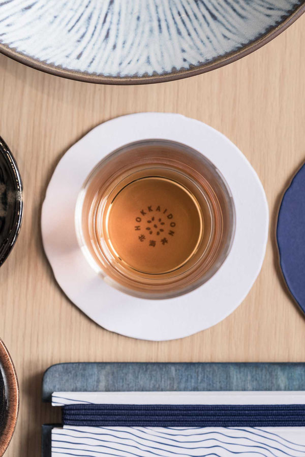
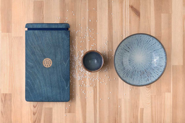
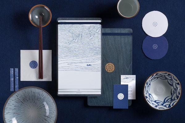
I must mention the tableware as well which is kept in indigo, white and brown tones with varying patterns of seigaiha and irregular shaped coasters subtly featuring the logo. The wooden menu boards are dyed to match the brand’s indigo blue and feature an easily exchangeable printed menu held by a strong blue elastic – simple, yet functional and completely on point.
Let’s hope Hokkaidon will open a London branch soon!
For more inspiring Branding head over to California cafe and bakery Voyageur du Temps and Austrian Hotel Trofana Alpin.
BRANDING | A Work of Substance
PHOTOGRAPHY | Vita Mak with thanks
Follow Stylejuicer with Bloglovin

Pingback: JAPANESE RESTAURANT HOKKAIDON IN HONG KONG – STYLEJUICER – The Silk Road Story