Monthly Archives: October 2013

AUTHENTIC BRANDING FOR GENTLEMEN’S BEANS BY INJECT DESIGN

9 October 2013

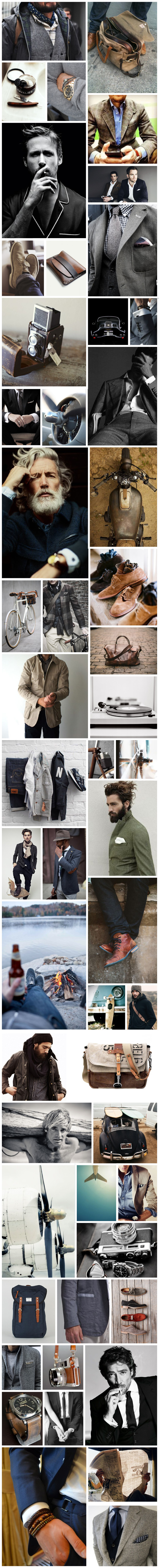
Since it’s MEN’S WEEK here on Stylejuicer I’ve chosen a powerful earthy branding that conjures up 20th Century workmen and their simple pleasure of enjoying a coffee at the end of a hard days work.

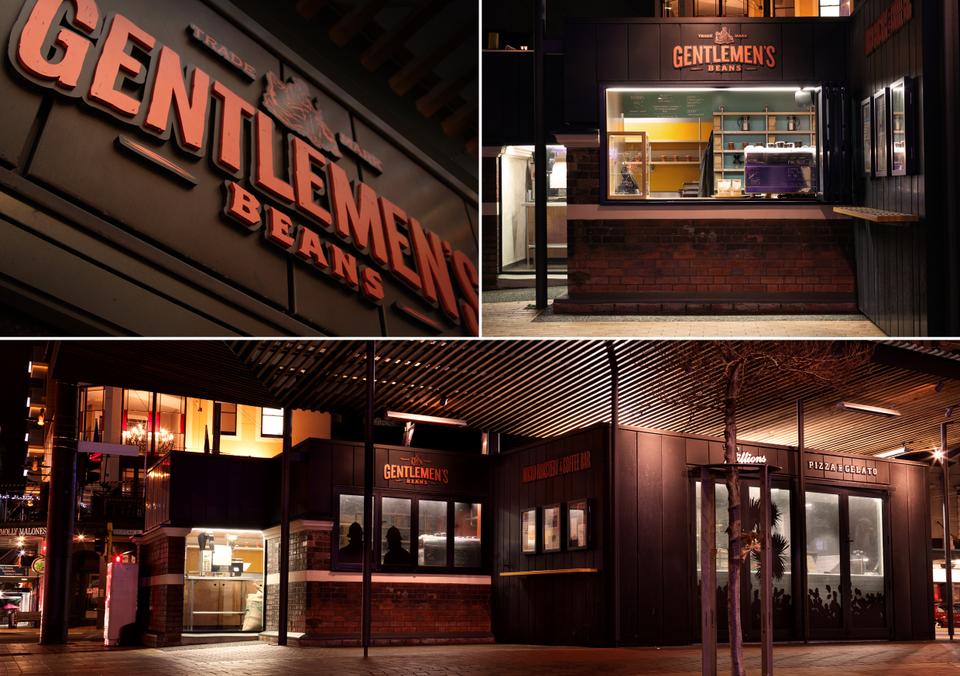
Wellington-based Inject Design are the creative heads behind the branding for coffee bar and micro roastery Gentlemen’s Beans and they are in the running for New Zealand’s Best Awards on the 11th of October.
[DESIGNERS & FONT NERDS: Check out Best Awards awesome splash intro for Call For Entries. Hilarious!]

Copyright-InjectDesign-GentlemenBeans-Brand-09

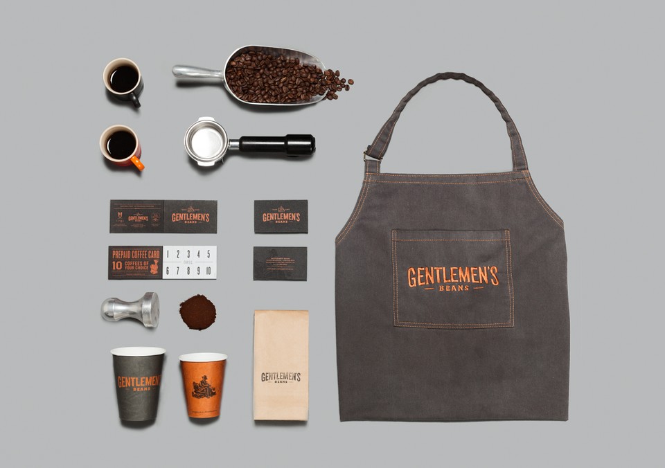
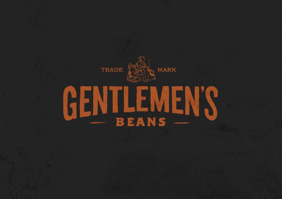
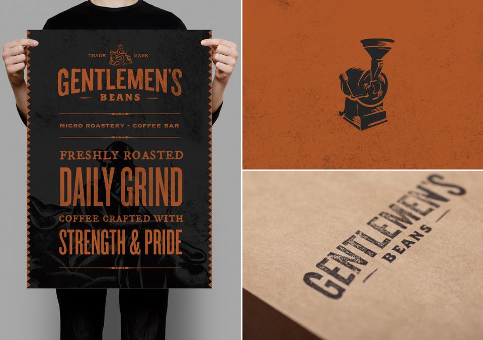
I love the treatment of the wood-cut styled logo and typefaces in combination with a dark earthy colour palette which works perfectly for the coffee bar and has an established and authentic look and feel to it. The brand oozes hard graft 1920th style and appreciation for craftsmanship which is exactly what Gentlemen’s Beans do every day: Roasting their own beans. No shortcut, just pure passion for coffee and not afraid of hard work.

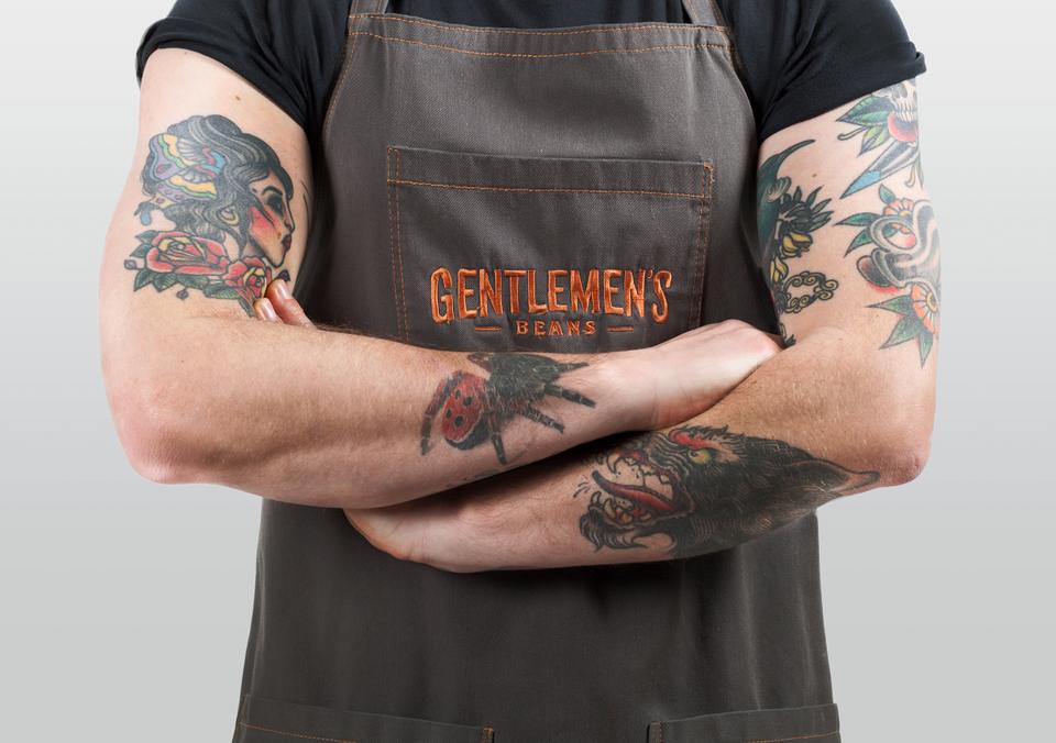
My favourite touch is the tattooed poster boy who I imagine serves as the 21st Century equivalent to the 1920th workman. I’m sure he’s got his iPhone in his back pocket.

Stylejuicer says:

Overall, a welcome change to the middle-of-the-road-lets-appeal-to-everybody branding and mass marketing of global coffee shop chains where I wonder what does a double-tailed mermaid have to do with coffee?

Copyright-InjectDesign-GentlemenBeans-Brand-01

Inject says about Gentlemen’s Beans:

The 1920s social undertone of the ‘working man’ and the consequent appreciation for craftsmanship, the trading of goods as a luxury in the days of long sea journeys and the hard-working innocence of the times, married well with the boutique nature of the business. The story of those hard working souls is what we encapsulated into the brand.

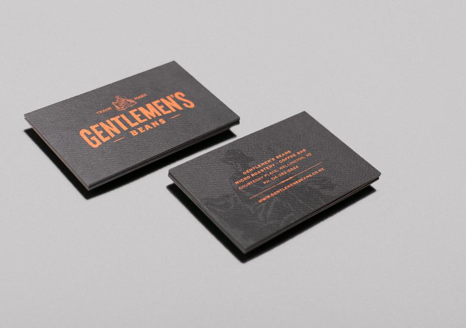
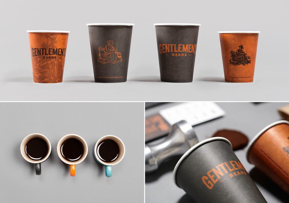
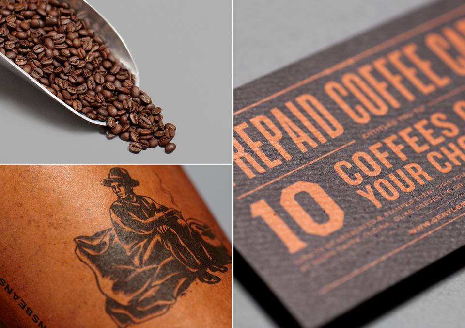
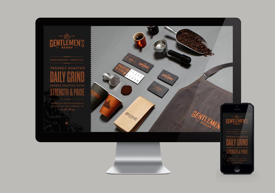
The typefaces used in the logo were re-drawn by hand to reflect a human presence and aged authenticity. The colour palette complements the brick tones of the original structure, as well as encourages desire for the taste of a delicious brew. The wood-cut styled logo mark tells a story about the ‘original gentlemen’ smoking a cigarette after a long, hard days work. The use of the contemporary materials, metallic inks and dimensional lettering, alongside the historical ambience of stamped coffee bags and the brand’s character, creates a harmonious balance of aesthetics from the old to the new, complementing the Architecture of the structure.

Copyright-InjectDesign-GentlemenBeans-Brand-02

Copyright-InjectDesign-GentlemenBeans-Brand-03

Copyright-InjectDesign-GentlemenBeans-Brand-04

Copyright-InjectDesign-GentlemenBeans-Brand-05

Copyright-InjectDesign-GentlemenBeans-Brand-06

Copyright-InjectDesign-GentlemenBeans-Brand-07

Copyright Inject Design Gentlemen's Beans Brand

Enjoy and I hope you’re inspired!

Annie Signature Stylejuicer

More information | Inject Design Ltd
Best Awards | Nominations for Graphic, Interactive, Product and Spacial

MEN’S STYLE AND FASHION TRENDS AW 2013

8 October 2013

Men have got it so easy, don’t they!? Suits for the office and jeans at the weekend. Sorted! Erm, not quite I think. There’s definitely a knack to dressing ‘well’ and picking combinations that are classic but interesting and different.

I’ve been collecting pins on men’s style and fashion trends on Pinterest and Tumblr for a while and feel it’s time to reveal my favourite picks. I’ve tried to keep the fashion autumnal as I want to bring you a new board every season and added a few lifestyle shots that will make any man weak at the knees… vintage Rolex, Porsche or Triumph anyone? Not to forget the manly beers around the campfire, hiking, biking and surfing. Plus a few of my favourite male icons like Ryan Gosling (DREAMY), Javier Bardem (MANLY) and Laird Hamilton (DUDE) to add a bit of glamour. Et voilà… there’s your men’s fashion and style mood board!

If you want specific trends, here’s what I’ve picked up for the coming season. Tweed is HUGE as are chunky knits, rugged boots with suits, beads and bracelets peaking out from a formal shirt, denim in the office, grandpa style bow ties, duffle coats, hiking boots and wild beards depending on what line of business you’re in. If you want to start somewhere wear layers and more layers. I love a shirt and tie with a waistcoat, suit jacket and coat, maybe even a handkerchief poking out. As you know Patrick Grant is a bit of a fashion icon for me and a good place to start if you want to dress formally with a bit of an edge. Check out his new range for Debenhams for some stylish but affordable gear.

Overall, there’s still a distinct 60ies Mad Men flavour around with bow ties and big black frame glasses newly interpreted for the 21st Century of course. Make of it what you like but don’t forget to layer up!

Men Style & Fashion Trends AW 2013 via Stylejuicer.com

Enjoy and I hope you’re inspired!

Annie Signature Stylejuicer

Credits | I’d like to give credit to all the photographers and designers whose work is featured on this board. Sadly, most of the originators can’t be identified anymore so if you recognise your work here please email me and I’ll happily credit you and add your link.

MALLORCA, BUT NOT AS YOU KNOW IT

3 October 2013

If you follow me on Instagram and Twitter you probably noticed that I recently spent a week on one of the Mediterranean’s most prolific islands: Mallorca! Known for it’s British and German package tourists and larger louts I’m happy to report that it’s perfectly possible to avoid that side completely.

Mallorca Collage copyright Stylejuicer.com

I wasn’t sure how going on holiday with extended family where the age ranges between one and 80 would work out but magically everybody was happy and we had no major dramas for a whole week – apart from losing little Usain Bolt Leo at the airport for what felt like a lifetime but was probably more like three minutes. Why can’t we microchip toddlers and track them on our smart phone?

Our apartment in Ciudad Jardin, a typically Spanish suburb of Palma, was perfectly located and the kids got lots of play time on the beach and various playgrounds. Grandparents got plenty of time to play with the kids and explore the town and thanks to said grandparents we had in-built baby sitters and managed to have seven date nights in a row!

Usually I’m not one for going back to the same place time and again but this was our third time in Palma and it still felt as exciting, cosmopolitan but totally authentically Spanish as the first time. There are of course the hordes of sun-burnt tourists in socks and sandals in the summer traipsing round the Old Town and Cathedral but you don’t need to venture far from the centre to find authentic tapas bars where they count up your pinxtos – skewers holding together your pincho or tapa – at the end of the night to see how much you’ve had to eat. One such place is L’Ambigú Pinxtos right in the Old Town tucked away at the back of Santa Eulalia, where we had the most amazing tapas (or pinxtos) sitting next to some locals.

Another fabulously authentic area is Santa Catalina, just a 15 minute walk west of the Old Town. It has a hip student vibe with a dense mix of bars and restaurants and eclectic shops. If you’re in the area make sure to pop into bconnected concept store for some quirky finds. One of the main streets for eating is Carrer de la Fabrica but to be honest the whole area oozes with little places that attract a mainly local crowd. We wondered around and stumbled upon ‘Simple’, a small restaurant on the ground floor of what looked like a recently restored town house. Totally gutted ‘Simple’ has a clean white minimalist look without feeling clinical and the added benefit of a small courtyard at the back, beautifully lit at night and perfect for some chillaxing Spanish style. Unfortunately I didn’t take a card but it’s next to the famous Bar Cuba on Carrer de Sant Magi.

Palma is certainly no hidden gem anymore thanks to it’s boutique hotels, sophisticated shopping and high-quality eateries. The main attraction still being the Cathedral which took 300 years to build and of course the beautiful Old Town. But for me the city still has lots more to explore and I’m looking forward to my next visit, be it with kids, a deux or with my girls – Palma is fab anywhich way.

Mallorca Collage copyright Stylejuicer.com

MY TOTALLY RANDOM LIST OF PLACES I CAME ACROSS OR EXPERIENCED

01. | View from Ciudad Jardin towards Palma Cathedral.
02. | Fundacio la Caixa, completed in 1903, this was the city’s first luxury hotel but has since been restored and now houses exhibition spaces, a design book shop and a cafe with floor to ceiling windows, perfect for people watching. Placa de Weyler.
03. | L’Ambigú Pinxtos, low-key tapas in the beautiful Old Town. Carrer de Sa Carnisseria.
04. | Placa Major, stunning but best to visit at night time if you’re allergic to tourists.
05. | Bar Restaurant Nicolas, fabulous watering hole, Plaça del Mercat.
06. | Yes, the beach really was that empty.
07. | Born 8, elegant and stylish all-day cafeteria on Passeo del Borne.
08. | Local bakery in Ciudad Jardin.
09. | Local ice-cream palour in Ciudad Jardin.
10. | One of many awesome Swedish style public playgrounds.
11. | THE best fresh fish restaurant in Ciudad Jardin.
12. | Gothic masterpiece Santa Eulàlia, Placa Santa Eulàlia.
13. | Hotel Cort, super central, hip and smart boutique hotel.
14. | One of many branches of upmarket coffee shop chain Cappuccino. This is definitely one of the best for location, setting and people watching. Cappuccino Palau March, Carrer Conquistador.
GELATERIA ITALIANA | No photo but THE best Italian ice-cream I’ve had to date and worth a special mention. Opposite Palma’s theatre, near the Placa Major.

Enjoy and I hope you’re inspired!

Annie Signature Stylejuicer

More information | We booked our apartment through MallorcApart run by Mia and Adam, a Swedish/British couple who have got lots of nice properties in and around Palma on their books. They are absolutely lovely, extremely helpful and easy to deal with and I cannot recommend them enough. Drop them an email if you’re interested.

Contact | apartment[at]facilnet.es

RICE DENMARK – COLOUR POPS FOR THE HOME

2 October 2013

For those of you who know me it might come as a bit of a shock to see me promoting colour in the home. You know that I like my home to be kept in calm, neutral colours until the kids wake up and Lego, Brio and evil plastic battery-operated toys take over and destroy my carefully arranged minimalist space.

‘Get a playroom’ I hear you say but until next week when I win the lottery (notice, ‘when’ not ‘if’) I bravely put up with the eyesore and take pride in the fact that my kids are having a whale of a time.
 

rice Denmark, colour, colourful, vintage, home decor, homes, scandinavian, interior design, fun, pattern, enjoyment, living, informal, company, contemporary, happy, home

Now, colourful and beautifully designed objects are of course a totally different kettle of fish and I love how they give me a bit of a boost during the long dark months. Like most people colour equals energy and happiness for me. Which leads me nicely to RICE Denmark, a home wares and accessories company who are known for their colourful melamine, handmade baskets/storage and hand glazed Italian tableware. RICE are eager to point out that Danish design is not all about cool and calm interiors. RICE style is about fun, colour, pattern and the enjoyment of informal living.

Their designs have a vintage feel to them and are inspired by ‘the good old days’. A zingier palette than our own British Cath Kidstone and certainly quirkier considering eg. the tassel detailing on the tea towels and plates featuring Victorian bird prints. I can’t help but being drawn to their designs and can see them working across a variety of homes, be it a contemporary apartment, a country retreat or a family home.

RICE Founder & Creative director, Charlotte, has made it her mission to bring humor, more colours and happiness to everyday life.

Colours are essential to me – I truly believe in the power of colours and my hope with Happy Home is to motivate you into making bold color choices… Just paint a wall – play with colors and live colorful lives.

It’s going to be a colourful week!

/// Don’t miss my travel report on PALMA DE MALLORCA tomorrow – it’s got ‘cojones’.

AW13-0009

rice Denmark, colour, colourful, vintage, home decor, homes, scandinavian, interior design, fun, pattern, enjoyment, living, informal, company, contemporary, happy, home

rice Denmark, colour, colourful, vintage, home decor, homes, scandinavian, interior design, fun, pattern, enjoyment, living, informal, company, contemporary, happy, home

rice Denmark, colour, colourful, vintage, home decor, homes, scandinavian, interior design, fun, pattern, enjoyment, living, informal, company, contemporary, happy, home

rice Denmark, colour, colourful, vintage, home decor, homes, scandinavian, interior design, fun, pattern, enjoyment, living, informal, company, contemporary, happy, home

rice Denmark, colour, colourful, vintage, home decor, homes, scandinavian, interior design, fun, pattern, enjoyment, living, informal, company, contemporary, happy, home

rice Denmark, colour, colourful, vintage, home decor, homes, scandinavian, interior design, fun, pattern, enjoyment, living, informal, company, contemporary, happy, home

rice Denmark, colour, colourful, vintage, home decor, homes, scandinavian, interior design, fun, pattern, enjoyment, living, informal, company, contemporary, happy, home

rice Denmark, colour, colourful, vintage, home decor, homes, scandinavian, interior design, fun, pattern, enjoyment, living, informal, company, contemporary, happy, home

rice Denmark, colour, colourful, vintage, home decor, homes, scandinavian, interior design, fun, pattern, enjoyment, living, informal, company, contemporary, happy, home

rice Denmark, colour, colourful, vintage, home decor, homes, scandinavian, interior design, fun, pattern, enjoyment, living, informal, company, contemporary, happy, home

rice Denmark, colour, colourful, vintage, home decor, homes, scandinavian, interior design, fun, pattern, enjoyment, living, informal, company, contemporary, happy, home

rice Denmark, colour, colourful, vintage, home decor, homes, scandinavian, interior design, fun, pattern, enjoyment, living, informal, company, contemporary, happy, home

rice Denmark, colour, colourful, vintage, home decor, homes, scandinavian, interior design, fun, pattern, enjoyment, living, informal, company, contemporary, happy, home

rice Denmark, colour, colourful, vintage, home decor, homes, scandinavian, interior design, fun, pattern, enjoyment, living, informal, company, contemporary, happy, home

rice Denmark, colour, colourful, vintage, home decor, homes, scandinavian, interior design, fun, pattern, enjoyment, living, informal, company, contemporary, happy, home

rice Denmark, colour, colourful, vintage, home decor, homes, scandinavian, interior design, fun, pattern, enjoyment, living, informal, company, contemporary, happy, home


MORE INFORMATION & PHOTOGRAPHY |Rice Denmark

 
PLEASE VOTE for Stylejuicer at the UK Blog Awards 2014! Apologies for the garish logo 😉

RAINBOW MILLE-FEUILLE FOR JAPANESE BANK

1 October 2013

There couldn’t be a more fitting concept to kick off Stylejuicer’s COLOURFUL WEEK than architect and designer Emmanuelle Moureaux’s rainbow mille-feuille for Japanese bank Sugamo Shinkin. The French designer has been living and working in Japan since 1997 and her technique of using colour as three-dimensional elements, like layers, in order to create spaces was inspired by traditional Japanese sliding screens.

Emmanuelle Moureaux Sugamo Shimura Bank via Stylejuicer

Japanese bank Sugamo Shinkin strives to provide first-rate hospitality to its customers in accordance with its motto: “we take pleasure in serving happy customers.” An ambitious sentiment which Emmanuelle translated beautifully into her architectural and interior design for this newly built branch creating a refreshing atmosphere with a palpable sense of nature based on an open sky motif.

She explains the concept in her own words:

12 LAYERS OF COLOUR
A rainbow-like stack of coloured layers, peeking out from the façade to welcome visitors. Reflected onto the white surface, these colours leave a faint trace over it, creating a warm, gentle feeling. At night, the coloured layers are faintly illuminated. The illumination varies according to the season and time of day, conjuring up myriad landscapes.

A PIECE OF THE SKY
Upon entering the building, three elliptical skylights bathe the interior in a soft light. Visitors spontaneously look up to see a cut-out piece of the sky that invites them to gaze languidly at it. The open sky and sensation of openness prompts you to take deep breaths, refreshing your body from within.

FUZZY PUFFS
The ceiling is adorned with dandelion puff motifs that seem to float and drift through the air. In Europe, there is a long and cherished custom of blowing on one of these fuzzy balls while secretly making a wish. Bits of fluffy down gently dance and frolic in the air, carried by the wind.

It is of course a holistic approach and includes ATMs, teller windows, consultation booths and an open space with chairs in 14 different colours located on the first floor. Three long glass airwells thread through the first and second levels of the building, flooding the interior with natural light as well as ‘blowing’ air through it.

How refreshing to see this radical new and fun approach for what must be one of the world’s oldest institutions, a bank! I know I’d be laughing all the way to the bank and back.

More colourful posts coming up this week, including my travel notes on Palma de Mallorca. Hasta mañana!

EmmanuelleMoureaux_SugamoShimura_09

EmmanuelleMoureaux_SugamoShimura_06

EmmanuelleMoureaux_SugamoShimura_01

EmmanuelleMoureaux_SugamoShimura_02

EmmanuelleMoureaux_SugamoShimura_03

EmmanuelleMoureaux_SugamoShimura_04

EmmanuelleMoureaux_SugamoShimura_08

EmmanuelleMoureaux_SugamoShimura_16

EmmanuelleMoureaux_SugamoShimura_18

EmmanuelleMoureaux_SugamoShimura_15

EmmanuelleMoureaux_SugamoShimura_14

EmmanuelleMoureaux_SugamoShimura_20

EmmanuelleMoureaux_SugamoShimura_23

EmmanuelleMoureaux_SugamoShimura_24

EmmanuelleMoureaux_SugamoShimura_33

EmmanuelleMoureaux_SugamoShimura_35

EmmanuelleMoureaux_SugamoShimura_40

EmmanuelleMoureaux_SugamoShimura_41

Emmanuelle Moureaux Sugamo Shimura Bank via Stylejuicer

Enjoy and I hope you’re inspired!

Annie Signature Stylejuicer

More information & photography | Emmanuelle Moureaux