Monthly Archives: September 2013

A UNIQUE VIBE AT KOOK RESTAURANT IN ROME

19 September 2013

If I owned a restaurant I would probably serve Italian food and it would look pretty darn close to Kook. Thanks to my tumblr feed I stumbled across this little gem and gave it a great big thumbs-up-Facebook like.

Kook_Restaurant_Noses_Architects_via_Stylejuicer11

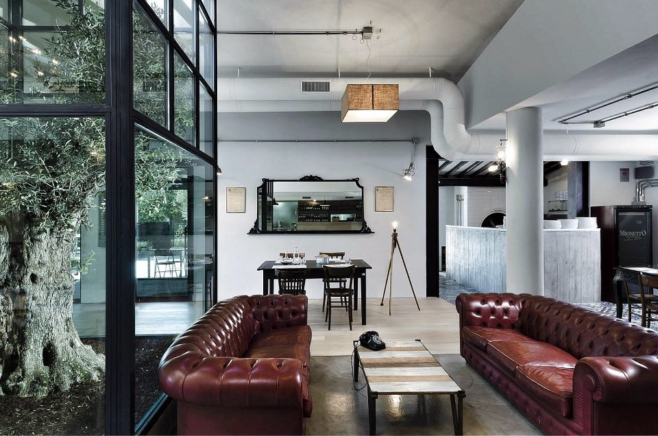
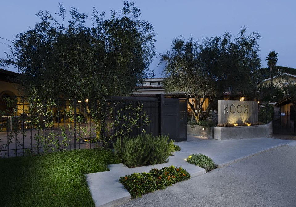
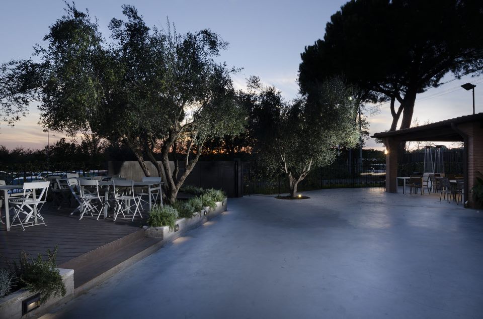
This Osteria & Pizzeria in Lazio, Rome serves traditional Italian food in an original setting and was designed by Noses Architects. It’s main feature is an iconic glass-encased Mediterranean olive tree sitting centrally in the dining area.

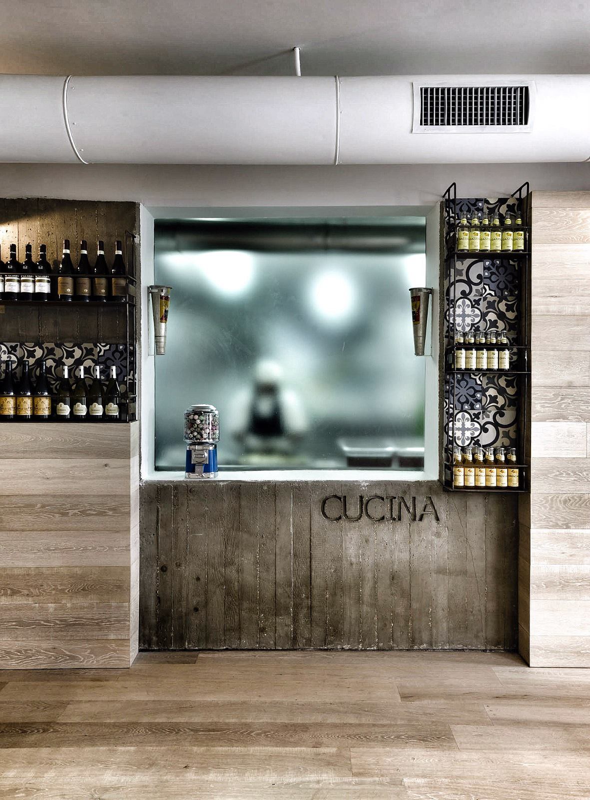
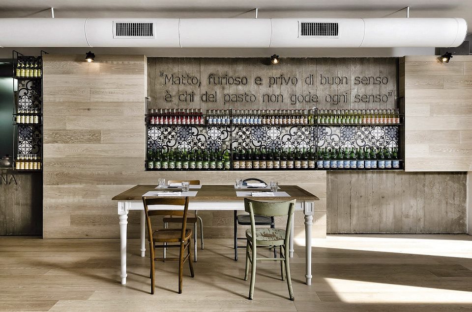
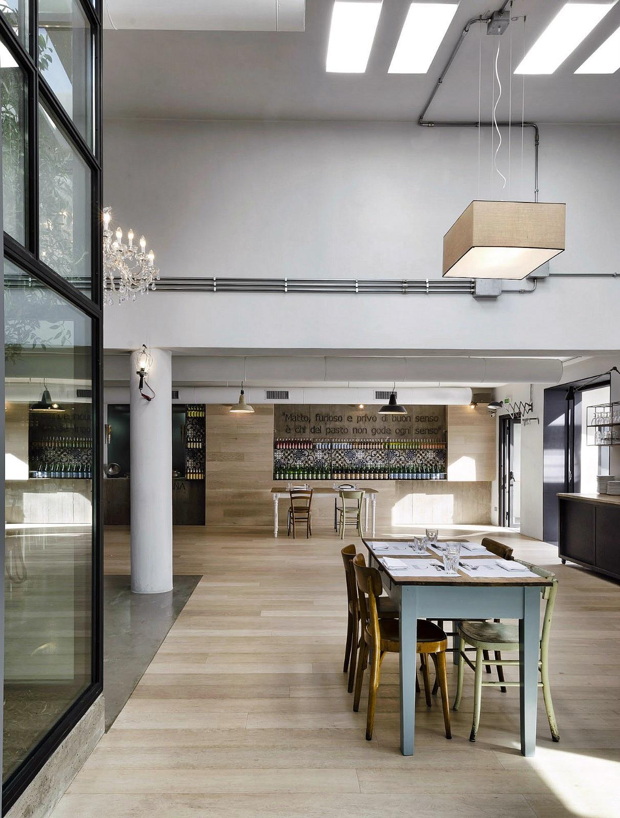
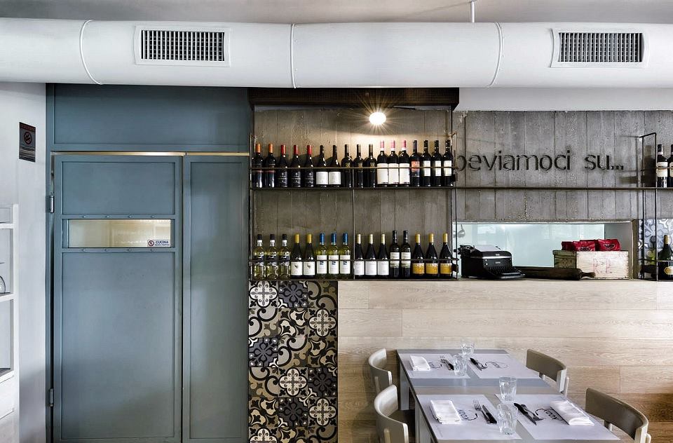
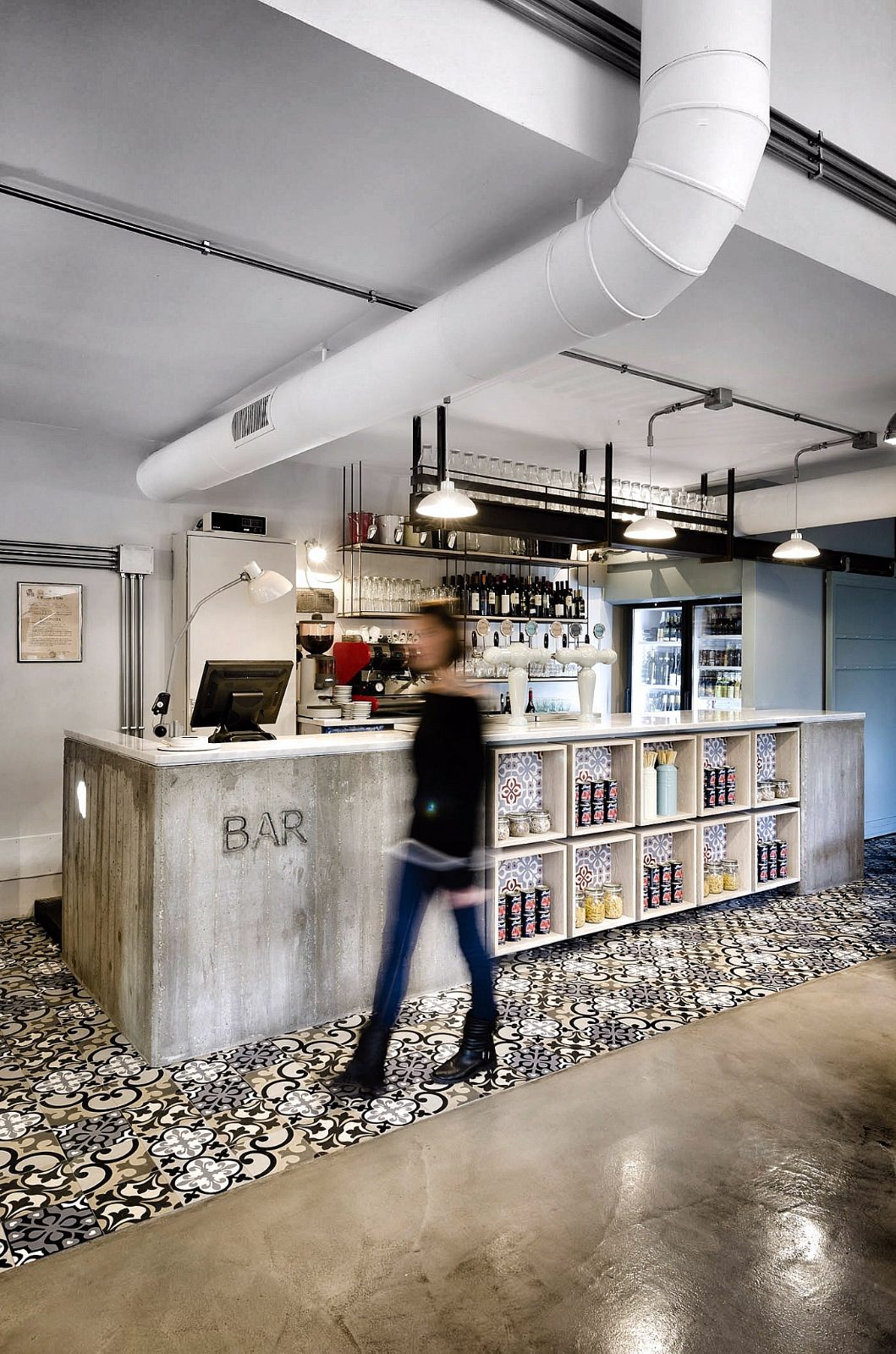
I love the use of industrial materials like board formed concrete, steel and metal and how they contrast against the softer woods and colourful traditional tiles in the bar area. As a designer and typography nut I get excited when seeing different sections like ‘cucina’ & ‘bar’ set in concrete and they didn’t even shy away from writing a whole quote in the bar area. Bet they proof read that a few times!

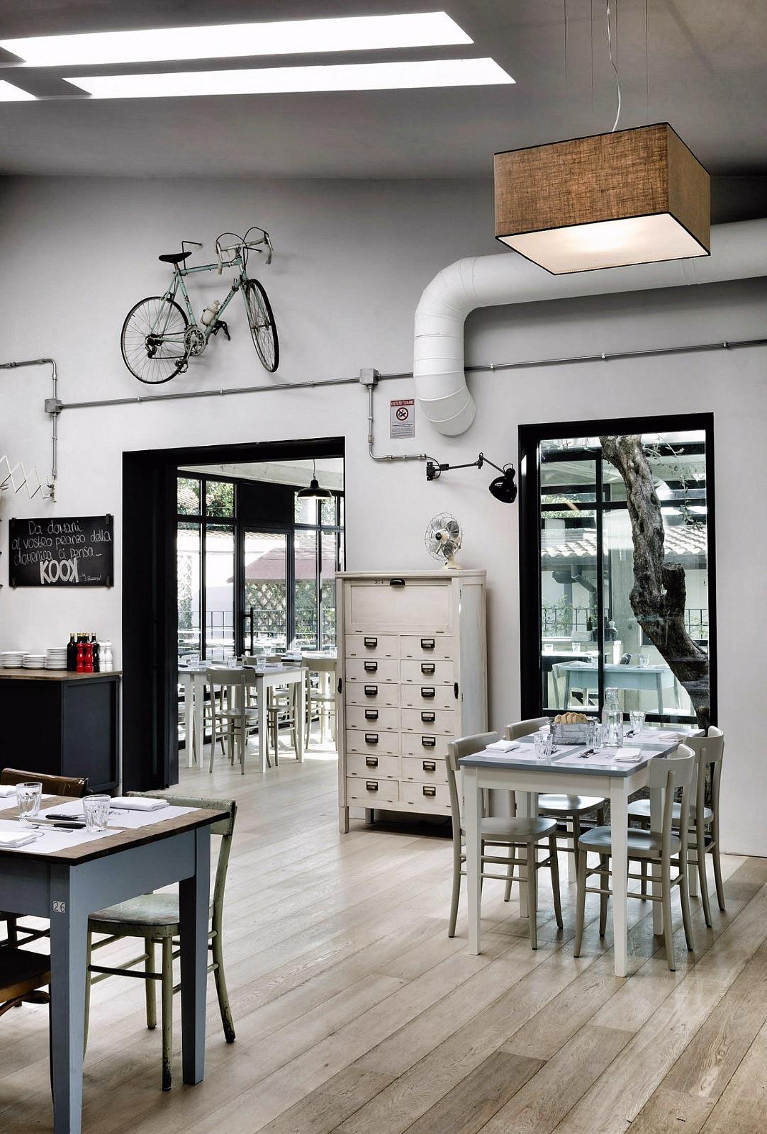
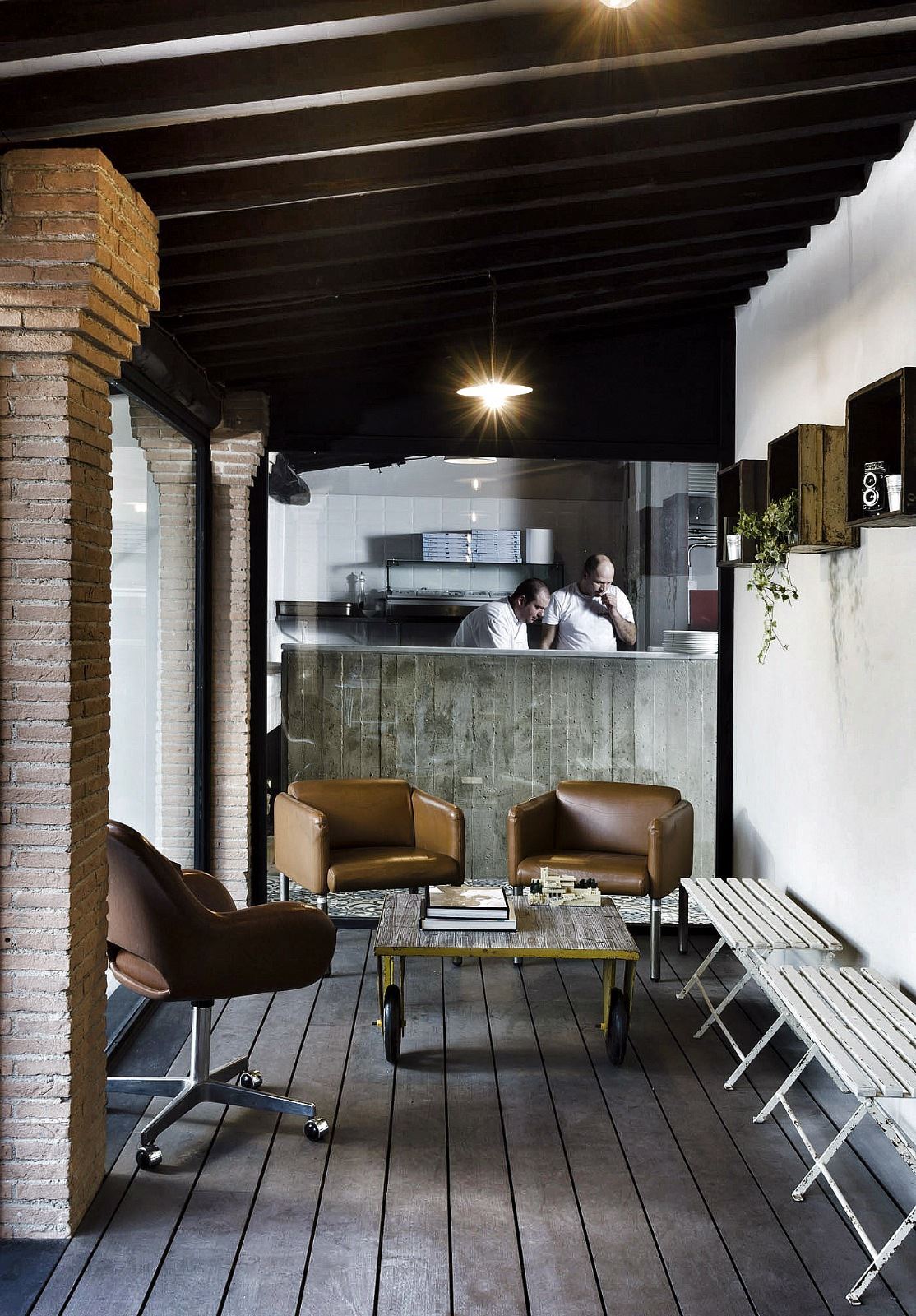
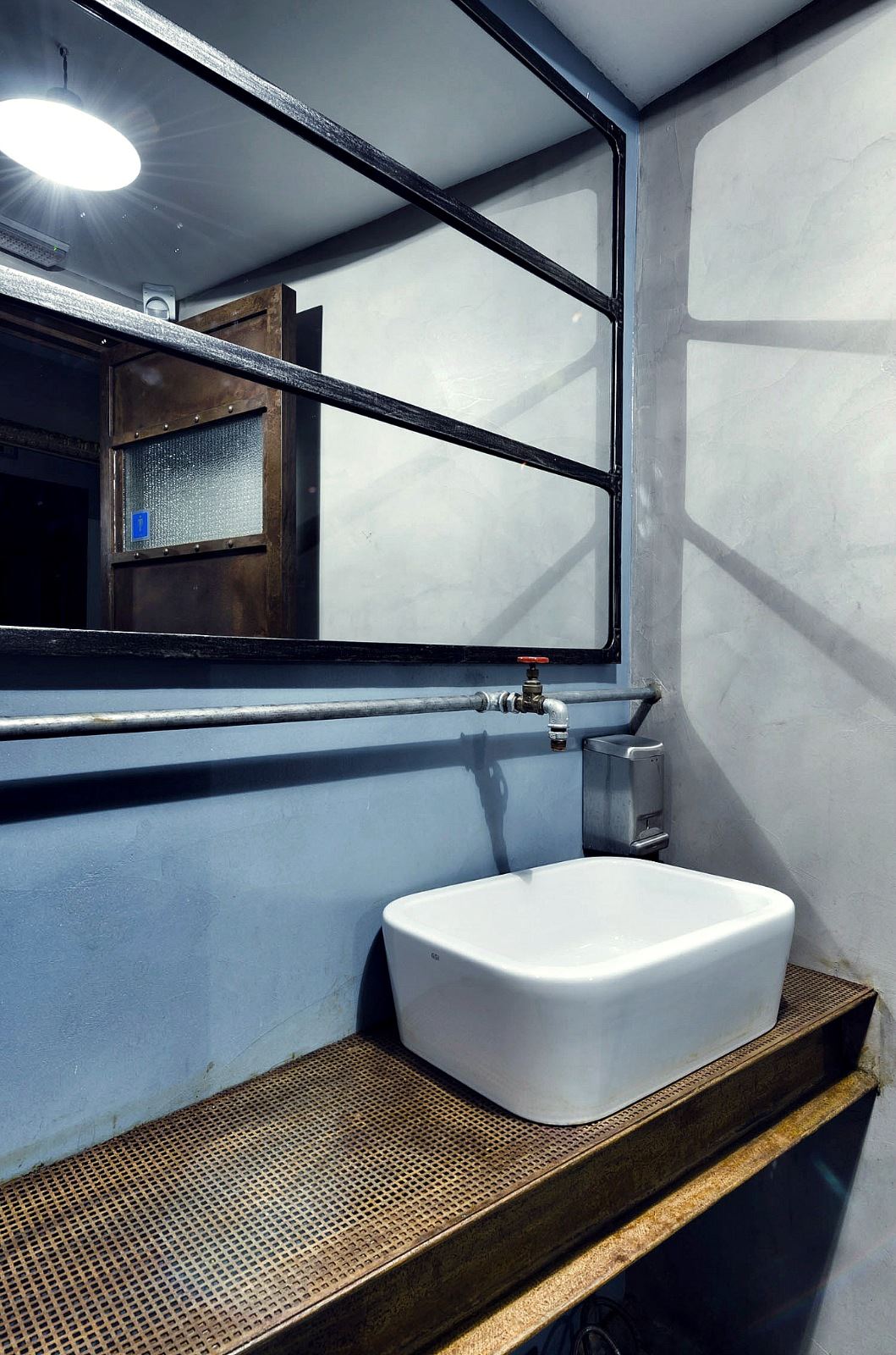
The furniture looks cobbled together consisting of apparent flee market finds set against bright white walls and quirky details like old racing bikes, filing cabinets and a fifties style black telephone. Pipes are exposed and there’s a no-frills feel to the bathrooms.

A unique vibe and a must visit for any Rome-lover.

Kook_Restaurant_Noses_Architects_via_Stylejuicer15

Kook_Restaurant_Noses_Architects_via_Stylejuicer10

Kook_Restaurant_Noses_Architects_via_Stylejuicer14

Kook_Restaurant_Noses_Architects_via_Stylejuicer13

Kook_Restaurant_Noses_Architects_via_Stylejuicer16

Kook_Restaurant_Noses_Architects_via_Stylejuicer04

Kook_Restaurant_Noses_Architects_via_Stylejuicer06

Kook_Restaurant_Noses_Architects_via_Stylejuicer07

Kook_Restaurant_Noses_Architects_via_Stylejuicer01

Kook_Restaurant_Noses_Architects_via_Stylejuicer08

Kook_Restaurant_Noses_Architects_via_Stylejuicer05

Kook_Restaurant_Noses_Architects_via_Stylejuicer09

Kook Restaurant Noses Architects via Stylejuicer

Enjoy and I hope you’re inspired!

Annie Signature Stylejuicer

More information | Kook Restaurant
Interior Design | Noses Architects

FUN, PLAY & CREATIVITY IS ENCOURAGED AT LEGO OFFICES DENMARK

18 September 2013

Imagine your job was to design new products for LEGO. And now imagine your working environment is shaped and designed with fun, play and creativity in mind. I know I’d be in heaven and so would my kids!

copyright-LEGO-Denmark-12

In 2010 Danish architects Rosan Bosch and Rune Fjord designed the interior of LEGO PMD [an acronym for LEGO’s development department] as a children’s universe where the designers imagination is allowed and encouraged to run wild. For starters you can escape from meetings via a slide back to your open-plan office and you can climb through holes and rest or hide in nooks and crannies just about anywhere in the padded ‘cloud’.

Rosan Bosch explains:

In order to create a design that matches the creative development process in the department, the imagination was given free reins. Across the large space, an existing walkway was turned into an oversize seating area with a light blue colour that transforms the walkway into a light, fluffy cloud. The cloud twists and turns and unfolds to form sofas, sitting podiums and a slide that connects the two floors.

A striking graphic design on the wall with giant blades of grass and an oversize LEGO man strike a contrast to the bonsai gardens with tiny LEGO people that are built into the tables. One’s sense of scale is challenged – who is big, and who is small?

In this physical design, children’s fantasy world becomes a part of everyday perception and defines a setting for creating new designs for games and play. The new LEGO PMD is a children’s universe where the imagination can be unleashed – for children and designers alike.

Wow, lucky LEGO employees! I just hope their legs still bend at the knees. 😉

copyright-LEGO-Denmark-15

copyright-LEGO-Denmark-11

copyright-LEGO-Denmark-10

copyright-LEGO-Denmark-09

copyright-LEGO-Denmark-07

copyright-LEGO-Denmark-06

copyright-LEGO-Denmark-05

copyright-LEGO-Denmark-04

copyright-LEGO-Denmark-03

copyright-LEGO-Denmark-02

copyright-LEGO-Denmark-01

copyright-LEGO-Denmark-08

Lego Offices Denmark via Stylejuicer

Lego Offices Denmark via Stylejuicer

Enjoy and I hope you’re inspired!

Annie Signature Stylejuicer

More information | Rosan Bosch & Rune Fjord
Photography | Anders Sune Berg

JUICY CONCEPT: SUCKING LEMONS FOR THE FIRST TIME

17 September 2013

Sucking lemons! Could there be a more apt concept for Stylejuicer!? I’m chuffed to bits to share Toronto photographer duo April Maciborka and David Wile’s ’pucker’ series with you today.

A simple and genius idea that provoked quite strong reactions in me. Not only did the childrens faces make me laugh out loud but I couldn’t help imagining the experience myself and started salivating and sucking my cheeks! I guess that’s what you’d call a Pavlovian response.

Finding this project online is exactely what Stylejuicer is all about: sharing cool (and juicy) ideas and bringing a smile and a dash of inspiration into your lives.

copyright David Wile April Maciborka via Stylejuicer.com

Apart from the fab photos I wanted to find out a bit more about the concept and how it all came together, so here’s what April told me.

HOW DID YOU COME UP WITH THE IDEA?

Dave and I wanted to shoot a creative [project] involving babies. We brainstormed the idea of photographing babies reactions to tasting or experiencing something for the first time, when our friend suggested lemons. It was such a great idea because everyone can relate to the experience of tasting something sour. We imagined that freezing that moment in time would be hilarious and it was!

DO YOU HAVE SMALL KIDS YOURSELVES?

No, we dont. Dave has 2 nephews and 1 neice that we hang out with a lot. I have done a lot of volunteer work abroad at baby orphanages so combined we have had a lot of child experience.

IN THE BUSINESS THEY SAY NEVER WORK WITH SMALL CHILDREN OR ANIMALS…

Lol. Somehow we chose to work with babies and animals in our series ‘splash’. I guess we are suckers for what is considered difficult.

WHO ARE THE LITTLE MODELS?

All of the babies are our friends kids or friends of friends kids. We advertised on Facebook and started a selection process. We offered a free family portrait in return for having your child be photographed as they taste lemon for the first time. Parents were exstatic for a free photoshoot and thought it would be hilarious to see their babies reaction!

HOW LONG DID IT THE SHOOT TAKE?

The shoot was completed over 2 weekends. Kids take a lot of patience to photograph and TIME. You need to allow time for them to get used to their new environment and be comfortable there. They also needed to be comfortable with us. For the most part we were strange faces to these babies. After easing them into the environment we would photograph them with their family and then break and then put them on a seperate set for the lemon. Out of about 20 kids, only 1 would not try the lemon. She hated the texture of the lemon in her fingers. Most babies love to eat so the idea of picking up a slice and munching on it was so alluring for them.

Shockingly, most babies continued eating the lemon even if they thought it was so sour. Some kids munched on it without a reaction at all!!!

copyright-DavidWile-via-Stylejuicer.com-18

copyright-DavidWile-via-Stylejuicer.com-05

copyright-DavidWile-via-Stylejuicer.com-14

copyright-DavidWile-via-Stylejuicer.com-16

copyright-DavidWile-via-Stylejuicer.com-08

copyright-DavidWile-via-Stylejuicer.com-03

copyright-DavidWile-via-Stylejuicer.com-01

copyright-DavidWile-via-Stylejuicer.com-06

copyright-DavidWile-via-Stylejuicer.com-10

copyright-DavidWile-via-Stylejuicer.com-09

copyright-DavidWile-via-Stylejuicer.com-11

copyright-DavidWile-via-Stylejuicer.com-13

copyright-DavidWile-via-Stylejuicer.com-15

copyright-DavidWile-via-Stylejuicer.com-12

copyright David Wile April Maciborka via Stylejuicer.com

Enjoy and I hope you’re inspired!

Annie Signature Stylejuicer

Photography | April Maciborka & David Wile

MADEWELL IS COUNTING ON FRENCH COOL FOR AW 2013

11 September 2013

We all know that our American cousins love the French and Paris in particular. Somehow they’ve got the reputation for being effortlessly stylish, chic and arrogant which infuriatingly contributes to their ‘cool’ factor and their ‘je ne sais quoi’. Putain, how do they do it!?

Madewell has cunningly cottoned on to this open secret and aligned themselves for the AW 2013 season with achingly cool Parisian model, mum and music producer Caroline de Maigret. Never heard of her? Don’t worry, I hadn’t either but I’ve since fallen in love with her ‘romantic tomboy style’. That and the fact that she’s in her late thirties. Just by being herself as well as reading her Madewell interview she’s sold the entire collection to me. I’m sure Madewell’s marketing and Social Media guru’s are climaxing right now but you’ve got to hand it to them. This is top notch marketing of a VERY good product.

I couldn’t help including an excerpt of Caroline’s interview with Madewell as it demonstrates all that I love about fashion and ok, I admit it: Fench style! [Please read with a French accent and a croissant.]

copyright Madewell CarolinedeMaigret viaStylejuicer

WHAT’S YOUR APPROACH TO STYLE?

It’s almost unconscious. A lot of it comes from what my mother taught me: to seek out a nice cut and a quality fabric. It’s in our roots not to show off or be too ostentatious, but rather to understand the classic beauty in the understated.

OTHER THAN YOUR MOM, WHO HAS INFLUENCED YOUR STYLE THE MOST?

My boyfriend taught me to have fun with clothes and to look in the mirror and find that little twist, that one signature or special item. I don’t follow trends but my style evolves with fashion in the sense that I incorporate new pieces into my wardrobe every season—a mix of closet staples with a few of those statement pieces to give it that unique twist.

YOU WEAR A LOT OF HATS. HOW DO YOU TRANSITION FROM A DAY SPENT IN THE STUDIO TO HEADING OUT AT NIGHT?

In France, we dress the same almost 24 hours a day. What you wear during the day can always take you out at night, because it’s already cool enough…I only wear things that can carry me from day to night.

Read more here…

So without further ado, here’s my AW 2013 Madewell moodboard featuring the coolest chick this side of the Atlantic. Alexa Chung eat your heart out!

Madewell Caroline de Maigret via Stylejuicer

CREATE THE LOOK WITH STYLEJUICER AND POLYVORE

Such is my affection for the brand that I’ve even created a MADEWELL AW 2013 collection with key pieces.
I must be mad!

Madewell AW2013on Polyvore by Stylejuicer

Enjoy and I hope you’re inspired!

Annie Signature Stylejuicer

More information & photography | Madewell

A MINIMALIST DREAM – RIDGE ROAD RESIDENCE BY STUDIO FOUR

10 September 2013

minimalist, architecture, australia, studio four, ridge road residence, melbourne, black timber, rugged landscape, terraced, decks, sustainability, green credentials, space, sanctuary, enclosure, comfort, calm, trend, style

This dramatic minimalist home on the edge of a golf course outside Melbourne caught my eye on Pinterest a while ago. It was designed by architects Studio Four and I love the stark contrast of black timber against the rugged landscape of grasses, gnarled old trees and brooding skies.

The design of Ridge Road Residence spills down the slope and ends in a series of terraced decks which makes it blend into the landscape rather than being elevated out of it. It also has fabulous sustainability credentials with the use of renewable timber, underground water storage, water saving fixtures, low VOC paints and materials. The site is also being re-vegetated with native species endemic to the local area.


minimalist, architecture, australia, studio four, ridge road residence, melbourne, black timber, rugged landscape, terraced, decks, sustainability, green credentials, space, sanctuary, enclosure, comfort, calm, trend, style


A beautiful and sensitive approach by architects Studio Four who say in their own words:

We sought to create a quality of space that provides a sense of sanctuary, enclosure and comfort. Emphasis was placed upon capturing the varying qualities of light, the scale and proportions of space, and providing a tangible connection with the building’s surrounds, both in topography and landscape.

The form of the building was also driven by the desire to separate the public and private zones of the residence. The kitchen, dining and living spaces are combined to create a single, fluid area, delineated only by a gentle level change and a fireplace / storage element. These elements provide the level of intimacy required by the client whilst also allowing the advantages provided by open planning.

The panelised matte black wall to the kitchen conceals a powder room, laundry and butler’s pantry, providing the high level of functionality required, while maintaining the calm qualities of the open plan space.


minimalist, architecture, australia, studio four, ridge road residence, melbourne, black timber, rugged landscape, terraced, decks, sustainability, green credentials, space, sanctuary, enclosure, comfort, calm, trend, style

minimalist, architecture, australia, studio four, ridge road residence, melbourne, black timber, rugged landscape, terraced, decks, sustainability, green credentials, space, sanctuary, enclosure, comfort, calm, trend, style

minimalist, architecture, australia, studio four, ridge road residence, melbourne, black timber, rugged landscape, terraced, decks, sustainability, green credentials, space, sanctuary, enclosure, comfort, calm, trend, style

minimalist, architecture, australia, studio four, ridge road residence, melbourne, black timber, rugged landscape, terraced, decks, sustainability, green credentials, space, sanctuary, enclosure, comfort, calm, trend, style

minimalist, architecture, australia, studio four, ridge road residence, melbourne, black timber, rugged landscape, terraced, decks, sustainability, green credentials, space, sanctuary, enclosure, comfort, calm, trend, style

minimalist, architecture, australia, studio four, ridge road residence, melbourne, black timber, rugged landscape, terraced, decks, sustainability, green credentials, space, sanctuary, enclosure, comfort, calm, trend, style

minimalist, architecture, australia, studio four, ridge road residence, melbourne, black timber, rugged landscape, terraced, decks, sustainability, green credentials, space, sanctuary, enclosure, comfort, calm, trend, style

minimalist, architecture, australia, studio four, ridge road residence, melbourne, black timber, rugged landscape, terraced, decks, sustainability, green credentials, space, sanctuary, enclosure, comfort, calm, trend, style

minimalist, architecture, australia, studio four, ridge road residence, melbourne, black timber, rugged landscape, terraced, decks, sustainability, green credentials, space, sanctuary, enclosure, comfort, calm, trend, style

minimalist, architecture, australia, studio four, ridge road residence, melbourne, black timber, rugged landscape, terraced, decks, sustainability, green credentials, space, sanctuary, enclosure, comfort, calm, trend, style


MORE INFORMATION | Studio Four
PHOTOGRAPHY | Shannon McGrath