Tag Archives: Rosa Park

MOOD BOARD | IN LOVE WITH GREY

14 January 2015

mood board, grey, favourite colour, clothing, interior design, cereal, rosa park, the graham and co, catskills, new york city, weekend getaway, design, fashion, instagram, pinterest, laid back, comfortable, style, trend

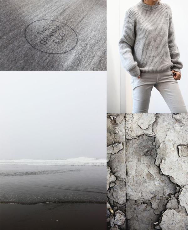
I’m going to continue the monochrome theme today with grey which has always been a bit of a favourite colour for me. It’s so flattering in clothing and interiors as it provides a great backdrop and base for pops of colour.

Last week I came across Cereal founder and editor Rosa Parks article of The Graham & Co and fell in love with the look of this small boutique hotel in the Catskills, a mere 100 miles north of New York City.

Perfectly located for hiking, fishing and skiing the hotel describes itself as a modern take on the classic weekend getaway. It is run by four friends who all have a background in design and fashion which accounts for the simple modern rustic styling of the rooms. Rosa’s shot of the branded grey blanket above gives you a flavour of the hotel’s laid back and comfortable style. Check out their website for more details.

And if you don’t already follow Rosa on Instagram make sure to check out her inspirational feed.

 
NOTE | All shots used on the mood board via my Pinterest boards
 
Follow Stylejuicer with Bloglovin

CEREAL MAGAZINE IS IN PURSUIT OF FOOD AND TRAVEL

6 November 2013

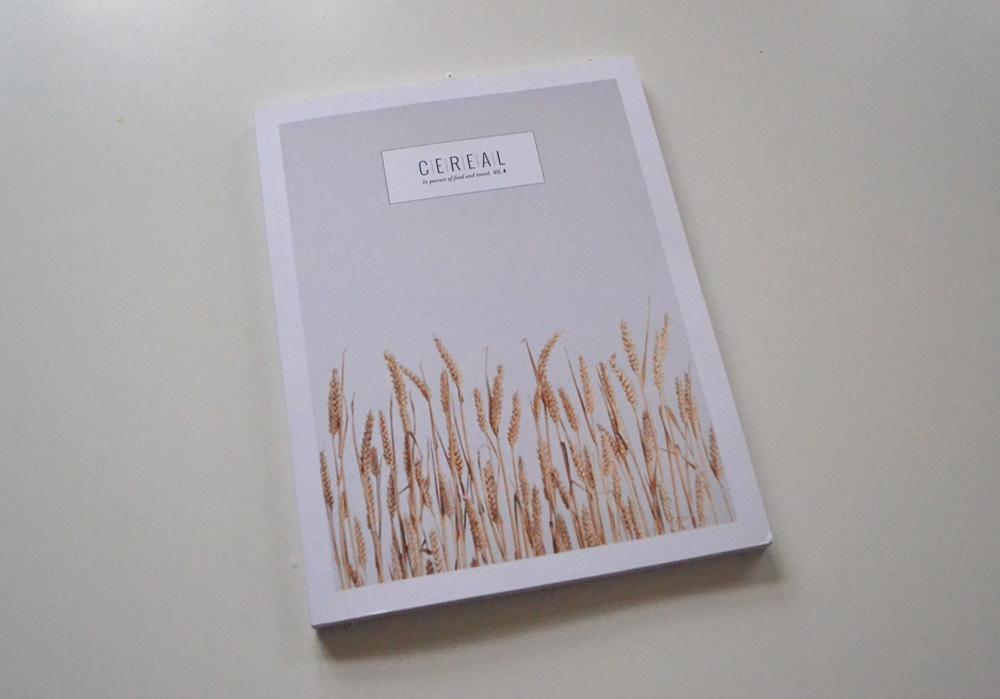
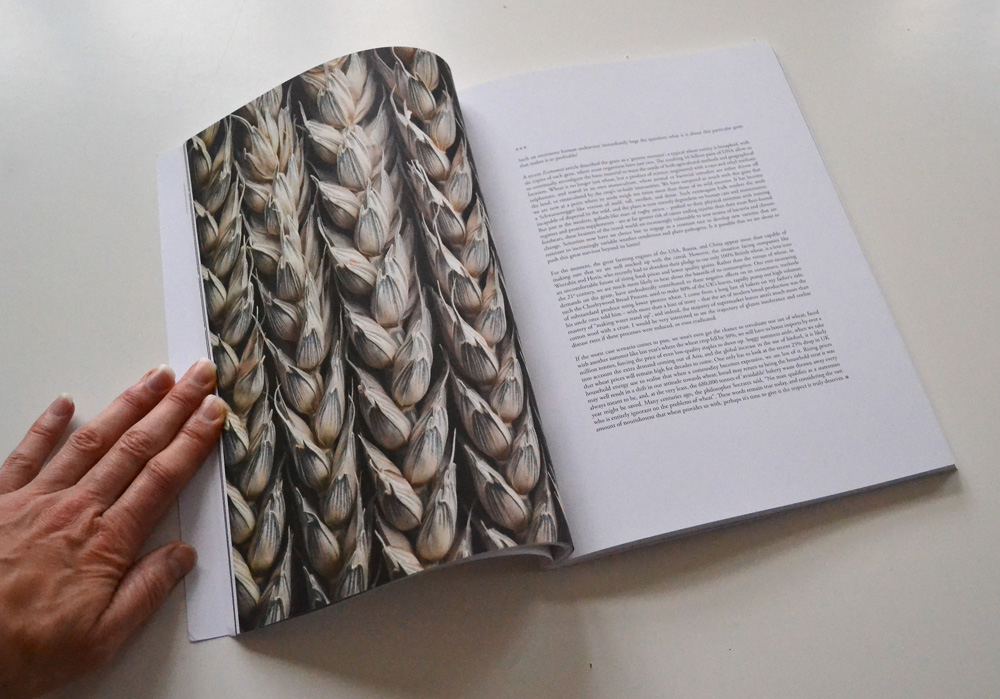
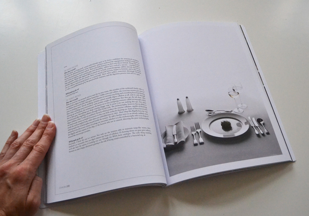
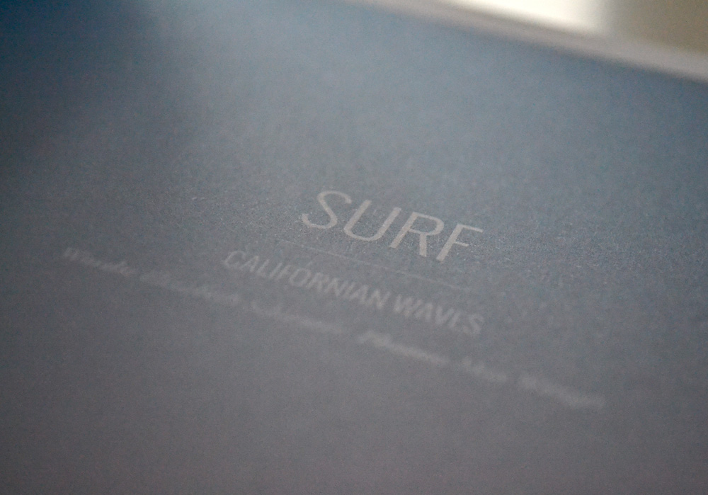
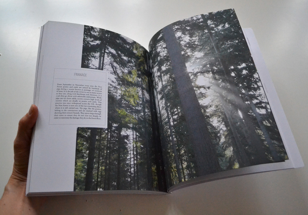
Oh, how I love to hold a beautifully produced, perfect bound, matt laminated, weighty magazine. Printed on tactile uncoated stock with text that doesn’t crowd the page but gives my eye a rest and images that inspire and make me day dream.

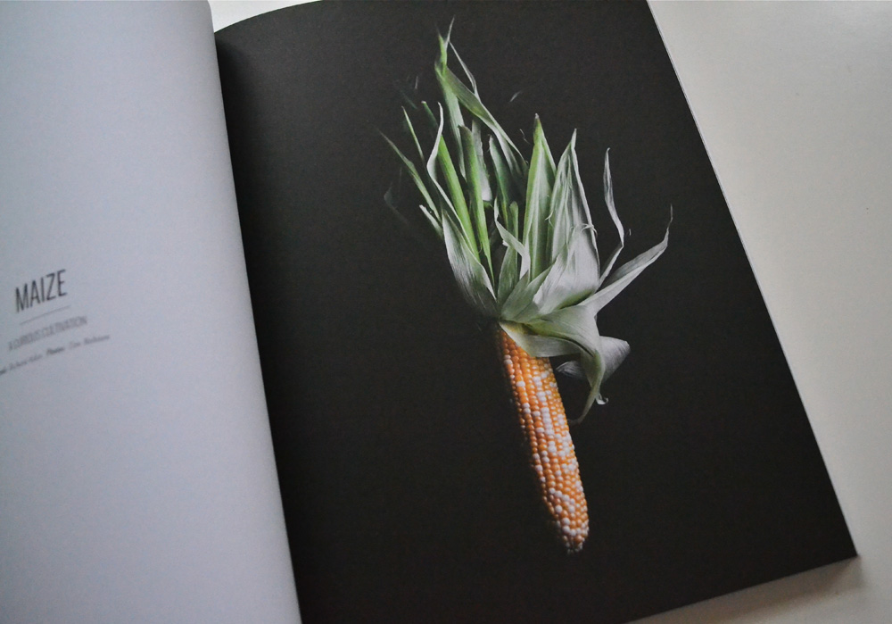
CEREAL is just that! A designers idea of spacial heaven, where section headers take up double page spreads, photos bleed to the edge in abundance and space is not at a premium. There’s no client demanding for the logo to be made bigger and more copy to be crammed in. The typography is outstanding with a perfect mix of serif and sans. For me it feels like a meal at a Michelin star restaurant with a perfect combination of flavours and textures. Every ingredient considered and never overbearing. But enough lyrical waxing now.

Cereal Magazine via Stylejuicer

The editor Rosa Park describes CEREAL as:

… a magazine rooted in our passions – for food, for travel. And for books too, with all the wonderful things they can teach us. Each quarterly volume of CEREAL contains details expositions of edible topics, travel destinations, as well as profiles on products, people and places – chosen because they’re relevant, interesting, or have simply caught our attention.

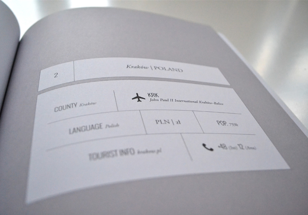
The Bristol based quarterly publication was launched late in 2012 with huge success and their first volume was a sell-out. I suspect a lot of the success can be attributed to designer Rich Stapleton’s minimal approach, subtle grey colour palette, infographics and maps that make the reading experience such a delight.

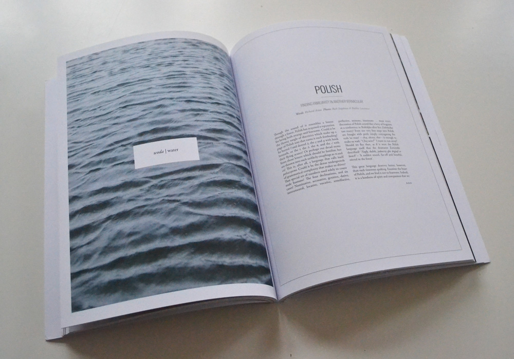
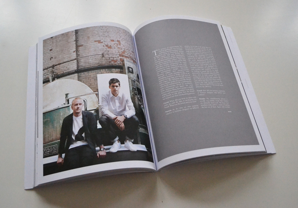
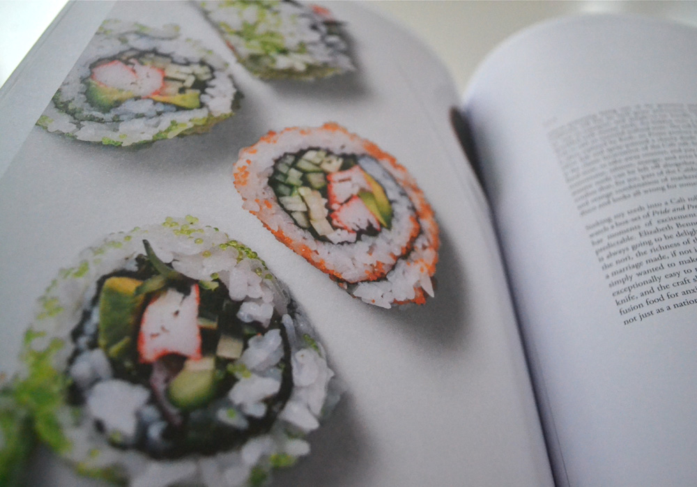
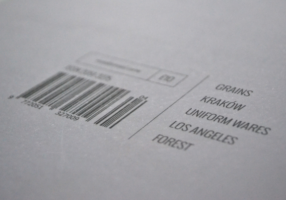
Topics are explored in great depth and in their current fourth volume range – seemingly random – from a photo essay on grains to Krakow and British watch manufacturers, to Californian residential architecture and sushi, finishing off with the UK’s New Forest. An eclectic selection which let’s you discover interesting facts about topics you never thought you’d be interested in. In my case I found myself fascinated by the analysis of the Polish language by Richard Aslan. Who would have thought!?

CEREAL has also launched a capsule collection of stationery items that appeal to the closet OCD-er and might be an idea for the end of year consumer extravaganza commonly known as “Christmas”! Hohoho!

Cereal-Mag-via-Stylejuicer02

Cereal-Mag-via-Stylejuicer03

Cereal-Mag-via-Stylejuicer04

Cereal-Mag-via-Stylejuicer05

Cereal-Mag-via-Stylejuicer06

Cereal-Mag-via-Stylejuicer07

Cereal-Mag-via-Stylejuicer13

Cereal-Mag-via-Stylejuicer09

Cereal-Mag-via-Stylejuicer10

Cereal Magazine via Stylejuicer

Enjoy and I hope you’re inspired!

Annie Signature Stylejuicer

More information | CEREAL magazine
Photography | Annie Kruse