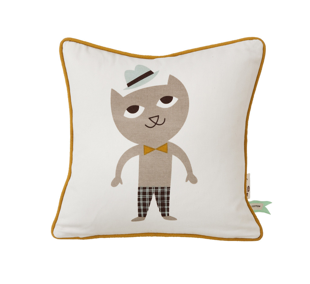
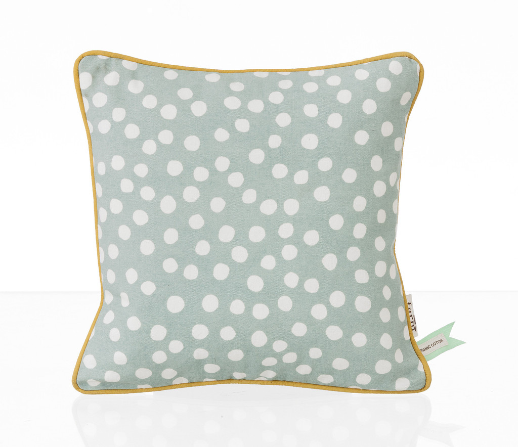
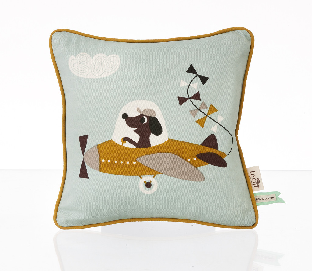
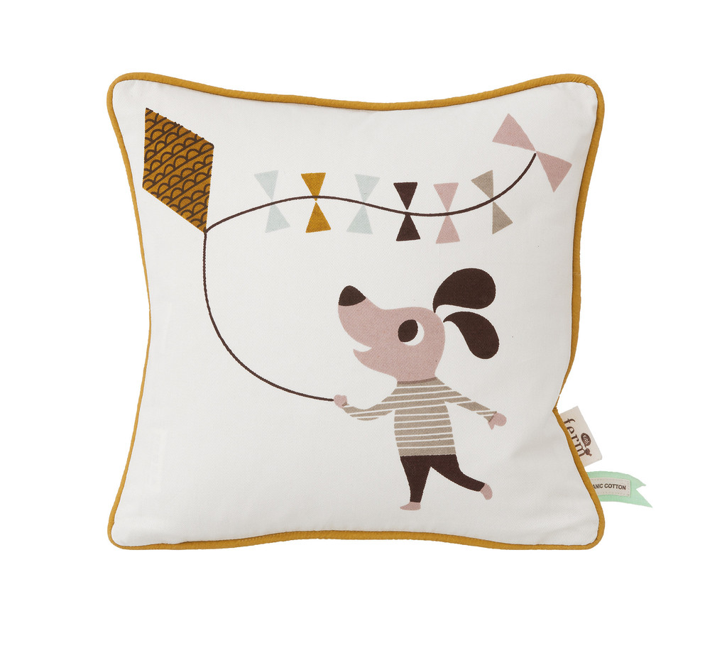
This SUBTLE week on Stylejuicer seems to be filled with real life fairy tales and to warm your heart just a little more and get your entrepreneurial spirit going I’m going to present you Ferm Living, another example of great style and taste coupled with impeccable timing and a dash of… luck!?
I’m hesitating to call Trine Andersen “lucky” as I firmly believe we all create our own lucky breaks but I won’t get too philosophical about it or you’ll have an essay on your hands.
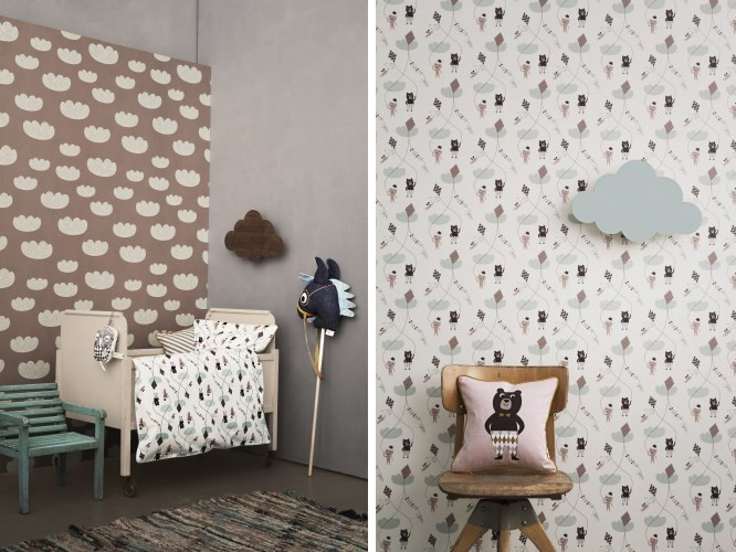
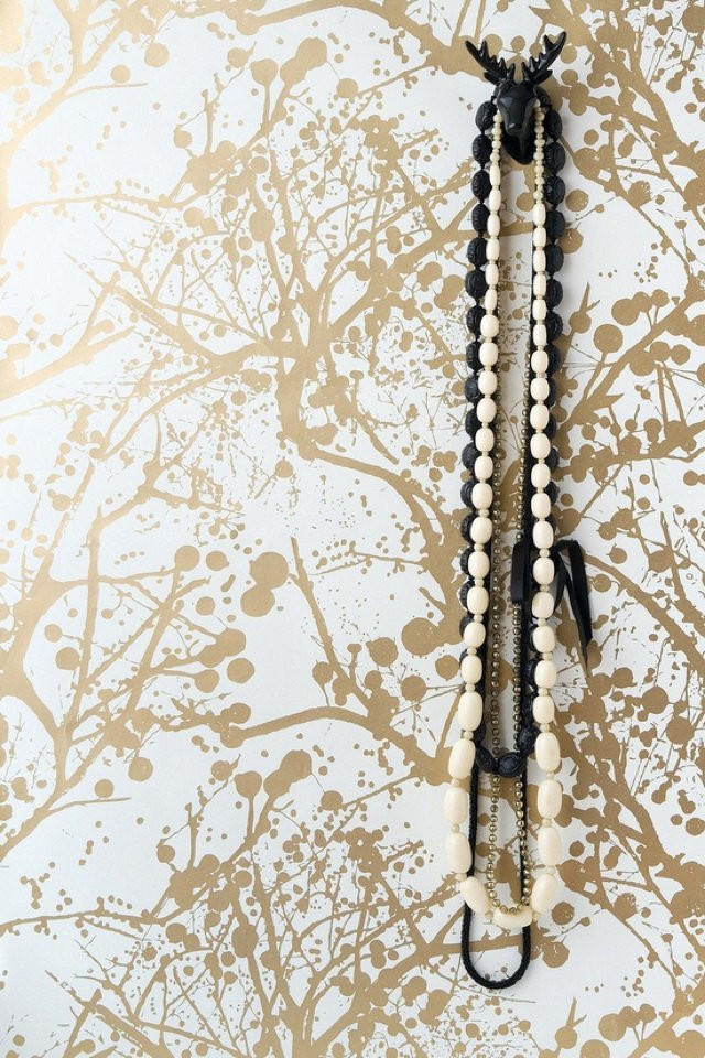
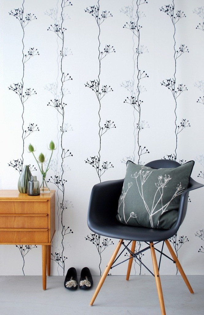
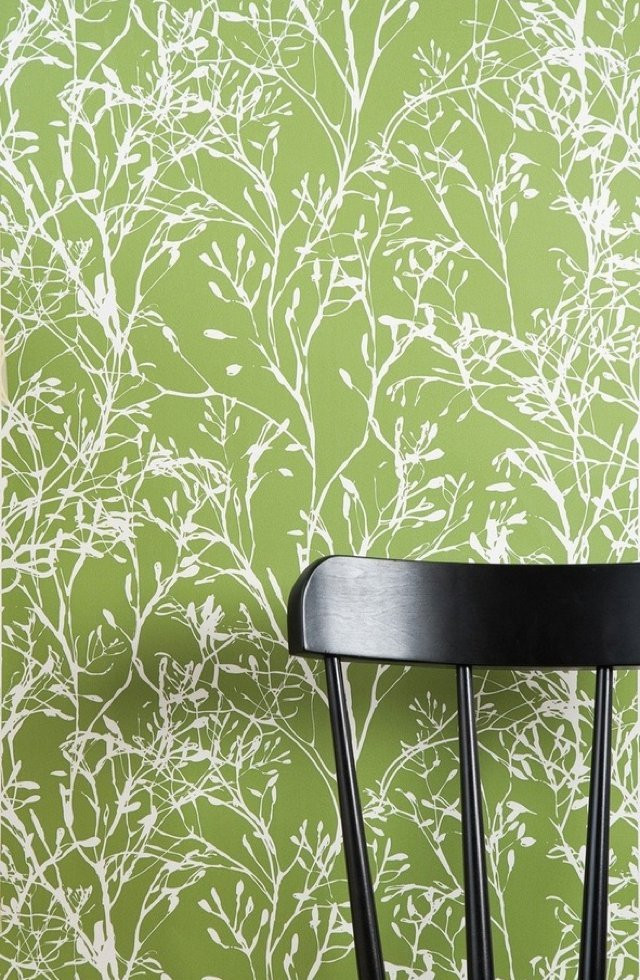
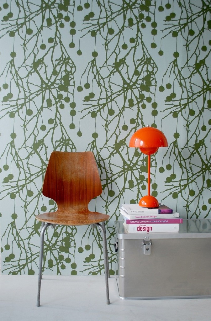
So, the story goes that when graphic designer Trine couldn’t find the wallpaper she wanted for her new home she decided to design and print it herself. So far, so extravagant but her timing back in 2004 (ish) turned out to be impeccable as she had stumbled across a niche in the market for quality graphic wallpaper and founded Ferm Living in 2005.
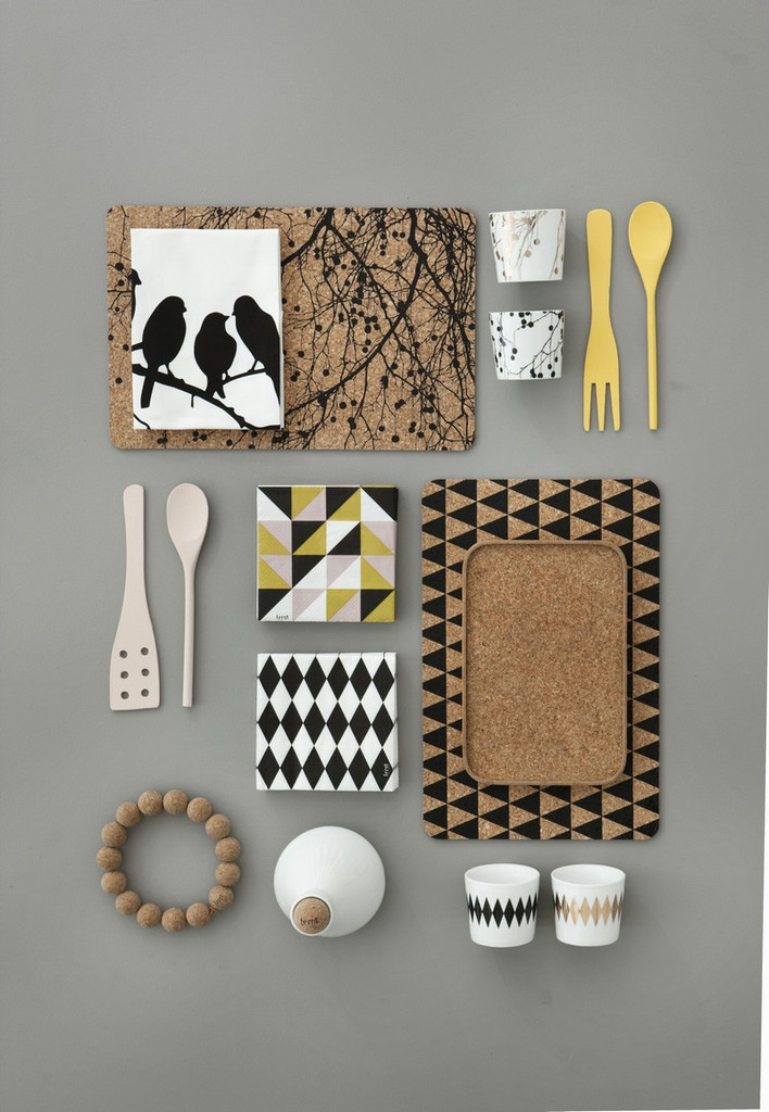
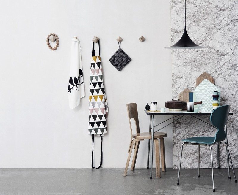
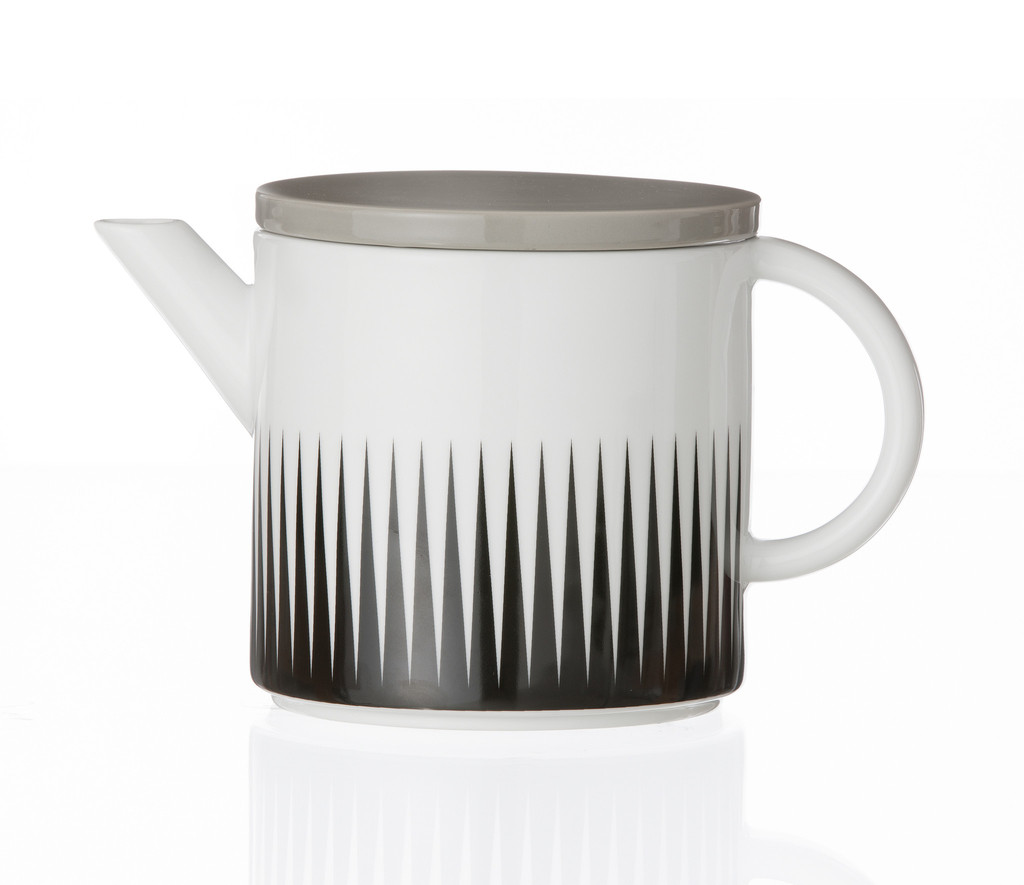
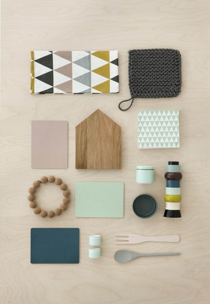
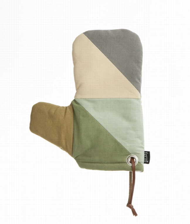
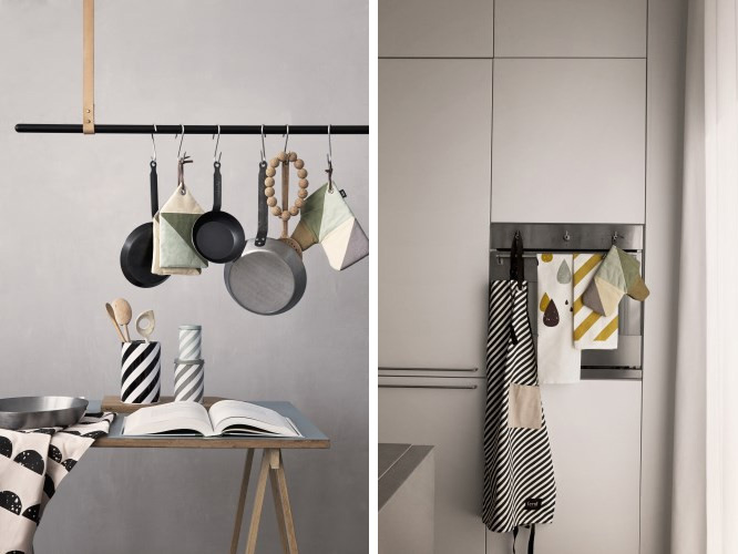
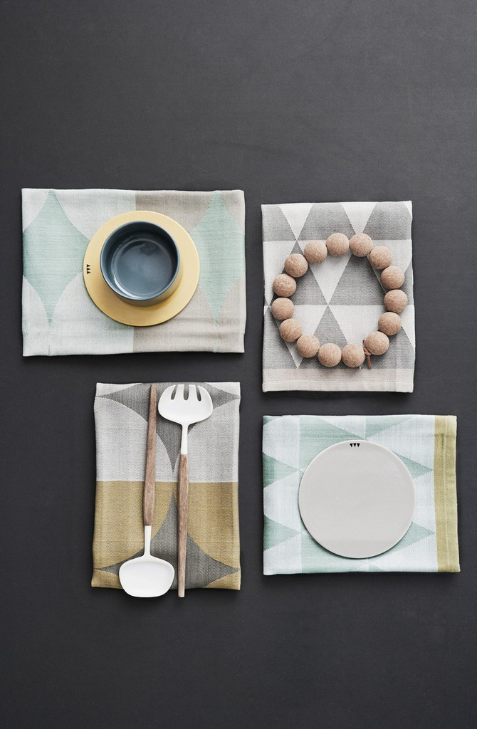
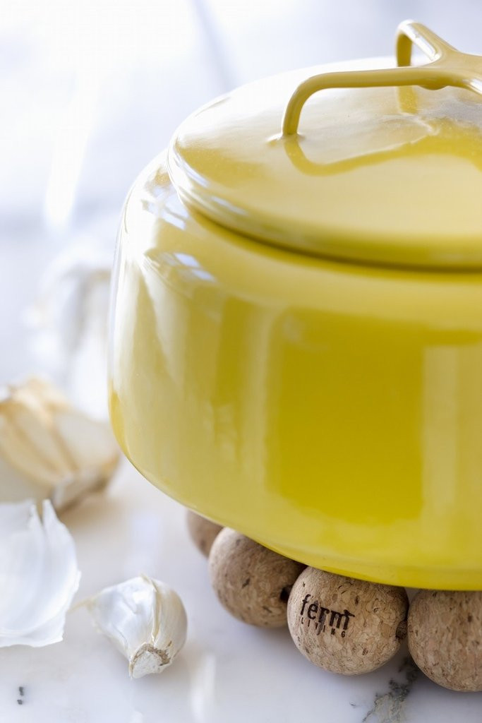
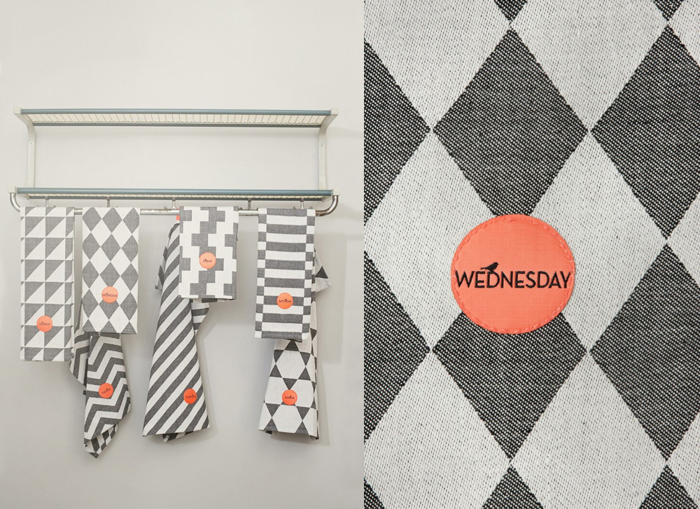
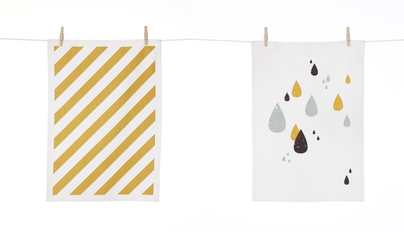
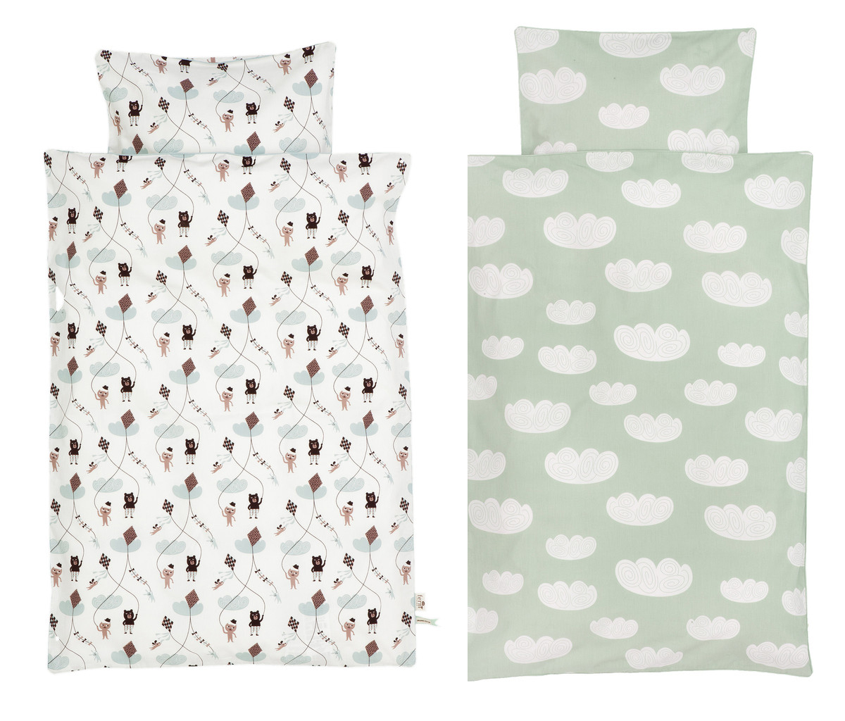
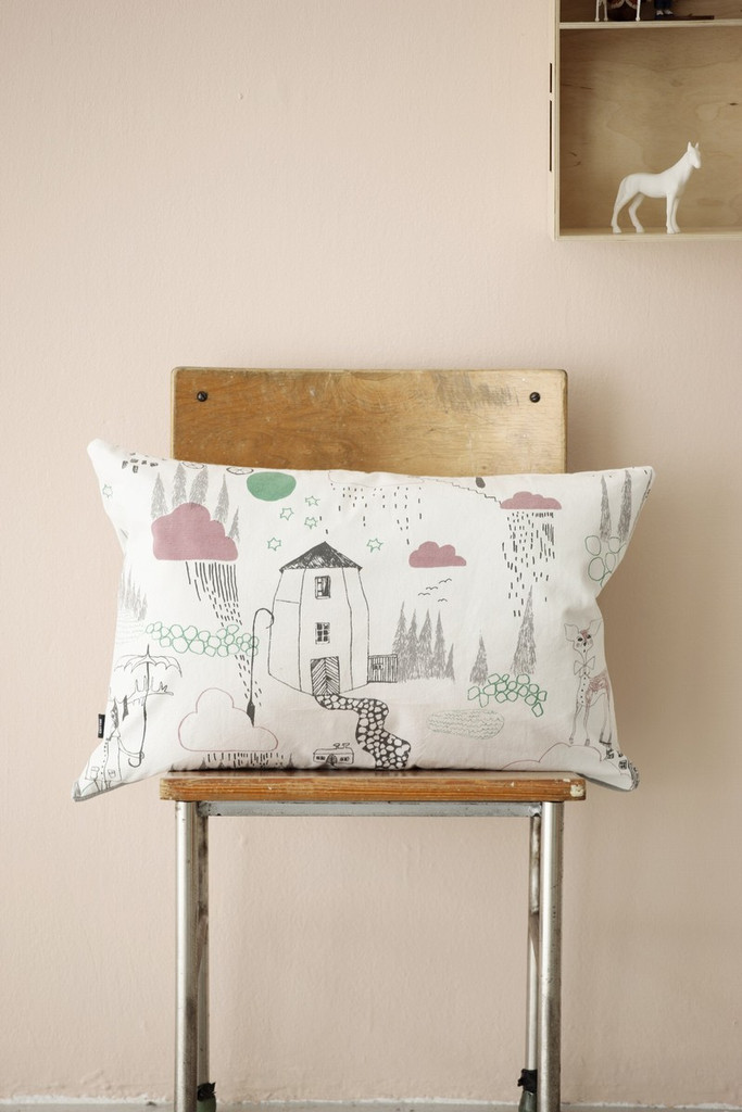
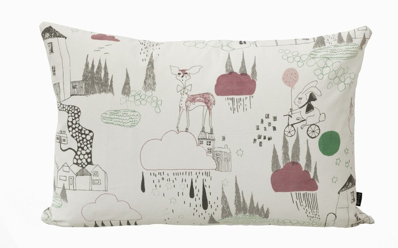
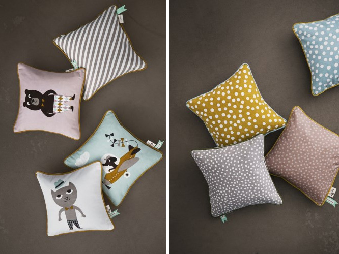
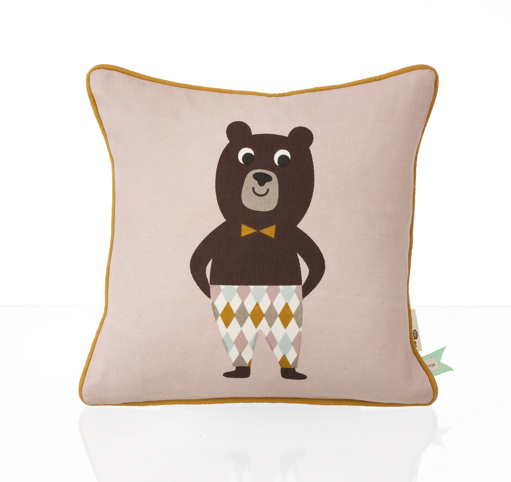
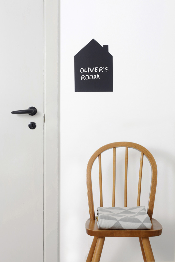
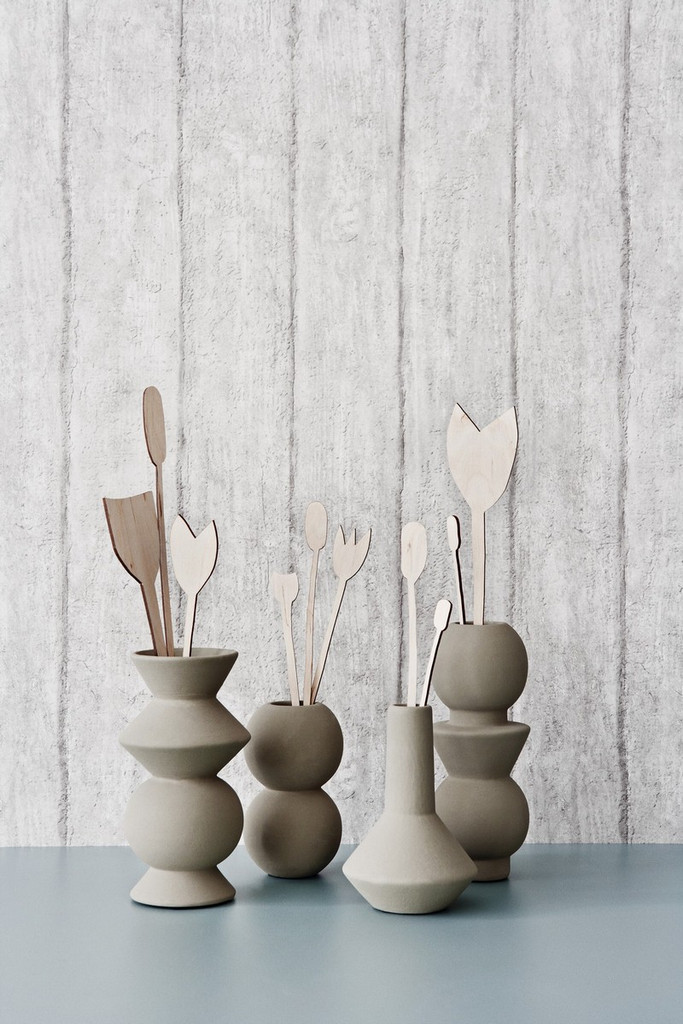
Wallpaper still being at the heart of it she has transferred her designs to homewares ranging from cushions and throws to kitchen and bathroom accessories as well as fabulous kid’s designs, toys and textiles.
The beauty of her designs is the fact that each new collection integrates perfectly with previous ones and subtly evolves your home. Her colour palette is mostly subdued and her designs incorporate strong graphic shapes and prints. I can see how once you’ve experienced her collection in your home you’d want to update it season by season.
To me Ferm’s aesthetic is classically Danish: understated, casual, approachable, mostly minimalist but oh, so strong with a little twinkle in the eye.
A nice strategy and one that has recently made her a success in the US, a notoriously tough market to crack but I suspect her Danish twinkle won them over.
NOTE: If you’d like to read more about Trine and how Ferm came to feature a bird as it’s logo, pop over to Bungalow5 for a small interview with the founder and designer.
Enjoy and I hope you’re inspired!
Photography & more information | Ferm Living

