Category Archives: Design & Illustration

DESIGN INSPIRATION | EMMADIME

3 June 2014

Emmadime, Emma Robertson, knitting by design, book, design, inspiration, graphic design, blog, Oakland, studio

I’ve been a fan of Emma Robertson’s blog Emmadime for a while now and love how she puts her heart and soul into just everything she does.

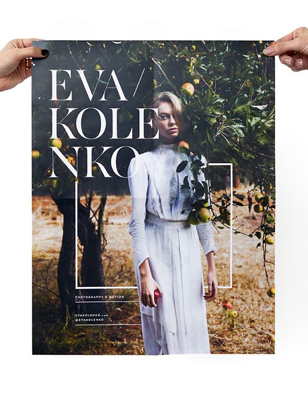
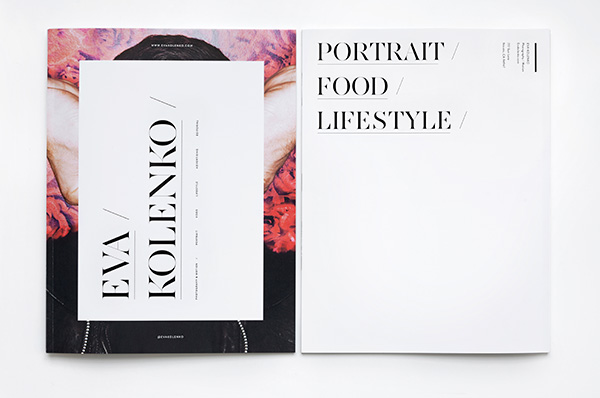
Writing a book about knitting as well as making a short promo video – just awesome! Shooting ‘A Day in The Life’ and showing off her beautiful studio space – super cute and great soundtrack (making the rest of the world’s freelance designers drool with envy and bop along). Arranging a monthly movie night for creative ladies in the bay area – oh, how I wish I’d live round the corner. Giving non other than Erin Hiemstra and the team from Apartment 34 a little design lecture and workshop – genius idea. Oh, and of course today’s highlight, a printed promo brochure for photographer Eva Kolenko.

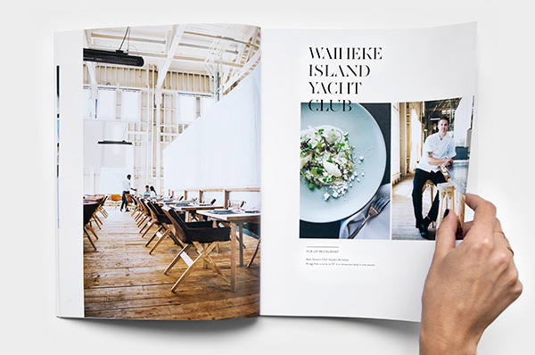
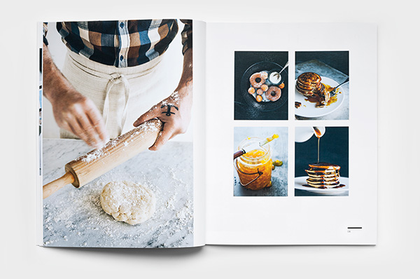
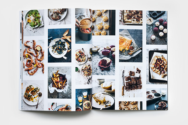
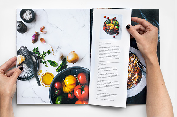
I absolutely adore how Emma treated the photography and overlaid the images subtly with text and minimal graphics. It feels very modern and approachable but very classy at the same time. I love that Emma hasn’t added too many design elements so the client, ie Eva’s photography is still the hero.

The brochure is 38 pages and has a poster as well as a perforated recipe card to take out. A neat idea and a subtle call to action as it will presumably encourage people to stick it to their wall or good ol’ fashioned pinboard reminding them to give Eva a shout when it comes to commissioning the next shoot. I like it!

Pop over to Emma’s blog for some more photos of this beautiful piece of print promotion and say hi from me. Love your work Emma!
 

Eva-Kolenko-Promo2014-by-Emmadime-03

Eva-Kolenko-Promo2014-by-Emmadime-04

Eva-Kolenko-Promo2014-by-Emmadime-05

Eva-Kolenko-Promo2014-by-Emmadime-06

Eva-Kolenko-Promo2014-by-Emmadime-07

Emmadime, Emma Robertson, knitting by design, book, design, inspiration, graphic design, blog, Oakland, studio

 
DESIGN | Emmadime
PHOTOGRAPHY | Eva Kolenko
 
Follow Stylejuicer with Bloglovin

DESIGN | CEREAL MAGAZINE VOLUME 5

1 May 2014

cereal magazine, food, travel, lifestyle, design, editorial, Helsinki, Charleston, Paris, Isles of Scilly, private history, honey, essential, travel bags

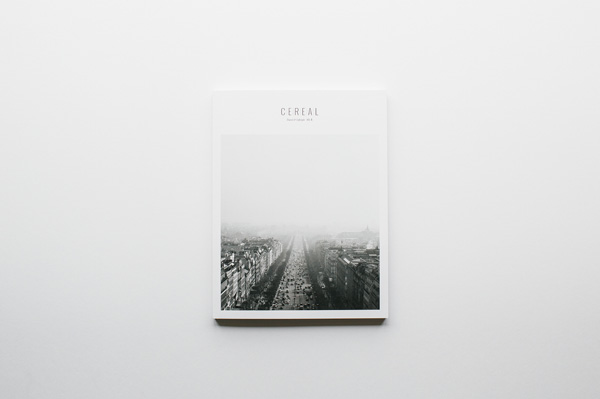
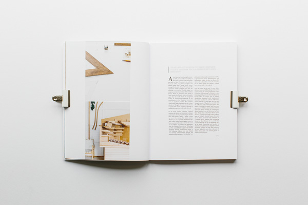
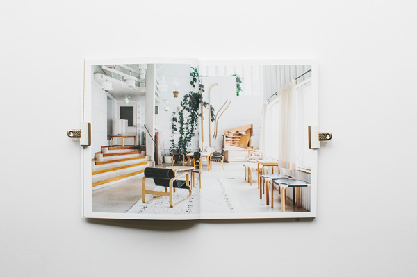
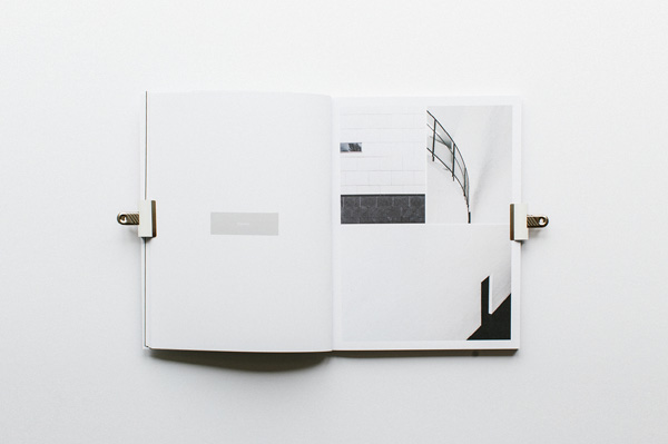
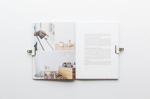
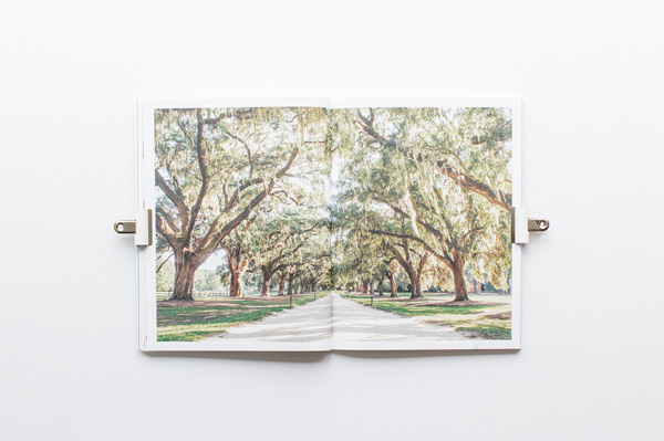
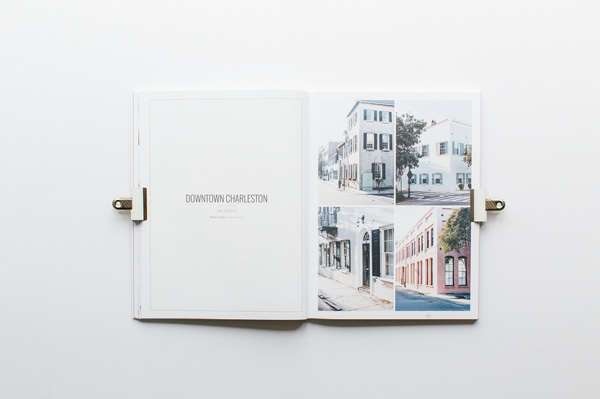
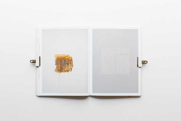
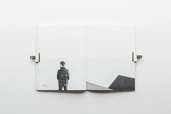
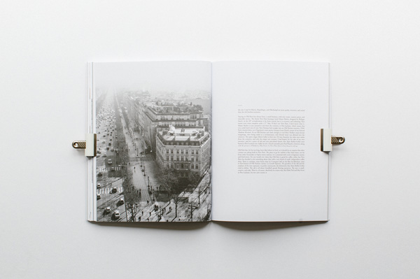
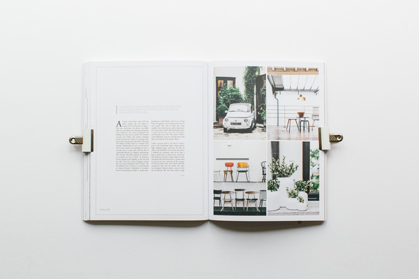
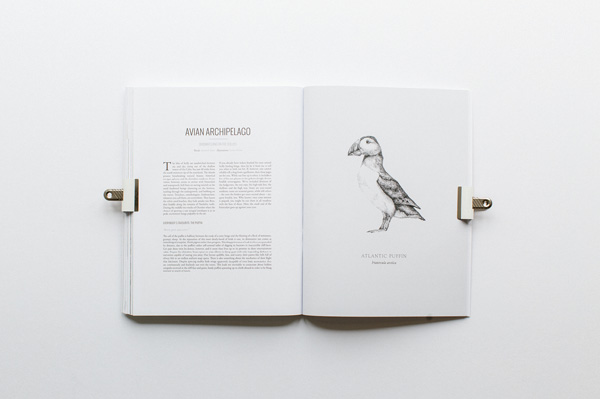
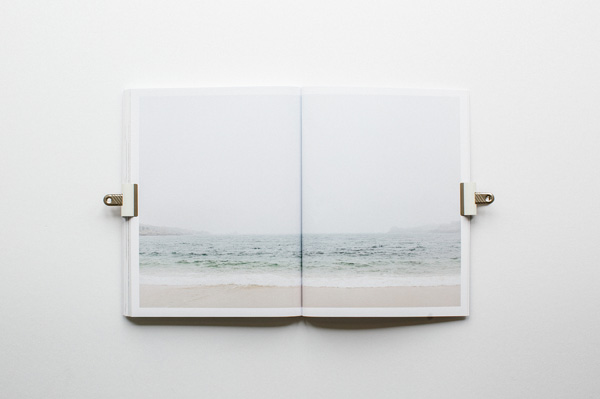
Cereal magazine Volume 5 is out now and it’s looking mighty fine indeed.

Lovers of minimalist aesthetics and quiet photography will no doubt salivate over the reduced and spacious layout of the latest 140 pages as I did over Volume 4.

Covering food, travel and lifestyle you can find stories off the beaten track on Helsinki, Charleston, Paris and the Isles of Scilly with an essay on the private history of honey and a showcase of some of the team’s essential travel bags.

Order your copy here.
 
cereal-magazine-volume5-via-stylejuicer-02

cereal-magazine-volume5-via-stylejuicer-03

cereal-magazine-volume5-via-stylejuicer-04

cereal-magazine-volume5-via-stylejuicer-05

cereal-magazine-volume5-via-stylejuicer-06

cereal-magazine-volume5-via-stylejuicer-07

cereal-magazine-volume5-via-stylejuicer-08

cereal-magazine-volume5-via-stylejuicer-09

cereal-magazine-volume5-via-stylejuicer-10

cereal-magazine-volume5-via-stylejuicer-11

cereal-magazine-volume5-via-stylejuicer-12

cereal magazine, food, travel, lifestyle, design, editorial, Helsinki, Charleston, Paris, Isles of Scilly, private history, honey, essential, travel bags

 
MORE INFORMATION & PHOTOGRAPHY | Cereal Magazine
 
Follow Stylejuicer with Bloglovin
DESIGN INSPIRATION | BRANDING BOLIVAR RESTAURANT OSLO

14 April 2014

Bolivar-Restaurant-via-Stylejuicer-10

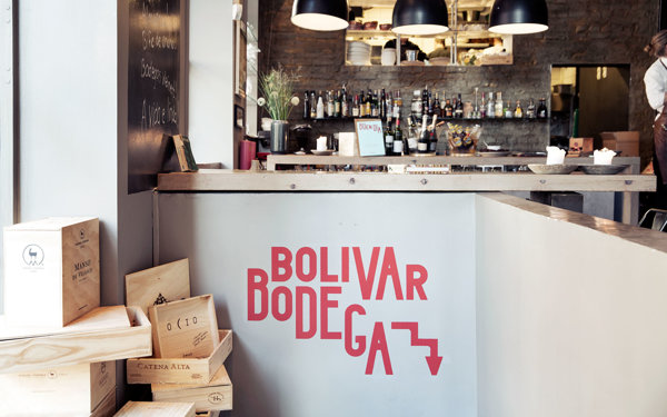
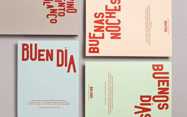
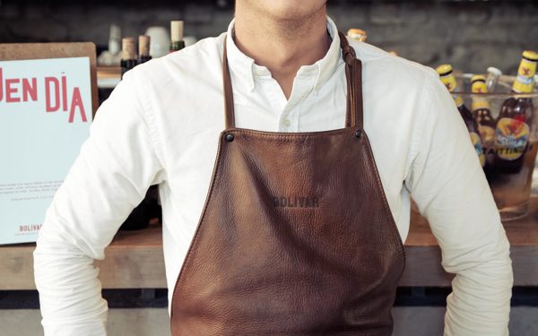
Hola, que tal?! I’ve decided that Mondays are for inspiration and today I’d like to share Norwegian design studio Heydays’ branding for restaurant Bolivar with you.

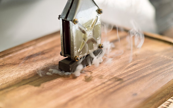
Bolivar is a small piece of South America served in Oslo through authentic food, wine and cigars. Inspired by personal travels and experiences, the identity reflects the owners own impressions of the continent. Joyful, vocal and varied.

Sounds good, doesn’t it!? The branding really caught my eye as it’s a modern take on the tried and tested good ol’ steak house. But unlike most traditional steak houses – thankfully – Bolivar’s menu doesn’t come in a heavy faux leather bound folder with plastic sleeves that stick together with cheap multipurpose cleaner.

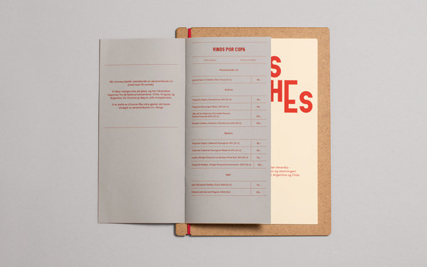
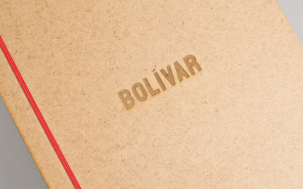
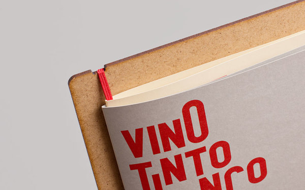
Heydays have come up with a creative binding technique for the menu whereby a branded board with a red elastic band holds drinks and main menu together, almost like a clip board. Oh, how I love a clip board… it gives you so much power, doesn’t it!? I should walk around with one more often… but I digress.

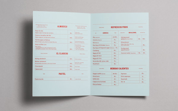
It’s a genius idea as unappetizing grubby menus can quickly and easily be replaced as well as updated reacting to customer preferences and including seasonal dishes. Everyone’s a winner!

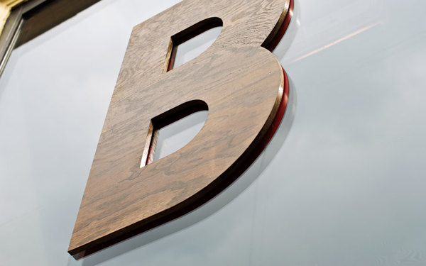
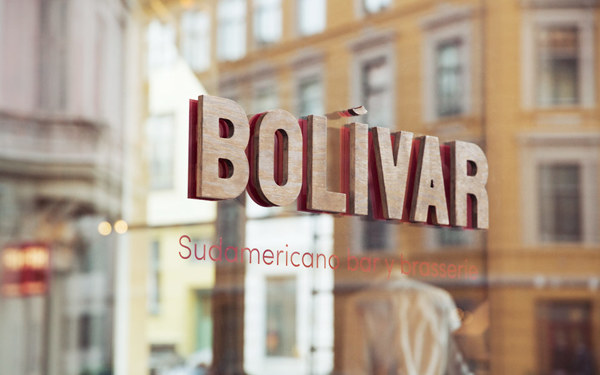
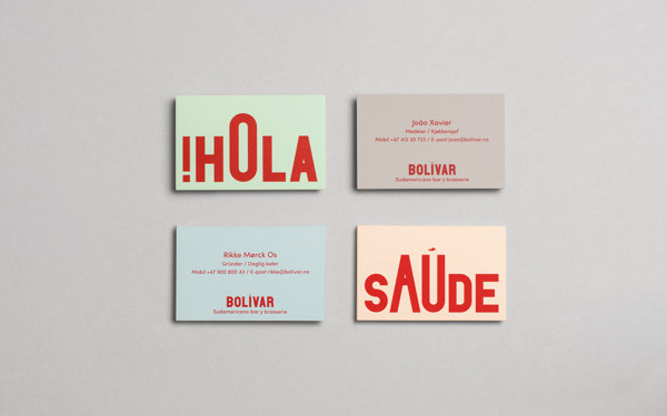
My favourite bit has to be the deliberately uneven typography that links back to one of their original inspiration shots showing a street vendors cart and it’s hand painted sign. The pastel stock for stationery and marketing materials is another nod to that photograph and works well with the intense red typography and tactile dark wood and leather for the rest of the signage.

An great example of a funky, modern South American eatery and bodega with a fun, earthy and totally authentic feel. Hasta mañana.

 
Bolivar-Restaurant-via-Stylejuicer-04

Bolivar-Restaurant-via-Stylejuicer-13

Bolivar-Restaurant-via-Stylejuicer-06

Bolivar-Restaurant-via-Stylejuicer-02

Bolivar-Restaurant-via-Stylejuicer-11

Bolivar-Restaurant-via-Stylejuicer-01

Bolivar-Restaurant-via-Stylejuicer-05

Bolivar-Restaurant-via-Stylejuicer-12

Bolivar-Restaurant-via-Stylejuicer-07

Bolivar, Restaurant, Branding, Brand Identity, Graphic Design, Trend, Letterpress, Oslo, Norway, Agency, Heydays, South America, Inspiration

 
MORE INFORMATION | Bolivar Restaurant Oslo
PHOTOGRAPHY & DESIGN | Heydays
 
Follow Stylejuicer with Bloglovin
EDITORIAL DESIGN BY JESSICA GIBOIN

25 February 2014

copyright-Jessica-Giboin-via-Stylejuicer04

Food is hip, right!? I don’t know a single person who’s not interested in what they eat. We all seem to love cooking and baking, enjoy instagraming our meals before we dive in, read blogs and books and magazines about food and care about food miles. The industry has mushroomed and food has become a lifestyle topic.
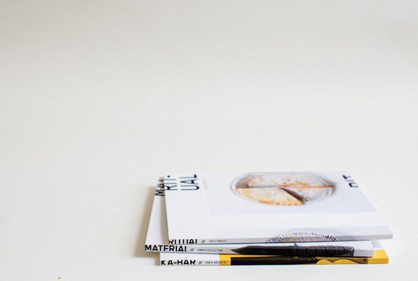
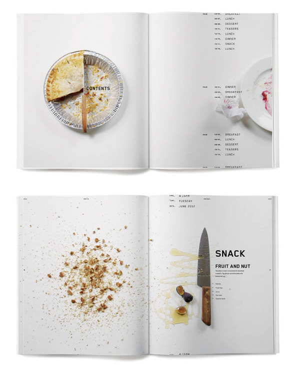
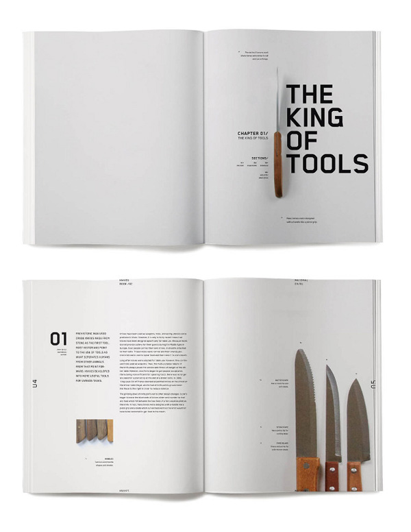
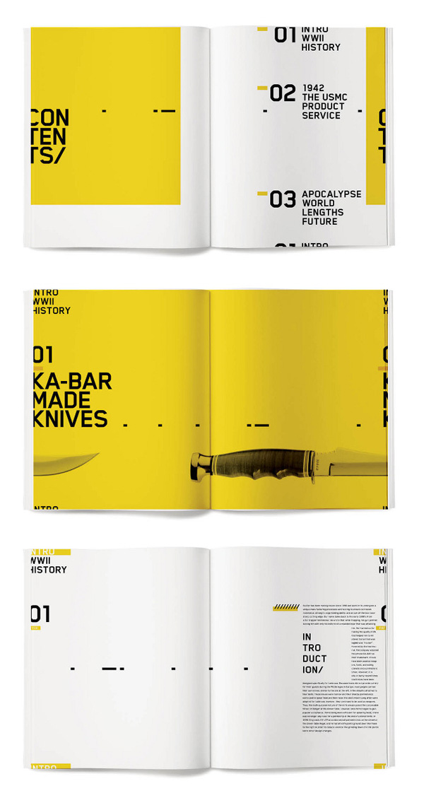
Half French, half Californian Jessica Giboin is a fellow food enthusiast and graphic designer who produced this beautiful ritual book series I’d like to share with you today. I was surprised to find out she’s only 27 years old and just out of college and that this was a school project for an experimental typography class.
The first book is mostly photography based, and was about a daily ritual that featured the object in every shot. The second book includes a bit more typography and is based on a collection of that object, and the third book is mostly type-driven and about the industry where that object came from.

Jessica chose knives because she felt it would be an interesting journey to follow, using it delicately in some of the food shots of the first book and more dramatically and ‘hard core’ in the third book documenting the industry it came from.

I love the concept for her editorial design and how she used typography creatively and playfully experimented with sizes, colour and composition. Her mostly overhead photography is clean and minimal, reminiscent of instagram shots giving it a very modern look and part-time OCD sufferers like myself will enjoy how she’s neatly lined up the items, all at right angles.

A very mature project for such a young designer who I have no doubt has a great career ahead of her. You can also follow her on Behance.

copyright-Jessica-Giboin-via-Stylejuicer01

copyright-Jessica-Giboin-via-Stylejuicer02

Editorial, Design, Jessica Giboin, Ritual Book Series, Graphic Design

 
MORE INFORMATION & PHOTOGRAPHY | Jessica Giboin
 
Follow Stylejuicer with Bloglovin