Tag Archives: light

XOIO – 3D ARCHITECTURAL VISUALISATION

14 July 2014

corona-renderer-by-xoio-bed1-1

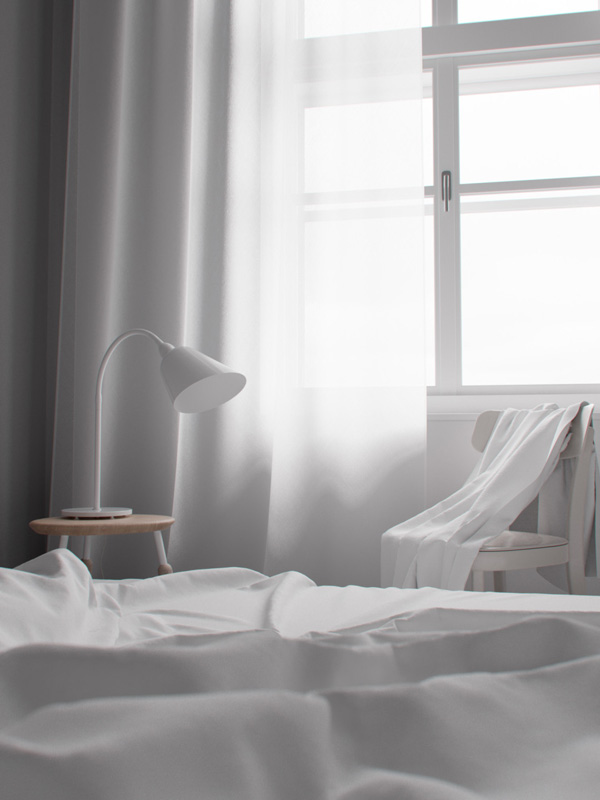
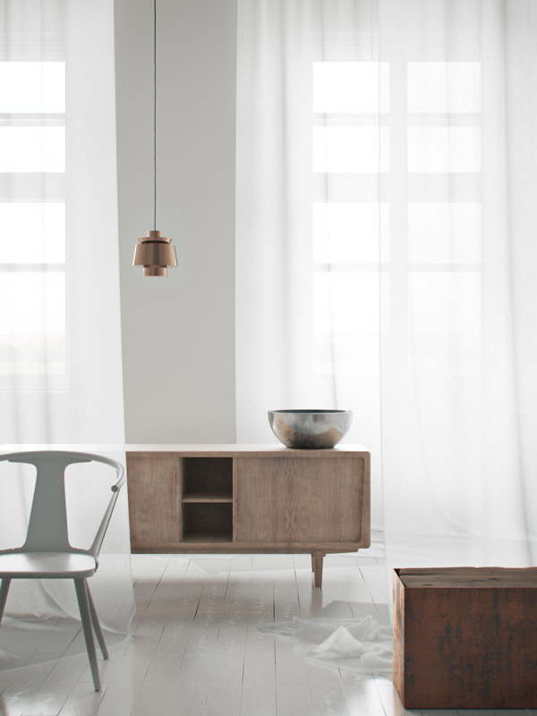
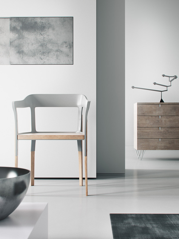
After that game last night, here are some calm and comforting images of a completely fictional apartment. I kid you not! This is the ah-ma-zing work of 3D visualization studio xoio situated in the heart of Berlin. Yay! Had to get a German reference in there somehow.

I still can’t quite get my head round the renderings or how you’d even go about creating one of these visuals. Textures, fabrics, light, shadows and reflections look amazingly realistic which is of course the point but somehow Peter Stulz and his team have taken it to another level.

I’ve seen some architectural visualisations on various blogs before which I wasn’t too keen on but when I came across xoio’s work I was totally convinced it was an actual apartment. I wonder if they employ an interior designer who sets the style and tone as it’s a very cool contemporary and minimalist space.

Oh, how I’d like to crawl under that duvet and have another little snooze only to wake up and realise that last night wasn’t a dream. Deutschland ist Weltmeister!

Happy Monday to you and especially to all my fellow countrymen and women! We did it!

 
corona-renderer-by-xoio-bed1-2

corona-renderer-by-xoio-bed1-3

corona-renderer-by-xoio-bed1-4

xoio, 3d, architectural visualisation, renderings, render, realistic, light, shadow, fabric, textures, berlin, kreuzberg, peter stulz, illustrations, technical perfection, creative, studio, 3d imageproduction provider

 
3D VISUALISATION | xoio
 
Follow Stylejuicer with Bloglovin

INTERIORS CRUSH | SOFIA JANSSON’S SWEDISH HOME

9 June 2014

Sofia, mokkasin, blog, photographer, scandinavian, interior design, white, bright, light, colourful, quirky, pieces, flowers, niki, my scandinavian home, instagram, william morris wallpaper


Ever since I came across Sofia Jansson from Mokkasin blog via the Zara brothers and sisters campaign I’ve kinda Instagram stalked her… in a nice way I hasten to add.

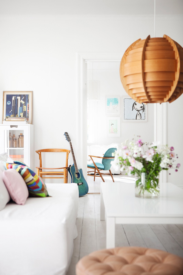
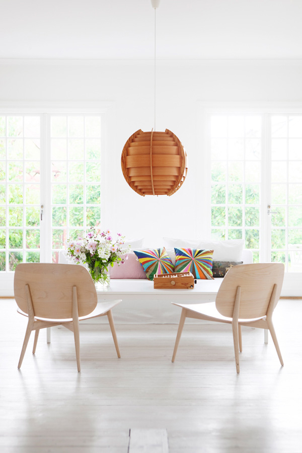
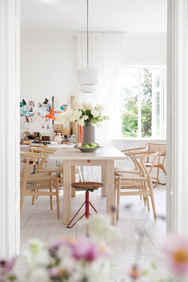
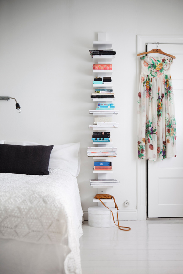
She’s not just the most wonderful photographer that sets up inspirational shoots with her 4 kids but her home is equally special, very light and Scandinavian with lots of interesting bits and pieces strewn around. You can imagine how thrilled I was when I found a tour of her home on the Swedish online edition of Elle Decor and via Niki from My Scandinavian Home.

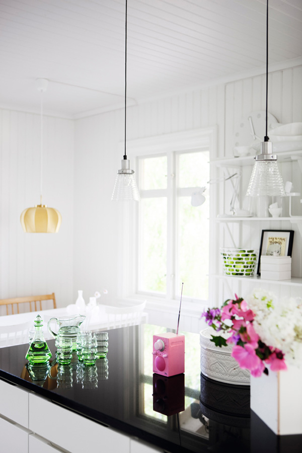
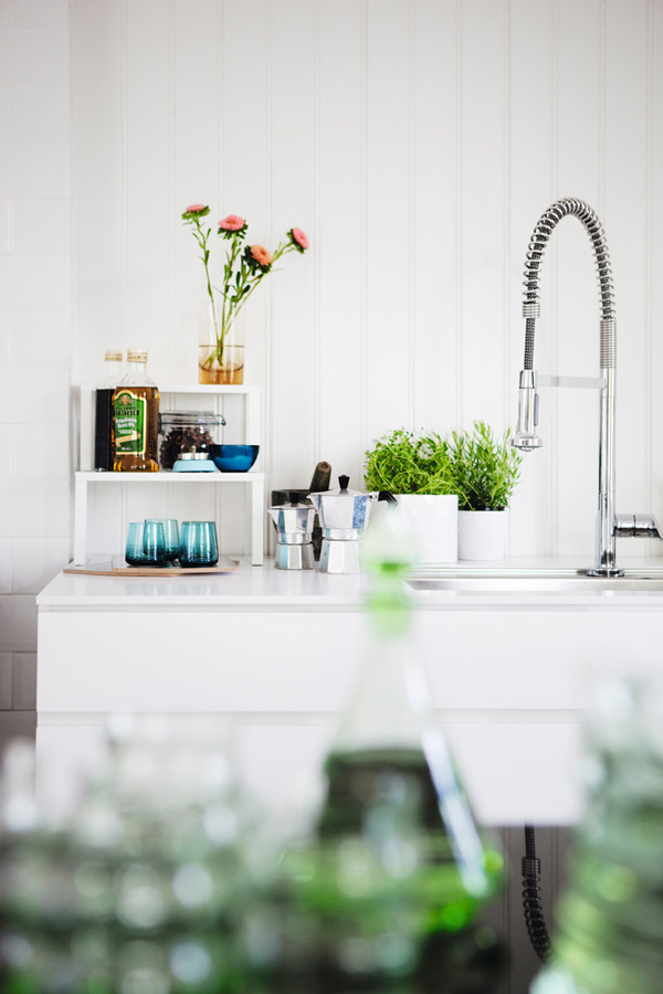
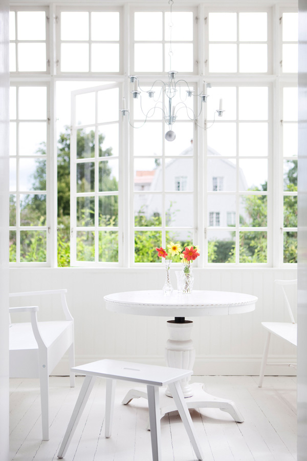
I’m head over Birkenstocks in love with Sofia’s clean white home which she uses a lot for photoshoots and thrilled to see it in a spring/summer setting with lots of flowers everywhere and flooded with light. The white lilac on the kitchen table is my fav and I love the large period double doors in the living room opening out into the garden. Did you notice the matching windows in the conservatory!? Most of her furniture is made from a light coloured wood – I’m guessing birch – which gives it a classic Scandinavian feel, keeping the interior light and bright.

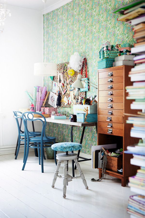
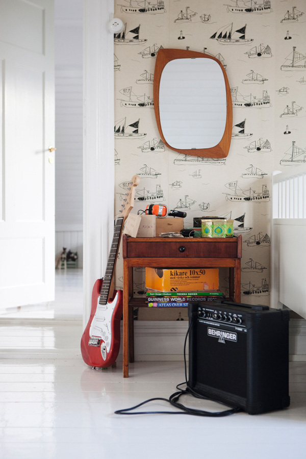
What really makes the place stand out to me are all the little colourful quirky details, like the rainbow cushions, the pink radio in the kitchen and a matching teal guitar and armchair in the background. Let me just add how fabulous to break up all this white space with a wall covered in William Morris wallpaper!? That work space is just so inspirational and a complete pattern overload – I love it!

I can’t see enough of her home… Guess I’ll need to stalk her some more on Instagram, wanna join the lovefest!? Don’t say I didn’t warn ya!


Sofia-Mokkasin-Home-By-Johan-Sellen-02

Sofia-Mokkasin-Home-By-Johan-Sellen-03

Sofia-Mokkasin-Home-By-Johan-Sellen-04

Sofia-Mokkasin-Home-By-Johan-Sellen-05

Sofia-Mokkasin-Home-By-Johan-Sellen-06

Sofia-Mokkasin-Home-By-Johan-Sellen-07

Sofia-Mokkasin-Home-By-Johan-Sellen-08

Sofia, mokkasin, blog, photographer, scandinavian, interior design, white, bright, light, colourful, quirky, pieces, flowers, niki, my scandinavian home, instagram, william morris wallpaper


MORE INFORMATION | Mokkasin
PHOTOGRAPHY | Johan Sellen
 
Follow Stylejuicer with Bloglovin
SMALL SPACES | WHITE HOUSE IN DELFT

28 May 2014

white, home, delft, netherlands, nu interieur ontwerp, interior design, modern, clean, light, bright, minimalist, monochrome

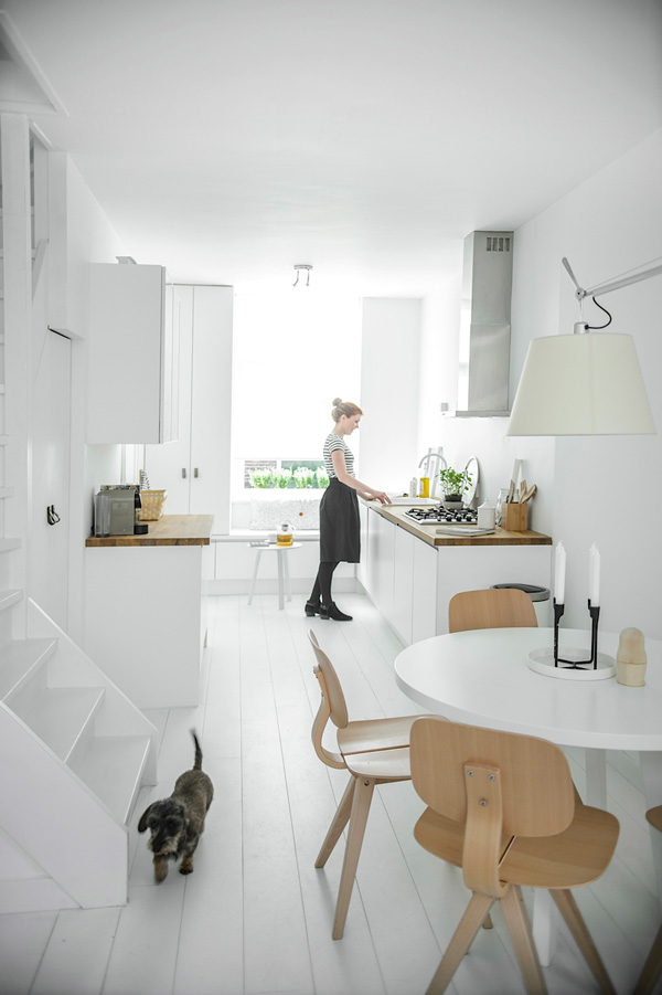
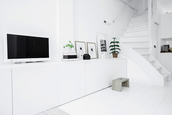
After so much colour on the blog last week I want to share a very pure white interior with you today that caught my eye on the fabulous Nordic Days blog.

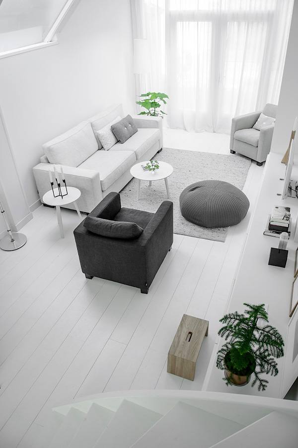
It’s a second home in Delft, Netherlands and was renovated by the talented designers Nathalie and Tessa from Nu Interieur Ontwerp with the brief of making the small space feel as big and bright as possible.

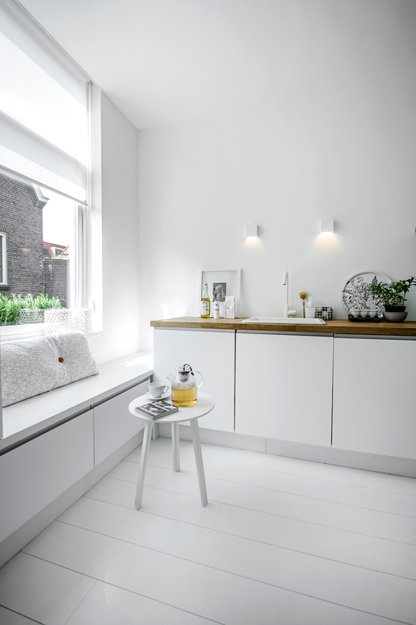
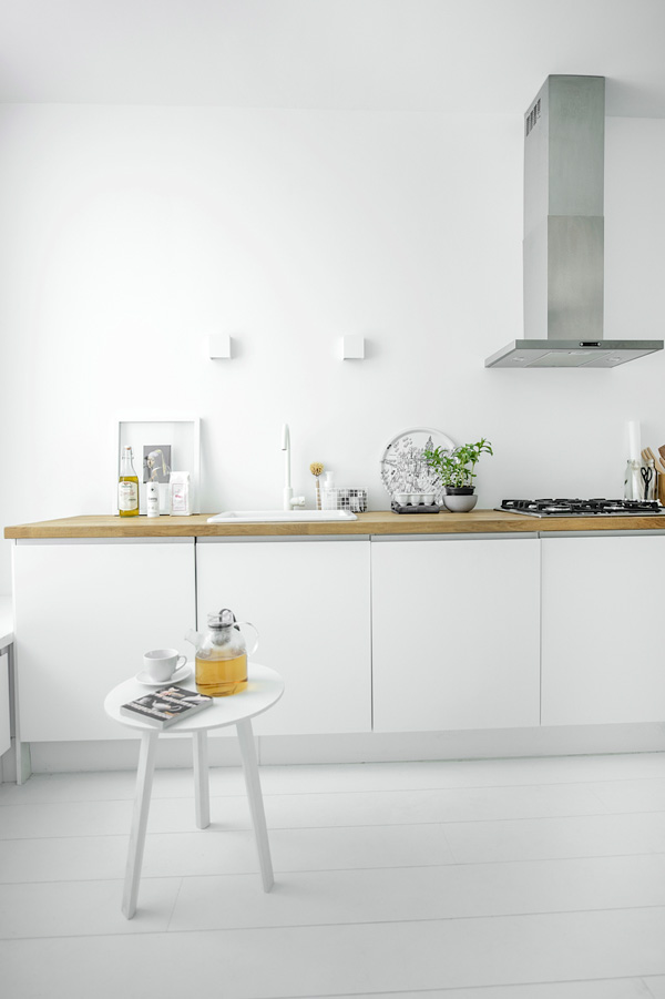
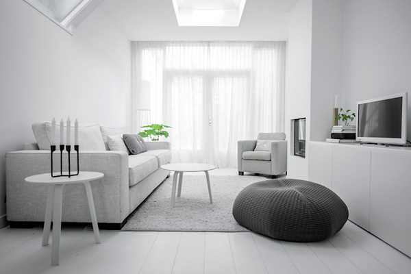
I’m always fascinated by white spaces and how they make you feel. Just from looking at the photos I feel strangely uplifted and calm. With the white floors boards, walls, ceiling and stairs it reminds me of a photographers studio and I particularly like all the in-built storage space and the neat little window seat in the kitchen for, errr… day-dreaming – at least that’s what I would do.

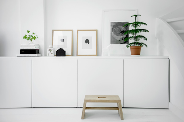
I like how the few plants and natural wooden elements break the space up a little and give it a bit of a homely feel. I also spotted a fire place which I’m sure will make this just the cosiest space and I can see the owner snuggling up with her adorable dog on the sofa.

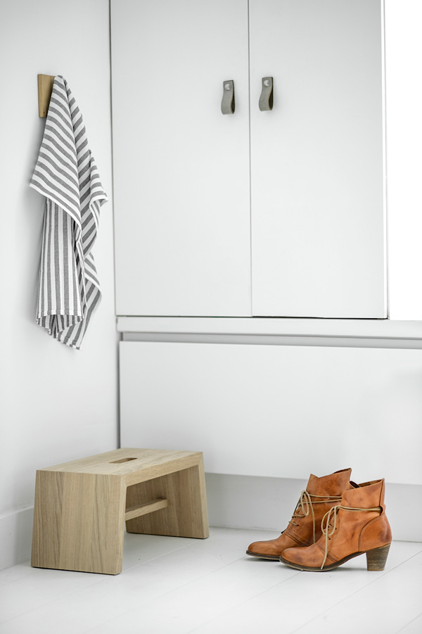
There are also some clever design elements that Nathalie and Tessa incorporated like their leather strap handles which come in different sizes and colours and the little oak foot stool that I’ve fallen in love with. A gorgeous design, sturdy, useful and only getting better with age – perfect.

I love this white house! And now I want to paint my own home all white. *day-dreams*


White-House-Delft-by-Nu-Interior-via-Stylejuicer-02

White-House-Delft-by-Nu-Interior-via-Stylejuicer-03

White-House-Delft-by-Nu-Interior-via-Stylejuicer-04

White-House-Delft-by-Nu-Interior-via-Stylejuicer-05

White-House-Delft-by-Nu-Interior-via-Stylejuicer-06

White-House-Delft-by-Nu-Interior-via-Stylejuicer-07

White-House-Delft-by-Nu-Interior-via-Stylejuicer-08

white, home, delft, netherlands, nu interieur ontwerp, interior design, modern, clean, light, bright, minimalist, monochrome

 
MORE INFORMATION & PHOTOGRAPHY | Nu Interieur Ontwerp (with kind permission)
 
Follow Stylejuicer with Bloglovin