Tag Archives: Interior Design

KIDS ROOMS IDEAS | MIXING MODERN & VINTAGE

1 July 2014

ikea furniture, ps range, modern, simple, functional, vintage, antique, quirky, old school, sports equipment, kids room ideas, tips, trends, monochrome, black and white, vtwonen, cleo schleuderman, alexander van berg, interior design, styling
 

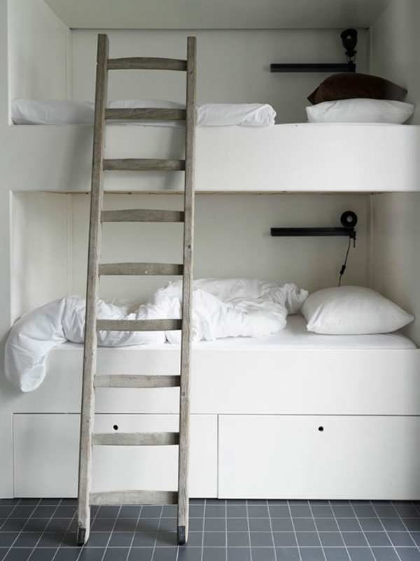
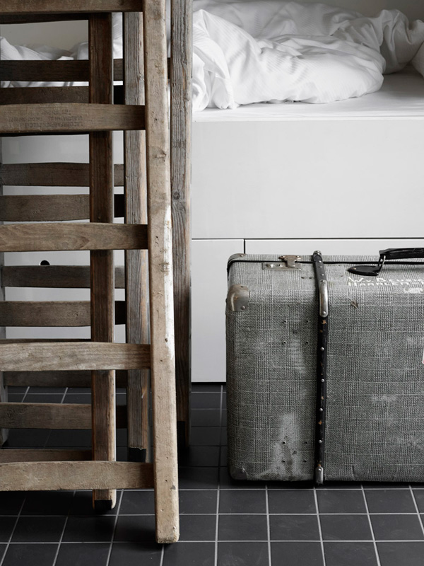
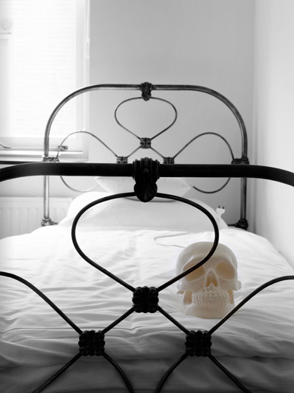
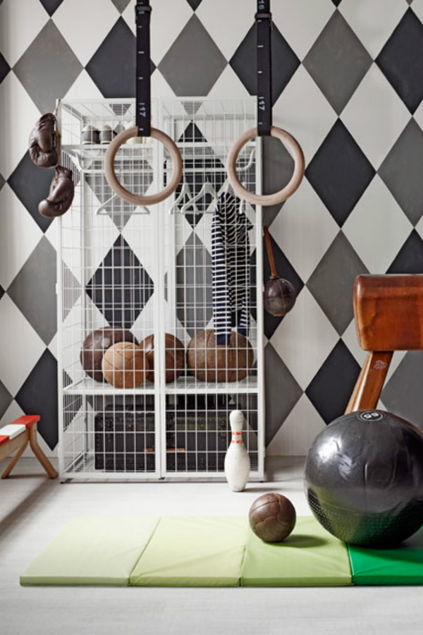
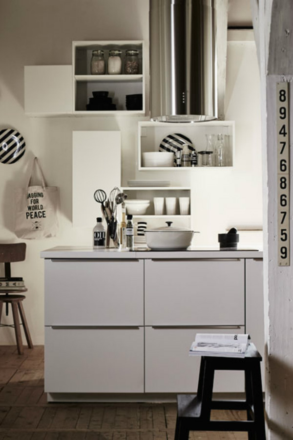
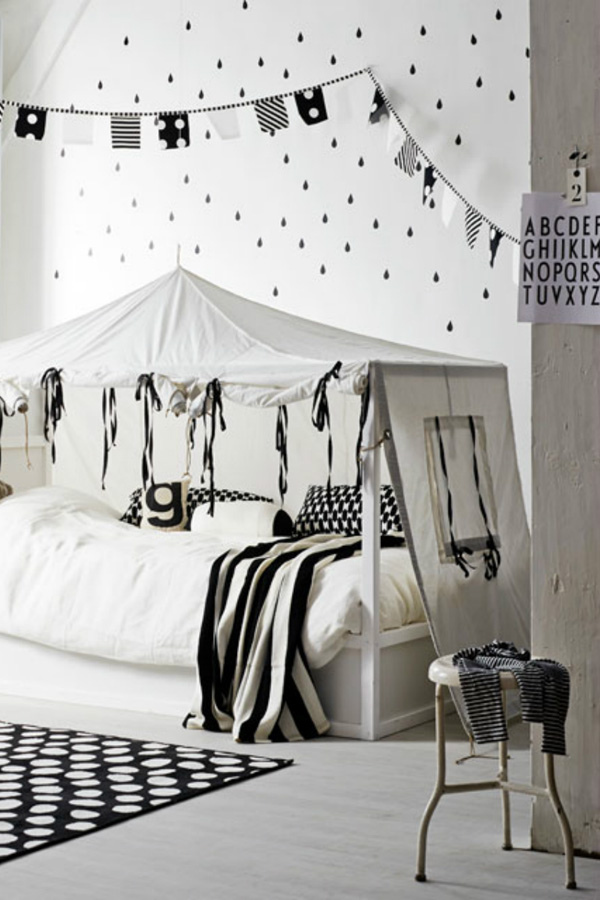
The trend for mixing old and new has been around for a long time but I like this new take for kids rooms ideas presented in the July edition of Dutch interiors magazine vtwonen, styled by Cleo Schleuderman and shot by Alexander van Berge.

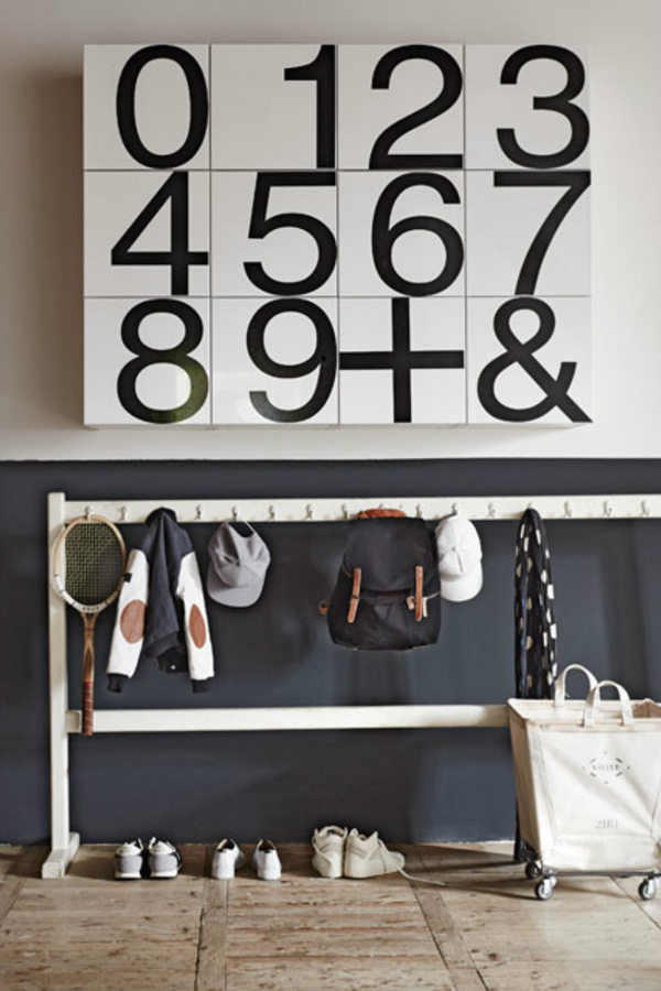
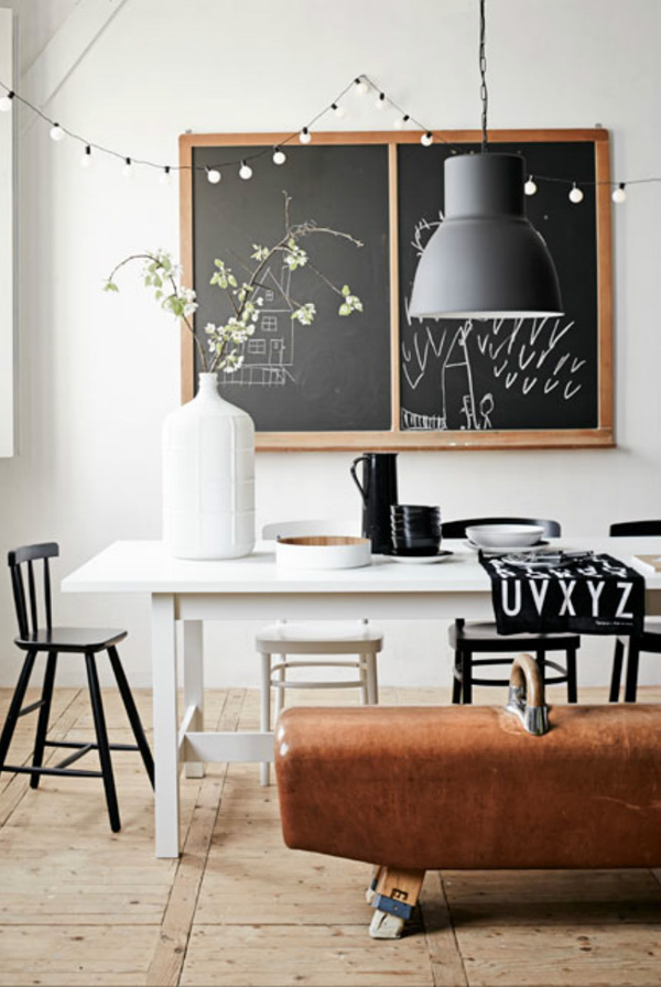
Titled ‘Living with kids’ they’ve added some lovely old school/sports equipment like blackboards, workout machines or coat racks with simple, modern and functional IKEA furniture to create an interesting mix.

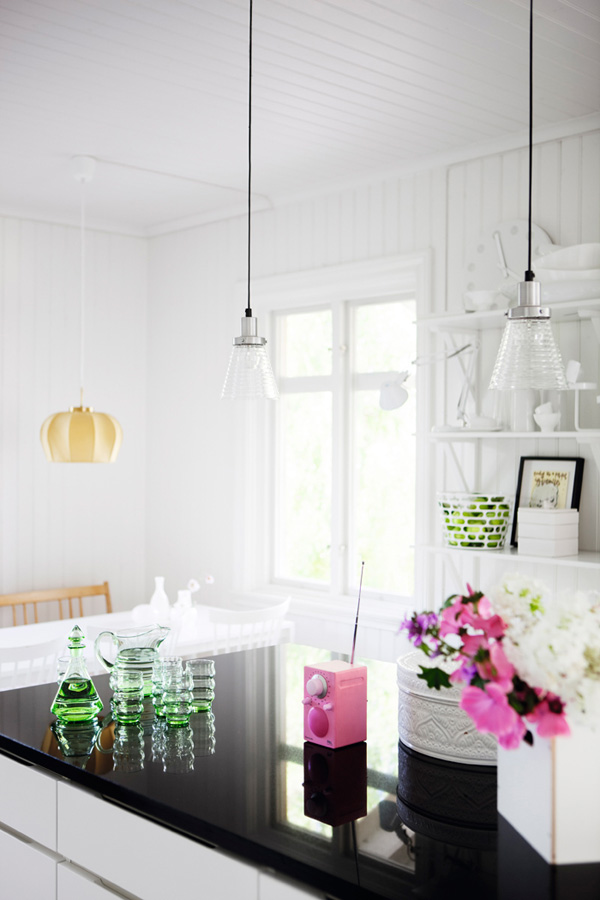
Personally, I’m a huge fan of this monochrome black and white look with a few antique details thrown in but feel it all hinges on getting your hands on the right kind of genuine (!) pieces.

Having said that IKEA’s new PS range – blogged about on here before – does offer some neat vintage inspired furniture like the featured wardrobe or balance bench which is a nice solution if you haven’t got the budget, time or patience to hunt around antiques markets or trawl the internet.

For more images check out the whole story on vtwonen or get your hands on a copy of the magazine. You can also follow Cleo Schleuderman – styling editor at vtwonen – on Pinterest.
 

copyright-Alexander-van-Berge-for-vtwonen-Jul-2014-02

copyright-Alexander-van-Berge-for-vtwonen-Jul-2014-03

copyright-Alexander-van-Berge-for-vtwonen-Jul-2014-04

ikea furniture, ps range, modern, simple, functional, vintage, antique, quirky, old school, sports equipment, kids room ideas, tips, trends, monochrome, black and white, vtwonen, cleo schleuderman, alexander van berg, interior design, styling

 
MORE INFORMATION | vtwonen
PHOTOGRAPHY | Alexander van Berge
STYLING | Cleo Schleuderman
 
Follow Stylejuicer with Bloglovin

STYLIST’S BLUE BEACH HOUSE IN SYDNEY

27 June 2014

Modernist-Beach-House-Sydney-01

This beautiful modernist beach house in Sydney was recently featured in Australia’s Inside Out Magazine – one of my favourites for interior eye candy from down under.

It belongs to interior stylist Karen Kelly Tarasin and has been lovingly filled with Nordic modernist furniture and a few selected modern pieces like the Muuto lamps above the dining table and sofa.

Maybe it’s the lighting or the fresh green and exotic leaves that peek through the windows but this home feels so fresh and cozy to me. I notice there are plants and flowers on display everywhere but all blending in apart from the ‘Rio’ garden column in the hallway which houses six individual vases for flower displays.

My favourite piece of art has to be the bull skull over the classic Saarinen ‘Tulip’ dining table – aren’t those horns magnificent!? I wonder what the emerald green decoration on the skull is.

I like how the overall colour palette is pared back and dominated by white, blonde wood and earthy tones with a few navy accents. Even the artwork of mostly black and white photography blends in with the owners collection of vintage Danish furniture and makes this home feel calm and peaceful.

Interestingly the outside is painted in a strong Matisse blue and a complete contrast to the serene inside.

What do you make of this bold contrast?


Modernist-Beach-House-Sydney-02

Modernist-Beach-House-Sydney-03

Modernist-Beach-House-Sydney-04

Modernist-Beach-House-Sydney-05

Modernist-Beach-House-Sydney-06

Modernist-Beach-House-Sydney-07

Modernist-Beach-House-Sydney-08

modernist, sydney, home, beach house, interior design, style, stylist karen kelly tarasin, decor, nordic, wood, lighting, trend,

 
VIA | Homelife
PHOTOGRAPHY | Prue Ruscoe
STYLING | Claire Delmar
INSTAGRAM | Karen Kelly Tarasin
 
Follow Stylejuicer with Bloglovin

POLISHED CONCRETE FLOORS IN COPENHAGEN HOME

20 June 2014

Polished-Concrete-Home-by-Peter-Kragballe-01

 
This open plan apartment is home to Lina and Thomas who both work in fashion and design and it’s conveniently located in central Copenhagen near the Royal Garden. The small but impressive industrial space has been totally gutted and I like how the owners have taken great care not to strip out it’s character.

Though walls, windows and ceiling are painted pristine white they managed to subtly add interest through a mix of materials. You can find roughly plastered walls, painted brickwork and wooden beams as well as an old metal pillar located centrally in the kitchen and dining area. In contrast, the newly installed kitchen cabinets are black veneer with a super smooth white work surface that sits comfortably next to the rough walls.

Interestingly, the object that first caught my eye – after the showstopping polished concrete floors – is the wooden dining table on a steel frame that looks as if it’s had many a good feast served. It’s a beautiful piece of furniture and I love how it contrasts with the polished concrete floors. As most nordic countries are often starved of natural daylight the glossy surfaces in this space, especially the flooring, reflect the light coming in through various large industrial windows beautifully.

I was umming and ahhing whether I should add this space to my Interiors Crush column but in the end decided it’s not a perfect love match for me. Though I love concrete and the many creative ways it can be applied the high gloss flooring is a little bit too shiny for me and I can imagine it might feel a bit cold.

I’d love to find out what you think of the polished concrete floors. Love it or hate it?

 
Polished-Concrete-Home-by-Peter-Kragballe-02

Polished-Concrete-Home-by-Peter-Kragballe-03

Polished-Concrete-Home-by-Peter-Kragballe-04

Polished-Concrete-Home-by-Peter-Kragballe-05

Polished-Concrete-Home-by-Peter-Kragballe-06

Polished-Concrete-Home-by-Peter-Kragballe-07

Polished-Concrete-Home-by-Peter-Kragballe-08

polished concrete floor, flooring, copenhagen, home, apartment, interior design, minimal, modern, monochrome, peter kragballe photography, simple, graphic, industrial, quality furniture, timeless

 
VIA | Rum Hemma
PHOTOGRAPHY | Peter Kragballe
 
Follow Stylejuicer with Bloglovin

PLACES TO GO | HELLO I’M LOCAL HOSTEL IN HAARLEM

16 June 2014

hello Im local, hostel, haarlem, netherlands, travel, accommodation, quirky, contemporary styling, interior design, anouk b studio

Do you guys know Haarlem? No, it’s not a spelling mistake Haarlem with 2 a’s is a small town west of Amsterdam who keeps popping into my social media feed more and more often. Wether it’s bloggers who live there, brands that catch my eye or like this unique hostel I want to introduce you to today.

It’s a funny thing because I’ve actually been to Haarlem back in 2010 for one of the cowboy’s best friends birthday and really liked the place and it’s beautiful historic architecture and canals, a mini Amsterdam.

But I’m starting to think that this little town has a higher creative head count than most places, certainly unusual for a small town. Does it have something to do with the 348.970 local beers being served? Is Amsterdam now grid locked with bicycles? I was curious and had a chat with my local friends who think it’s partly to do with the proximity to both the creative hub of Amsterdam as well as some gloriously unspoilt beaches. The council also has a favourable attitude towards creative initiatives and encourages art galleries, organisations and creative collectives due to Haarlem’s history of printing and graphic design. Can you believe that Haarlem’s newspaper is the oldest in the country!?

But back to today’s post about this boutique hostel in the centre of Haarlem with the quirky name of ‘Hello I’m local’. It’s been a dream of Saskia Hurd to open up a hostel and when she found the site occupied by 4 derelict buildings which had been empty for 23 years she knew she had to go for it.

The hostel offers 12 unique rooms that cater for pretty much any size party and you’re invited to sit back, relax and enjoy Saskia’s living room and patio where she often lights a cosy fire. By her own account Saskia is a little old fashioned and likes to encourage people to talk, play board games or just enjoy the outdoor fireplace but don’t fret there’s wifi in the living room, just no TV please.

I love the individually styled rooms, all based on historical themes, very clean and contemporary with a mostly black and white colour palette. My favourite room has to be the smallest one with an old fashioned bedstee, a bed in the wall, that’s accessed through canary yellow double doors. Unbelievably, people used to sleep standing up in them – hence the name – but oh so cozy.

Saskia has paid attention to every detail and fully embraced the ‘local’ in her hostel’s title, encouraging guests to rent bikes to explore Haarlem or the nearby beaches and dive into the local culture and museums. Before you go make sure to check out her funky website and give her FB page some love. I’m sure to pop in next time I’m visiting.

hello-im-local-hostel-haarlem-02

hello-im-local-hostel-haarlem-03

hello-im-local-hostel-haarlem-04

hello-im-local-hostel-haarlem-05

hello-im-local-hostel-haarlem-06

hello-im-local-hostel-haarlem-07

hello Im local, hostel, haarlem, netherlands, travel, accommodation, quirky, contemporary styling, interior design, anouk b studio

 
MORE INFORMATION | Hello I’m local
PHOTOGRAPHY | Anouk B with kind permission by Hello I’m local
 
Follow Stylejuicer with Bloglovin

INTERIORS CRUSH | SOFIA JANSSON’S SWEDISH HOME

9 June 2014

Sofia, mokkasin, blog, photographer, scandinavian, interior design, white, bright, light, colourful, quirky, pieces, flowers, niki, my scandinavian home, instagram, william morris wallpaper


Ever since I came across Sofia Jansson from Mokkasin blog via the Zara brothers and sisters campaign I’ve kinda Instagram stalked her… in a nice way I hasten to add.

She’s not just the most wonderful photographer that sets up inspirational shoots with her 4 kids but her home is equally special, very light and Scandinavian with lots of interesting bits and pieces strewn around. You can imagine how thrilled I was when I found a tour of her home on the Swedish online edition of Elle Decor and via Niki from My Scandinavian Home.

I’m head over Birkenstocks in love with Sofia’s clean white home which she uses a lot for photoshoots and thrilled to see it in a spring/summer setting with lots of flowers everywhere and flooded with light. The white lilac on the kitchen table is my fav and I love the large period double doors in the living room opening out into the garden. Did you notice the matching windows in the conservatory!? Most of her furniture is made from a light coloured wood – I’m guessing birch – which gives it a classic Scandinavian feel, keeping the interior light and bright.

What really makes the place stand out to me are all the little colourful quirky details, like the rainbow cushions, the pink radio in the kitchen and a matching teal guitar and armchair in the background. Let me just add how fabulous to break up all this white space with a wall covered in William Morris wallpaper!? That work space is just so inspirational and a complete pattern overload – I love it!

I can’t see enough of her home… Guess I’ll need to stalk her some more on Instagram, wanna join the lovefest!? Don’t say I didn’t warn ya!


Sofia-Mokkasin-Home-By-Johan-Sellen-02

Sofia-Mokkasin-Home-By-Johan-Sellen-03

Sofia-Mokkasin-Home-By-Johan-Sellen-04

Sofia-Mokkasin-Home-By-Johan-Sellen-05

Sofia-Mokkasin-Home-By-Johan-Sellen-06

Sofia-Mokkasin-Home-By-Johan-Sellen-07

Sofia-Mokkasin-Home-By-Johan-Sellen-08

Sofia, mokkasin, blog, photographer, scandinavian, interior design, white, bright, light, colourful, quirky, pieces, flowers, niki, my scandinavian home, instagram, william morris wallpaper


MORE INFORMATION | Mokkasin
PHOTOGRAPHY | Johan Sellen
 
Follow Stylejuicer with Bloglovin