Alphabet of light by Artemide
Hard to believe that it’s been almost 2 weeks since I was invited to the Salone del Mobile in Milan by Design Diffusion to join a ‘Blog Safari’ with a bunch of European interior design and lifestyle bloggers. I went with my Function+Form sidekick Tiff and after leaving our kids in the safe hands of Daddy Daycare (what can go wrong!?) we took off and spent an incredibly packed and inspirational two days in Milan discovering new brands and trends as well as chatting to some of the creative minds behind the ideas.
Milan-based Design Diffusion is a media powerhouse that covers the world of design, architecture, lifestyle and events through their magazines, blog and TV channel. Their idea of introducing interior design brands through a ‘Blog Safari’ during Milan’s largest yearly event – the Salone del Mobile – was pure genius and a great opportunity to connect with so many European bloggers face-to-face, many of whom I’ve been following for years and some I hope will become good friends in the future.
Our mutual passion for interior design was an instant talking point and I could have spent hours chatting had I not been on the brink of losing my voice – evidence of which in the video right at the bottom of this post. *cringe* Honestly, I’m a lot more together normally. *hides red face*
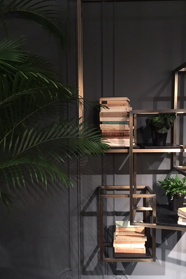
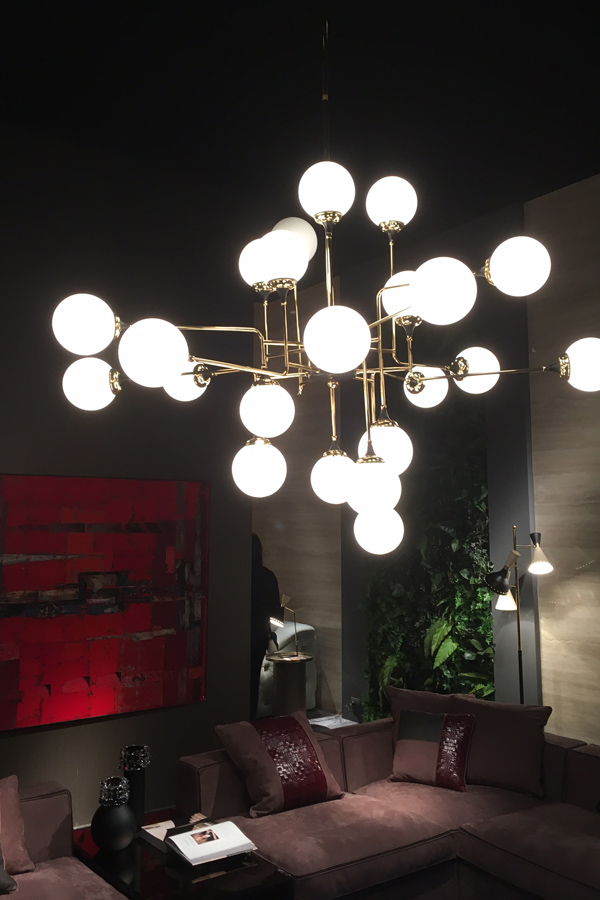
Our safari started with the interior arms of some classic Italian fashion houses Gianfranco Ferrè Home and Roberto Cavalli Home Interiors. Both cater to the upmarket client who loves luxurious textures and own a home big enough for large statement pieces. Their stands were indulgently rich, dark and moody, softened by a lot of texture from brass and marble to velvet and fur, including some stunning lighting and elaborate chandeliers inspired by Art Deco.
Interlocking brass shelving system by Gianfranco Ferrè Home
Stunning statement chandelier by Gianfranco Ferrè Home
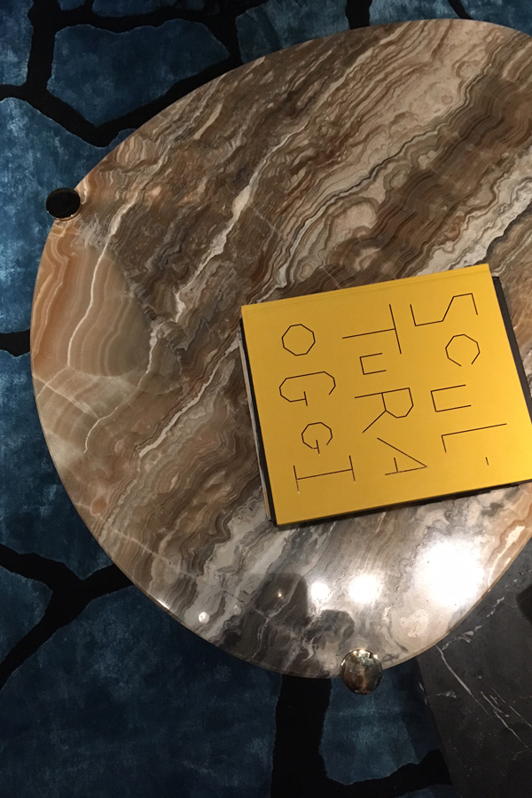
Rich materials and textures at Gianfranco Ferrè Home
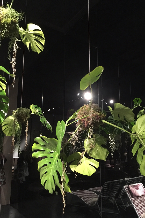
Cheese plant Kokedama at Roberto Cavalli Home Interiors
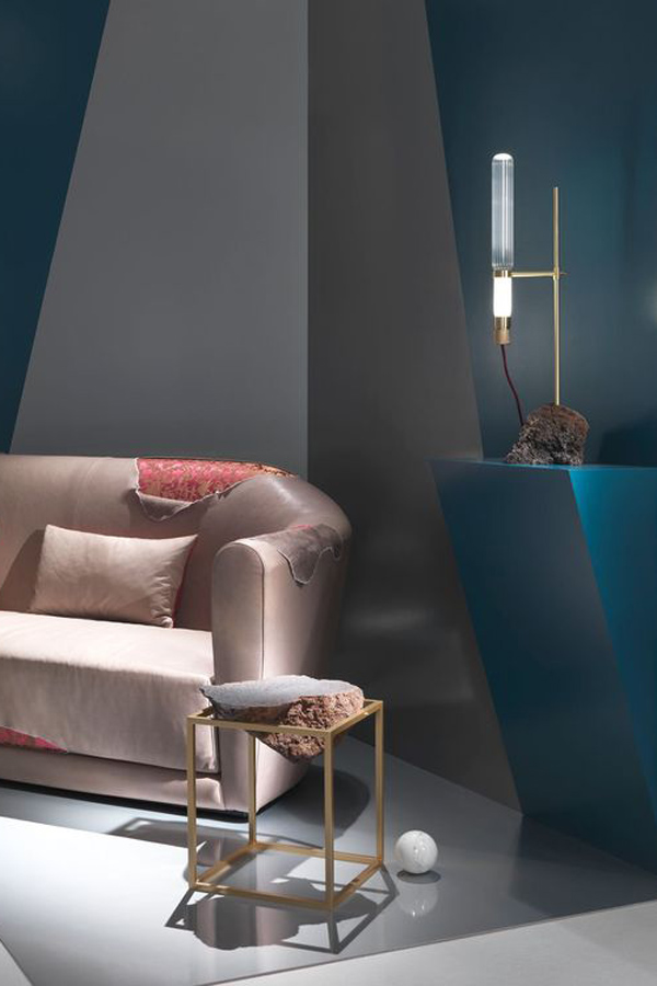
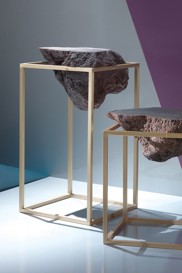
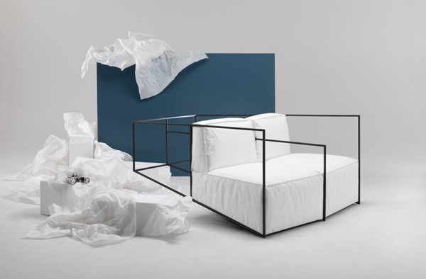
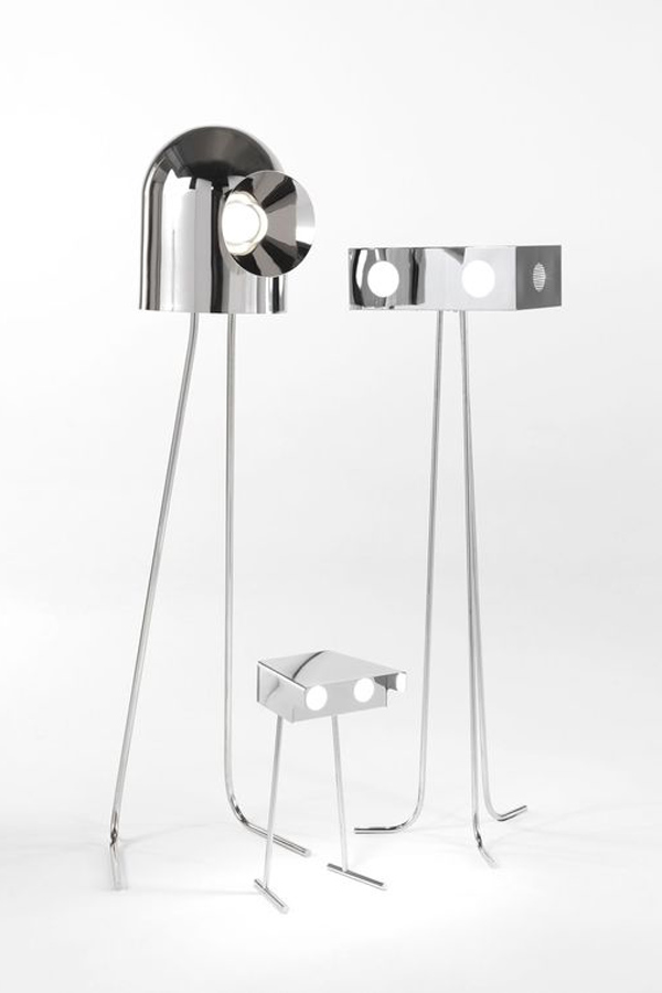
JCP was a total contrast with their experimental designs that bridge the gap between art and function. The brand was introduced only last year and has already made waves with their Artifacts collection which includes – amongst others – side tables and lighting made of chrome and brass incorporating lava stone, incredibly comfortable iron structures with seats in Jacroki-Racy fabric upholstery and some shiny robot-lookalike floorlamps. Quirky, innovative and utterly different to anything you’ve seen before.
Lava stone side table and lamp by JCP
Iron seat structure in Jacroki-Racy fabric upholstery by JCP
Threeve, Betoo and Rone by Richard Hutton for JCP
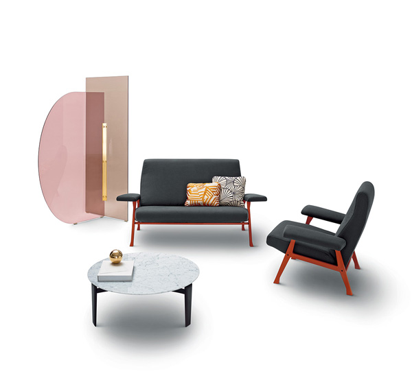
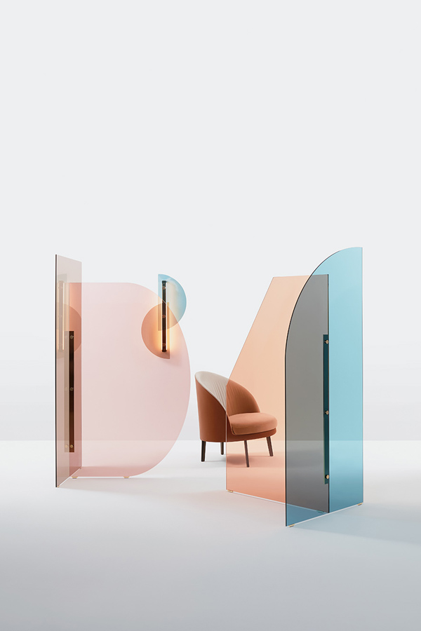
I simply loved the colours at the Arflex stand. Soft pastels from green to light blue and pink with rich dark blue, mustard and green as a contrast. Some sparingly used graphic patterns and brass accents gave the stand a mid century feel. An interesting addition is Arflex’ semi-transparent Vela screen which comes in different colours, shapes and sizes and lets you create a discreet divider without imposing on the space.
Vela screen by Arflex
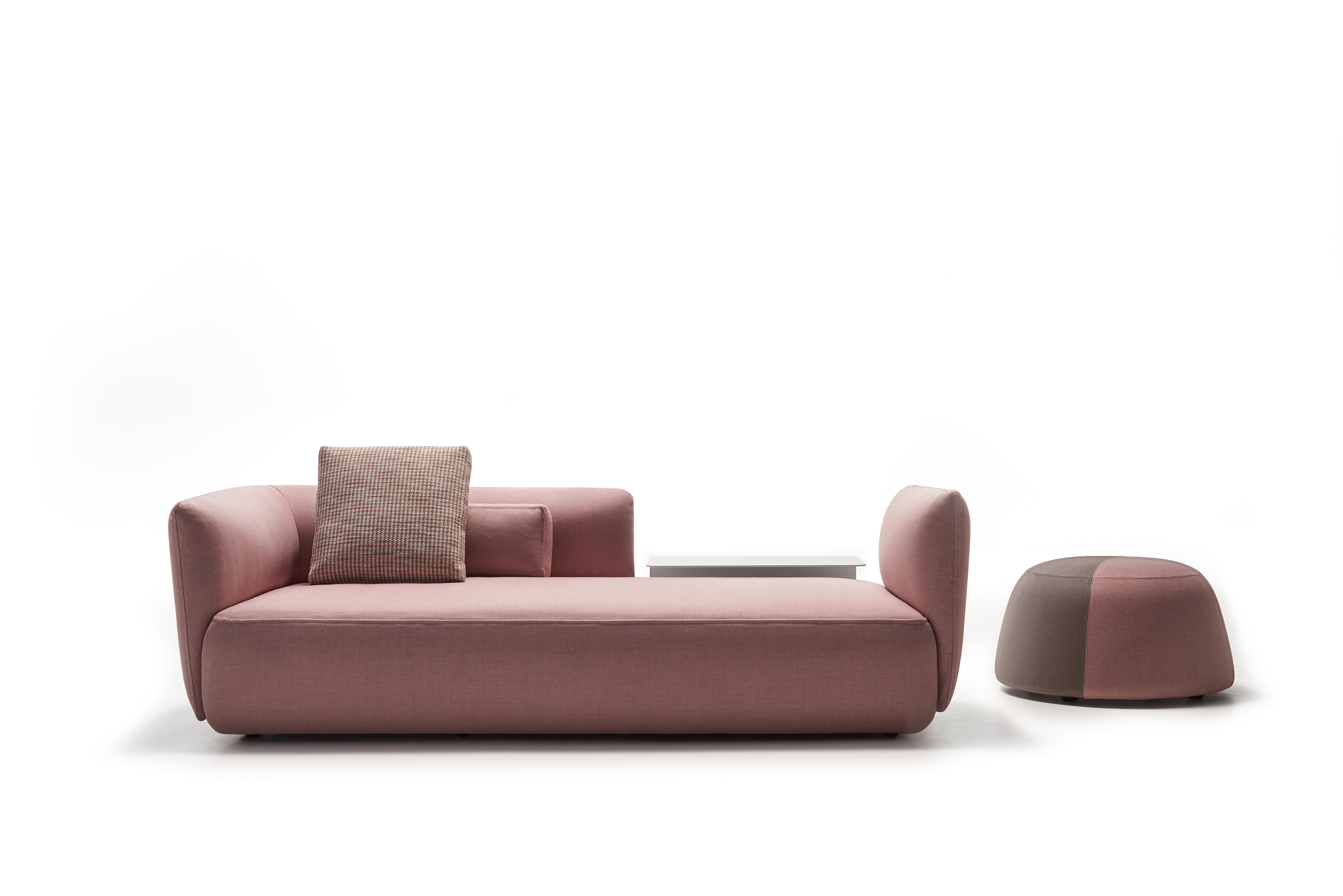
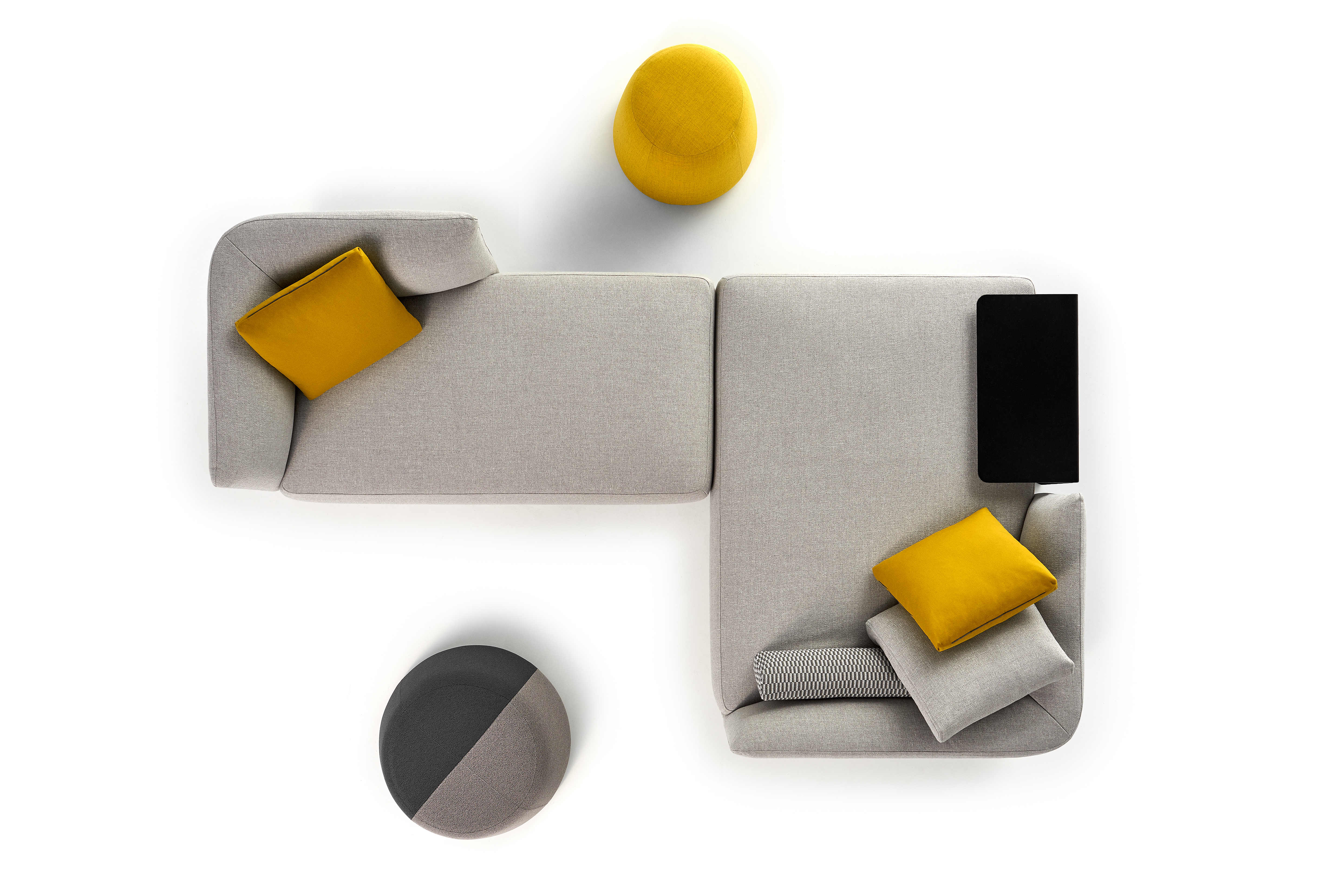
MDF Italia was where I felt most comfortable, not just because I got to sit down on their incredibly cosy Cosy sofa talking to one of the owners, but because MDF’s simple lines, contemporary design and muted colours naturally resonate with me. The modular Cosy sofa is endlessly adaptable to whatever your needs and I love the addition of the slim metal side table where the bottom slides under the sofa therefore giving you a safe place to put all those spillable drinks. It’s details like these that make life and living with furniture effortlessly.
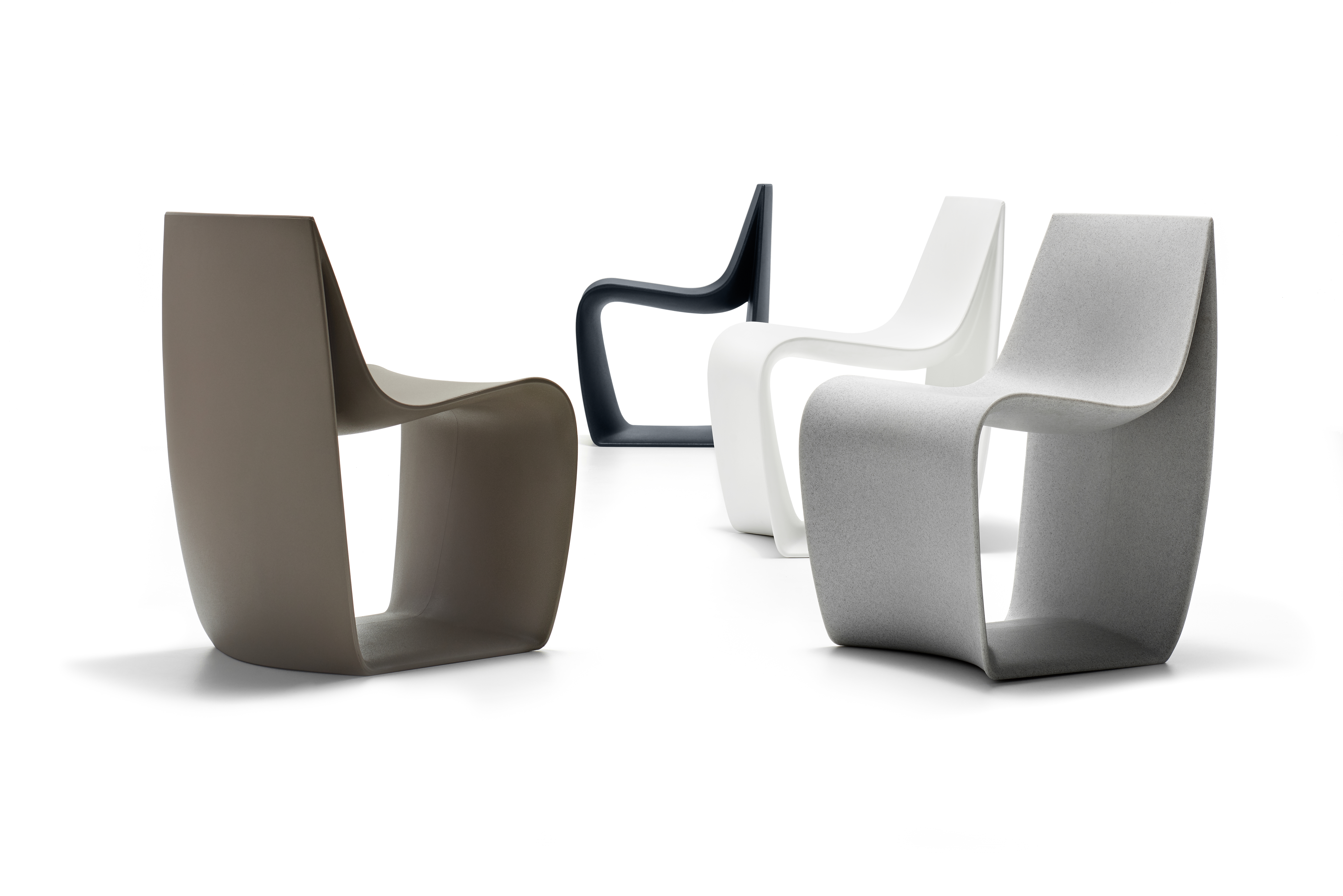
Sign Matt chair by MDF Italia
The new Cosy sofa
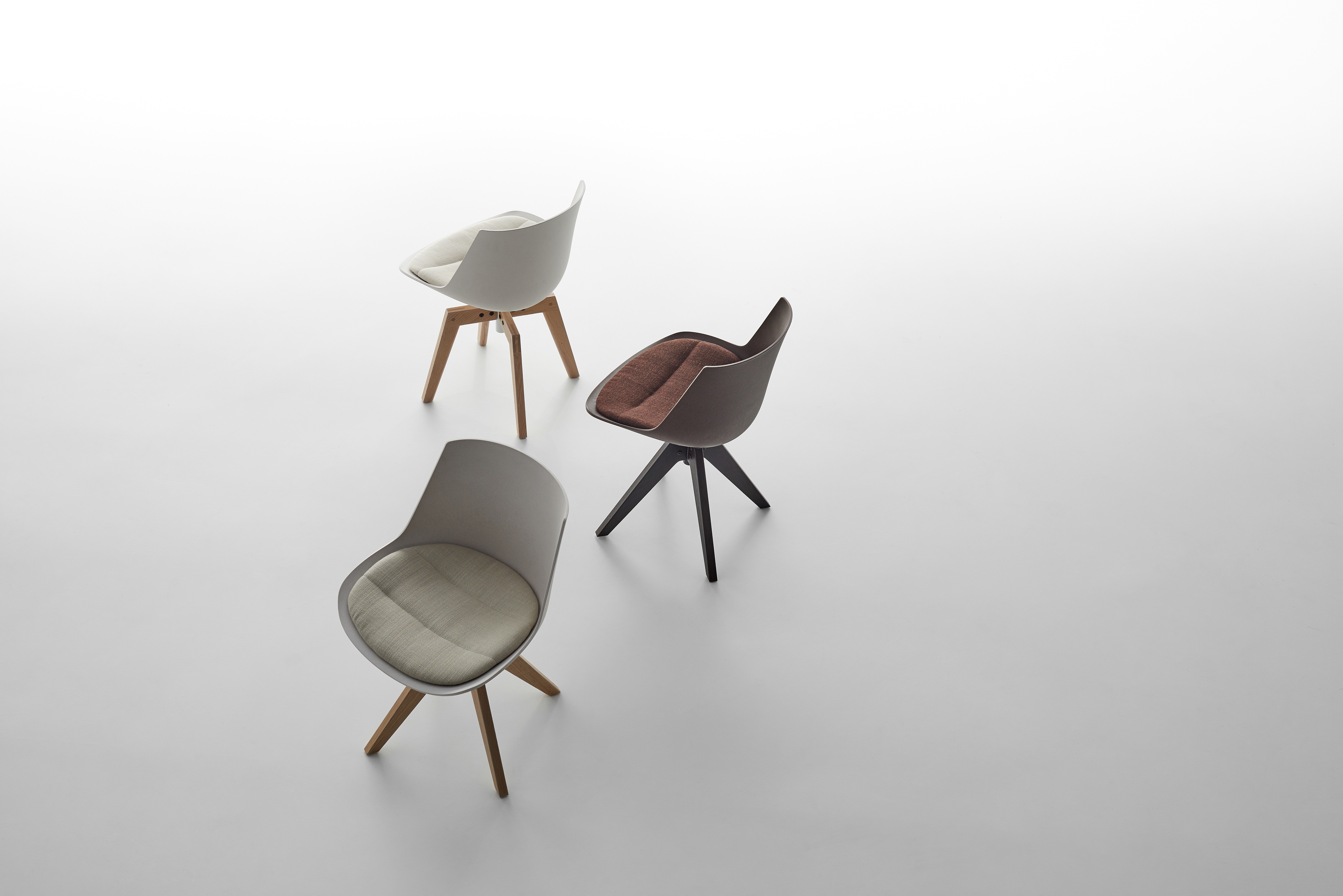
I was also really impressed with the Flow Eco chair and it’s environmentally-friendly credentials, replacing the polycarbonate shell with pressed fibres from renewable sources: beech fibre for the light colour and coconut fibre for the dark colour.
The Flow Eco chair made from coconut and beech fibres
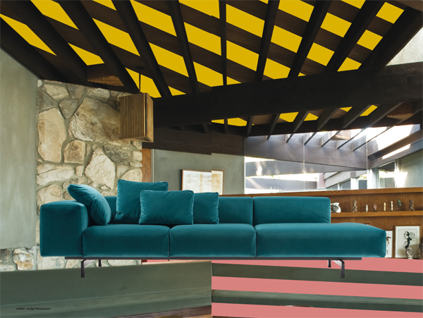
What I loved most about the chosen brands for the safari was the variety and Kartell stood out with it’s colourful theme of ContamiNation. Seeing themselves as a nation, Kartell is contaminated by different ideas and styles. No limits or boundaries stand in the way of creativity to explore new technologies and continuous innovation. The main message of fun, innovation and creativity poured out of their engaged designer who showed us around the stand.
Kartell’s Largo sofa in velvet
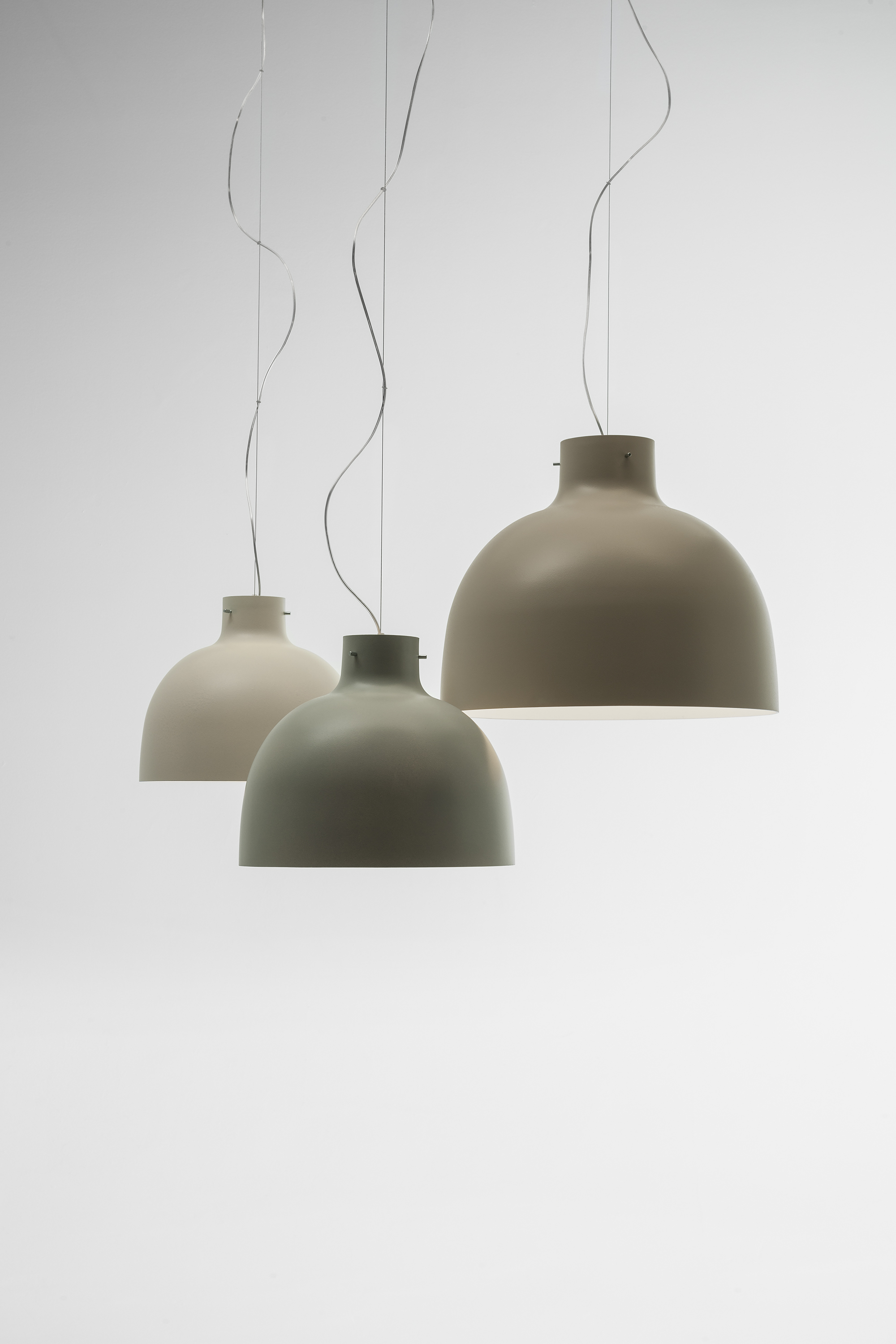
Bella light
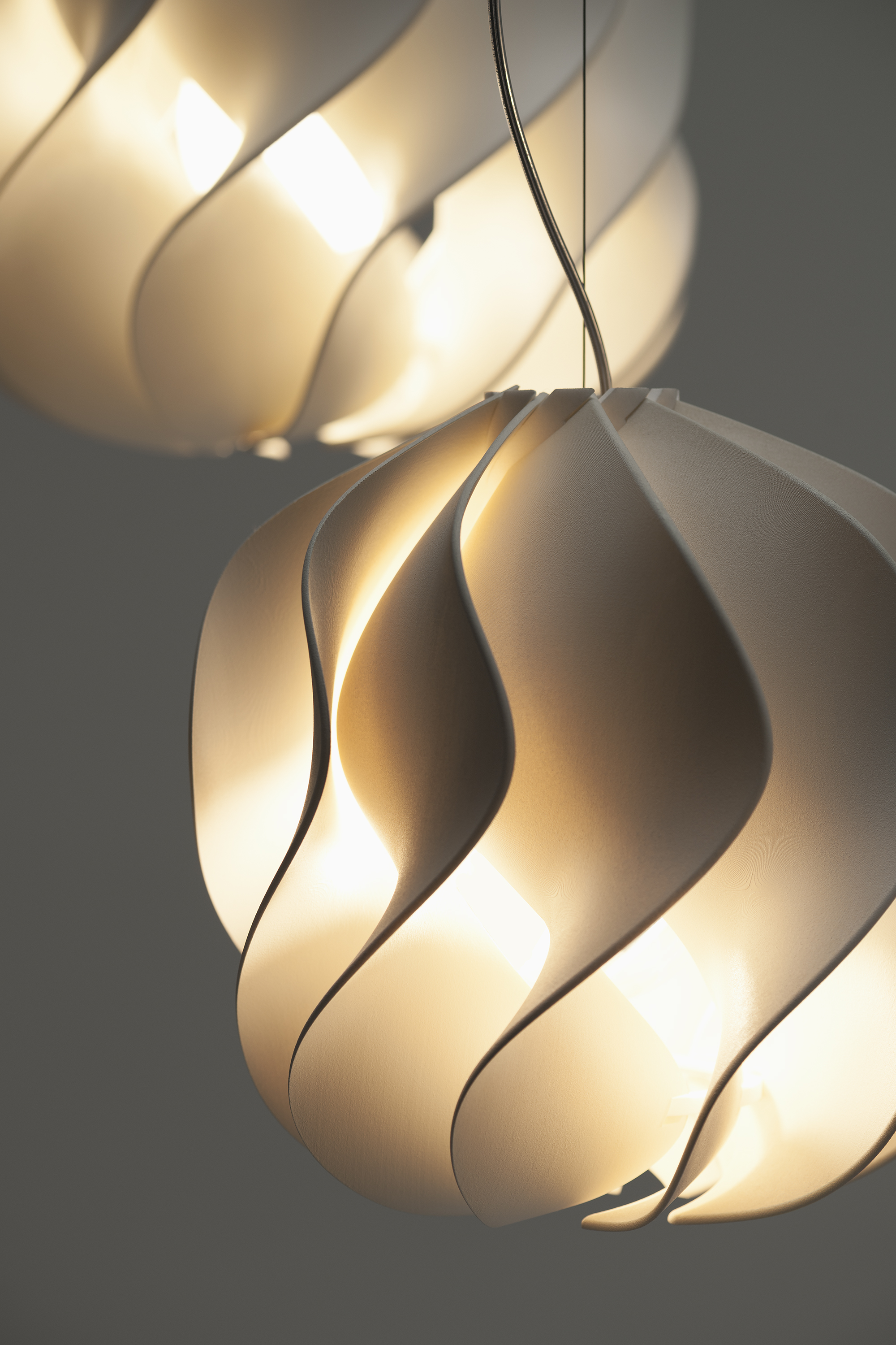
Spin light
I particularly loved their Bella and Spin pendant lights, their classic shapes giving beautiful diffused light.
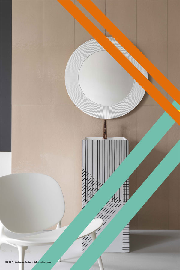
Be Bop chair by Kartell
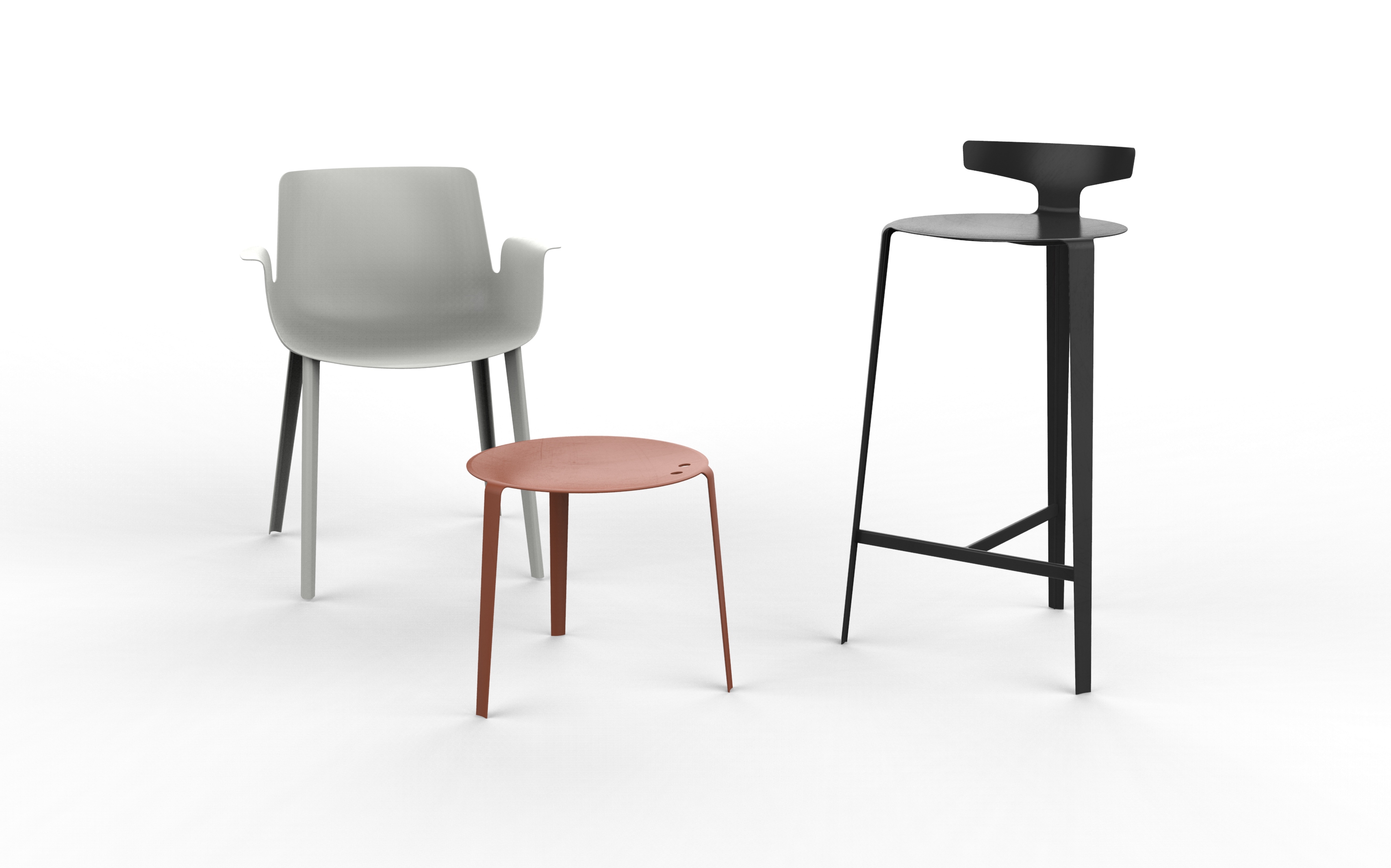
The metal Piuma family and the Be Bop chair stood out for me as well due to their beautiful colour palette of deep dark red, mossy grey/green and black.
Piuma family
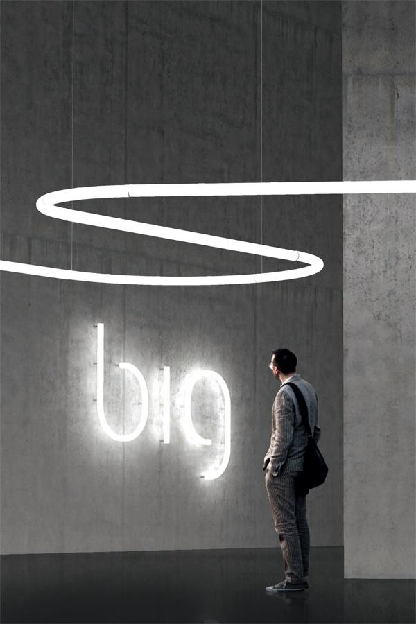
We finished off the safari with a visit to one of my favourite lighting brands: Artemide. Their Alphabet of light has captured my imagination as a graphic designer and typography nerd since it was first shown last year. To see the separate elements in real life was somewhat of an eye-opener. Much larger than I imagined but I can see endless possibilities for this system in public spaces or offices. I was not surprised to find out it was designed by BIG – a group of architects, designers and thinkers led by Danish architect Bjarke Ingels whom I wrote about on here a couple of weeks ago.
Alphabet of Light by Bjarke Ingels Group for Artemide
I find most of Artemide’s designs fascinating, of course a lot of them are 20th Century icons, but I particularly love their Human Light philosophy which put (wo)man and her/his well-being at the core of each design making it a means to improve the quality of life, supporting people in their daily activities and complying with their moods.
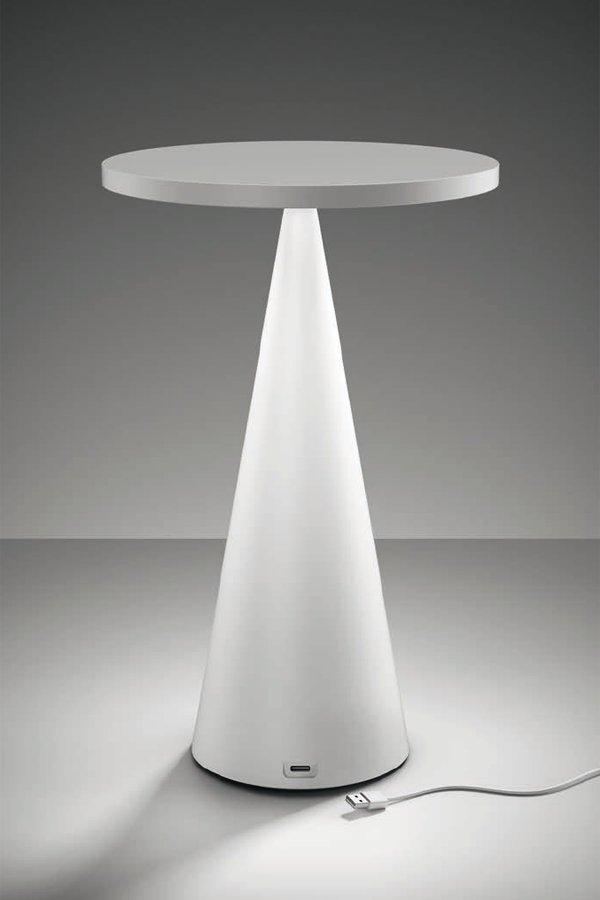
Mobile Emera light with USB charger
I just have to mention their new mobile lighting Emera which allows you to charge via USB and take your light wherever you like therefore creating a flexible atmosphere that can adapt to the ever-changing organisation of a space.
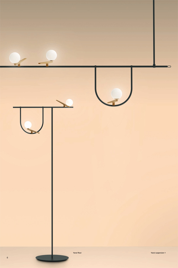
Poetic modular lighting system Yanzi for Artemide
And last but not least the Yanzi, a modular lightweight system that support multiple stylized figures like iconic swallows with a brushed brass body and a head like a white glass sphere animating any space with an elegant poetic attitude.
The above is only just scratching the surface of the vast array of exhibition stands at the Salone. I think I may have seen only about 5% in total, most of which were glimpses whilst rushing past but Francesca from Design Diffusion made it fun and easy to navigate amongst the stands.
I’m definitely planning on coming back next year aiming to see more of the installations and events organised around the city in hidden warehouses, palazzos or converted garages – during the Salone the whole city buzzes with innovation and creativity and it’s impossible not to get swept away.
Ciao Milano, alla prossima!
PHOTOGRAPHY | with kind permission by the brands [first 4 pictures by Annie Kruse]
This post is sponsored by Design Diffusion as well as Gianfranco Ferrè Home, Roberto Cavalli Home Interiors, JCP, Arflex, Annibale Colombo, Gallotti&Radice, Poliform, MDF Italia, Natuzzi, Kartell, Artemide.
I only work with products and services I truly love and all opinions are my own.

