Sometimes things come together in mysterious ways, maybe the stars are aligned, maybe you get out of bed on the right foot, maybe your train is running on time, maybe your flat white is just how you like it, maybe you have a good hair day. Sometimes things just work.
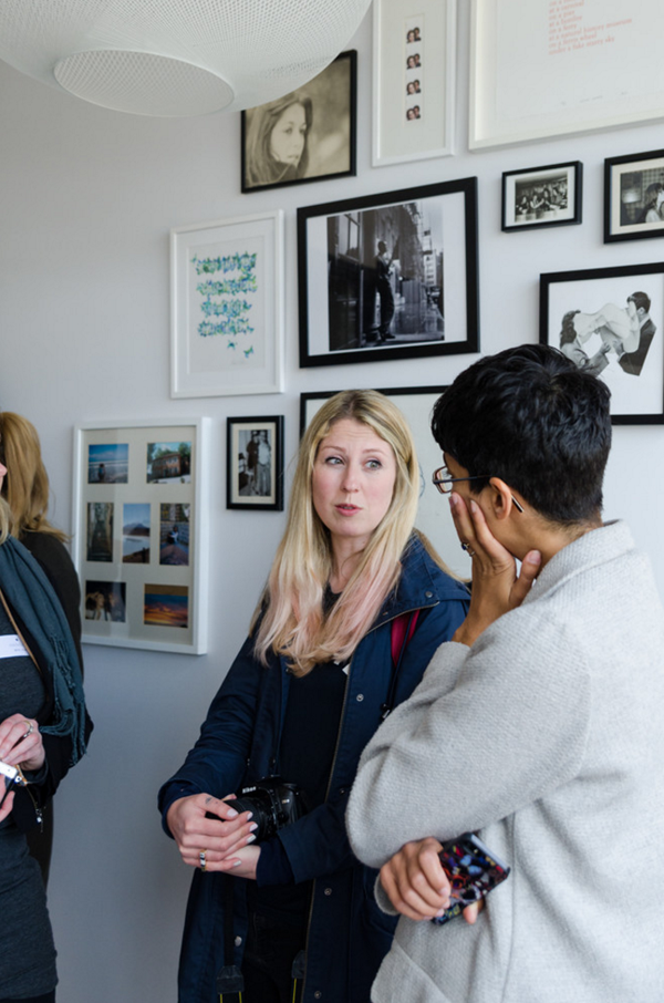
Such was the case at our second Function And Form event last Saturday. As with our previous event Tiff from Curate & Display and myself had invited some like minded interior fanatics lovers for an informal gathering and thanks to our lovely sponsors Houzz we were able to snoop around two extraordinary homes in East London.
You might have come across Houzz the online platform for home renovation and design who bring homeowners and home professionals together in a unique visual community. Their site is vast and with more than 40 million users it has grown into a valuable resource for anybody who is looking to get inspired, discover products and to find and collaborate with the perfect architect, designer or contractor.
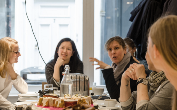
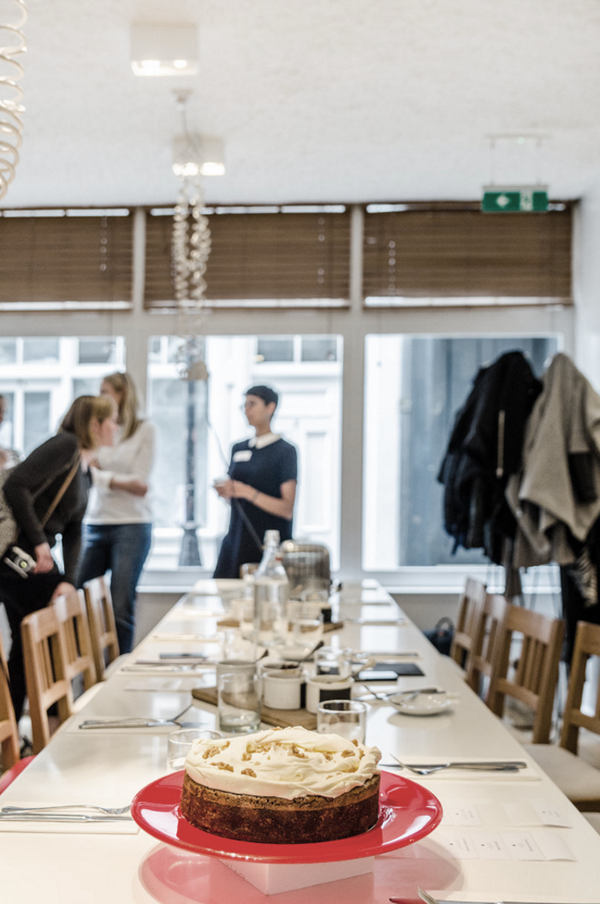
We kicked off around 10:30am at Ottolenghi in Spitalfields with hot drinks and delicious cakes in their beautiful contemporary Scandi meets Mediterranean dining room. A great mix of people all connected by their love for interiors. Some had known each other for years, some met for the first time in person after connecting through social media and some were totally new to the group. It didn’t matter – everybody was equally welcome and the atmosphere was relaxed from the start.
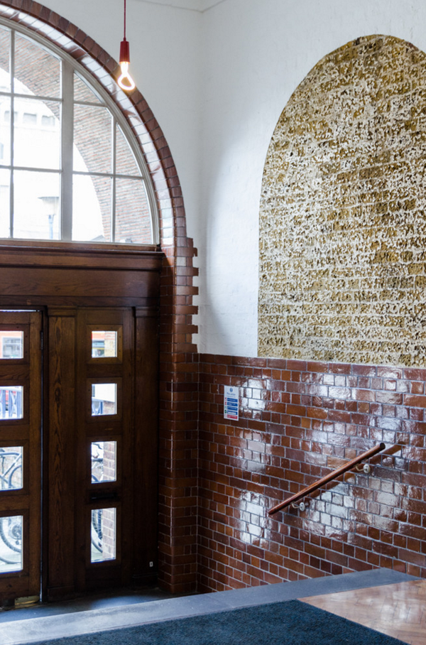
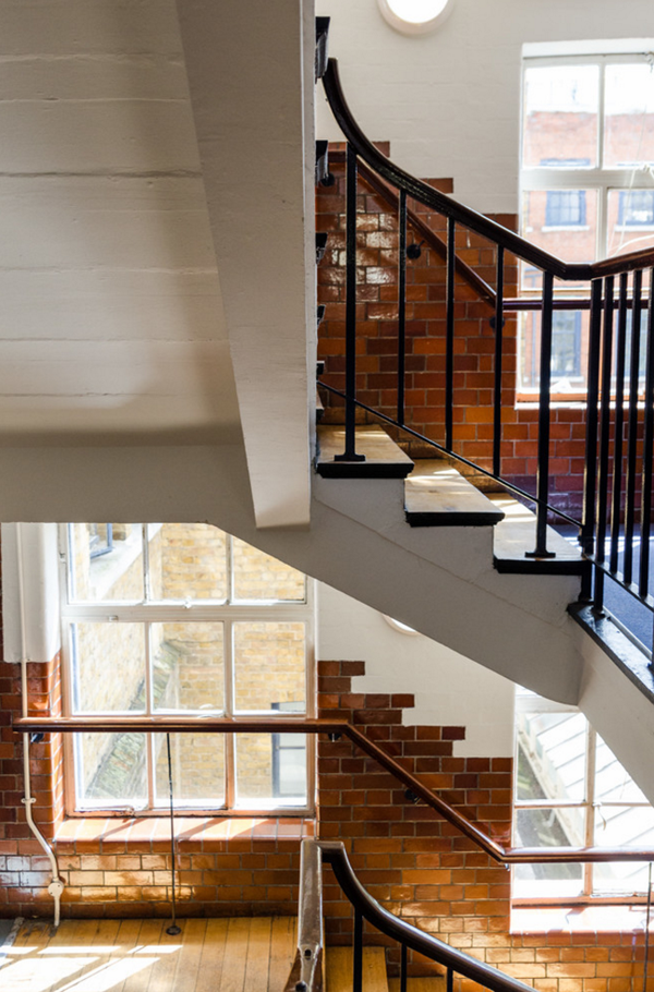
Through their community Houzz managed to give us access to tour two fabulous homes in East London and speak to their respective owners who also happen to be – in today’s feature – the interior designer Laura Lakin who gave us some great insights into how she planned to convert the space in an old school in Hackney.
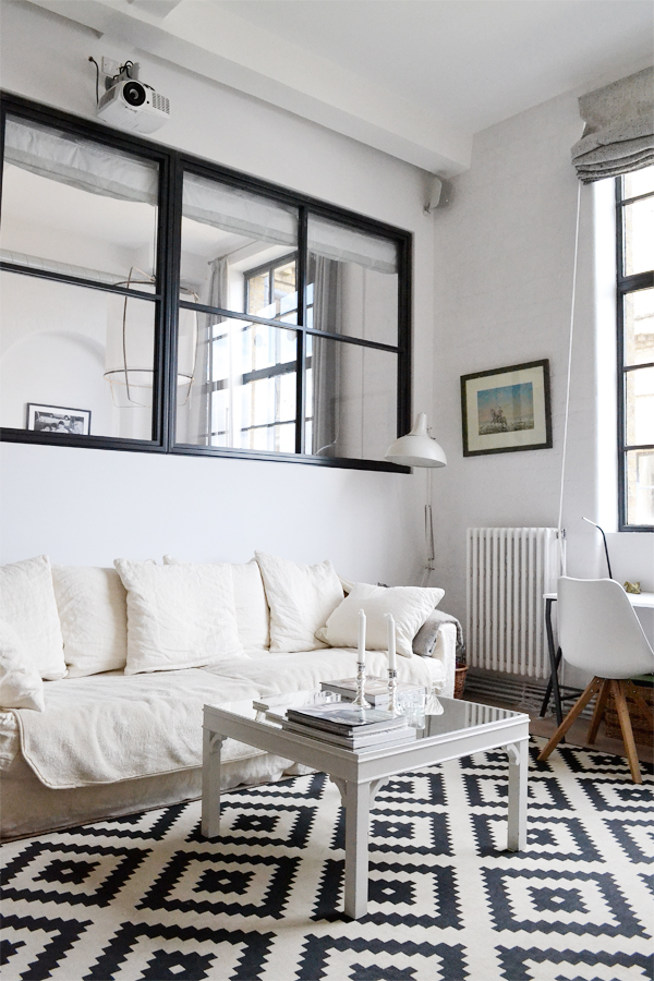
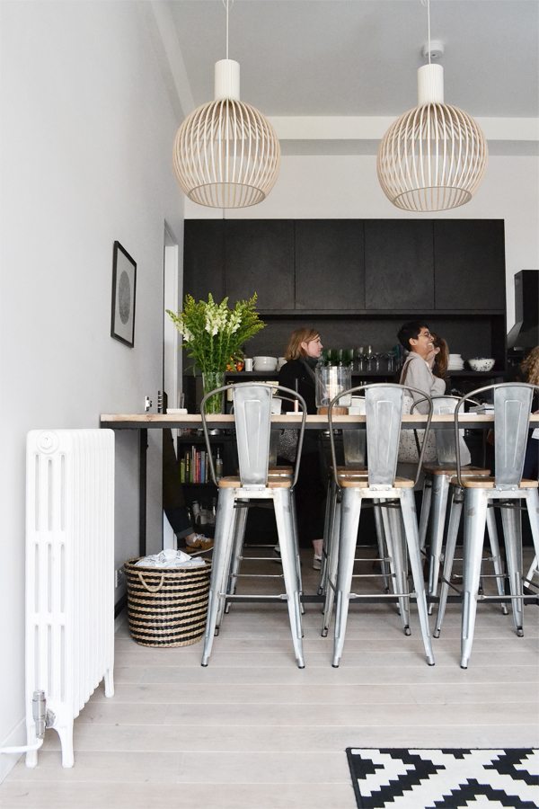
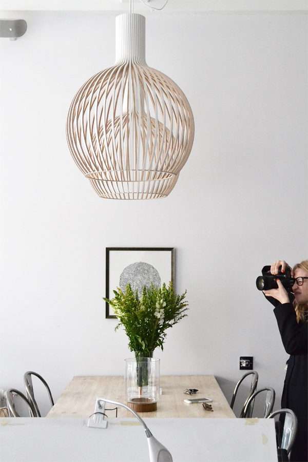
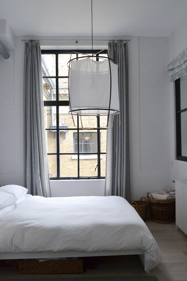
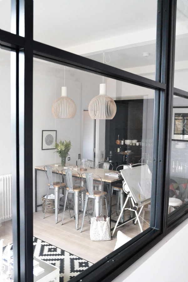
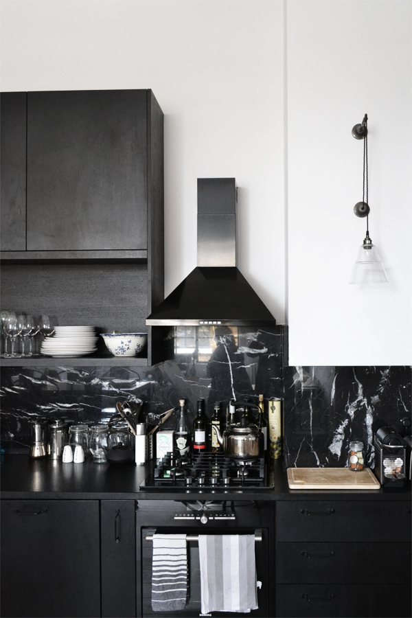
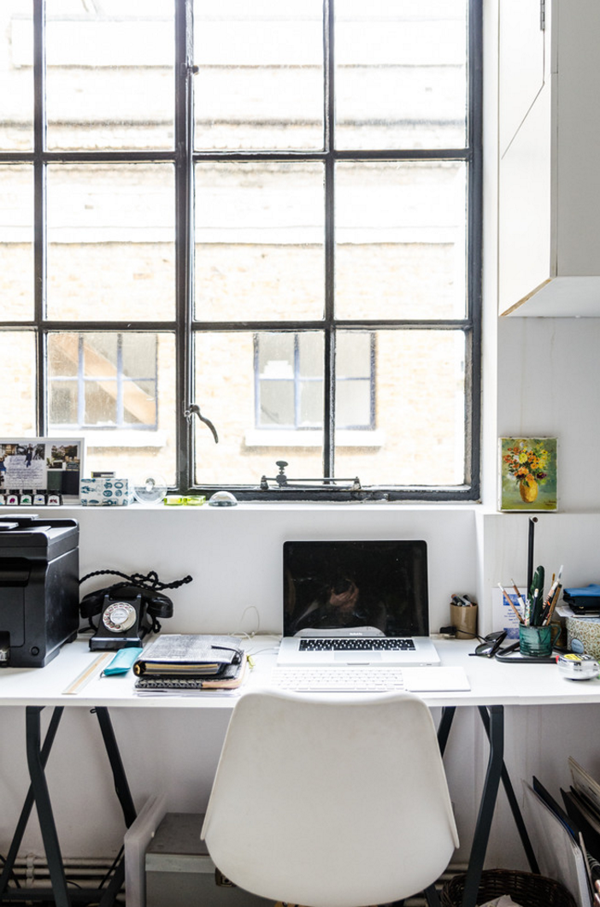
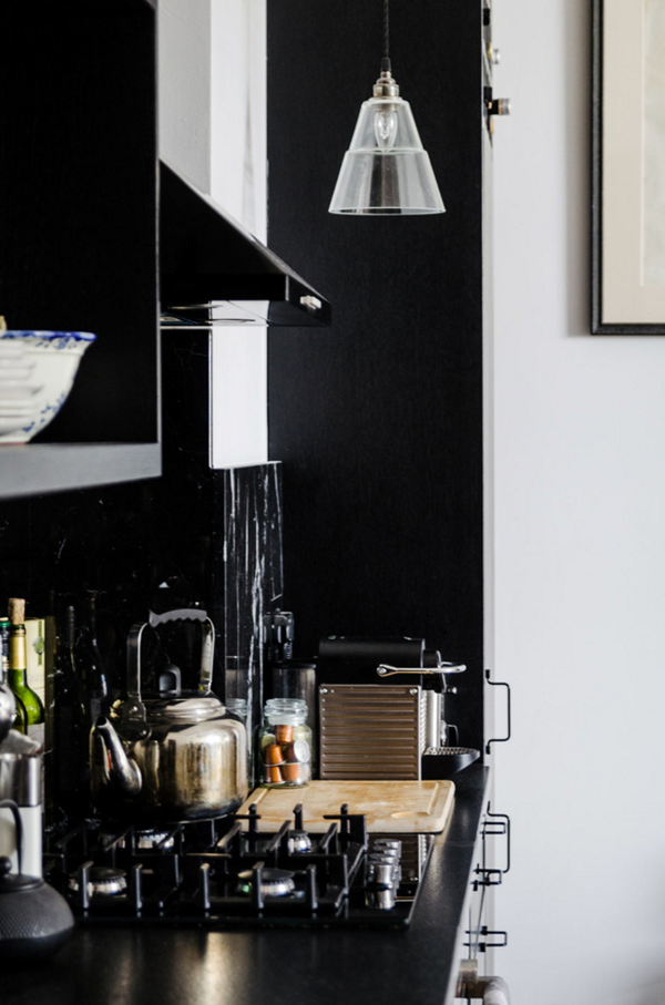
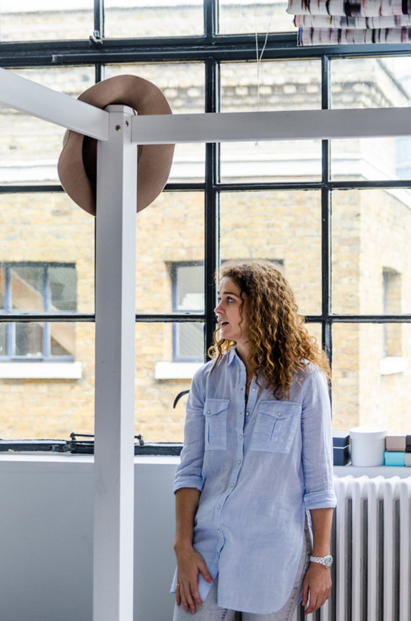
I wanted this space to feel contemporary, open plan with clean lines and a predominantly monochrome palette but still retain some of its industrial feel. I was inspired by Scandinavian design but it’s definitely a combination of different influences. I love introducing patterns and colour to interiors but for this flat I was drawn to a white and black palette – I didn’t want to be distracted, I wanted the architectural details such as the windows to be the focus and the feeling of space and openness to be highlighted.
In terms of the layout, I loved the idea of knocking all the walls down and having one big open space but I knew I would be sharing the space with a friend and didn’t want to lose one bedroom. To solve this I had internal steel windows made and the large one opened onto the living room from the second bedroom – this allowed the light to flow throughout but also made the space feel more open plan. I also wanted us to have our own space but then meet in the middle – literally – when we want to socialise or watch a movie on the projector.
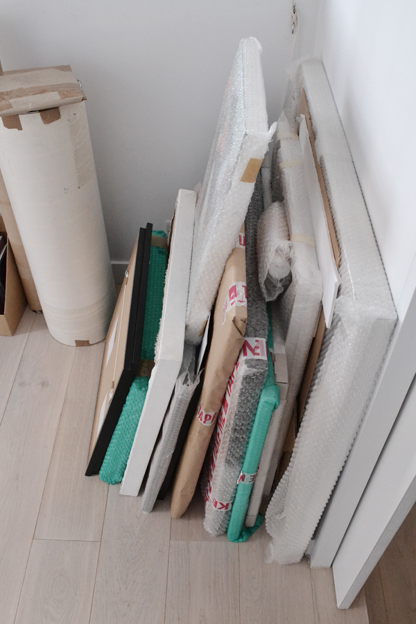
I knew art would play an important role here and would be changing fairly regularly so the black and white palette worked well as a background.
Laura also had some great tips on how to design your own home and what to consider.
I think it’s important to consider artwork when designing your own home – do you have a lot of art? Do you plan on building a collection? If so, consider this when designing your home – make sure you leave enough wall space free and don’t forget about lighting if you want to make a real feature of it.
When designing your own home think about your average day and how you use your home. Where do you put your shoes on? When you leave the house or in your bedroom? Are you very active? Where are you going to store your tennis rackets/surfboards etc.? Do you read a lot in the daytime? Do you live to cook? Consider all these things when designing your space.
The kitchen is the heart of the home so I would always say if there’s one room you spend money on that should be it.
Open plan living may be ‘de rigour’ these days but if you cook a lot of curries and don’t particularly like food smells then you might prefer to have a separate dining/living room – don’t just follow trends, make sure it suits you and your lifestyle.If you like mixing different styles, then I would suggest using something to tie it all together to make sure it’s cohesive. Working in the same colour palette is a nice way to make sure it all works well.
You can imagine how drawn I was to Laura’s home and I think she may have had just a little bit of a hard time getting everybody out of there.
The second part of our home tour will be up here next week so make sure you check back in to see a very different but equally inspiring property: An original Hugenot silk weavers house sensitively restored and brought into the 21st century by owner and architect Chris Dyson.
INTERIOR DESIGN | Laura Lakin
MORE INFORMATION | Houzz
PHOTOGRAPHY | Annie Kruse (unless indicated)

Thanks so much to you, Tiff and Houzz for such a fun, interesting gathering! The homes were just beautiful, and it was a really inspiring morning all round x