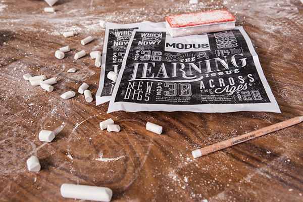
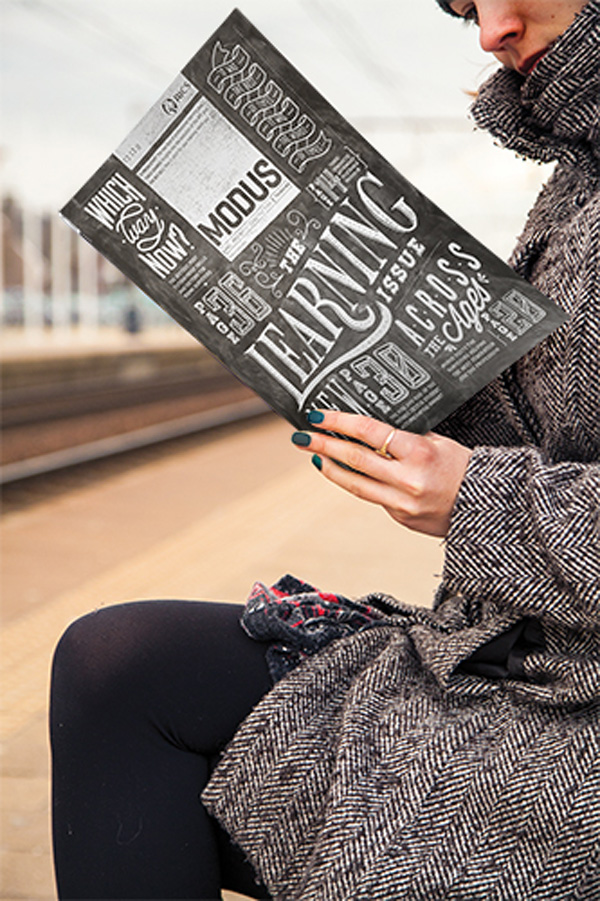
Did you enjoy my post about the Broste Copenhagen ‘Behind The Scenes’ photoshoot last week? If you did you’re in luck as here’s another one that shows you the making of. This time for Modus, a membership magazine for the Royal Institution of Chartered Surveyors mailed 10 times a year to more than 95,000 members and the UK’s highest-circulation property-related B2B title. Have you switched off already and skipped to the next paragraph? I don’t blame you, I would.
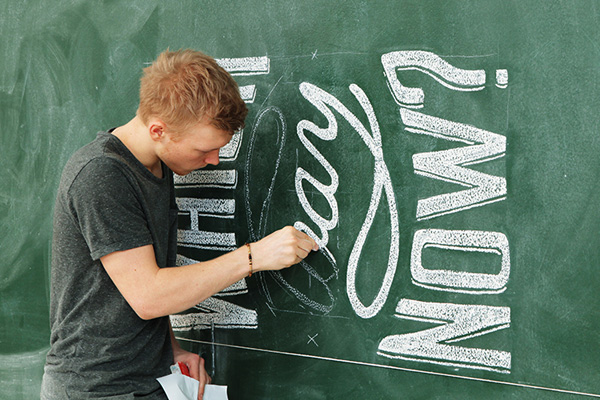
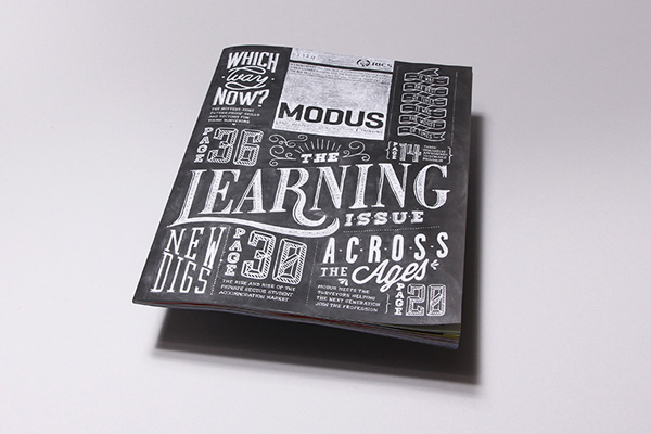
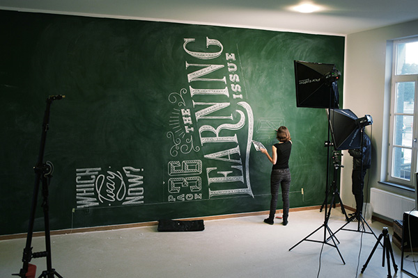
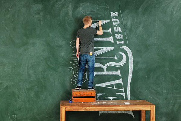
So here’s the fun part: For their ‘Learning’ issue they commissioned a supersized chalk board with hand drawn typography which then served as a cover shot. Wowzers. I so L O V E a chalk board and it speaks volumes for the agency-client relationship that they managed to get this idea signed off.
In fact this project is both: a piece of art as well as a very clever and highly unusual piece of typography and cover design. Everyone involved should get a medal or at least an D&AD award. I just wish I could have helped out on a few letters.
Sure they could have photoshopped the whole thing but it would have never looked that real with little imperfections and wipe marks plus what’s the fun in that if you can DIY it!? If you’re a typography geek like me then watch the short clip to see how it all came together.
7x3m Modus cover from Soon on Vimeo.
MORE INFORMATION | Coming Soon
CREATIVE DIRECTOR | Jim Van Raemdonck (BE)
GRAPHIC DESIGN & TYPOGRAPHY | Phoebe De Corte (BE) & Lee Skinner (GB)
CHALK DRAWERS | Phoebe De Corte (BE), Lee Skinner (GB), Lucie Muchovičová (CZ), Bi Schutte (BE) and Silke Vermassen (BE)
FILM, PHOTOGRAPHY & MONTAGE | Romain Menke
MUSIC | Laura Aerts (BE)

