Monthly Archives: June 2014

POLISHED CONCRETE FLOORS IN COPENHAGEN HOME

20 June 2014

Polished-Concrete-Home-by-Peter-Kragballe-01

 
This open plan apartment is home to Lina and Thomas who both work in fashion and design and it’s conveniently located in central Copenhagen near the Royal Garden. The small but impressive industrial space has been totally gutted and I like how the owners have taken great care not to strip out it’s character.

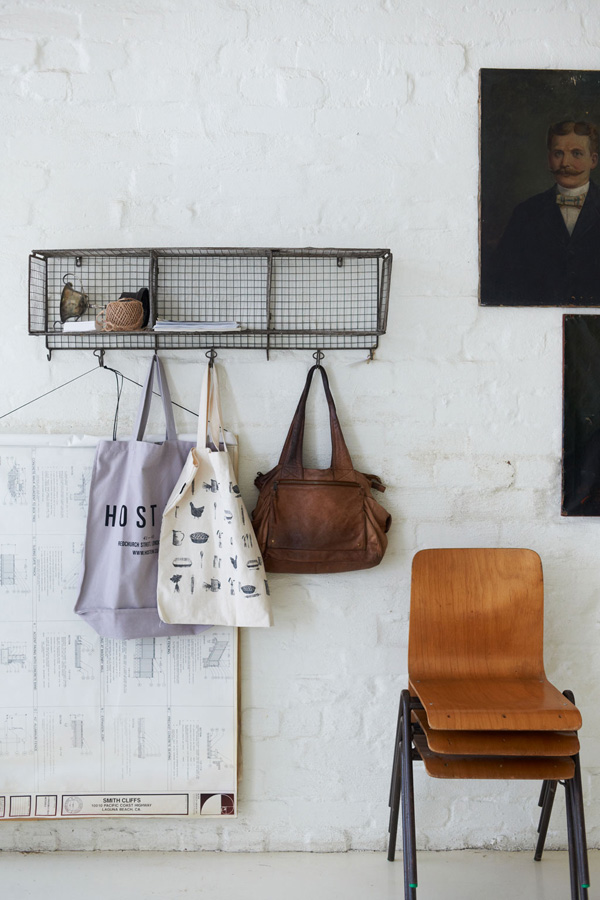
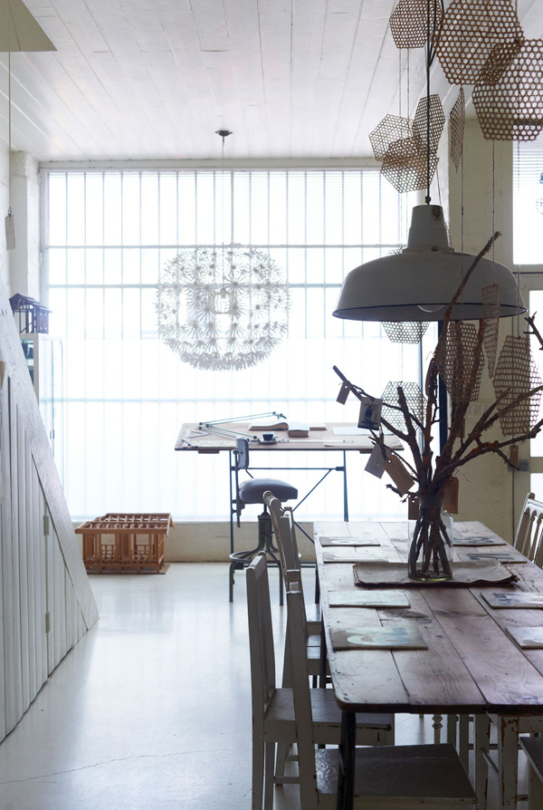
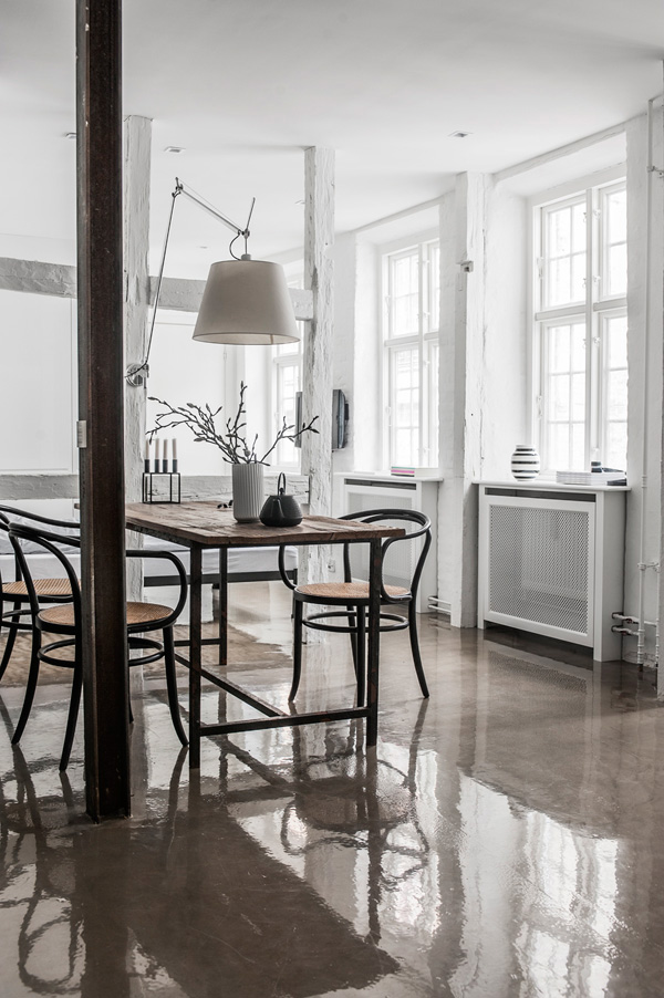
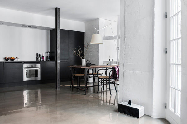
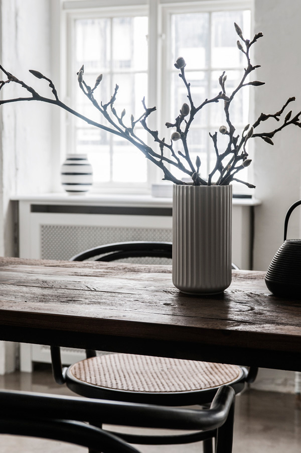
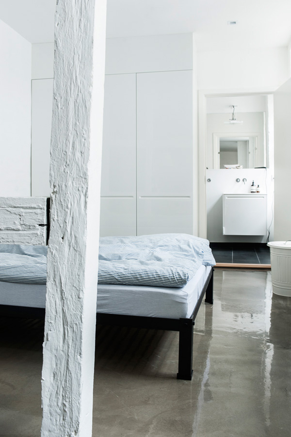
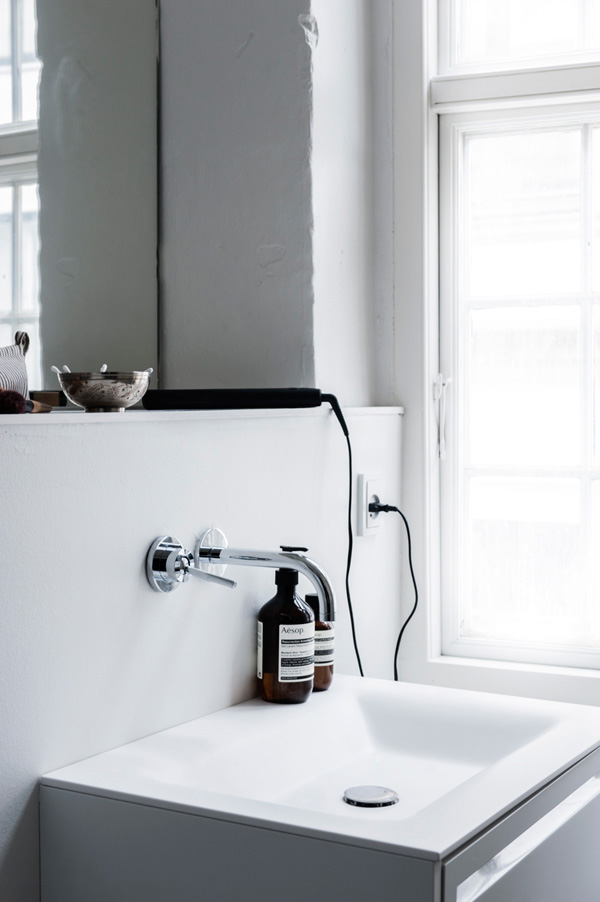
Though walls, windows and ceiling are painted pristine white they managed to subtly add interest through a mix of materials. You can find roughly plastered walls, painted brickwork and wooden beams as well as an old metal pillar located centrally in the kitchen and dining area. In contrast, the newly installed kitchen cabinets are black veneer with a super smooth white work surface that sits comfortably next to the rough walls.

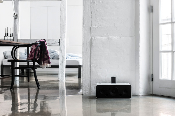
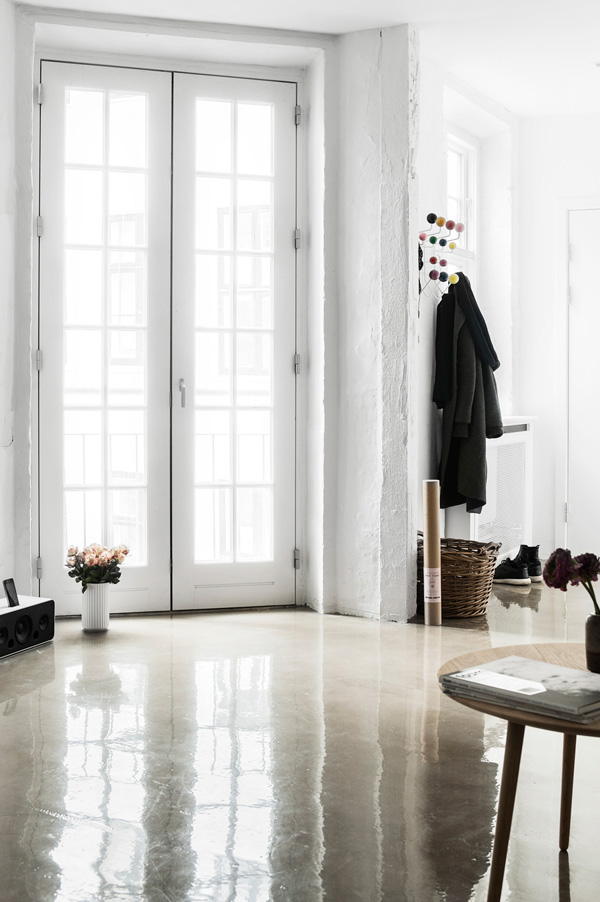
Interestingly, the object that first caught my eye – after the showstopping polished concrete floors – is the wooden dining table on a steel frame that looks as if it’s had many a good feast served. It’s a beautiful piece of furniture and I love how it contrasts with the polished concrete floors. As most nordic countries are often starved of natural daylight the glossy surfaces in this space, especially the flooring, reflect the light coming in through various large industrial windows beautifully.

I was umming and ahhing whether I should add this space to my Interiors Crush column but in the end decided it’s not a perfect love match for me. Though I love concrete and the many creative ways it can be applied the high gloss flooring is a little bit too shiny for me and I can imagine it might feel a bit cold.

I’d love to find out what you think of the polished concrete floors. Love it or hate it?

 
Polished-Concrete-Home-by-Peter-Kragballe-02

Polished-Concrete-Home-by-Peter-Kragballe-03

Polished-Concrete-Home-by-Peter-Kragballe-04

Polished-Concrete-Home-by-Peter-Kragballe-05

Polished-Concrete-Home-by-Peter-Kragballe-06

Polished-Concrete-Home-by-Peter-Kragballe-07

Polished-Concrete-Home-by-Peter-Kragballe-08

polished concrete floor, flooring, copenhagen, home, apartment, interior design, minimal, modern, monochrome, peter kragballe photography, simple, graphic, industrial, quality furniture, timeless

 
VIA | Rum Hemma
PHOTOGRAPHY | Peter Kragballe
 
Follow Stylejuicer with Bloglovin

PLACES TO GO | MELANIE GILES CAFE

19 June 2014

places to go, melanie giles cafe, hair salon, bradford on avon, monmouth coffee, croissants, rayburn oven, Rich Stapleton, cereal magazine, readcereal, wiltshire, tip

Remember my girlie trip to Wiltshire and visit to Hartley Farm shop & cafe a few weeks ago!? Turns out me and girls missed another highlight in the area, namely the fabulous hair salon come cafe Melanie Giles in Bradford on Avon, a stone’s throw from Hartley Farm.

I came across it on readcereal.com and loved Rich Stapelton’s photos of which I’m giving you a sneak peek – please go to readcereal.com for the whole story and more photos.

Melanie Giles’ quirky idea came about when they started serving fresh croissants, simply with jam and butter out of their Rayburn oven in the winter months and the customers (and staff) leapt up the idea. Melanie decided to add some great quality Monmouth coffee beans and THE best cafe slash hair salon in the area was born. They’ve now even got their very own Monmouth schooled barista on site who knows how to pour the silky smooth Ivy House Jersey milk for the perfect cappuccino.

Think another trip to Wiltshire is on the cards.
 

copyright-Rich-Stapleton-via-Ceral-Mag-02

places to go, melanie giles cafe, hair salon, bradford on avon, monmouth coffee, croissants, rayburn oven, Rich Stapleton, cereal magazine, readcereal, wiltshire, tip

 
VIA | Cereal Magazine
PHOTOGRAPHY | Rich Stapleton
MORE INFORMATION | Melanie Giles
 
Follow Stylejuicer with Bloglovin

PLACES TO GO | HELLO I’M LOCAL HOSTEL IN HAARLEM

16 June 2014

hello Im local, hostel, haarlem, netherlands, travel, accommodation, quirky, contemporary styling, interior design, anouk b studio

Do you guys know Haarlem? No, it’s not a spelling mistake Haarlem with 2 a’s is a small town west of Amsterdam who keeps popping into my social media feed more and more often. Wether it’s bloggers who live there, brands that catch my eye or like this unique hostel I want to introduce you to today.

It’s a funny thing because I’ve actually been to Haarlem back in 2010 for one of the cowboy’s best friends birthday and really liked the place and it’s beautiful historic architecture and canals, a mini Amsterdam.

But I’m starting to think that this little town has a higher creative head count than most places, certainly unusual for a small town. Does it have something to do with the 348.970 local beers being served? Is Amsterdam now grid locked with bicycles? I was curious and had a chat with my local friends who think it’s partly to do with the proximity to both the creative hub of Amsterdam as well as some gloriously unspoilt beaches. The council also has a favourable attitude towards creative initiatives and encourages art galleries, organisations and creative collectives due to Haarlem’s history of printing and graphic design. Can you believe that Haarlem’s newspaper is the oldest in the country!?

But back to today’s post about this boutique hostel in the centre of Haarlem with the quirky name of ‘Hello I’m local’. It’s been a dream of Saskia Hurd to open up a hostel and when she found the site occupied by 4 derelict buildings which had been empty for 23 years she knew she had to go for it.

The hostel offers 12 unique rooms that cater for pretty much any size party and you’re invited to sit back, relax and enjoy Saskia’s living room and patio where she often lights a cosy fire. By her own account Saskia is a little old fashioned and likes to encourage people to talk, play board games or just enjoy the outdoor fireplace but don’t fret there’s wifi in the living room, just no TV please.

I love the individually styled rooms, all based on historical themes, very clean and contemporary with a mostly black and white colour palette. My favourite room has to be the smallest one with an old fashioned bedstee, a bed in the wall, that’s accessed through canary yellow double doors. Unbelievably, people used to sleep standing up in them – hence the name – but oh so cozy.

Saskia has paid attention to every detail and fully embraced the ‘local’ in her hostel’s title, encouraging guests to rent bikes to explore Haarlem or the nearby beaches and dive into the local culture and museums. Before you go make sure to check out her funky website and give her FB page some love. I’m sure to pop in next time I’m visiting.

hello-im-local-hostel-haarlem-02

hello-im-local-hostel-haarlem-03

hello-im-local-hostel-haarlem-04

hello-im-local-hostel-haarlem-05

hello-im-local-hostel-haarlem-06

hello-im-local-hostel-haarlem-07

hello Im local, hostel, haarlem, netherlands, travel, accommodation, quirky, contemporary styling, interior design, anouk b studio

 
MORE INFORMATION | Hello I’m local
PHOTOGRAPHY | Anouk B with kind permission by Hello I’m local
 
Follow Stylejuicer with Bloglovin

FORMER MATTRESS FACTORY IN MELBOURNE

13 June 2014

former mattress factory, melbourne, australia, vintage, antique, bric-a-brac, collection, industrial, patina, interior design, quirky
 

It’s been a gloriously sunny week here in the UK and I want to celebrate Friday with a bang and show you a really special home that I found on Dutch VT Wonen.

Located in Melbourne this home used to be an old mattress factory and appropriately the owner has filled it with lots of vintage pieces and bric-a-brac collected over the past 20 years.

She admits: ‘My passion for beautiful, used stuff is still growing by the day. I just love the patina of age, the worn character of bygone memories, stories and secrets.’

It’s a very quirky home and I like that the owner has painted everything white, like a canvas, to make her beautiful vintage finds stand out. It feels almost like a little museum or antiques shop and I love how she’s given the rusty locker a new use as a kitchen cabinet.

Everything is a bit raw and rough but very deliberate. The armchairs aren’t covered in luxurious fabric, there are no table cloths and the yellow iron ladder leads to… errr, nowhere actually. How very Beuys!

Grouping old finds together helps to give the interior and eye a focal point and I like the collection of oil paintings as a feature wall, the group of sports balls, mixed with some taxidermy and the pile of old books and postcards with a bust on top.

It’s impressive how the owner managed to keep the place feeling modern with all the antiques around and I think it’s partly due to the warm colour palette of mainly browns and greys as well as the white backdrop and the industrial dimensions of the building.

I’d love to have a good old snoop around here… what about you?

 
Former-Mattress-Factory-Melbourne-by-Mikkel-Yang-12

Former-Mattress-Factory-Melbourne-by-Mikkel-Yang-07

Former-Mattress-Factory-Melbourne-by-Mikkel-Yang-02

Former-Mattress-Factory-Melbourne-by-Mikkel-Yang-08

Former-Mattress-Factory-Melbourne-by-Mikkel-Yang-06

Former-Mattress-Factory-Melbourne-by-Mikkel-Yang-04

Former-Mattress-Factory-Melbourne-by-Mikkel-Yang-10

Former-Mattress-Factory-Melbourne-by-Mikkel-Yang-11

Former-Mattress-Factory-Melbourne-by-Mikkel-Yang-05

former mattress factory, melbourne, australia, vintage, antique, bric-a-brac, collection, industrial, patina, interior design, quirky


VIA | VT Wonen
PHOTOGRAPHY | Mikkel Yang
 
Follow Stylejuicer with Bloglovin