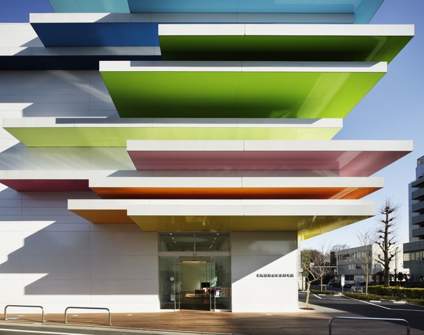
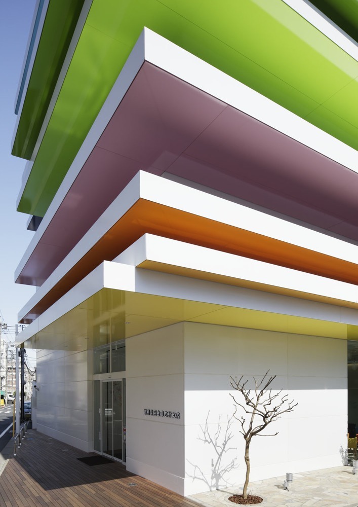
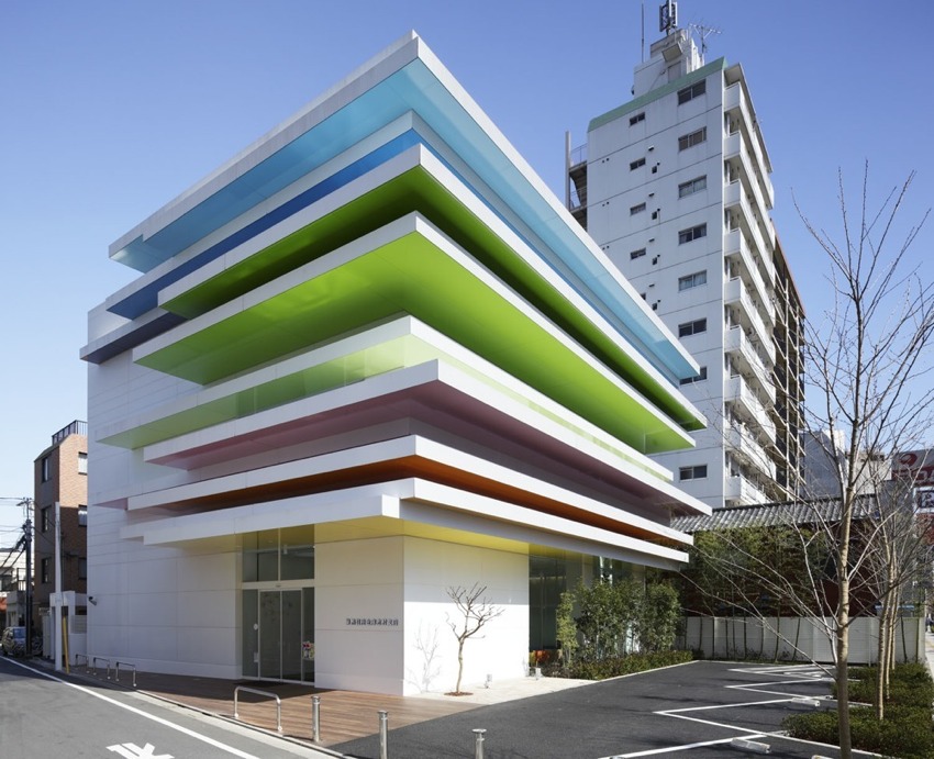
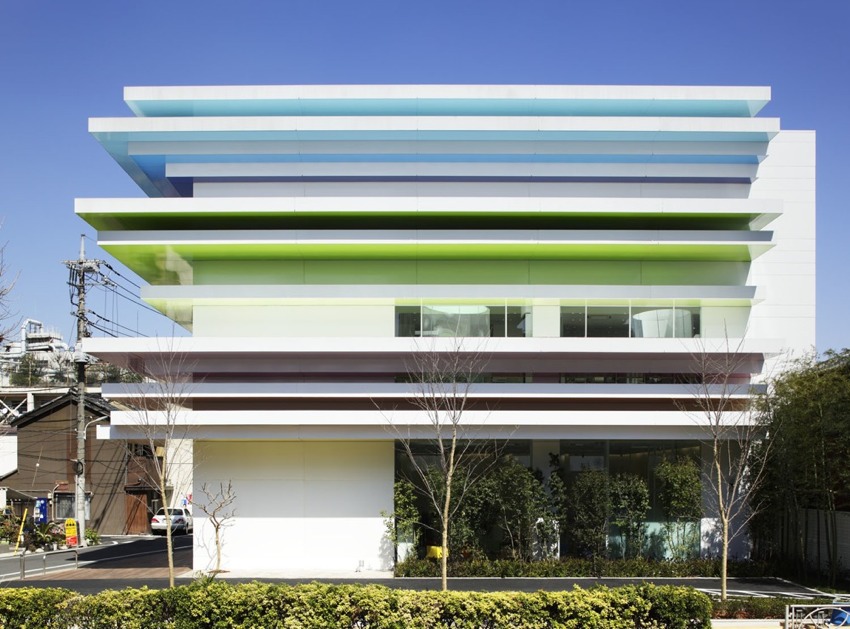
There couldn’t be a more fitting concept to kick off Stylejuicer’s COLOURFUL WEEK than architect and designer Emmanuelle Moureaux’s rainbow mille-feuille for Japanese bank Sugamo Shinkin. The French designer has been living and working in Japan since 1997 and her technique of using colour as three-dimensional elements, like layers, in order to create spaces was inspired by traditional Japanese sliding screens.
Japanese bank Sugamo Shinkin strives to provide first-rate hospitality to its customers in accordance with its motto: “we take pleasure in serving happy customers.” An ambitious sentiment which Emmanuelle translated beautifully into her architectural and interior design for this newly built branch creating a refreshing atmosphere with a palpable sense of nature based on an open sky motif.
She explains the concept in her own words:
12 LAYERS OF COLOUR
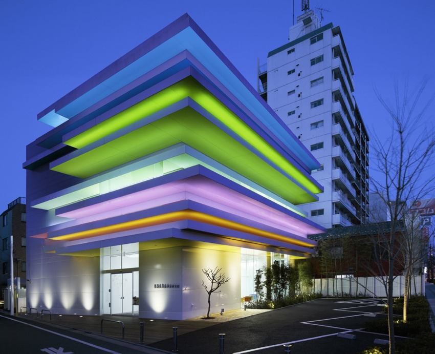
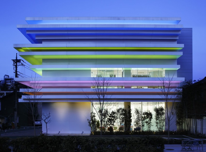
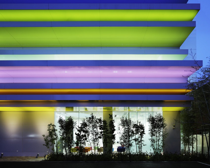
A rainbow-like stack of coloured layers, peeking out from the façade to welcome visitors. Reflected onto the white surface, these colours leave a faint trace over it, creating a warm, gentle feeling. At night, the coloured layers are faintly illuminated. The illumination varies according to the season and time of day, conjuring up myriad landscapes.A PIECE OF THE SKY
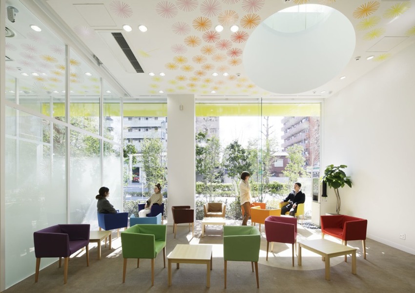
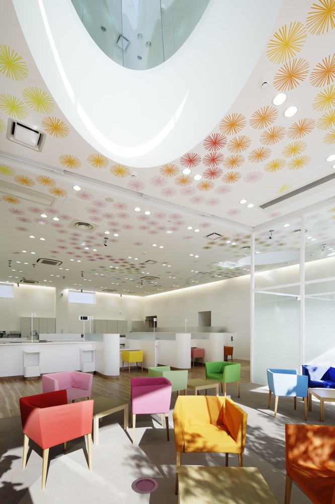
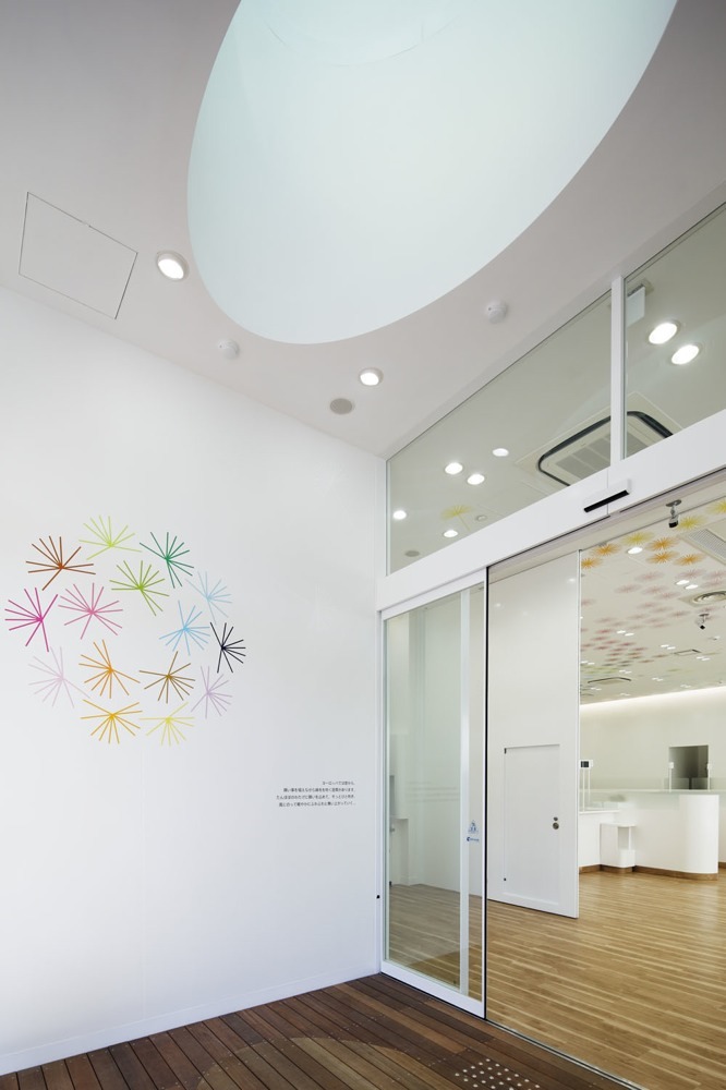
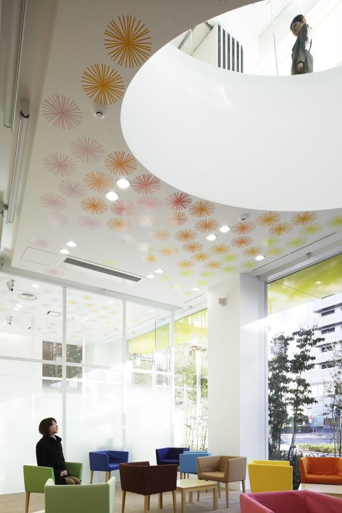
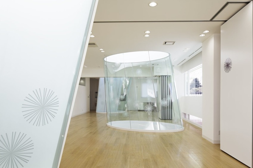
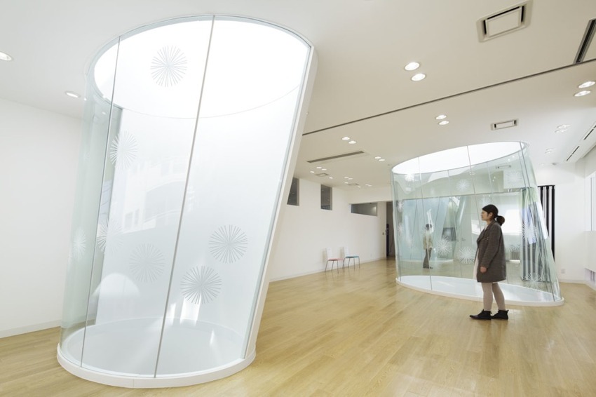
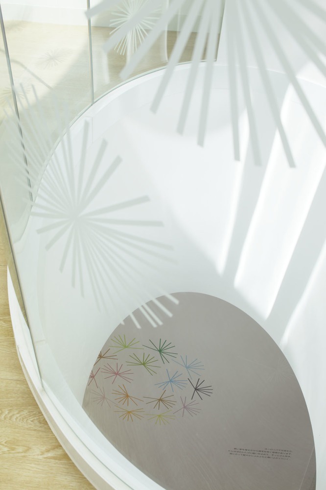
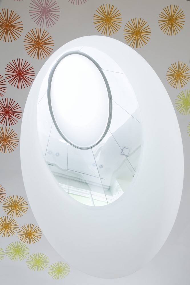
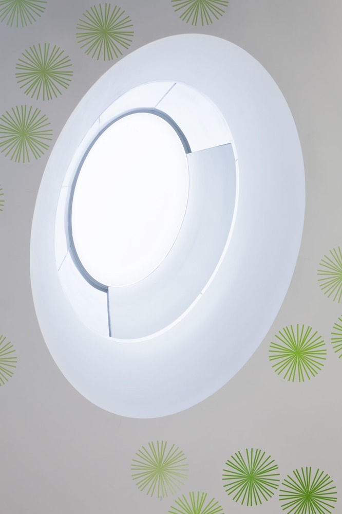
Upon entering the building, three elliptical skylights bathe the interior in a soft light. Visitors spontaneously look up to see a cut-out piece of the sky that invites them to gaze languidly at it. The open sky and sensation of openness prompts you to take deep breaths, refreshing your body from within.FUZZY PUFFS
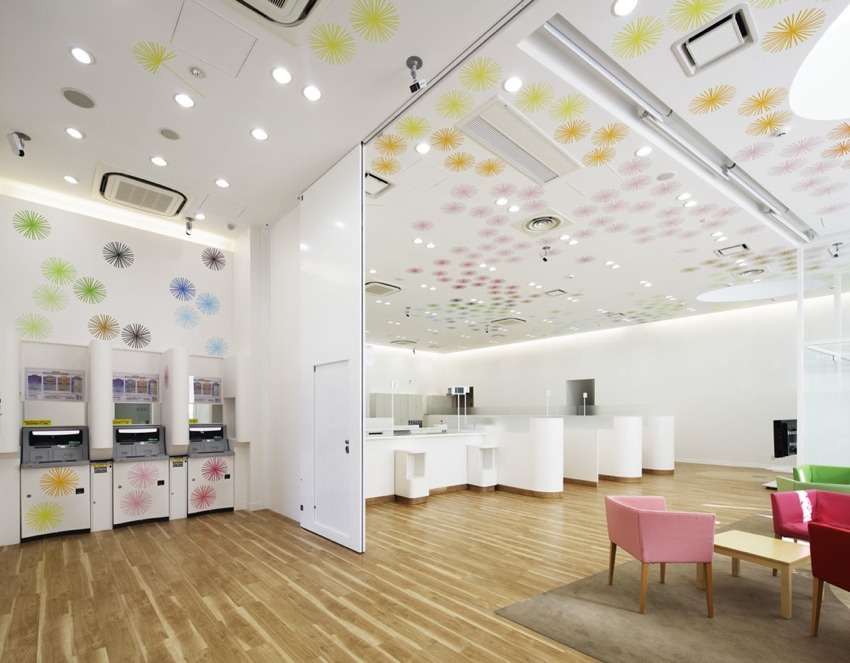
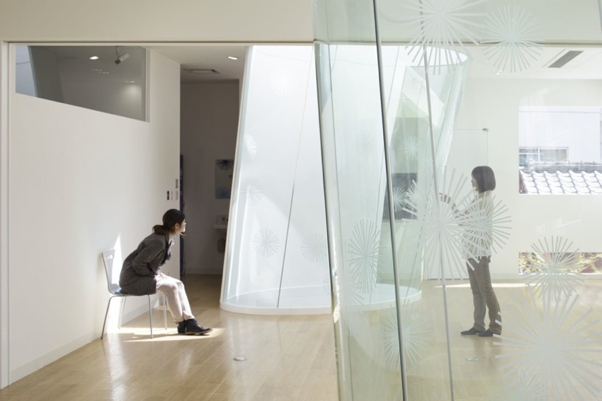
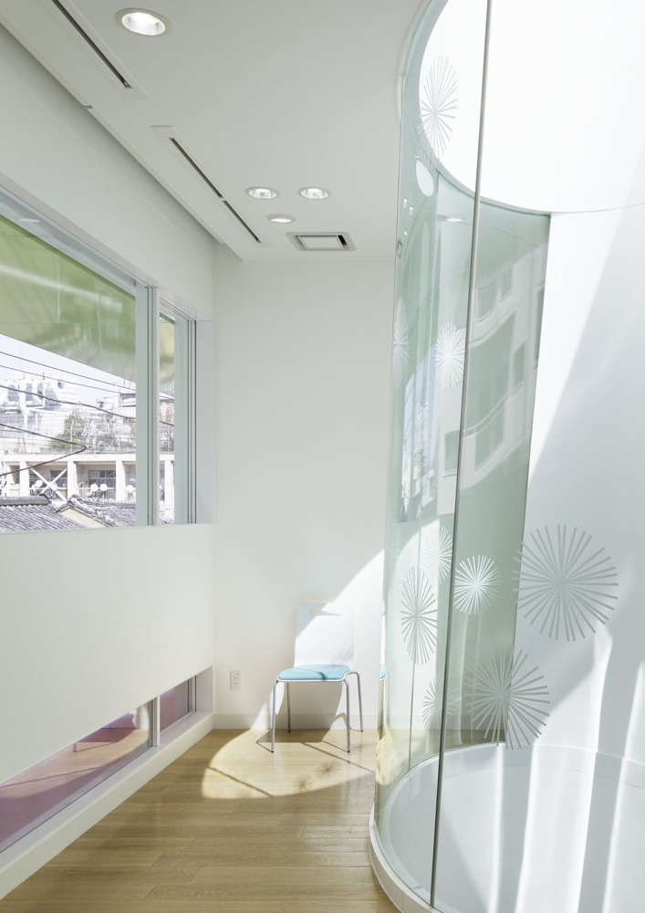
The ceiling is adorned with dandelion puff motifs that seem to float and drift through the air. In Europe, there is a long and cherished custom of blowing on one of these fuzzy balls while secretly making a wish. Bits of fluffy down gently dance and frolic in the air, carried by the wind.
It is of course a holistic approach and includes ATMs, teller windows, consultation booths and an open space with chairs in 14 different colours located on the first floor. Three long glass airwells thread through the first and second levels of the building, flooding the interior with natural light as well as ‘blowing’ air through it.
How refreshing to see this radical new and fun approach for what must be one of the world’s oldest institutions, a bank! I know I’d be laughing all the way to the bank and back.
More colourful posts coming up this week, including my travel notes on Palma de Mallorca. Hasta mañana!
Enjoy and I hope you’re inspired!
More information & photography | Emmanuelle Moureaux

