Jessica Helgerson Interior Design was featured on one of my favourite blogs Design*Sponge and I fell in love with her style straight away. She creates beautifully subtle and interesting interiors through her choice of materials, colours and decorative elements.
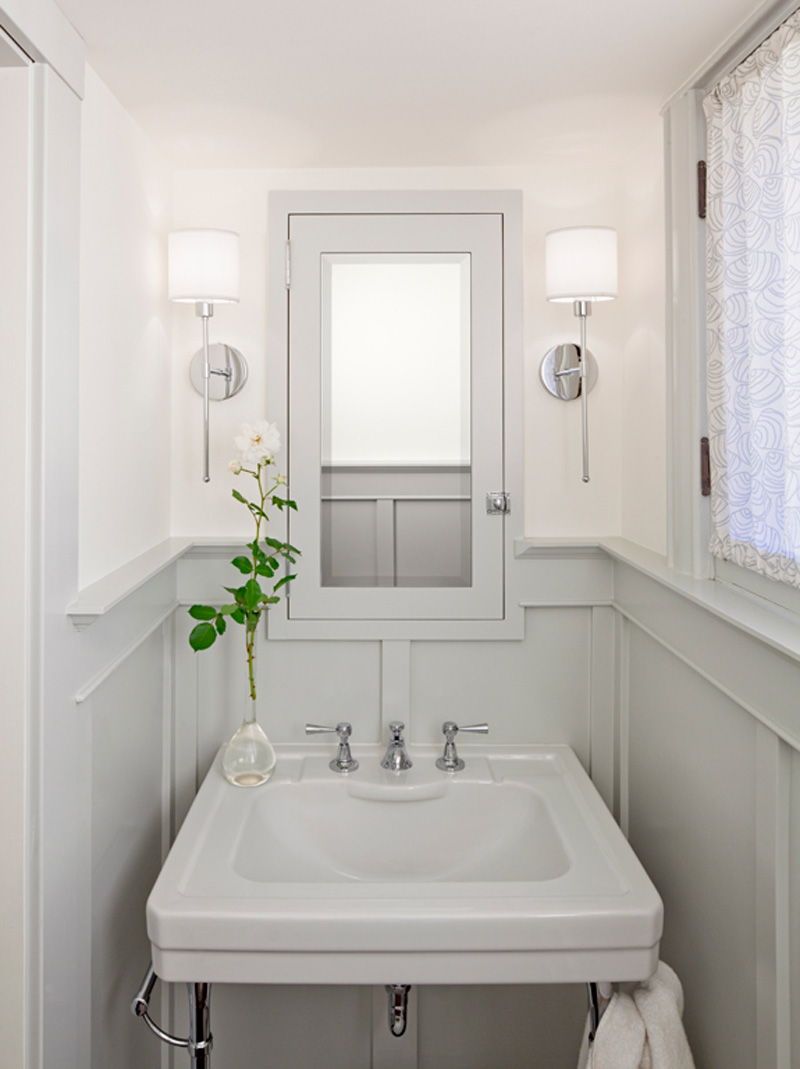
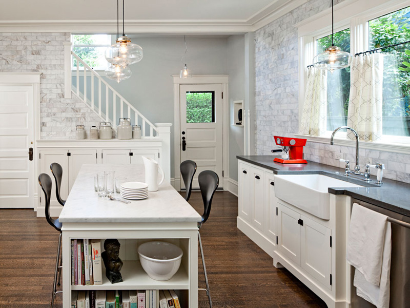
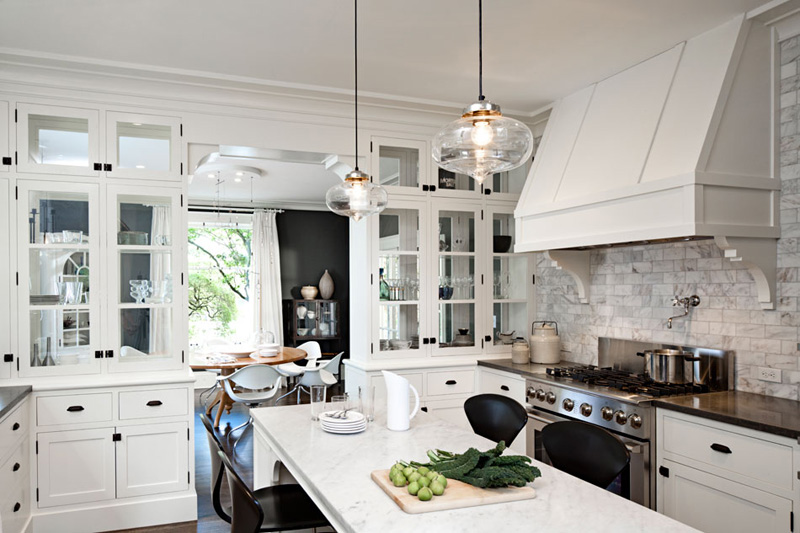
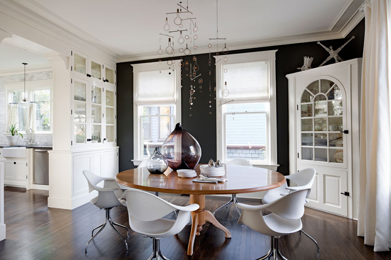
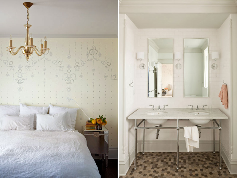
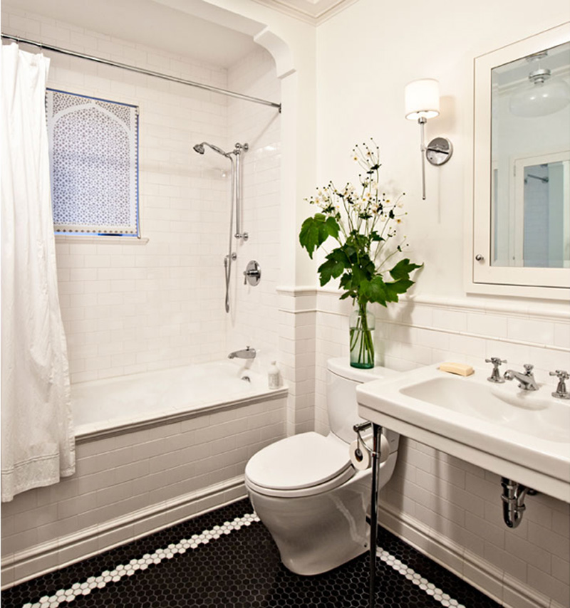
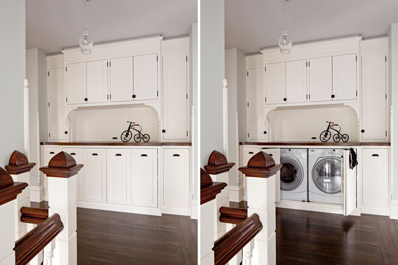
This Turn-Of-The-Century family home in Portland needed remodelling to get a better flow serving modern family living. The kitchen was opened up to the dining room and excess space from a spare bedroom was borrowed to create a master bathroom, complete with double sinks and a generously sized shower. For me the most successful transformation is the formerly dim attic studio space with it’s white walls and floors and four new skylights that flood the space with light. But the piece-de-resistance has to be the cleverly customised cupboard at the top of the stairs concealing a washer, dryer and storage space. Storage doesn’t come much more sophisticated than this.
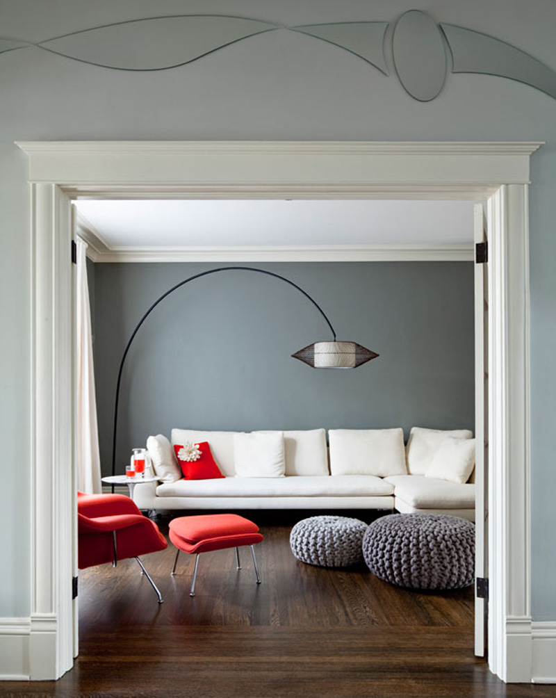
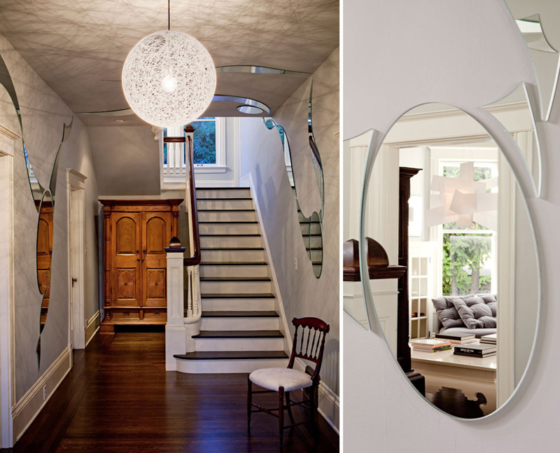
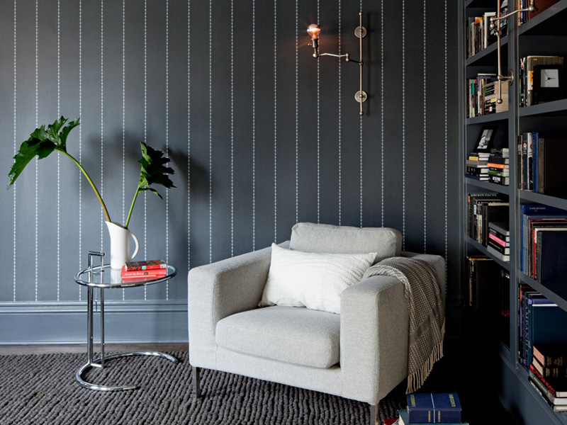
What I love about Jessica’s design for this family home is the subtle use of whites and greys throughout the house which creates continuity as well as contrast. She used a light grey wall colour for the entry area, leading into a medium grey living room and a dramatically dark grey dining room and library. A clever way of drawing the visitor in and an appropriate choice for the different uses of each room.
Another trick she applied is the use of organic shaped mirrors along the entry walls reflecting snippets of the interior and leading making the visitor curious to explore more.
Overall, the period features and dimensions have been kept intact and the house has been brought into the 21st Century with this fresh, bright and functional interior design. A success story that was awarded the 2011 Northwest Design Award for a whole house interior design budget below $400,000.
Enjoy and I hope you’re inspired!
More information | Jessica Helgerson Interior Design
Photography | Lincoln Barbour

