I’ve be umming and ahhing about how to tackle this post purely because Viewers Like You is a design consultancy like no other and they are not just good at designing, they are great at selling themselves! So, I’ve been a little hesitant worrying about doing them a disservice. But hey, I’m writing a blog about everything that’s new and inspiring and I really want you and the world to know about them.
So, let me try and capture why Viewers Like You are different. Firstly, they are a small firm, founded by Jennifer Elsner and David Shields, who frankly are picky about who they work with. If you already know what your website/logo/packaging should look like, working with them will ultimately frustrate you because they don’t approach your project just as an idea needing to be illustrated.
Secondly, once you’ve entered into a contract with them they will obsess over your project, push you out of your comfort zone and even strategically become your friend as they believe that being connected to their clients emotionally is the root of potent results and sets the stage to freely create, in a most integrated way.
Not what you’d call common practice but if I was a client reading that I’d be thrilled!
Thirdly, they get that long-term involvement is quite a commitment which is why they’re offering three levels of engagement to meet your needs and change your perception of how design can influence your business. The levels range from an “Inspired 1 month”, a “Comprehensive 12 month” to a “4 months Design Concierge” and this is the one I’m REALLY excited about.
The Concierge is for people who excel at their job and who are totally focussed on developing their business. They don’t want to get bogged down with decisions on design details, web hosting or stock selection. They are visionaries who want to continue driving their business forward and trust that Viewers Like You is on the same page and understand their brand 100%. Effectively the Design Concierge is gifting yourself a functional, strategic, potent, successful and delightful brand.
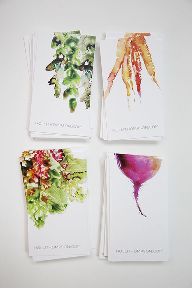
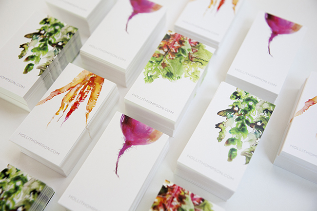
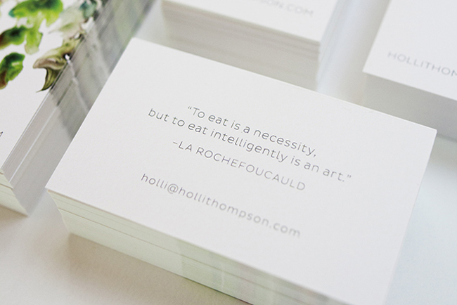
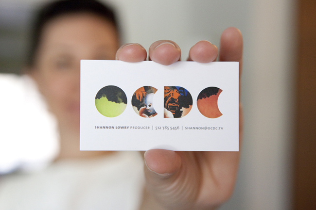
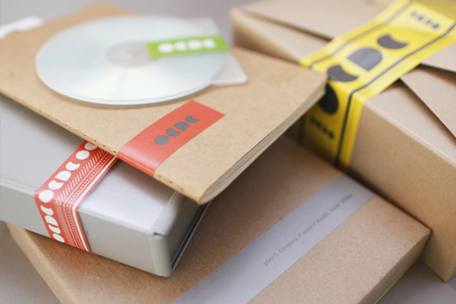
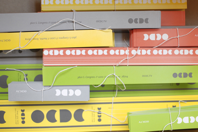
Wow, what a great service and one that was engaged by US health professional and TV personality Holli Thompson. Her business cards below show glimpses of the fabulous brand VLY created for her.
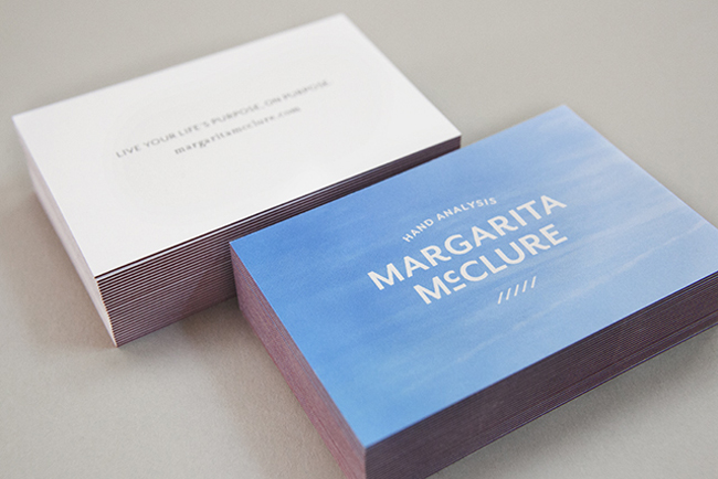
Another great project and example of VLY’s understanding of branding are the business cards created for
Margarita McClure. Jennifer talks about them eloquently on the blog and explains the stock selection:
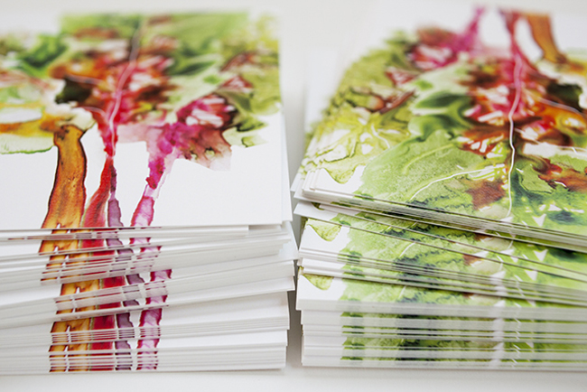
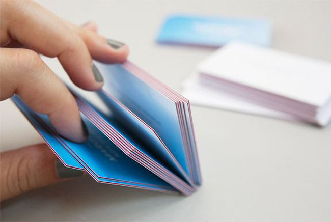
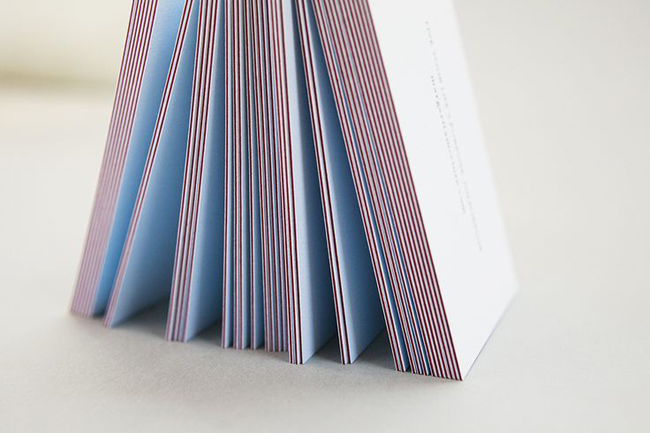
They’re dreamy, right? Triple-thick with a seam of colour. Premium Mohawk Superfine stock. And while the photos capture how incredible the cards look, they transcend that, and literally feel different. Which makes the world of difference for our client when passing one to her potential clients.
The extra investment required was worth it not only because the card is impressive to the receiver, but because the act of handing it out inspires a new posture from the giver. THAT is the point-of-difference of placing oneself at the crossroad of premium cost and value. You get taller when you stand up straight. You have more energy. You are slimmer-looking. Really.
For those who have read my $300 bathing suit post, you know that that intersection is not only where I encourage my clients to reside, but where I, too, choose to live. It’s loverly.
So, after that little introduction let me finish by encouraging all designers to go forth, stand tall and convince your clients to spend the proverbial $300 on a bathing suit! As Jennifer says:
When a seductive presentation of goods and services meets a holistic purchasing experience and results in “fit-me-like-a-glove” long-term satisfaction… I haven’t paid enough.
Couldn’t have put it better myself!
Enjoy and I hope you’re inspired!
More information & photography | Viewers Like You

