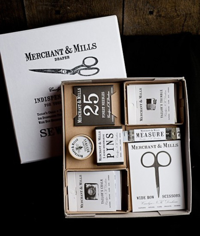
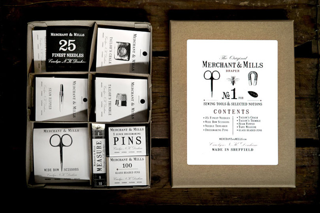
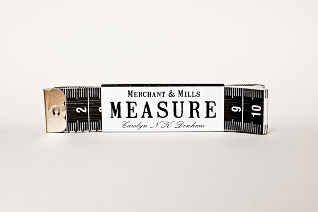
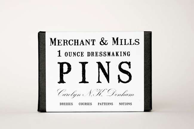
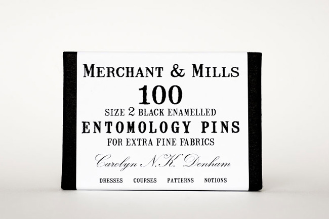
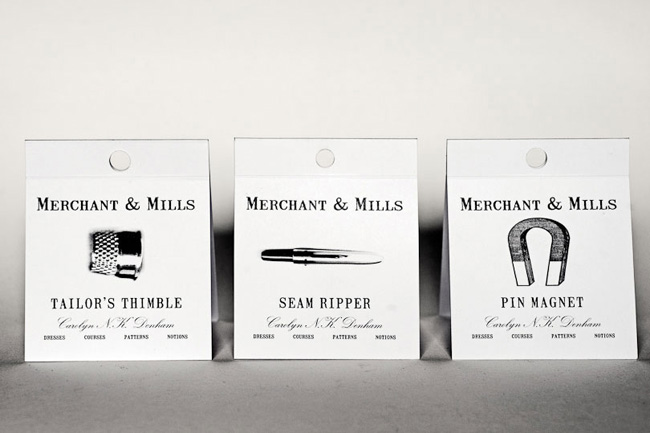
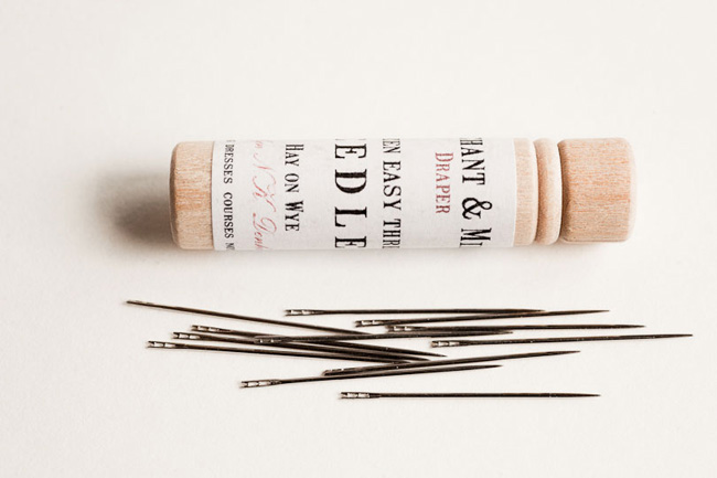
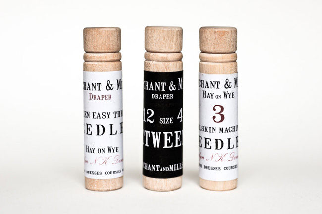
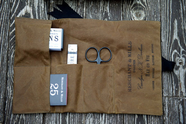
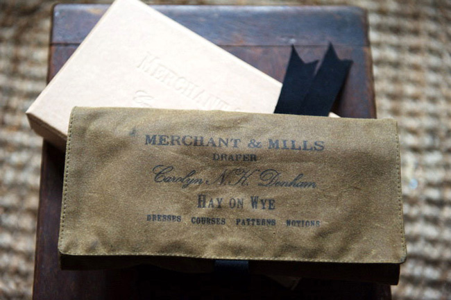
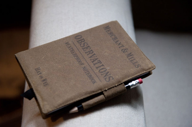
Continuing with my quintessentially English theme today I’d like to introduce you to fine graphic artist and gentleman Roderick Field. Brand creator and designer for the Merchant and Mills Sewing Company and all round good egg. A chap who by his own admission is troubled by the daily pitfalls of communicating ideas and sometimes uses words and pictures together.
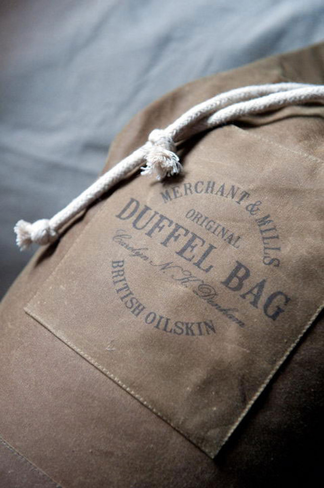
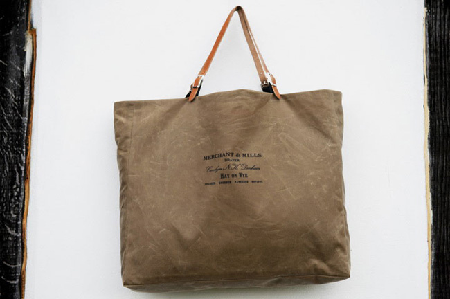
I found him to be quite amusing when communicating via electronic mail and wanted you to see for yourself what a marvellous brand he created for this nostalgic company. Based in Rye, East Sussex, the shop sets you back in time and is a treasure trove for all things sewing related, offering fabrics, patterns and courses along with beautiful stationery and exquisite oil cloth duffle bags and totes.
As previously mentioned Roderick is quite good with words so I’ll let him explain his thinking behind the design and branding.
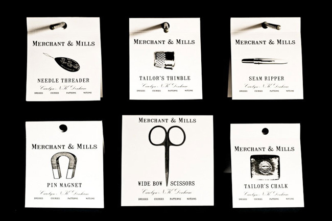
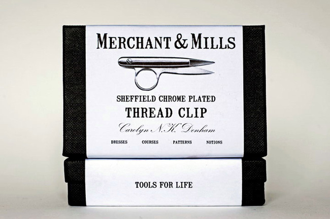
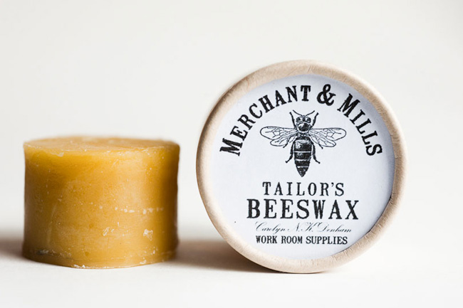
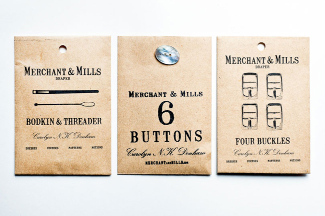
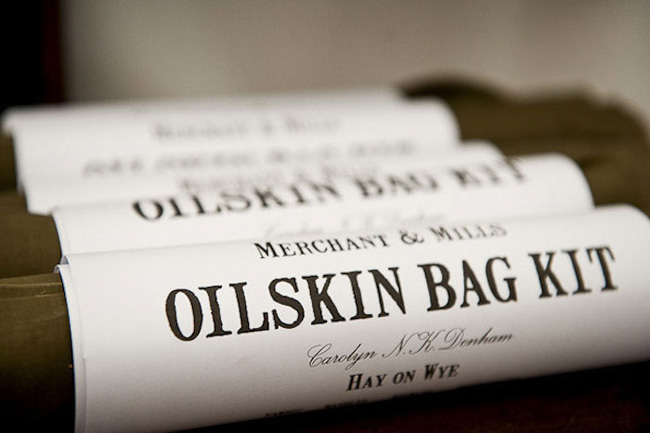
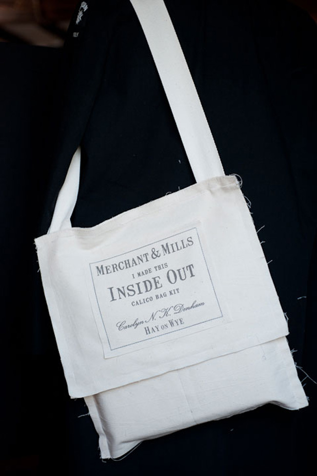
The Merchant & Mills brand is where my photography and writing first merged to make coveted packaging for our sewing company. It is the answer to a question; if Merchant & Mills were packaging, what would it look like?
As it turns out, it is stark black and white in a crumbling font with some simple, sketchy images and the occasional daring splash of deep red. Who knew?
If, like me, you’re excited by what you’ve read and seen please frequent his gallery where you’ll find more pleasing, even funny ideas by this thoroughly modern gentleman.
And last but not least let me mention that such is the quality of the Merchant & Mills products they are now available in the V&A shop, Liberty and a host of retailers worldwide.
How splendid with the Yuletide festivities just around the corner!
Enjoy and I hope you’re inspired!
More information | Merchant & Mills
Design & photography | Roderick Field

