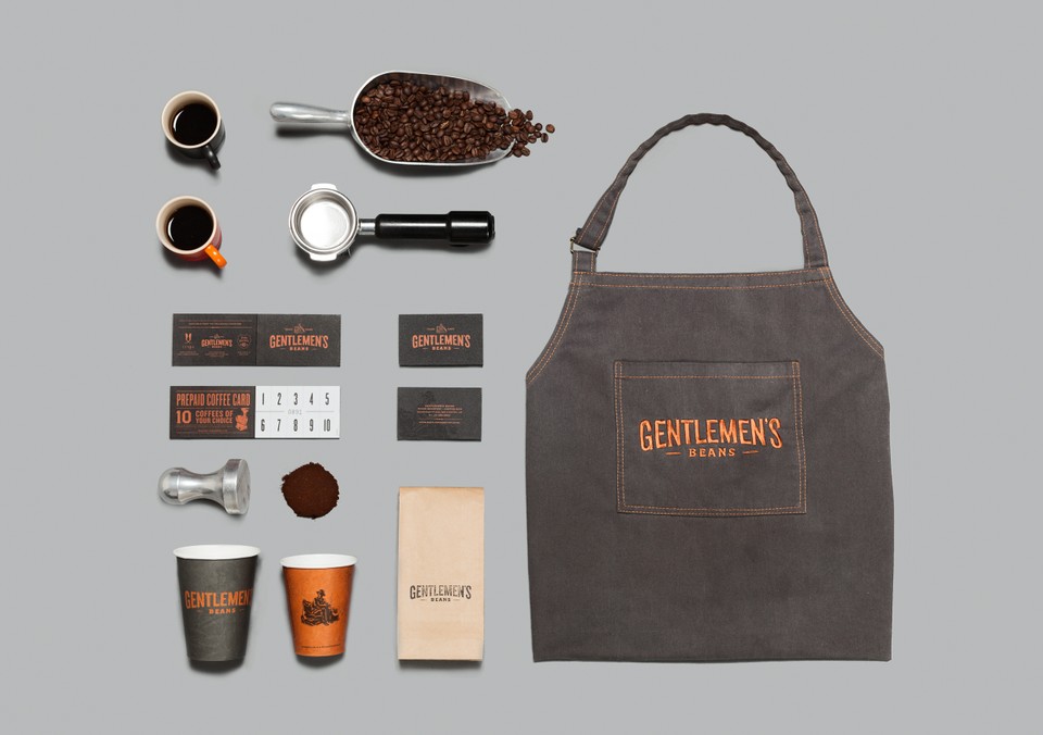
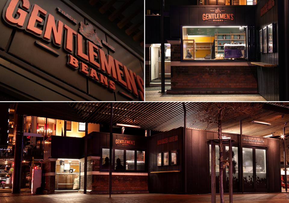
Since it’s MEN’S WEEK here on Stylejuicer I’ve chosen a powerful earthy branding that conjures up 20th Century workmen and their simple pleasure of enjoying a coffee at the end of a hard days work.
Wellington-based Inject Design are the creative heads behind the branding for coffee bar and micro roastery Gentlemen’s Beans and they are in the running for New Zealand’s Best Awards on the 11th of October.
[DESIGNERS & FONT NERDS: Check out Best Awards awesome splash intro for Call For Entries. Hilarious!]
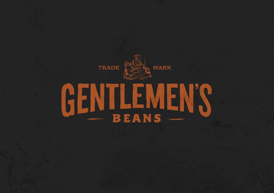
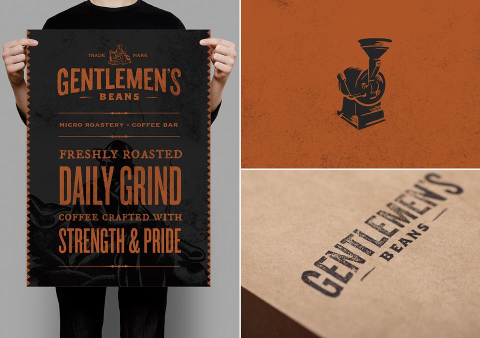
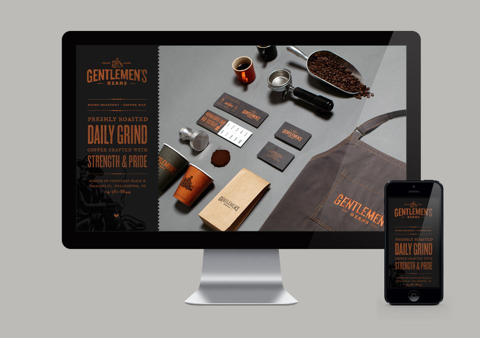
I love the treatment of the wood-cut styled logo and typefaces in combination with a dark earthy colour palette which works perfectly for the coffee bar and has an established and authentic look and feel to it. The brand oozes hard graft 1920th style and appreciation for craftsmanship which is exactly what Gentlemen’s Beans do every day: Roasting their own beans. No shortcut, just pure passion for coffee and not afraid of hard work.
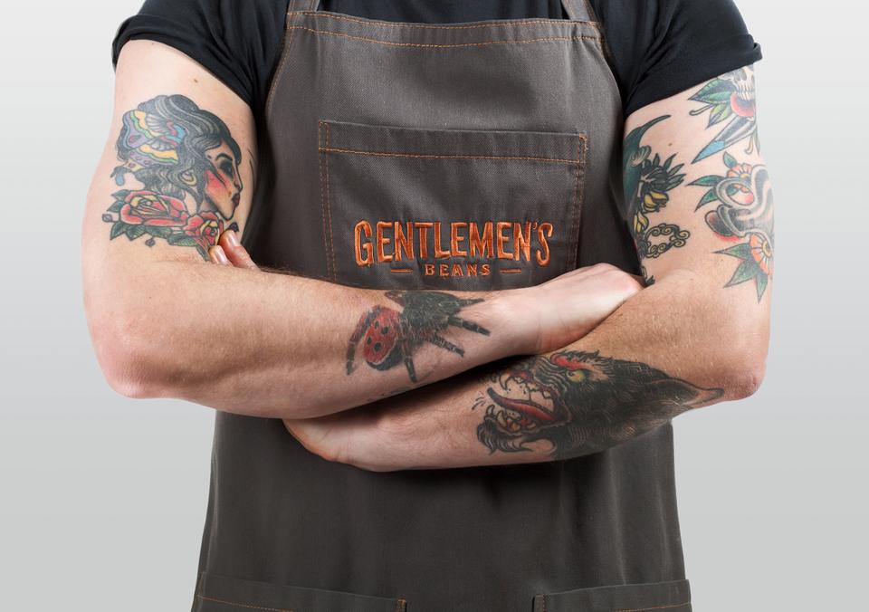
My favourite touch is the tattooed poster boy who I imagine serves as the 21st Century equivalent to the 1920th workman. I’m sure he’s got his iPhone in his back pocket.
Stylejuicer says:
Overall, a welcome change to the middle-of-the-road-lets-appeal-to-everybody branding and mass marketing of global coffee shop chains where I wonder what does a double-tailed mermaid have to do with coffee?
Inject says about Gentlemen’s Beans:
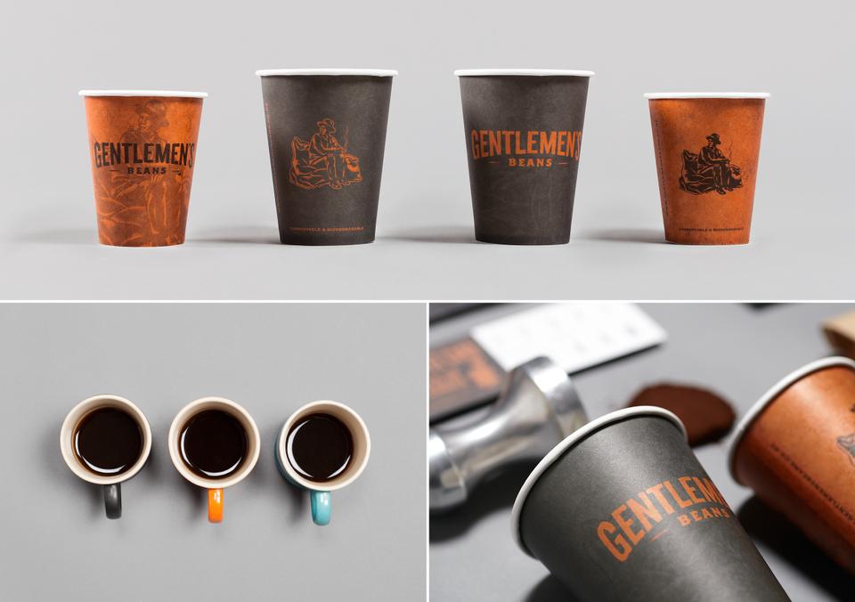
The 1920s social undertone of the ‘working man’ and the consequent appreciation for craftsmanship, the trading of goods as a luxury in the days of long sea journeys and the hard-working innocence of the times, married well with the boutique nature of the business. The story of those hard working souls is what we encapsulated into the brand.
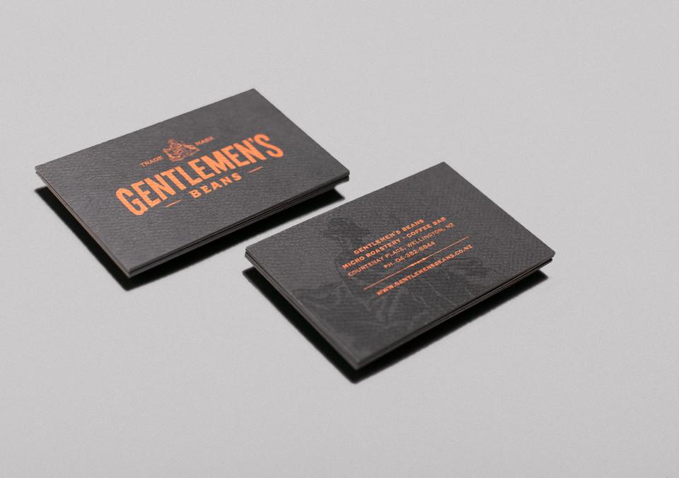
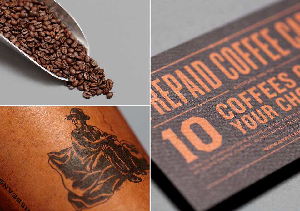
The typefaces used in the logo were re-drawn by hand to reflect a human presence and aged authenticity. The colour palette complements the brick tones of the original structure, as well as encourages desire for the taste of a delicious brew. The wood-cut styled logo mark tells a story about the ‘original gentlemen’ smoking a cigarette after a long, hard days work. The use of the contemporary materials, metallic inks and dimensional lettering, alongside the historical ambience of stamped coffee bags and the brand’s character, creates a harmonious balance of aesthetics from the old to the new, complementing the Architecture of the structure.
Enjoy and I hope you’re inspired!
More information | Inject Design Ltd
Best Awards | Nominations for Graphic, Interactive, Product and Spacial

