BRANDING | UNA RESTAURANT AND MICROBREWERY

30 May 2016

branding project, design, graphic design, una, bergen, restaurant, microbrewery, earthy tones, calligraphy, distinct, sharp angles, serif typeface, together, good food and beer, trend, style
 

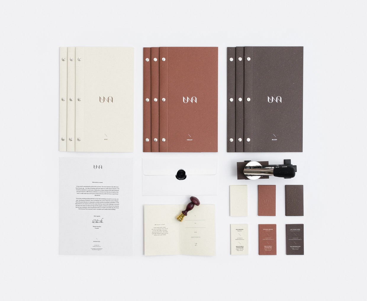
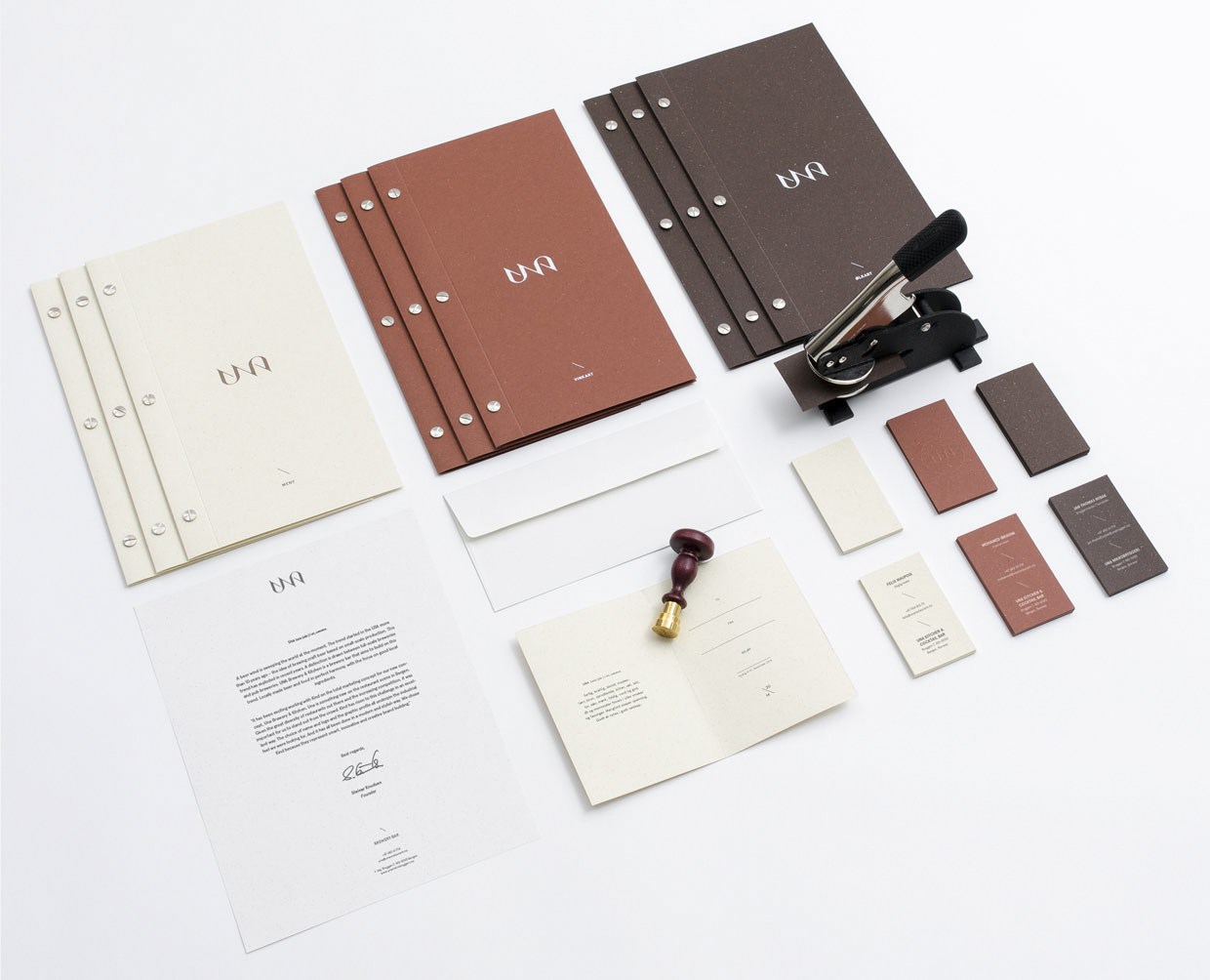
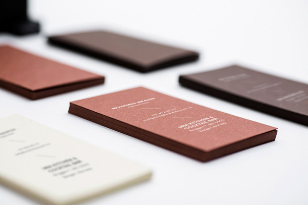
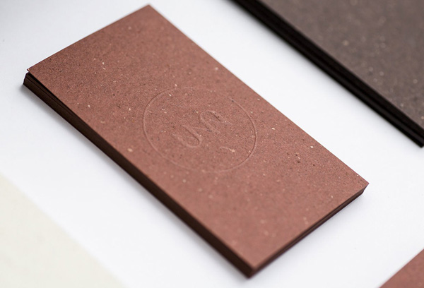
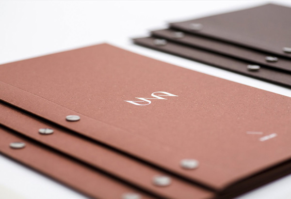
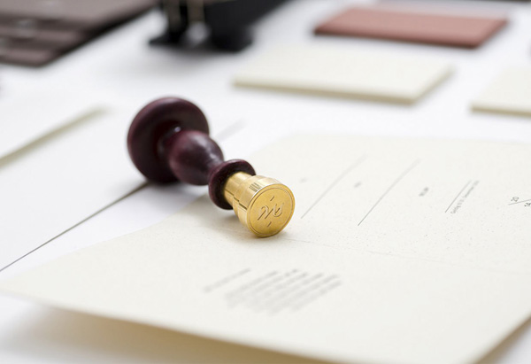
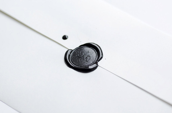
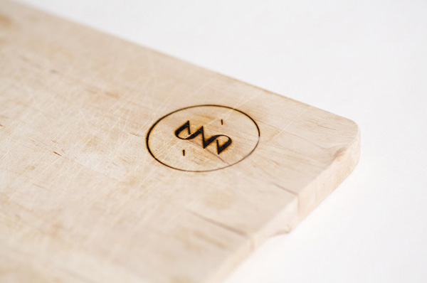
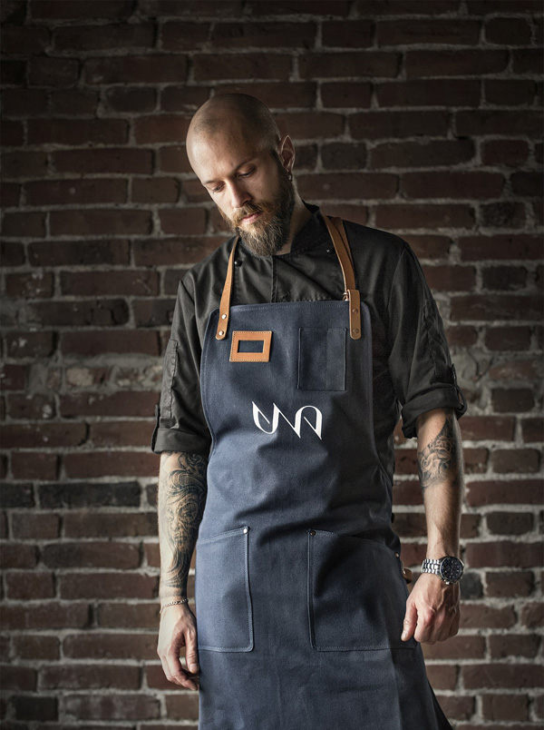
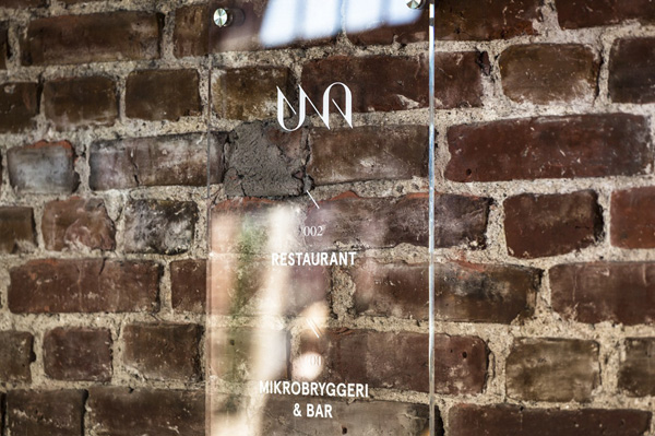
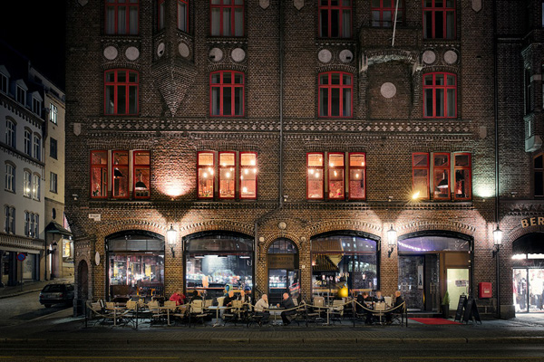
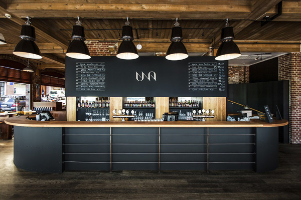
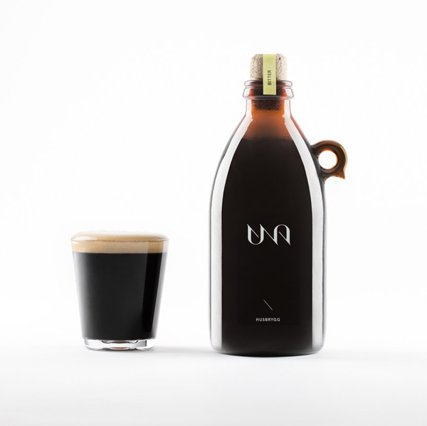
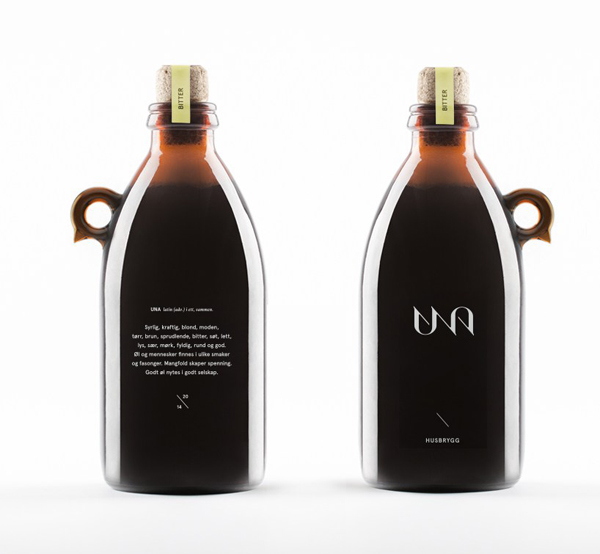
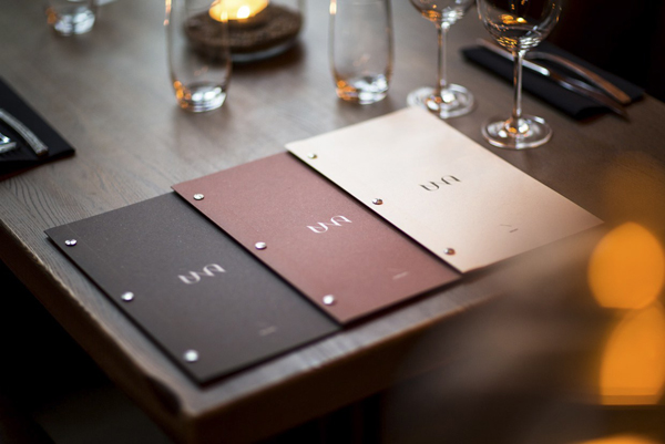
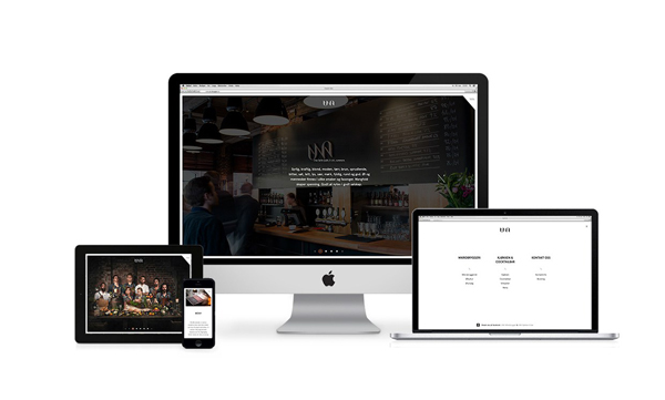
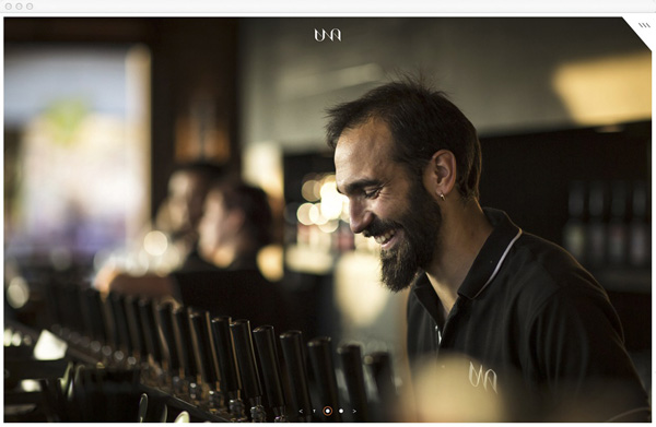
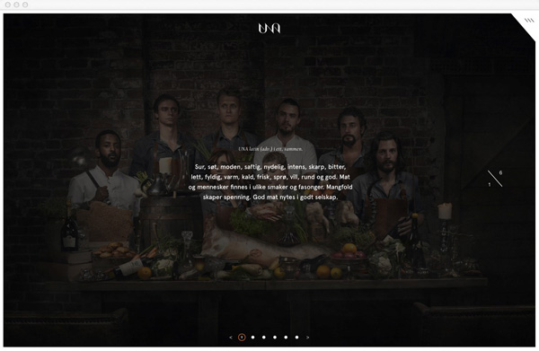
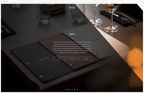
I haven’t shared any graphic design projects for a while simply because I haven’t come across anything particularly exciting. But this branding project for an Bergen restaurant and microbrewery caught my eye with it’s earthy tones, distinct logo type and use of natural materials.

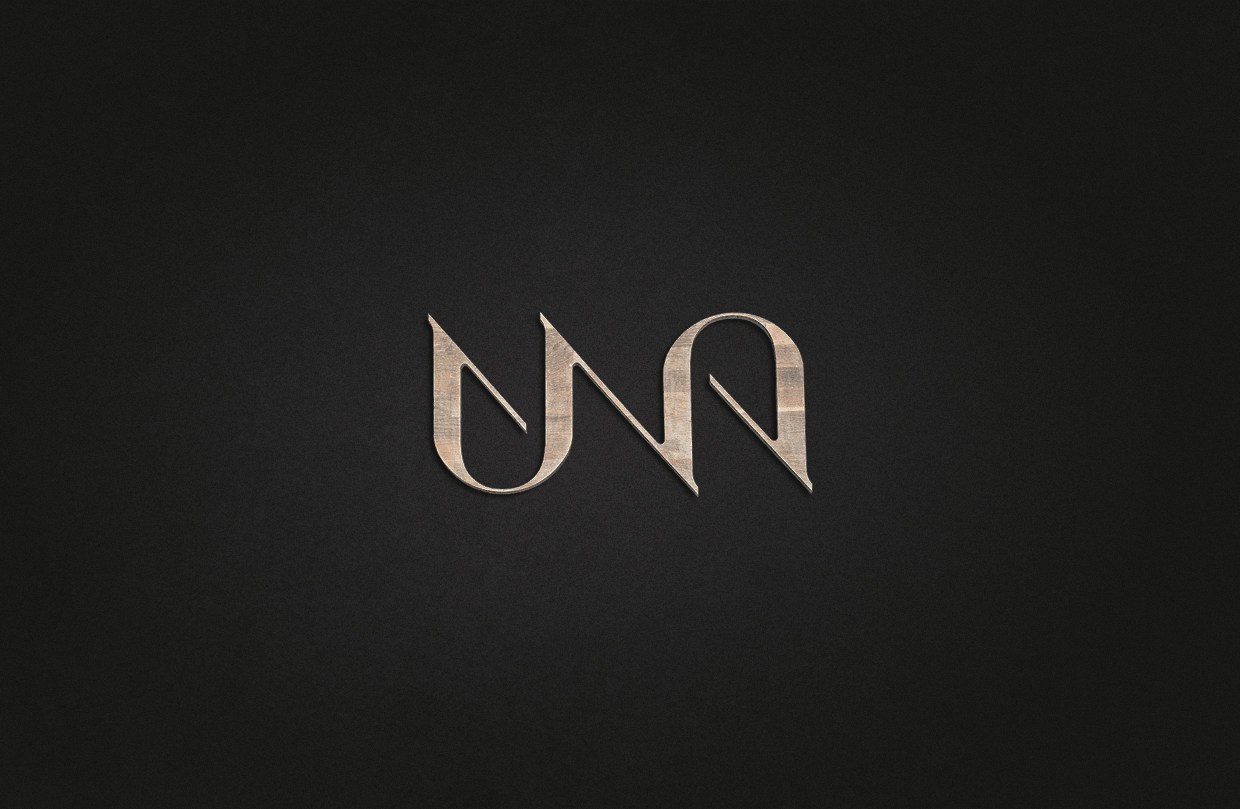
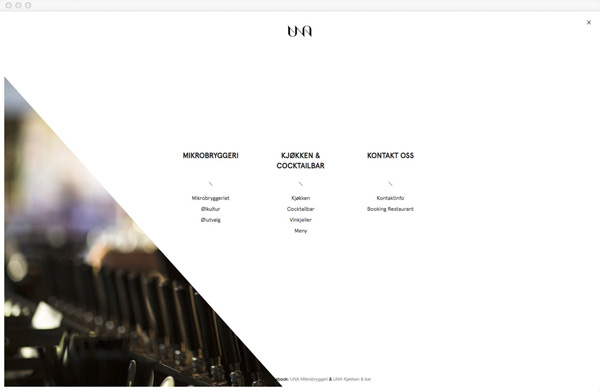
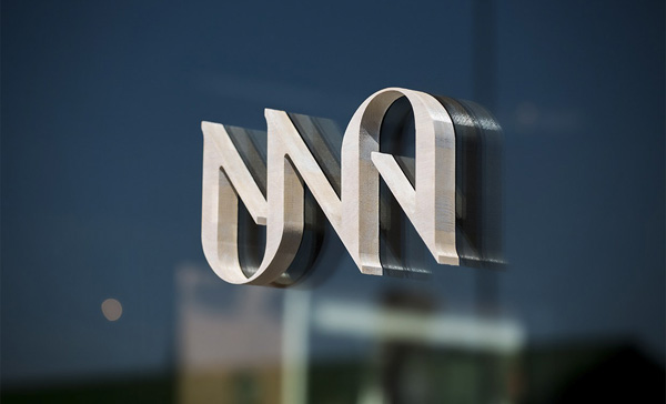
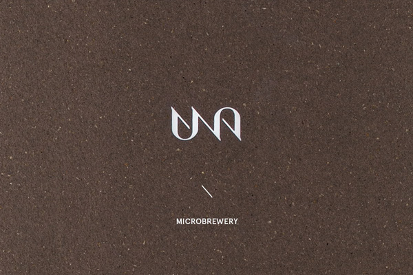
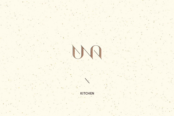
The logo has got a calligraphic feel to it as if it was written with a broad flat nib. There’s an interesting contrast between the broad and thin strokes similar to a serif typeface. The distinct sharp 45 degree angles are a design element in themselves and subtly appear throughout their branding, especially on their website and signage. Una says:

The name Una comes from Latin. It means ‘together’ or ‘in one’. Togetherness is the essence of the concept. Good beer is best enjoyed in good company and at Una you will find craft beer from all over the world under the same roof.

A beer wind is sweeping the world at the moment. The trend started in the USA more than 10 years ago – the idea of brewing craft beer based on small-scale production. This trend has exploded in recent years. A distinction is drawn between full-scale breweries and pub breweries. UNA Brewery & Kitchen is a brewery bar that aims to build on this trend. Locally made beer and food in perfect harmony, with the focus on good local ingredients.

If you like the concept of UNA restaurant and happen to be in Bergen, go and check it out.

 
branding project, design, graphic design, una, bergen, restaurant, microbrewery, earthy tones, calligraphy, distinct, sharp angles, serif typeface, together, good food and beer, trend, style

branding project, design, graphic design, una, bergen, restaurant, microbrewery, earthy tones, calligraphy, distinct, sharp angles, serif typeface, together, good food and beer, trend, style

branding project, design, graphic design, una, bergen, restaurant, microbrewery, earthy tones, calligraphy, distinct, sharp angles, serif typeface, together, good food and beer, trend, style

branding project, design, graphic design, una, bergen, restaurant, microbrewery, earthy tones, calligraphy, distinct, sharp angles, serif typeface, together, good food and beer, trend, style

branding project, design, graphic design, una, bergen, restaurant, microbrewery, earthy tones, calligraphy, distinct, sharp angles, serif typeface, together, good food and beer, trend, style

branding project, design, graphic design, una, bergen, restaurant, microbrewery, earthy tones, calligraphy, distinct, sharp angles, serif typeface, together, good food and beer, trend, style

branding project, design, graphic design, una, bergen, restaurant, microbrewery, earthy tones, calligraphy, distinct, sharp angles, serif typeface, together, good food and beer, trend, style

branding project, design, graphic design, una, bergen, restaurant, microbrewery, earthy tones, calligraphy, distinct, sharp angles, serif typeface, together, good food and beer, trend, style

branding project, design, graphic design, una, bergen, restaurant, microbrewery, earthy tones, calligraphy, distinct, sharp angles, serif typeface, together, good food and beer, trend, style

branding project, design, graphic design, una, bergen, restaurant, microbrewery, earthy tones, calligraphy, distinct, sharp angles, serif typeface, together, good food and beer, trend, style

branding project, design, graphic design, una, bergen, restaurant, microbrewery, earthy tones, calligraphy, distinct, sharp angles, serif typeface, together, good food and beer, trend, style

branding project, design, graphic design, una, bergen, restaurant, microbrewery, earthy tones, calligraphy, distinct, sharp angles, serif typeface, together, good food and beer, trend, style

branding project, design, graphic design, una, bergen, restaurant, microbrewery, earthy tones, calligraphy, distinct, sharp angles, serif typeface, together, good food and beer, trend, style

branding project, design, graphic design, una, bergen, restaurant, microbrewery, earthy tones, calligraphy, distinct, sharp angles, serif typeface, together, good food and beer, trend, style

branding project, design, graphic design, una, bergen, restaurant, microbrewery, earthy tones, calligraphy, distinct, sharp angles, serif typeface, together, good food and beer, trend, style

branding project, design, graphic design, una, bergen, restaurant, microbrewery, earthy tones, calligraphy, distinct, sharp angles, serif typeface, together, good food and beer, trend, style

branding project, design, graphic design, una, bergen, restaurant, microbrewery, earthy tones, calligraphy, distinct, sharp angles, serif typeface, together, good food and beer, trend, style

branding project, design, graphic design, una, bergen, restaurant, microbrewery, earthy tones, calligraphy, distinct, sharp angles, serif typeface, together, good food and beer, trend, style

branding project, design, graphic design, una, bergen, restaurant, microbrewery, earthy tones, calligraphy, distinct, sharp angles, serif typeface, together, good food and beer, trend, style

branding project, design, graphic design, una, bergen, restaurant, microbrewery, earthy tones, calligraphy, distinct, sharp angles, serif typeface, together, good food and beer, trend, style

branding project, design, graphic design, una, bergen, restaurant, microbrewery, earthy tones, calligraphy, distinct, sharp angles, serif typeface, together, good food and beer, trend, style

branding project, design, graphic design, una, bergen, restaurant, microbrewery, earthy tones, calligraphy, distinct, sharp angles, serif typeface, together, good food and beer, trend, style

branding project, design, graphic design, una, bergen, restaurant, microbrewery, earthy tones, calligraphy, distinct, sharp angles, serif typeface, together, good food and beer, trend, style

branding project, design, graphic design, una, bergen, restaurant, microbrewery, earthy tones, calligraphy, distinct, sharp angles, serif typeface, together, good food and beer, trend, style


CONCEPT & BRANDING | Kind
MORE INFORMATION | Una
 
Follow Stylejuicer with Bloglovin

1 thought on “BRANDING | UNA RESTAURANT AND MICROBREWERY

Leave a Reply

Your email address will not be published. Required fields are marked *