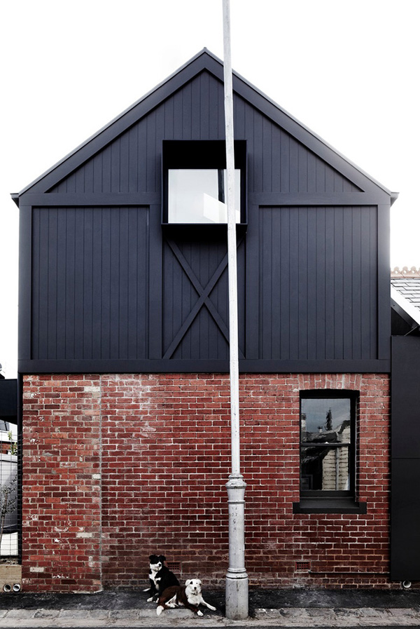
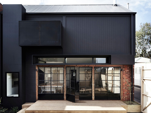
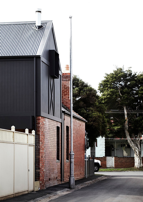
I’m a huge fan of converted industrial and utilitarian spaces and love the design of this two-storey gabled addition reminiscent of a converted warehouse. The Melbourne suburb where the site is located is an infill building and Whiting Architects call it ‘the missing tooth’ in a lane with pitch roofs and attic garage extensions.
It was a deliberate choice to create a utilitarian extension like a workshop or a barn which inevitably drives the aesthetic of this new self-contained home for parents, keeping children and guests housed in the existing Edwardian Redbrick with their own large bathroom.
Founders Steve and Carole Whiting already had (or sourced) industrial and vintage elements and materials before they started designing the extension. It was important for them to capture the informality of a holiday place where everything is kept simple and practical, remaining contemporary and robust.
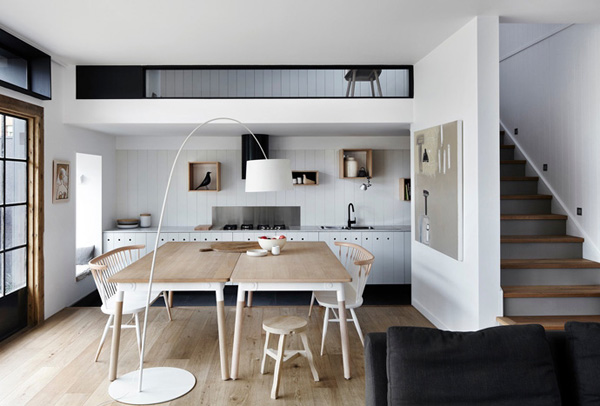
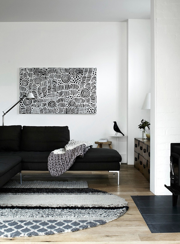
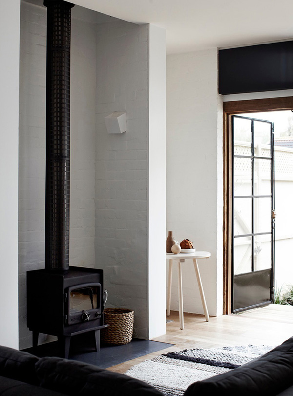
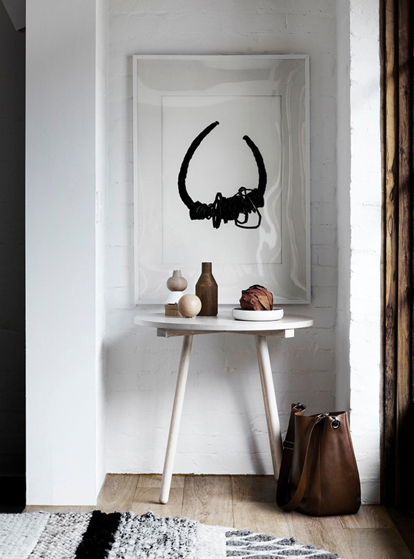
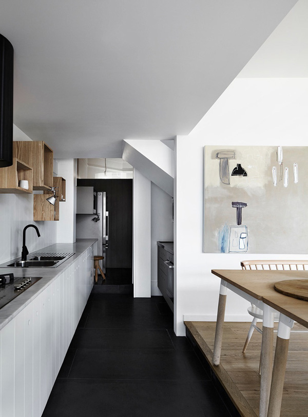
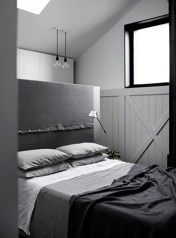
I love the material mix of rough red bricks and dark cladding on the outside and clean white finishes on the inside accompanied by oak floors and a wood-burning stove. The custom built kitchen cabinets and bedroom robe are simple and contemporary with discreet holes cut into the wood rather than handles and I adore the mix of different wall textures with wooden panelling, subway tiles and plywood, all united by keeping it white.
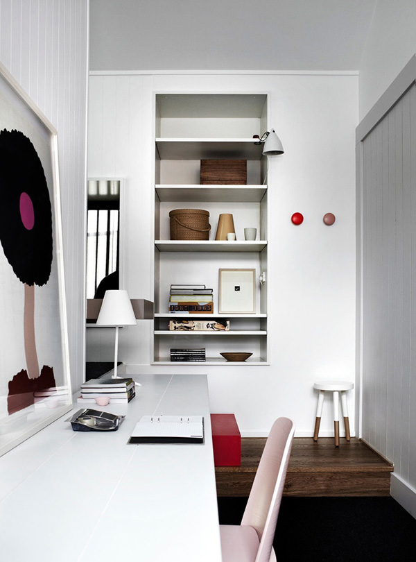
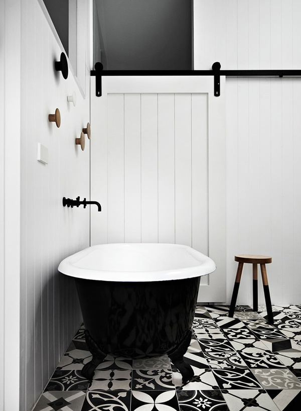
A utilitarian building like this was never intended to have any corridors or stairs so part of the interior design brief was to keep this ‘dead space’ to a minimum. Therefore Whiting incorporated a desk along a corridor converting it effectively into a home office and linking it to the living area below with an internal window. Another clever solution is the window box daybed seating area adjacent to the master bedroom where you can find the only internal door – appropriately an old-style barn door leading to the en-suite bathroom.
To me this place is a wonderful example of how classic dimensions and designs can be combined with contemporary clean interiors and transcendent fashion. A fabulous choice and one I’d make for my own future home.
I hope you enjoy the ‘eye-candy’ and I’d love to know what you think of the project? Let me know in the comments below.
MORE INFORMATION | Whiting Architects
PHOTOGRAPHY | Sharyn Cairns with kind permission by Whiting Architects





That’s my kind of space, beautifully and perfectly clean and simple!
Beautiful space!!
Gorgeous home. Beautiful how the architecture is united with the interior. Neutral colors, natural materials and lovely furniture. Definitely a dream house!