Tag Archives: Graphic Design

DESIGN INSPIRATION | WHITNEY LINDSEY

24 September 2014

whitney lindsey, graphic design, design, inspiration, embossing, typography, production, texas, photography, materials, production, dallas, Ussery Printing, interior design, letterpress, tactile,

I’m always excited to come across like-minded people especially if they’re fellow graphic designers and share my passion for typography and production.

Whitney Lindsey might live around 5,000 miles south west of me but we sure speak the same graphic language. Not surprisingly we also share a similar background. The 28-year old grew up on a farm (like me) and spent a lot of time outside using her imagination to keep her occupied. Being so closely connected to nature she says that she always had a natural inclination to appreciate beauty and great design she just didn’t know it was called design – as silly as that sounds I can totally relate to that.

Despite her lack of exposure to any urban art or culture when growing up she has succeeded in her field and credits exactly that lack to making her very introspective which defines her as a person and designer.

I’ve always believed that true creativity is challenged and stimulated when we’re left to our own devices and that boredom is actually healthy for children – a point I try to make with my own kids. Whitney is a great example of that theory and I was entranced when she told me about her work, her inspiration and how she discovered graphic design almost by accident. Dive into the interview below and admire her beautiful work along the way.

whitney lindsey, graphic design, design, inspiration, embossing, typography, production, texas, photography, materials, production, dallas, Ussery Printing, interior design, letterpress, tactile,

Let me start by asking how you got into graphic design?

When I started college I had no idea what I wanted to do (and really no idea what graphic design was) so I just started taking my core classes without picking a major. After about a year and a half I was starting to run out of core classes to take so my advisor suggested that I look through the course catalogue and pick out a couple of classes that looked interesting to me. The things that looked most interesting to me were all of the art classes, but being the procrastinator I can sometimes be, all of the art classes were already full except for Photography and Graphic Design. I was really excited about photography, but not that thrilled about graphic design. For some reason I thought graphic design was going to be a bunch of web banners and not much else. On my first day of class I was proven very wrong. The professor gave a lecture on “What Is Graphic Design” and I absolutely fell in love. I saw how alive type could come—how it had the ability to visually speak louder than the words themselves. I saw how visual design could create very powerful experiences and I was hooked. I remember leaving class that night knowing that was what I would do for the rest of my life. I’ve never had an experience like that before. It was pretty magical.
 

How would you describe your style and aesthetic?

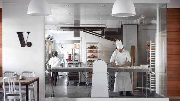
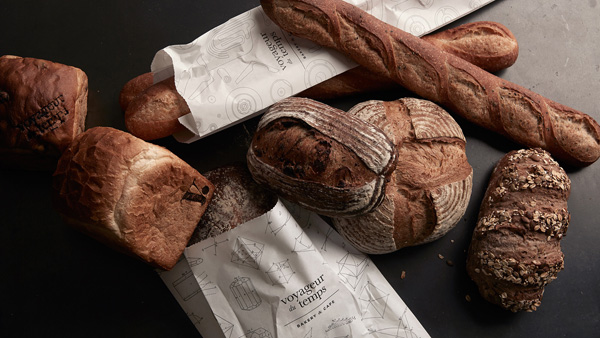
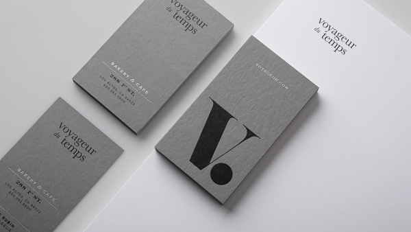
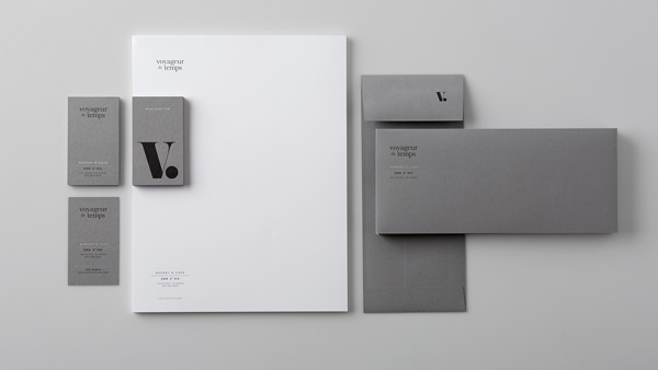
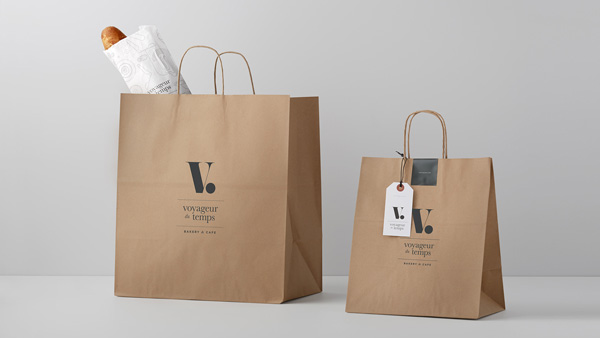
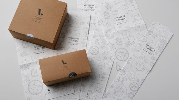
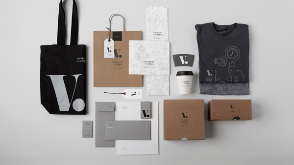
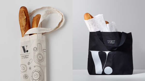
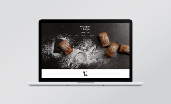
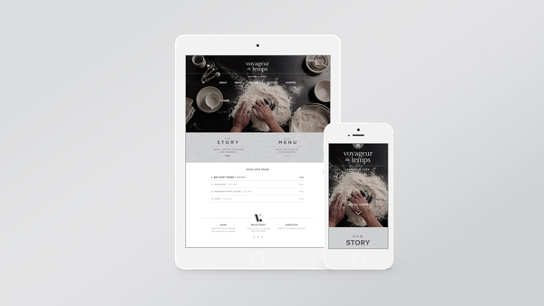
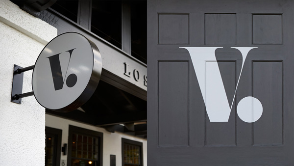
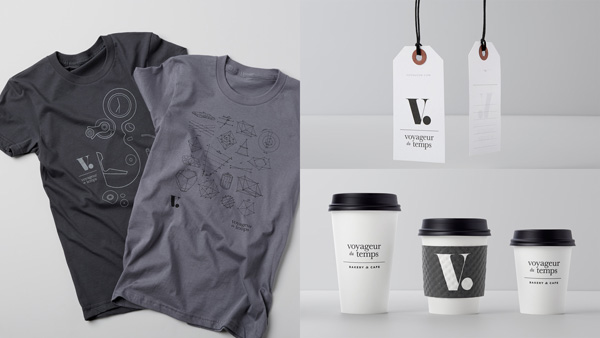
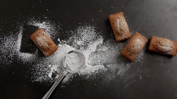
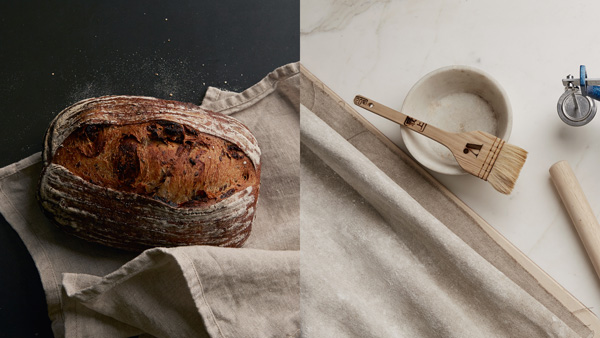
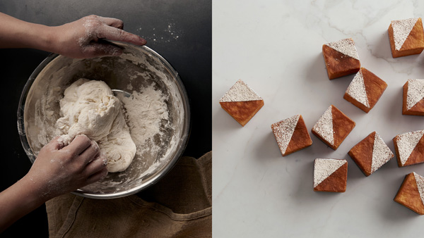
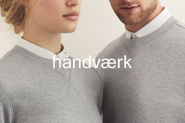
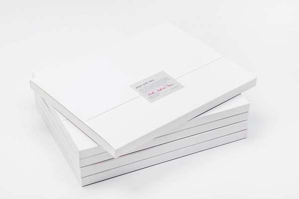
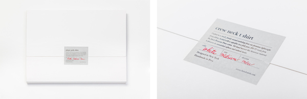
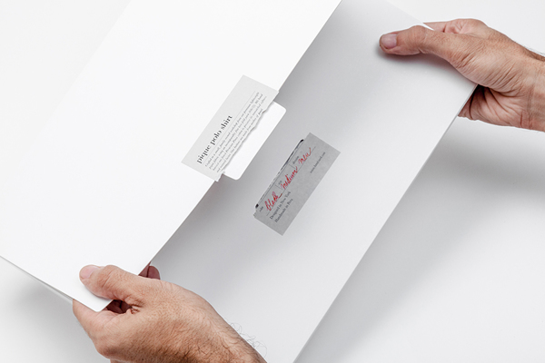
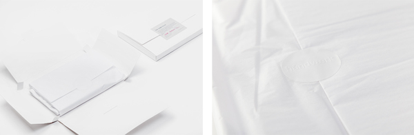
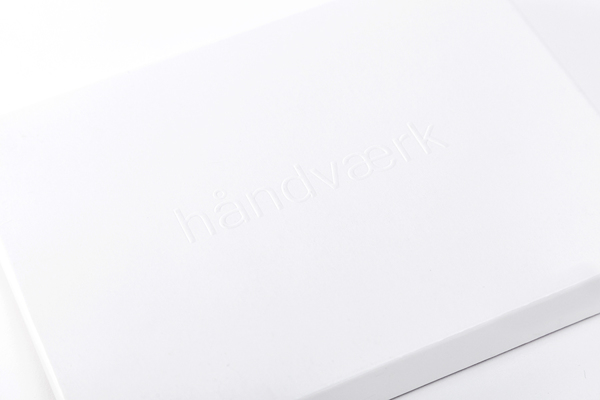
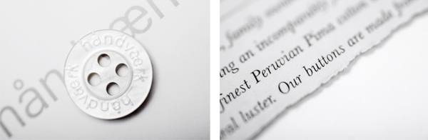
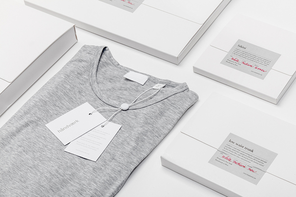
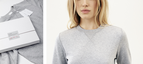
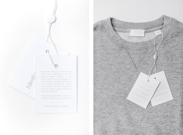
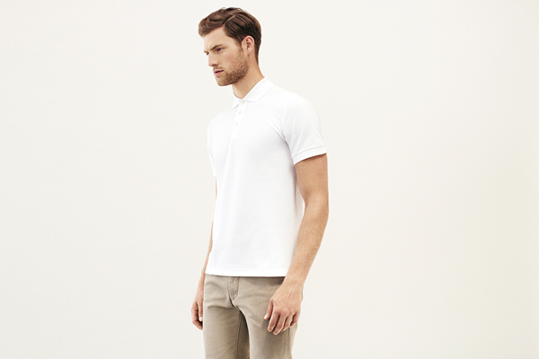
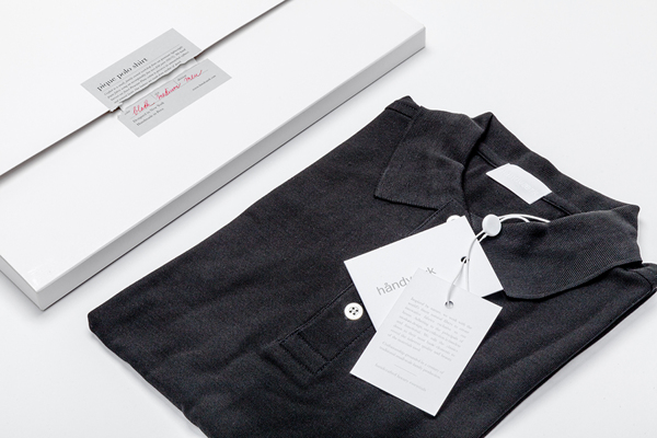
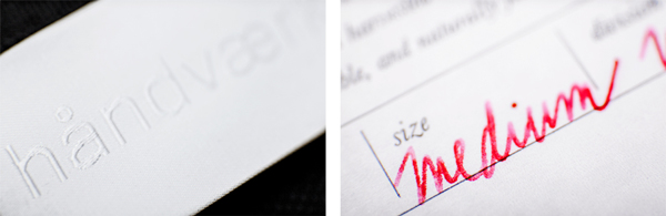
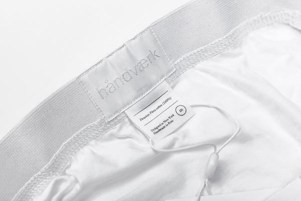
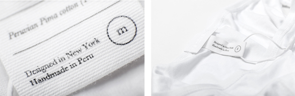
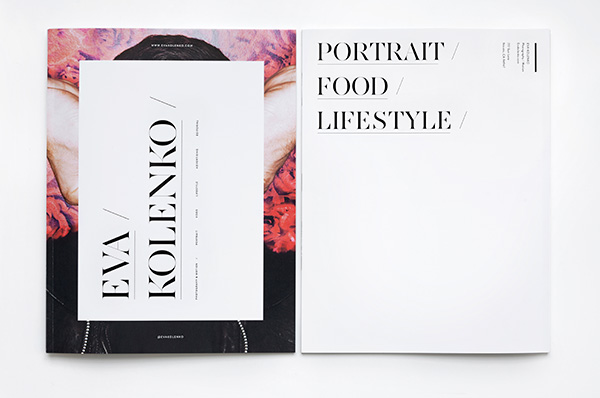
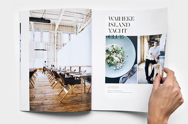
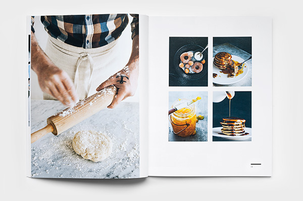
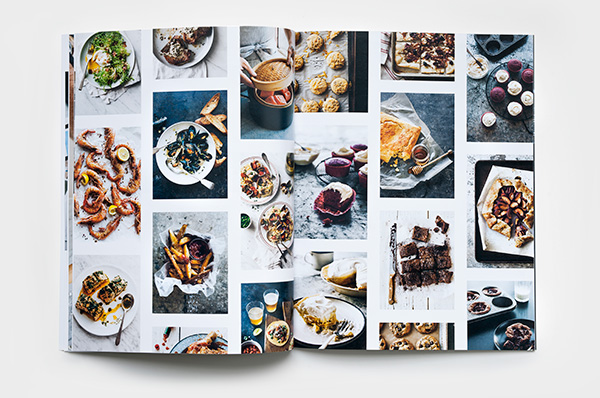
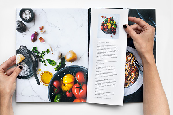
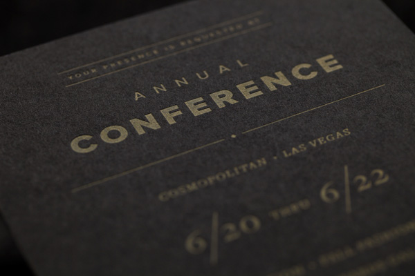
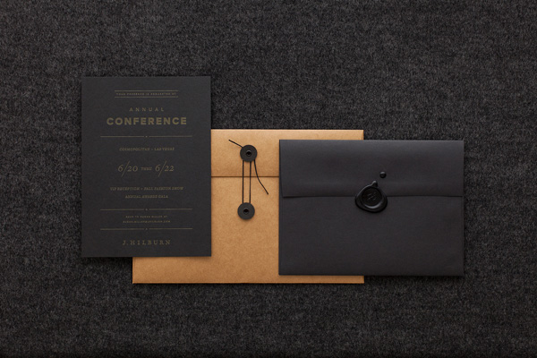
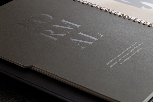
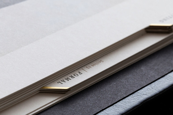
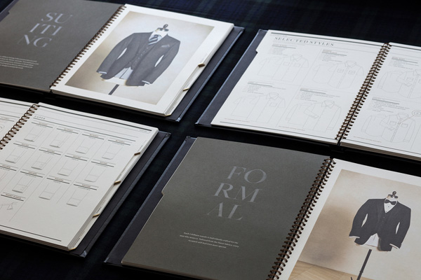
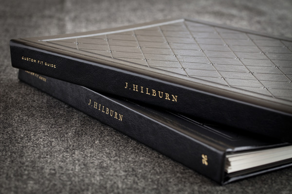
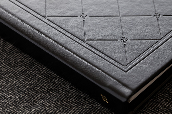
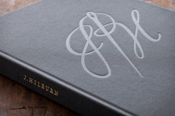
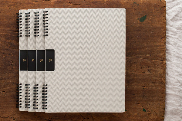
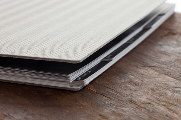
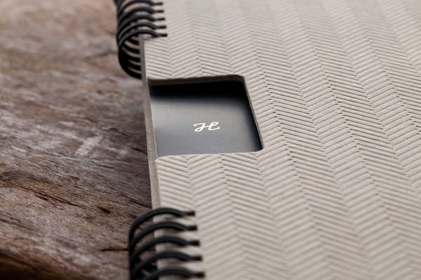
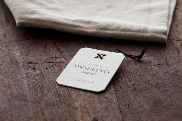
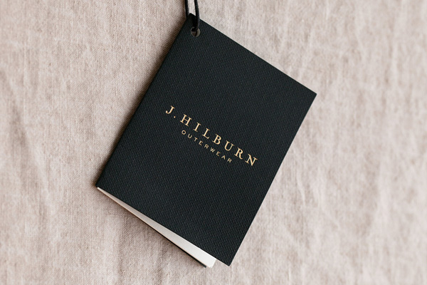
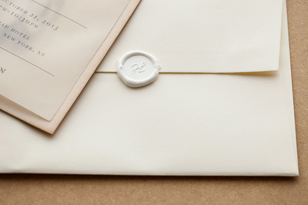
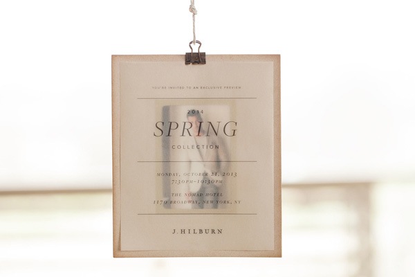
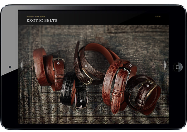
My style is generally pretty clean and airy. I tend to focus on the production of a piece just as much as the design. The physical feel of a piece—the texture and weight of the paper, the quality of the materials, the contrasts in textures throughout the piece—plays such a big part in the overall experience of it and I always try to keep that in mind. Design is never just visual to me and I think that mentality really influences my work.
 

Which part do you enjoy most?

I enjoy the entire process! I love the actual design phase—I can spend hours in front of my computer completely enthralled in a design and it will feel as if only an hour has passed. I also love the energy and collaborative nature of a photo shoot. I enjoy the production phase of a project as well and getting to see all of the hard work put into a project come to fruition. Of course, there are bumps along the road of every project, but overall I thoroughly enjoy the whole process.
 

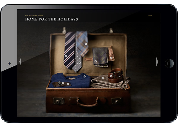
What gets you excited and how much do you get involved in the art direction and styling of the shots.

I do get involved in art direction and I’m continuously art directing more and more. Lately I’ve been working on projects where my only role is art directing a photo shoot.

 
design-inspiration-whitney-lindsey-via-stylejuicer-04

design-inspiration-whitney-lindsey-via-stylejuicer-05

design-inspiration-whitney-lindsey-via-stylejuicer-03

design-inspiration-whitney-lindsey-via-stylejuicer-07

design-inspiration-whitney-lindsey-via-stylejuicer-08

whitney lindsey, graphic design, design, inspiration, embossing, typography, production, texas, photography, materials, production, dallas, Ussery Printing, interior design, letterpress, tactile,
 

What about the production values… do you get to chose the materials?

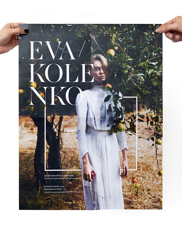
I usually choose the materials for the projects I work on. I really believe that the materials can make or break a design. On most of the projects I’ve worked on, I work with Ussery Printing in Dallas. They are the best. I do a lot of production-heavy things in my work and the representative from Ussery that I work with, John Lawrimore, goes above and beyond to make my vision a reality. I really could not do the things I’ve been able to without the hard work of the pressmen, the diemakers, the foil stampers, and anyone else who has a hand in the production and the dedication they have to their craft. I have so much respect for these individuals and could not create successful work without them.
 

Where do you get your inspiration from?

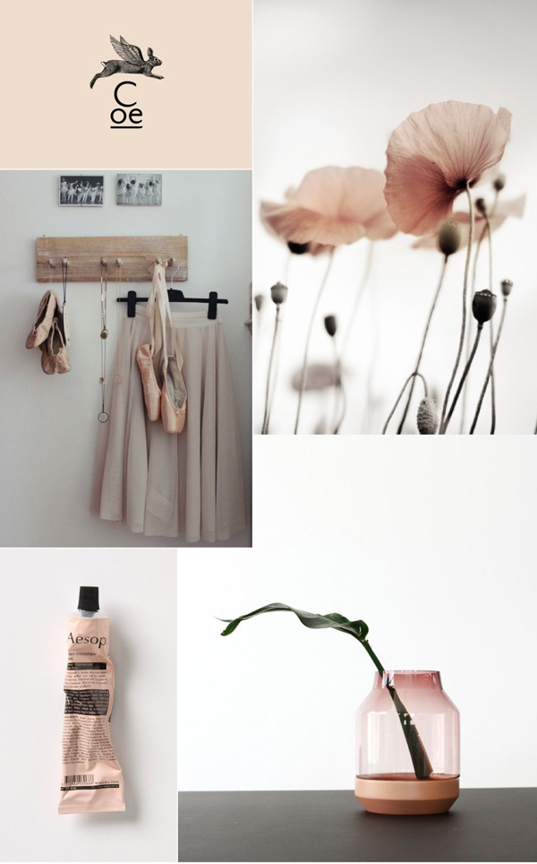
Everywhere! I feel very inspired by seeing other people who have so much passion for what they do—whatever it is. I’m very inspired by great music. I’m inspired by beautiful interiors, nature, and fashion. Honestly, I’m just inspired by anything I find beautiful. Having such a great appreciation for the beauty in our world lights some sort of fire in me to add to it by creating beautiful things.
 

design-inspiration-whitney-lindsey-via-stylejuicer-10

design-inspiration-whitney-lindsey-via-stylejuicer-11

design-inspiration-whitney-lindsey-via-stylejuicer-12

design-inspiration-whitney-lindsey-via-stylejuicer-13

design-inspiration-whitney-lindsey-via-stylejuicer-14

design-inspiration-whitney-lindsey-via-stylejuicer-15

whitney lindsey, graphic design, design, inspiration, embossing, typography, production, texas, photography, materials, production, dallas, Ussery Printing, interior design, letterpress, tactile,
 

My surroundings are very important to me… Do you have a penchant for interior design too? If so how would you describe your style at home

Oh, I love interior design. Sometimes I wish I had studied interior design as well as graphic design. I am such a homebody—my home is my sanctuary. When the world feels crazy and overwhelming my home is my retreat and I try to make it as beautiful and calming as I can. Honestly, I don’t know how to describe my style at home. I love having rustic, historic pieces and mixing them with refined pieces. It’s very much a balance between rustic and refinement. I’m very particular about the details of my home—lighting is very important to me and I don’t like having clutter. I try to have a reason and purpose for everything I have out in my home—even down to the kitchen countertops. If a bag of chips sitting on the counter isn’t adding to the look and feel of the kitchen, it gets put away very quickly.
 

design-inspiration-whitney-lindsey-via-stylejuicer-17

design-inspiration-whitney-lindsey-via-stylejuicer-18

design-inspiration-whitney-lindsey-via-stylejuicer-19

whitney lindsey, graphic design, design, inspiration, embossing, typography, production, texas, photography, materials, production, dallas, Ussery Printing, interior design, letterpress, tactile,
 

And finally, where’s your happy place? Where do you feel most comfortable? Can you describe a perfect day scenario for us?

Home. My happy place is definitely my home. A perfect day would be spent at home with beautiful music quietly playing, my fiancée in the kitchen cooking something amazing (he’s a wonderful cook), the weather’s perfect outside (which is a rarity living in Texas) and the windows are open.
 

Aw, that sounds wonderful! Thank you so much for your time Whitney – you’re a true design inspiration.

NOTE: Whitney is a tad social media shy but loves hearing from other designers and artists so feel free to drop her an email whitney [at] brickandmortarco.com


PORTFOLIO | Whitney Lindsey
 
Follow Stylejuicer with Bloglovin

DESIGN INSPIRATION | VOYAGEUR DU TEMPS BRANDING

11 September 2014

design, inspiration, branding, voyageur du temps, san francisco, studio character, artisan bakery, cafe, time traveler, contemporary, classic, identity, rustic, refined, graphic design, packaging

I’ve been on the look out for some Design Inspiration to share with you for a while and was thrilled when I came across the branding for Voyageur Du Temps. I think if I owned a café the branding would probably look something like VDT, an artisan bakery and café serving world-class bread, pastries and coffee that opened in March this year.

Voyageur Du Temps is located in Los Altos San Francisco and is the vision of owner and local resident, Rie Rubin who tasked design and branding studio Character to bring his vision to life. As the name means time traveller in French the brief was to transport people back in time, a place that moved between tradition and modernity drawing on the classic values of cooking and baking, but with a contemporary twist.

This tension between the classic and the contemporary, the rustic and the refined led Character to the selected ‘V’ logo which was inspired by a Roman numeral five, found on an old clock in a French train station. A perfect symbol for the café’s theme of time travel and also its location – an old Los Altos train station.

I love the clean typography with the sumptuous ‘V’ and the beautiful production values of the stationery range with thick colorplan grey card and silver and black lettering for the business cards. The black fabric carrier bags with the large white V are super stylish and something I’d love to get my hands on! What a great idea to spread the word about this refined local haunt.

The photography by Todd Tankersley is natural and real referring to the care and craftsmanship that goes into the baking process and I adore the art direction which is simple and contemporary with lots of overhead shots featuring top-notch ingredients and essential baking utensils.

A wonderful cohesive branding project by Character from brand identity to stationery, packaging, signage, livery and website. Make sure you pop in for a coffee and a delicious pastry and make sure to get one of those gorgeous black bags. *swoon*

 
voyageur-du-temps-branding-by-character-via-stylejuicer-02

voyageur-du-temps-branding-by-character-via-stylejuicer-04

voyageur-du-temps-branding-by-character-via-stylejuicer-05

voyageur-du-temps-branding-by-character-via-stylejuicer-06

voyageur-du-temps-branding-by-character-via-stylejuicer-07

voyageur-du-temps-branding-by-character-via-stylejuicer-08

voyageur-du-temps-branding-by-character-via-stylejuicer-09

voyageur-du-temps-branding-by-character-via-stylejuicer-10

voyageur-du-temps-branding-by-character-via-stylejuicer-11

voyageur-du-temps-branding-by-character-via-stylejuicer-12

voyageur-du-temps-branding-by-character-via-stylejuicer-13

voyageur-du-temps-branding-by-character-via-stylejuicer-14

voyageur-du-temps-branding-by-character-via-stylejuicer-15

design, inspiration, branding, voyageur du temps, san francisco, studio character, artisan bakery, cafe, time traveler, contemporary, classic, identity, rustic, refined, graphic design, packaging


DESIGN STUDIO | Character
MORE INFORMATION | Voyageur Du Temps
PHOTOGRAPHY | Todd Tankersley
 
Follow Stylejuicer with Bloglovin

DESIGN INSPIRATION | BRANDING BY SAVVY STUDIO

15 July 2014

Håndværk, handvaerk, branding, design, graphic design, savvy studio, mexico, monterray, quality, luxury, craftsmanship, hand-make, hand-finish, finest raw materials, family owned workshops, clean aesthetics, understated, NYC, esteban saba, petra brichnacova

Today’s branding project was a complete surprise to me on two levels. Firstly it’s not – as first thought – a Scandinavian brand but was actually established in New York only last year by husband and wife team Esteban Saba and Petra Brichnacova. They say:

Håndværk is a small, artisan label specialising in supremely luxurious pieces with a thoughtfully curated collection of high quality everyday essentials made from the finest natural raw materials and innovative fabrics.

Our heritage is grounded in three generations of small-scale family production; a storied legacy of manufacturing textiles, garments, and luxury products. We hand-make or hand-finish each individual piece in collaboration with other family owned workshops specialized in their craft, who share our unwavering commitment for exceptional quality.

Wow, they had me at artisan but that’s not all. I was probably even more surprised to find out that the branding was done by Savvy, a design studio in Monterray Mexico, of all places. Wow, again as I think their translation of the brand values is perfectly reflected in the logo and understated packaging. The predominantly white aesthetics, clean lines and minimalist typography oozes luxury and quality. I should also mention that the word håndværk means craft in Danish and the special lower case a and ae characters add interest and subtle recognition to the logo type.

A beautiful branding job that got me thinking about the Mexican design studio that managed to create such a cool luxury brand. On further snooping around Savvy’s instagram account it seems that they’re a fan of Scandinavian aesthetics as shots of their office could easily be in Copenhagen, Stockholm or Berlin. I guess the beauty of the world wide web brings us ever closer together and how wonderful to think that a NYC luxury brand with Scandinavian and Japanese aesthetics was conjured up by a Mexican design studio. Truly inspirational!

NOTE: Check out the branding for Nordic House by another superb Mexcian studio.

 
Handvaerk-Branding-By-Savvy-Studio-02

Handvaerk-Branding-By-Savvy-Studio-03

Handvaerk-Branding-By-Savvy-Studio-04

Handvaerk-Branding-By-Savvy-Studio-05

Handvaerk-Branding-By-Savvy-Studio-06

Handvaerk-Branding-By-Savvy-Studio-07

Handvaerk-Branding-By-Savvy-Studio-08

Handvaerk-Branding-By-Savvy-Studio-09

Handvaerk-Branding-By-Savvy-Studio-10

Handvaerk-Branding-By-Savvy-Studio-11

Handvaerk-Branding-By-Savvy-Studio-12

Handvaerk-Branding-By-Savvy-Studio-13

Handvaerk-Branding-By-Savvy-Studio-14

Handvaerk-Branding-By-Savvy-Studio-15

Handvaerk-Branding-By-Savvy-Studio-16

Handvaerk-Branding-By-Savvy-Studio-17

Håndværk, handvaerk, branding, design, graphic design, savvy studio, mexico, monterray, quality, luxury, craftsmanship, hand-make, hand-finish, finest raw materials, family owned workshops, clean aesthetics, understated, NYC, esteban saba, petra brichnacova


MORE INFORMATION & PHOTOGRAPHY | Håndværk
DESIGN | Savvy Studio
 
Follow Stylejuicer with Bloglovin

DESIGN INSPIRATION | EMMADIME

3 June 2014

Emmadime, Emma Robertson, knitting by design, book, design, inspiration, graphic design, blog, Oakland, studio

I’ve been a fan of Emma Robertson’s blog Emmadime for a while now and love how she puts her heart and soul into just everything she does.

Writing a book about knitting as well as making a short promo video – just awesome! Shooting ‘A Day in The Life’ and showing off her beautiful studio space – super cute and great soundtrack (making the rest of the world’s freelance designers drool with envy and bop along). Arranging a monthly movie night for creative ladies in the bay area – oh, how I wish I’d live round the corner. Giving non other than Erin Hiemstra and the team from Apartment 34 a little design lecture and workshop – genius idea. Oh, and of course today’s highlight, a printed promo brochure for photographer Eva Kolenko.

I absolutely adore how Emma treated the photography and overlaid the images subtly with text and minimal graphics. It feels very modern and approachable but very classy at the same time. I love that Emma hasn’t added too many design elements so the client, ie Eva’s photography is still the hero.

The brochure is 38 pages and has a poster as well as a perforated recipe card to take out. A neat idea and a subtle call to action as it will presumably encourage people to stick it to their wall or good ol’ fashioned pinboard reminding them to give Eva a shout when it comes to commissioning the next shoot. I like it!

Pop over to Emma’s blog for some more photos of this beautiful piece of print promotion and say hi from me. Love your work Emma!
 

Eva-Kolenko-Promo2014-by-Emmadime-03

Eva-Kolenko-Promo2014-by-Emmadime-04

Eva-Kolenko-Promo2014-by-Emmadime-05

Eva-Kolenko-Promo2014-by-Emmadime-06

Eva-Kolenko-Promo2014-by-Emmadime-07

Emmadime, Emma Robertson, knitting by design, book, design, inspiration, graphic design, blog, Oakland, studio

 
DESIGN | Emmadime
PHOTOGRAPHY | Eva Kolenko
 
Follow Stylejuicer with Bloglovin