DESIGN INSPIRATION | AWARD WINNING VIPP SHELTER

5 February 2015

vipp shelter, danish, design, form follows function, dna, brand experience, wallpaper magazine awards, indoor, outdoor, framing nature, vipp world, experience, style, trend, design inspiration, design, architecture, interior, decor

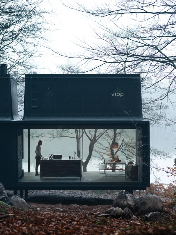
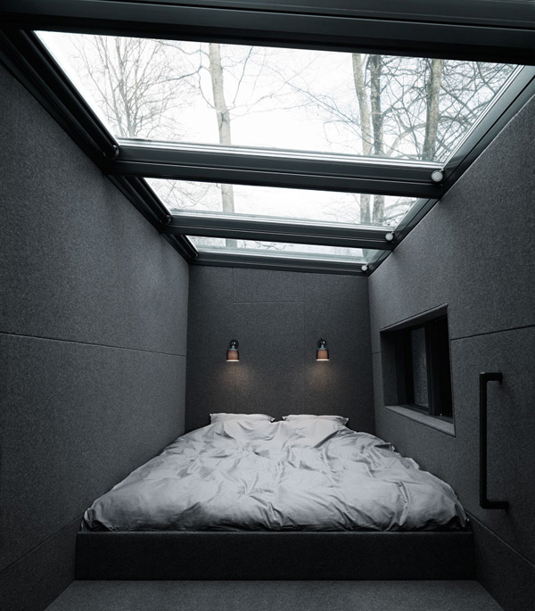
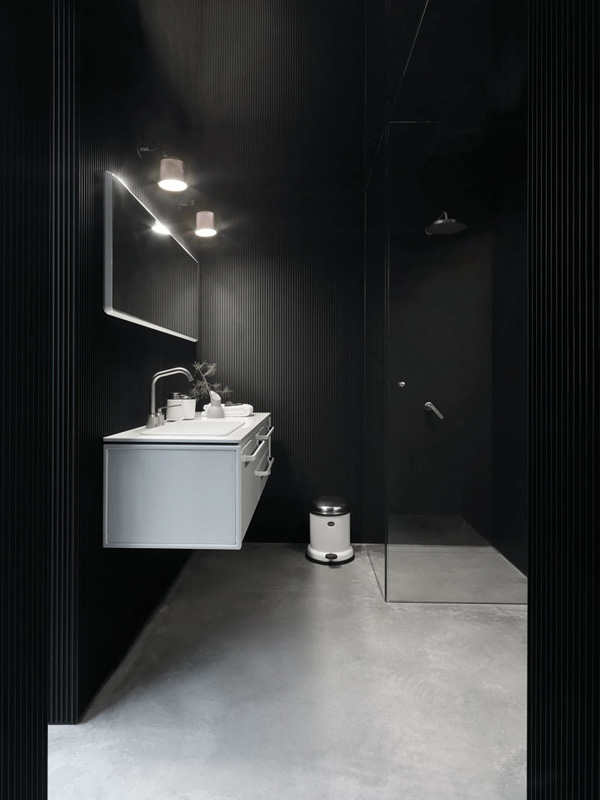
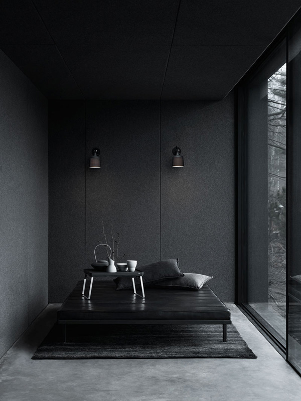
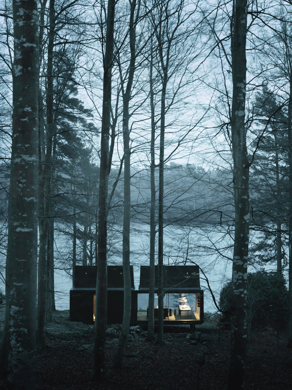
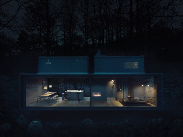
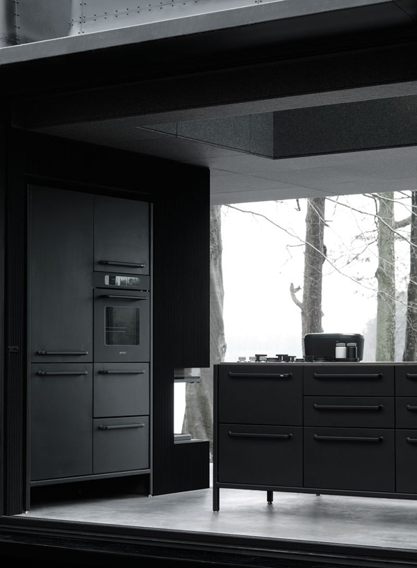
The Vipp shelter recently won best brand extension in the Wallpaper Design Awards 2015 and you can easily see why. The Danish brand that started off with pedal bins has expanded and gone from strength to strength over the years. Embracing new technologies as well as reaching out to social media and hosting a styling competition last autumn for influential bloggers. My invite got lost in the post – apparently.

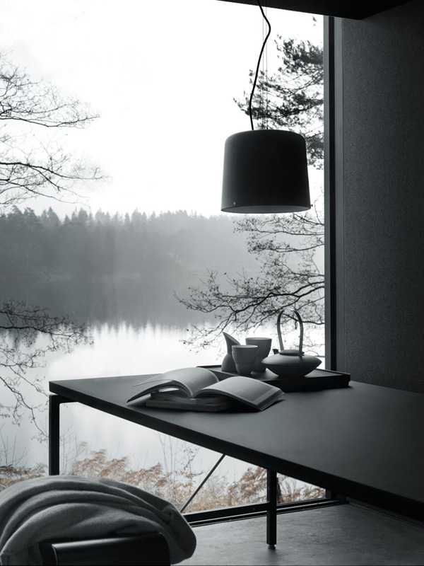
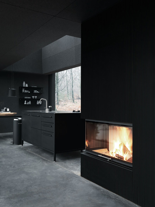
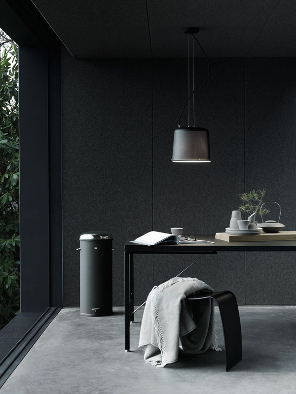
When I first saw the shelter I thought what a great concept, expecting the photos to turn out to be 3D computer visualisations. But the cynic in me was proven wrong when I found out that you can actually BUY this shelter including all fittings for a mere 485,000 Euros! Great value if you ask me as you’re not just buying the 55sqm space but the whole Vipp world – an experience you can’t put a price tag on. And no, they didn’t pay me to say that but here’s a quote that sums up the experience beautifully:

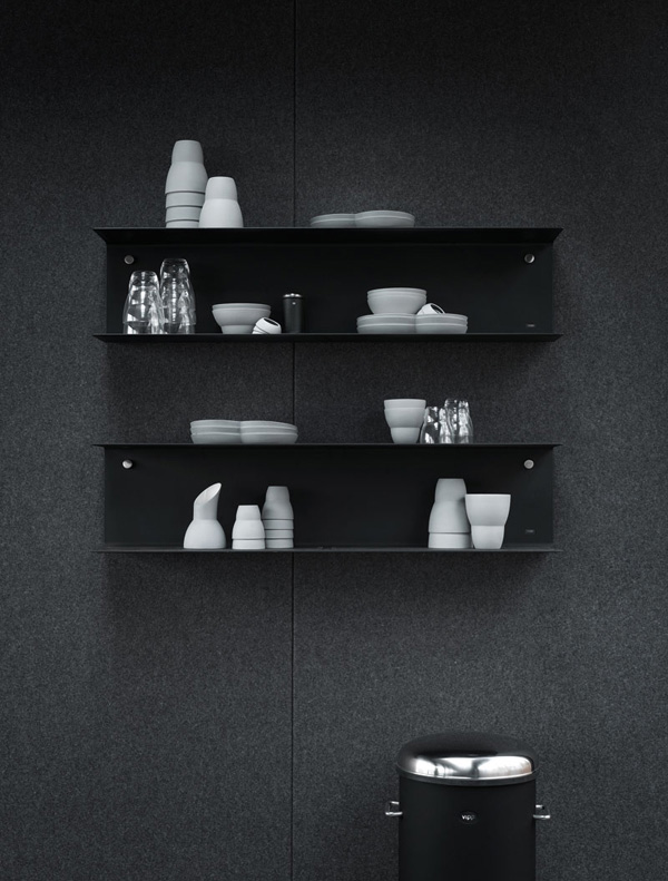
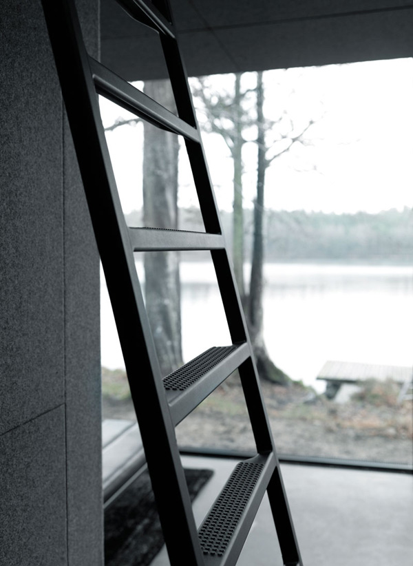
The starting point of the Vipp shelter is going back to basics; back to nature in a dense, compact space wrapped in the Vipp DNA. The landscape is purposely framed, turning it into the predominant element of the interior space. Each piece of interior and its dominant dark tones are carefully selected in order to keep focus on nature. The sliding window frames accentuate the sensation of living in nature by blurring the distinction of indoor outdoor space.

All you have to do is tell them where you want your humble shelter to be placed. Genius!


vipp shelter, danish, design, form follows function, dna, brand experience, wallpaper magazine awards, indoor, outdoor, framing nature, vipp world, experience, style, trend, design inspiration, design, architecture, interior, decor

vipp shelter, danish, design, form follows function, dna, brand experience, wallpaper magazine awards, indoor, outdoor, framing nature, vipp world, experience, style, trend, design inspiration, design, architecture, interior, decor

vipp shelter, danish, design, form follows function, dna, brand experience, wallpaper magazine awards, indoor, outdoor, framing nature, vipp world, experience, style, trend, design inspiration, design, architecture, interior, decor

vipp shelter, danish, design, form follows function, dna, brand experience, wallpaper magazine awards, indoor, outdoor, framing nature, vipp world, experience, style, trend, design inspiration, design, architecture, interior, decor

vipp shelter, danish, design, form follows function, dna, brand experience, wallpaper magazine awards, indoor, outdoor, framing nature, vipp world, experience, style, trend, design inspiration, design, architecture, interior, decor

vipp shelter, danish, design, form follows function, dna, brand experience, wallpaper magazine awards, indoor, outdoor, framing nature, vipp world, experience, style, trend, design inspiration, design, architecture, interior, decor

vipp shelter, danish, design, form follows function, dna, brand experience, wallpaper magazine awards, indoor, outdoor, framing nature, vipp world, experience, style, trend, design inspiration, design, architecture, interior, decor

vipp shelter, danish, design, form follows function, dna, brand experience, wallpaper magazine awards, indoor, outdoor, framing nature, vipp world, experience, style, trend, design inspiration, design, architecture, interior, decor

vipp shelter, danish, design, form follows function, dna, brand experience, wallpaper magazine awards, indoor, outdoor, framing nature, vipp world, experience, style, trend, design inspiration, design, architecture, interior, decor

vipp shelter, danish, design, form follows function, dna, brand experience, wallpaper magazine awards, indoor, outdoor, framing nature, vipp world, experience, style, trend, design inspiration, design, architecture, interior, decor

vipp shelter, danish, design, form follows function, dna, brand experience, wallpaper magazine awards, indoor, outdoor, framing nature, vipp world, experience, style, trend, design inspiration, design, architecture, interior, decor

 
MORE INFORMATION & PHOTOGRAPHY | Vipp
 
Follow Stylejuicer with Bloglovin

EAST VILLAGE | SHOPPING & STYLING

4 February 2015

East village, London, east, E20, shopping centre, shopping, westfield, athletes village, newest neighbourhood, closer than you think, shopping voucher, kitchen accessories, best new place to live, planning awards

A few weeks ago Get Living London, who redeveloped the Olympic Athlete’s Village, invited a few select bloggers to come and join them for breakfast in London’s newest neighbourhood – aka East Village – with a spot of recreational shopping in the adjacent Westfield shopping centre thrown in.

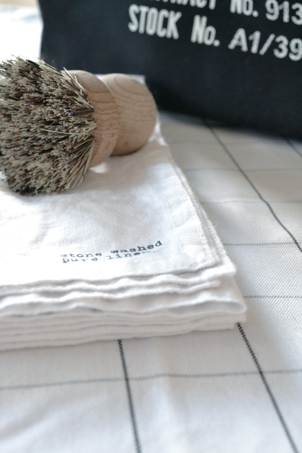
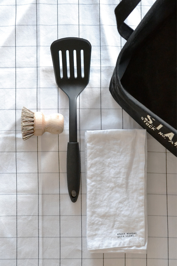
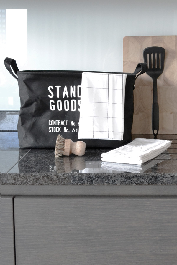
You can imagine I jumped at the chance to head east and explore the area whilst connecting with some fellow London bloggers. Having just moved a month ago I bought some nice kitchen accessories with my shopping voucher and couldn’t resist styling my finds in one of their gorgeous show homes on the tenth floor.

Needless to say the views were amazing across the Olympic Stadium, Canary Wharf and The City but what impressed me most was how well designed and planned everything is. Transport, green spaces, schools, health services it’s all easily accessible and I love the fact that they’ll be renting out over 30 retail units to independents so I’m expecting some artisan coffee shops and bakeries next time I visit.

If you want to see more about our day – or see me on camera (*cringe*) – check out the video below. My fellow bloggers were bubbly fashion queens Lauren & Felicity from Pretty, Posh, Oh My Gosh! and lovely Katherine from Lady Loves Cake.

East village, London, east, E20, shopping centre, shopping, westfield, athletes village, newest neighbourhood, closer than you think, shopping voucher, kitchen accessories, best new place to live, planning awards

East village, London, east, E20, shopping centre, shopping, westfield, athletes village, newest neighbourhood, closer than you think, shopping voucher, kitchen accessories, best new place to live, planning awards

East village, London, east, E20, shopping centre, shopping, westfield, athletes village, newest neighbourhood, closer than you think, shopping voucher, kitchen accessories, best new place to live, planning awards

East village, London, east, E20, shopping centre, shopping, westfield, athletes village, newest neighbourhood, closer than you think, shopping voucher, kitchen accessories, best new place to live, planning awards


DISCLOSURE | I was a guest of Get Living London and given a £100 shopping voucher for Westfield as part of the #MyE20 shopping challenge. All text and opinions are my own.
PHOTOGRAPHY | Yours Truly
 
Follow Stylejuicer with Bloglovin
MY MONTH ON INSTAGRAM | JANUARY 2015

31 January 2015

instagram, my month, January, mymonthoninstagram, photo, photography, trend, style, daily, experiences, beauty, moments, frost, winter, season, stylejuicer, kids, bed, london, MyE20, East Village, get living london, yay, wood, rustic, desk, office, sorting, flat lay

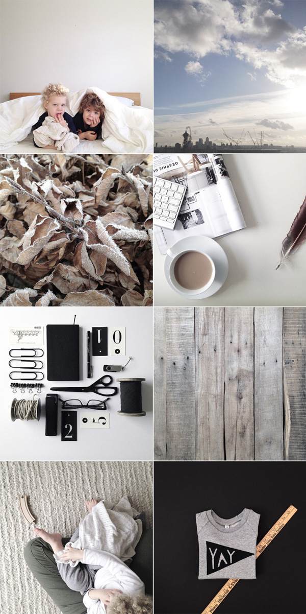
Phew… finally it’s the end of January. How long was this month – surely there were more than 31 days!?

So what did we do? Well, we packed, we moved, we settled and we’ve been waiting for it to snow here in London all of January. The kids are desperate to build a snowman and I’m swooning over the snowy landscapes of my fellow Instagram -ers from far and not so wide. Seems everybody has had at least a little sprinkling apart from us in the Big Smoke. *unfair*

Despite the lack of said snow we’re loving our new home which is south facing and has got the most amazing light flooding in. I’m in heaven in my new small home office which is clear of anything kids related, pristine white and clutter free – for now at least.

Changing the kids bedroom from baby to kids is my next project and I’m busy planning and sifting through ideas. Remember my post about black and white kids room ideas? I’m honing in and will be sharing more soon.

Here’s to February with Valentines and small signs of Spring coming up – or will we finally get some snow in London!?


PHOTOGRAPHY | Annie Kruse Please don’t take my shots without my permission. Instead follow me on Instagram.

 
Follow Stylejuicer with Bloglovin
DESIGN INSPIRATION | CHALK BOARD TYPOGRAPHY

28 January 2015

modus, magazine, publication, B2B, journal, rics, uk, Royal Institution of Chartered Surveyors, learning, super sized, chalk board, lettering, typography, hand drawn, photoshop, fun, diy, coming soon agency, belgium, imperfections, style, trend, design inspiration, inspo

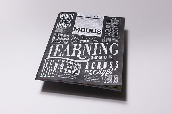
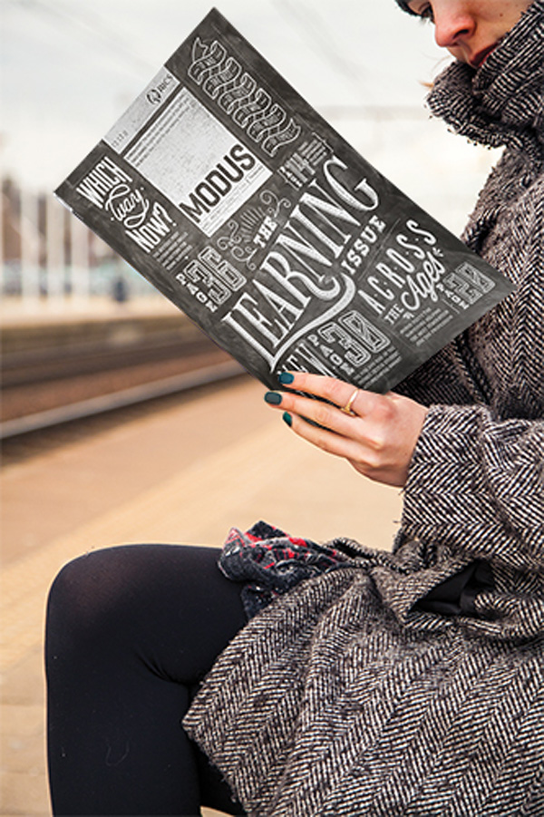
Did you enjoy my post about the Broste Copenhagen ‘Behind The Scenes’ photoshoot last week? If you did you’re in luck as here’s another one that shows you the making of. This time for Modus, a membership magazine for the Royal Institution of Chartered Surveyors mailed 10 times a year to more than 95,000 members and the UK’s highest-circulation property-related B2B title. Have you switched off already and skipped to the next paragraph? I don’t blame you, I would.

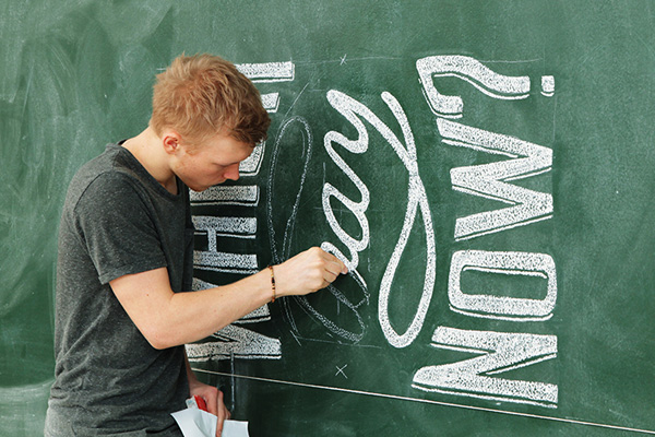
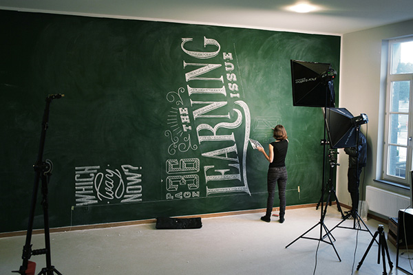
So here’s the fun part: For their ‘Learning’ issue they commissioned a supersized chalk board with hand drawn typography which then served as a cover shot. Wowzers. I so L O V E a chalk board and it speaks volumes for the agency-client relationship that they managed to get this idea signed off.

In fact this project is both: a piece of art as well as a very clever and highly unusual piece of typography and cover design. Everyone involved should get a medal or at least an D&AD award. I just wish I could have helped out on a few letters.

Sure they could have photoshopped the whole thing but it would have never looked that real with little imperfections and wipe marks plus what’s the fun in that if you can DIY it!? If you’re a typography geek like me then watch the short clip to see how it all came together.
 

modus, magazine, publication, B2B, journal, rics, uk, Royal Institution of Chartered Surveyors, learning, super sized, chalk board, lettering, typography, hand drawn, photoshop, fun, diy, coming soon agency, belgium, imperfections, style, trend, design inspiration, inspo

modus, magazine, publication, B2B, journal, rics, uk, Royal Institution of Chartered Surveyors, learning, super sized, chalk board, lettering, typography, hand drawn, photoshop, fun, diy, coming soon agency, belgium, imperfections, style, trend, design inspiration, inspo

modus, magazine, publication, B2B, journal, rics, uk, Royal Institution of Chartered Surveyors, learning, super sized, chalk board, lettering, typography, hand drawn, photoshop, fun, diy, coming soon agency, belgium, imperfections, style, trend, design inspiration, inspo

modus, magazine, publication, B2B, journal, rics, uk, Royal Institution of Chartered Surveyors, learning, super sized, chalk board, lettering, typography, hand drawn, photoshop, fun, diy, coming soon agency, belgium, imperfections, style, trend, design inspiration, inspo

modus, magazine, publication, B2B, journal, rics, uk, Royal Institution of Chartered Surveyors, learning, super sized, chalk board, lettering, typography, hand drawn, photoshop, fun, diy, coming soon agency, belgium, imperfections, style, trend, design inspiration, inspo
 

7x3m Modus cover from Soon on Vimeo.


MORE INFORMATION | Coming Soon
CREATIVE DIRECTOR | Jim Van Raemdonck (BE)
GRAPHIC DESIGN & TYPOGRAPHY | Phoebe De Corte (BE) & Lee Skinner (GB)
CHALK DRAWERS | Phoebe De Corte (BE), Lee Skinner (GB), Lucie Muchovičová (CZ), Bi Schutte (BE) and Silke Vermassen (BE)
FILM, PHOTOGRAPHY & MONTAGE | Romain Menke
MUSIC | Laura Aerts (BE)

 
Follow Stylejuicer with Bloglovin
SPLIT VIEW MOUNTAIN LODGE IN NORWAY

26 January 2015

architecture, split view, mountain lodge, norway, ski chalet, contemporary, interpretation, timber facade, concrete workbench, luxury, relaxed, cozy, style, trend, minimal, scandinavian, simple, holiday home, photography

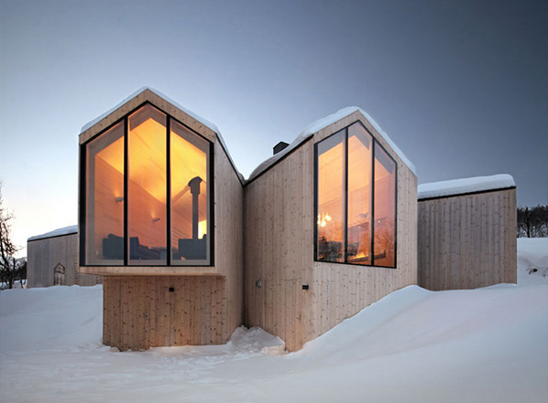
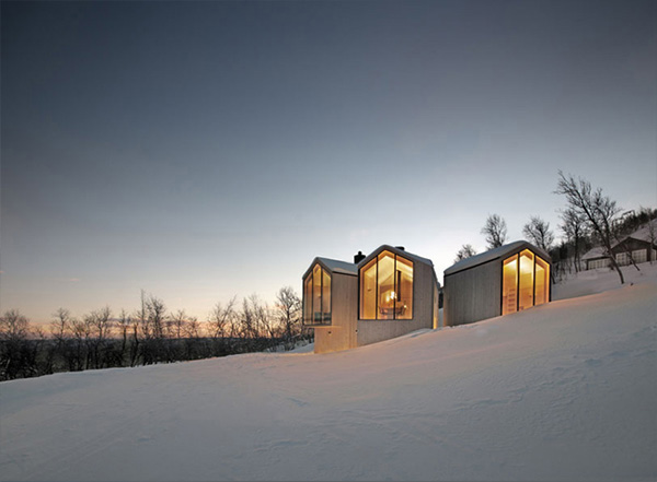
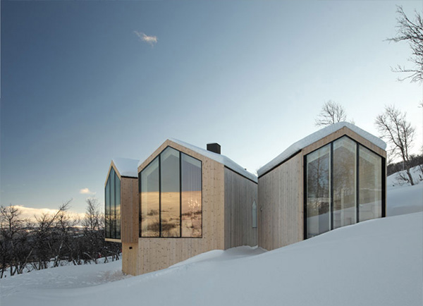
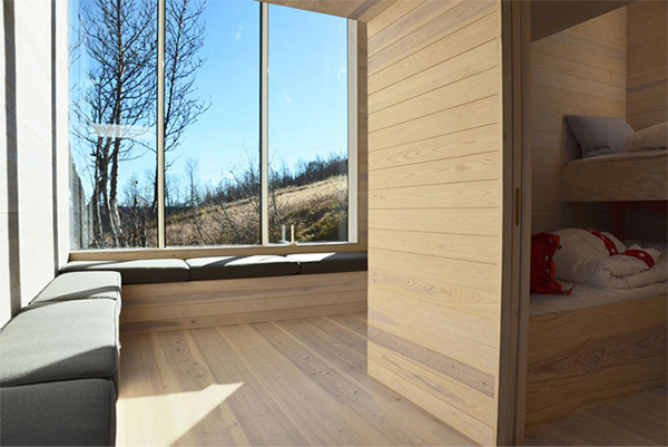
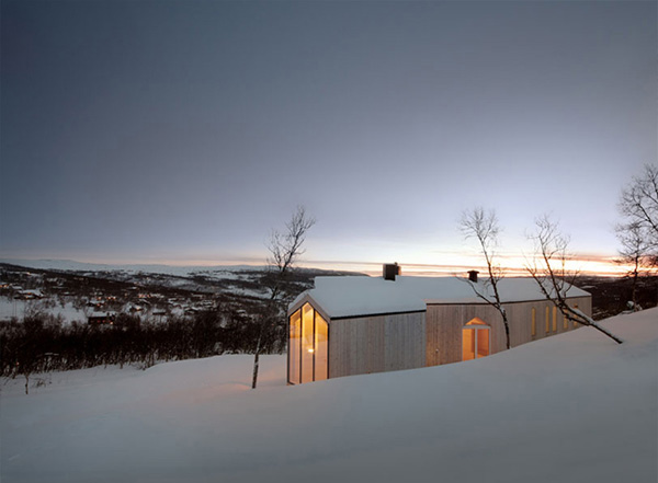
I’m fascinated by the contemporary architecture of this Norwegian mountain lodge by Reiulf Ramstad Arkiteckter. Beautifully captured in the twilight hours drawing you in with it’s warm glow that spills out into the snowy landscape.

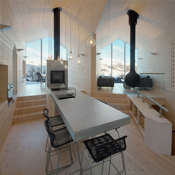
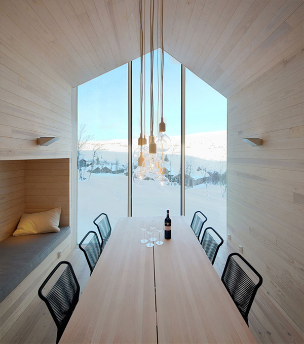
I like how the architecture follows the natural contours of the mountain slope with multiple levels and split living zones and it’s current timber facade will fade over time to grey blending beautifully with the surroundings. The layout draws you towards the fully glazed end walls that frame magnificent views in the dining and living areas. But my heart skipped a beat when I saw the open-plan kitchen with a double sided fire place and a ‘floating’ concrete workbench. Simply gorgeous!

The mountain lodge has a distinct luxurious feel, partly because of the sleek knot-free timber lined walls and ceiling, but it’s still very much a family holiday home with cozy and relaxed in-built seating, a children’s lounge and mezzanine as well as a separate guest annex.

A fabulous interpretation of a traditional ski chalet.
 

architecture, split view, mountain lodge, norway, ski chalet, contemporary, interpretation, timber facade, concrete workbench, luxury, relaxed, cozy, style, trend, minimal, scandinavian, simple, holiday home, photography

architecture, split view, mountain lodge, norway, ski chalet, contemporary, interpretation, timber facade, concrete workbench, luxury, relaxed, cozy, style, trend, minimal, scandinavian, simple, holiday home, photography

architecture, split view, mountain lodge, norway, ski chalet, contemporary, interpretation, timber facade, concrete workbench, luxury, relaxed, cozy, style, trend, minimal, scandinavian, simple, holiday home, photography

architecture, split view, mountain lodge, norway, ski chalet, contemporary, interpretation, timber facade, concrete workbench, luxury, relaxed, cozy, style, trend, minimal, scandinavian, simple, holiday home, photography

architecture, split view, mountain lodge, norway, ski chalet, contemporary, interpretation, timber facade, concrete workbench, luxury, relaxed, cozy, style, trend, minimal, scandinavian, simple, holiday home, photography

architecture, split view, mountain lodge, norway, ski chalet, contemporary, interpretation, timber facade, concrete workbench, luxury, relaxed, cozy, style, trend, minimal, scandinavian, simple, holiday home, photography

architecture, split view, mountain lodge, norway, ski chalet, contemporary, interpretation, timber facade, concrete workbench, luxury, relaxed, cozy, style, trend, minimal, scandinavian, simple, holiday home, photography

architecture, split view, mountain lodge, norway, ski chalet, contemporary, interpretation, timber facade, concrete workbench, luxury, relaxed, cozy, style, trend, minimal, scandinavian, simple, holiday home, photography

 
ARCHITECTS | Reiulf Ramstad Arkiteckter
PHOTOGRAPHY | Søren Harder Nielsen
 
Follow Stylejuicer with Bloglovin