BOOK REVIEW | STILL BY NATALIE WALTON

1 June 2020

Book Review for Still by Natalie Walton

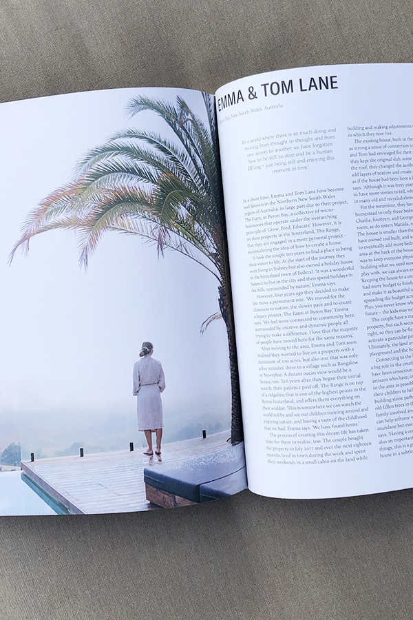
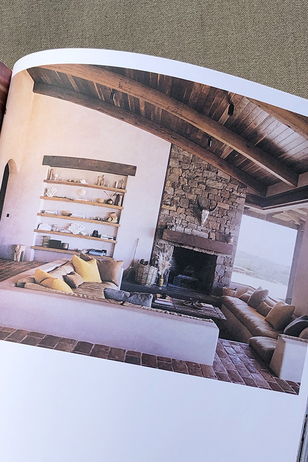
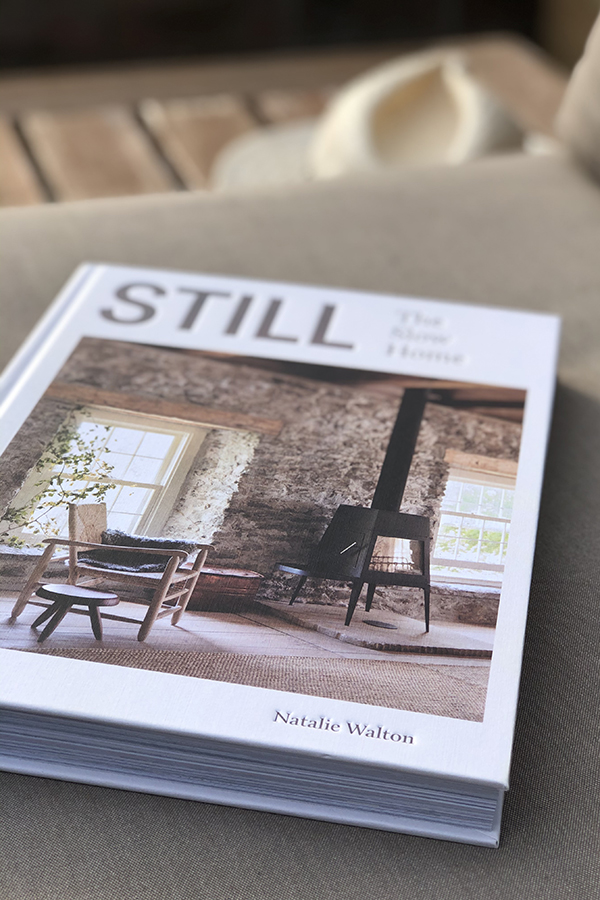
This week I want to share the stunning book STILL by Natalie Walton with you. I caught a glimpse of it in Courtney Adamo’s stories feed and immediately pre-ordered it. Luckily, it arrived before it’s official release date in the UK and I’ve been loving dipping in and out of it. 

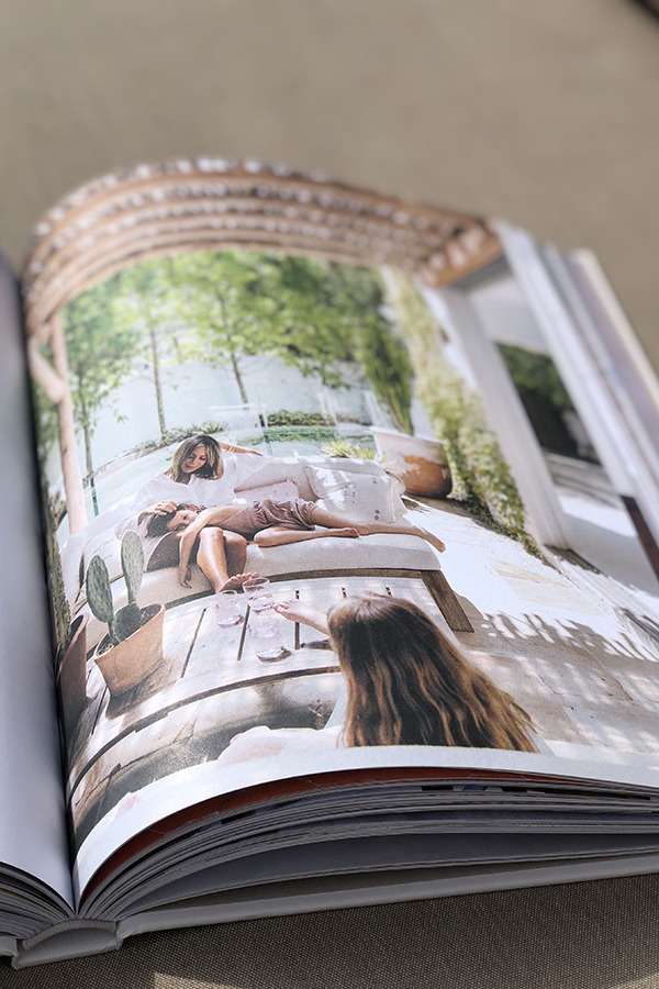
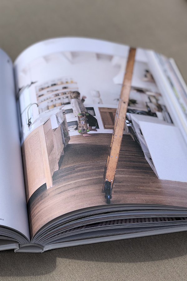
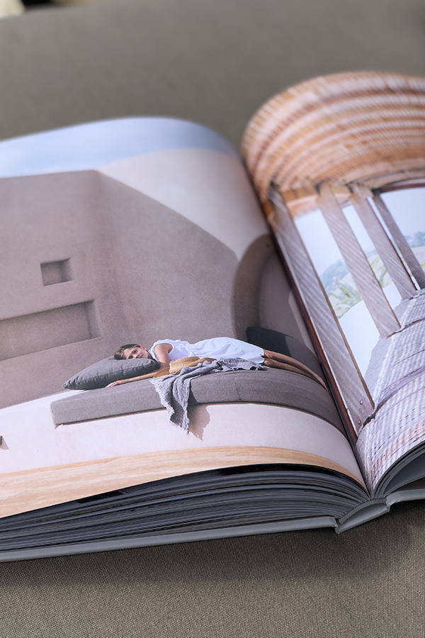
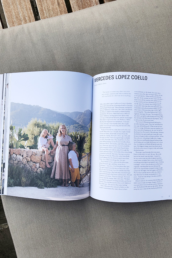
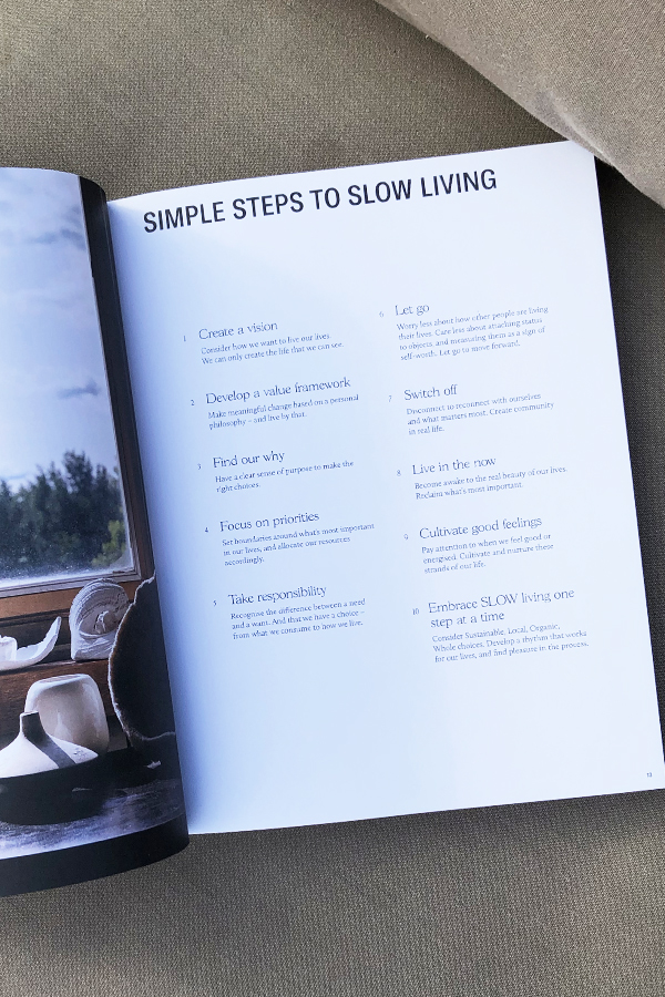
The Australian author has selected, interviewed and photographed 20 inspirational homes from all around the world, designed by individuals who are aligned to the SLOW movement, standing for sustainability, local, organic and whole.

I found it fascinating to read about these couples and families who have all been on a journey of self-discovery and re-evaluation of life and their own priorities. Not only is a slower pace a common denominator but the longing for a simpler life, often driven by a deep feeling of responsibility for the planet and their loved ones.

The photography by Chris Warnes is eye-wateringly beautiful and looking through the pages you will notice a calm, reduced colour palette with lots of references to nature. There is a common aesthetic of simplicity and minimalism on show which resonates with my own interior style. Each shot has of course been styled to perfection by Natalie who coincidentally runs master styling classes. Check them out here if you’re interested.

I was so intrigued by the multi-talented author that I listened to her podcast series Imprint where she talks about finding her voice and how she achieves a calm home for her family. I got the impression of a very humble, clean living and responsible person who is an awful lot more disciplined than me! I admire the amount of wellbeing she can fit into her day around all the other chores work and a large family brings with it – maybe the fact that she doesn’t watch TV has something to do with it. And no, as much as I admire her achievements I’m not ready to give up the box just yet. 

If you’d like to live more mindfully, embracing slow living without losing a sense of style in your home I highly recommend this book which continues to give me hours of interior, life and living inspiration.  
Book Review for Still by Natalie Walton

NOTE | This is not an advert. I found and purchased Still by Natalie Walton myself and do not benefit in any way from the write-up.

MORE INFORMATION | Natalie Walton

PHOTOGRAPHY | Annie Kruse

_______________________________________________________________________________________

Follow Stylejuicer with Bloglovin and never miss a post. Just follow the linkety link.

_______________________________________________________________________________________

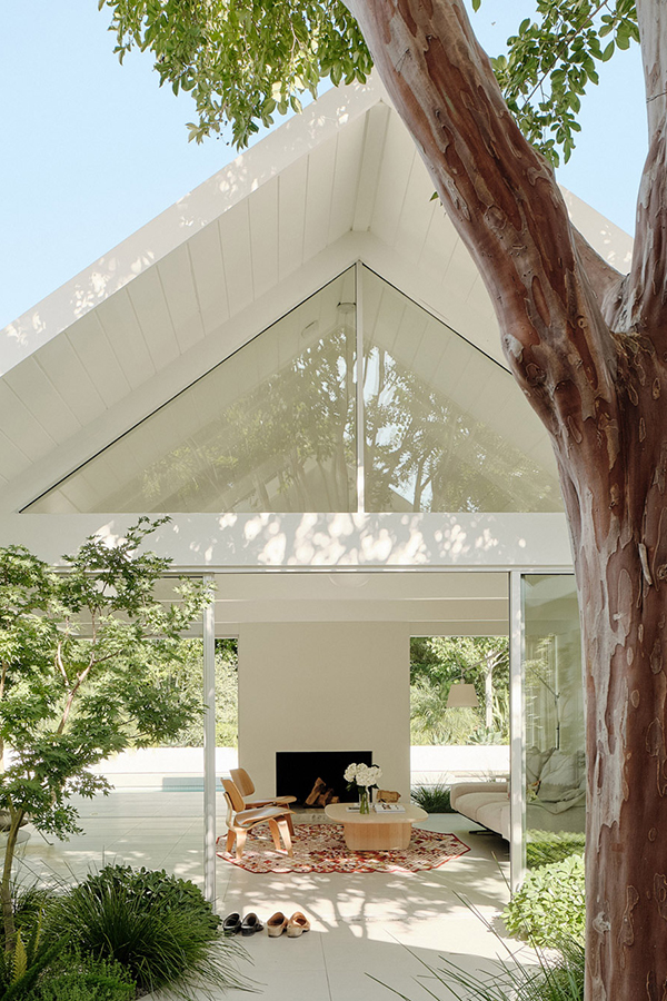
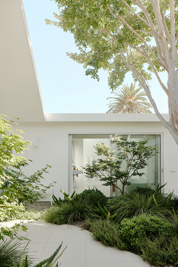
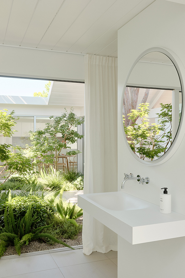
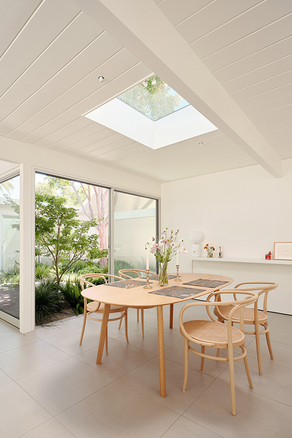
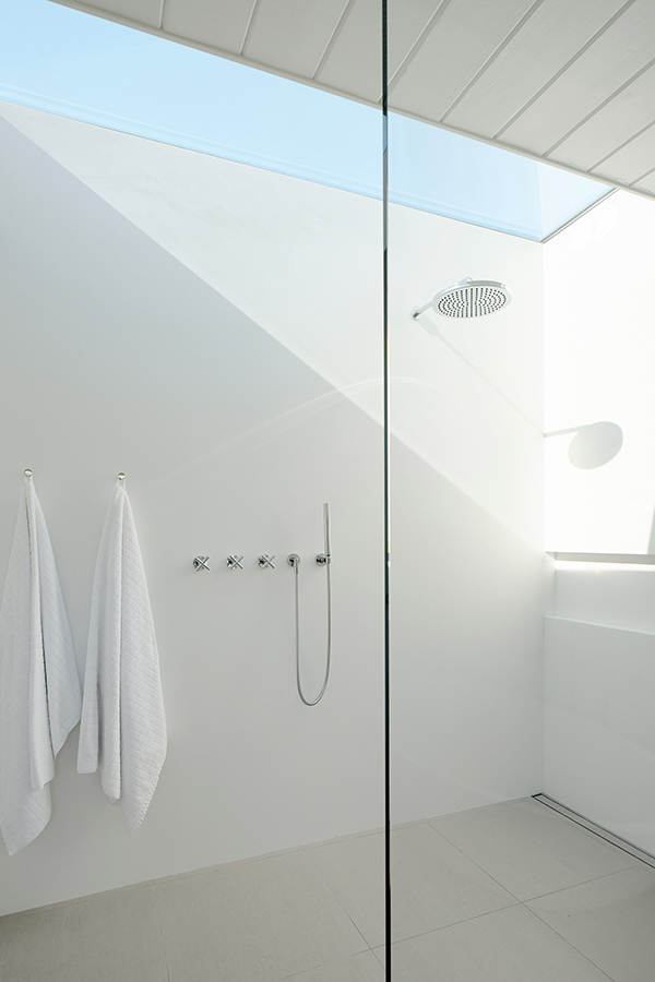
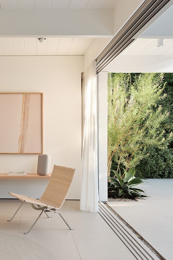
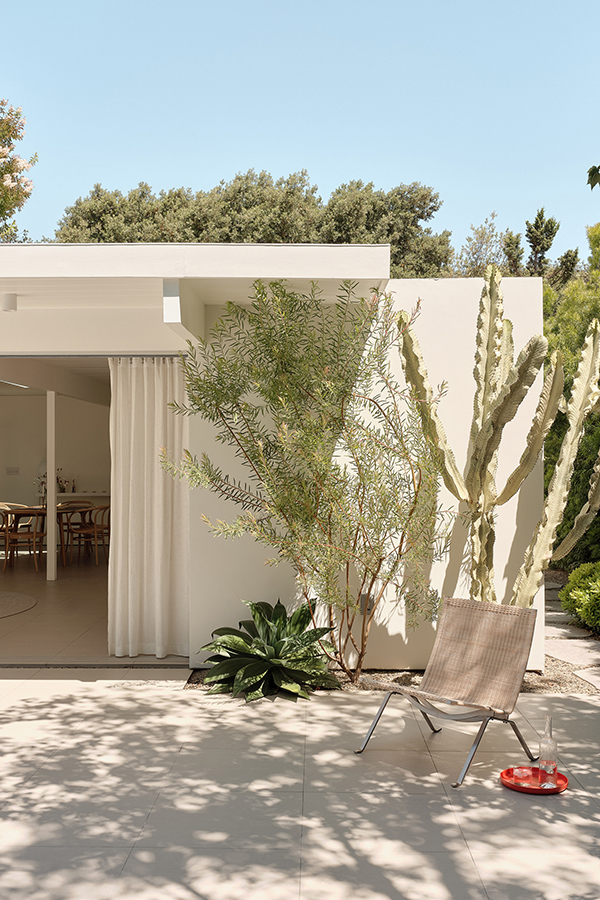
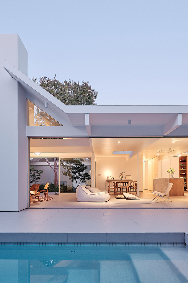
1960 californian remodel by ryan leidner architects

25 May 2020

1960 californian remodel by ryan leider architects photo by joe fletcher

It’s been over a year since my last blog post so I thought now is as good a time as any to start again. In case you’re wondering about the radio silence – no dramas, just life.

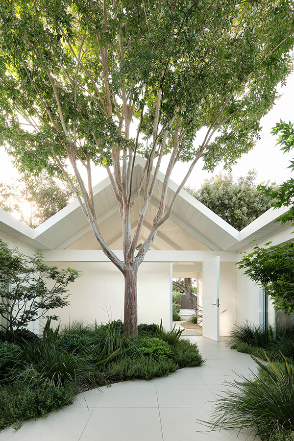
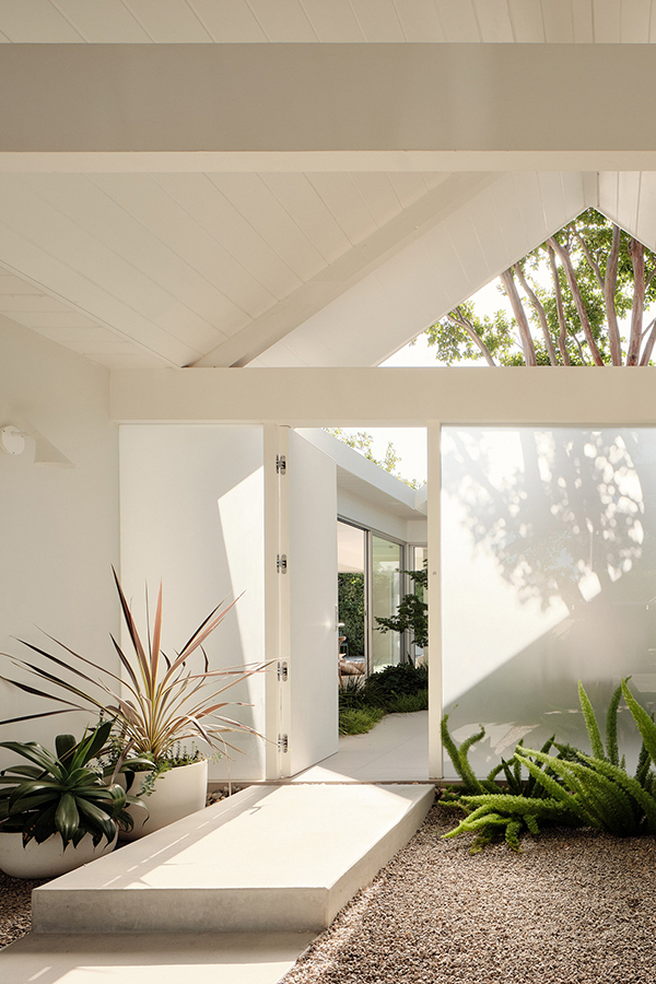
But I couldn’t pass the opportunity to share this 1960 Californian remodel of a modernist Joseph Eichler house in Silicon Valley. The studio Ryan Leidner Architects did an amazing job stripping back all the previous reincarnations and came up with this simple broken plan remodel for a family of four centering around a lush courtyard. 

The white walls, lofty ceilings and modernist lines contrast beautifully with the lush green foliage that features an array of climate appropriate planting, from cacti to grasses and trees, displaying texture with large foliage and interest at every level. The landscape Stephens Design Studio also added a new swimming pool – a must-have in sunny California.

I just can’t stop staring at the photos by Joe Fletcher and think this remodel may be right up there on my list of dream homes.

_______________________________________________________________________________________

If you like this post, check out these stunning New York lofts, one in Gramercy Park and one in Tribeca.

1960 californian remodel by ryan leider architects photo by joe fletcher

MORE INFORMATION | Ryan Leidner Architects

PHOTOGRAPHY | Joe Fletcher

_______________________________________________________________________________________

Follow Stylejuicer with Bloglovin and never miss a post. Just follow the linkety link.

_______________________________________________________________________________________

Finally, whilst we’re all in the throws of Covid19 I want to share this quote from Rich Roll with you which really resonated with me this week:

Breathe.
Be gentle on yourself and others.
Move your body.
Eat healthy.
Rest.
Let go of expectations.
Accept what is.
Go inward.
Make a list of things to be grateful for.
And tell your loved ones how you feel.

LONDON LOFT WITH RUSTY STEEL SHOWSTOPPER

22 February 2019

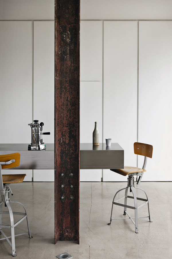
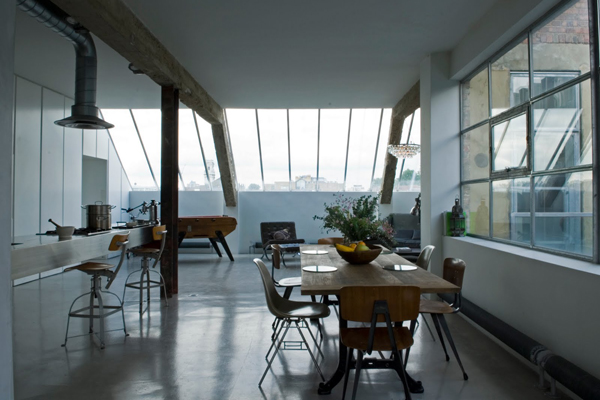
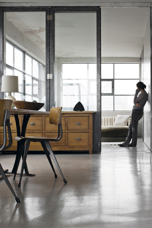
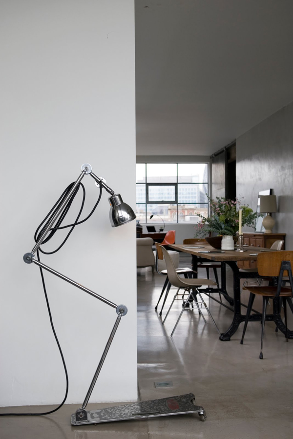
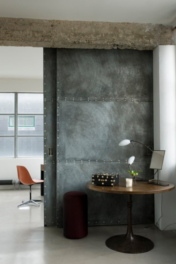
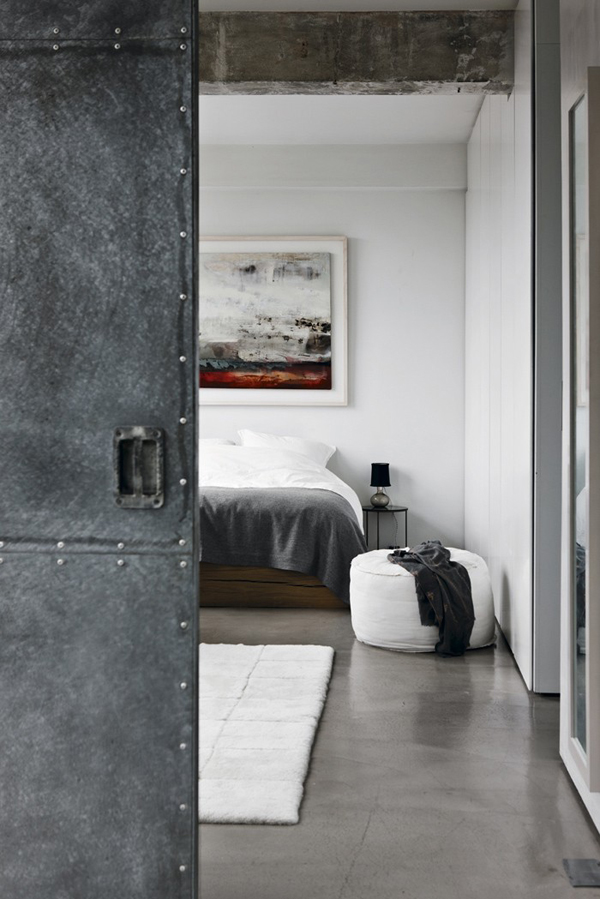
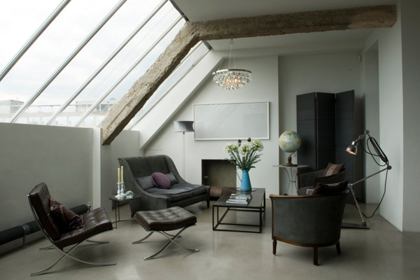
This loft is a successful mix of high and low spec with a rusty steel RSJ showstopper.

I was looking for some kitchen inspo on beloved (and sometimes hated) Pinterest and found this gorgeous London loft. You can hire it as a location for photo shoots and I can see the attraction.

The loft is a successful mix of high and low spec with smart polished concrete flooring and sleek inbuilt kitchen cabinets as well as flea market finds and – my favourite piece – a rusty steel RSJ holding up the kitchen ceiling. I wonder if that was an original feature or added when the renovation took place. Either way I want one! It adds character and industrial flair but mostly it’s a great show stopper and talking point.

If you’re a fellow loft lover check out some of my favs here, here and here. You’re welcome!

This loft is a successful mix of high and low spec with a rusty steel RSJ showstopper.

OWNER & PHOTOGRAPHY | Solenne de La Fouchardiere Ochre

––––––––––––––––––––––––––––––––––––––––––––––––––––––––––––––––––––––––

Follow Stylejuicer with Bloglovin

PINK AESOP STORE IN LONDON BY SNØHETTA

15 February 2019

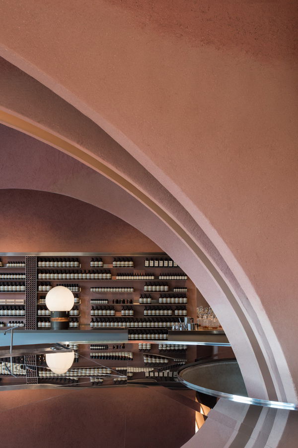
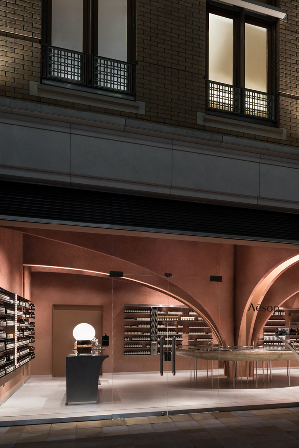
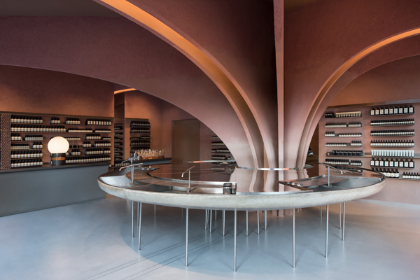
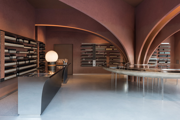
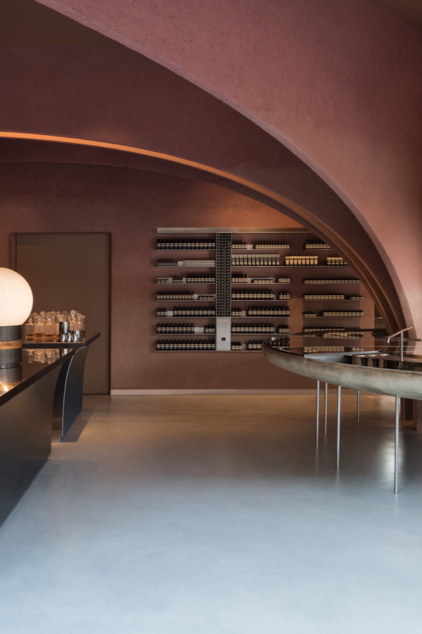
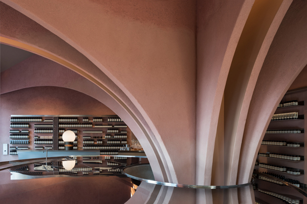
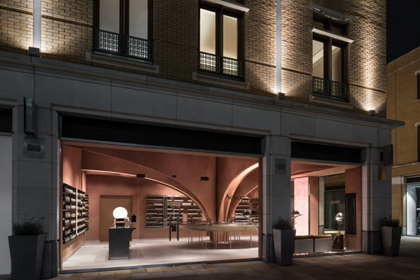
This new pink AESOP store in London features a large vaulted structure originating from a central round basin which gives the store a real sense of drama.

I’ve featured a few AESOP interiors on the blog before – remember the Melbourne one – but none of them had such a strong colour reference as the new pink AESOP store in London’s Duke of York Square, just off the famous Kings Road.

AESOP interiors around the world are show stoppers, always pushing the boundaries of what we traditionally think a skin care brand should look like. None look the same and they often commission famous leading interior designers to fit out their stores, like Ilse Crawford or in today’s feature Norwegian studio Snøhetta.

I love the strategic thinking behind the brand which has become synonymous with innovation and leadership in design. This can only be a good thing and from working with clients on a daily basis I know who much guts and bravery it takes to push such a brand strategy through. ‘It’s lonely at the top’ as they say but polarising your audience also ensures a loyal following from those who do ‘buy into’ your values.

I for one am totally addicted to their mandarin, rosemary and cedar hand wash and cream and I never tire of their exotic and complex Marrakesh scent. The functional, apothecary-style packaging and ‘off’ colours like brown, sludgy grey, moss green or burnt orange is an equally brave choice amongst the sea of white and vibrant colours used by competitors.

This new pink AESOP store in London features a large vaulted structure originating from a central round basin which gives the store a real sense of drama.

But I digress and giving you far too much marketing spiel. The main point is the new store’s dominate pink colour, a pigmented clay based plaster by Clayworks sourced from the South West of England. It totally nails sophistication and approachability, a subtle grown up greyish pink. Perfectly contrasted by the use of futuristic steel in the other customised store elements. 

The addition of a large vaulted structure originating from a central round basin gives the store a sense of drama and rather weirdly (but in a good way) it reminds me of the insides of a large fictional organ, especially in combination with the colour. Not too far fetched considering they sell skin care products.

This is seventh store designed by Snøhetta and if you live in Oslo, Düsseldorf, Berlin or Singapore you can check out their extraordinary store designs for yourself.

This new pink AESOP store in London features a large vaulted structure originating from a central round basin which gives the store a real sense of drama.
AESOP interiors around the world are show stoppers and this new pink AESOP store in london designed by Snøhetta is no exception.
 pink aesop store, london, duke of york square, interior design, architecture, marketing, brand, loyalty, Ilse Crawford, Snøhetta, style, sophisticated, futuristic, steel, vaulted structure, stylejuicer, trend, blog

MORE INFORMATION & PHOTOGRAPHY | Snøhetta

––––––––––––––––––––––––––––––––––––––––––––––––––––––––––––––––––––––––

Follow Stylejuicer with Bloglovin

MONOCHROME CAFE IN MOSCOW BY ASKETIK

8 February 2019

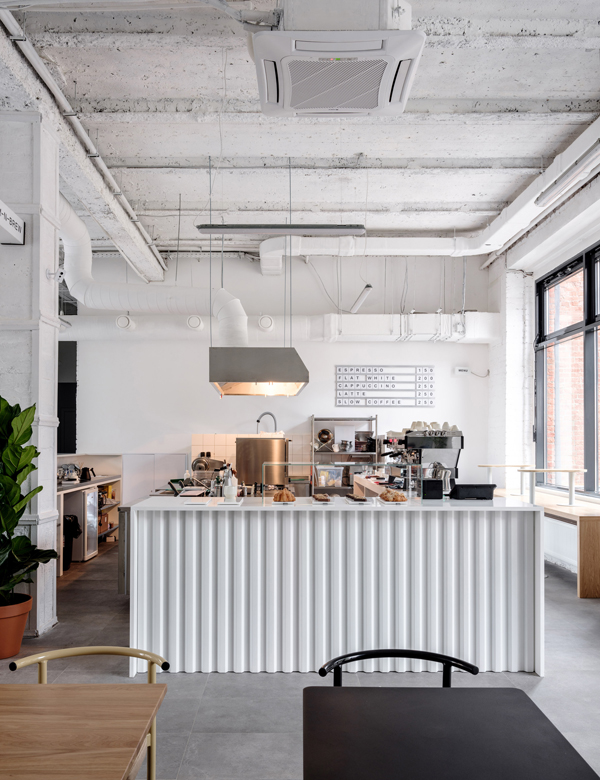
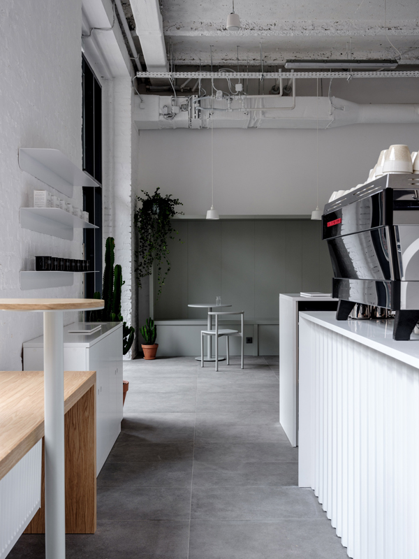
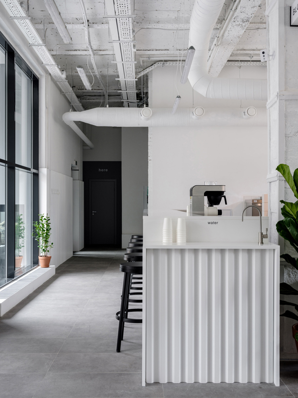
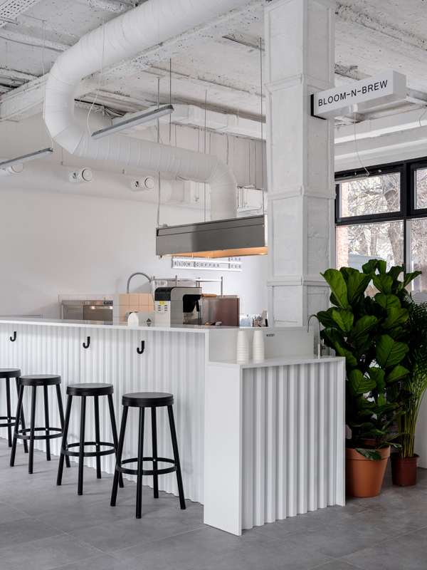
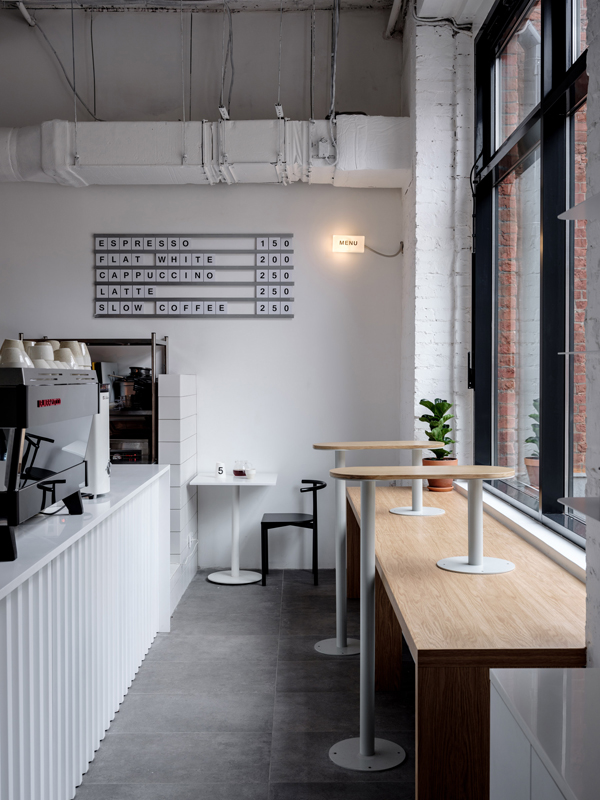
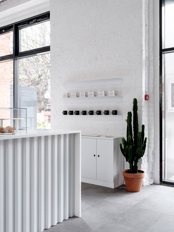
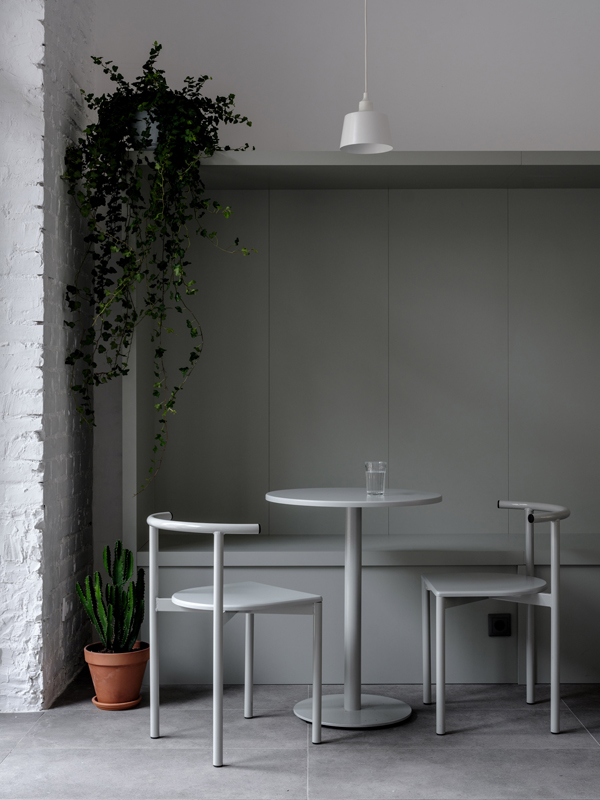
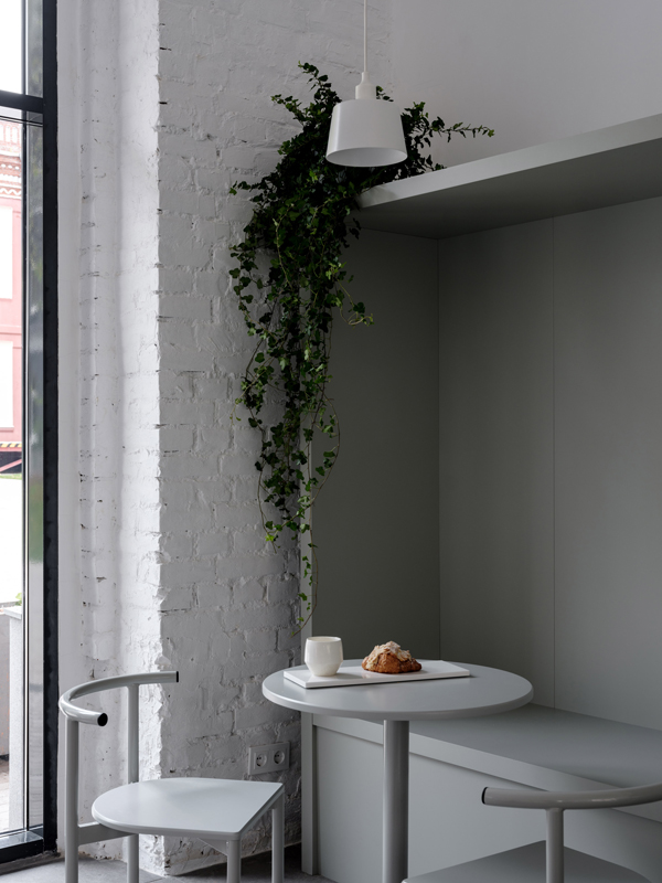
This industrial former silk factory in Moscow has been transformed by studio Asketik into a monochrome cafe with beautiful proportions.
monochrome, cafe, moscow, asketik, stylejuicer, blog, trend, industrial space, white wash, bloom-n-brew, hip, cultural differences, connected, melbourne, stockholm

You know how much I love an industrial space and this monochrome cafe in Moscow designed by studio Asketik immediately caught my eye during one of my late night surfs.

The white wash formula never fails to have an impact especially in such an impressive space which used to be a silk factory in the Factoria Park district of Moscow. Beautiful designer furniture by Delo Design of St Petersburg and large plants in terracotta pots soften the sharp edges of the vast space which is flooded with light.

Asketik was also tasked to come up with the cafe’s brand identity which derives from the gorgeous smell a freshly brewed cup of coffee emits: Bloom-n-Brew. The simple font supports the contemporary industrial look and feel of the space and sits discreetly on cups and packaging.

My final thought is a controversial one: This place could be in any of the world’s hip coffee-loving cities, from Australia to America, Africa, Asia or Europe. I’m not too sure how I feel about the fact that there’s no distinct cultural reference apart from the currency. I actually love cultural differences and want to consume food and drink local to the country I’m visiting. How do you feel about the fact that places start to look the same throughout the world? Does it bother you or do you find it comforting? Its definitely a question that will be coming up more and more in the future as we continue to become more connected.

If you want to see more hip cafes check out this one in Melbourne or this gorgeous restaurant / bar / cafe in Stockholm, still one of my favs.

This industrial former silk factory in Moscow has been transformed by studio Asketik into a monochrome cafe with beautiful proportions.
monochrome, cafe, moscow, asketik, stylejuicer, blog, trend, industrial space, white wash, bloom-n-brew, hip, cultural differences, connected, melbourne, stockholm
This industrial former silk factory in Moscow has been transformed by studio Asketik into a monochrome cafe with beautiful proportions.
monochrome, cafe, moscow, asketik, stylejuicer, blog, trend, industrial space, white wash, bloom-n-brew, hip, cultural differences, connected, melbourne, stockholm
This industrial former silk factory in Moscow has been transformed by studio Asketik into a monochrome cafe with beautiful proportions.
monochrome, cafe, moscow, asketik, stylejuicer, blog, trend, industrial space, white wash, bloom-n-brew, hip, cultural differences, connected, melbourne, stockholm
This industrial former silk factory in Moscow has been transformed by studio Asketik into a monochrome cafe with beautiful proportions.
monochrome, cafe, moscow, asketik, stylejuicer, blog, trend, industrial space, white wash, bloom-n-brew, hip, cultural differences, connected, melbourne, stockholm
This industrial former silk factory in Moscow has been transformed by studio Asketik into a monochrome cafe with beautiful proportions.
monochrome, cafe, moscow, asketik, stylejuicer, blog, trend, industrial space, white wash, bloom-n-brew, hip, cultural differences, connected, melbourne, stockholm
This industrial former silk factory in Moscow has been transformed by studio Asketik into a monochrome cafe with beautiful proportions.
monochrome, cafe, moscow, asketik, stylejuicer, blog, trend, industrial space, white wash, bloom-n-brew, hip, cultural differences, connected, melbourne, stockholm
This industrial former silk factory in Moscow has been transformed by studio Asketik into a monochrome cafe with beautiful proportions.
monochrome, cafe, moscow, asketik, stylejuicer, blog, trend, industrial space, white wash, bloom-n-brew, hip, cultural differences, connected, melbourne, stockholm

MORE INFORMATION | Asketik

PHOTO | Mikhail Loskutov with thanks

––––––––––––––––––––––––––––––––––––––––––––––––––––––––––––––––––––––––

Follow Stylejuicer with Bloglovin