CARL HANSEN & SONS RELAUNCHES CH23 BY HANS J WEGNER

8 February 2017

carl hansen and son, master cabinet maker, furniture, denmark, danish, design icons, high standard, craftsmanship, natural materials, sustainable, durable, everyday use, hans j wegner, chair, CH23, wishbone chair, style, danish modern, bauhaus, minimalism, simple, elegant, steam-bending, trend, relaunch
 

It’s not often that emailed press releases get me excited but this one made my ears prick up, Carl Hansen & Son are relaunching the CH23 chair by Hans J Wegner.

In case you struggle to distinguish your Fritz from your Carl Hansen (the former’s best seller is the Egg Chair by Arne Jacobsen and the latter’s is the Wishbone chair by Wegner) – or don’t even know what the heck I’m talking about – this is the Danish furniture brand started by master cabinet maker Carl Hansen over 100 years ago in 1908 that has been producing design icons to the highest standard in craftsmanship ever since.

I’m fascinated by the story of Wegner and Carl Hansen’s collaboration which started in 1949 to develop a unique chair series which in turn laid the foundation for an extensive furniture collection. During a short but intense period prior to the 1950 launch, the young furniture designer worked with some of the most highly skilled craftspeople at Carl Hansen & Son to create the CH22, CH23, CH24 and CH25 chairs – four designs with very different expressions, yet all bearing Wegner’s unique fingerprint and emphasis on high-quality craftsmanship.

Wegner was an accomplished cabinet maker himself and pushed the boundaries of Carl Hansen’s craftsmen by applying advanced design techniques such as steam-bent backrests, organic forms, complex constructions and seats made of woven paper cord and light coloured wood – all united in a simple and elegant expression – considered avant-garde at the time.

For us Wegner’s chairs are timeless and synonymous with Danish Modern, a style of minimalist furniture and homewares from Denmark based on the principles of Bauhaus modernism, creating pure, clean lines based on an understanding of classical furniture craftsmanship and coupled with careful research into materials, proportions and the requirements of the human body. Made from natural materials the chairs are durable and sustainable and even with their strong artistic expression clearly designed for everyday use.


carl hansen and son, master cabinet maker, furniture, denmark, danish, design icons, high standard, craftsmanship, natural materials, sustainable, durable, everyday use, hans j wegner, chair, CH23, wishbone chair, style, danish modern, bauhaus, minimalism, simple, elegant, steam-bending, trend, relaunch

ABOVE | The relaunched CH23
 

carl hansen and son, master cabinet maker, furniture, denmark, danish, design icons, high standard, craftsmanship, natural materials, sustainable, durable, everyday use, hans j wegner, chair, CH23, wishbone chair, style, danish modern, bauhaus, minimalism, simple, elegant, steam-bending, trend, relaunch

ABOVE | Detail of the CH23


Two of these chairs – the CH24, also known worldwide as the iconic Wishbone Chair, and the woven CH25 lounge chair – have been in production at Carl Hansen & Son for over 65 years. The other two, the CH22 and CH23, which have been out of production for various periods of time, are now being manufactured once again.

With the current relaunch of the CH23 dining chair, all of the master furniture designer’s first four chairs are again part of Carl Hansen & Son’s extensive Wegner collection. The Danish furniture manufacturer is bringing renewed focus to the period that proved to be Wegner’s most productive – a period when the CH26 dining chair also took shape. Conceived in 1950 and closely related to the CH22 lounge chair, the CH26 was never put into production; the drawings were only discovered in Wegner’s vast archives last year. The elegant chair with organic forms has now finally been brought to life and added to Wegner’s first collection.

And as if you need convincing but check out the beautiful product photography and close ups of details of the chairs below as well as one of the master himself: Hans J Wegner.
 

carl hansen and son, master cabinet maker, furniture, denmark, danish, design icons, high standard, craftsmanship, natural materials, sustainable, durable, everyday use, hans j wegner, chair, CH23, wishbone chair, style, danish modern, bauhaus, minimalism, simple, elegant, steam-bending, trend, relaunch
ABOVE | The relaunched CH23 dining chair
 

carl hansen and son, master cabinet maker, furniture, denmark, danish, design icons, high standard, craftsmanship, natural materials, sustainable, durable, everyday use, hans j wegner, chair, CH23, wishbone chair, style, danish modern, bauhaus, minimalism, simple, elegant, steam-bending, trend, relaunch

ABOVE | All four design icons in a room. From left CH25, CH22, CH23 and CH24
 

carl hansen and son, master cabinet maker, furniture, denmark, danish, design icons, high standard, craftsmanship, natural materials, sustainable, durable, everyday use, hans j wegner, chair, CH23, wishbone chair, style, danish modern, bauhaus, minimalism, simple, elegant, steam-bending, trend, relaunch

ABOVE | Lounge Chair CH25
 

carl hansen and son, master cabinet maker, furniture, denmark, danish, design icons, high standard, craftsmanship, natural materials, sustainable, durable, everyday use, hans j wegner, chair, CH23, wishbone chair, style, danish modern, bauhaus, minimalism, simple, elegant, steam-bending, trend, relaunch

ABOVE | Wishbone chair in black and olive
 

carl hansen and son, master cabinet maker, furniture, denmark, danish, design icons, high standard, craftsmanship, natural materials, sustainable, durable, everyday use, hans j wegner, chair, CH23, wishbone chair, style, danish modern, bauhaus, minimalism, simple, elegant, steam-bending, trend, relaunch
ABOVE | Hans J Wegner at work


MORE INFORMATION & PHOTOGRAPHY | Carl Hansen & Son with thanks
 
Follow Stylejuicer with Bloglovin

CLEVER ISLINGTON CONVERSION BY LARISSA JOHNSTON ARCHITECTS

1 February 2017

islington conversion, larissa johnston, architects, plywood, connection, light, modern, simple, floorspace, floorplan, clean, storage, decor, interior, interior design, trend, style, minimalist


Phew… it’s February!

You may have noticed my absence on here during last month and though not physically absent – after all the kids are back at school – I’ve been struggling to find my mojo. Not just in terms of blogging but generally as I talked about in this post here.

Politics is not something I usually talk about on Stylejuicer but the events in the US are worrying me… a lot! Coupled with what seems like an endless stream of colds and coughs around the house no amount of interior porn design has managed to drag me out from under the proverbial duvet.

Until now… and it’s all down to plywood.

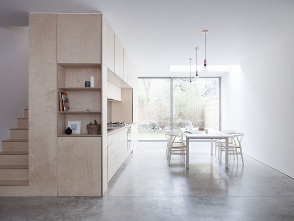
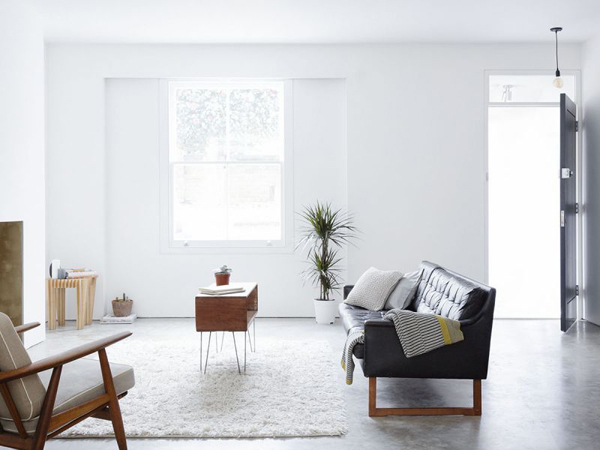
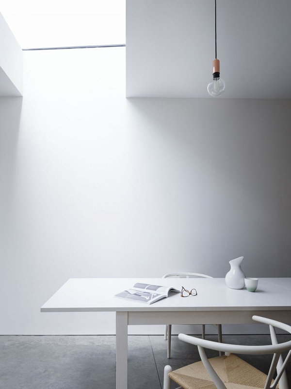
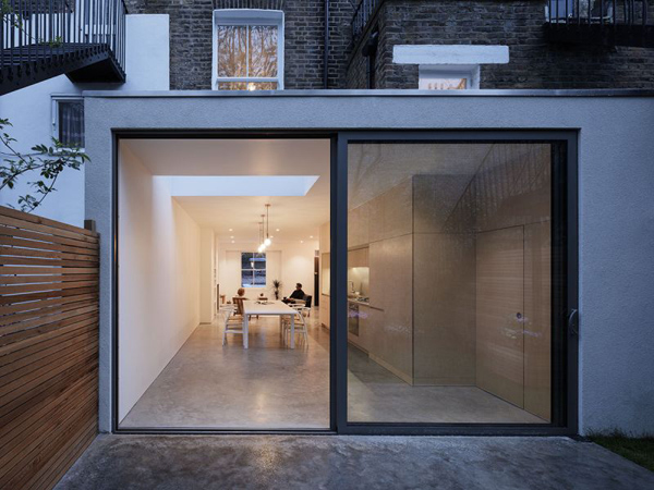
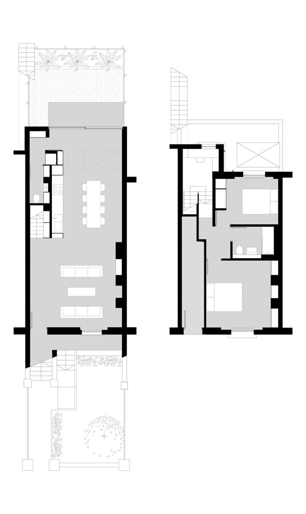
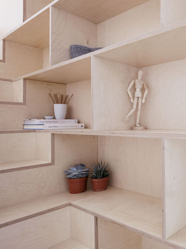
This fabulous conversion by Larissa Johnston Architects is in Islington, North London and I love how they have completely rearranged the house, taking out all internal walls and switching the bedrooms so now the living space including dining and kitchen are downstairs and connect to the rear garden via some full height glass sliding doors flooding the house with light. It’s a minimalist modern space where each nook and cranny has been put to good use which in turn maximises the floorspace on view making the house feel a lot bigger.

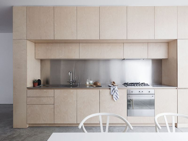
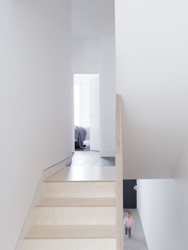
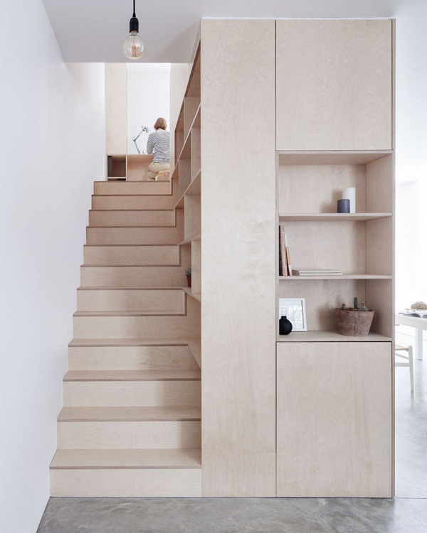
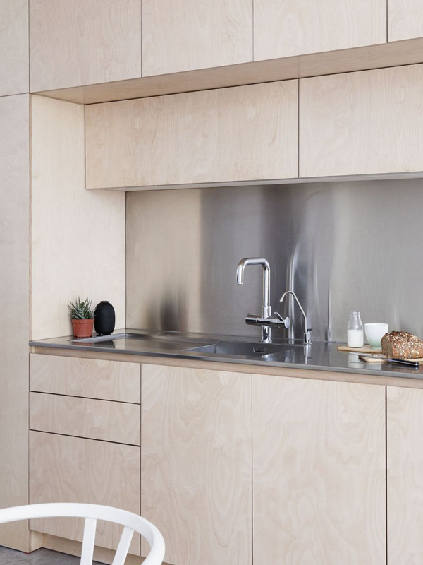
What really got me excited was the way they have managed to create a custom built unit that not only incorporates the stairs but also the kitchen and some clever storage areas. This plywood unit wraps up the stairs and gives the house an anchor connecting all the floors and making for an easy flow.

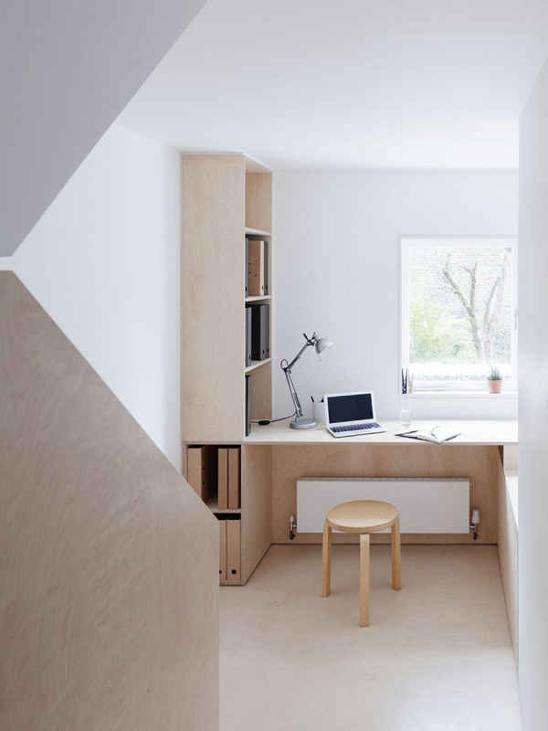
Larissa and her team have also made great use of the half landing making it a study area with more inbuilt shelving and a desk running along the window. I wish there were some shots of the downstairs WC and utility area as they are both concealed underneath the stairs and clad with plywood.

It may seem a bit geeky but I love seeing the bare bones of a house which is why I’m showing you the floorplan at the end of this post. I’ve got a feeling I’m not the only nerd on here.

Here’s to plywood!


islington conversion, larissa johnston, architects, plywood, connection, light, modern, simple, floorspace, floorplan, clean, storage, decor, interior, interior design, trend, style, minimalist

islington conversion, larissa johnston, architects, plywood, connection, light, modern, simple, floorspace, floorplan, clean, storage, decor, interior, interior design, trend, style, minimalist

islington conversion, larissa johnston, architects, plywood, connection, light, modern, simple, floorspace, floorplan, clean, storage, decor, interior, interior design, trend, style, minimalist

islington conversion, larissa johnston, architects, plywood, connection, light, modern, simple, floorspace, floorplan, clean, storage, decor, interior, interior design, trend, style, minimalist

islington conversion, larissa johnston, architects, plywood, connection, light, modern, simple, floorspace, floorplan, clean, storage, decor, interior, interior design, trend, style, minimalist

islington conversion, larissa johnston, architects, plywood, connection, light, modern, simple, floorspace, floorplan, clean, storage, decor, interior, interior design, trend, style, minimalist

islington conversion, larissa johnston, architects, plywood, connection, light, modern, simple, floorspace, floorplan, clean, storage, decor, interior, interior design, trend, style, minimalist

islington conversion, larissa johnston, architects, plywood, connection, light, modern, simple, floorspace, floorplan, clean, storage, decor, interior, interior design, trend, style, minimalist

islington conversion, larissa johnston, architects, plywood, connection, light, modern, simple, floorspace, floorplan, clean, storage, decor, interior, interior design, trend, style, minimalist

islington conversion, larissa johnston, architects, plywood, connection, light, modern, simple, floorspace, floorplan, clean, storage, decor, interior, interior design, trend, style, minimalist

islington conversion, larissa johnston, architects, plywood, connection, light, modern, simple, floorspace, floorplan, clean, storage, decor, interior, interior design, trend, style, minimalist

islington conversion, larissa johnston, architects, plywood, connection, light, modern, simple, floorspace, floorplan, clean, storage, decor, interior, interior design, trend, style, minimalist


MORE INFORMATION & PHOTOGRAPHY | Larissa Johnston Architects with thanks
 
Follow Stylejuicer with Bloglovin
FERM LIVING KIDS | SPRING SUMMER 2017

24 January 2017

ferm living kids, spring/summer collection, 2017, jumbo terrazzo print, wallpaper, decor, texture, popcorn bolster, dusty, muted colours, architects desk, scandi class, sophistication, bedroom, kids room, decor, denmark, danish, trend


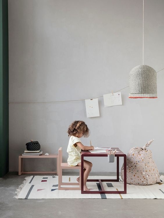
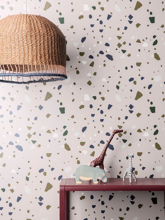
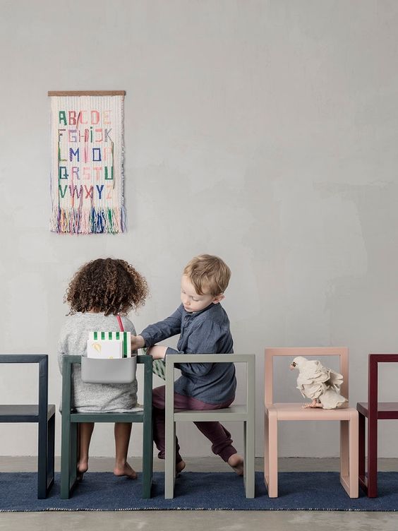
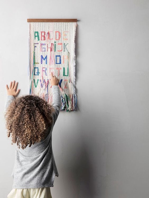
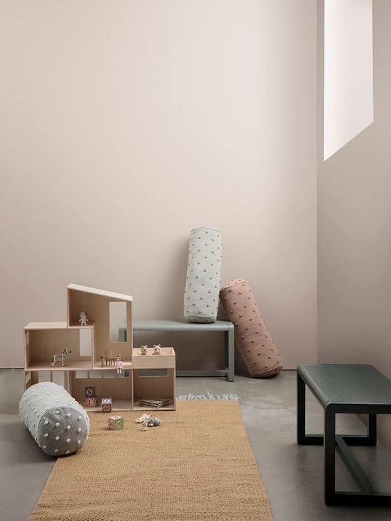
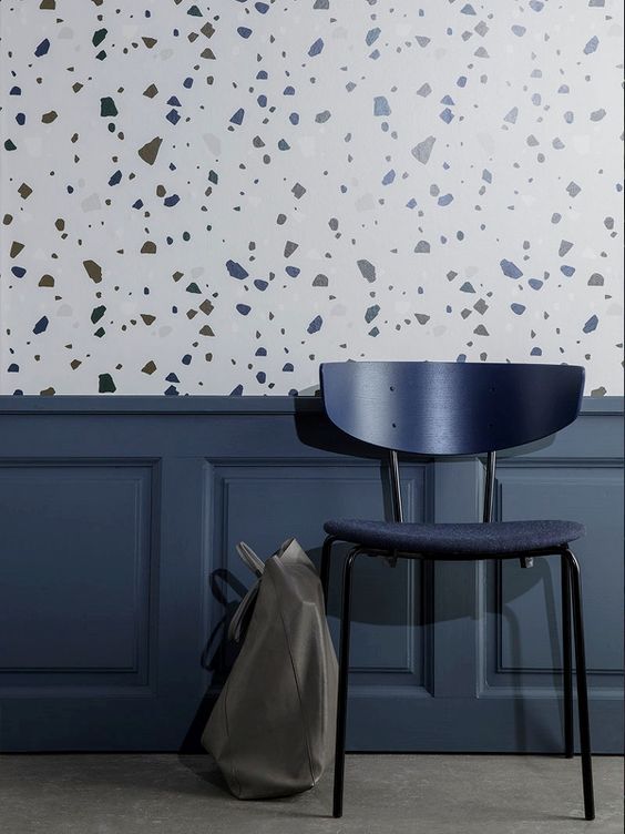
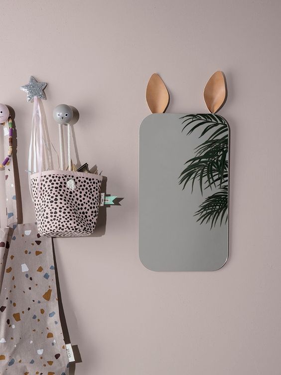
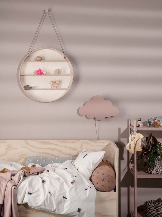
I’m totally smitten with Ferm Living Kids latest Spring/Summer collection for 2017 which includes an awesome jumbo terrazzo print on wallpaper, tote bag or knotted bean bag. The small architects desks and chairs are the perfect height and design for little artists and come in a range of tastefully dusty and muted colours that suit the trend-chasing, design-conscious parent (*coughs*) as well as their offspring.

The hand braided lampshade is a lovely texture to add to any bedroom and I love their whimsical details like the little leather bunny ears on the mirror or the tactile dots on the Popcorn bolsters. It all oozes Scandi class and sophistication and I’ve pinned just about everything onto my kids new bedroom moodboard.

Who cares what they want – we’re the ones who have to look at it, right!? #mymummyisadesigner

For more inspo flick through their look book on issuu here.


ferm living kids, spring/summer collection, 2017, jumbo terrazzo print, wallpaper, decor, texture, popcorn bolster, dusty, muted colours, architects desk, scandi class, sophistication, bedroom, kids room, decor, denmark, danish, trend

ferm living kids, spring/summer collection, 2017, jumbo terrazzo print, wallpaper, decor, texture, popcorn bolster, dusty, muted colours, architects desk, scandi class, sophistication, bedroom, kids room, decor, denmark, danish, trend

ferm living kids, spring/summer collection, 2017, jumbo terrazzo print, wallpaper, decor, texture, popcorn bolster, dusty, muted colours, architects desk, scandi class, sophistication, bedroom, kids room, decor, denmark, danish, trend

ferm living kids, spring/summer collection, 2017, jumbo terrazzo print, wallpaper, decor, texture, popcorn bolster, dusty, muted colours, architects desk, scandi class, sophistication, bedroom, kids room, decor, denmark, danish, trend

ferm living kids, spring/summer collection, 2017, jumbo terrazzo print, wallpaper, decor, texture, popcorn bolster, dusty, muted colours, architects desk, scandi class, sophistication, bedroom, kids room, decor, denmark, danish, trend

ferm living kids, spring/summer collection, 2017, jumbo terrazzo print, wallpaper, decor, texture, popcorn bolster, dusty, muted colours, architects desk, scandi class, sophistication, bedroom, kids room, decor, denmark, danish, trend

ferm living kids, spring/summer collection, 2017, jumbo terrazzo print, wallpaper, decor, texture, popcorn bolster, dusty, muted colours, architects desk, scandi class, sophistication, bedroom, kids room, decor, denmark, danish, trend


MORE INFORMATION & PHOTOGRAPHY | Ferm Living Kids
 
Follow Stylejuicer with Bloglovin
FINDING MY MOJO AND TRENDS FOR 2017

18 January 2017

mojo, interiors, interior, style, styling, trends for 2017, hexagonal tiles, dark greens, murky, bloggers, Miele Experience Centre, matt surfaces, antwerp, st vincents, houzz
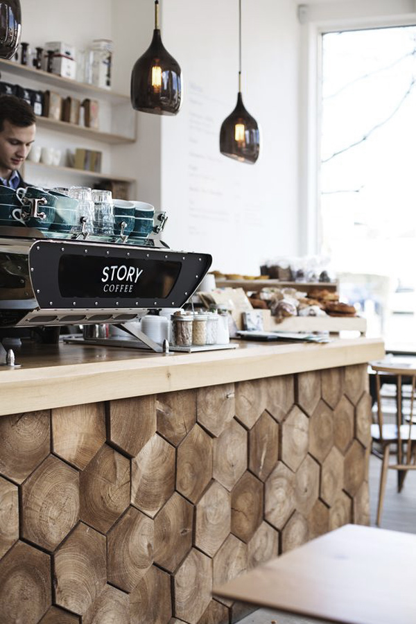
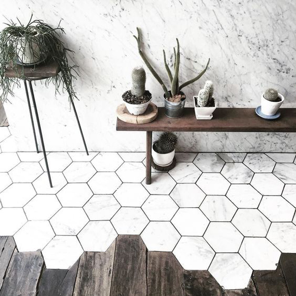
Beautiful Story Coffee on London’s St John’s Hill, Battersea. Loving the wooden hexagonal tiles.


It’s been a sloooow start to the year. We got back from the Canary Islands just before New Year’s to the most awful rainy, miserable, grey and cold winter weather you can imagine and were stuck indoors with various illnesses until the kids started school again.

2017 is going to be a big year for us as we will be looking to move out of London and find a home to renovate. The kids will inevitably switch schools and we will have to make new friends and find a new social circle. All of which has been a bit daunting and I’ve struggled to find my mojo in 2017 so far.

Naturally, I’m browsing Pinterest and various blogs for inspiration but somehow nothing sparks much interest with me. I wonder if we are coming to the end of a phase and waiting for the next big thing to happen?

In December I was lucky to be invited by Houzz to discuss emerging trends in interior design with a bunch of bloggers at the Miele Experience Centre. We were served a delicious 5 course meal by head chef Martyn Meid, founder of Ink and ambassador for Miele, and had a wonderful time exchanging views and discussing trends for 2017.


mojo, interiors, interior, style, styling, trends for 2017, hexagonal tiles, dark greens, murky, bloggers, Miele Experience Centre, matt surfaces, antwerp, st vincents, houzz

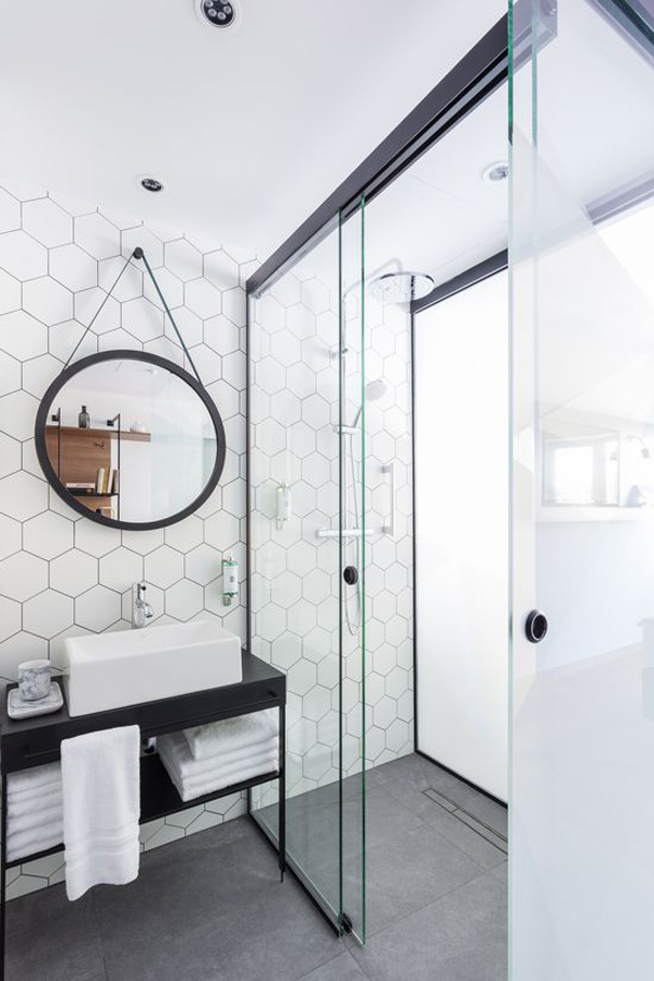
I’ve particularly noticed the increased use of hexagonal tiles in bathrooms, kitchens and flooring. Via Pinterest.

mojo, interiors, interior, style, styling, trends for 2017, hexagonal tiles, dark greens, murky, bloggers, Miele Experience Centre, matt surfaces, antwerp, st vincents, houzz

Colour and texture perfection via Wanderer Wanderer.

mojo, interiors, interior, style, styling, trends for 2017, hexagonal tiles, dark greens, murky, bloggers, Miele Experience Centre, matt surfaces, antwerp, st vincents, houzz
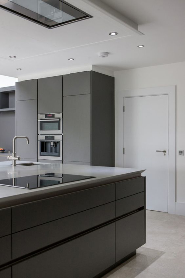
A movement towards matt surfaces is emerging after years of high gloss finishes. Via Pinterest.


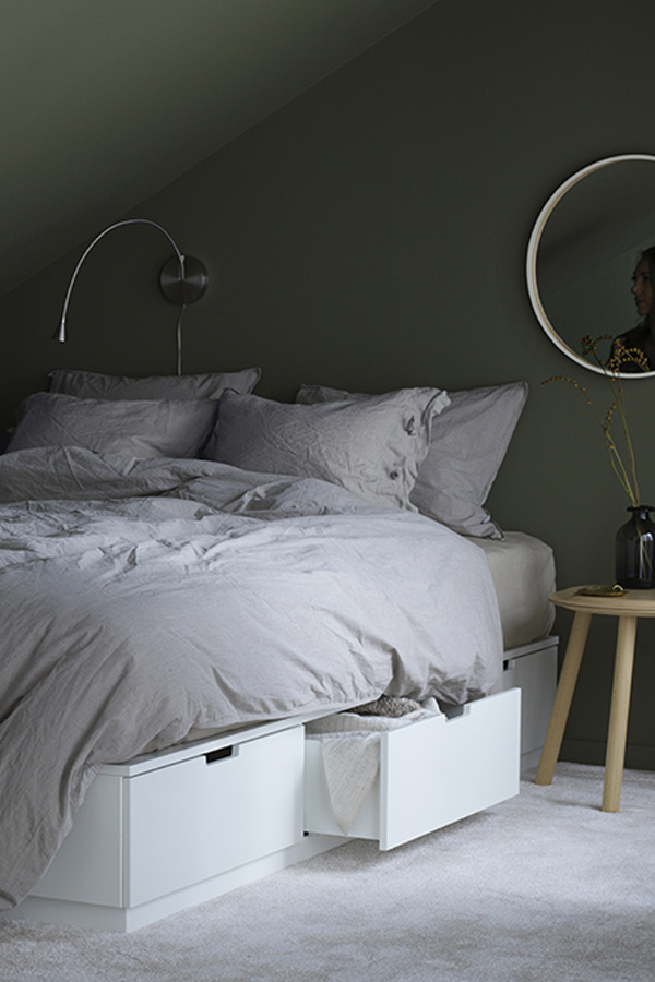
My Function+Form sidekick and mad plant lady (her words not mine) Tiff predicts “dark and murky greens” and so far I’ve spotted this trend not only in interiors but fashion and wall art as well.

 
mojo, interiors, interior, style, styling, trends for 2017, hexagonal tiles, dark greens, murky, bloggers, Miele Experience Centre, matt surfaces, antwerp, st vincents, houzz

One of IKEA‘s latest addition for 2017 shot against a dark green wall. LOVE!

mojo, interiors, interior, style, styling, trends for 2017, hexagonal tiles, dark greens, murky, bloggers, Miele Experience Centre, matt surfaces, antwerp, st vincents, houzz

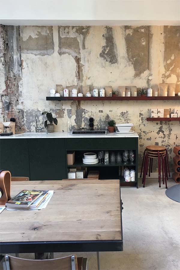
You may remember our trip to Antwerp a few month ago where we spotted these gorgeous dark green kitchen cabinets at trendy concept store St Vincent’s.

mojo, interiors, interior, style, styling, trends for 2017, hexagonal tiles, dark greens, murky, bloggers, Miele Experience Centre, matt surfaces, antwerp, st vincents, houzz

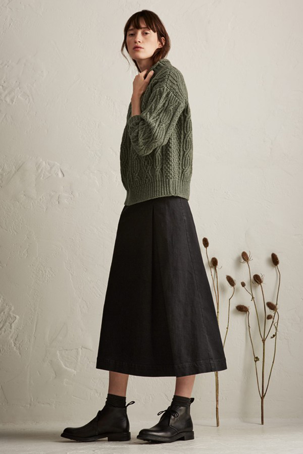
Pre Collection 2017 from Toast featuring “murky greens”.

mojo, interiors, interior, style, styling, trends for 2017, hexagonal tiles, dark greens, murky, bloggers, Miele Experience Centre, matt surfaces, antwerp, st vincents, houzz
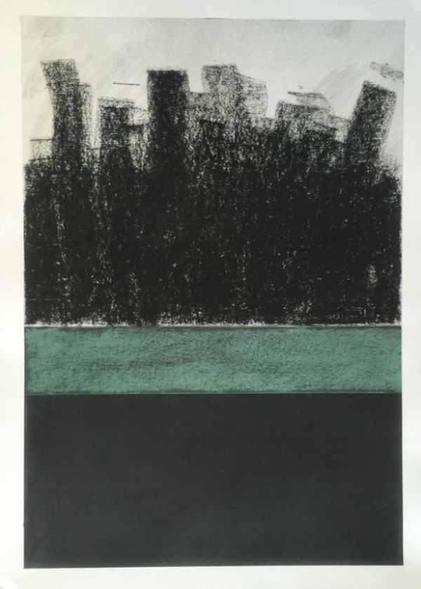
“Recent Works On Paper” by KENNETH JAWORSKI – exhibition at St Vincents, Antwerp


Find out what fellow bloggers Hannah, Lotte and Geraldine predict for 2017 over on Houzz.


Follow Stylejuicer with Bloglovin
ALL IS CALM

24 December 2016

christmas eve, christmas, canary islands, las palmas, santa, beach life, family holiday, all is calm, christmas wish, thank you


It’s Christmas Eve and since arriving in the Canary Islands a few days ago we’ve pretty much managed to let go of all that pre-Christmas stress and instead relaxed into bach life and running after the kids going with the flow.

I can’t wait to finally unpack the presents from our suitcase Santa’s sack (obvs) tomorrow and get rid of all this unnecessary packaging kids toys seem to come in these days. Annoyingly, it’s exactly said packaging that makes the present extra special for them so I was only able to pack the absolutely minimum with regards to clothing and shoes. Quite a good exercise actually in minimal living and no real hardship considering there’s a washing machine in the apartment.

Although this is a family holiday with the in-laws we are exploring the city as much as we can from coffee shops and tapas bars to small boutiques and quirky shops. I’m posting my finds over on Instagram if you’re curious.

Now, only leaves me to wish you a Happy Christmas and thank you all for reading and following along. I really do appreciate each and every comment, link back or thumbs up and am so chuffed that I might contribute in some small way to inspiring your daily life.

I hope All Is Calm, All Is Bright wherever you are.


PHOTOGRAPHY | Annie Kruse
 
Follow Stylejuicer with Bloglovin