Do you remember the Vipp shelter from last week? I’ve just discovered that some of my favourite lifestyle images on Pinterest all originate from this monochrome family townhouse in Copenhagen.
I found the place on Dwell and it turns out that the couple who live there with their four children both work for Vipp in a senior capacity. Hence the beautifully placed products around the house.
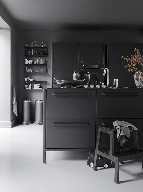
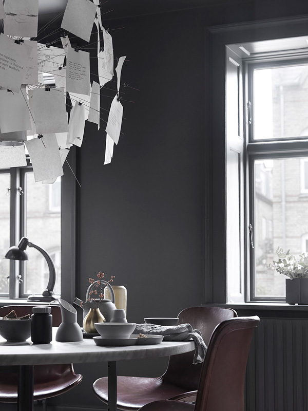
You know grey is my favourite colour but I’m not sure I’d be brave enough to paint my whole kitchen and dining area in this dark-ish shade. Let alone dark grey kitchen units. The couple say it is their most used room of the house and that it works particularly well for entertaining as the space feels cozy and cave like. A stark contrast to the rest of the house which feels light and airy.
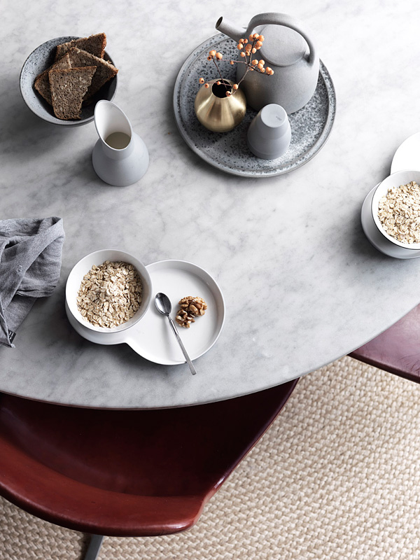
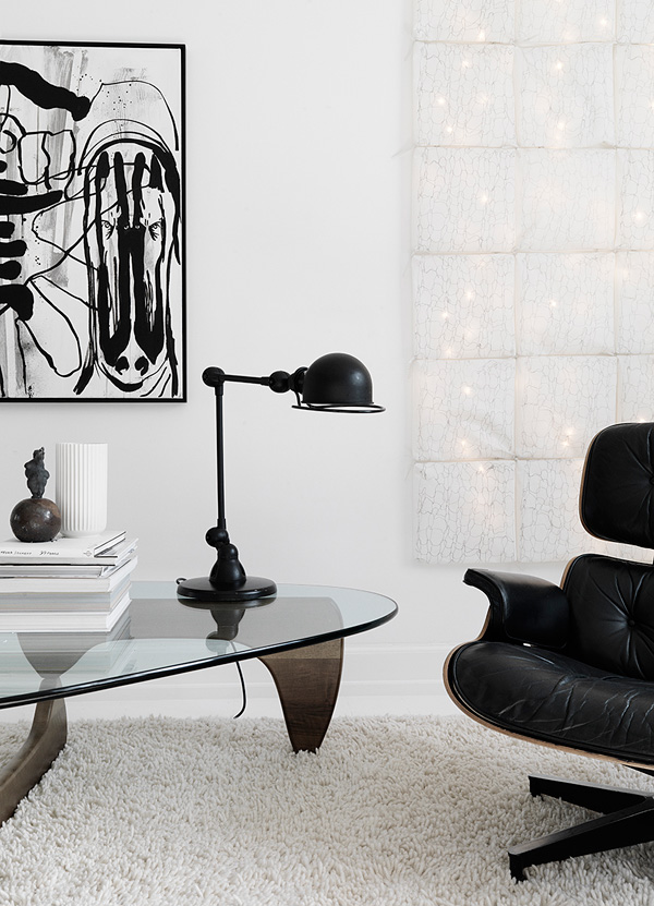
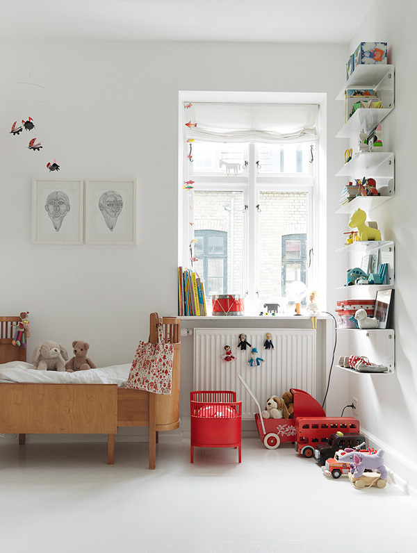
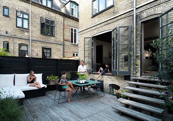
It’s a very monochrome and minimalist space where each piece of furniture is a (future) design classic supporting the Scandinavian tradition of ‘form follows function’ as well as the use of organic and quality materials.
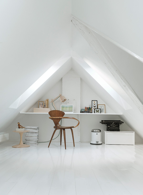
My favourite room of the house has to be the home office in the attic though. Oh, how I love that butterfly chair and the old black typewriter. What a gem!
MORE INFORMATION | Dwell
PHOTOGRAPHY | by Vipp with thanks
Follow Stylejuicer with Bloglovin

It’s a very beautiful minimal and monochrome space!!!
You find the best homes! This one is glorious.
The kitchen is hideous and obviously digitally manipulated to suck out the life and colour from it.
In years to come people will look back at this monochrome fad and laugh. It’s like Voldemort became majorly depressed, took on a career in interior design and convinced everyone that colour is the real evil.
Madness.
One of my favourites as well!