Category Archives: Home & Interior

PINK AESOP STORE IN LONDON BY SNØHETTA

15 February 2019

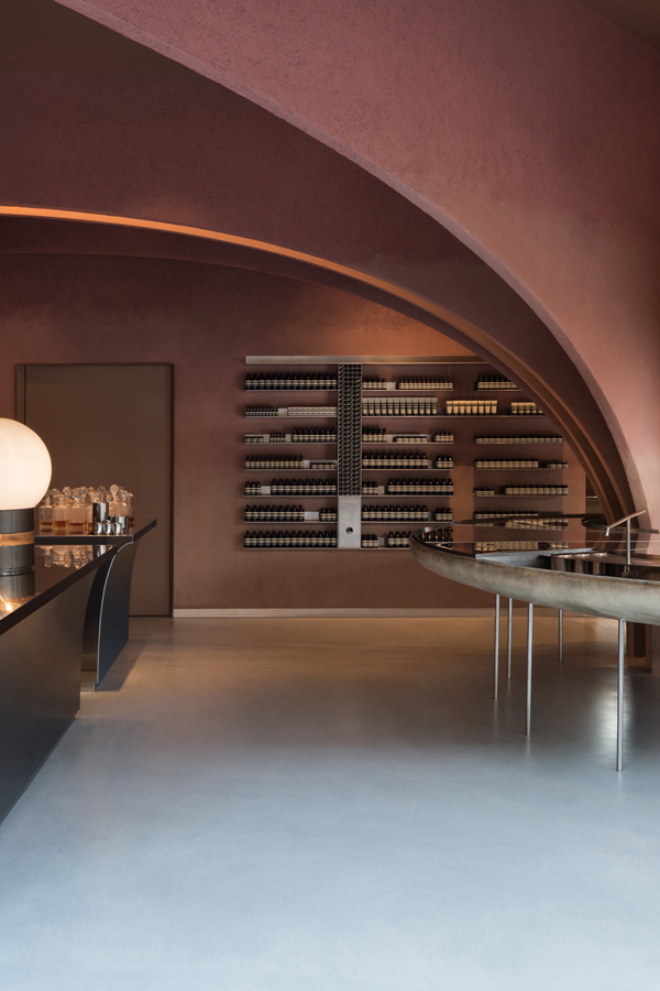
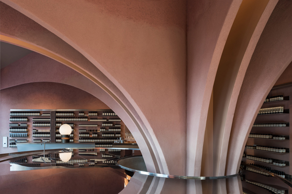
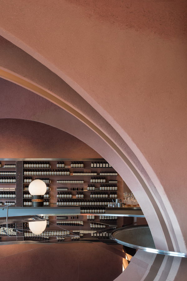
This new pink AESOP store in London features a large vaulted structure originating from a central round basin which gives the store a real sense of drama.

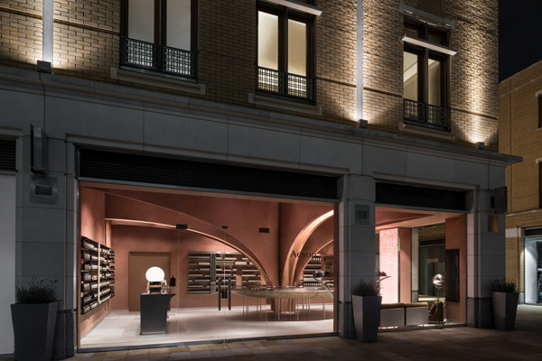
I’ve featured a few AESOP interiors on the blog before – remember the Melbourne one – but none of them had such a strong colour reference as the new pink AESOP store in London’s Duke of York Square, just off the famous Kings Road.

AESOP interiors around the world are show stoppers, always pushing the boundaries of what we traditionally think a skin care brand should look like. None look the same and they often commission famous leading interior designers to fit out their stores, like Ilse Crawford or in today’s feature Norwegian studio Snøhetta.

I love the strategic thinking behind the brand which has become synonymous with innovation and leadership in design. This can only be a good thing and from working with clients on a daily basis I know who much guts and bravery it takes to push such a brand strategy through. ‘It’s lonely at the top’ as they say but polarising your audience also ensures a loyal following from those who do ‘buy into’ your values.

I for one am totally addicted to their mandarin, rosemary and cedar hand wash and cream and I never tire of their exotic and complex Marrakesh scent. The functional, apothecary-style packaging and ‘off’ colours like brown, sludgy grey, moss green or burnt orange is an equally brave choice amongst the sea of white and vibrant colours used by competitors.
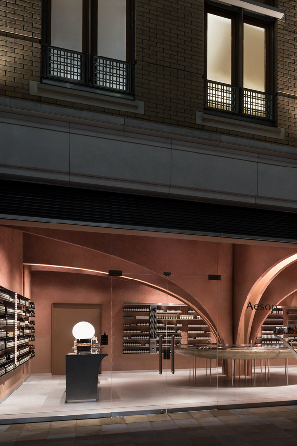
This new pink AESOP store in London features a large vaulted structure originating from a central round basin which gives the store a real sense of drama.

But I digress and giving you far too much marketing spiel. The main point is the new store’s dominate pink colour, a pigmented clay based plaster by Clayworks sourced from the South West of England. It totally nails sophistication and approachability, a subtle grown up greyish pink. Perfectly contrasted by the use of futuristic steel in the other customised store elements. 

The addition of a large vaulted structure originating from a central round basin gives the store a sense of drama and rather weirdly (but in a good way) it reminds me of the insides of a large fictional organ, especially in combination with the colour. Not too far fetched considering they sell skin care products.

This is seventh store designed by Snøhetta and if you live in Oslo, Düsseldorf, Berlin or Singapore you can check out their extraordinary store designs for yourself.
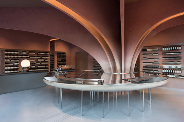
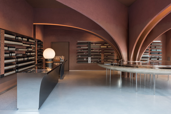
This new pink AESOP store in London features a large vaulted structure originating from a central round basin which gives the store a real sense of drama.
AESOP interiors around the world are show stoppers and this new pink AESOP store in london designed by Snøhetta is no exception.
 pink aesop store, london, duke of york square, interior design, architecture, marketing, brand, loyalty, Ilse Crawford, Snøhetta, style, sophisticated, futuristic, steel, vaulted structure, stylejuicer, trend, blog

MORE INFORMATION & PHOTOGRAPHY | Snøhetta

––––––––––––––––––––––––––––––––––––––––––––––––––––––––––––––––––––––––

Follow Stylejuicer with Bloglovin

MONOCHROME CAFE IN MOSCOW BY ASKETIK

8 February 2019

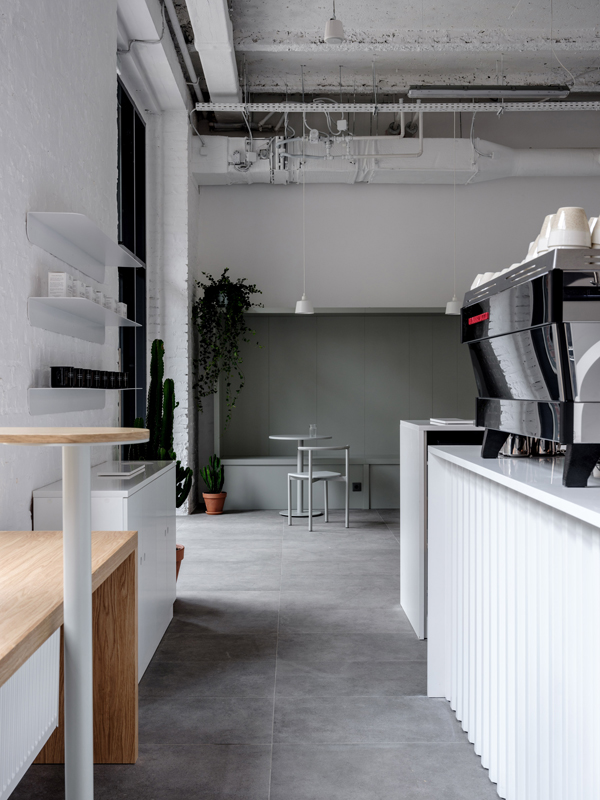
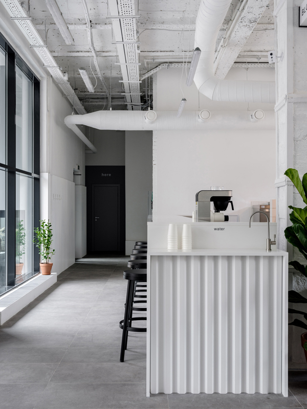
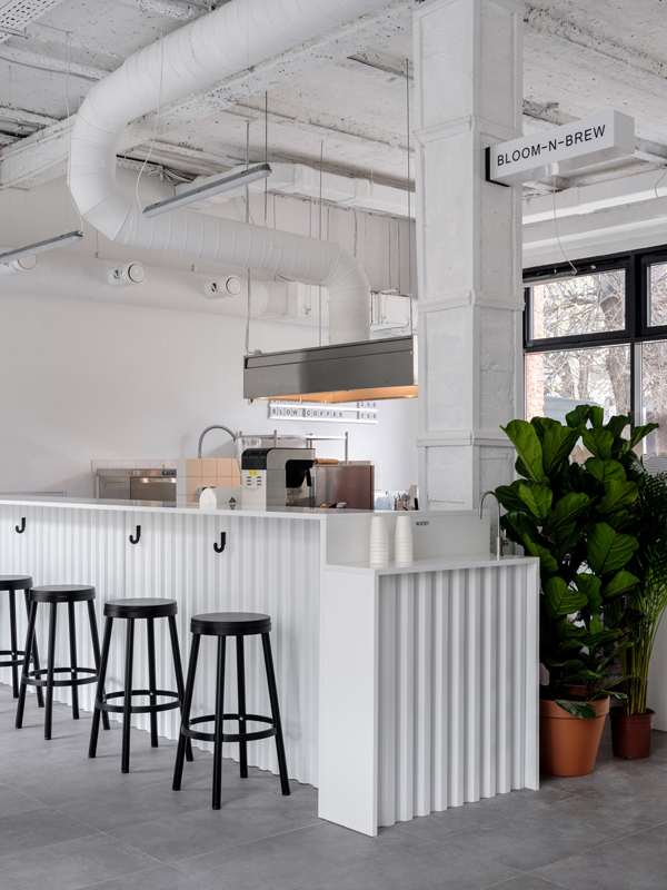
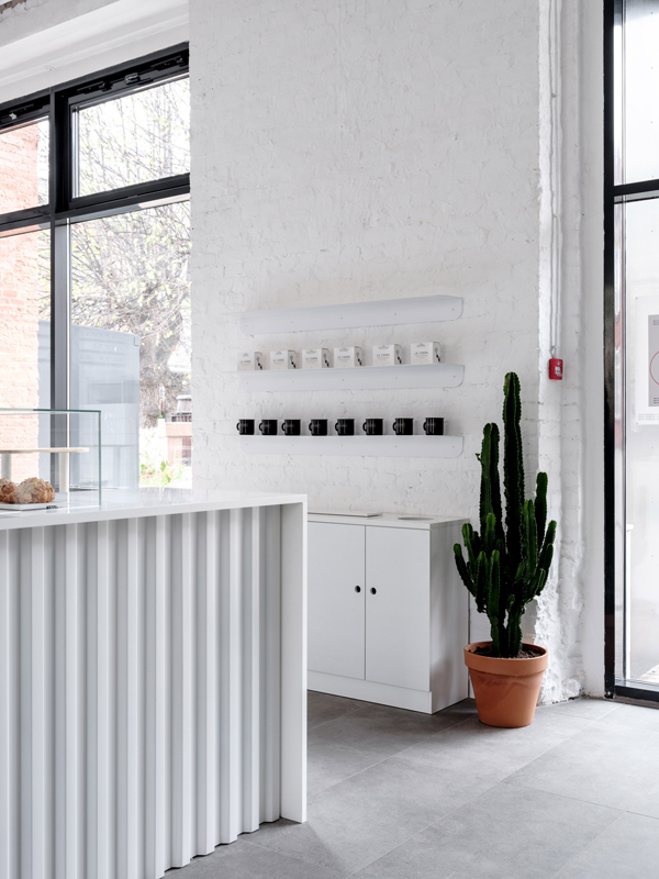
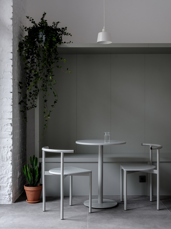
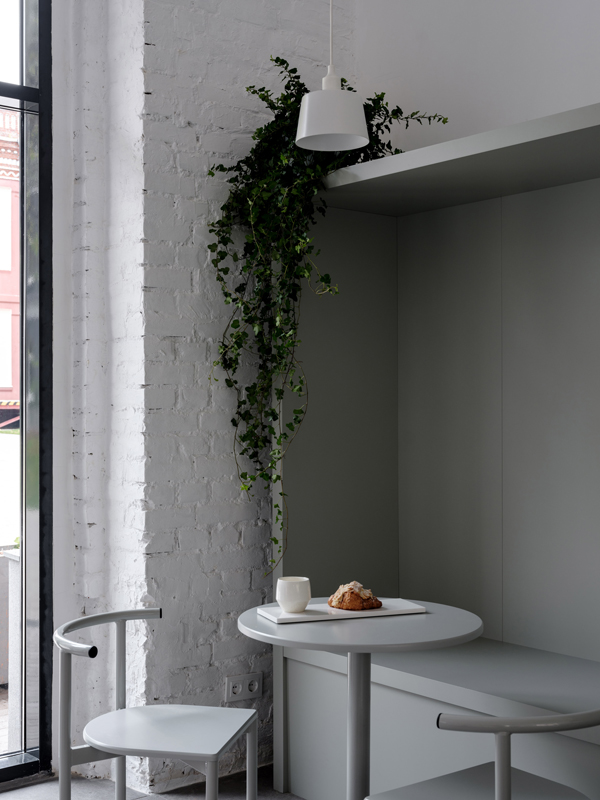
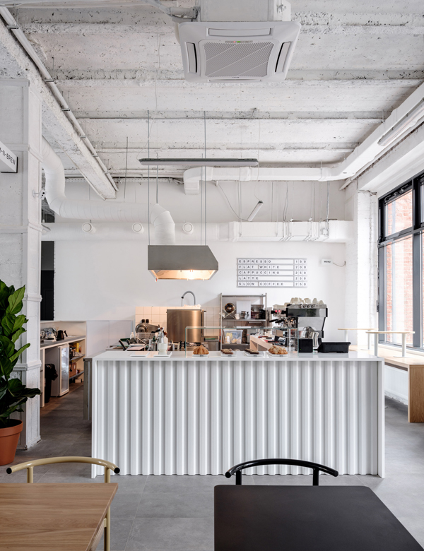
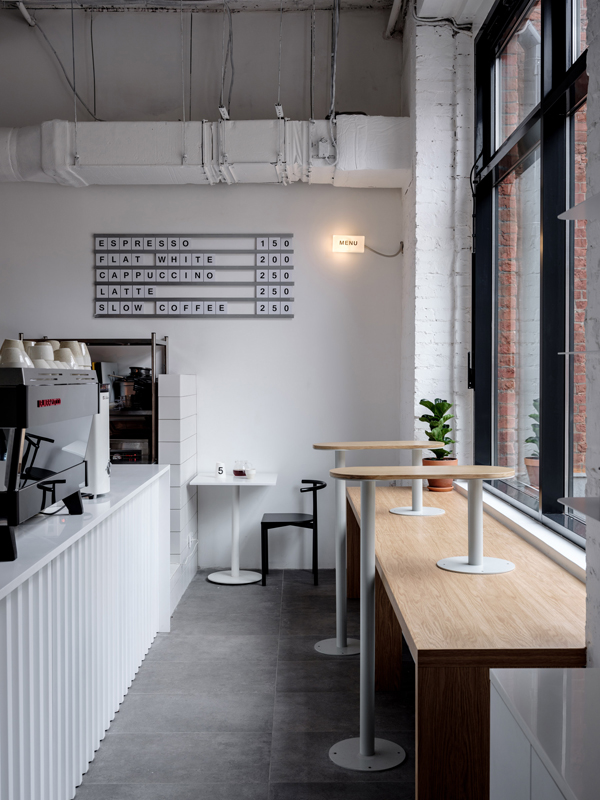
This industrial former silk factory in Moscow has been transformed by studio Asketik into a monochrome cafe with beautiful proportions.
monochrome, cafe, moscow, asketik, stylejuicer, blog, trend, industrial space, white wash, bloom-n-brew, hip, cultural differences, connected, melbourne, stockholm

You know how much I love an industrial space and this monochrome cafe in Moscow designed by studio Asketik immediately caught my eye during one of my late night surfs.

The white wash formula never fails to have an impact especially in such an impressive space which used to be a silk factory in the Factoria Park district of Moscow. Beautiful designer furniture by Delo Design of St Petersburg and large plants in terracotta pots soften the sharp edges of the vast space which is flooded with light.

Asketik was also tasked to come up with the cafe’s brand identity which derives from the gorgeous smell a freshly brewed cup of coffee emits: Bloom-n-Brew. The simple font supports the contemporary industrial look and feel of the space and sits discreetly on cups and packaging.

My final thought is a controversial one: This place could be in any of the world’s hip coffee-loving cities, from Australia to America, Africa, Asia or Europe. I’m not too sure how I feel about the fact that there’s no distinct cultural reference apart from the currency. I actually love cultural differences and want to consume food and drink local to the country I’m visiting. How do you feel about the fact that places start to look the same throughout the world? Does it bother you or do you find it comforting? Its definitely a question that will be coming up more and more in the future as we continue to become more connected.

If you want to see more hip cafes check out this one in Melbourne or this gorgeous restaurant / bar / cafe in Stockholm, still one of my favs.

This industrial former silk factory in Moscow has been transformed by studio Asketik into a monochrome cafe with beautiful proportions.
monochrome, cafe, moscow, asketik, stylejuicer, blog, trend, industrial space, white wash, bloom-n-brew, hip, cultural differences, connected, melbourne, stockholm
This industrial former silk factory in Moscow has been transformed by studio Asketik into a monochrome cafe with beautiful proportions.
monochrome, cafe, moscow, asketik, stylejuicer, blog, trend, industrial space, white wash, bloom-n-brew, hip, cultural differences, connected, melbourne, stockholm
This industrial former silk factory in Moscow has been transformed by studio Asketik into a monochrome cafe with beautiful proportions.
monochrome, cafe, moscow, asketik, stylejuicer, blog, trend, industrial space, white wash, bloom-n-brew, hip, cultural differences, connected, melbourne, stockholm
This industrial former silk factory in Moscow has been transformed by studio Asketik into a monochrome cafe with beautiful proportions.
monochrome, cafe, moscow, asketik, stylejuicer, blog, trend, industrial space, white wash, bloom-n-brew, hip, cultural differences, connected, melbourne, stockholm
This industrial former silk factory in Moscow has been transformed by studio Asketik into a monochrome cafe with beautiful proportions.
monochrome, cafe, moscow, asketik, stylejuicer, blog, trend, industrial space, white wash, bloom-n-brew, hip, cultural differences, connected, melbourne, stockholm
This industrial former silk factory in Moscow has been transformed by studio Asketik into a monochrome cafe with beautiful proportions.
monochrome, cafe, moscow, asketik, stylejuicer, blog, trend, industrial space, white wash, bloom-n-brew, hip, cultural differences, connected, melbourne, stockholm
This industrial former silk factory in Moscow has been transformed by studio Asketik into a monochrome cafe with beautiful proportions.
monochrome, cafe, moscow, asketik, stylejuicer, blog, trend, industrial space, white wash, bloom-n-brew, hip, cultural differences, connected, melbourne, stockholm

MORE INFORMATION | Asketik

PHOTO | Mikhail Loskutov with thanks

––––––––––––––––––––––––––––––––––––––––––––––––––––––––––––––––––––––––

Follow Stylejuicer with Bloglovin
STYLISH WORKSPACE ALMA | STOCKHOLM

25 January 2019

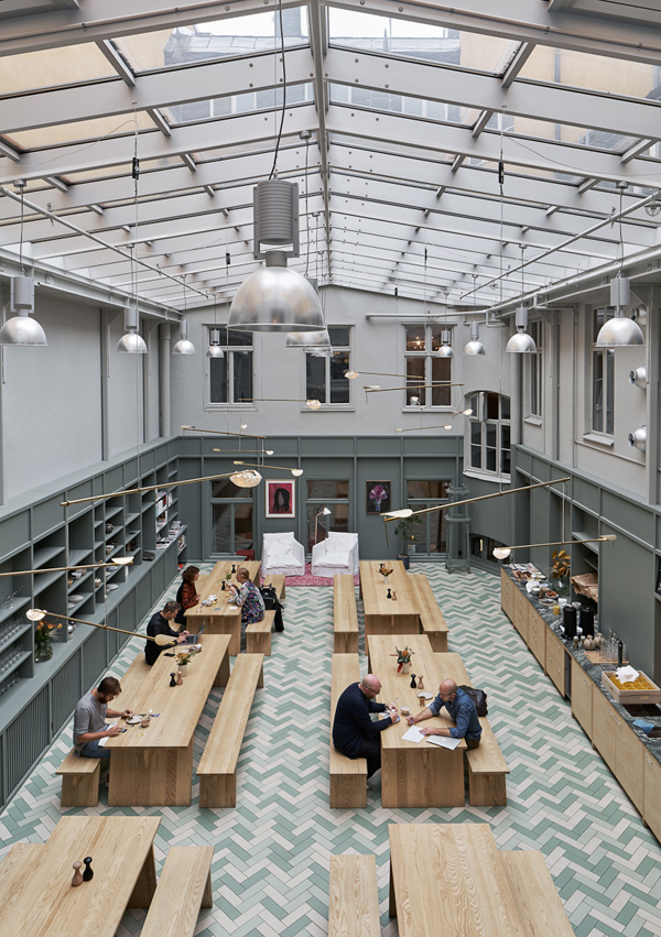
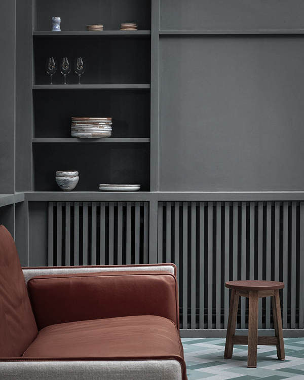
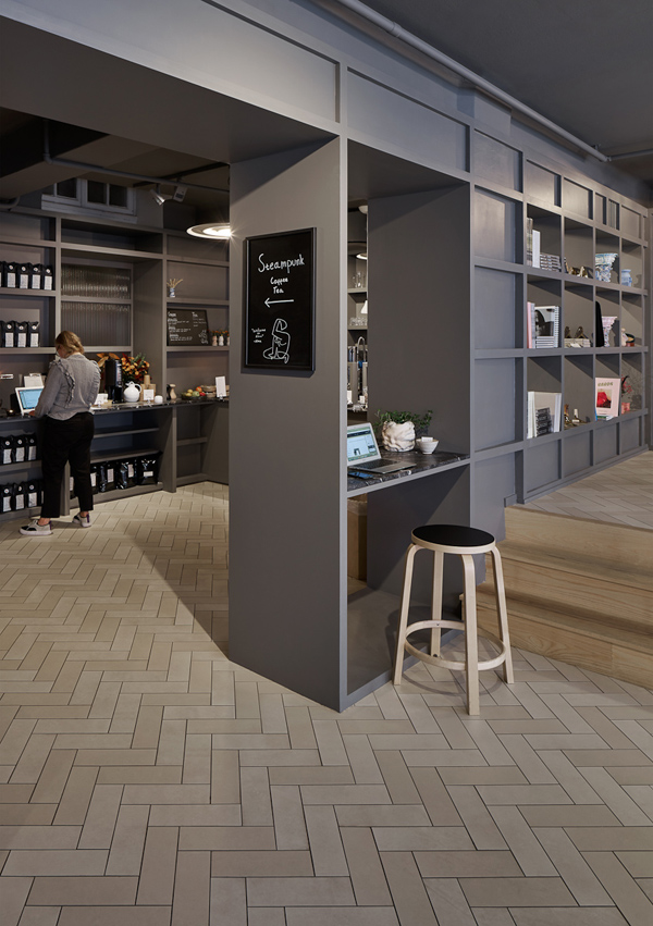
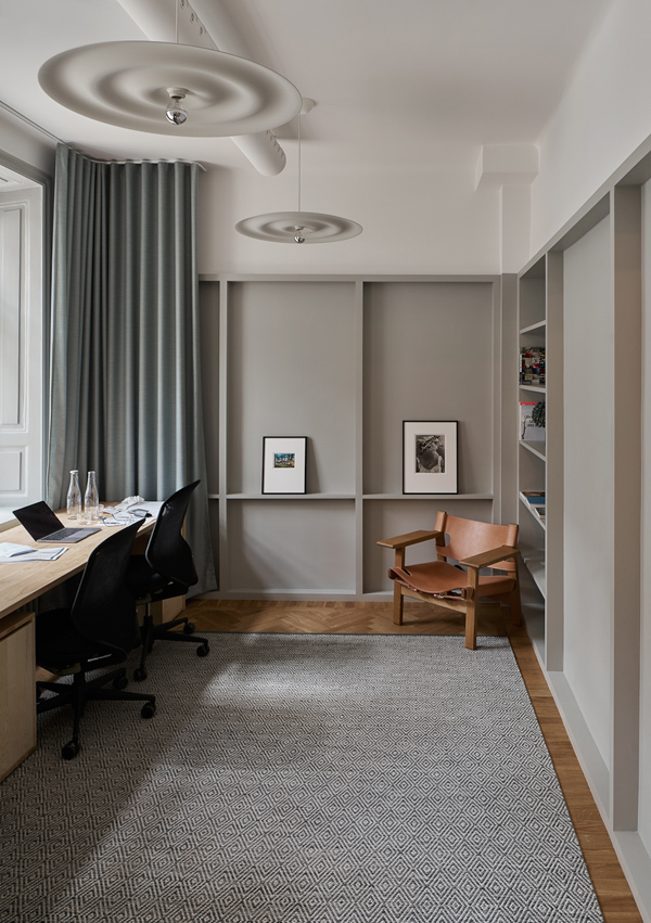
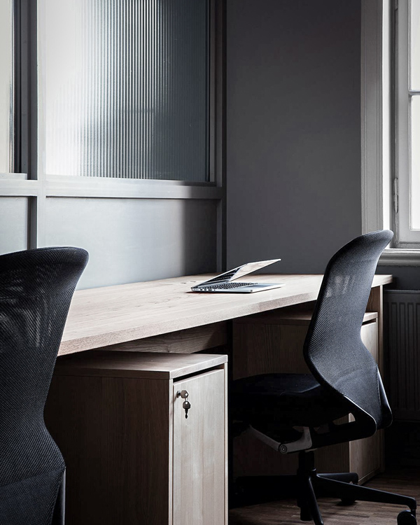
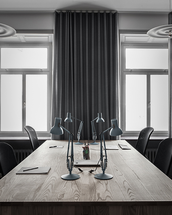
Alma is currently Stockholm’s hippest collaborative workspace, offering a stylish nurturing atmosphere as well as a mindful balance of work and play.

Who wouldn’t want to go to work in this stylish collaborative workspace in Stockholm?! Aptly called Alma this members club nurtures entrepreneurs and small companies mostly from the creative sector with its all-round offering of different types of communal and workspaces, a restaurant and bar as well as cultural events like art exhibitions, music gigs and lectures. 

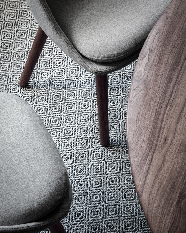
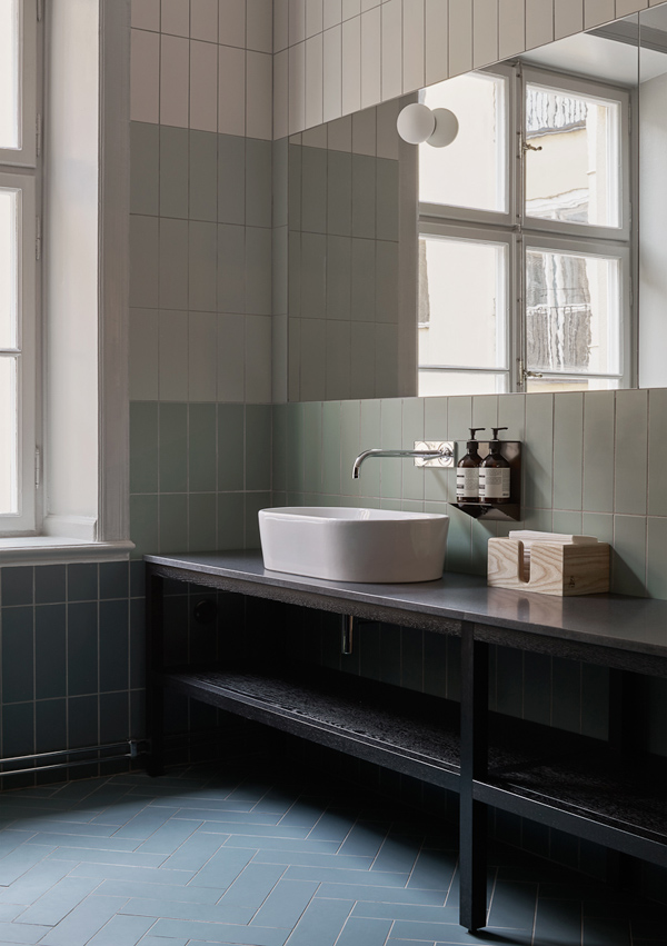
Architects Tham & Videgård have helped redevelop the large building by creating a mindful balance of work and social spaces. The interior design echoes the natural beauty of Sweden’s landscape and demonstrates the calm minimalism Scandinavia has become known for. There is a wonderful variety of luxurious textures and materials on show all kept in a muted colour palette with a sage green theme running through.

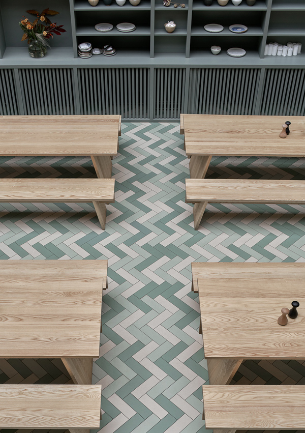
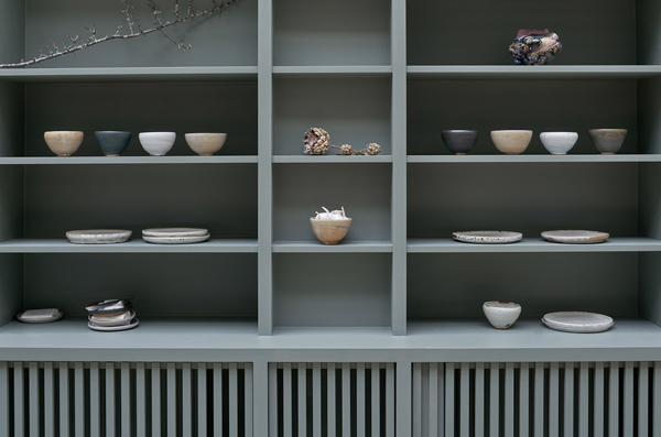
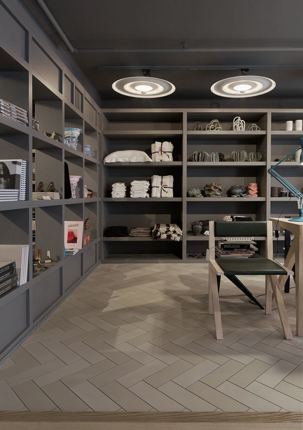
I love the enormous shelving unit running alongside one wall, painted in that distinct grey green which compliments the objects on show. The beautiful tri-colour chevron floor tiles are a real showstopper and add pattern to the serene space. 

The furniture is mostly crafted from light-coloured woods by PP Møbler, De La Espada and Austere with design by the likes of Ilse Crawford, Neri & Hu, Matthew Hilton and Hans Wegner. 

And the best thing is that everything you see from the ceramics by Rikard Palmquist and Samir Dzabirov to the award wining lights by Wästberg can be purchased via their in-house shop making this a concept store as well as Stockholms hippest members club. Now, where do I sign up!?

Alma is currently Stockholm’s hippest collaborative workspace, offering a stylish nurturing atmosphere as well as a mindful balance of work and play.

MORE INFORMATION | Alma, Stockholm

PHOTOGRAPHY | Åke E:son Lindman with thanks

DREAM HOME | IRISH COTTAGE EXTENSION

17 January 2019

dream home, interior design, architecture, stone clad, irish cottage extension, contemporary, modern, open plan, living dining area, historic contrast, flagstones, picture window, cantilevered, modern fireplace, stylejuicer, trends, design, interior design


Happy New Year peeps! Todays post has been a long time coming. I thought I may have lost my mojo altogether as everywhere I looked there was more of the same stuff. Maybe it’s the Brexit blues overshadowing any visual delight for me or maybe just the regular January blues. Who knows!?

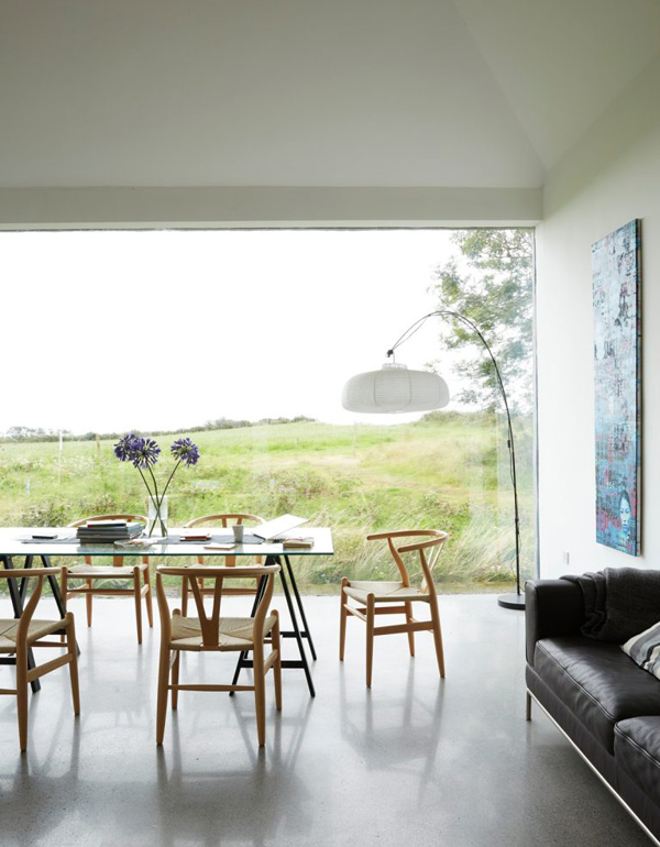
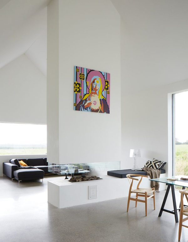
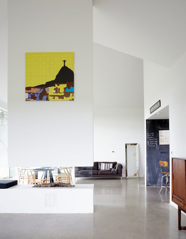
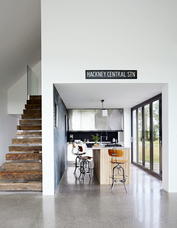
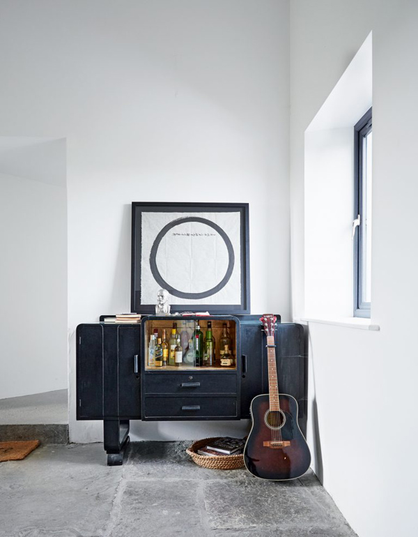
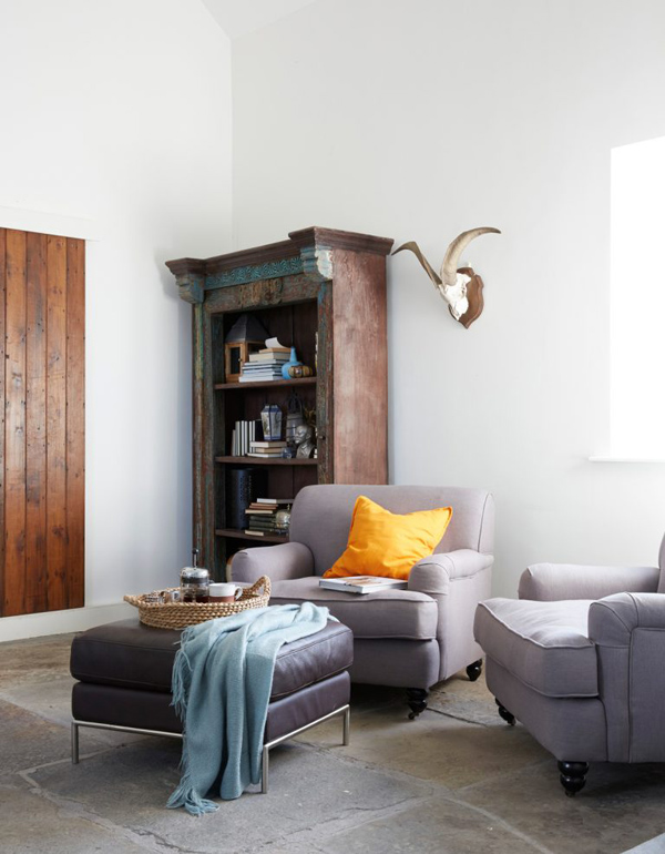
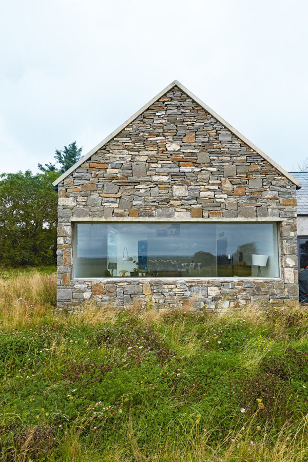
Point is I’m back and this one is a beauty! I spotted this Irish cottage extension and my mojo kicked right back in. I love how they’ve treated the exterior in the traditional stone clad style but totally rearranged the interior to suit modern living. The contemporary open fireplace is probably my favourite feature though I’m also fascinated by the large picture window giving a perfect view of adjacent meadows and resident cows.

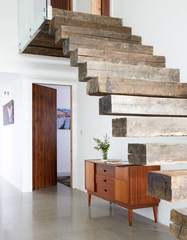
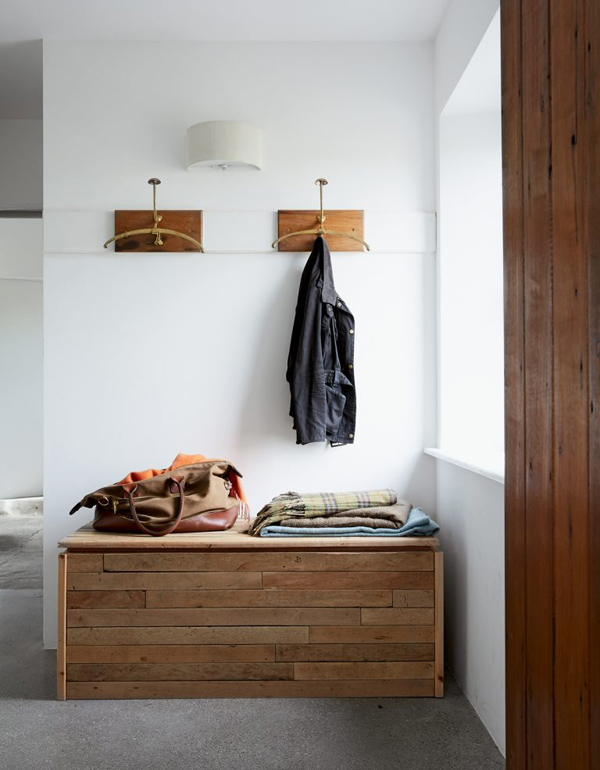
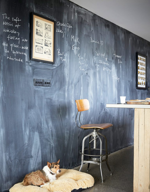
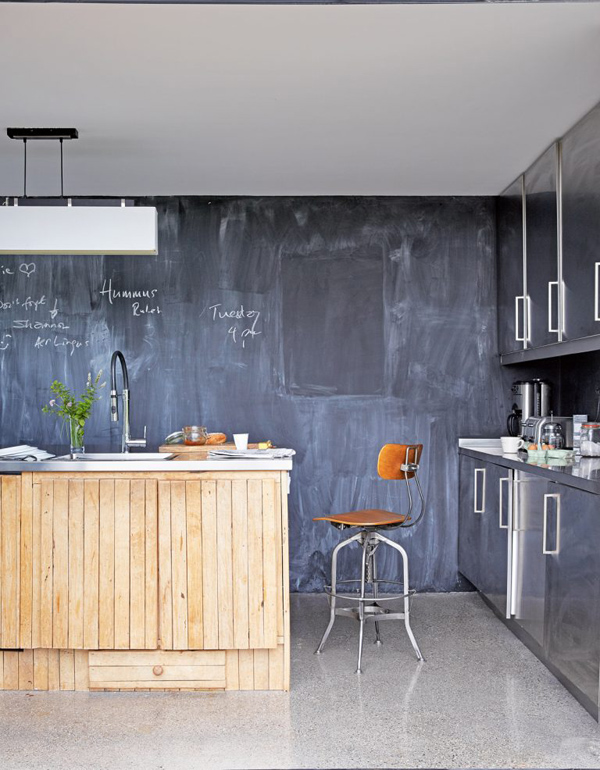
I can’t even get my head around the fact that the railway sleeper steps are cantilevered and anchored into a steel frame hidden in the wall – simply blows my mind but that’s what clever architecture does I guess. The carefully curated mix of old and contemporary furniture and local finds can best be seen in the kitchen where the island unit is clad with recycled wood from the local church. The flagstones in the original part of the cottage are another stunner and a lovely historic contrast to the polished concrete flooring in the extension. The double height above the living and dining areas add grandeur to these social areas and let you admire the view for as long as you like.

A stunning piece of architecture and interior design alike which has reinforced my desire to visit Ireland. And if love this place then check out this villa and this Berlin loft!


dream home, interior design, architecture, stone clad, irish cottage extension, contemporary, modern, open plan, living dining area, historic contrast, flagstones, picture window, cantilevered, modern fireplace, stylejuicer, trends, design, interior design

dream home, interior design, architecture, stone clad, irish cottage extension, contemporary, modern, open plan, living dining area, historic contrast, flagstones, picture window, cantilevered, modern fireplace, stylejuicer, trends, design, interior design

dream home, interior design, architecture, stone clad, irish cottage extension, contemporary, modern, open plan, living dining area, historic contrast, flagstones, picture window, cantilevered, modern fireplace, stylejuicer, trends, design, interior design

dream home, interior design, architecture, stone clad, irish cottage extension, contemporary, modern, open plan, living dining area, historic contrast, flagstones, picture window, cantilevered, modern fireplace, stylejuicer, trends, design, interior design

dream home, interior design, architecture, stone clad, irish cottage extension, contemporary, modern, open plan, living dining area, historic contrast, flagstones, picture window, cantilevered, modern fireplace, stylejuicer, trends, design, interior design

dream home, interior design, architecture, stone clad, irish cottage extension, contemporary, modern, open plan, living dining area, historic contrast, flagstones, picture window, cantilevered, modern fireplace, stylejuicer, trends, design, interior design

dream home, interior design, architecture, stone clad, irish cottage extension, contemporary, modern, open plan, living dining area, historic contrast, flagstones, picture window, cantilevered, modern fireplace, stylejuicer, trends, design, interior design

dream home, interior design, architecture, stone clad, irish cottage extension, contemporary, modern, open plan, living dining area, historic contrast, flagstones, picture window, cantilevered, modern fireplace, stylejuicer, trends, design, interior design

dream home, interior design, architecture, stone clad, irish cottage extension, contemporary, modern, open plan, living dining area, historic contrast, flagstones, picture window, cantilevered, modern fireplace, stylejuicer, trends, design, interior design

dream home, interior design, architecture, stone clad, irish cottage extension, contemporary, modern, open plan, living dining area, historic contrast, flagstones, picture window, cantilevered, modern fireplace, stylejuicer, trends, design, interior design


ARCHITECTS | Jean Claude Girard
PHOTOGRAPHY | Paul Massey
 
Follow Stylejuicer with Bloglovin
REFERENCING BRICK COLOUR FOR MELBOURNE CAFE

30 October 2018

interior design, interiors, style, styling, trend, stylejuicer, thonet, heritage, iconic design, icon, furniture design, bentwood chair, brick colour, light timber, fine joinery, brick walls, cafe, bentwood, fitzroy, melbourne


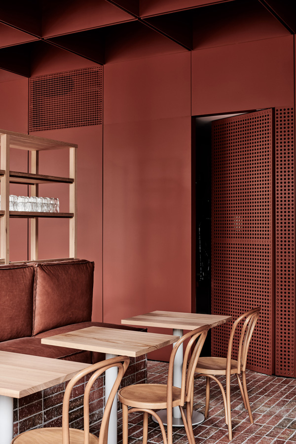
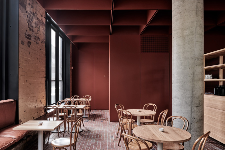
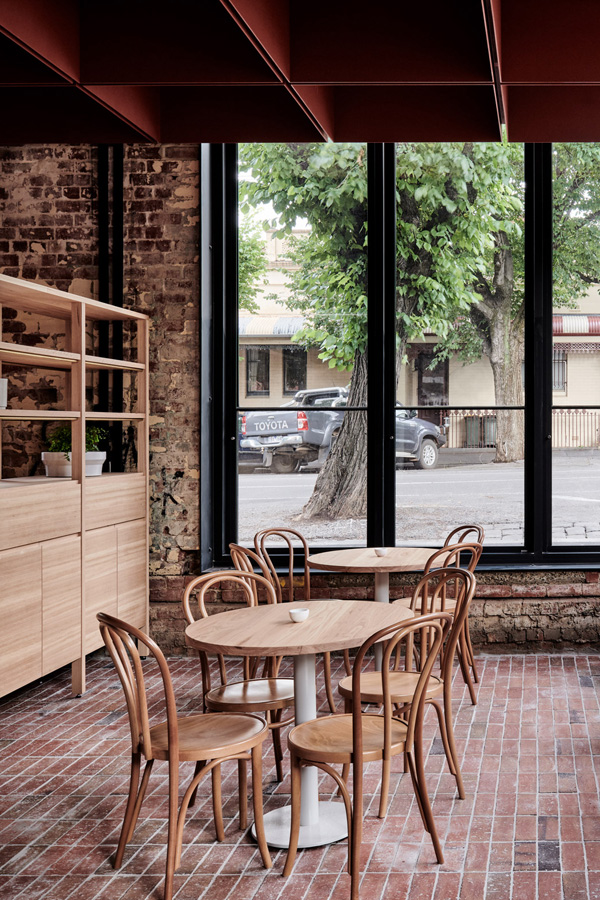
I’m currently swooning over this brick colour for Melbourne cafe Bentwood Fitzroy set in the old Thonet showroom. In case this doesn’t mean anything to you, German heritage furniture brand Thonet were the designers of what became known as the ‘bentwood chair’, a design classic and icon that has been imitated all over the world, and now referenced in the cafe’s name.

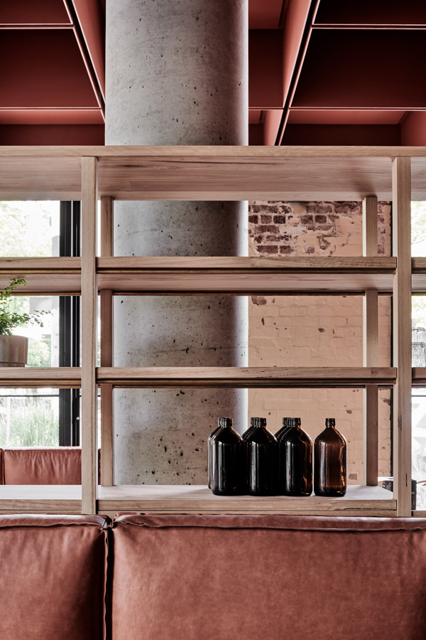
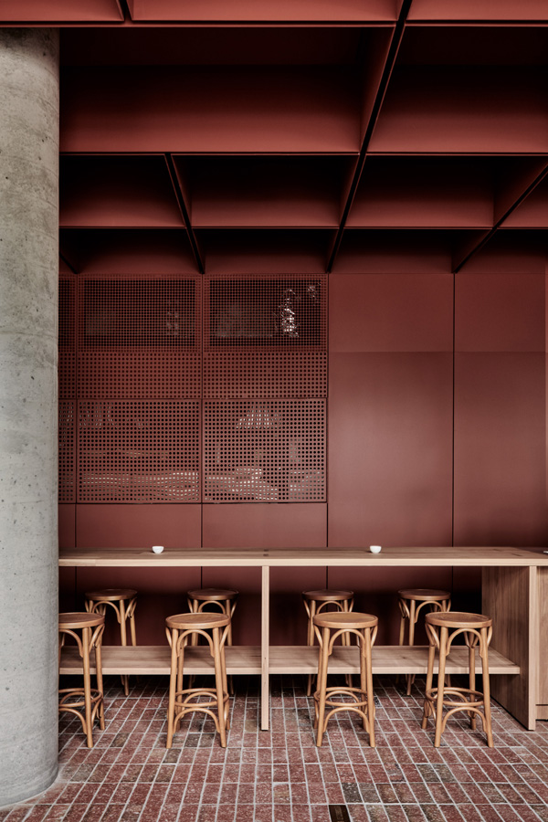
Ritz and Ghougassian who designed the interior of the cafe paid homage to the Thonet company’s former showroom by including their iconic bentwood chairs as seating and I love how the fine joinery and light timber contrasts with the roughly painted brick walls and massive concrete pillars. Though my favourite has to be the russet red brick colour used throughout on solid and perforated metal sheeting. Interestingly it’s also used on the deep pocketed ceiling which I imagine helps with the acoustics and creates interesting shapes of light and shadow throughout the day.

Owner and local coffee connoisseur Julien Moussi, gave Ritz and Ghougassian a wonderful brief asking them to create “a unique space that pushed what a cafe should look and feel like”. In my opinion they’ve delivered exactly that and if you live in the Fitzroy neighbourhood I urge you to pop in and report back to me – I know this would definitely be one of my favourite places to hang out.

You may also fall in love with another Ritz and Ghougassian project, a courtyard extension I featured a few weeks ago here. Get ready to swoon – again!


interior design, interiors, style, styling, trend, stylejuicer, thonet, heritage, iconic design, icon, furniture design, bentwood chair, brick colour, light timber, fine joinery, brick walls, cafe, bentwood, fitzroy, melbourne

interior design, interiors, style, styling, trend, stylejuicer, thonet, heritage, iconic design, icon, furniture design, bentwood chair, light timber, fine joinery, brick walls, cafe, bentwood, fitzroy, melbourne

interior design, interiors, style, styling, trend, stylejuicer, thonet, heritage, iconic design, icon, furniture design, bentwood chair, brick colour, brick colour, light timber, fine joinery, brick walls, cafe, bentwood, fitzroy, melbourne

interior design, interiors, style, styling, trend, stylejuicer, thonet, heritage, iconic design, icon, furniture design, bentwood chair, brick colour, light timber, fine joinery, brick walls, cafe, bentwood, fitzroy, melbourne


MORE INFORMATION | Ritz & Ghougassian Studio
PHOTOGRAPHY | Tom Blachford with thanks
 
Follow Stylejuicer with Bloglovin