Category Archives: Home & Interior

Warm and sophisticated family apartment in Stockholm

22 June 2020

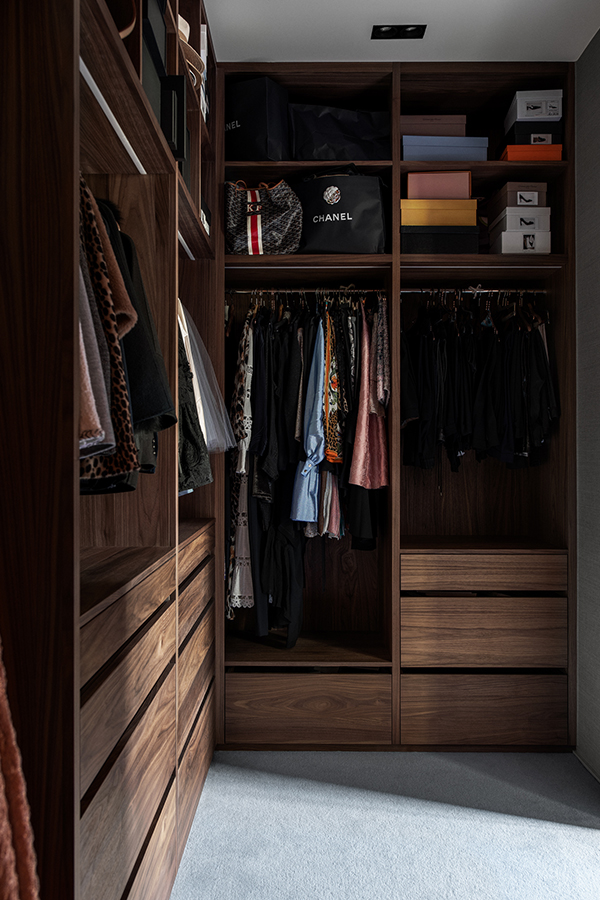
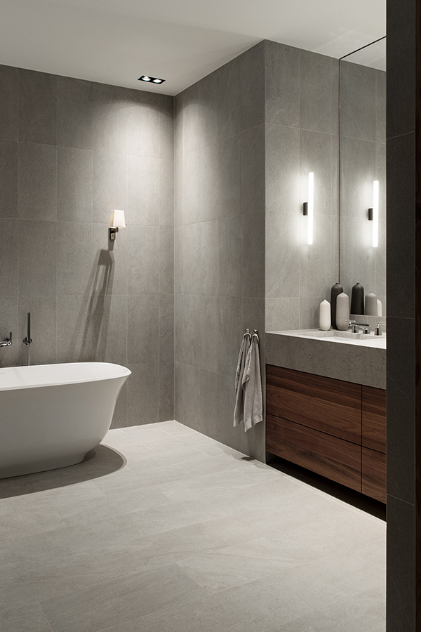
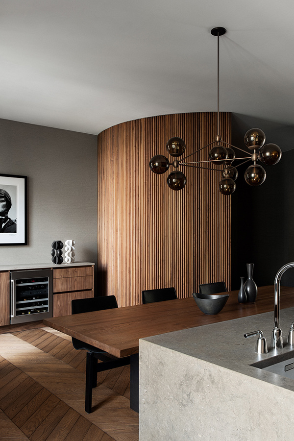
This warm and sophisticated 1920s apartment was remodeled by interior and furniture designer Louise Liljecrantz and her sense of understated luxury.

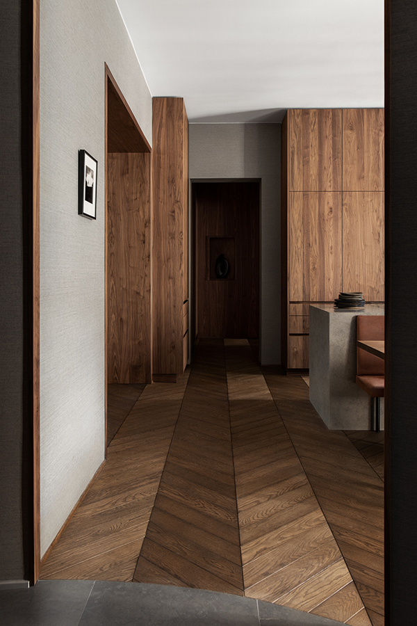
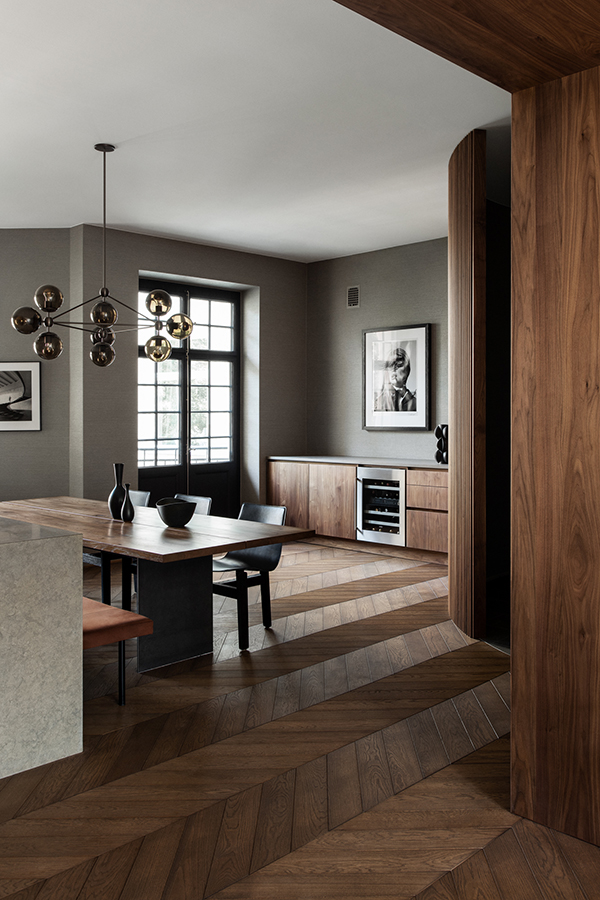
This warm and sophisticated remodel of a 1920s apartment may not seem like a family residence at first glance but interior and furniture designer Louise Liljecrantz took great care to alter the spacial flow to accommodate everybody’s needs.

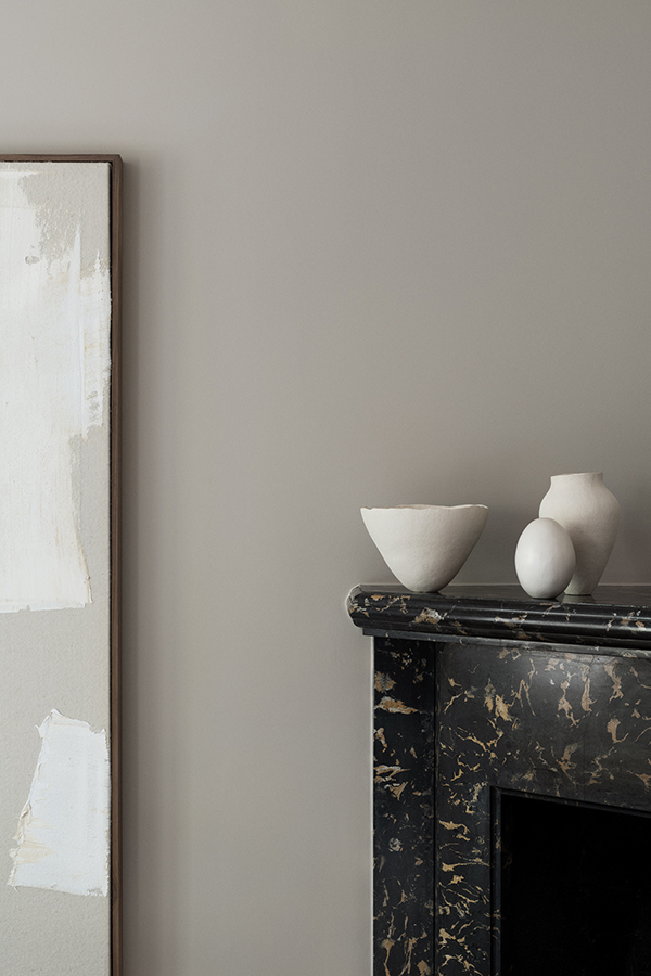
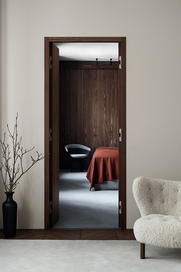
The open-plan kitchen is right at the heart of the apartment partly obscured by a sculptural semi circular wooden screen that sets the tone as soon as you enter. The dark wooden herringbone flooring gives the residence immediately a warm feel and is reflected throughout the home in bespoke joinery. Paired with the sludgy grey tone of the walls and other exquisite materials like limestone worktop and a pair of my favourite Petra chairs in sheepskin you are presented with a sophistication that pays tribute to the buildings central Stockholm location.

This is of course photographed in it’s prime state – just finished but not quite moved in yet. A sweet spot I’d like to be able to maintain in my own home but living with others always ruins the look. Still, a beautiful project by Liljencrantz Design.

_______________________________________________________________________________________

If you’d like to see more Stockholm interiors head over to this post I wrote about ALMA, a wonderfully understated stylish workspace. Or have a look at USINE, an achingly trendy restaurant, bar, cafe, take away place with additional reception and conference spaces giving your business increased kudos.
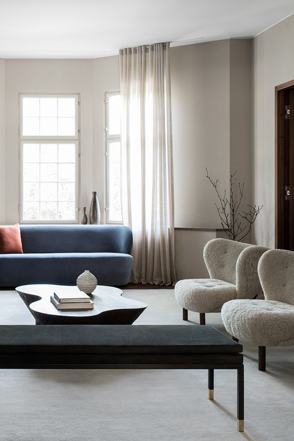
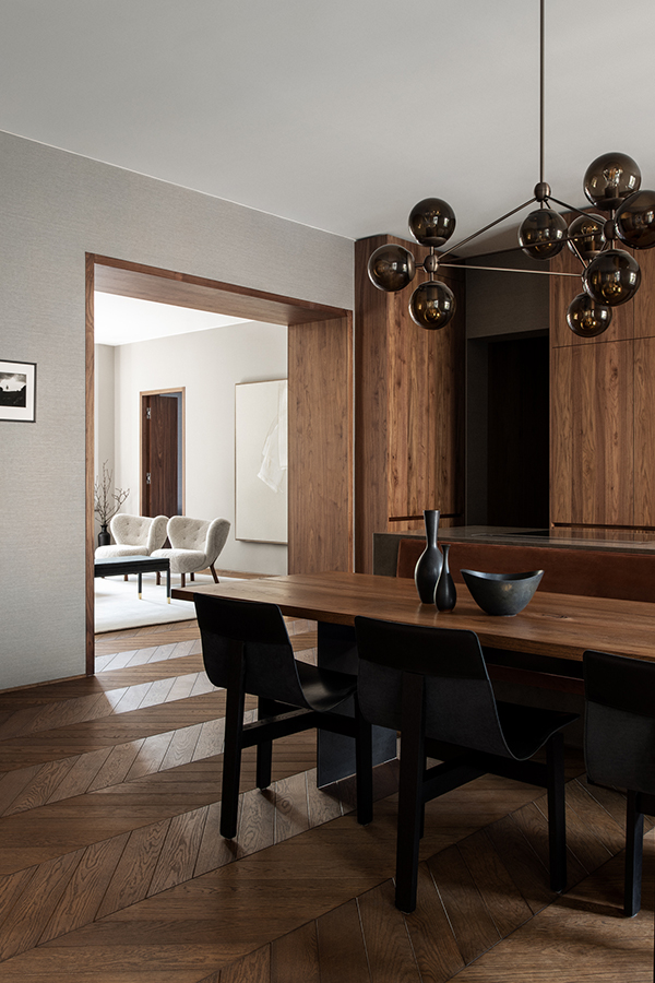
This warm and sophisticated 1920s apartment was remodeled by interior and furniture designer Louise Liljecrantz and her sense of understated luxury.

PHOTOGRAPHY | Kristofer Johnsson with thanks

_______________________________________________________________________________________

Follow Stylejuicer with Bloglovin and never miss a post. Just follow the link.

_______________________________________________________________________________________

CONTEMPORARY, LIGHT FILLED RESIDENCE BY CERA STRIBLEY

15 June 2020

melbourne contemporary light filled residence by cera stribley

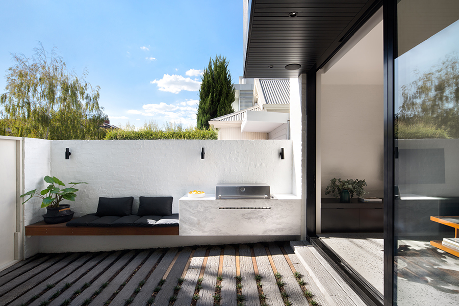
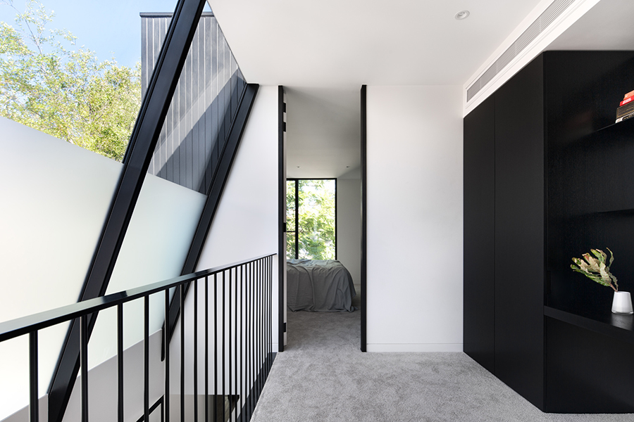
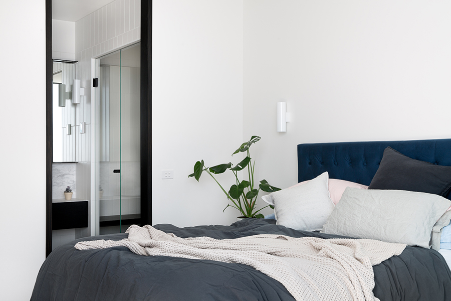
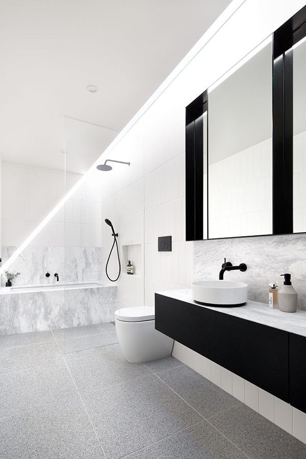
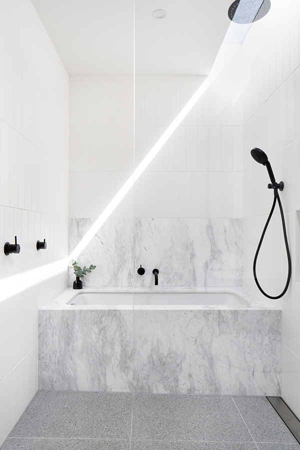
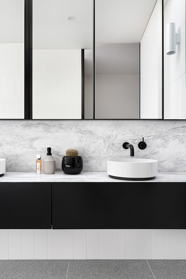
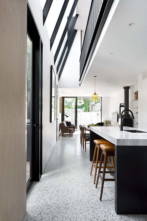
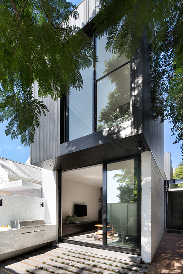
It’s my birthday today and I’m treating myself and you lovely readers to some extra cool eye candy from down under. This contemporary light filled residence has been cleverly designed with an angled skylight in the entryway extending to the mezzanine landing on the first floor. Thus bringing brightness into the house even on the dullest of rainy days. 

I love how architects Cera Stribley have managed to create a sort of sundial in the bathroom through the installation of a narrow strip of skylight. I’m sure you’d be able to judge if you’re late for work in the morning just by where the shaft of light falls.

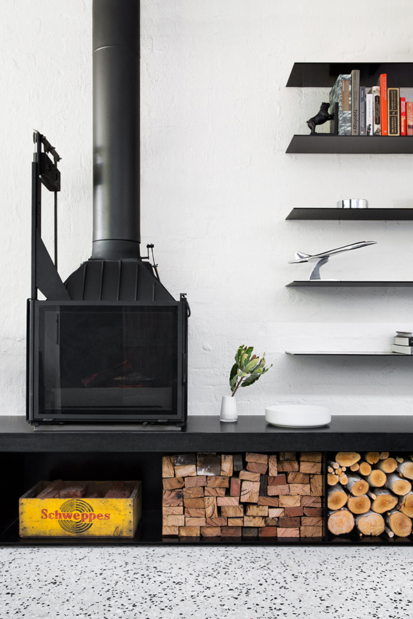
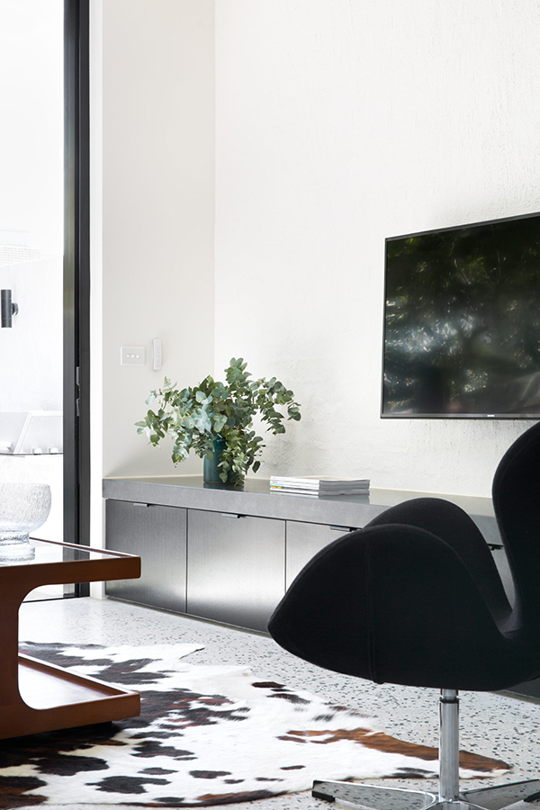
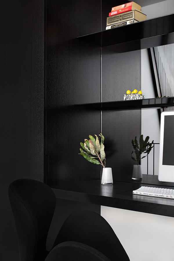
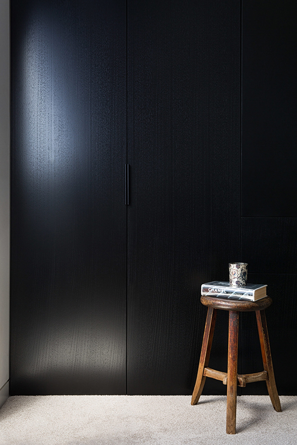
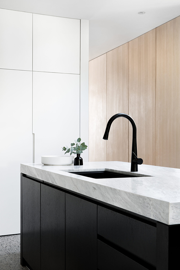
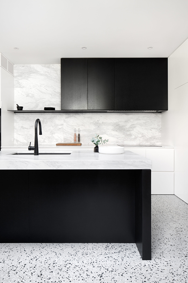
You know I’m still a fan of the overall monochrome look which in my opinion brings sharpness, style and calm into the home. The dark kitchen island with grey marble (quartz?) worktop is a particular favourite and one that I’ve had on my own kitchen idea board for a long time. I also totally dig the black and white speckled terrazzo flooring which I think works perfectly in warmer climes, like this Melbourne residence. Though judging by the installation of a wood burner maybe it does get chilly in Oz occasionally!? 

Overall, this is an exceptional light filled 3-bedroom urban residence and I’m glad that inspirational new builds like these get realised and not choked with red tape and regulations. Hats off to Cera Stribley and it’s clients.

_______________________________________________________________________________________

Can’t get enough of Australian interior design and architecture? Check out some previous blog posts here and here.

melbourne contemporary light filled residence by cera stribley

MORE INFORMATION & PHOTOGRAPHY | Cera Stribley

_______________________________________________________________________________________

Follow Stylejuicer with Bloglovin and never miss a post. Just follow the link.

_______________________________________________________________________________________
LOFT LOVE | CONVERTED WAREHOUSE BY LISA KOEHLER

8 June 2020

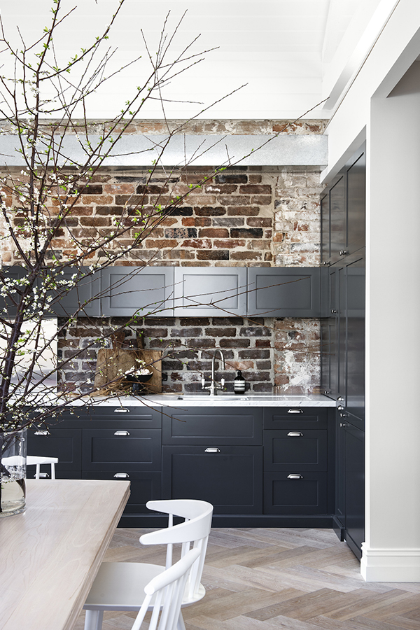
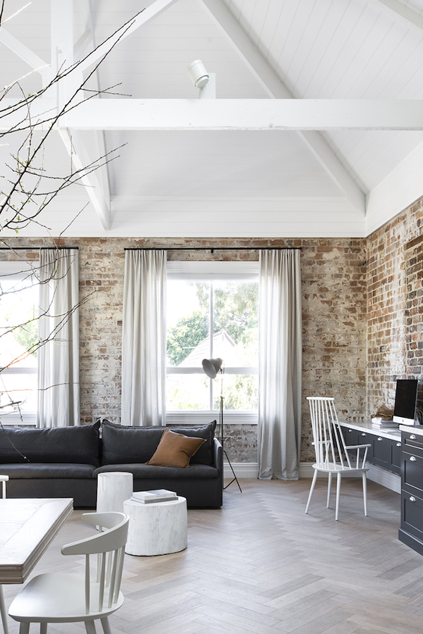
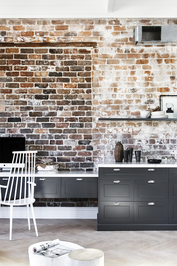
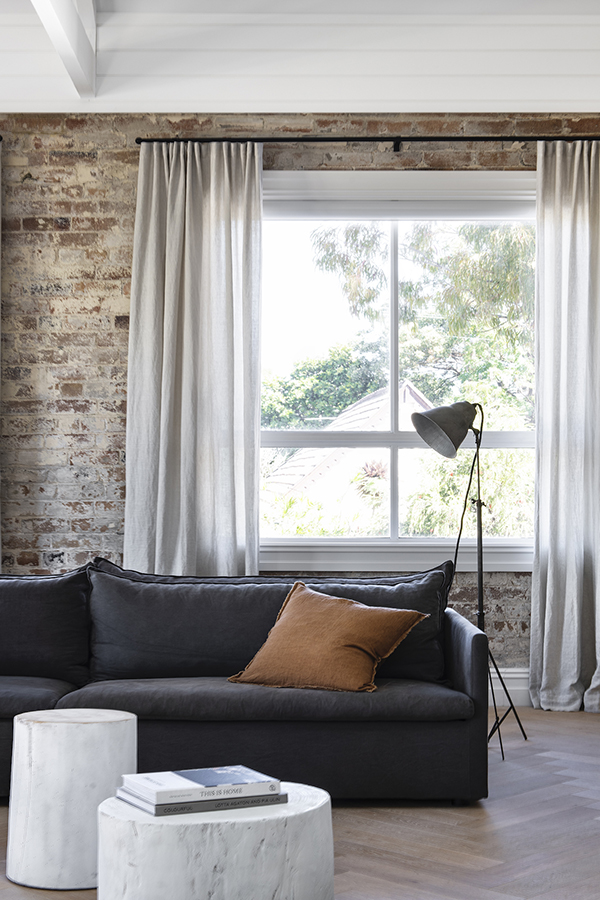
a stunning example of a converted warehouse by lisa koehler in sydney, australia

My love for lofts has been well documented on this blog and today I want to share this stunning example of a converted warehouse by Lisa Koehler with you. The space is wonderfully stylish as well as inviting and there isn’t a single item or texture in here that I don’t drool over. 

The structure and dimensions of any loft are always impressive due to their historic use but that doesn’t necessarily translate into a warm and engaging habitable space. Lisa has enhanced the converted warehouse for her client by adding texture and a pared back colour palette thus giving the brick walls, exposed heating and that wonderful white washed vaulted ceiling priority.

I thought I was a bit tired of seeing shaker style kitchens but in the context of this space and with the addition of those metal semi-circular handles it is reminiscent of early 20th century utilitarian cupboards, so fitting for a converted warehouse – and I simply love that dark inky blue. The vaulted ceiling made for an ideal mezzanine platform to add a bedroom which has a large roof light, perfect for counting the stars should you have trouble falling asleep.

The space is laid back, stylish and honest and I can’t wait to see Lisa’s next project.

_______________________________________________________________________________________

If you’ve enjoyed this converted warehouse, check out some more Australian eye-candy with beautiful exposed brick and a striking monochrome colour palette or one of my favourite coffee shops in Melbourne, bathed in brick colour.  

a stunning example of a converted warehouse by lisa koehler in sydney, australia

MORE INFORMATION | Lisa Koehler

PHOTOGRAPHY | Nicole England

_______________________________________________________________________________________

Follow Stylejuicer with Bloglovin and never miss a post. Just follow the link.

_______________________________________________________________________________________
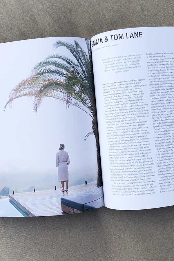
BOOK REVIEW | STILL BY NATALIE WALTON

1 June 2020

Book Review for Still by Natalie Walton

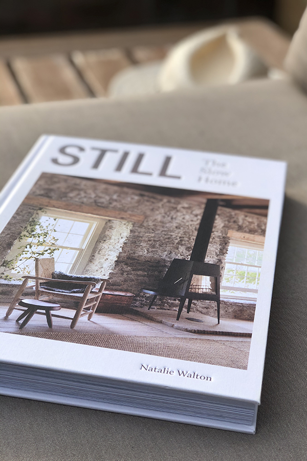
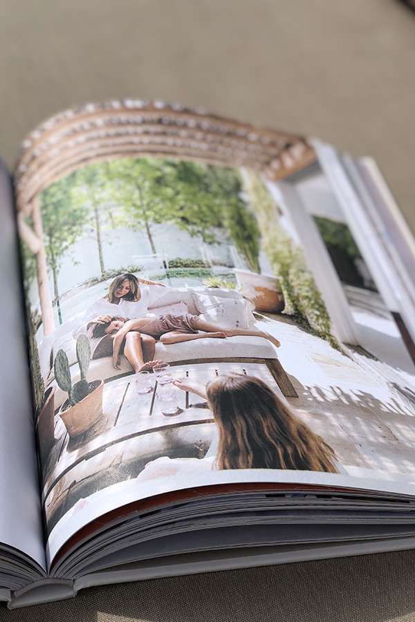
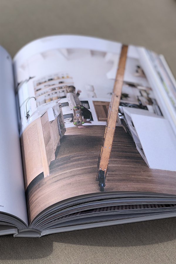
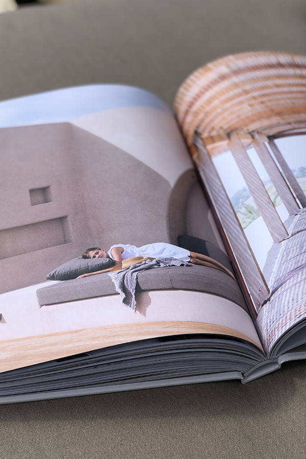
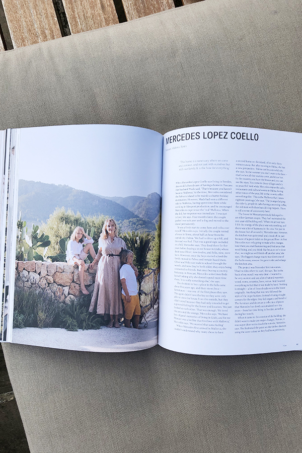
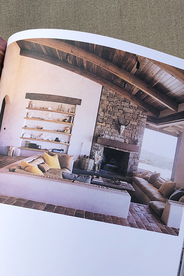
This week I want to share the stunning book STILL by Natalie Walton with you. I caught a glimpse of it in Courtney Adamo’s stories feed and immediately pre-ordered it. Luckily, it arrived before it’s official release date in the UK and I’ve been loving dipping in and out of it. 

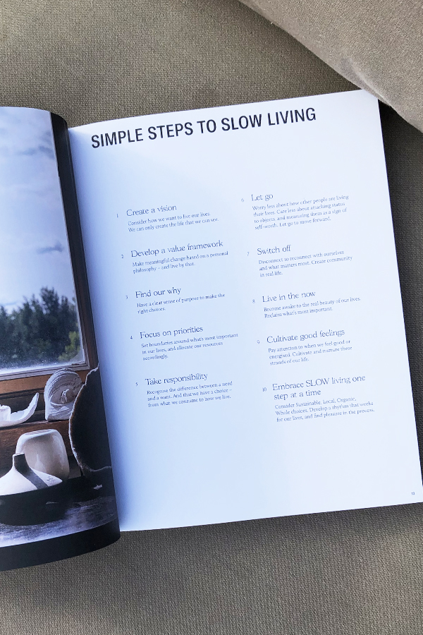
The Australian author has selected, interviewed and photographed 20 inspirational homes from all around the world, designed by individuals who are aligned to the SLOW movement, standing for sustainability, local, organic and whole.

I found it fascinating to read about these couples and families who have all been on a journey of self-discovery and re-evaluation of life and their own priorities. Not only is a slower pace a common denominator but the longing for a simpler life, often driven by a deep feeling of responsibility for the planet and their loved ones.

The photography by Chris Warnes is eye-wateringly beautiful and looking through the pages you will notice a calm, reduced colour palette with lots of references to nature. There is a common aesthetic of simplicity and minimalism on show which resonates with my own interior style. Each shot has of course been styled to perfection by Natalie who coincidentally runs master styling classes. Check them out here if you’re interested.

I was so intrigued by the multi-talented author that I listened to her podcast series Imprint where she talks about finding her voice and how she achieves a calm home for her family. I got the impression of a very humble, clean living and responsible person who is an awful lot more disciplined than me! I admire the amount of wellbeing she can fit into her day around all the other chores work and a large family brings with it – maybe the fact that she doesn’t watch TV has something to do with it. And no, as much as I admire her achievements I’m not ready to give up the box just yet. 

If you’d like to live more mindfully, embracing slow living without losing a sense of style in your home I highly recommend this book which continues to give me hours of interior, life and living inspiration.  

Book Review for Still by Natalie Walton

NOTE | This is not an advert. I found and purchased Still by Natalie Walton myself and do not benefit in any way from the write-up.

MORE INFORMATION | Natalie Walton

PHOTOGRAPHY | Annie Kruse

_______________________________________________________________________________________
Follow Stylejuicer with Bloglovin and never miss a post. Just follow the linkety link.

_______________________________________________________________________________________
LONDON LOFT WITH RUSTY STEEL SHOWSTOPPER

22 February 2019

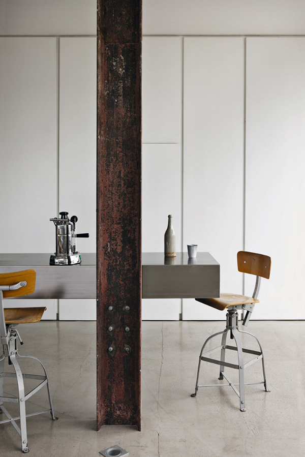
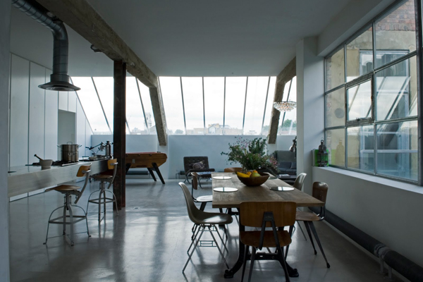
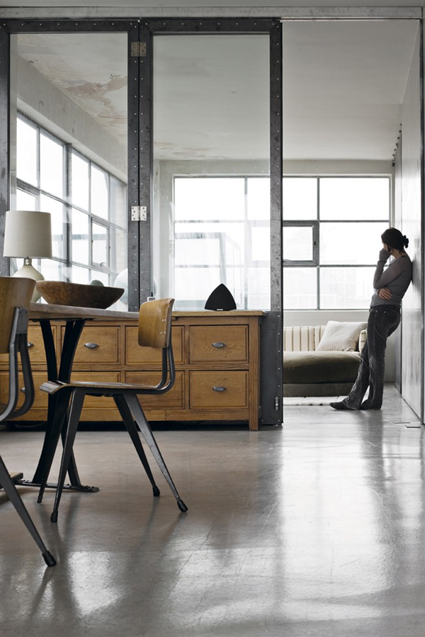
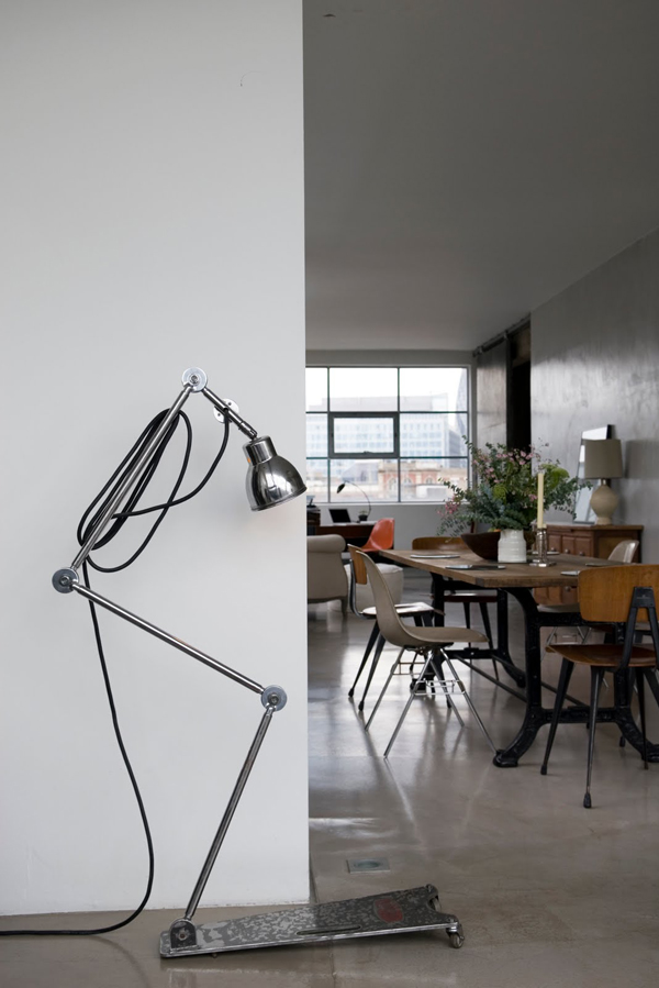
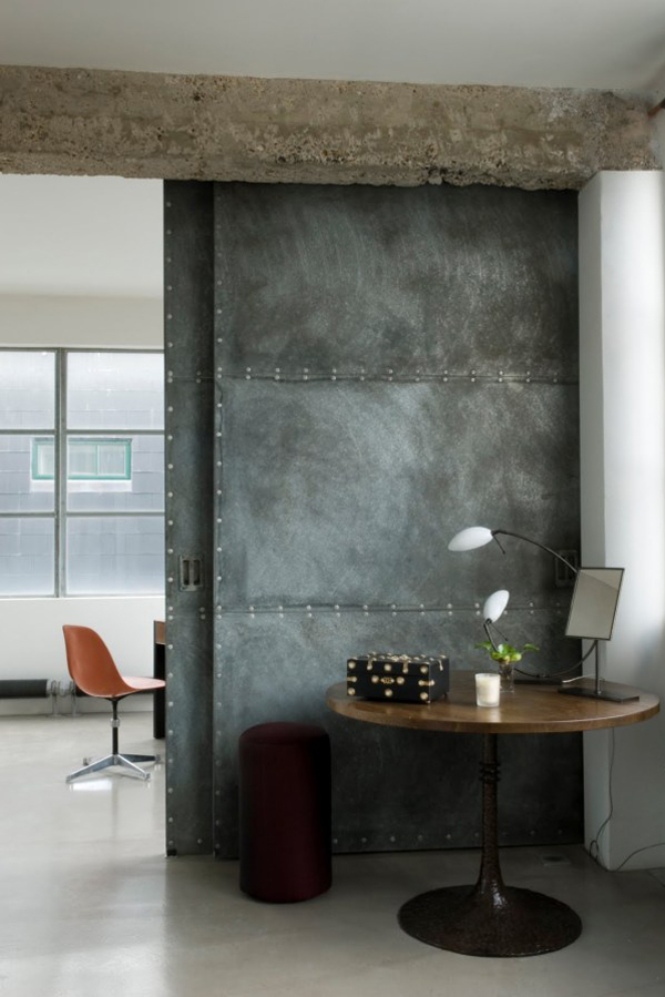
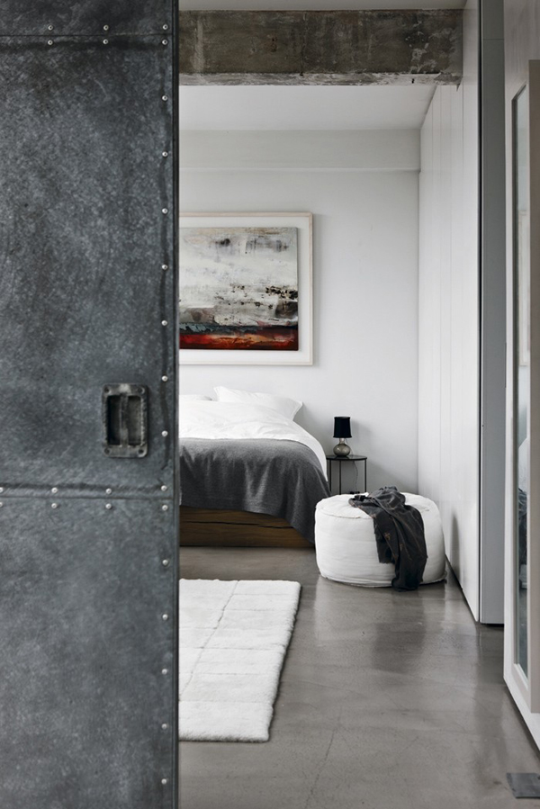
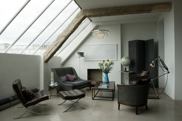
This loft is a successful mix of high and low spec with a rusty steel RSJ showstopper.

I was looking for some kitchen inspo on beloved (and sometimes hated) Pinterest and found this gorgeous London loft. You can hire it as a location for photo shoots and I can see the attraction.

The loft is a successful mix of high and low spec with smart polished concrete flooring and sleek inbuilt kitchen cabinets as well as flea market finds and – my favourite piece – a rusty steel RSJ holding up the kitchen ceiling. I wonder if that was an original feature or added when the renovation took place. Either way I want one! It adds character and industrial flair but mostly it’s a great show stopper and talking point.

If you’re a fellow loft lover check out some of my favs here, here and here. You’re welcome!

This loft is a successful mix of high and low spec with a rusty steel RSJ showstopper.

OWNER & PHOTOGRAPHY | Solenne de La Fouchardiere Ochre

––––––––––––––––––––––––––––––––––––––––––––––––––––––––––––––––––––––––

Follow Stylejuicer with Bloglovin