Category Archives: Architecture

MONOCHROME CAFE IN MOSCOW BY ASKETIK

8 February 2019

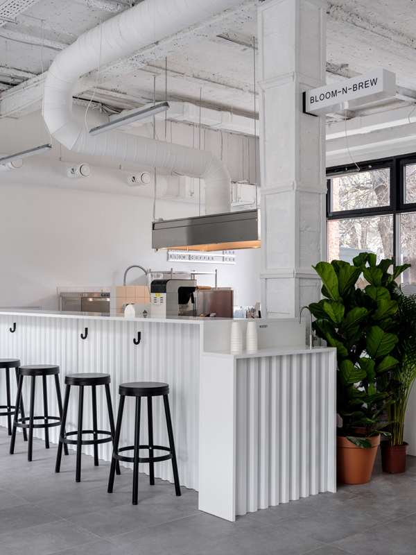
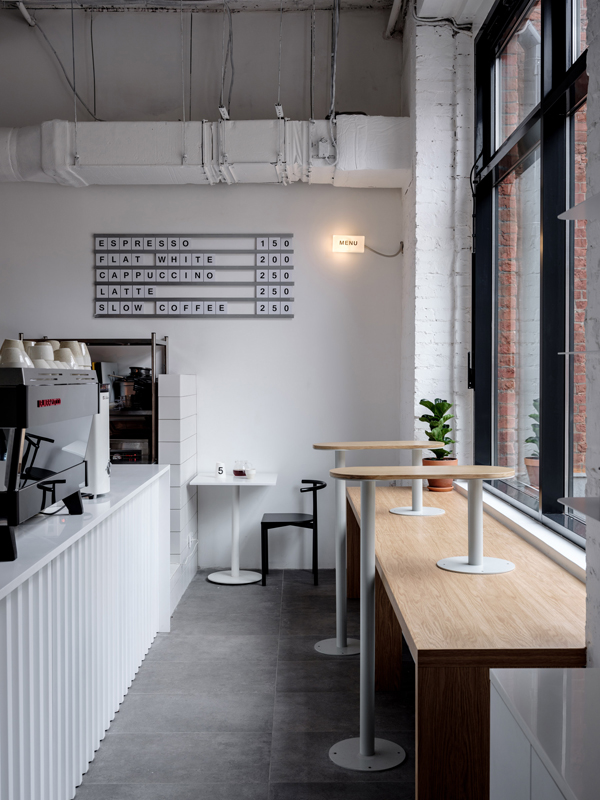
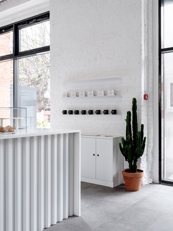
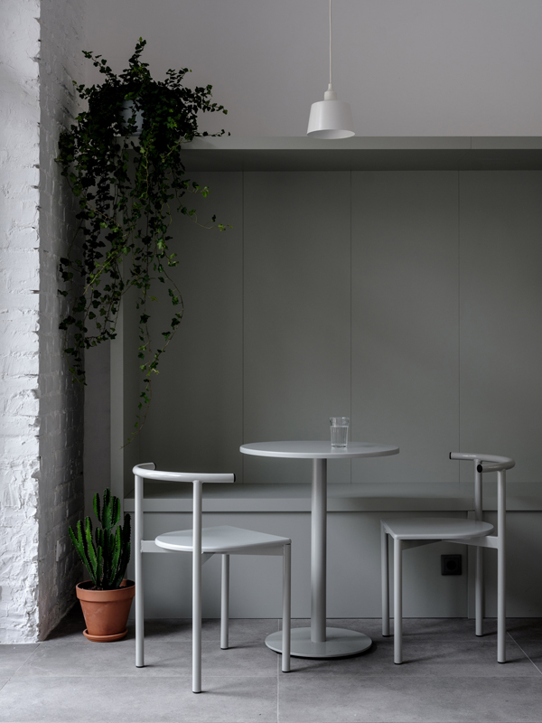
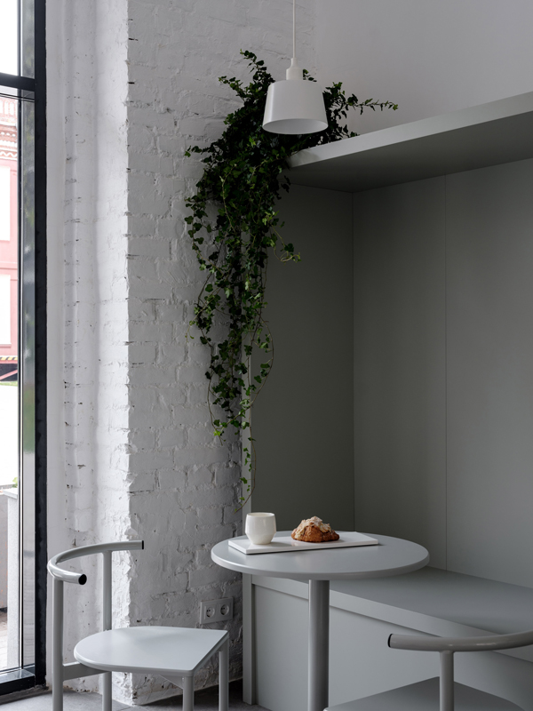
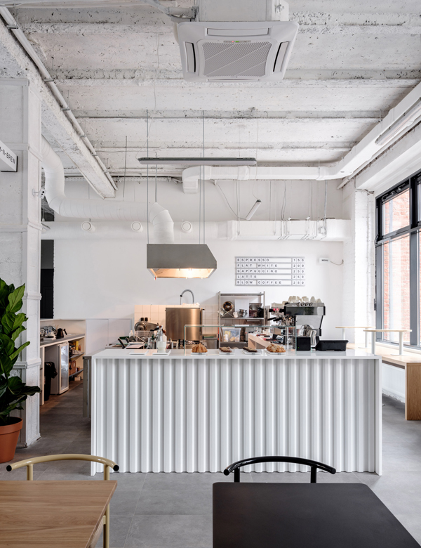
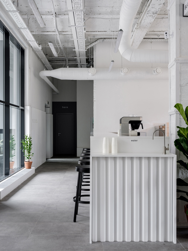
This industrial former silk factory in Moscow has been transformed by studio Asketik into a monochrome cafe with beautiful proportions.
monochrome, cafe, moscow, asketik, stylejuicer, blog, trend, industrial space, white wash, bloom-n-brew, hip, cultural differences, connected, melbourne, stockholm

You know how much I love an industrial space and this monochrome cafe in Moscow designed by studio Asketik immediately caught my eye during one of my late night surfs.

The white wash formula never fails to have an impact especially in such an impressive space which used to be a silk factory in the Factoria Park district of Moscow. Beautiful designer furniture by Delo Design of St Petersburg and large plants in terracotta pots soften the sharp edges of the vast space which is flooded with light.

Asketik was also tasked to come up with the cafe’s brand identity which derives from the gorgeous smell a freshly brewed cup of coffee emits: Bloom-n-Brew. The simple font supports the contemporary industrial look and feel of the space and sits discreetly on cups and packaging.

My final thought is a controversial one: This place could be in any of the world’s hip coffee-loving cities, from Australia to America, Africa, Asia or Europe. I’m not too sure how I feel about the fact that there’s no distinct cultural reference apart from the currency. I actually love cultural differences and want to consume food and drink local to the country I’m visiting. How do you feel about the fact that places start to look the same throughout the world? Does it bother you or do you find it comforting? Its definitely a question that will be coming up more and more in the future as we continue to become more connected.

If you want to see more hip cafes check out this one in Melbourne or this gorgeous restaurant / bar / cafe in Stockholm, still one of my favs.
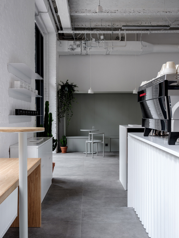
This industrial former silk factory in Moscow has been transformed by studio Asketik into a monochrome cafe with beautiful proportions.
monochrome, cafe, moscow, asketik, stylejuicer, blog, trend, industrial space, white wash, bloom-n-brew, hip, cultural differences, connected, melbourne, stockholm
This industrial former silk factory in Moscow has been transformed by studio Asketik into a monochrome cafe with beautiful proportions.
monochrome, cafe, moscow, asketik, stylejuicer, blog, trend, industrial space, white wash, bloom-n-brew, hip, cultural differences, connected, melbourne, stockholm
This industrial former silk factory in Moscow has been transformed by studio Asketik into a monochrome cafe with beautiful proportions.
monochrome, cafe, moscow, asketik, stylejuicer, blog, trend, industrial space, white wash, bloom-n-brew, hip, cultural differences, connected, melbourne, stockholm
This industrial former silk factory in Moscow has been transformed by studio Asketik into a monochrome cafe with beautiful proportions.
monochrome, cafe, moscow, asketik, stylejuicer, blog, trend, industrial space, white wash, bloom-n-brew, hip, cultural differences, connected, melbourne, stockholm
This industrial former silk factory in Moscow has been transformed by studio Asketik into a monochrome cafe with beautiful proportions.
monochrome, cafe, moscow, asketik, stylejuicer, blog, trend, industrial space, white wash, bloom-n-brew, hip, cultural differences, connected, melbourne, stockholm
This industrial former silk factory in Moscow has been transformed by studio Asketik into a monochrome cafe with beautiful proportions.
monochrome, cafe, moscow, asketik, stylejuicer, blog, trend, industrial space, white wash, bloom-n-brew, hip, cultural differences, connected, melbourne, stockholm
This industrial former silk factory in Moscow has been transformed by studio Asketik into a monochrome cafe with beautiful proportions.
monochrome, cafe, moscow, asketik, stylejuicer, blog, trend, industrial space, white wash, bloom-n-brew, hip, cultural differences, connected, melbourne, stockholm

MORE INFORMATION | Asketik

PHOTO | Mikhail Loskutov with thanks

––––––––––––––––––––––––––––––––––––––––––––––––––––––––––––––––––––––––

Follow Stylejuicer with Bloglovin

DREAM HOME | NORTH LONDON RENOVATION

1 February 2019

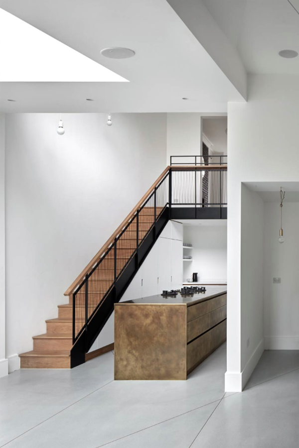
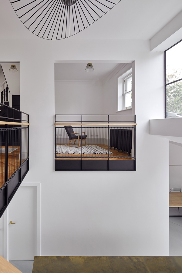
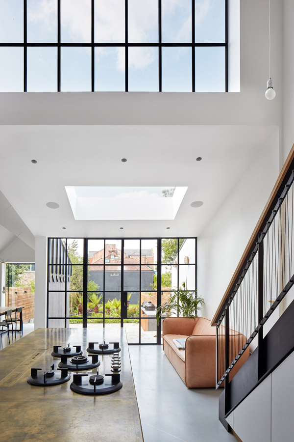
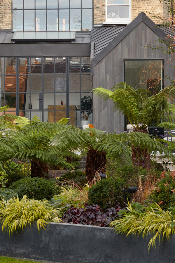
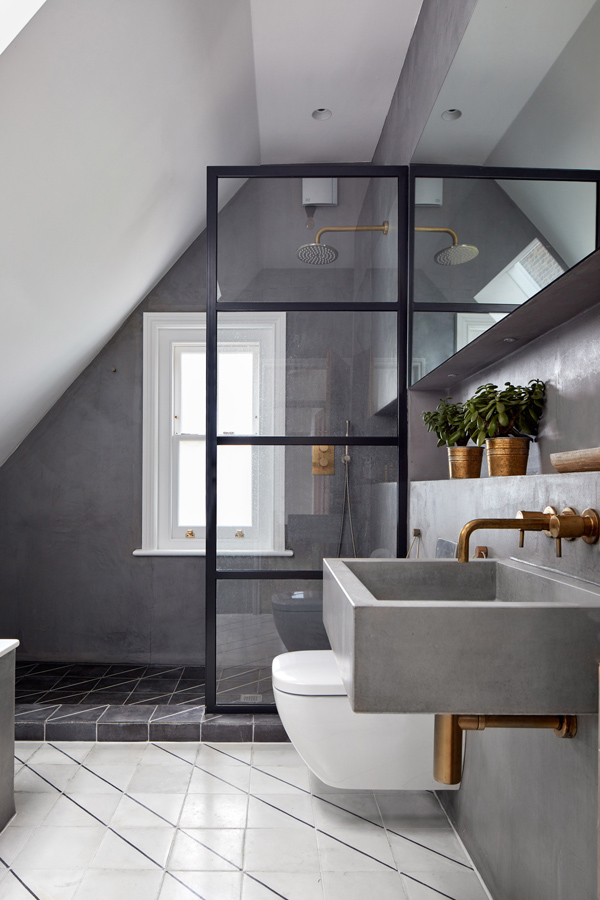
I love this North London renovation by Merrett Houmoller architects who opened up the back, adding a stunning extension with kitchen / living and dining area. Renovation, north London, architecture, interior design, remodel, chevron, parquet flooring, artists studio, limited materials, colour palette, brass, metal, crittall style, dream home, landscape garden, 45 degree angle, merrett and houmoller, Alan Williams, style, minimalism, polished concrete, clean lines, old and new, trend, blog, stylejuicer

I love a renovation, especially the London ones, as I’m always on the lookout for new ideas that I may incorporate into my dream home one day – maybe even the one I’m living in now, I haven’t decided yet.

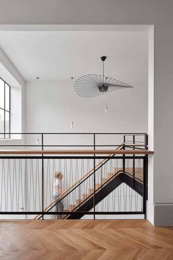
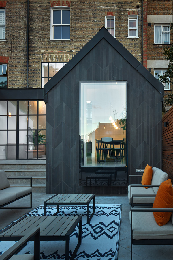
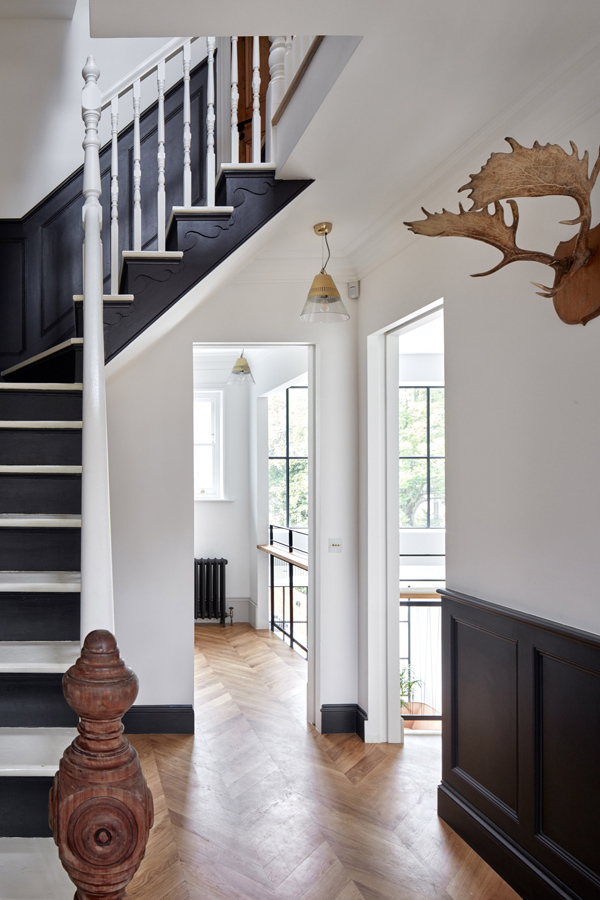
This North London renovation of a townhouse including landscaping by architects Peter Merrett and Robert Houmøller is extraordinary. Clearly the clients had a healthy budget but I love how the simple ‘chevron’ shape taken from the original parquet flooring has served as a blueprint and theme throughout the house and into the garden.

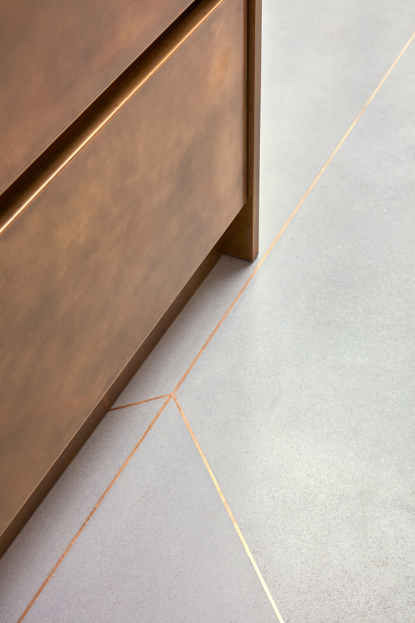
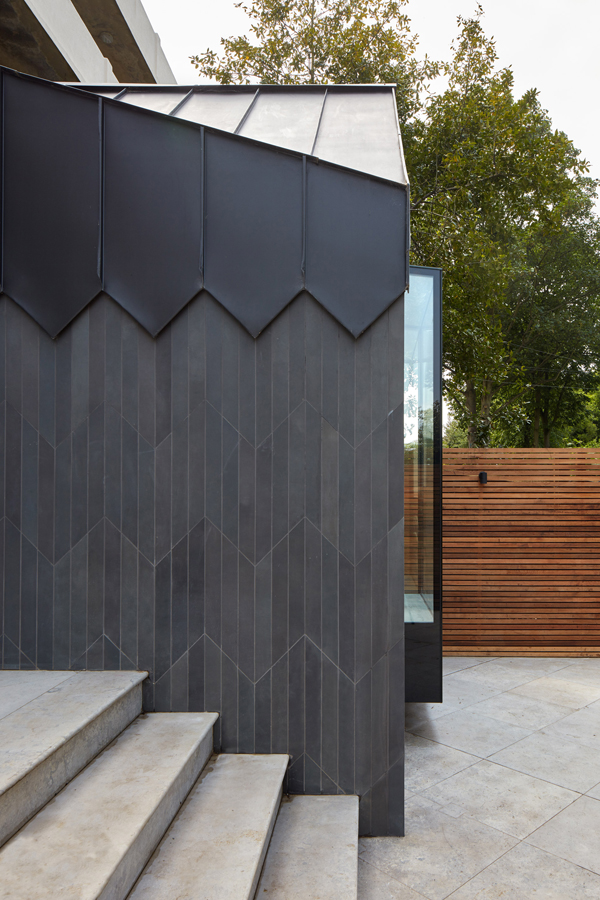
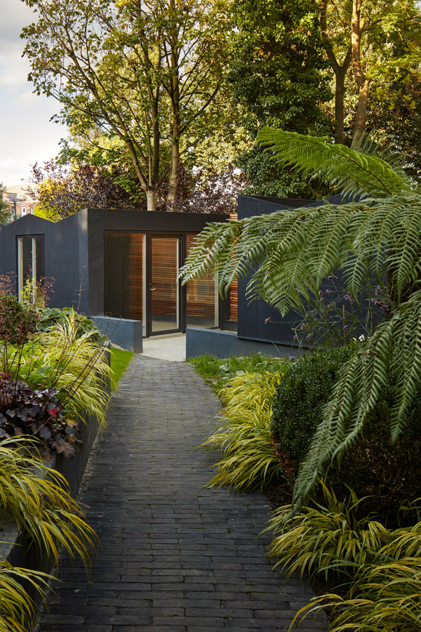
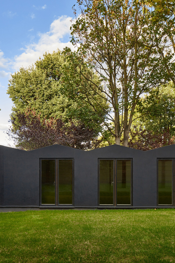
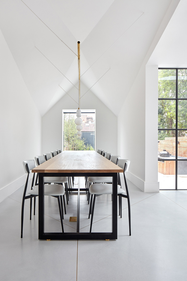
The 45 degree angle can be seen everywhere once you’re aware of it. Just look at the roof structure of the dining room extension and the brass inlays between the polished concrete slabs on the lower ground floor. It even shows up on the dark tiled cladding of the rear extension and the angled path leading down to a semi-sunken artists studio.

Opening up the floorplan to connect the street level and the lower garden basement level lets light penetrate deep into the house increasing the feeling of space. It must be wonderful coming downstairs in the morning and getting the first glimpses of the garden from the top of the stairs.

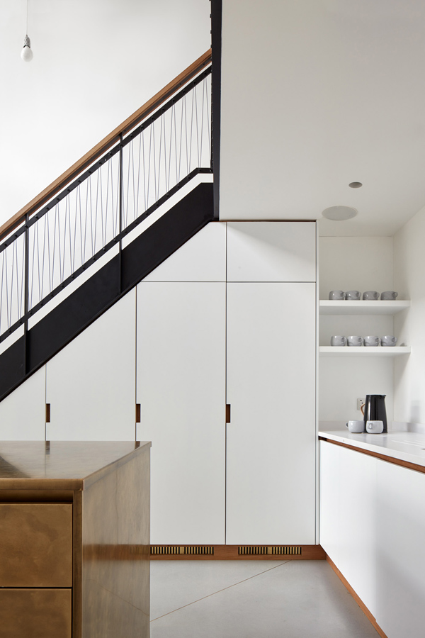
I have to say I also absolutely adore the bespoke brass-clad kitchen island including the handle-less drawers. A refreshing change from all that stainless steel we’ve been seeing for the past decades. Brass is another recurring theme, seen in the light fittings, taps and door handles.

Limiting your material and colour palette is a great way to bring the old and new parts of the house together and if you can incorporate it in the garden you cannot fail but achieve most people’s holy grail – and I include myself here: the inside/outside look.

If you like this renovation check out other dream homes like this loft in Vienna or this home in Sydney.


I love this North London renovation by Merrett Houmoller architects who opened up the back, adding a stunning extension with kitchen / living and dining area. Renovation, north London, architecture, interior design, remodel, chevron, parquet flooring, artists studio, limited materials, colour palette, brass, metal, crittall style, dream home, landscape garden, 45 degree angle, merrett and houmoller, Alan Williams, style, minimalism, polished concrete, clean lines, old and new, trend, blog, stylejuicer


I love this North London renovation by Merrett Houmoller architects who opened up the back, adding a stunning extension with kitchen / living and dining area. Renovation, north London, architecture, interior design, remodel, chevron, parquet flooring, artists studio, limited materials, colour palette, brass, metal, crittall style, dream home, landscape garden, 45 degree angle, merrett and houmoller, Alan Williams, style, minimalism, polished concrete, clean lines, old and new, trend, blog, stylejuicer


MORE INFORMATION | Merret Houmoller architects

PHOTOGRAPHY | Alan Williams


<a rel=”nofollow” href=”http://www.bloglovin.com/en/blog/9704095″ title=”bloglovin stylejuicer” target=”_blank”>Follow Stylejuicer with Bloglovin</a>

PLACES TO GO | LOUVRE ABU DHABI BY JEAN NOUVEL

11 October 2018

architecture, places to go, abu dhabi, united arab emirates, jean nouvel, Bruno Happold, Andy Pottinger, souk, middle eastern, dome, steel, star pattern, semi transparent, porosity, gallery, museum, persian gulf, louvre abu dhabi, geometric, engineering feat, style, trend, stylejuicer


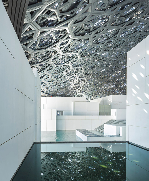
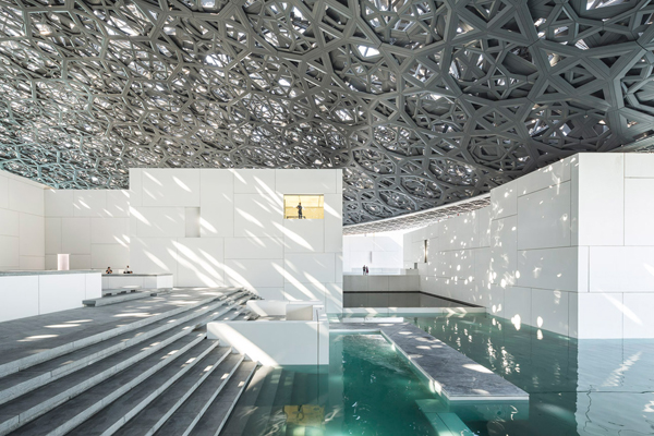
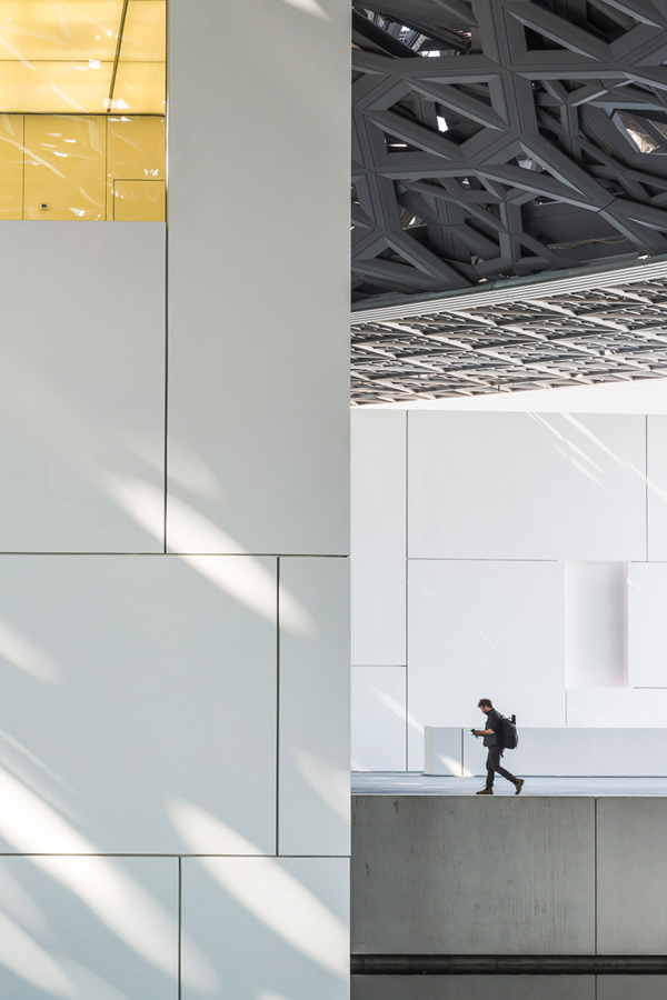
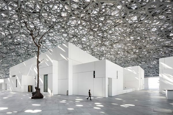
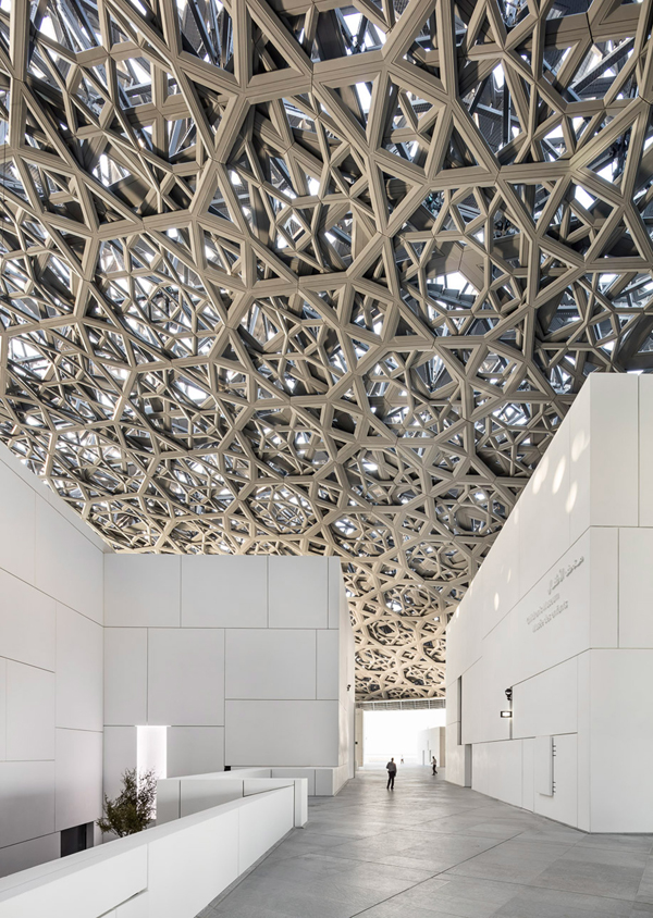
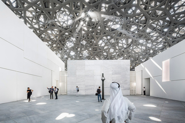
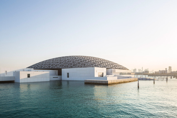
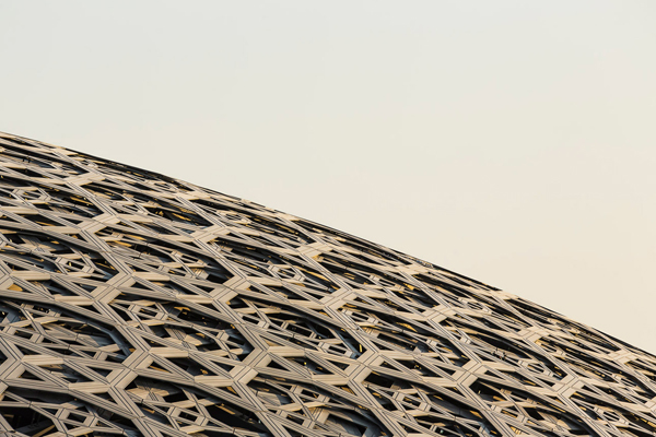
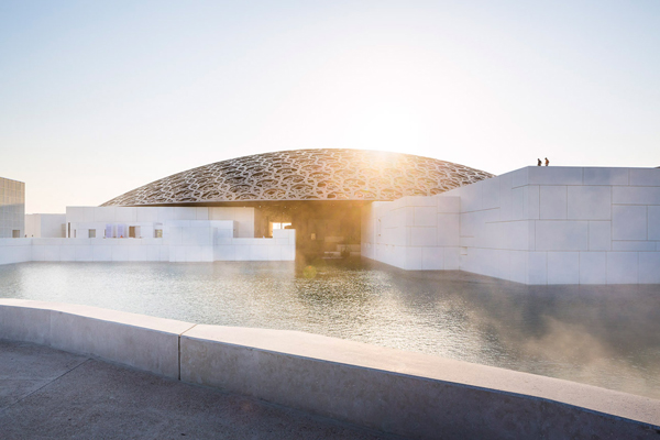
I was seriously excited when I came across photos by Luc Boegly and Sergio Grazia of the new Louvre Abu Dhabi and the more I read up on it the more it becomes transparent just how extraordinary Jean Nouvel’s design is.

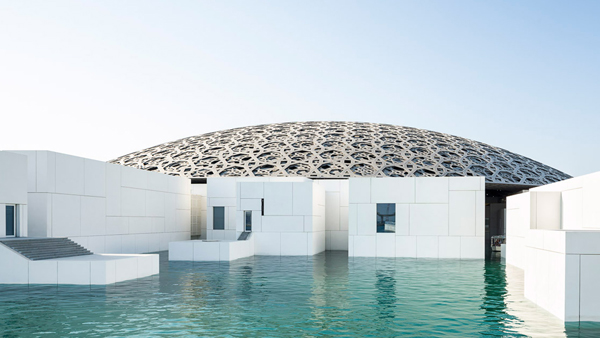
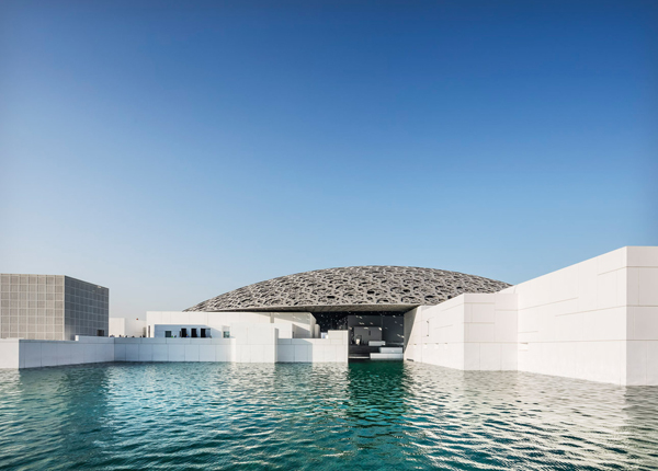
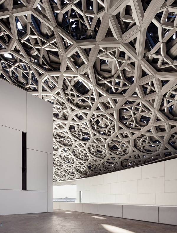
His vision of a Souk inspired cluster of buildings floating out in the Persian Gulf on a man-made island took no less than 8 years to complete and is nothing like any gallery you’ve seen before. There is a great time lapse video below which will give you a sense of the proverbial and real mountains that were moved to bring this piece of architecture to life. It’s the French Musee de Louvre’s first outpost and the defining feature of a floating dome spans 180 meters covering semi-outdoor spaces.

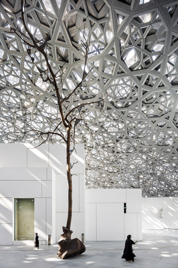
I’m absolutely fascinated by the dome which is made from multiple layers of iconic geometric stars made of steel that offer protection from the hot Middle Eastern sunshine yet let just enough light through to create ever changing patterns when walking along the plazas and galleries underneath. This incredible feat of engineering was brought to life by Bruno Happold and Andy Pottinger who had to computer simulate 23 models for the dome before the pattern and the harnessing of light had just the right porosity and was true to Nouvel’s original vision.

I’ve not really had any urges to visit the United Arab Emirates but after seeing these photos I’m fascinated and I suddenly find Abu Dhabi top of my travel list, especially since there will also be a Guggenheim designed by Frank Gehry and the Foster + Partner-designed Zayed National Museum on Saadiyat Island. Watch this space!


architecture, places to go, abu dhabi, united arab emirates, jean nouvel, Bruno Happold, Andy Pottinger, souk, middle eastern, dome, steel, star pattern, semi transparent, porosity, gallery, museum, persian gulf, louvre abu dhabi, geometric, engineering feat, style, trend, stylejuicer

architecture, places to go, abu dhabi, united arab emirates, jean nouvel, Bruno Happold, Andy Pottinger, souk, middle eastern, dome, steel, star pattern, semi transparent, porosity, gallery, museum, persian gulf, louvre abu dhabi, geometric, engineering feat, style, trend, stylejuicer

architecture, places to go, abu dhabi, united arab emirates, jean nouvel, Bruno Happold, Andy Pottinger, souk, middle eastern, dome, steel, star pattern, semi transparent, porosity, gallery, museum, persian gulf, louvre abu dhabi, geometric, engineering feat, style, trend, stylejuicer

architecture, places to go, abu dhabi, united arab emirates, jean nouvel, Bruno Happold, Andy Pottinger, souk, middle eastern, dome, steel, star pattern, semi transparent, porosity, gallery, museum, persian gulf, louvre abu dhabi, geometric, engineering feat, style, trend, stylejuicer

architecture, places to go, abu dhabi, united arab emirates, jean nouvel, Bruno Happold, Andy Pottinger, souk, middle eastern, dome, steel, star pattern, semi transparent, porosity, gallery, museum, persian gulf, louvre abu dhabi, geometric, engineering feat, style, trend, stylejuicer

architecture, places to go, abu dhabi, united arab emirates, jean nouvel, Bruno Happold, Andy Pottinger, souk, middle eastern, dome, steel, star pattern, semi transparent, porosity, gallery, museum, persian gulf, louvre abu dhabi, geometric, engineering feat, style, trend, stylejuicer

architecture, places to go, abu dhabi, united arab emirates, jean nouvel, Bruno Happold, Andy Pottinger, souk, middle eastern, dome, steel, star pattern, semi transparent, porosity, gallery, museum, persian gulf, louvre abu dhabi, geometric, engineering feat, style, trend, stylejuicer

architecture, places to go, abu dhabi, united arab emirates, jean nouvel, Bruno Happold, Andy Pottinger, souk, middle eastern, dome, steel, star pattern, semi transparent, porosity, gallery, museum, persian gulf, louvre abu dhabi, geometric, engineering feat, style, trend, stylejuicer

architecture, places to go, abu dhabi, united arab emirates, jean nouvel, Bruno Happold, Andy Pottinger, souk, middle eastern, dome, steel, star pattern, semi transparent, porosity, gallery, museum, persian gulf, louvre abu dhabi, geometric, engineering feat, style, trend, stylejuicer

architecture, places to go, abu dhabi, united arab emirates, jean nouvel, Bruno Happold, Andy Pottinger, souk, middle eastern, dome, steel, star pattern, semi transparent, porosity, gallery, museum, persian gulf, louvre abu dhabi, geometric, engineering feat, style, trend, stylejuicer

architecture, places to go, abu dhabi, united arab emirates, jean nouvel, Bruno Happold, Andy Pottinger, souk, middle eastern, dome, steel, star pattern, semi transparent, porosity, gallery, museum, persian gulf, louvre abu dhabi, geometric, engineering feat, style, trend, stylejuicer

architecture, places to go, abu dhabi, united arab emirates, jean nouvel, Bruno Happold, Andy Pottinger, souk, middle eastern, dome, steel, star pattern, semi transparent, porosity, gallery, museum, persian gulf, louvre abu dhabi, geometric, engineering feat, style, trend, stylejuicer


MORE INFORMATION | Louvre Abu Dhabi
PHOTOGRAPHY | Luc Boegly and Sergio Grazia
 
Follow Stylejuicer with Bloglovin
COURTYARD EXTENSION BY RITZ AND GHOUGASSIAN

4 October 2018

courtyard extension, australian design, interior design, interiors, style, stylist, styling, architecture, contemporary, modern, block work, lush greenery, light, holiday vibes, mixing materials, textures, industrial, minimal, dark wood, stylejuicer, trend, trending
 

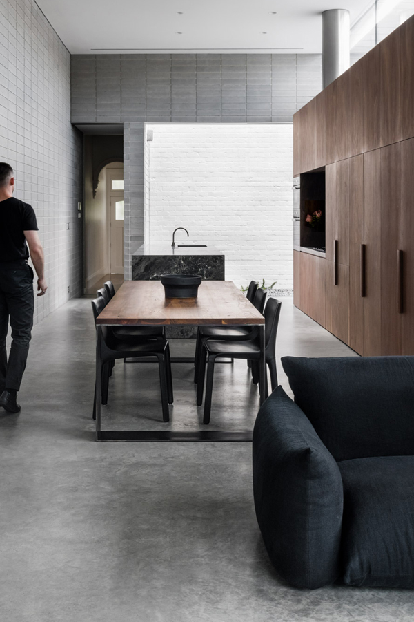
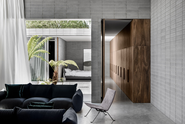
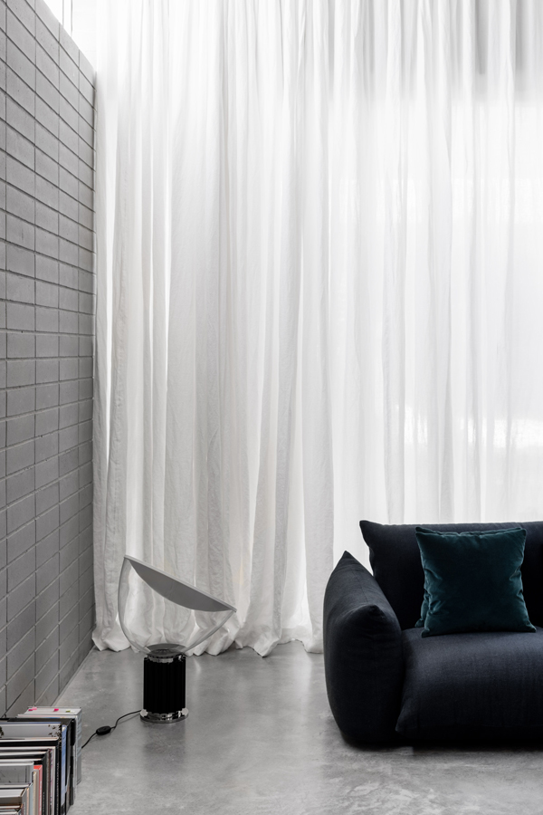
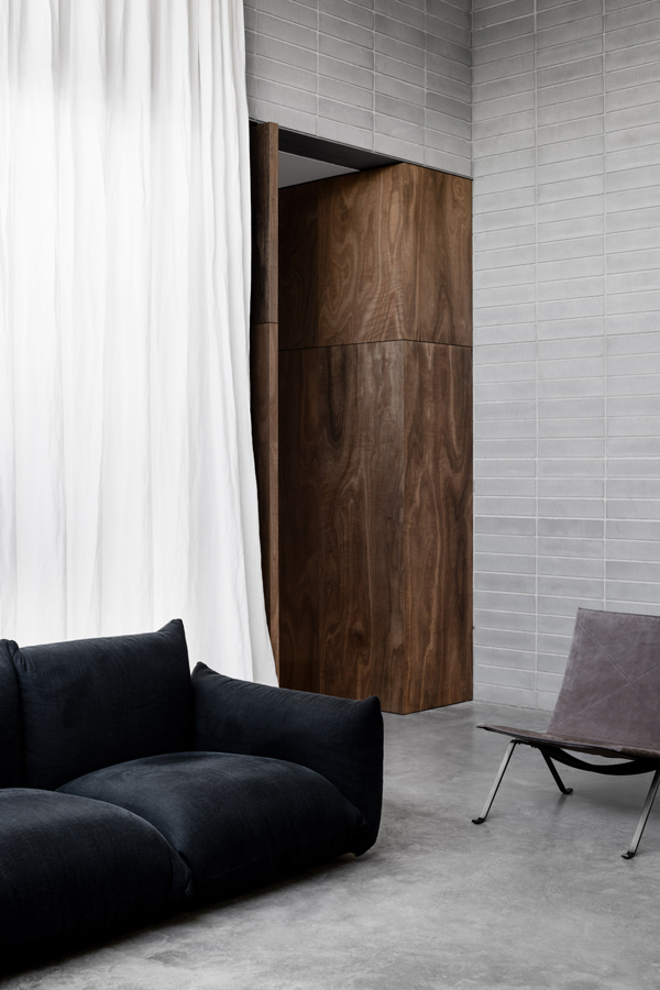
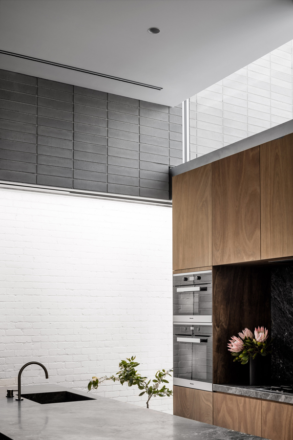
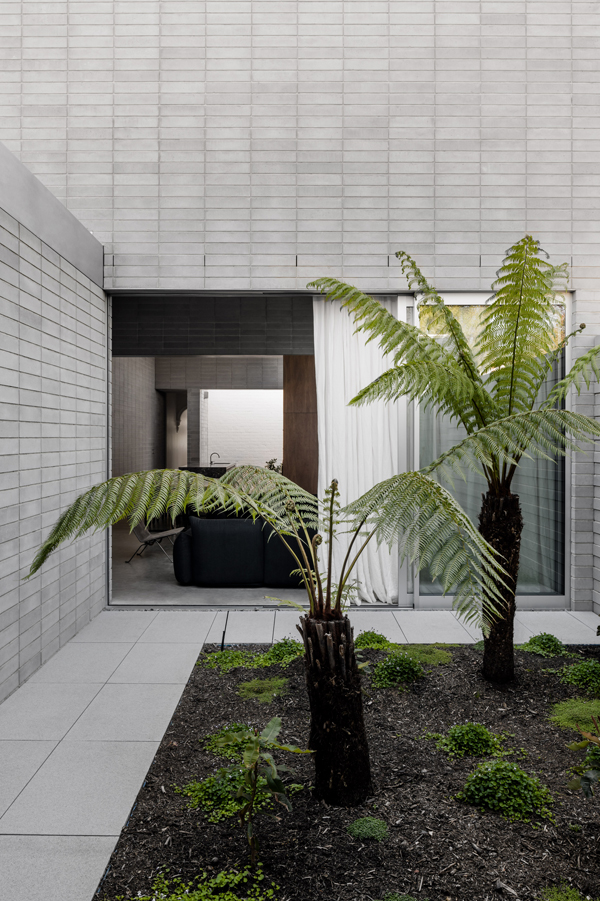
I seem to be drawn to Australian architecture and interior design at the moment especially this amazing contemporary courtyard extension to a traditional federation-style cottage in the leafy suburb of Prahran in Melbourne.

Maybe it’s the incredible light that brightens up even the darkest interior down under or maybe it’s the holiday vibe that comes with lush greenery and inside outside living spaces that have me captivated!? Actually, I think the Australians have a real ease mixing materials, textures and colours. They take the best from the rest of the world and give it their own twist.

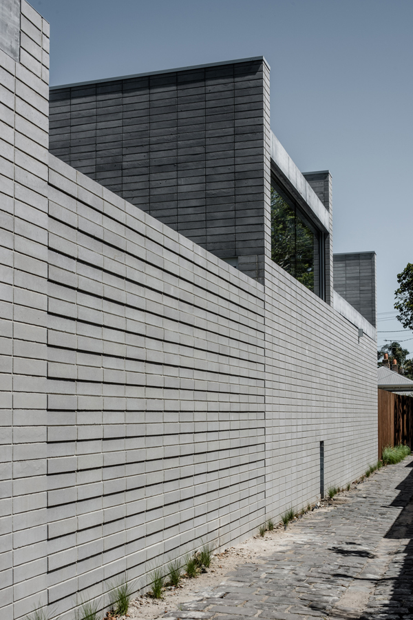
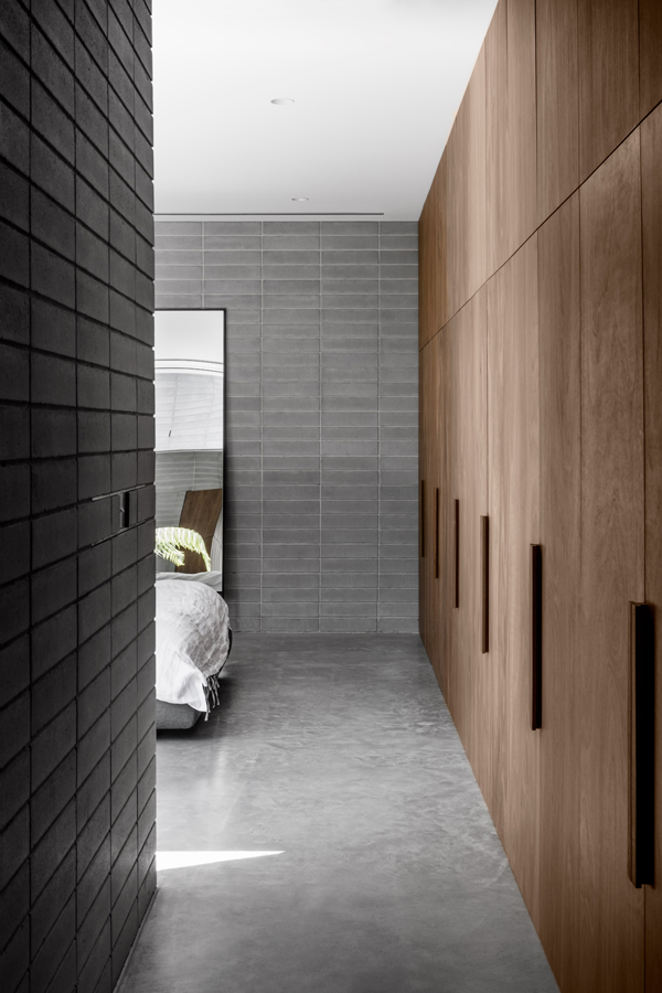
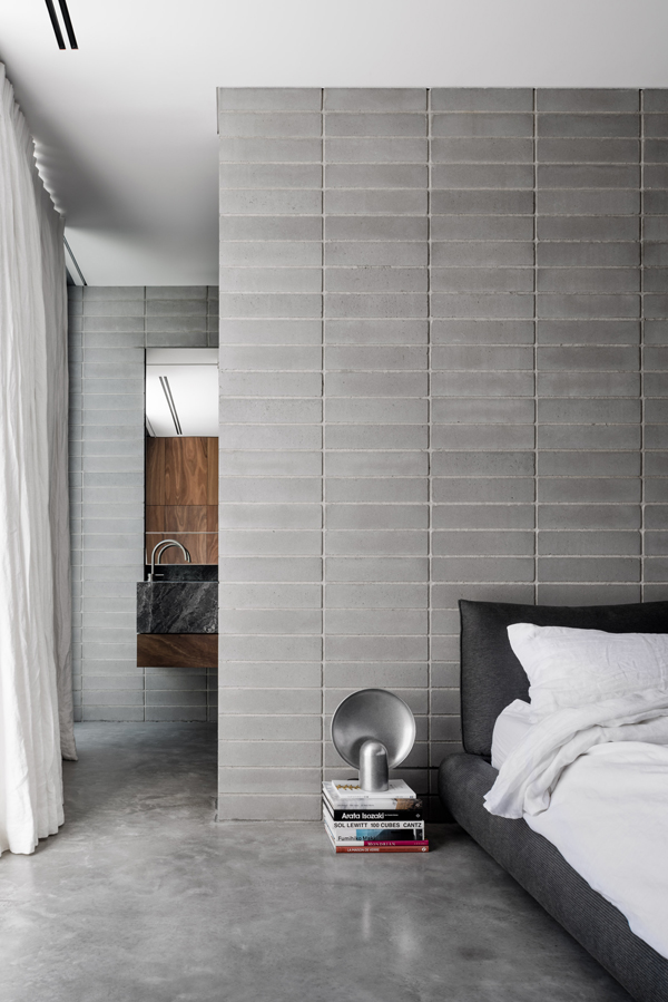
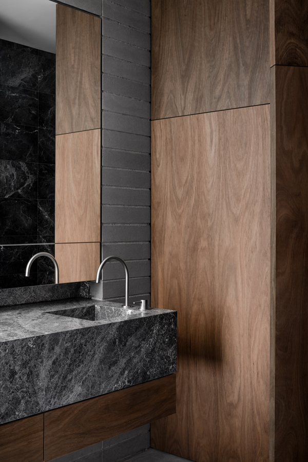
Today’s home by Ritz and Ghougassian is no exception with industrial block work unplastered and raw inside and outside in stark contrast to the calm and serene white washed courtyards at both ends of the extension. The space is contemporary and minimal with dark wooden cabinets and a large plump sofa from which you’d struggle to get me up. Good job the sofa is likely to be out of my price range.

If you like this courtyard house you’d enjoy this one and drool over this one too. Hope this has cheered you up.
 

courtyard extension, australian design, interior design, interiors, style, stylist, styling, architecture, contemporary, modern, block work, lush greenery, light, holiday vibes, mixing materials, textures, industrial, minimal, dark wood, stylejuicer, trend, trending

courtyard extension, australian design, interior design, interiors, style, stylist, styling, architecture, contemporary, modern, block work, lush greenery, light, holiday vibes, mixing materials, textures, industrial, minimal, dark wood, stylejuicer, trend, trending

courtyard extension, australian design, interior design, interiors, style, stylist, styling, architecture, contemporary, modern, block work, lush greenery, light, holiday vibes, mixing materials, textures, industrial, minimal, dark wood, stylejuicer, trend, trending

courtyard extension, australian design, interior design, interiors, style, stylist, styling, architecture, contemporary, modern, block work, lush greenery, light, holiday vibes, mixing materials, textures, industrial, minimal, dark wood, stylejuicer, trend, trending

courtyard extension, australian design, interior design, interiors, style, stylist, styling, architecture, contemporary, modern, block work, lush greenery, light, holiday vibes, mixing materials, textures, industrial, minimal, dark wood, stylejuicer, trend, trending

courtyard extension, australian design, interior design, interiors, style, stylist, styling, architecture, contemporary, modern, block work, lush greenery, light, holiday vibes, mixing materials, textures, industrial, minimal, dark wood, stylejuicer, trend, trending

courtyard extension, australian design, interior design, interiors, style, stylist, styling, architecture, contemporary, modern, block work, lush greenery, light, holiday vibes, mixing materials, textures, industrial, minimal, dark wood, stylejuicer, trend, trending

courtyard extension, australian design, interior design, interiors, style, stylist, styling, architecture, contemporary, modern, block work, lush greenery, light, holiday vibes, mixing materials, textures, industrial, minimal, dark wood, stylejuicer, trend, trending

courtyard extension, australian design, interior design, interiors, style, stylist, styling, architecture, contemporary, modern, block work, lush greenery, light, holiday vibes, mixing materials, textures, industrial, minimal, dark wood, stylejuicer, trend, trending

courtyard extension, australian design, interior design, interiors, style, stylist, styling, architecture, contemporary, modern, block work, lush greenery, light, holiday vibes, mixing materials, textures, industrial, minimal, dark wood, stylejuicer, trend, trending

courtyard extension, australian design, interior design, interiors, style, stylist, styling, architecture, contemporary, modern, block work, lush greenery, light, holiday vibes, mixing materials, textures, industrial, minimal, dark wood, stylejuicer, trend, trending


MORE INFORMATION | Ritz and Ghougassian
PHOTOGRAPHY | Tom Blachford with thanks
 
Follow Stylejuicer with Bloglovin
BLACK AND WHITE CHALET IN ONTARIO BY AKB STUDIO

11 April 2018

black and white, chalet, ski, snow, mountains, rural, minimal, mindfulness, reflection, stark, limited palette, materials, wood, concrete, oak, trend, style, styling, blending in, akb studio, architects, ontario, clearview chalet
 

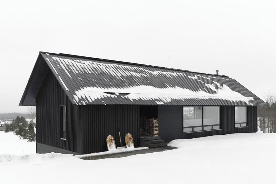
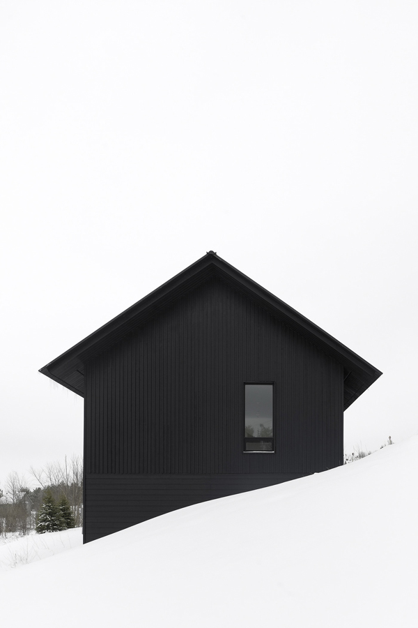
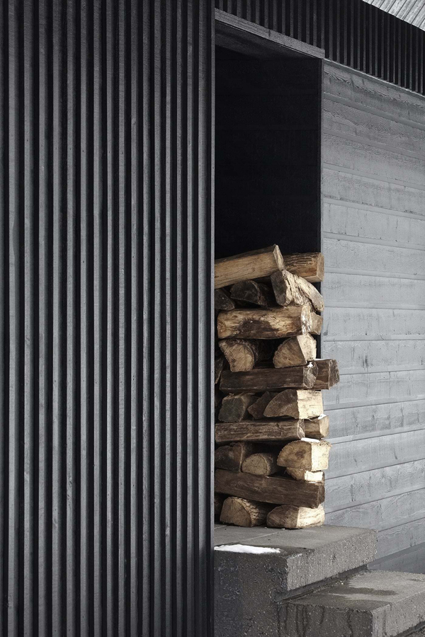
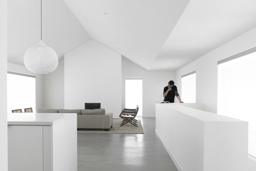
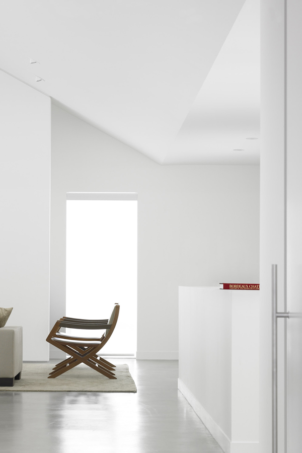
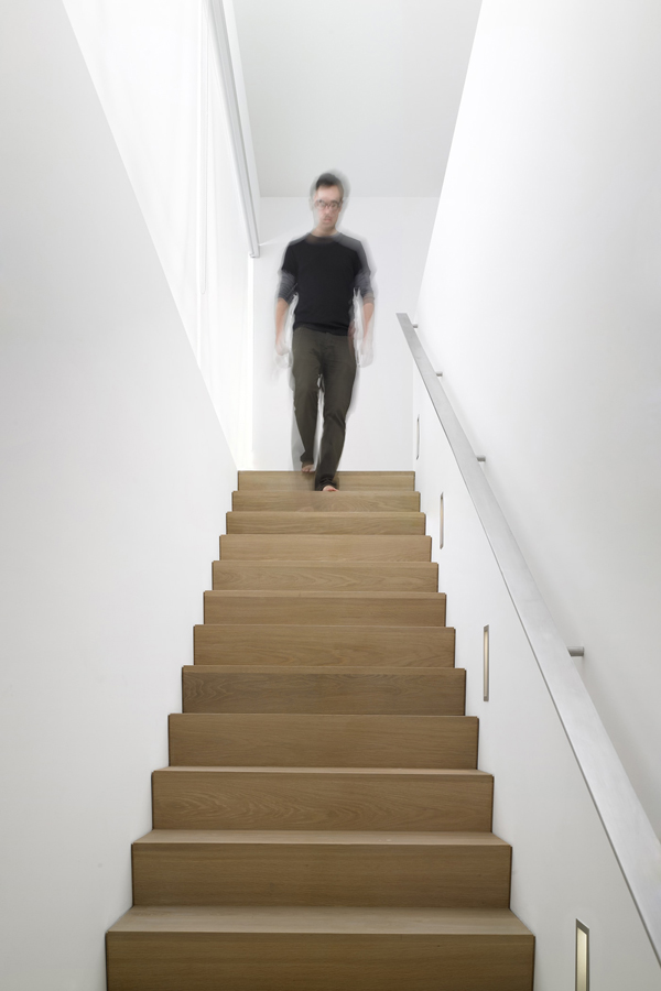
Darn this black and white chalet is handsome! Designed by AKB studio it’s strikingly black on the outside contrasting sharply with the white snowy landscape. An impression that is reversed on the inside where everything is stark white and blending into the landscape when looking out.
A simple idea beautifully executed with a limited palette of materials. This minimalist chalet brings you closer to nature and encourages mindfulness and reflection – something we all I ought to do more of.

 
black and white, chalet, ski, snow, mountains, rural, minimal, mindfulness, reflection, stark, limited palette, materials, wood, concrete, oak, trend, style, styling, blending in, akb studio, architects, ontario, clearview chalet

black and white, chalet, ski, snow, mountains, rural, minimal, mindfulness, reflection, stark, limited palette, materials, wood, concrete, oak, trend, style, styling, blending in, akb studio, architects, ontario, clearview chalet

black and white, chalet, ski, snow, mountains, rural, minimal, mindfulness, reflection, stark, limited palette, materials, wood, concrete, oak, trend, style, styling, blending in, akb studio, architects, ontario, clearview chalet

black and white, chalet, ski, snow, mountains, rural, minimal, mindfulness, reflection, stark, limited palette, materials, wood, concrete, oak, trend, style, styling, blending in, akb studio, architects, ontario, clearview chalet

black and white, chalet, ski, snow, mountains, rural, minimal, mindfulness, reflection, stark, limited palette, materials, wood, concrete, oak, trend, style, styling, blending in, akb studio, architects, ontario, clearview chalet


MORE INFORMATION | AKB studio
PHOTOGRAPHY | Shai Gil with thanks
 
Follow Stylejuicer with Bloglovin