Let me dish you some hot Dutch design this Friday and inspire you to go organic, if you’re not already a convert.
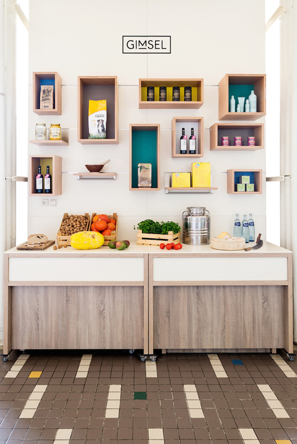
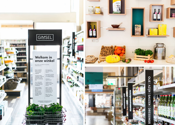
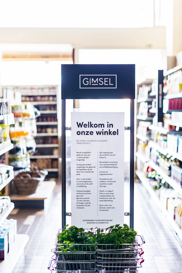
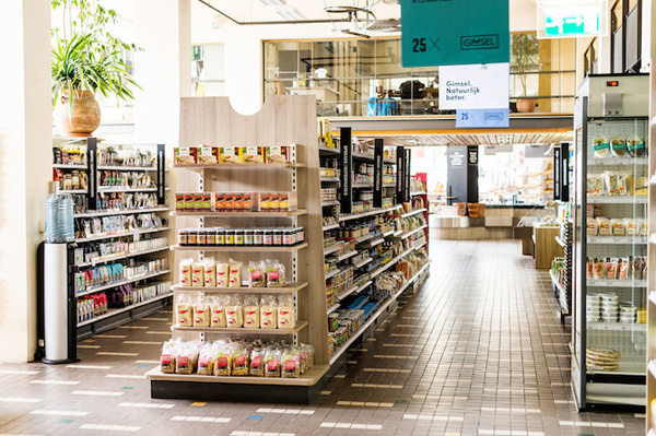
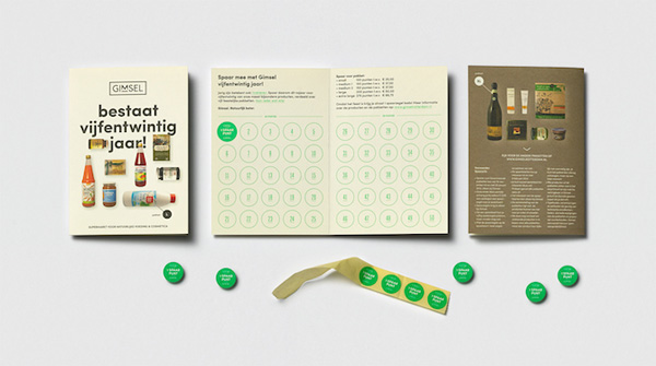
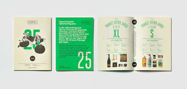
I was stunned to read that organic supermarkets Gimsel has been going for 25 years, selling natural products, pharmaceuticals and cosmetics whilst promoting sustainability and green living. They were so ahead of their time back in 1988 that I’m quite surprised and very glad they managed to keep going and have now transitioned into the 21st century with a strong new identity by design Studio Beige.
The Rotterdam based design studio is known for it’s love of typography and simplicity – two things that are top of my own aesthetics and style, hence the urge to share this branding gem with you all today.
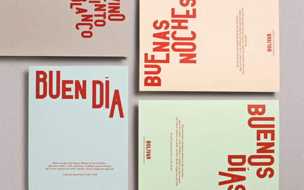
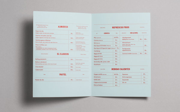
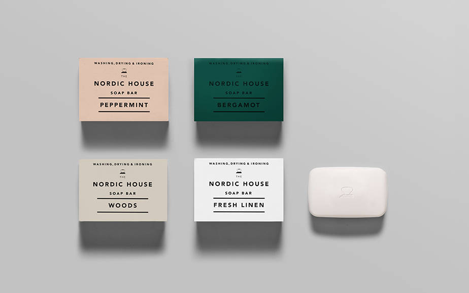
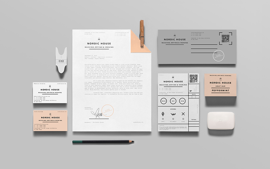
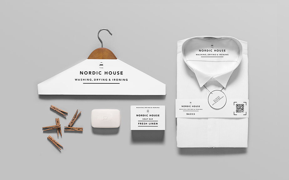
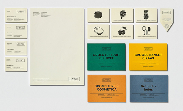
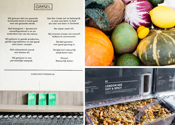
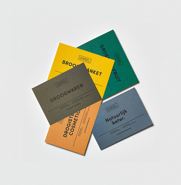
I like the earthy colour palette of mustard, dirty orange, emerald-green and grey-blue which fits well with Gimsel’s ethical values and organic product, emphasising their link with nature and the elements.
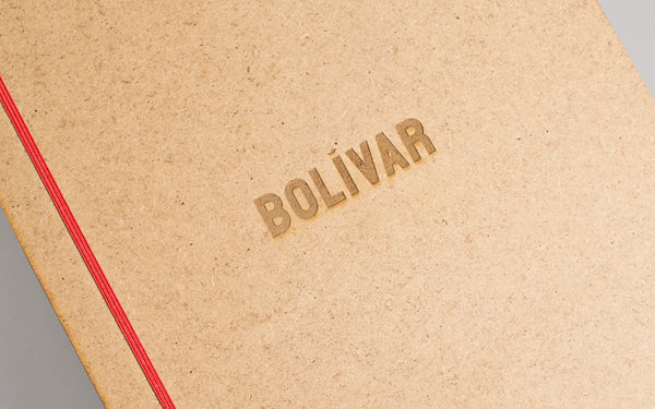
The new typographic logo is my favourite item. It’s simple, modern and functional with a stamp-like look that works across a whole range of products from signage to stationery. Mainly it’s highly recognisable and has stand-out in a market that is dominated by bright colours and brands competing for your attention.
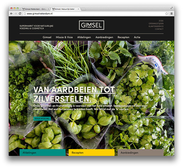
Gimsel’s new website is beautifully layed out, visually stimulating through large photography and very easy to navigate. It focuses on the essence of their brand which is just simple, quality, organic products. A fabulous branding job by Studio Beige and a must visit on my next trip to The Netherlands.
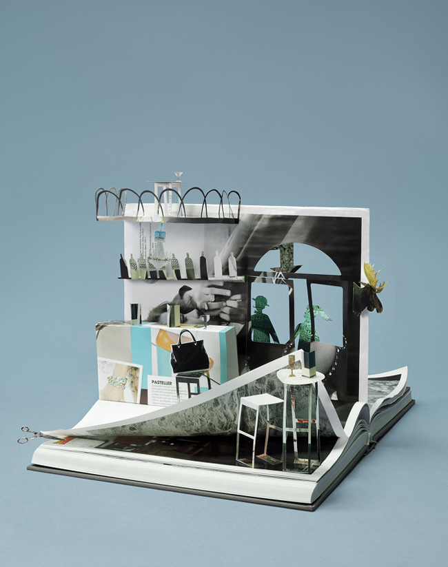
VIA | This Is Paper
MORE INFORMATION | Gimsel
DESIGN | Studio Beige
PHOTOGRAPHY | Jan Bijl, Leontien Herkelman
Follow Stylejuicer with Bloglovin