DONNA HAY FAST WEEKNIGHTS MUSHROOM PASTA

30 June 2014

donna hay, fast weeknights, easy, simple, recipe, pasta, mushroom, haloumi, walnuts, sour cream, australian, magazine, book

Do you dread the ‘what’s for dinner’ question by your partner and/or kids? I have to admit that I do as I’m not very organised when it comes to meal planning. It’s something I know I should do but somehow it never happens and I end up searching for quick and easy recipes online in a bit of a panic.

One (of many) good things about this blog is that I can collect all my favourite recipes in one place and today is another fast weeknights pasta dish that is quick, easy and delicious by the lovely Donna Hay who is fast becoming Australia’s answer to Jamie Oliver and it says in her biography:

Her food, recipes and styling focus on basic ingredients that are simply prepared and beautifully photographed – hallmarks of her work which have set the benchmark for food publishing worldwide and inspired a whole new generation of cooks.

And since mouth-watering food photography is a benchmark for Stylejuicer I’m sure it won’t be the last time I’m going to feature one of Donna’s recipes. For more fast weeknights pop over to her site and be inspired – just don’t do it on an empty stomach.

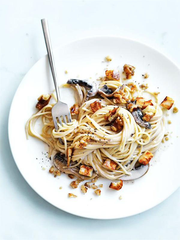
MUSHROOM PASTA WITH HALOUMI & WALNUTS

Serves 4

INGREDIENTS:

400g spaghetti
1/4 cup (60ml) extra virgin olive oil
250g haloumi, chopped
1/2 cup (50g) walnuts, roughly chopped
2 cloves garlic, sliced
300g field mushrooms, sliced
sea salt and cracked black pepper
250g sour cream

DIRECTIONS:

Cook the pasta in a saucepan of salted boiling water for 8–10 minutes or until al dente. Drain, reserving 1/3 cup (80ml) of the cooking liquid. Heat 1 tablespoon of the oil in a large non-stick frying pan over high heat. Add the haloumi and walnuts and cook, stirring, for 3 minutes or until golden. Set aside and keep warm. Add the remaining oil, the garlic, mushrooms, salt and pepper and cook, stirring, for 3–4 minutes. Add the cream and reserved liquid and cook for 3 minutes. Add the pasta to the pan and toss to coat. Top with the haloumi, walnuts and pepper to serve.

 
MORE INFORMATION & PHOTOGRAPHY | Donna Hay
 
Follow Stylejuicer with Bloglovin

STYLIST’S BLUE BEACH HOUSE IN SYDNEY

27 June 2014

Modernist-Beach-House-Sydney-01

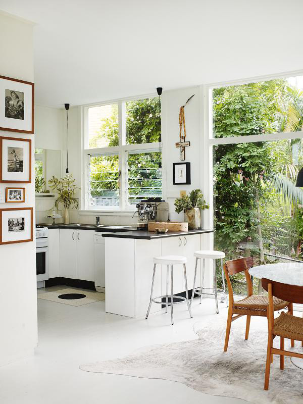
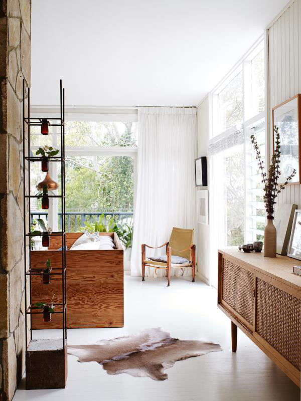
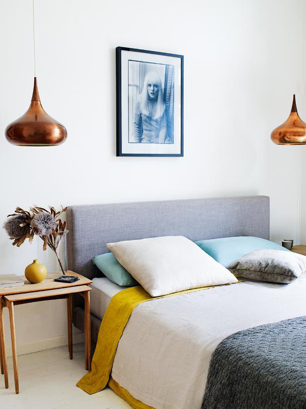
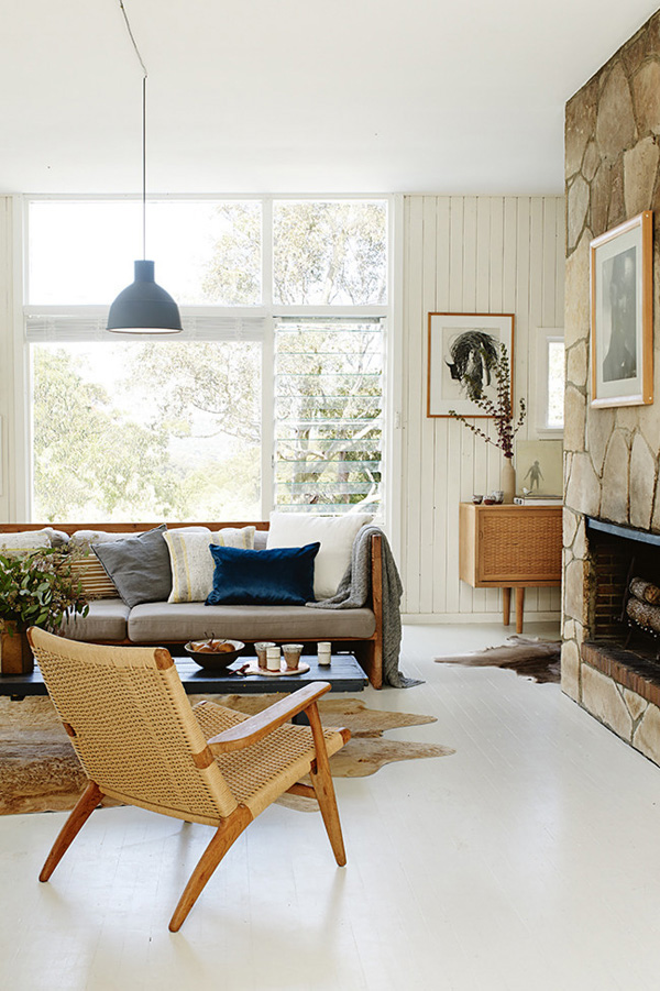
This beautiful modernist beach house in Sydney was recently featured in Australia’s Inside Out Magazine – one of my favourites for interior eye candy from down under.

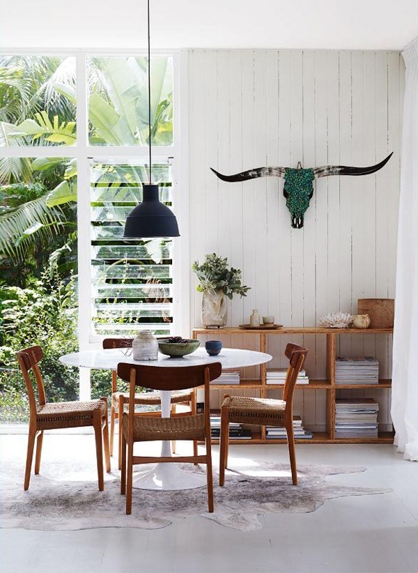
It belongs to interior stylist Karen Kelly Tarasin and has been lovingly filled with Nordic modernist furniture and a few selected modern pieces like the Muuto lamps above the dining table and sofa.

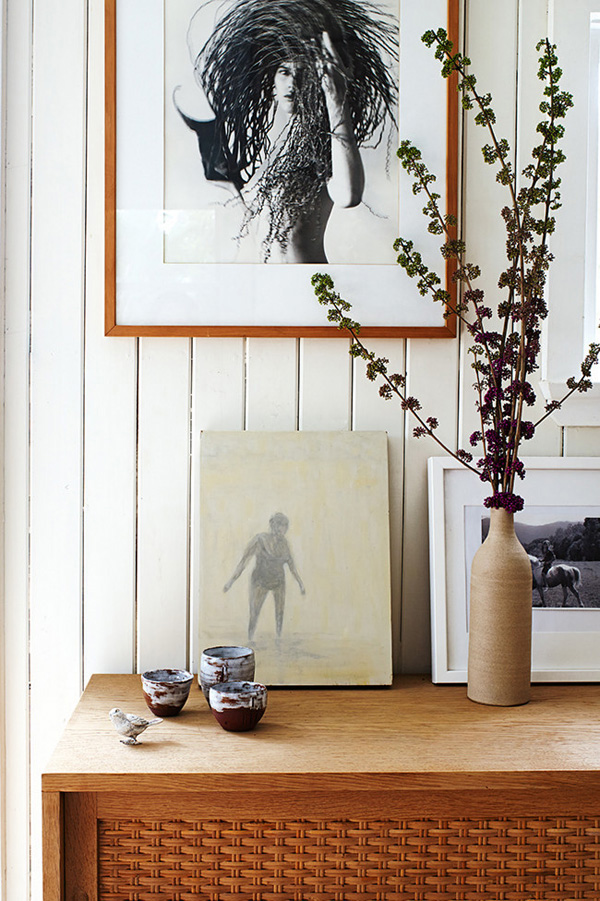
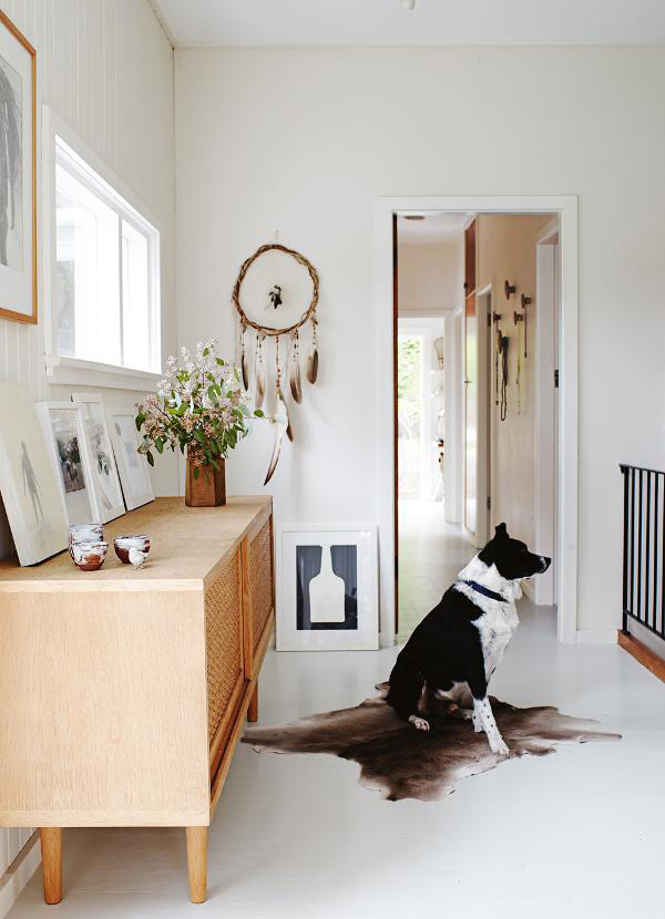
Maybe it’s the lighting or the fresh green and exotic leaves that peek through the windows but this home feels so fresh and cozy to me. I notice there are plants and flowers on display everywhere but all blending in apart from the ‘Rio’ garden column in the hallway which houses six individual vases for flower displays.

My favourite piece of art has to be the bull skull over the classic Saarinen ‘Tulip’ dining table – aren’t those horns magnificent!? I wonder what the emerald green decoration on the skull is.

I like how the overall colour palette is pared back and dominated by white, blonde wood and earthy tones with a few navy accents. Even the artwork of mostly black and white photography blends in with the owners collection of vintage Danish furniture and makes this home feel calm and peaceful.

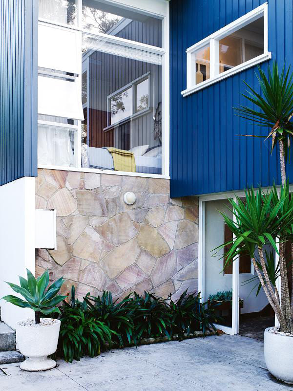
Interestingly the outside is painted in a strong Matisse blue and a complete contrast to the serene inside.

What do you make of this bold contrast?


Modernist-Beach-House-Sydney-02

Modernist-Beach-House-Sydney-03

Modernist-Beach-House-Sydney-04

Modernist-Beach-House-Sydney-05

Modernist-Beach-House-Sydney-06

Modernist-Beach-House-Sydney-07

Modernist-Beach-House-Sydney-08

modernist, sydney, home, beach house, interior design, style, stylist karen kelly tarasin, decor, nordic, wood, lighting, trend,

 
VIA | Homelife
PHOTOGRAPHY | Prue Ruscoe
STYLING | Claire Delmar
INSTAGRAM | Karen Kelly Tarasin
 
Follow Stylejuicer with Bloglovin
DESIGN INSPIRATION | ALPHABET FAMILY JOURNAL

25 June 2014

alphabet family journal, design inspiration, graphic design, editorial, photography, parenting, home, stories, portrayals, celebrating, lucy feaigns, the design files, australia, luisa brimble, sarah sukisri
 

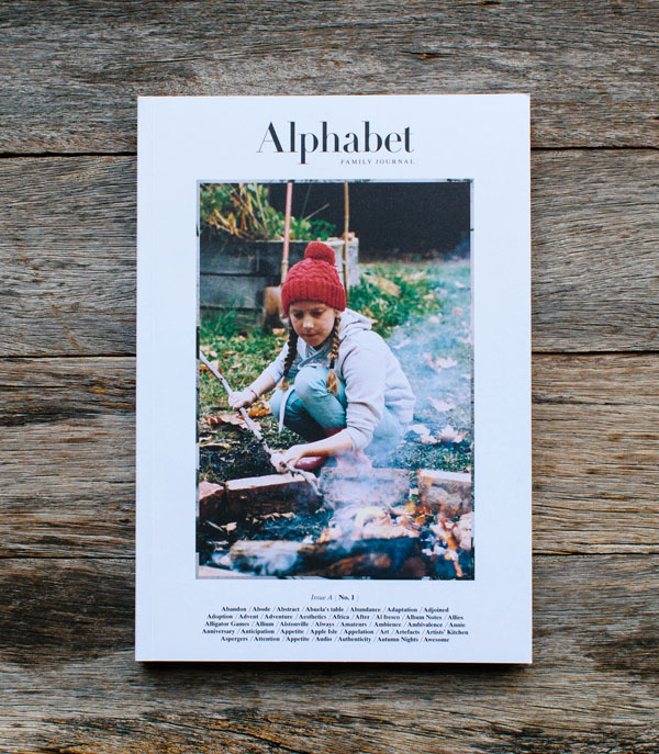
I love it when true passion and vision come together without compromising. Alphabet Family Journal is the brain child of Sydney based photographer Luisa Brimble who’s vision and tenacity led her to hook up with Sarah Suksiri, a writer and editor living in Indianapolis, USA.

As I enjoy hearing success stories I’m just going to let Luisa talk about her journey:

The concept for Alphabet Family Journal first came to me about three years ago, after I gave birth to my youngest daughter Poppy. I began to notice that parenting and family magazines seemed so focussed on either the perfection of family life, or how to ‘fit’ having a family into our hectic lifestyles. But there wasn’t a magazine that talked about the realities of what it means to have a family or to make a home together.

Alphabet is a magazine for people who make a home together. We believe the home is a lived space and not a showroom. We believe that when families return to the basics – acts of gratitude, curiosity, collaboration – they are writing the kinds of living stories that are meant to be shared. This is where we share them.

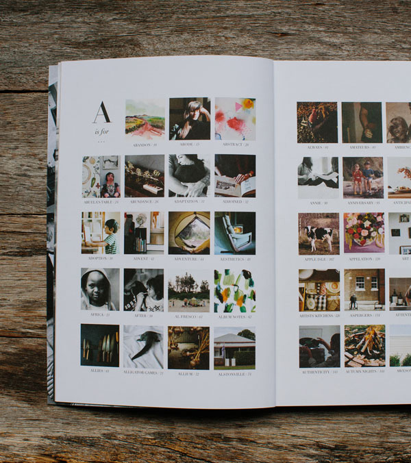
Alphabet Family Journal Issue A is the product of 26 writers, 31 photographers, 4 artists and an editorial team of 13 across 4 continents! All our contributors share a mission to celebrate the messes and miracles of what it’s like to find, grow, and be a part of a family.

I love the concept, design and tone of the journal that offers honest portrayals of today’s family in all its shapes and sizes in Australia and around the world. Each issue features stories around a letter of the alphabet and in issue ‘A’ the contributors talk about adoption, celebrating an anniversary and reflect on art and aesthetics amongst others.

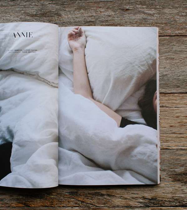
I can’t wait to get my hands on the first edition that launched in Australia mid June. Did you notice there’s a story about ‘Annie’!? I’m intrigued…


Alphabet-Family-Journal-via-The-Design-Files-02

Alphabet-Family-Journal-via-The-Design-Files-04

Alphabet-Family-Journal-via-The-Design-Files-03

alphabet family journal, design inspiration, graphic design, editorial, photography, parenting, home, stories, portrayals, celebrating, lucy feaigns, the design files, australia, luisa brimble, sarah sukisri


PHOTOGRAPHY | Lucy Feagins from The Design Files with kind permission
MORE INFORMATION | Alphabet family Journal

NOCH MINI ORGANIC CLOTHING FROM NYC

24 June 2014

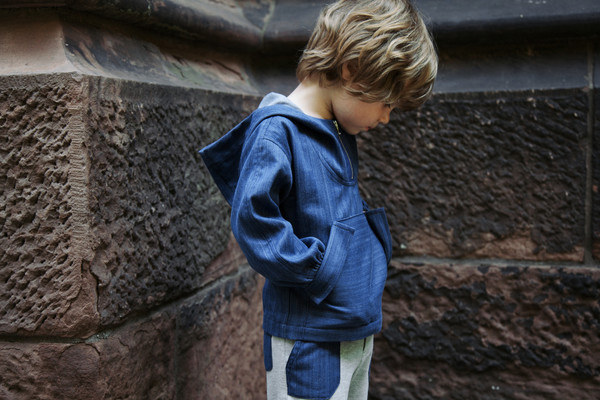
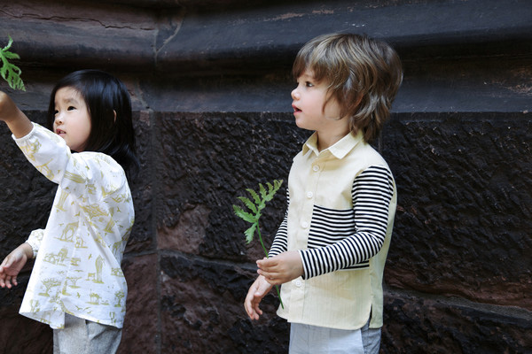
Noch-Mini-SS2014-Kids-Corner-via-Stylejuicer-01

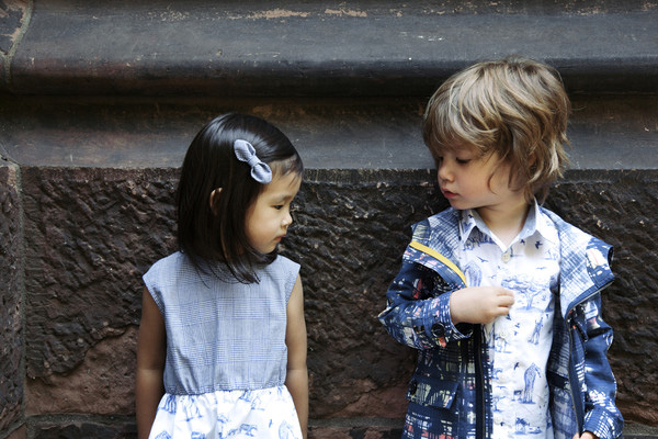
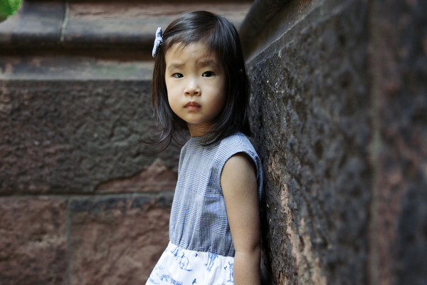
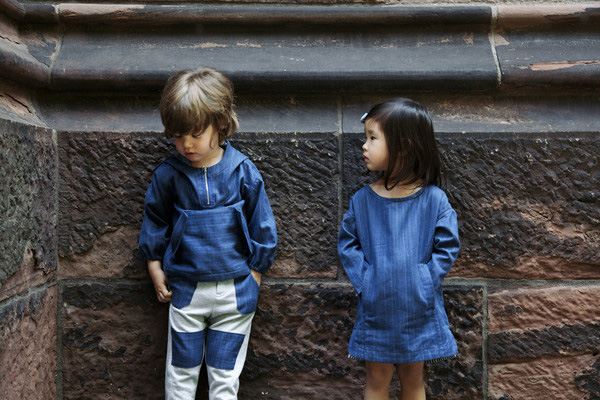
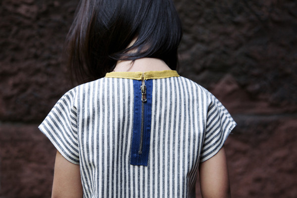
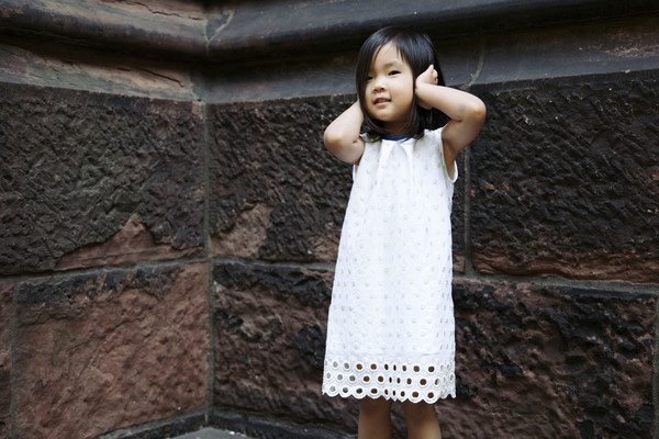
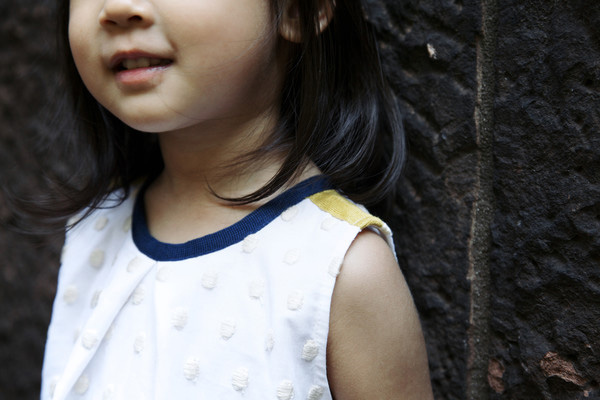
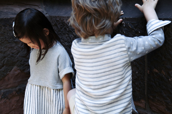
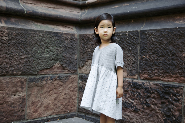
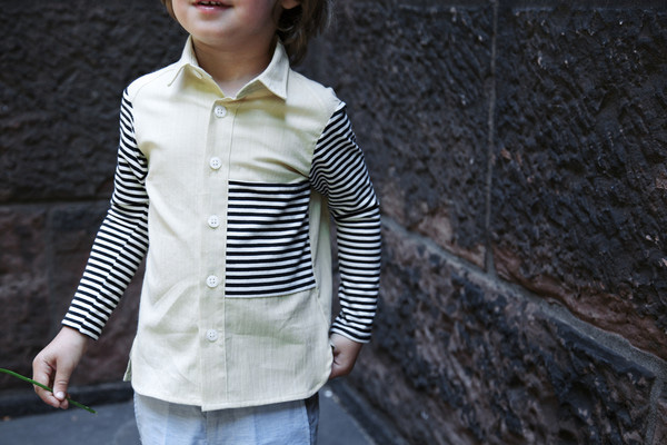
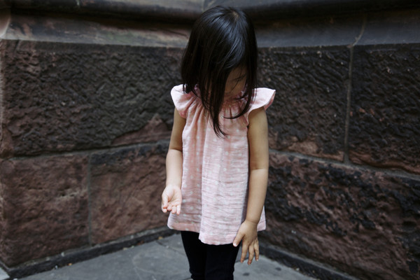
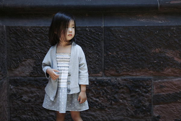
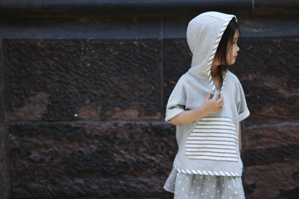
NOCH Mini is another great find that popped into my Pinterest feed via Peggy from Paul et Paula. I love the simple look book shots that show off their stylish clothes and I’m totally in love with these little models – they could sell me anything!

The brand is very environmentally conscious and most of their collection is made locally in New York City using only certified organic materials and low-impact dyes. In their own words:

We are committed to designing beautiful, well-made, simple, yet sophisticated clothes for children. We also believe in protecting our body and environment from harsh chemical pollutants. Soft on our children’s skin, only highest quality organic materials are carefully selected and transformed into NOCH’s collection.

I like their simple cuts, innovative designs and attention to detail which makes them stand out from the crowd. Another example of how children’s clothes don’t have to stick to stereotypical colour palettes. Thanks Peggy for the inspiration!
 

Noch-Mini-SS2014-Kids-Corner-via-Stylejuicer-02

Noch-Mini-SS2014-Kids-Corner-via-Stylejuicer-03

Noch-Mini-SS2014-Kids-Corner-via-Stylejuicer-04

Noch-Mini-SS2014-Kids-Corner-via-Stylejuicer-06

Noch-Mini-SS2014-Kids-Corner-via-Stylejuicer-08

Noch-Mini-SS2014-Kids-Corner-via-Stylejuicer-09

Noch-Mini-SS2014-Kids-Corner-via-Stylejuicer-07

Noch-Mini-SS2014-Kids-Corner-via-Stylejuicer-12

Noch-Mini-SS2014-Kids-Corner-via-Stylejuicer-11

Noch-Mini-SS2014-Kids-Corner-via-Stylejuicer-10

Noch-Mini-SS2014-Kids-Corner-via-Stylejuicer-13

Noch-Mini-SS2014-Kids-Corner-via-Stylejuicer-14

kids clothing, fashion, simple, sophisticated, quality, organic, boutique, new york city, noch, ss2014, kids corner, collection, trend

 
MORE INFORMATION & PHOTOGRAPHY | Noch Mini
 
Follow Stylejuicer with Bloglovin
MOOD BOARD | WIMBLEDON 2014

23 June 2014

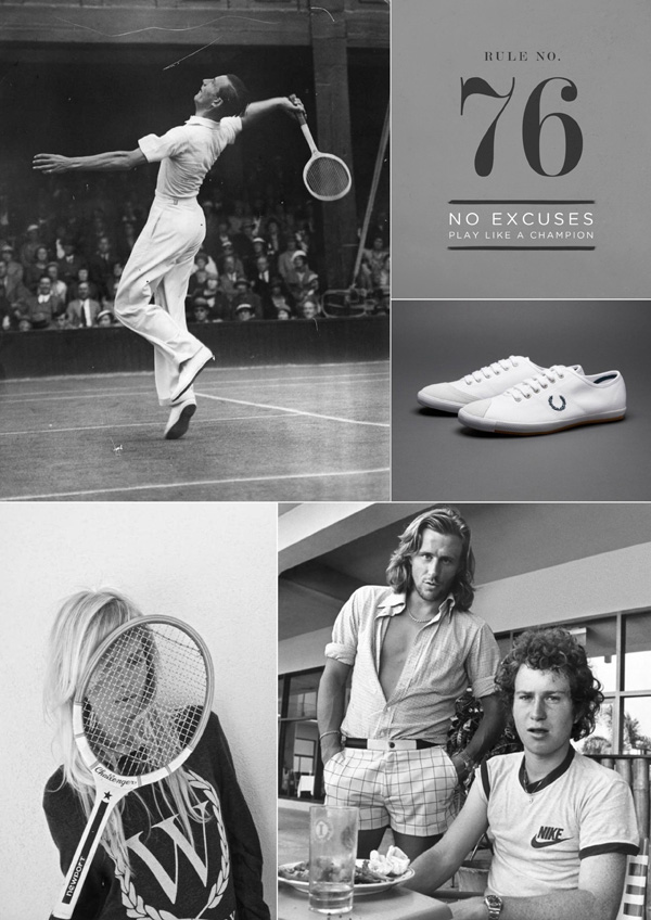
wimbledon 2014, mood board, tennis, english, event, tournament, grand slam, fred perry, canvas shoes, fashion, bjorn borg, john mcenroe, classic
 

It’s my favourite fortnight again and just one of the reasons I’ve moved to London: Wimbledon 2014 gets under way today and the TV will be my best friend for the next two weeks. Never mind that there’s some crazy tournament on in Brazil, it’s strawberries and cream all the way at our house.

Today is a bit of a classic black and white take on Wimbledon with featuring some legends as well as some stylish fashion. I hope you enjoy and please feel free to pin, share and spread the Stylejuicer love.
 

LEGEND NO.1 // Prior to Andy Murray in 2013, Fred Perry was the last British player to win the men’s Wimbledon championship, in 1936
POSTER // Loving the typography on this poster found on etsy
SHOES // New classic’s – Fred Perry canvas tennis shoes
MODEL // I love her ‘W’ sweater
LEGEND NO. 2 & 3 // My goodness Borg was SO handsome

 
PHOTOGRAPHY | N/K [If you know who took the shot please email me at annie {at} stylejuicer.com]