RESTORED FARMHOUSE IN SOUTHERN SWEDEN

8 July 2014

magdalena-bjornsdotter-via-lantliv-01

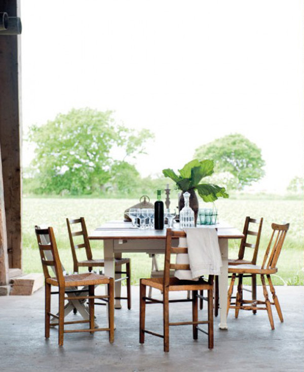
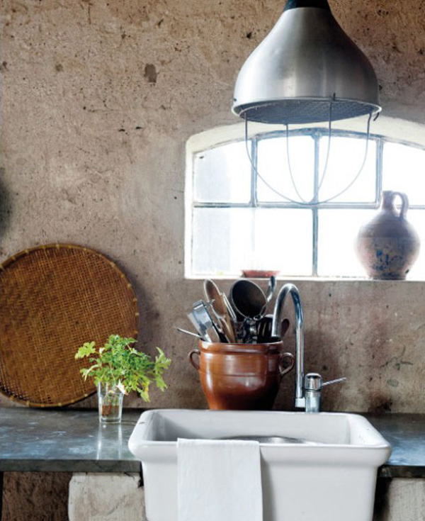
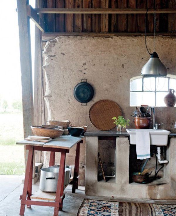
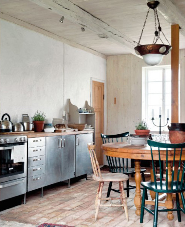
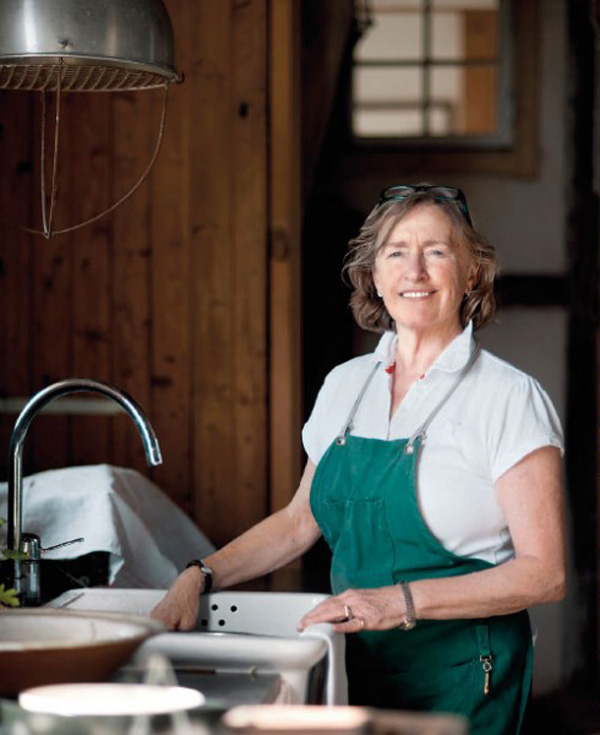
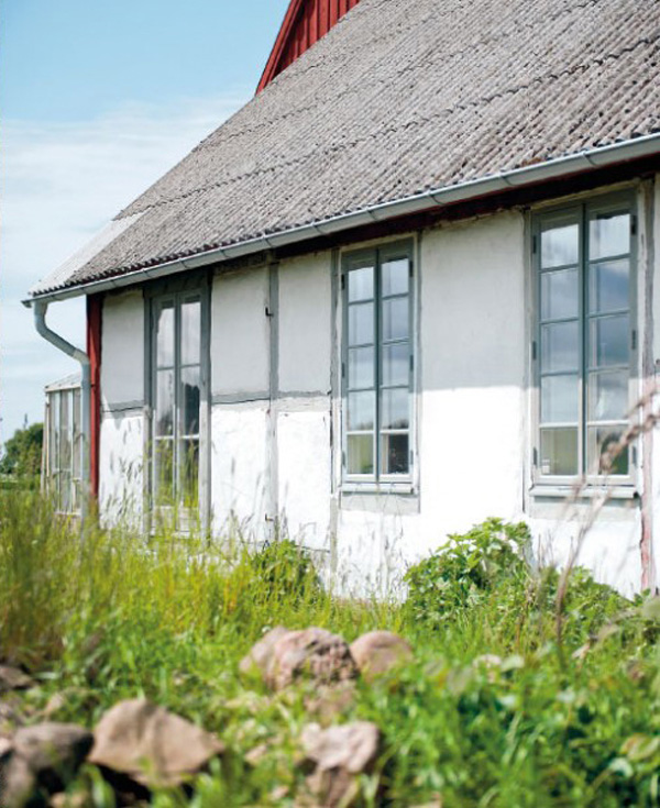
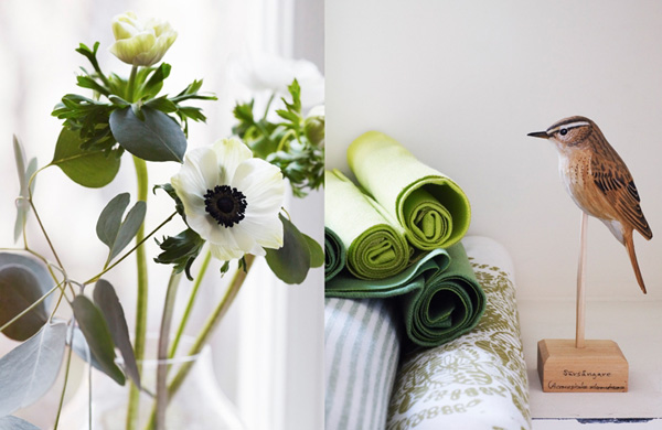
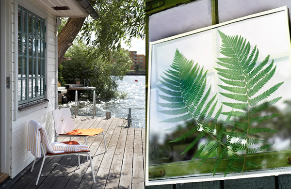
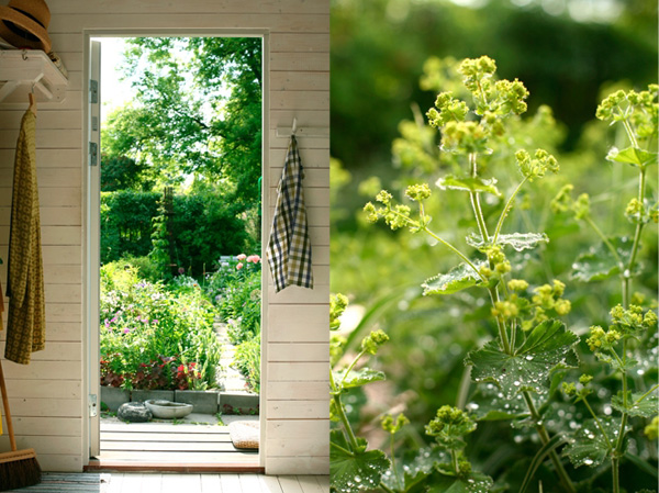
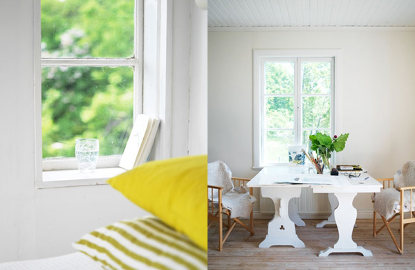
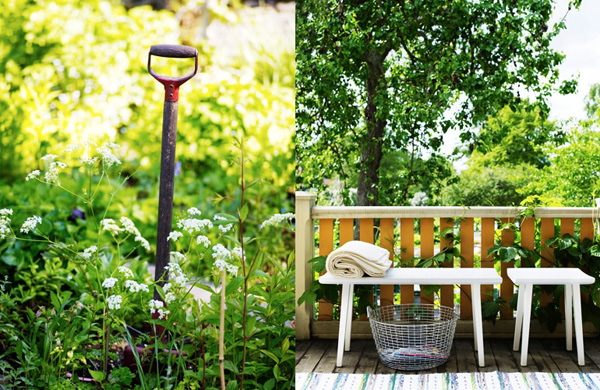
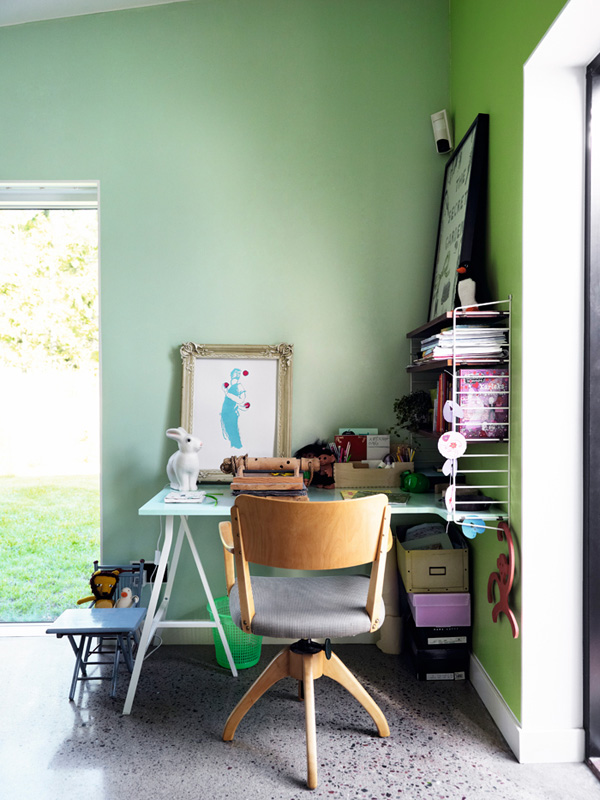
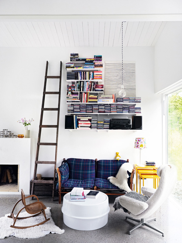
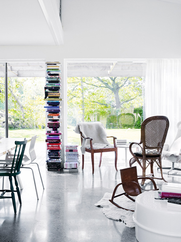
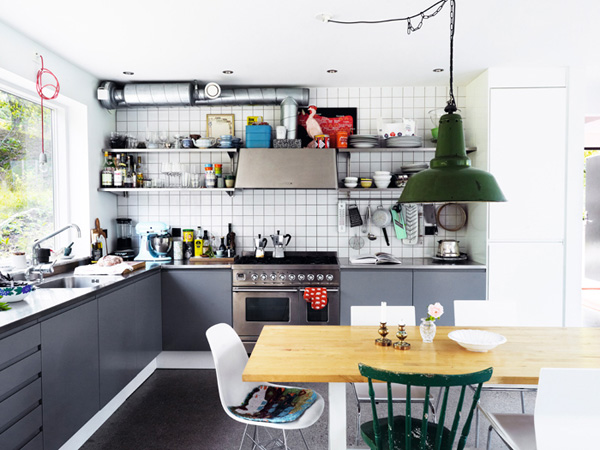
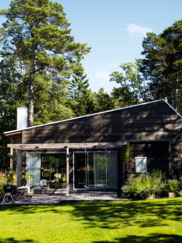
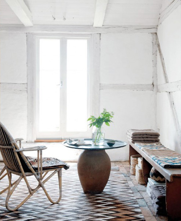
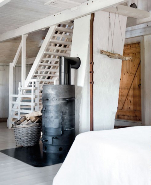
It’s funny how one blog post can lead to another. Yesterday’s Summer Stories styled by Cia Wedin led me to the Swedish magazine Lantliv where I found this wonderful restored farmhouse in the southern Swedish region of Skane. The shots by Magdalena Bjornsdotter beautifully portray the rustic Scandinavian charm with whitewashed walls, old beams and an eclectic mix of vintage finds, heirlooms and some modern pieces.

From what I could find out via google translate the owners Gunilla and Sven Montan bought the farm over 15 years ago when it was a mere wreck, covered with metal sheets and not a single window intact. As with most renovation projects they could immediately see the potential of this traditional farmhouse and fell in love with the old floors, hand crafted timber and beautiful courtyard.

They employed local craftsmen using traditional materials and methods to make sure the house was being restored sensitively. One of their greatest challenges was to decide what bits should be restored and what should be replaced. “If you change too much you lose the sense of the old. It’s a constant balance between what should be replaced and what should be saved.”

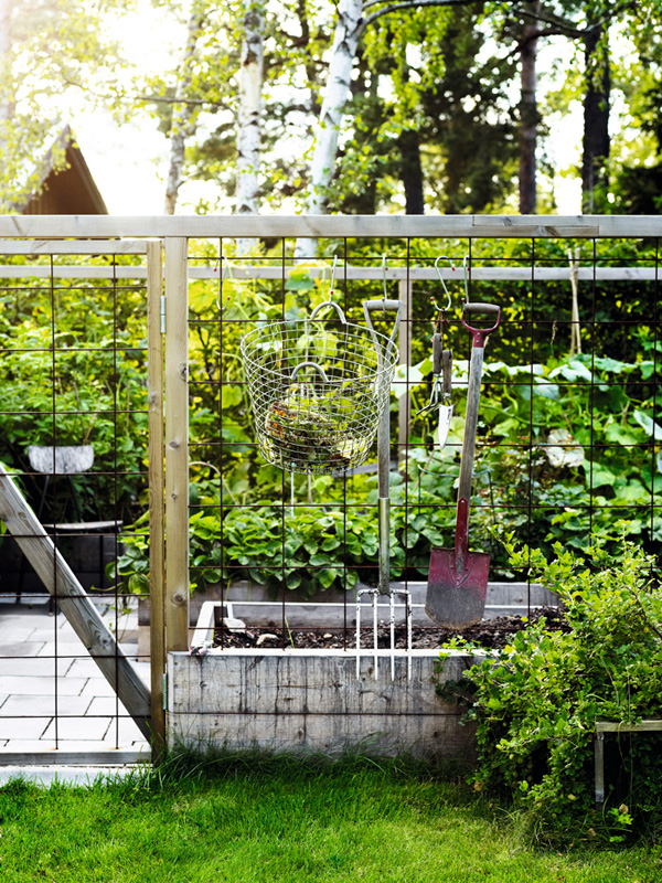
Gunilla selects all of her furniture with her heart and doesn’t worry too much about style and consistency. For her the more eclectic the better. She also has a refreshingly relaxed approach to gardening where she likes to just let things go wild with some regular lawn mowing and weeding making sure that nature doesn’t completely take over.

She says her priority are her children and grand children now and the couple fly around the world to visit their extended families in far flung places like Brazil and China. But Gunilla has also made sure that there’s enough space for everyone on the farm by creating four separate accommodations with their own facilities. A most idyllic setup and perfect backdrop for a yearly family reunion.

If you like renovation projects you will like this Swiss chalet restoration by Bergdorf Agency and – one of my favourites – Bruecke 49, a boutique chalet hotel in the Alps.

 
magdalena-bjornsdotter-via-lantliv-02

magdalena-bjornsdotter-via-lantliv-03

magdalena-bjornsdotter-via-lantliv-04

magdalena-bjornsdotter-via-lantliv-05

magdalena-bjornsdotter-via-lantliv-06

magdalena-bjornsdotter-via-lantliv-07

magdalena-bjornsdotter-via-lantliv-08

magdalena-bjornsdotter-via-lantliv-09

skane, farmhouse, sweden, gunilla and sven montan, restore, replace, traditional, craftsmen, method, materials, relaxed, styling, gardening, rustic, charm, mix and match, flea market finds, heirlooms

 
VIA | Lantliv
PHOTOGRAPHY | Magdalena Bjornsdotter
 
Follow Stylejuicer with Bloglovin

SUMMER STORIES BY STYLIST CIA WEDIN

7 July 2014

cia wedin, stylist, scandinavian, summer, stories, editorial, magazine, residence, elle interior, lantliv, interior design, anna kern, johan sellen, johanna ekmark, photography, stellan herner,

Happy sunny Monday to you all. Did you have a nice weekend? I was glued to the Wimbledon Men’s Final yesterday and kept changing my mind about who I wanted to win. Both SO deserved it but sadly only one winner – what a great match.

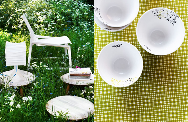
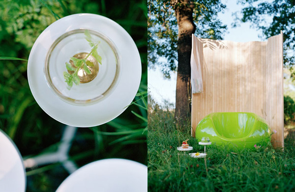
But back to Monday and I hope these shots styled by Cia Wedin will give you some joy and inspiration. I came across Cia’s site whilst writing Friday’s post about the small Swedish Cabin and because the weather has been really lovely recently I think today’s photos fit right in with that fresh sunny summer feel with a Scandinavian touch.

All of them are editorial Summer Stories shot for Scandinavian interior magazines like Residence, Elle Interior and Lantliv. For more beautiful styling head over to Cia’s site and check out her portfolio. She’s super talented and even styled photographer and blogger Sofia Jansson’s home which I featured on here a few weeks ago.

Seems that Cia and I are inspired by the same things.
 

Summer-Stories-by-Cia-Wedin-02

Summer-Stories-by-Cia-Wedin-03

Summer-Stories-by-Cia-Wedin-04

Summer-Stories-by-Cia-Wedin-05

Summer-Stories-by-Cia-Wedin-06

cia wedin, stylist, scandinavian, summer, stories, editorial, magazine, residence, elle interior, lantliv, interior design, anna kern, johan sellen, johanna ekmark, photography, stellan herner,


STYLING | Cia Wedin
PHOTOGRAPHY | Anna Kern, Johanna Ekmark, Johan Sellén, Stellan Herner
 
Follow Stylejuicer with Bloglovin
SMALL SPACES | SWEDISH CABIN

4 July 2014

Swedish-cabin-via-Elle-Decoration-01
 

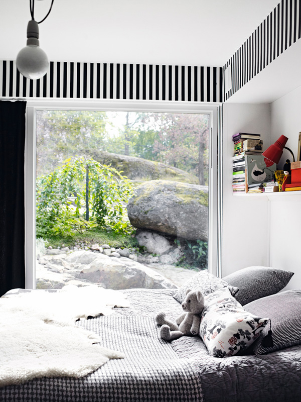
This cabin is just 70 sqm (750 sqft) and nestled in the woods somewhere in Sweden. It’s home to Katy and Hugo and their two children who like to live outside as much as possible. Large windows and doors let in plenty of light and views of the garden and woods connect inside and outside.

From what I can see and read they live a very environmentally conscious life and most of their furniture is inherited or found at flea markets – bar the odd piece from IKEA which is almost mandatory if you’re Swedish.

They also love cooking and their reading nook has lots of bargain cookbooks close at hand. With so much land around it’s not surprising they’ve got their own vegetable garden too and like to harvest just before dinner so no food miles here. I bet those veggies are full of flavour.

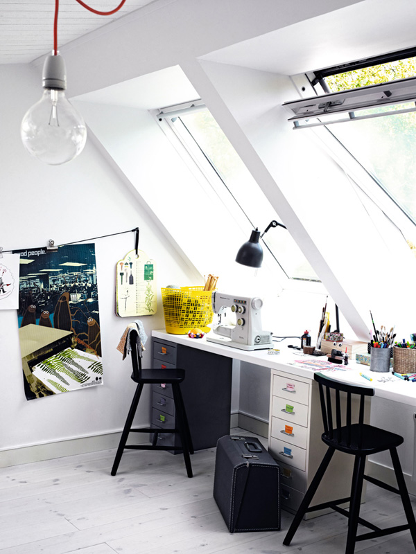
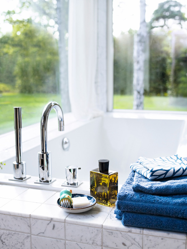
I like that Katy has also created a studio space in the loft which must have the most wonderful views through those large Velux windows. Talking of views I don’t think you can beat the one from the sunken bath across the lawn and into the woods. Katy says: “It’s incredibly nice to be there in the morning and brush your teeth while watching blackbirds bathing in the small puddles we created in rock crevices.”

Katy and Hugo’s lifestyle reminds me of my own upbringing and I’m feeling quite nostalgic about their rural set-up and wholesome attitude. I’m sure there are drawbacks and the long dark winter months would make me feel quite isolated but these sunny shots by Anna Kern are wonderfully enticing to go back to my roots and live the country life.

What do you think about their Swedish cabin? Would you feel isolated living in the woods?


Swedish-cabin-via-Elle-Decoration-02

Swedish-cabin-via-Elle-Decoration-03

Swedish-cabin-via-Elle-Decoration-04

Swedish-cabin-via-Elle-Decoration-06

Swedish-cabin-via-Elle-Decoration-07

Swedish-cabin-via-Elle-Decoration-08

Swedish-cabin-via-Elle-Decoration-09

Swedish-cabin-via-Elle-Decoration-09b

Swedish-cabin-via-Elle-Decoration-10

ikea ps, recycled, reclaimed, inherited, flea market finds, decor, inside outside, garden, vegetables, cooking, small spaces, woods, sweden, swedish cabin

 
VIA | Elle Decoration
PHOTOGRAPHY | Anna Kern
STYLING | Cia Wedin
 
Follow Stylejuicer with Bloglovin
PLACES TO GO | CLARRODS COPENHAGEN

2 July 2014

places to go, clarrods, copenhagen, furniture, design, store, shop, bar, cafe, claus larsen, paulina arcklin, photography, vintage, industrial, creative fulfilment, trend, travel

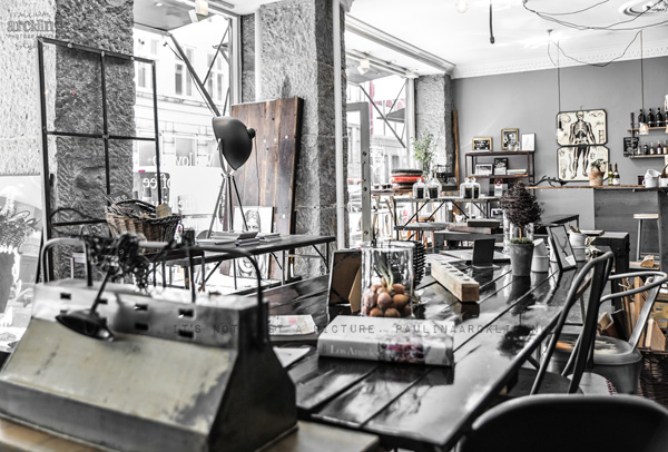
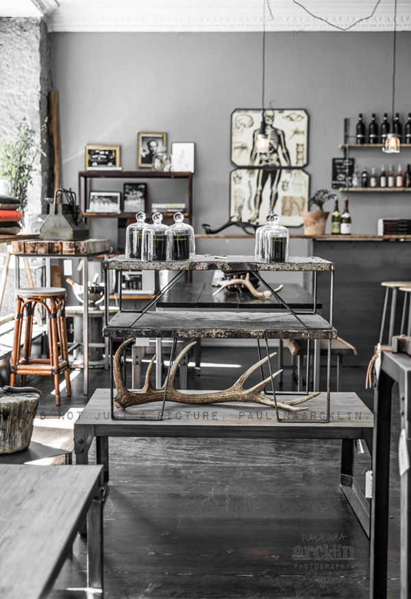
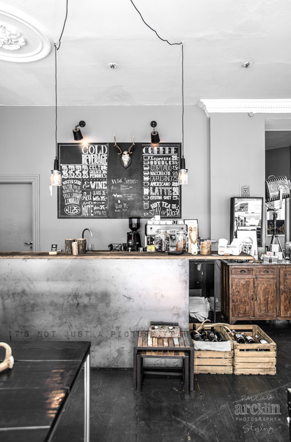
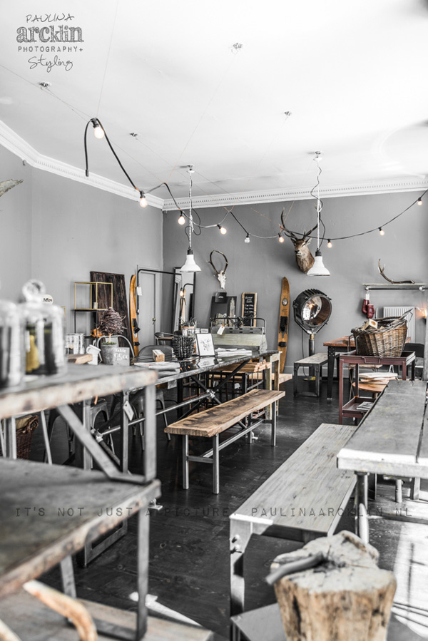
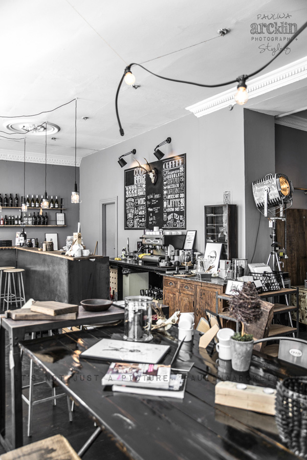
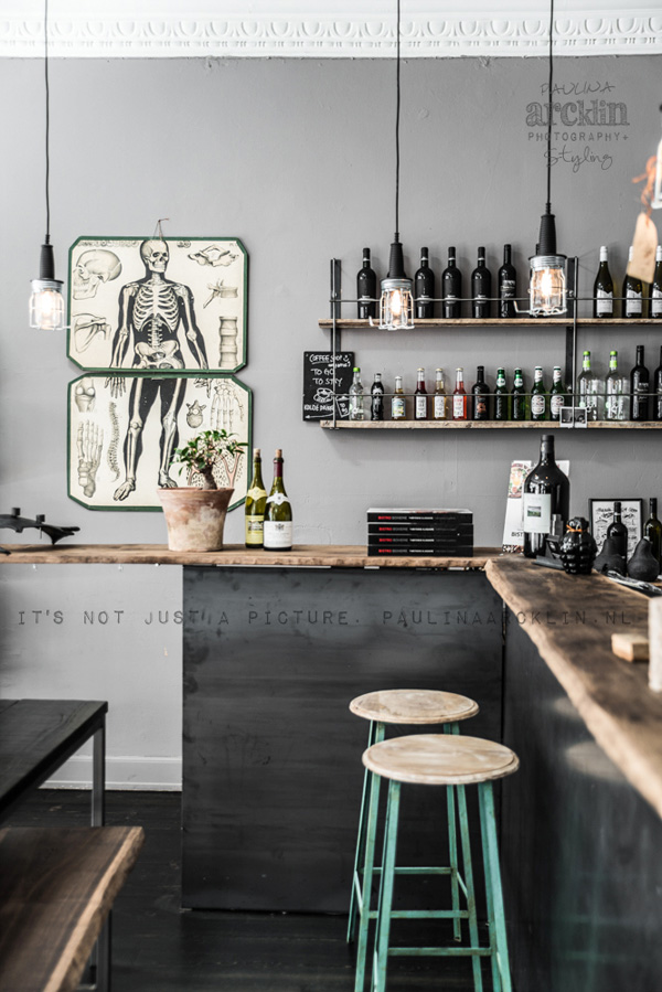
Ok, if I could move into this shop I totally would. Not only is it in beautiful design heaven Copenhagen but it also comes with a bar/cafe and will soon be serving food I’m being told by the owner Claus Larsen.

Claus used to have a career in ‘money’ (erm… something lost in translation here but I get the drift) before he opened Clarrods – a fabulous furniture shop selling mostly Claus’ own designs and some hand-picked decorative vintage pieces. He’s also trained as a welder and has two other guys helping him produce a variety of tables and benches with mostly wooden tops on steel frames.

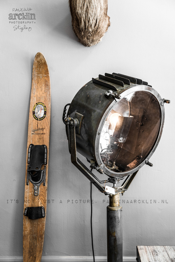
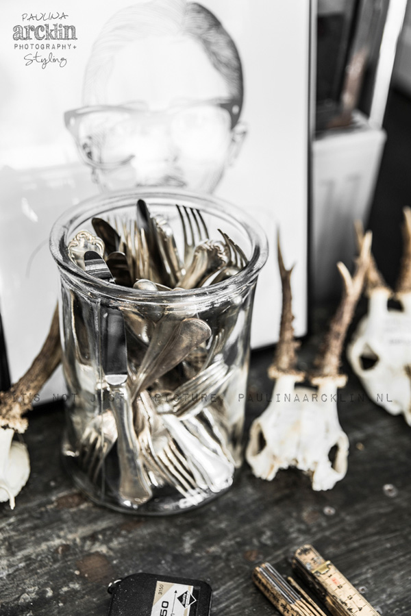
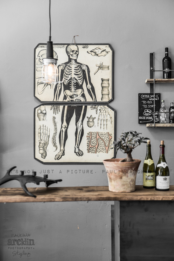
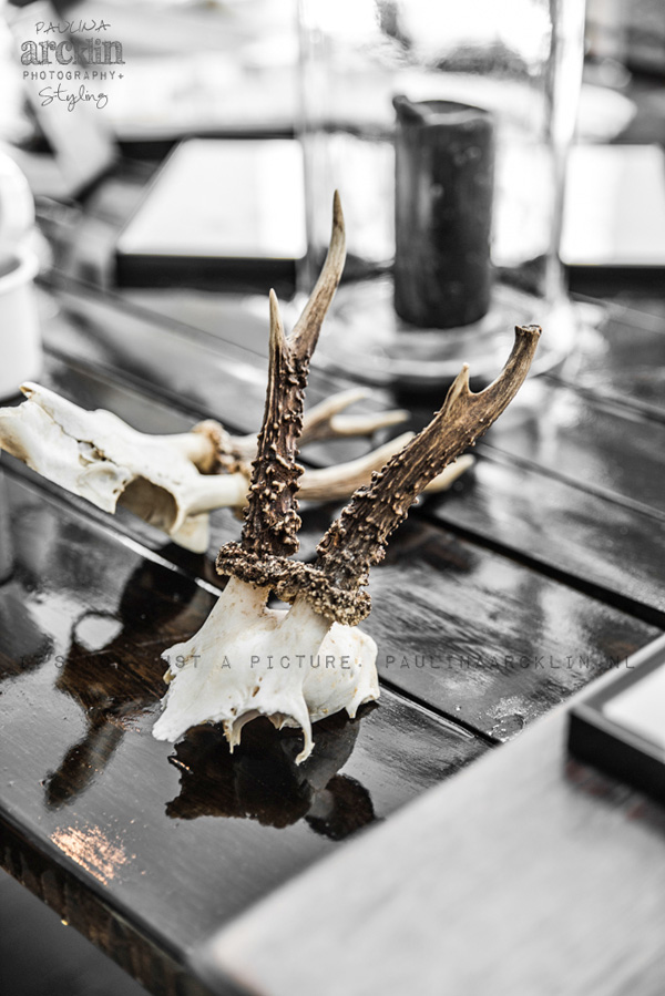
I saw the shots of his store on Paulina Arcklin’s site, a Finnish photographer who now lives in Amsterdam. She was scouting for material for one of her books when she passed Clarrods and took this beautiful series. When I got in touch with her to ask permission she emphasised that nothing is styled in these shots which makes them even more special.

This shop is pretty much bang on my current taste for industrial vintage and I love the fact that Claus included a bar/cafe because ‘it would be cool to try that out and why not’.

I’ve got enormous respect for people who decide to switch careers and – once again – it shows that there’s nothing better than creative fulfilment. As they say if you do what you love you won’t have to do a day’s work in your life.

I hope you’ll pop by Clarrods if you’re in the area and make sure to soak up the atmosphere with a little drink or two. A definite must-see on my own CPH list.
 

copyright-Paulina-Arcklin-Clarrods-via-Stylejuicer-02

copyright-Paulina-Arcklin-Clarrods-via-Stylejuicer-03

copyright-Paulina-Arcklin-Clarrods-via-Stylejuicer-04

copyright-Paulina-Arcklin-Clarrods-via-Stylejuicer-05

copyright-Paulina-Arcklin-Clarrods-via-Stylejuicer-06

copyright-Paulina-Arcklin-Clarrods-via-Stylejuicer-07

copyright-Paulina-Arcklin-Clarrods-via-Stylejuicer-08

copyright-Paulina-Arcklin-Clarrods-via-Stylejuicer-09

places to go, clarrods, copenhagen, furniture, design, store, shop, bar, cafe, claus larsen, paulina arcklin, photography, vintage, industrial, creative fulfilment, trend, travel

 
MORE INFORMATION | Clarrods
PHOTOGRAPHY | Paulina Arcklin with kind permission
 
Follow Stylejuicer with Bloglovin
KIDS ROOMS IDEAS | MIXING MODERN & VINTAGE

1 July 2014

ikea furniture, ps range, modern, simple, functional, vintage, antique, quirky, old school, sports equipment, kids room ideas, tips, trends, monochrome, black and white, vtwonen, cleo schleuderman, alexander van berg, interior design, styling
 

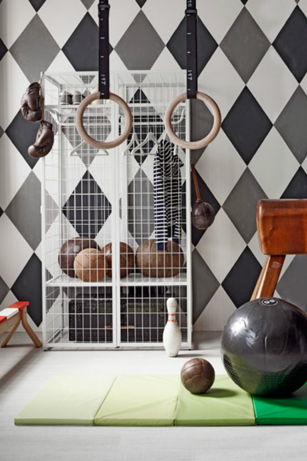
The trend for mixing old and new has been around for a long time but I like this new take for kids rooms ideas presented in the July edition of Dutch interiors magazine vtwonen, styled by Cleo Schleuderman and shot by Alexander van Berge.
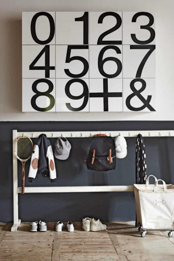
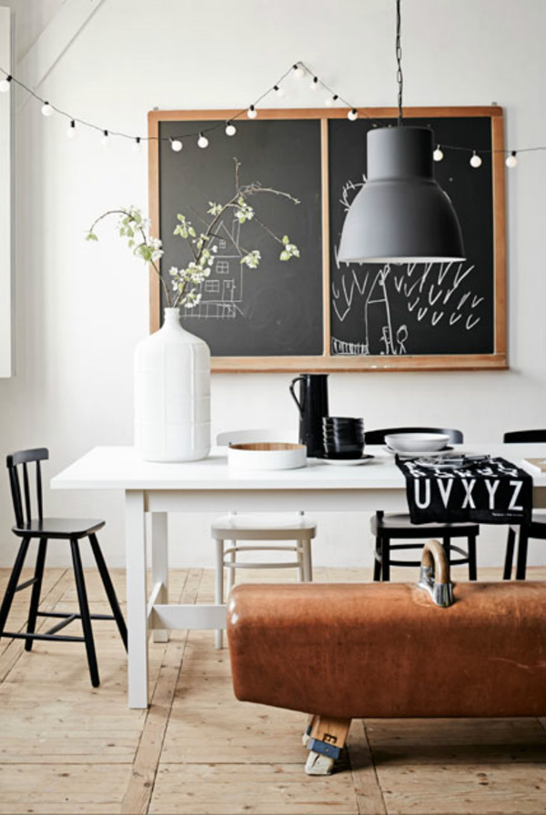
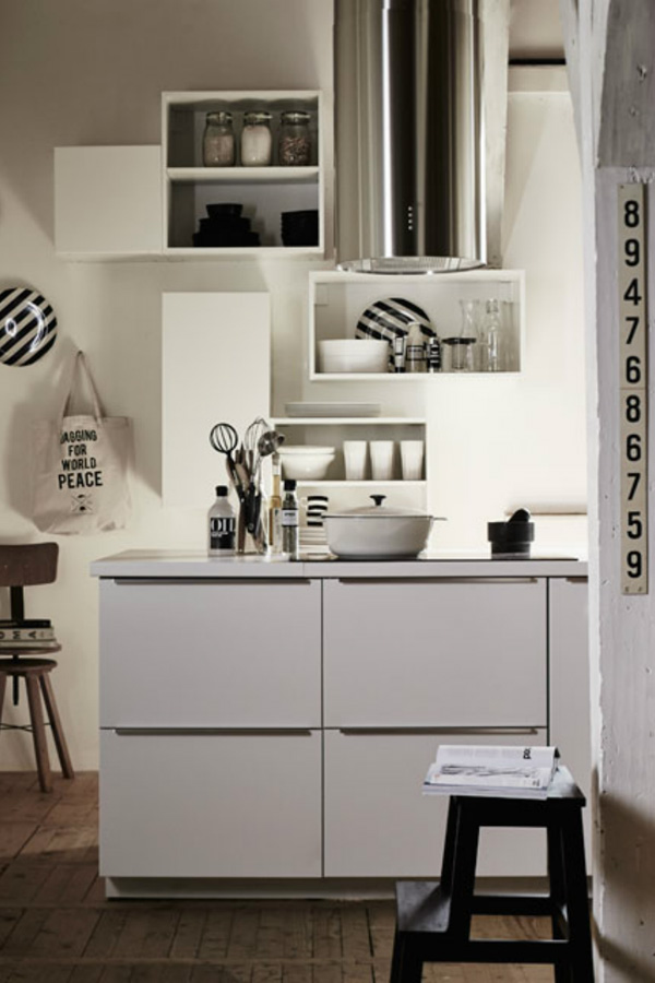
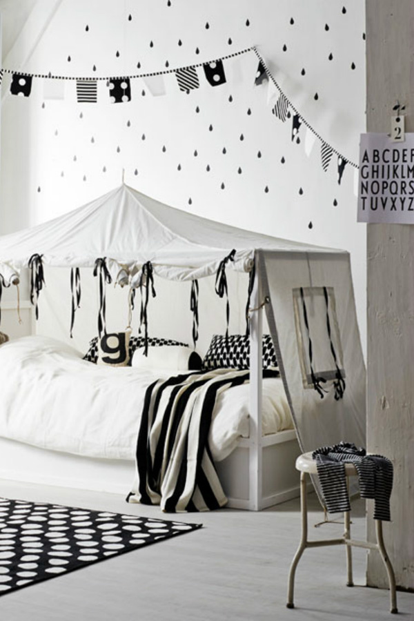
Titled ‘Living with kids’ they’ve added some lovely old school/sports equipment like blackboards, workout machines or coat racks with simple, modern and functional IKEA furniture to create an interesting mix.

Personally, I’m a huge fan of this monochrome black and white look with a few antique details thrown in but feel it all hinges on getting your hands on the right kind of genuine (!) pieces.

Having said that IKEA’s new PS range – blogged about on here before – does offer some neat vintage inspired furniture like the featured wardrobe or balance bench which is a nice solution if you haven’t got the budget, time or patience to hunt around antiques markets or trawl the internet.

For more images check out the whole story on vtwonen or get your hands on a copy of the magazine. You can also follow Cleo Schleuderman – styling editor at vtwonen – on Pinterest.
 

copyright-Alexander-van-Berge-for-vtwonen-Jul-2014-02

copyright-Alexander-van-Berge-for-vtwonen-Jul-2014-03

copyright-Alexander-van-Berge-for-vtwonen-Jul-2014-04

ikea furniture, ps range, modern, simple, functional, vintage, antique, quirky, old school, sports equipment, kids room ideas, tips, trends, monochrome, black and white, vtwonen, cleo schleuderman, alexander van berg, interior design, styling

 
MORE INFORMATION | vtwonen
PHOTOGRAPHY | Alexander van Berge
STYLING | Cleo Schleuderman
 
Follow Stylejuicer with Bloglovin