CALLIGRAPHER YLVA SKARP’S IMPERFECT HOME

1 September 2014

ylva skarp, calligrapher, sweden, home, interior, design, style, trend, monochrome, imperfect, words, raw, rough, vintage, materials, textures, loose, brush, pen, artist

Hello Monday! Hello September! As there’s no denying anymore that autumn is on it’s way I’d like to bring you a lovely raw and earthy interior today.

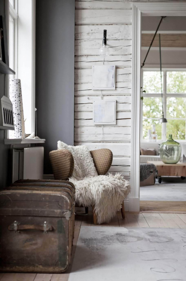
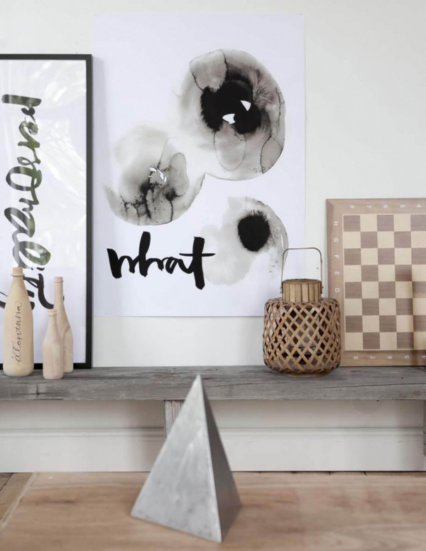
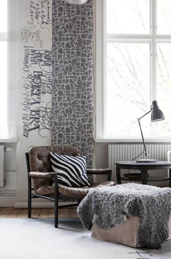
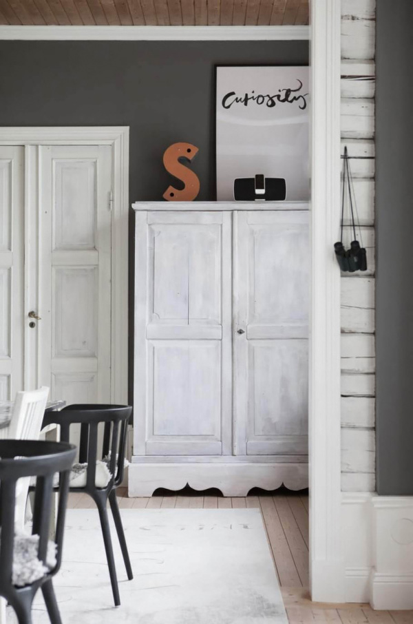
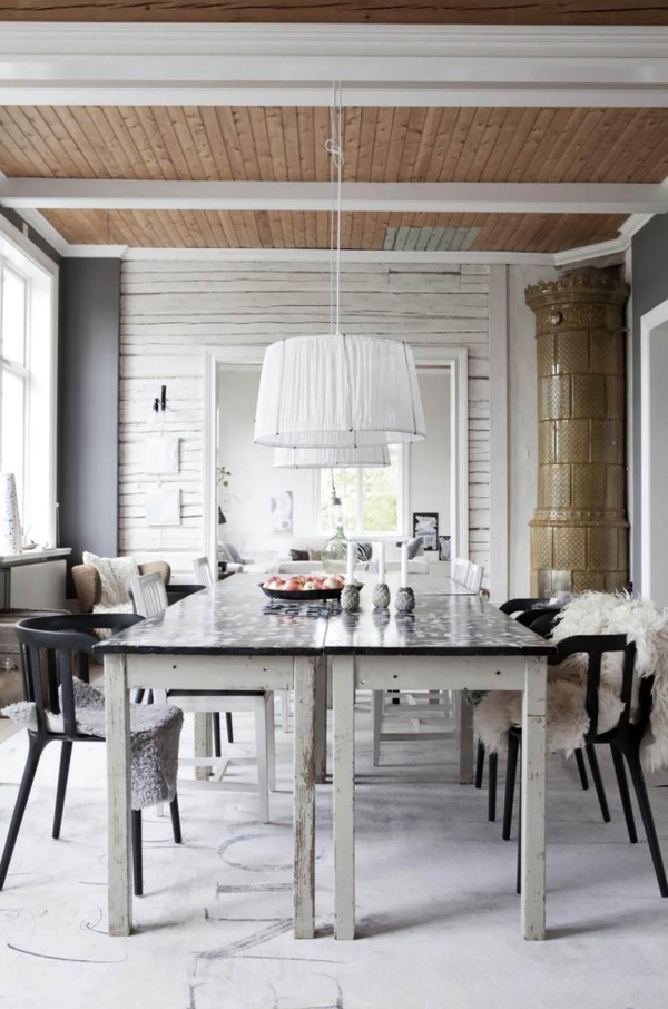
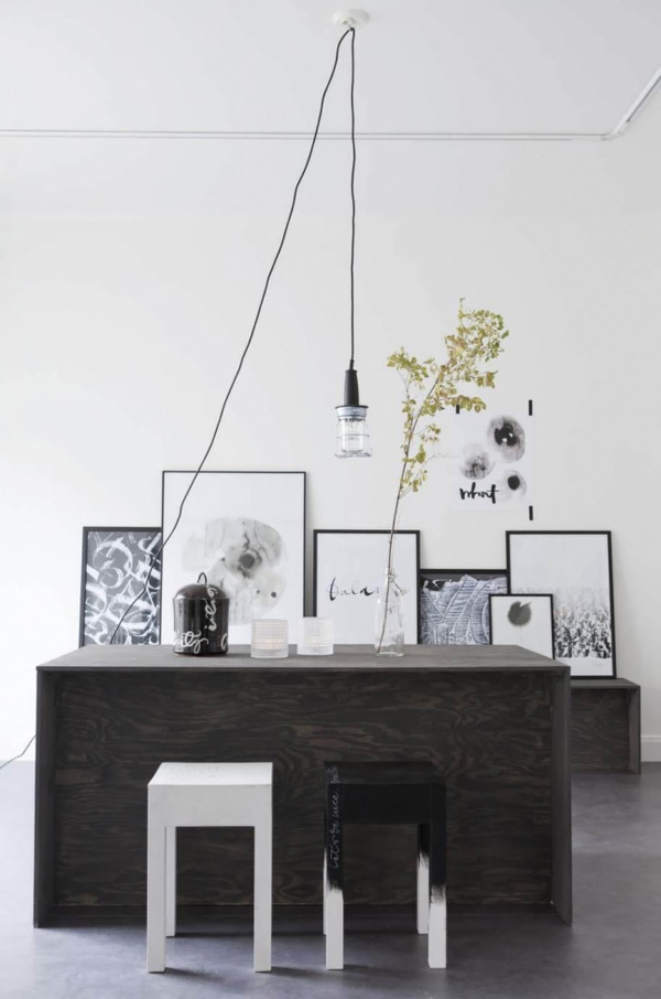
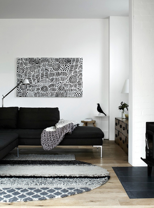
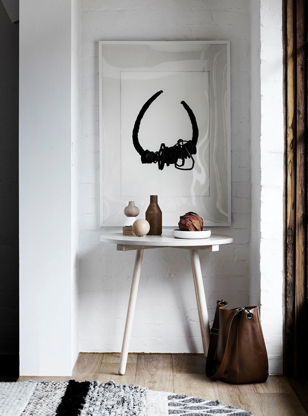
It’s the home of Swedish calligrapher Ylva Skarp and you can see her work throughout her home, neatly framed and presented, on a roll of wallpaper or even what looks like a rough sketch on the floor.

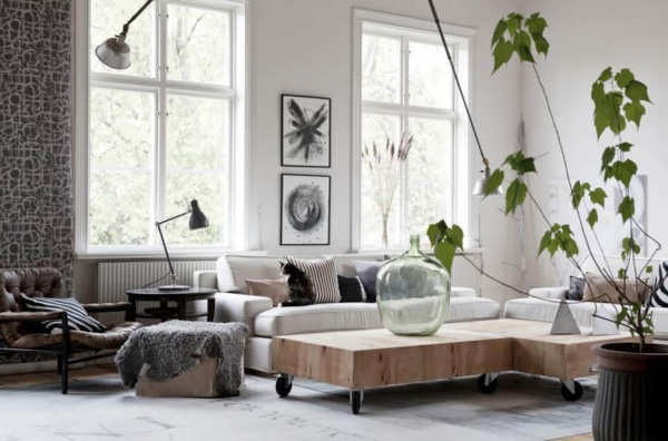
Ylva says about her work: ‘Some elements may be a bit unexpected, but I can’t stand perfection – things need to be a little irregular’ which sums up her loose monochrome style. She crafts with brush and pen in hand to form images from words, mixing modern with traditional to create unique pieces for the contemporary home.

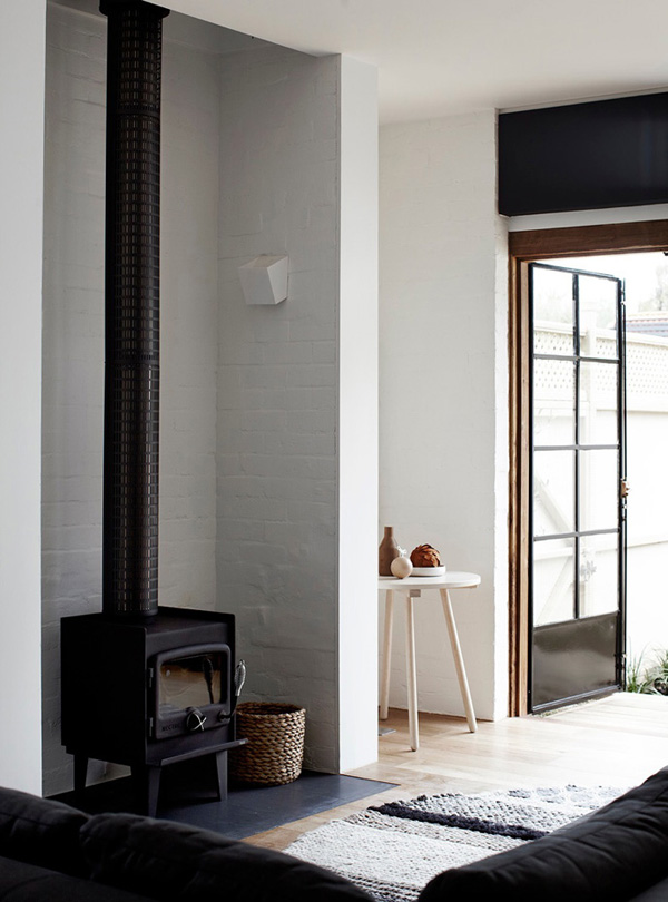
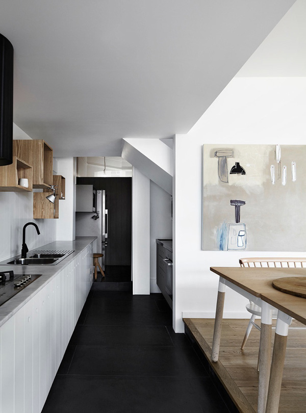
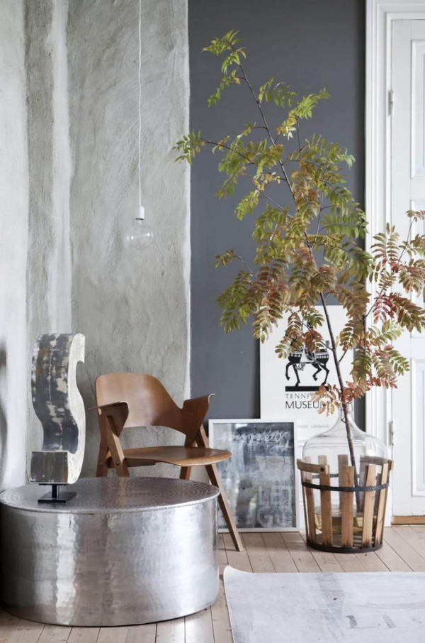
Interestingly, her home is the perfect backdrop for her work and her calligraphic style transcends into her interior styling. A mostly monochrome colour palette of white and grey with lots of raw wood and different textures and materials on display. I like the different vintage armchairs with cosy animal skins and the old suitcase which add warmth and charm.

I also spy some roughly painted walls and pieces of furniture – a deliberate choice no doubt to achieve that imperfect look. 😉
 

Calligrapher-Ylva-Skarp-Home-via-Stylejuicer-02

Calligrapher-Ylva-Skarp-Home-via-Stylejuicer-03

Calligrapher-Ylva-Skarp-Home-via-Stylejuicer-04

Calligrapher-Ylva-Skarp-Home-via-Stylejuicer-05

Calligrapher-Ylva-Skarp-Home-via-Stylejuicer-06

Calligrapher-Ylva-Skarp-Home-via-Stylejuicer-07

Calligrapher-Ylva-Skarp-Home-via-Stylejuicer-08

ylva skarp, calligrapher, sweden, home, interior, design, style, trend, monochrome, imperfect, words, raw, rough, vintage, materials, textures, loose, brush, pen, artist

 
SHOP | Ylva Skarp
VIA | Planete Deco with thanks
PHOTOGRAPHY | Helena Blomqvist
 
Follow Stylejuicer with Bloglovin

INTERIORS CRUSH | QUIRKY AND RUSTIC HOME IN IBIZA

29 August 2014

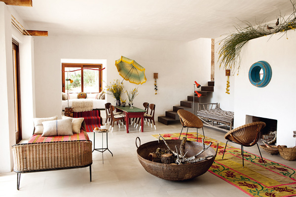
Ibiza-Luis-Galliussi-by-Ricardo-Labougle-01

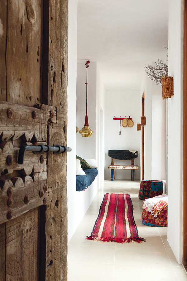
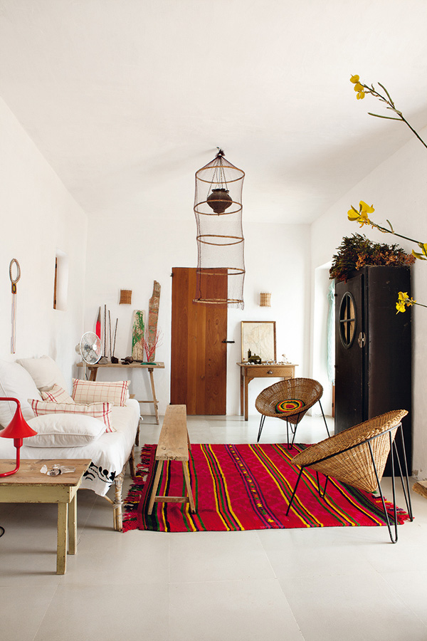
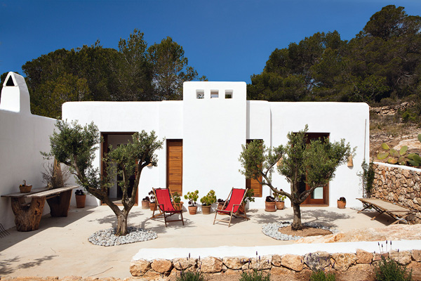
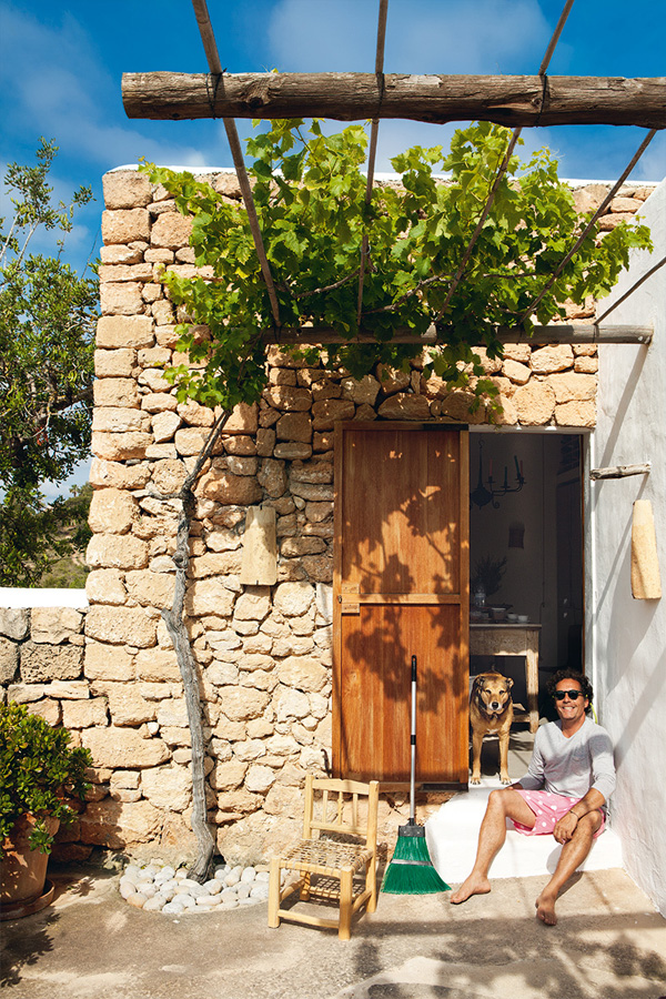
Oh, this door – it had me at hello. I’m currently totally crushing on renovated holiday homes with rustic original features and this home in Ibiza got me dreaming about a September holiday in the Med.

It’s the perfect month for me. The crowds are gone, the sun has lost it’s intensity and you don’t have to reserve a sunbed with your towel the night before. Being German I’m sensitive about this cliché and for the record I’ve never knowingly taken part in such appalling behaviour.

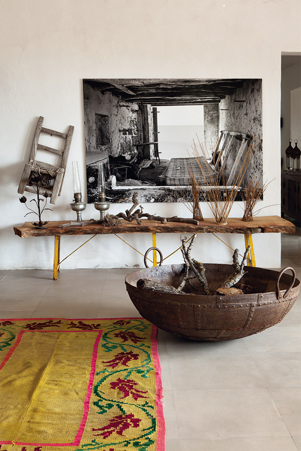
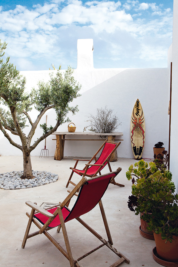
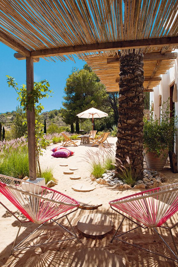
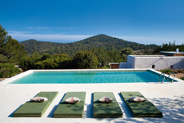
So, come and soak up some sun and relaxed holiday vibes through these gorgeous photographs by Ricardo Labougle. The owner is interior designer Luis Galliussi who renovated and extended this simple peasant house set back from the party atmosphere amongst fig and olive trees. In addition to the stunning infinity pool he added a living room with fireplace and two bedrooms with bathrooms, all in the traditional cubic style so the house nestles quietly into the countryside.

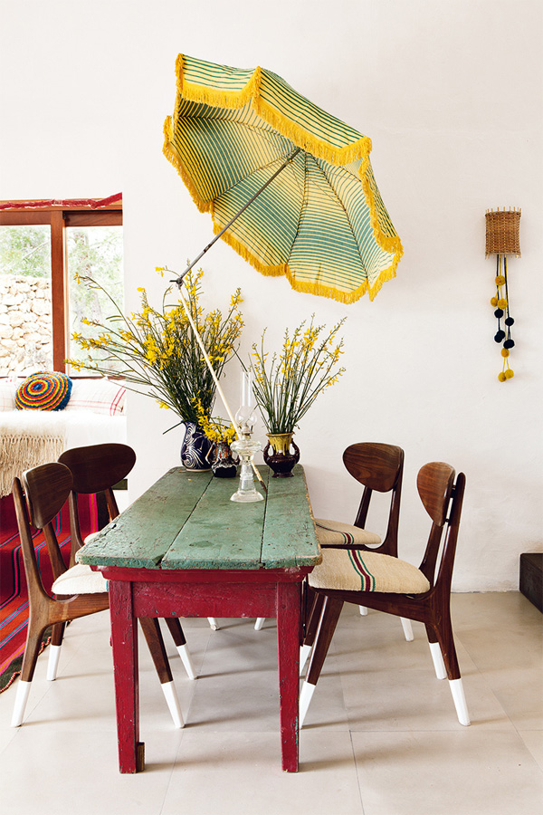
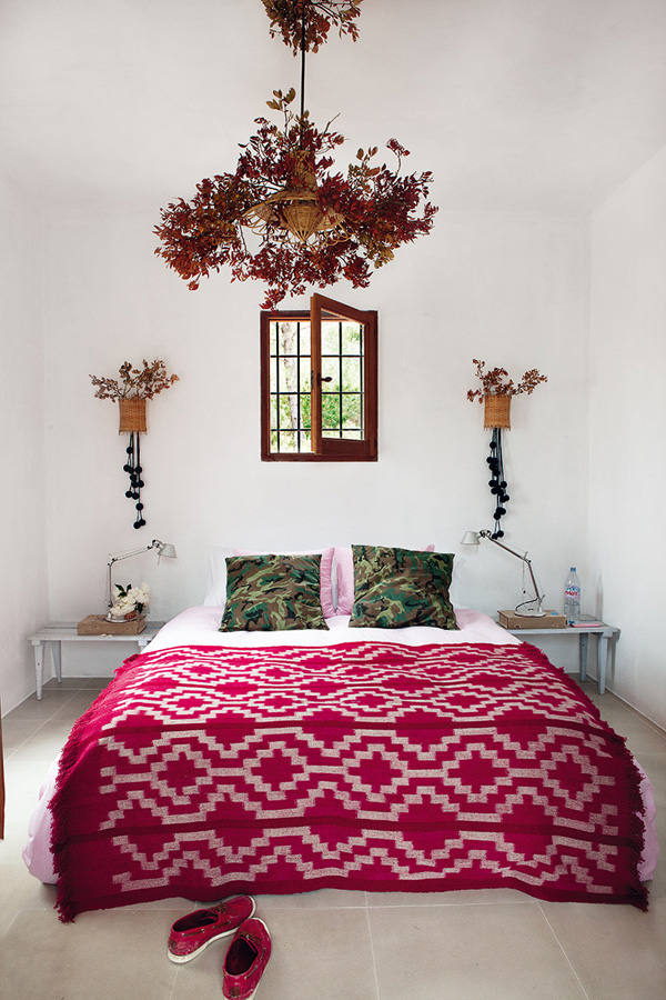
His quirky choices of furniture and bright colours are refreshing and I get the impression he just had some fun with this project. Where else would you find garden gnomes, an umbrella above the dining table and army style camouflage pillows in the guest bedroom?

I like this home that’s simple and unassuming on the outside but hides so many treasures on the inside, presenting relaxed country loving with a twinkle in the eye.

And don’t get me started on that kitchen island… #dreamy

 
Ibiza-Luis-Galliussi-by-Ricardo-Labougle-02

Ibiza-Luis-Galliussi-by-Ricardo-Labougle-03

Ibiza-Luis-Galliussi-by-Ricardo-Labougle-04

Ibiza-Luis-Galliussi-by-Ricardo-Labougle-05

Ibiza-Luis-Galliussi-by-Ricardo-Labougle-06

Ibiza-Luis-Galliussi-by-Ricardo-Labougle-07 quirky, bohemian, rustic, home, summer, ibiza, luis galliussi, ricardo labougle, photography, design, style, interior, mediteranean, balearics, island, colourful, eclectic, furniture, holiday

Ibiza-Luis-Galliussi-by-Ricardo-Labougle-08

Ibiza-Luis-Galliussi-by-Ricardo-Labougle-09

Ibiza-Luis-Galliussi-by-Ricardo-Labougle-10

Ibiza-Luis-Galliussi-by-Ricardo-Labougle-11

Ibiza-Luis-Galliussi-by-Ricardo-Labougle-12

quirky, bohemian, rustic, home, summer, ibiza, luis galliussi, ricardo labougle, photography, design, style, interior, mediteranean, balearics, island, colourful, eclectic, furniture, holiday

 
VIA | AD Spain
PHOTOGRAPHY | Ricardo Labougle
 
Follow Stylejuicer with Bloglovin
UTILITARIAN EXTENSION BY WHITING ARCHITECTS

27 August 2014

whiting architects, utilitarian extension, melbourne, kerferd, industrial, vintage, barn, material mix, contemporary, white, clean, simple, minimal, interior design

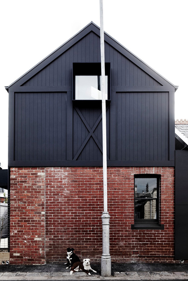
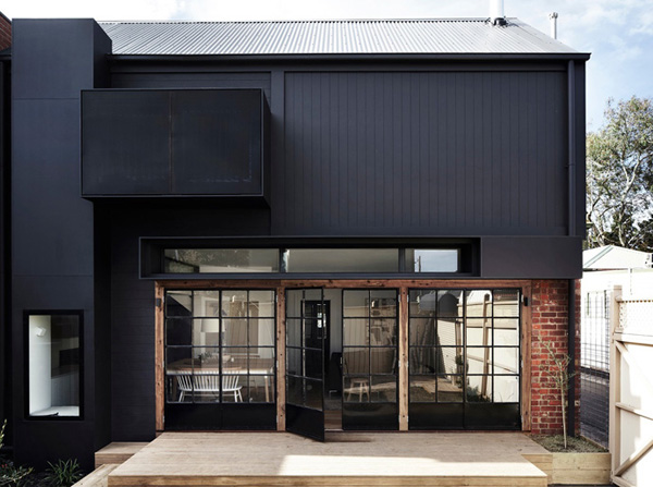
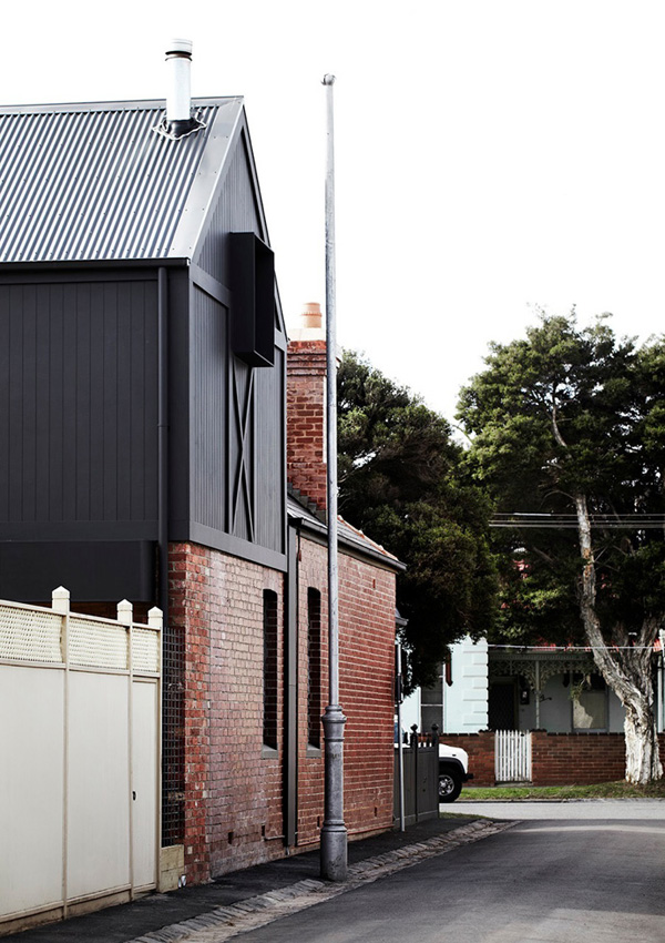
I’m a huge fan of converted industrial and utilitarian spaces and love the design of this two-storey gabled addition reminiscent of a converted warehouse. The Melbourne suburb where the site is located is an infill building and Whiting Architects call it ‘the missing tooth’ in a lane with pitch roofs and attic garage extensions.

It was a deliberate choice to create a utilitarian extension like a workshop or a barn which inevitably drives the aesthetic of this new self-contained home for parents, keeping children and guests housed in the existing Edwardian Redbrick with their own large bathroom.

Founders Steve and Carole Whiting already had (or sourced) industrial and vintage elements and materials before they started designing the extension. It was important for them to capture the informality of a holiday place where everything is kept simple and practical, remaining contemporary and robust.

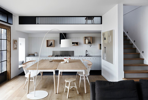
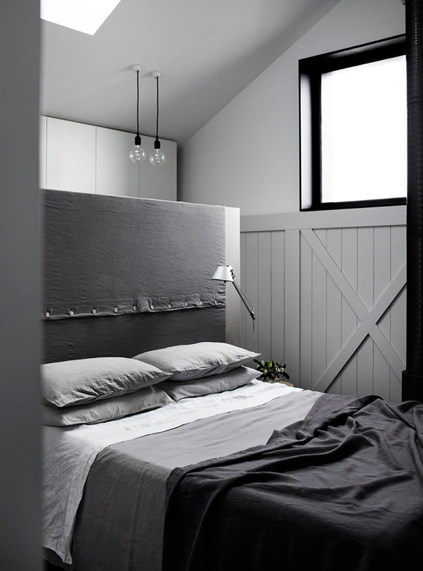
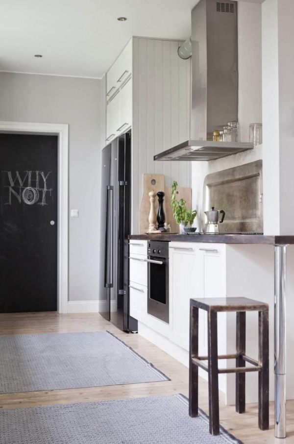
I love the material mix of rough red bricks and dark cladding on the outside and clean white finishes on the inside accompanied by oak floors and a wood-burning stove. The custom built kitchen cabinets and bedroom robe are simple and contemporary with discreet holes cut into the wood rather than handles and I adore the mix of different wall textures with wooden panelling, subway tiles and plywood, all united by keeping it white.

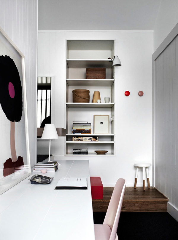
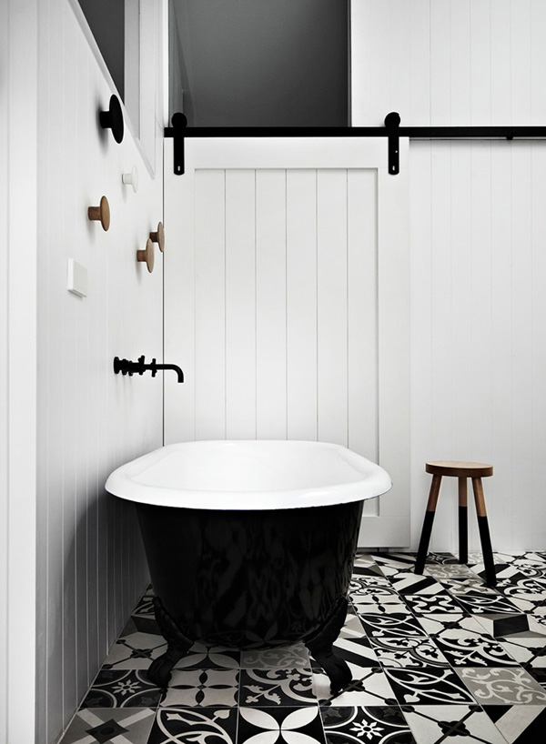
A utilitarian building like this was never intended to have any corridors or stairs so part of the interior design brief was to keep this ‘dead space’ to a minimum. Therefore Whiting incorporated a desk along a corridor converting it effectively into a home office and linking it to the living area below with an internal window. Another clever solution is the window box daybed seating area adjacent to the master bedroom where you can find the only internal door – appropriately an old-style barn door leading to the en-suite bathroom.

To me this place is a wonderful example of how classic dimensions and designs can be combined with contemporary clean interiors and transcendent fashion. A fabulous choice and one I’d make for my own future home.

I hope you enjoy the ‘eye-candy’ and I’d love to know what you think of the project? Let me know in the comments below.

Whiting-Architects-Kerferd-AUS-001

Whiting-Architects-Kerferd-AUS-004

Whiting-Architects-Kerferd-AUS-005

Whiting-Architects-Kerferd-AUS-006

Whiting-Architects-Kerferd-AUS-007

Whiting-Architects-Kerferd-AUS-008

Whiting-Architects-Kerferd-AUS-009

Whiting-Architects-Kerferd-AUS-010

Whiting-Architects-Kerferd-AUS-011

Whiting-Architects-Kerferd-AUS-012

Whiting-Architects-Kerferd-AUS-18

Whiting-Architects-Kerferd-AUS-013

Whiting-Architects-Kerferd-AUS-014

Whiting-Architects-Kerferd-AUS-015

Whiting-Architects-Kerferd-AUS-003

whiting architects, utilitarian extension, melbourne, kerferd, industrial, vintage, barn, material mix, contemporary, white, clean, simple, minimal, interior design

MORE INFORMATION | Whiting Architects
PHOTOGRAPHY | Sharyn Cairns with kind permission by Whiting Architects

MOOD BOARD | BRING BACK SUMMER

26 August 2014

mood board, bring back summer, georgia o’keeffe, breaking bad, desert, sky, heat, sunshine, new mexico, vibes, style, trend, pinterest Oh, I’m SO not ready to give up on summer yet!

We probably had one of the worst rainy, depression-inducing bank holiday Mondays I’ve ever experienced and I miss the sunshine like crazy. We even had to buy wellies for the kids yesterday because it was raining so hard though I’m sure I only got their summer sandals a few weeks ago. And there are still 2 whole weeks before the kids go back to preschool. And we’ve got grandma and grandpa to entertain for the next couple of weeks. Argh! Help!

My mood board today says it all: Bring back summer! Pronto, please!

I adore the colours and heat these pictures give off – a of bit ‘Breaking Bad’, New Mexico desert and Georgia O’Keeffe influence. If that doesn’t bring back summer vibes, nothing will.

GIRL //
SKULL //
BREEZE //
DESERT //

 
NOTE | All via my Pinterest boards
 
Follow Stylejuicer with Bloglovin
INTERIOR INSPIRATION | LAURENCE SIMONCINI

21 August 2014

Laurence-Simoncini-Ile-De-Re-by-Karel-Balas-01

Today’s interior inspiration is another ‘corker’ from the Ile De Ré, off the west coast of France. Funnily enough it’s been photographed by Karel Balas whose summer house is also located on the chic island and was featured here on Monday.

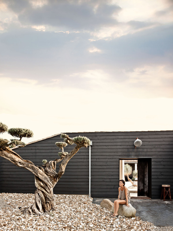
It’s the holiday home of Laurence Simoncini, co-founder of Parisian concept store Serendipity and her dramatic and consistent design shows what a creative talent she is. Built in the middle of coastal marshland this single story home with black wooden cladding blends effortlessly into the landscape and I adore the ancient gnarled and twisted tree surrounded by pebbles and the desert like garden design which is easily maintained.
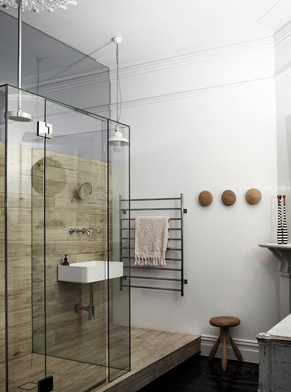
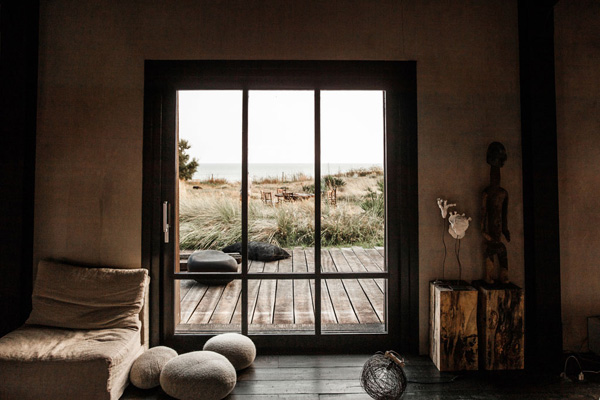
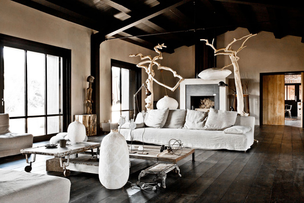
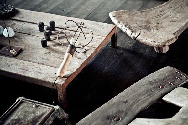
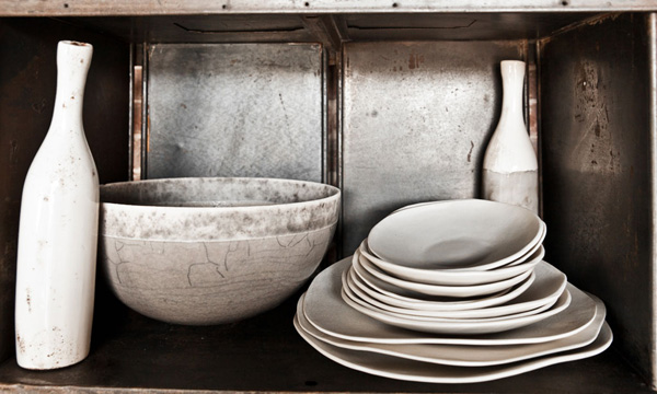
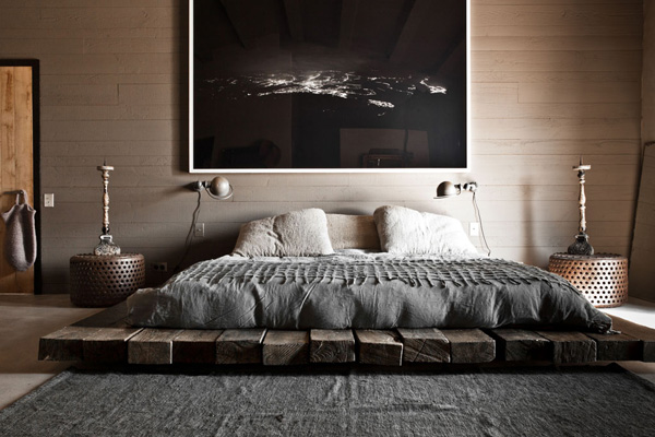
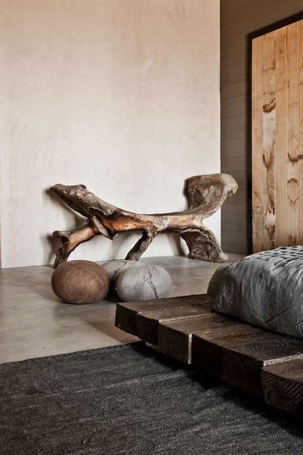
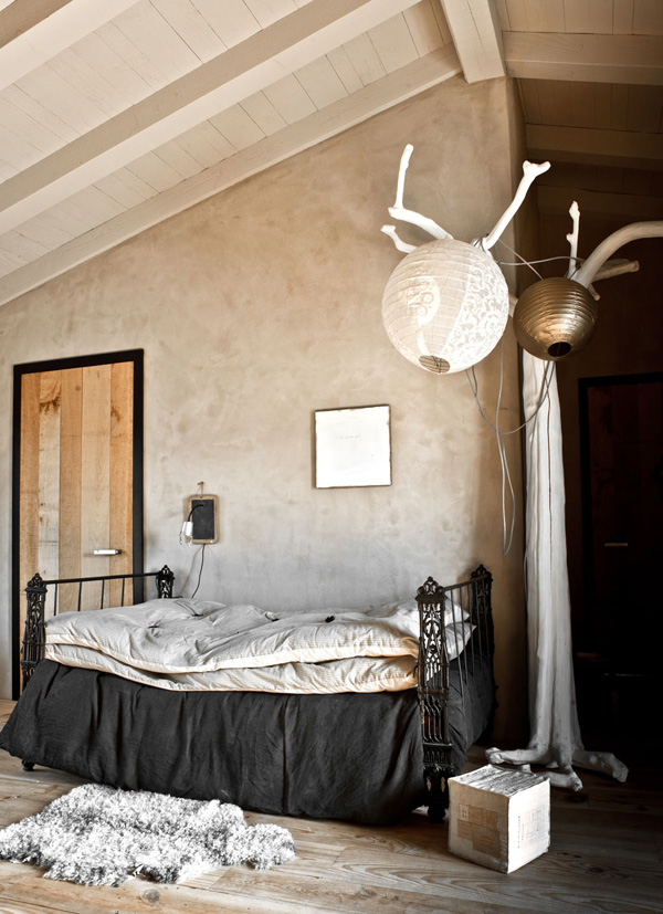
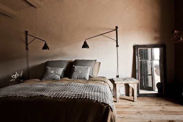
Inside there’s a very quiet and serene atmosphere where the emphasis is on raw and natural materials, textures and fabrics. Polished concrete, lime washed walls, wooden flooring – everything is kept in a wonderful brown, grey and black palette with carefully selected art objects, modern lighting, drift wood seats, hand-thrown ceramics and ornate vintage candle sticks blending perfectly.

No quirky touches or bright colours just an amazingly luxurious interior that still feels inviting. Granted you have to imagine your everyday objects like remote controls, newspapers, post-it notes, socks and shoes flying around. I know I might be stating the obvious but sometimes we forget how highly styled these shots are to show off the interior concept for the glossy magazines.

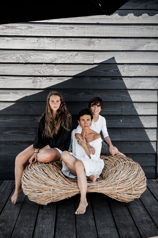
My favourite pieces have to be the fireplace, the double bed sitting on railway sleepers and how wonderful is that woven nest-like seat Laurence poses on with her adorable children!?


Laurence-Simoncini-Ile-De-Re-by-Karel-Balas-02

Laurence-Simoncini-Ile-De-Re-by-Karel-Balas-03

Laurence-Simoncini-Ile-De-Re-by-Karel-Balas-04

Laurence-Simoncini-Ile-De-Re-by-Karel-Balas-05

Laurence-Simoncini-Ile-De-Re-by-Karel-Balas-06

Laurence-Simoncini-Ile-De-Re-by-Karel-Balas-07

Laurence-Simoncini-Ile-De-Re-by-Karel-Balas-08

Laurence-Simoncini-Ile-De-Re-by-Karel-Balas-09

ile de re, france, laurence simoncini, summer house, holiday home, vacation, get away, vintage, restored, recycled, plank, wood, drift wood, views, sea, island, interior design, style, trend, serendipity, concept store, decor, beach, photography, karel balas


VIA | Elle Decoration with thanks
CONCEPT STORE | Serendipity
PHOTOGRAPHY | Karel Balas
 
Follow Stylejuicer with Bloglovin