PORTLAND LOFT BY JESSICA HELGERSON

27 October 2014

jessica helgerson, interior design, portland, loft, beams, exposed brickwork, materials, textures, sophisticated, eames, ethnic vibes, moroccan, inviting, warm, open, space, industrial, mira eng-goetz, dark, style, trend

Oh how I like a loft. The space, the beams, the exposed brick wall and concrete floor are all elements that make my heart beat faster and I knew I had to share this project with you when Portland based interior designer Jessica Helgerson popped into my Pinterest feed.

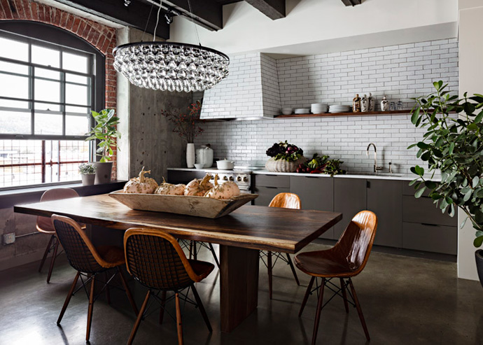
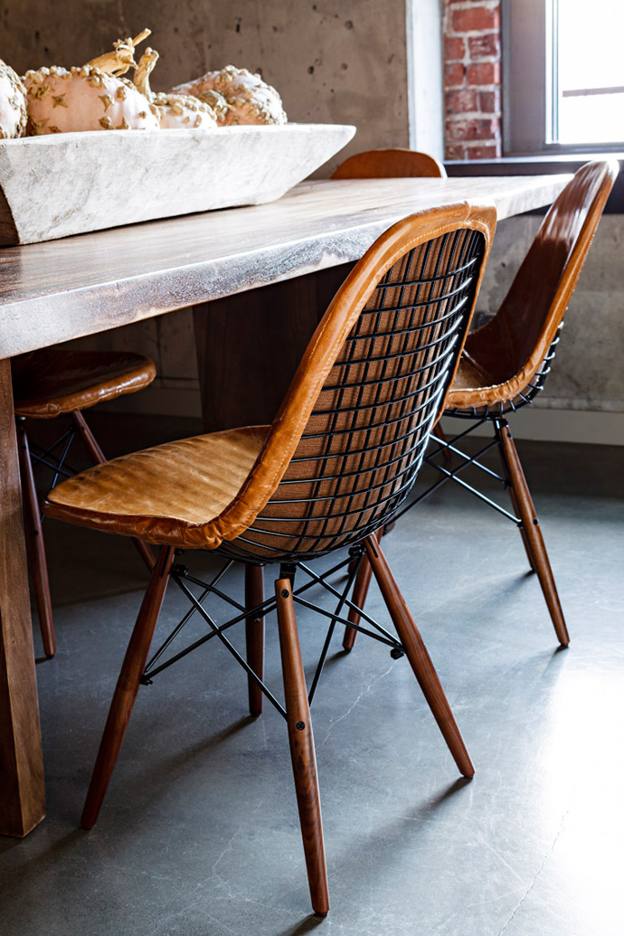
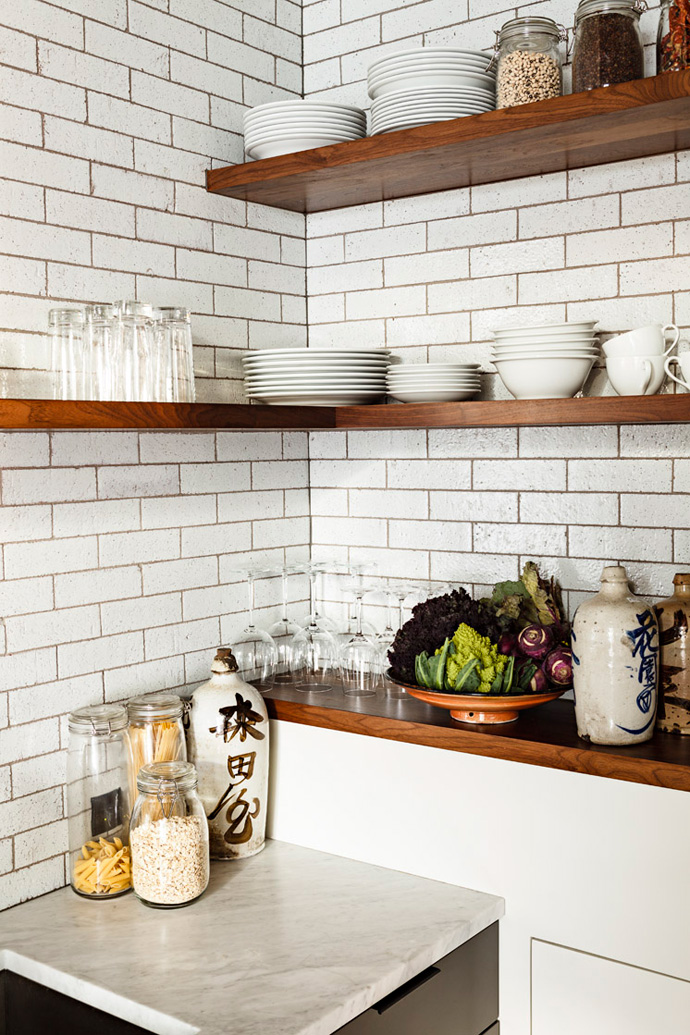
Her work is wonderfully rich and she’s a master at creating interest and intrigue through the use of different materials and textures. The first impression is one of sophistication with the mouth-blown glass chandelier forming a focal point above the beautifully polished timber dining table and ‘to-die-for’ vintage Eames DKW leather and steel chairs. In the open-plan kitchen the glazed subway tiles introduce a more industrial vibe that links in with a glimpse of exposed brick wall around the dark window frames and rough concrete wall.

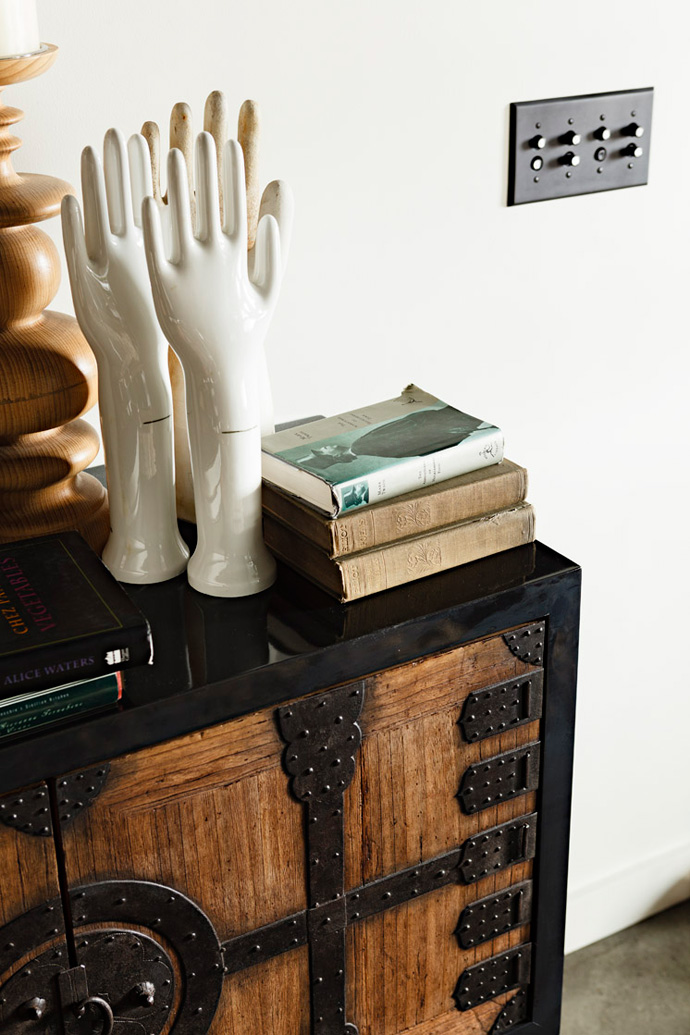
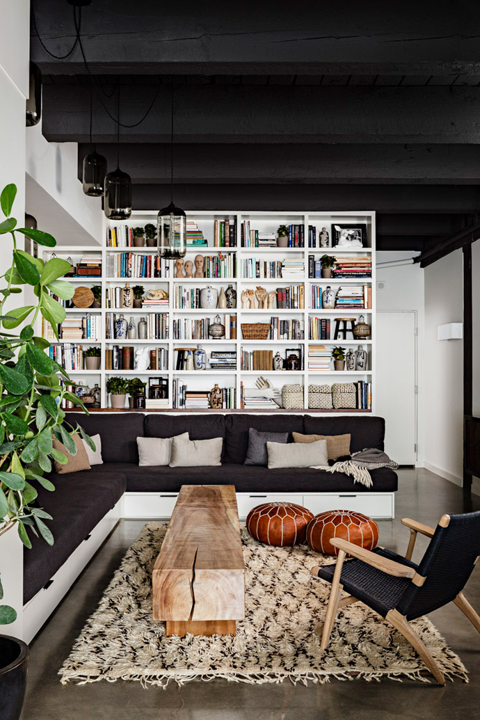
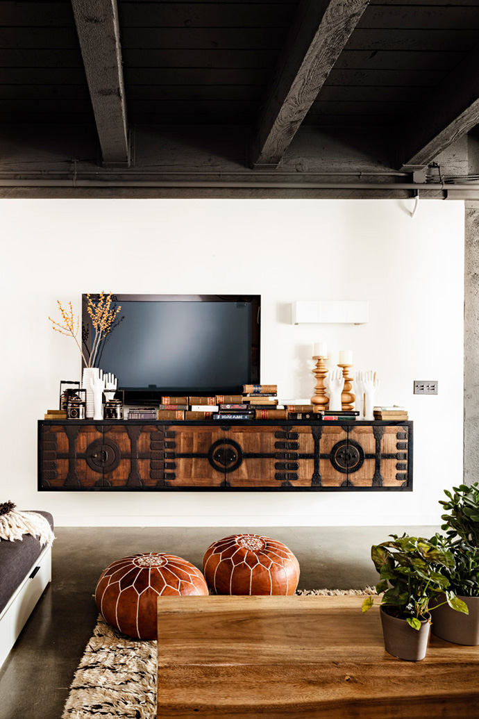
Peeking round the corner into the living room ethnic vibes are introduced with a Moroccan rug, hand-embroidered leather poufs and a custom-built console table made from antique Chinese doors. My favourite piece here is the chunky wooden coffee table which must weigh a ton but is oh so stroke-worthy. I also love the clever storage units underneath the custom upholstered L-shaped sofa and the floor to ceiling open shelf unit housing not just books but interesting finds and artefacts from around the world.

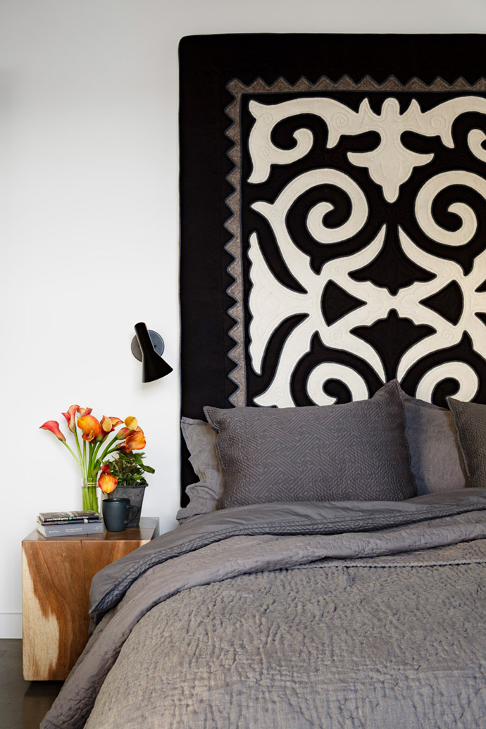
To give privacy the bedroom is tucked behind this wall of built-in cabinetry and continues the ethnic theme with a hand-embroidered felt headboard, luxuriously quilted dark grey bedspreads and polished blocks of timber as small bedside tables.

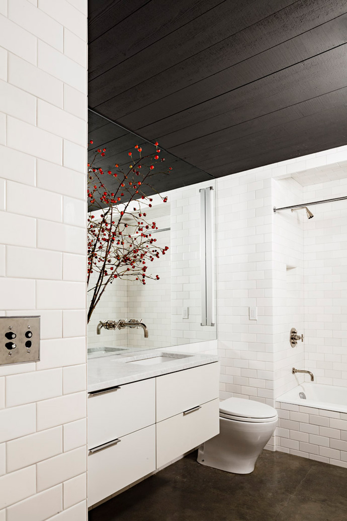
To create warmth and fulfil the clients brief of an open, inviting and warm space project manager Mira Eng-Goetz painted the ceilings and beams a dark earthy grey and used a soft shade of white for the walls. Sticking to this earthy colour palette in combination with the use of different materials and fabrics this wonderful blend of sophisticated, ethnic and industrial vibe is achieved and I’m sure the clients absolutely adore their new space.

NOTE: If you enjoyed Jessica’s style, have a look at another featured project of a Gothic-style office. To-die-for!
 

Jessica-Helgerson-Interior-Design-Portland-Loft-Kitchen-by-Lincoln-Barbour-02

Jessica-Helgerson-Interior-Design-Portland-Loft-Dining-Chairs-by-Lincoln-Barbour-03

Jessica-Helgerson-Interior-Design-Portland-Loft-Kitchen-Shelves-by-Lincoln-Barbour-04

Jessica-Helgerson-Interior-Design-Portland-Loft-Living-by-Lincoln-Barbour-05

Jessica-Helgerson-Interior-Design-Portland-Loft-TV-by-Lincoln-Barbour-06

Jessica-Helgerson-Interior-Design-Portland-Loft-Detail-by-Lincoln-Barbour-07

Jessica-Helgerson-Interior-Design-Portland-Loft-Bedroom-by-Lincoln-Barbour-08

jessica helgerson, interior design, portland, loft, beams, exposed brickwork, materials, textures, sophisticated, eames, ethnic vibes, moroccan, inviting, warm, open, space, industrial, mira eng-goetz, dark, style, trend


MORE INFORMATION | Jessica Helgerson Interior Design
PHOTOGRAPHY | Lincoln Barbour with thanks.
 
Follow Stylejuicer with Bloglovin

COOL STUFF | BERLIN WALL LIGHT INSTALLATION

24 October 2014

berlin, wall, 25 years, fall of the wall, divide, east, west, lichtgrenze, border of light, balloons, light, installation, balloon patrons, commemoration, celebration, christopher bauder, marc bauder, filmmaker, light artist, 48 hours, biodegradable

I’m not from Berlin and for a long time during my adolescence the city was a tricky place to get to. I remember seemingly never-ending car journeys on a bumpy motorway with nothing but fields to look at and old-fashioned garages selling dodgy food. And then it happened: The Wall came down. Just like that. David Hasselhoff danced on the debris and sang ‘Looking for freedom’ and we were one united Germany.

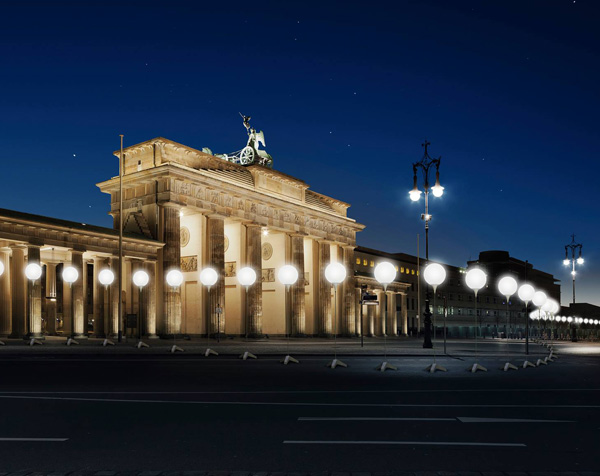
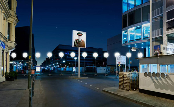
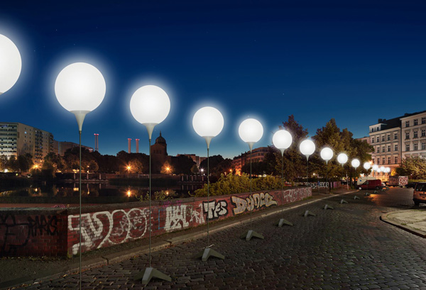
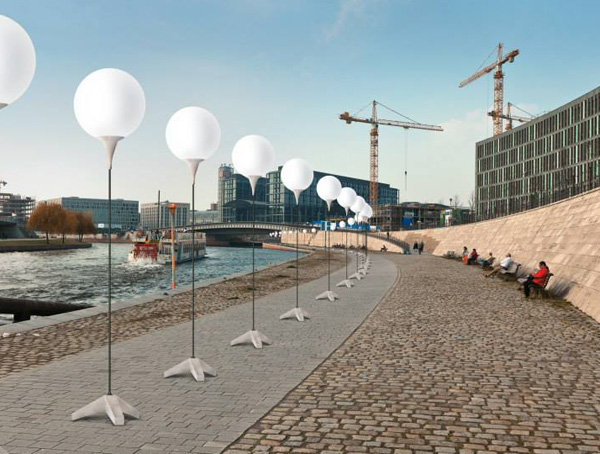
To commemorate 25 years since the fall of the Berlin Wall light artist and designer Christopher Bauder and his filmmaker brother Marc came up with a simple, beautiful, profound and spectacular concept. For 48hrs the Berlin Wall will be brought back to life, dividing the city with an installation of illuminated 11-foot-high white balloons along the original path of the Wall. Just reading about it gives me goose bumps and I wish I could be there.

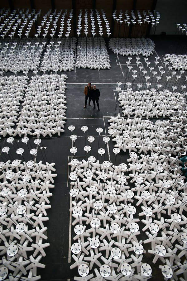
The ‘Lichtgrenze’ – the border of light – will go up over night, just like the original wall that was first constructed out of barbed wire before being replaced with concrete slabs. It’ll be up for two days and nights from the 7th till the 9th of November spanning nearly 10 miles. The 8,000 24 inch biodegradable white balls will once again divide the city into East and West and the event will culminate and mark the fall of the Wall at 7pm on the 9th of November with balloon patrons attaching personal messages and releasing the helium filled balls into the night sky.

There will be cinematic collages on large video screens at six key locations along the path showing historical footage of the divided Berlin and the city as we know it today as well as personal anecdotes and stories of the Wall every 500 feet to celebrate and commemorate.

What a wonderful concept!
 
Berlin-Wall-Light-Installation-02

Berlin-Wall-Light-Installation-03

Berlin-Wall-Light-Installation-04

berlin, wall, 25 years, fall of the wall, divide, east, west, lichtgrenze, border of light, balloons, light, installation, balloon patrons, commemoration, celebration, christopher bauder, marc bauder, filmmaker, light artist, 48 hours, biodegradable


MORE INFORMATION | Lichtgrenze
CONCEPT | Christopher Bauder & Marc Bauder
PRODUCTION | White Void
IMAGES | Daniel Büche
 
Follow Stylejuicer with Bloglovin
INTERIORS CRUSH | VILLA WITH POLISHED CONCRETE FLOORS

22 October 2014

norm architects, Jonas Bjerre-Poulsen, photographer, architect, designer, style, interior design, villa, renovation, vedbaek, copenhagen, scandinavian, clean, simple, original details, light, polished concrete, floor, denmark, daylight, trend, style

You’ve probably seen bits and pieces of this incredible project on Pinterest and Tumblr before but I wanted to show you the whole house and give you a bit of background info.

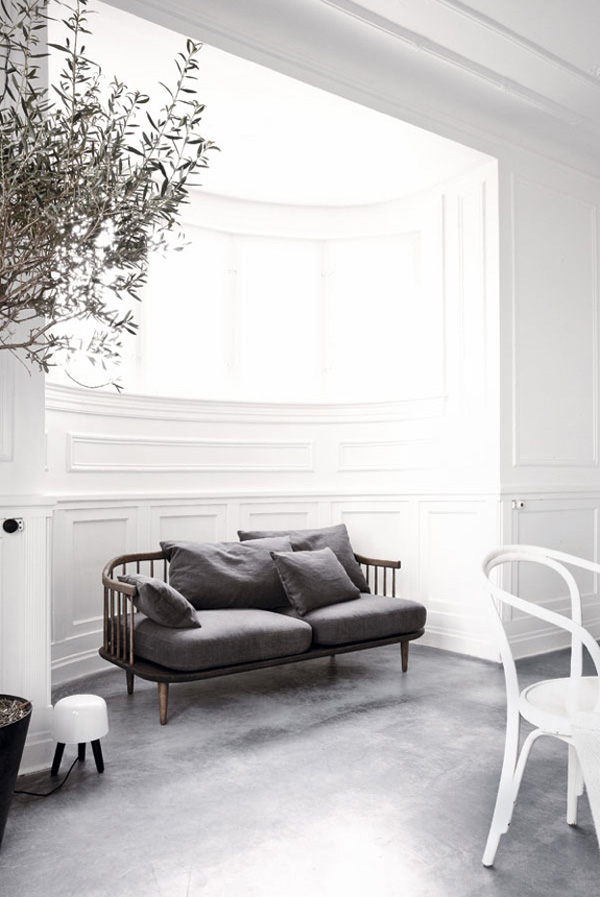
The owner is multi-creative talent Jonas Bjerre-Poulsen who is not only the co-founder of Danish Norm Architects but also a designer, stylist, art director and photographer. He pays particular attention to haptic qualities – sense of touch that is to you and me – and the human scale in interior design. His spaces are always spectacular and striking, very minimal and understated but nevertheless inviting and full of life, light and atmosphere.

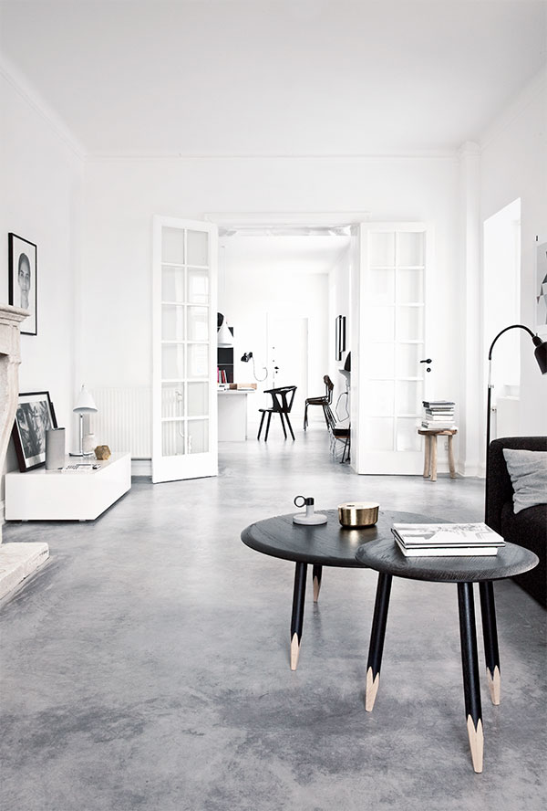
Today’s featured project is his own house located in an old fishing village just outside Copenhagen with views across the harbour and sea. The villa was built in 1911 and the architecture inspired by the Tyrolean Alps. It was in bad need of renovation and Jonas wanted to strip out all the non-original features therefore unearthing it’s heritage and some art deco details.

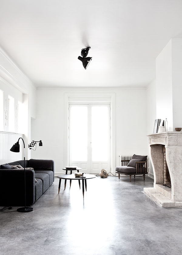
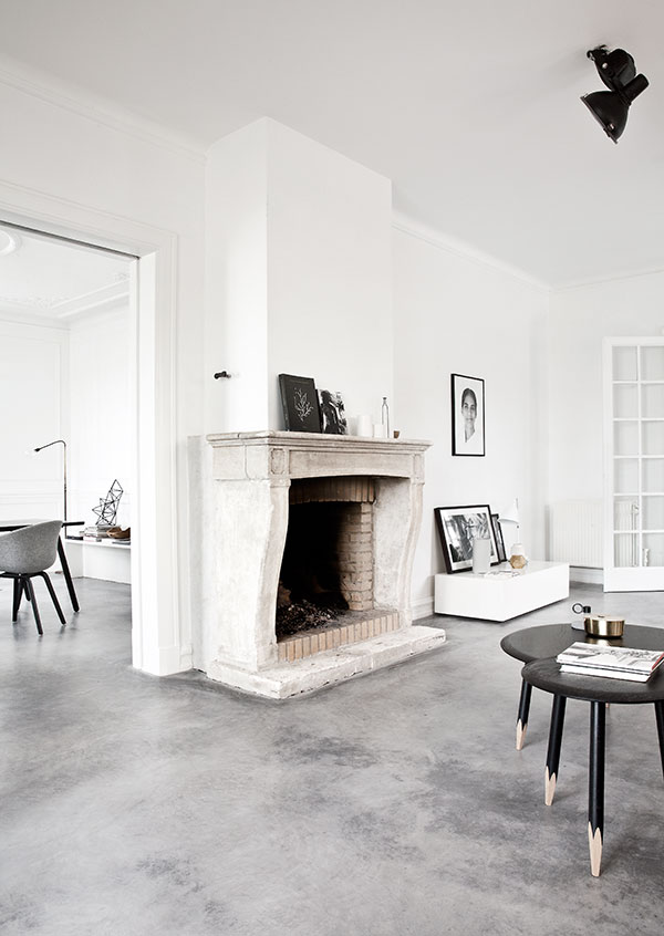
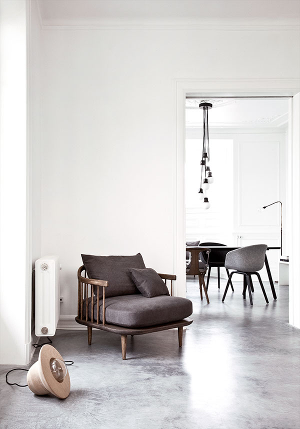
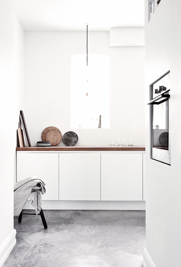
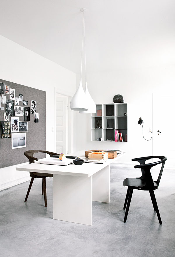
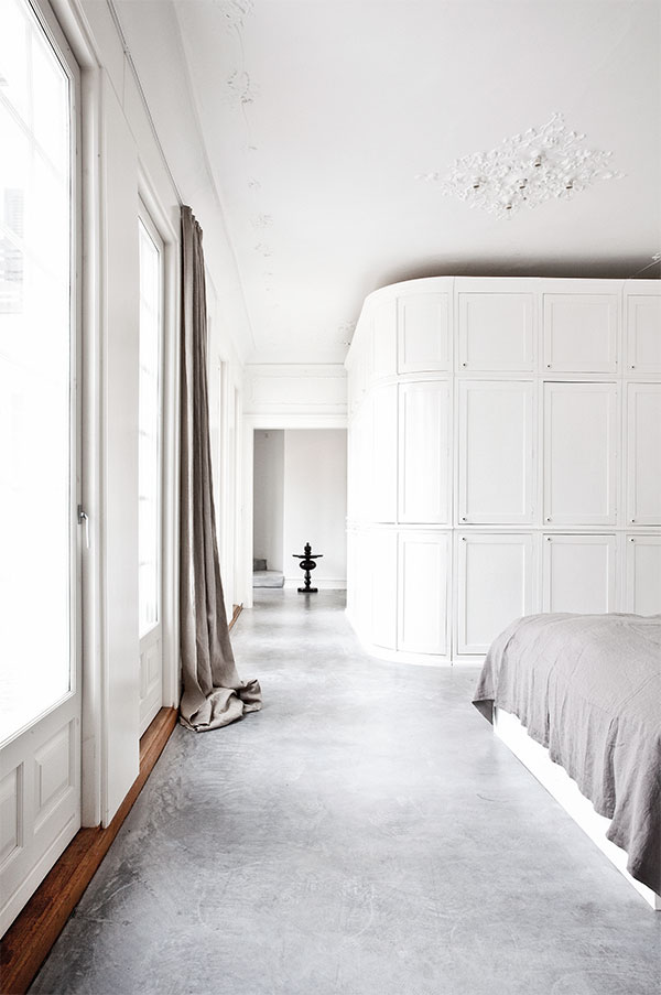
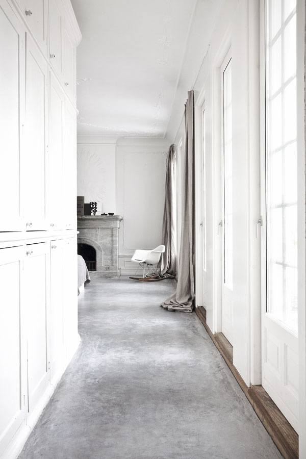
I would have loved to see a before and after shot as Jonas took out a few walls to create long sight lines and to let daylight stream through the house into the north facing living room. The polished concrete floors give the place a wonderful cohesion and flow carefully balancing the original details with some industrial elements.

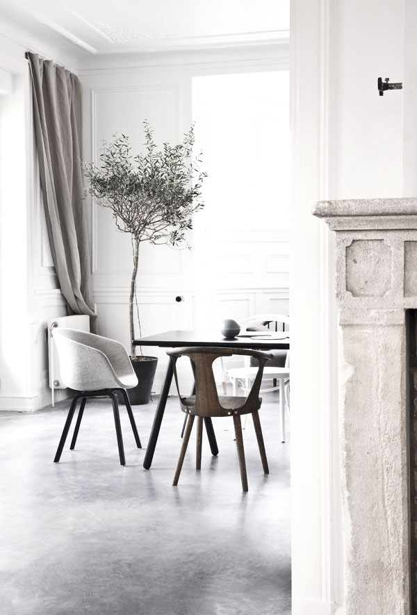
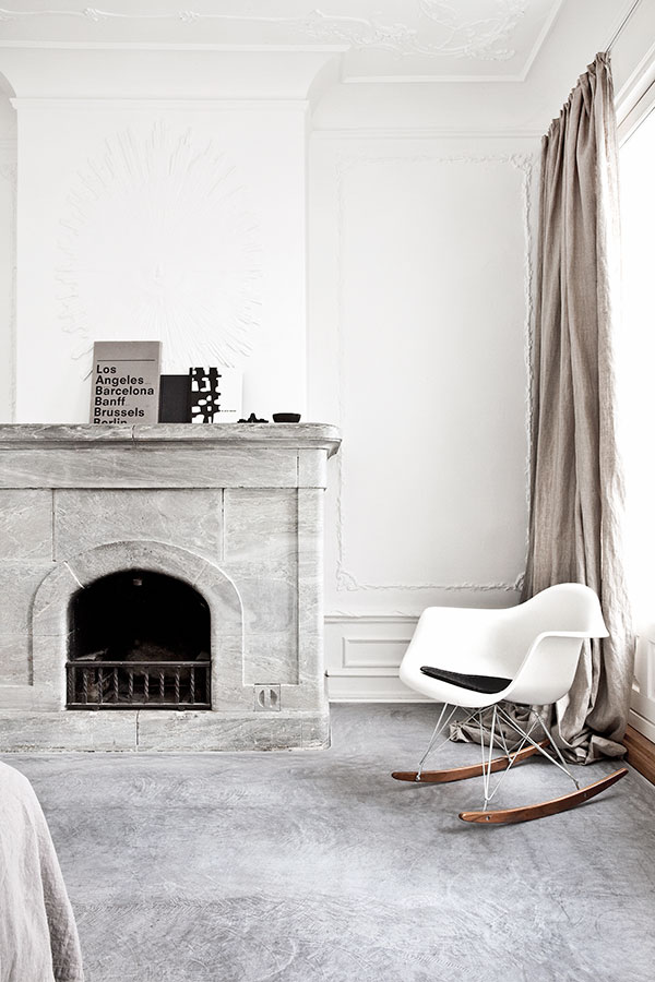
Though the rooms are set up for the shoot I can’t help but appreciate the almost poetic quality of his home. I love the stripped back stone fire places, the potted olive tree, the simple and classic furniture in soft greys and different woods and the long tactile curtains gathering on the floor. There’s a feeling of luxury as well as ease running through the property that only a combination of space and natural light can achieve. *swoon*

Can you tell I’ve got a crush!? Check out some more polished concrete here.
 

norm architects, Jonas Bjerre-Poulsen, photographer, architect, designer, style, interior design, villa, renovation, vedbaek, copenhagen, scandinavian, clean, simple, original details, light, polished concrete, floor, denmark, daylight, trend, style

norm architects, Jonas Bjerre-Poulsen, photographer, architect, designer, style, interior design, villa, renovation, vedbaek, copenhagen, scandinavian, clean, simple, original details, light, polished concrete, floor, denmark, daylight, trend, style

norm architects, Jonas Bjerre-Poulsen, photographer, architect, designer, style, interior design, villa, renovation, vedbaek, copenhagen, scandinavian, clean, simple, original details, light, polished concrete, floor, denmark, daylight, trend, style

norm architects, Jonas Bjerre-Poulsen, photographer, architect, designer, style, interior design, villa, renovation, vedbaek, copenhagen, scandinavian, clean, simple, original details, light, polished concrete, floor, denmark, daylight, trend, style

norm architects, Jonas Bjerre-Poulsen, photographer, architect, designer, style, interior design, villa, renovation, vedbaek, copenhagen, scandinavian, clean, simple, original details, light, polished concrete, floor, denmark, daylight, trend, style

norm architects, Jonas Bjerre-Poulsen, photographer, architect, designer, style, interior design, villa, renovation, vedbaek, copenhagen, scandinavian, clean, simple, original details, light, polished concrete, floor, denmark, daylight, trend, style

norm architects, Jonas Bjerre-Poulsen, photographer, architect, designer, style, interior design, villa, renovation, vedbaek, copenhagen, scandinavian, clean, simple, original details, light, polished concrete, floor, denmark, daylight, trend, style

norm architects, Jonas Bjerre-Poulsen, photographer, architect, designer, style, interior design, villa, renovation, vedbaek, copenhagen, scandinavian, clean, simple, original details, light, polished concrete, floor, denmark, daylight, trend, style

norm architects, Jonas Bjerre-Poulsen, photographer, architect, designer, style, interior design, villa, renovation, vedbaek, copenhagen, scandinavian, clean, simple, original details, light, polished concrete, floor, denmark, daylight, trend, style

norm architects, Jonas Bjerre-Poulsen, photographer, architect, designer, style, interior design, villa, renovation, vedbaek, copenhagen, scandinavian, clean, simple, original details, light, polished concrete, floor, denmark, daylight, trend, style


MORE INFORMATION & PHOTOGRAPHY | Norm Architects with thanks
 
Follow Stylejuicer with Bloglovin
WORKSHOP | DEFINE YOUR SIGNATURE STYLE

20 October 2014

define, signature style, trend, expert, interior, photographer, workshop, london, hoxton, professional, bloggers, business owners, project managers, personal project, mood board, creative, bespoke, emily quinton, gudy herder

Defining your signature style is essential whether you’re a blogger, starting a business or work on a personal project. Our world and especially the internet is becoming ever more crowded and noisy so good photography is a necessity to help you stand out.

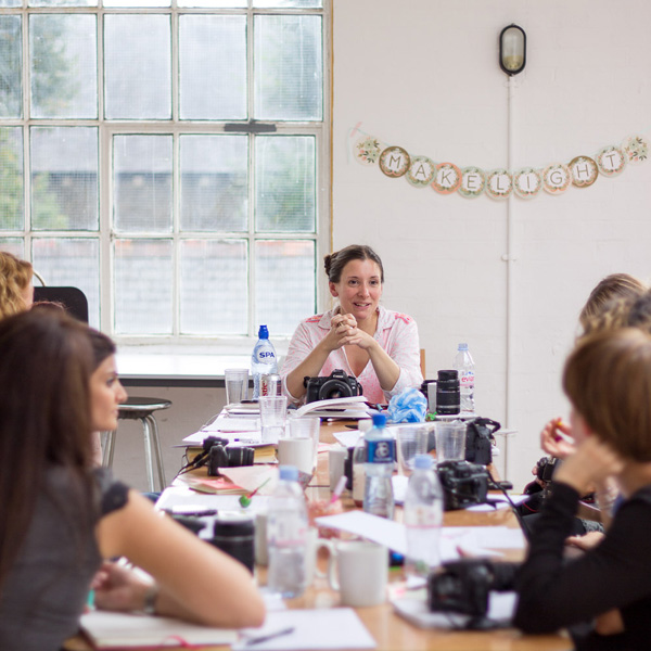
My blogging friend professional photographer, Emily Quinton has therefore teamed up with interiors stylist and trend expert, Gudy Herder to teach this workshop over two days in London.

They are both absolutely lovely people with years of experience and will cover a huge amount of material and practical advice allowing you the creative space to find your own distinctive style.

If your project, whether that’s a brand or blog, lacks focus or unity, or if you just want to gather some new skills to use on projects in your home this workshop will give you the confidence, inspiration and motivation to translate your ideas into a consistent, articulate and bespoke style.

By the end of the weekend you’ll be able to compose beautiful photographs on both your camera phone and dSLR using all the inside tips and advice by professional photographer Emily, including shooting in Aperture Priority mode to really capture the images you want to create.

Interior stylist and trend expert, Gudy will teach you how to define your signature style that can then be applied to your brand, blog or personal project through an inspiration board you will take home with you.
 
define, signature style, trend, expert, interior, photographer, workshop, london, hoxton, professional, bloggers, business owners, project managers, personal project, mood board, creative, bespoke, emily quinton, gudy herder

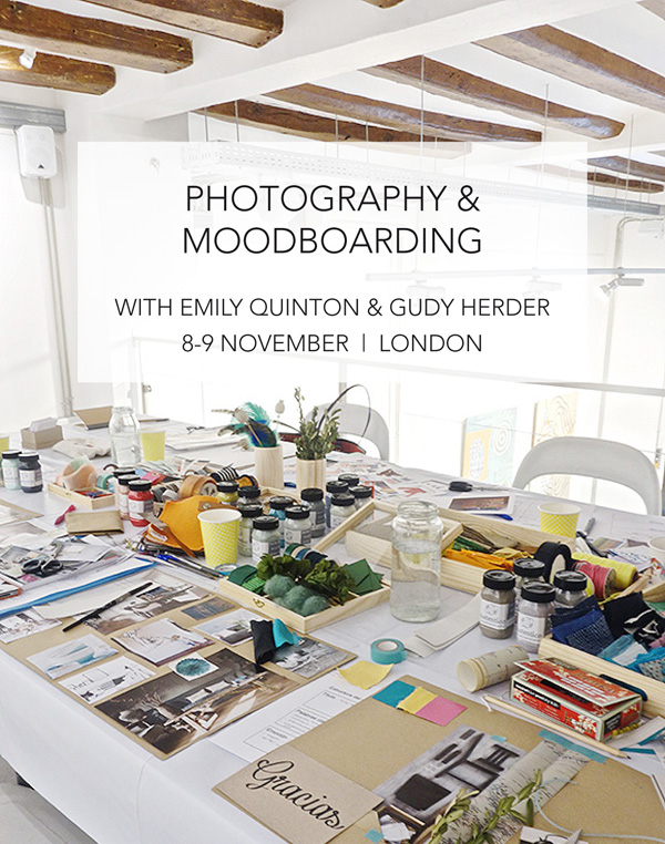
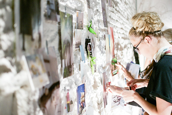
For maximum creative input, Gudy, Emily and all participants will build a giant mood board which will pull all their current inspirations and everyone’s ideas together in a coherent and inspiring way. Connecting with others is a huge part of this weekend workshop and this exercise gives everyone the opportunity to work together creatively in a way they may not have done before.

Absolutely no experience is required, this workshop is suitable for any bloggers, business owners, project managers or those working on personal projects. It makes sense to have a project in mind to apply your newly defined style to, but you can be right at the very beginning of the road, at a crossroads, or some way down the line.

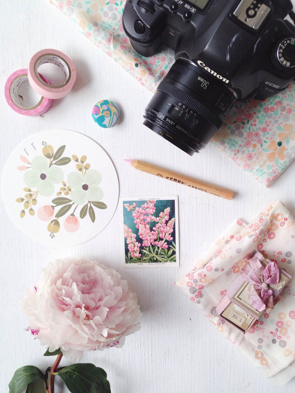
Ideally, you will bring with you a camera phone and dSLR or compact camera. And for the mood boarding you will need images and materials which define you and your project best. There will also be plenty of materials for you to work with during the workshop too and beautiful props for you to photograph.

The cost of this workshop is £275 per person and includes the following:

• all materials for the weekend, including props for the photography lessons and material for mood boarding;

• a full set of notes for each part of the course with a breakdown of instructions for each process: and

• lunch, coffee break, all refreshments.
 

A fantastic opportunity to learn from two pros in the creative surroundings of Hoxton.
Follow the link to sign up, limited spaces available.

 
Define-Signature-Style-Workshop-Emily-Quinton-Gudy-Herder-03

define, signature style, trend, expert, interior, photographer, workshop, london, hoxton, professional, bloggers, business owners, project managers, personal project, mood board, creative, bespoke, emily quinton, gudy herder


MORE INFORMATION & PHOTOGRAPHY | Emily Quinton & Gudy Herder

MOOD BOARD | AW14 TREND

17 October 2014

fashion, aw14, oversize, long sleeves, sweater, coat, fabric, cozy, layers, hip, trend, zara, cos, andotherstories, wool, cashmere, alpaca, natural, muted colours, design, high street, skinny straight

What’s nicer than to wrap up in an oversize sweater or coat when you’re chilly!? It’s like a warm blanket that comforts and protects you and I just love this AW14 trend which inspired me to put a little mood board together all courtesy of my Pinterest feed.

I recently read somewhere that you’re only as cool as your sleeves are long this season – or words to the effect – and I for one am very happy to embrace this trend. Being taller and longer limbed than the average female I’m delighted to see there are lots of tall (as well as petite) sections now on the high street and some of my favourite brands like Zara, COS and &otherstories have always cut their clothes with extra long sleeves. Or if you want designer pop over to Joseph and ACNE – did you spot their divine sweater top left!?

I’m not a big fan of the cold so it’s fair to say that autumn and winter aren’t my favourite seasons but I do enjoy putting on lots of cosy layers and playing with different textures and colours. Naturally soft yarns like wool, cashmere and alpaca are my wardobe staple for the coming months and I mostly stick to muted colours from off whites to greys, navy and black with some dark forest greens and plum shades. Mix that with some skinny straight trousers and hip sneakers and you’re all set for the coming months.

Cold? Who’s cold now?

 
NOTE | All via my Pinterest boards
 
Follow Stylejuicer with Bloglovin