PERFECTLY STYLED SWEDISH APARTMENT

2 March 2015

gothenburg, sweden, kitchen, cabinetry, carpentry, estate agency, entrance, styling, perfectly styled, soft colour palette, vintage, mid-century, shaker style, dining table, style, trend

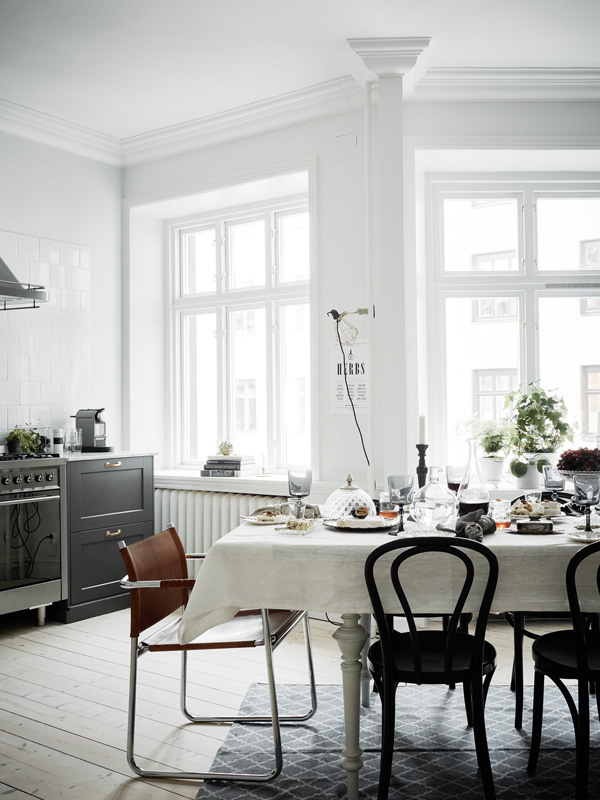
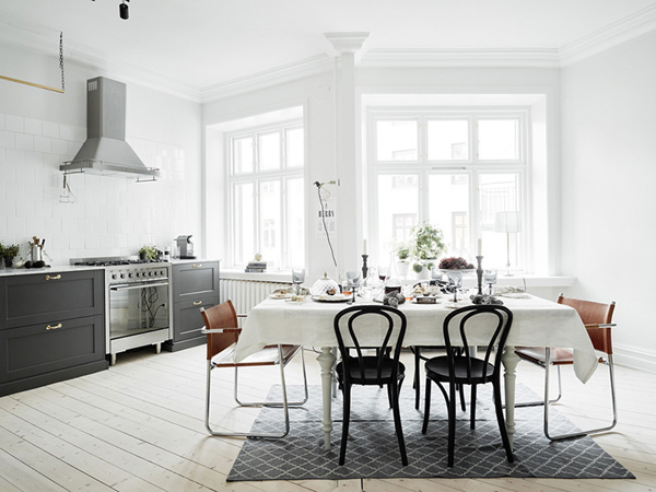
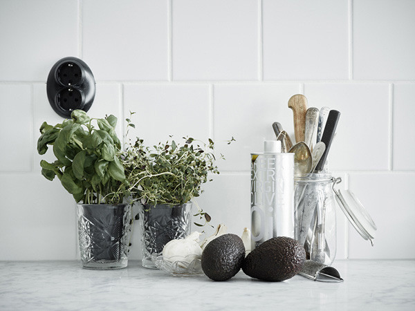
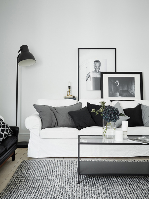
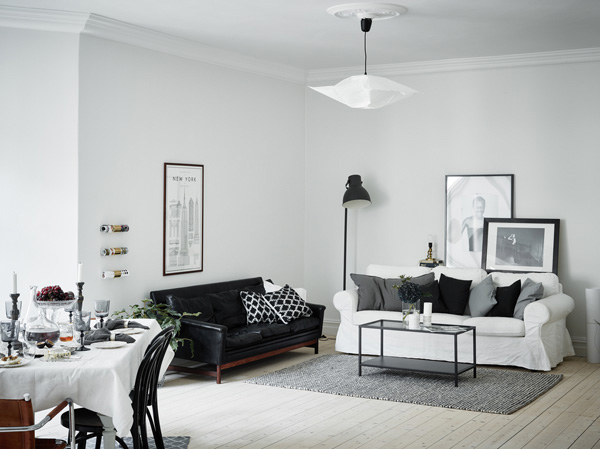
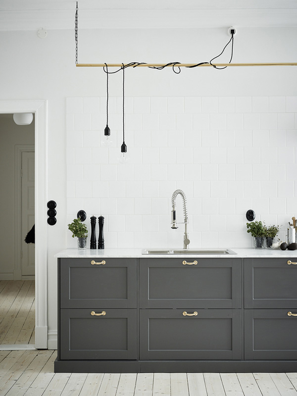
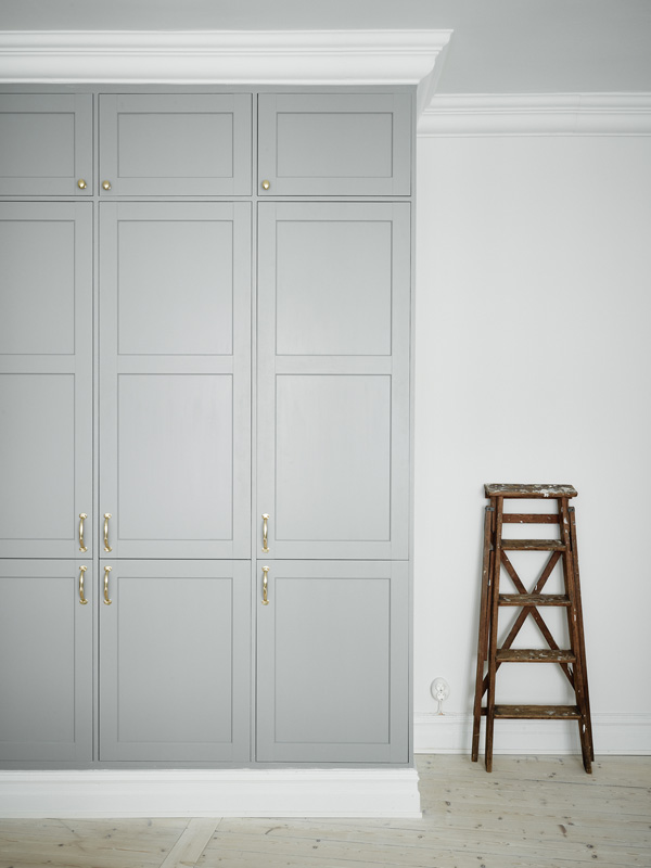
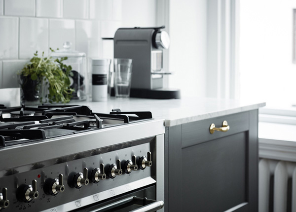
Argh! I don’t like Monday mornings so I’m swooning over this beautiful Swedish apartment which I found via real estate agency Entrance. It’s gorgeous, right!? The bad news is, it’s sold. The good news is that you can see it here on the blog.

I wish they’d put this much effort into selling houses over here in the UK. How much more enticing if you see a tidy, clutter-free and lived-in environment that’s styled to perfection. It immediately triggers the ‘yes, I want that lifestyle and yes, I’m going to outbid whoever stands in my way.’ response. No? Doesn’t have the same effect on you? Maybe it’s just me and my mild OCD.

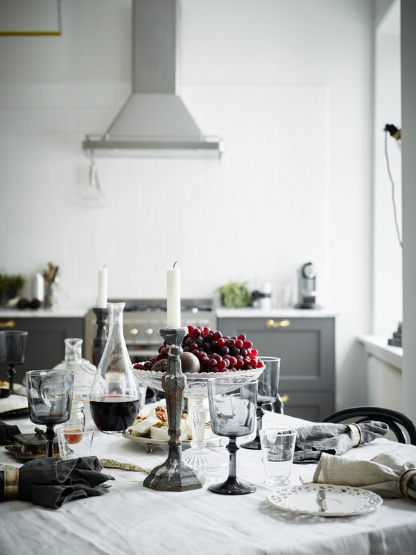
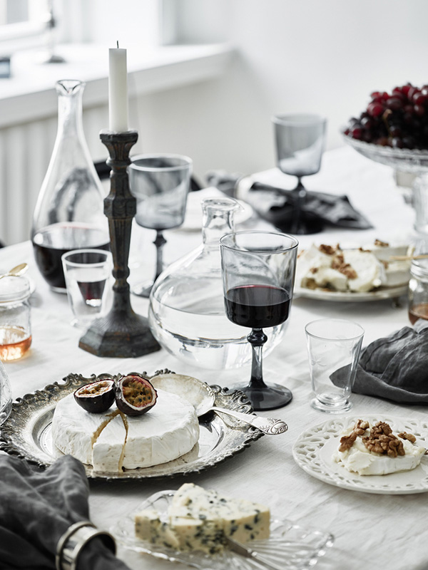
I just want to sit down at that table and tuck into the lovely cheeses and help myself to a glass or two of red before collapsing on the white sofa and probably nodding off reading the papers.

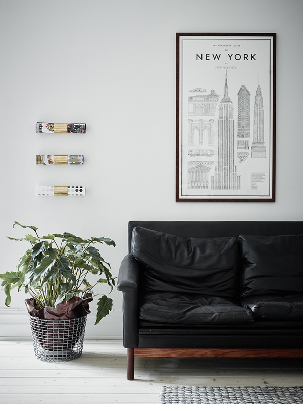
I particularly love the black leather sofa which looks like a vintage mid-century piece and works beautifully with the surrounding soft greys and whites. Now the open-plan kitchen dining area has to be my favourite though with the dark grey cabinetry and I even like the brass door handles – not normally something I’d go for but it works with the Shaker style for the wood work. And how cool is the DIY string lighting above the sink!? Reminds me of a futuristic version of an old fashioned drying rack. Genius!


gothenburg, sweden, kitchen, cabinetry, carpentry, estate agency, entrance, styling, perfectly styled, soft colour palette, vintage, mid-century, shaker style, dining table, style, trend

gothenburg, sweden, kitchen, cabinetry, carpentry, estate agency, entrance, styling, perfectly styled, soft colour palette, vintage, mid-century, shaker style, dining table, style, trend

gothenburg, sweden, kitchen, cabinetry, carpentry, estate agency, entrance, styling, perfectly styled, soft colour palette, vintage, mid-century, shaker style, dining table, style, trend

gothenburg, sweden, kitchen, cabinetry, carpentry, estate agency, entrance, styling, perfectly styled, soft colour palette, vintage, mid-century, shaker style, dining table, style, trend

gothenburg, sweden, kitchen, cabinetry, carpentry, estate agency, entrance, styling, perfectly styled, soft colour palette, vintage, mid-century, shaker style, dining table, style, trend

gothenburg, sweden, kitchen, cabinetry, carpentry, estate agency, entrance, styling, perfectly styled, soft colour palette, vintage, mid-century, shaker style, dining table, style, trend

gothenburg, sweden, kitchen, cabinetry, carpentry, estate agency, entrance, styling, perfectly styled, soft colour palette, vintage, mid-century, shaker style, dining table, style, trend

gothenburg, sweden, kitchen, cabinetry, carpentry, estate agency, entrance, styling, perfectly styled, soft colour palette, vintage, mid-century, shaker style, dining table, style, trend

gothenburg, sweden, kitchen, cabinetry, carpentry, estate agency, entrance, styling, perfectly styled, soft colour palette, vintage, mid-century, shaker style, dining table, style, trend

gothenburg, sweden, kitchen, cabinetry, carpentry, estate agency, entrance, styling, perfectly styled, soft colour palette, vintage, mid-century, shaker style, dining table, style, trend

 
PHOTOGRAPHY | Jonas Berg for Entrance
 
Follow Stylejuicer with Bloglovin

MY MONTH ON INSTAGRAM | FEBRUARY 2015

28 February 2015

instagram, my month, february, mymonthoninstagram, photo, photography, trend, style, daily, experiences, beauty, moments, snow, winter, season, stylejuicer, kids, bed, london, breakfast, magnolia, kew gardens, smoothie, selfie, hashtag, 20beautifulwomenchallenge, 20 beautiful women challenge
 

Zoom… wow, how fast has February flown by!? Don’t be fooled by some of the sunny pictures, it was a pretty gloomy month – though we did at last get about 2 inches of snow which disappeared in all of five seconds. The kids loved it though they did comment how cold it was, duh!

The main event this month in Instagram world was the hashtag #20beautifulwomenchallenge to encourage self esteem and confidence in women. After being tagged by far too many to ignore I finally decided to take part and posted the dreaded selfie. How I cringed and didn’t dare to look at the likes and comments for ages… well, at least 2 hours which is ‘ages’ in IG world.

But I’m glad to report that my follower figures didn’t plummet and it was quite overwhelming and emotional to receive all the lovely supportive comments. By tagging 20 more women I realised that the vast majority have got the same fears and it is precisely for that reason that this campaign is necessary and so healthy especially on a social platform that is for the most part obsessed with beauty and documenting life in the best possible light.

We are all women and we are all beautiful, whatever age or colour, and if you haven’t taken part consider yourself tagged and I promise you it’s a liberating and empowering experience.

#20beautifulwomenchallenge


PHOTOGRAPHY | Annie Kruse Please don’t take my shots without my permission. Instead follow me on Instagram.

 
Follow Stylejuicer with Bloglovin
A CALM AND PURE HOME IN CAPE TOWN

25 February 2015

calm, pure, home, cape town, south africa, est magazine, isuu, online magazine, make up artist, Algria Ferreira-Watling, monastery, zen, bare, walls, floors, white washed, interior design, styling, trend, style, decor, muted colour palette, less is more

After a week of far too much work and too little time to play I’m finally back to blogging and want to share this amazing home in Cape Town with you which I discovered via one of my favourite online magazines EST.

It’s the home of make-up artist Algria Ferreira-Watling who by her own admission comes from a poor background and never dreamt of living in a palace. She says she has never needed things but instead has always wanted to live in a little house with the peaceful feel of a monastery.

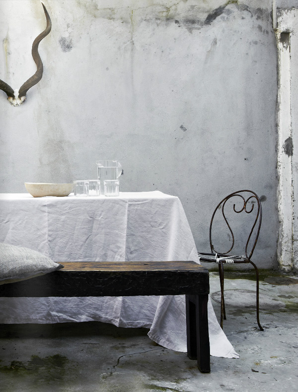
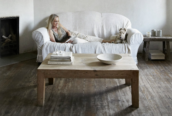
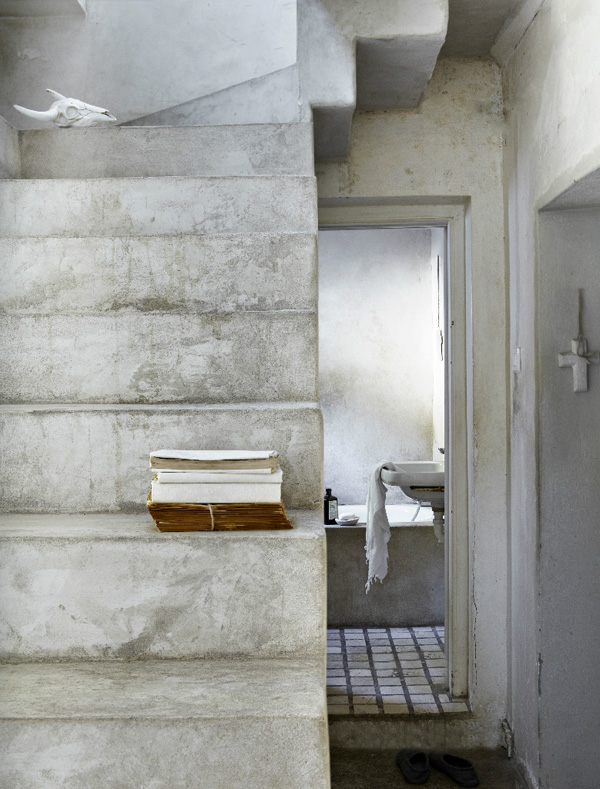
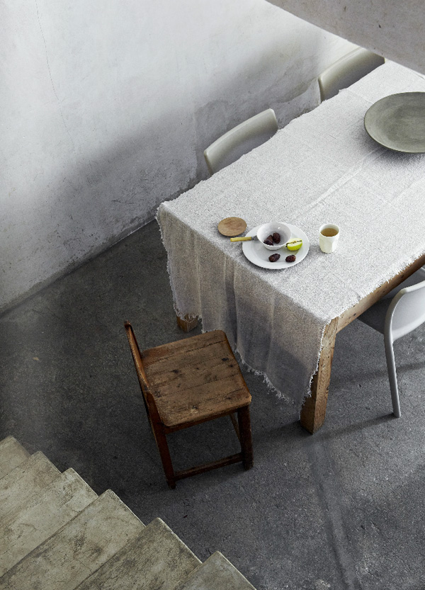
A truly admirable and humbling approach to decorating, interior design and styling and in fact to the rest of the world’s drive to consumerism. Her place feels very Zen like and utterly calm and pure with bare walls and floors in a muted earthy colour palette.

Looking at her place made me take a step back and remind myself that less is more. *Sigh* but I do so like some new shoes…


calm, pure, home, cape town, south africa, est magazine, isuu, online magazine, make up artist, Algria Ferreira-Watling, monastery, zen, bare, walls, floors, white washed, interior design, styling, trend, style, decor, muted colour palette, less is more

calm, pure, home, cape town, south africa, est magazine, isuu, online magazine, make up artist, Algria Ferreira-Watling, monastery, zen, bare, walls, floors, white washed, interior design, styling, trend, style, decor, muted colour palette, less is more

calm, pure, home, cape town, south africa, est magazine, isuu, online magazine, make up artist, Algria Ferreira-Watling, monastery, zen, bare, walls, floors, white washed, interior design, styling, trend, style, decor, muted colour palette, less is more

calm, pure, home, cape town, south africa, est magazine, isuu, online magazine, make up artist, Algria Ferreira-Watling, monastery, zen, bare, walls, floors, white washed, interior design, styling, trend, style, decor, muted colour palette, less is more

calm, pure, home, cape town, south africa, est magazine, isuu, online magazine, make up artist, Algria Ferreira-Watling, monastery, zen, bare, walls, floors, white washed, interior design, styling, trend, style, decor, muted colour palette, less is more

 
PHOTOGRAPHY | Greg Cox with thanks
 
Follow Stylejuicer with Bloglovin
MOOD BOARD | GRID LOVE

23 February 2015

mood board, trend, styling, grid, grid love, grid addict, instagram, pinterest, fashion, interiors, home, decor, aura, bedlinen, grid blanket, grid sweater, h&m home

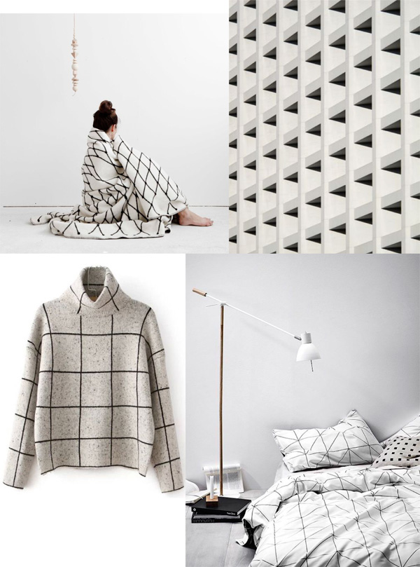
In case you’re not an Instagram addict / blog lover / design nerd and Pinterest fanatic like me you may be surprised to find that GRIDs are totally a thing at the moment.

From socks to frocks, teatowels to bedlinen they even made their way into our kids rooms (see Suzanne’s fabulous post last week). Mostly monochrome and often reversible I’m in love with this trend and have gathered a few of my favourites on the mood board above. Do you remember that grid teatowel I bought from H&M home a couple of weeks ago… fits right in. But if I may please can I also have:

01 | This beautiful blanket as winter seems to have returned with freezing temperatures.
02 | The polo neck sweater for reasons see above.
03 | And this AURA reversible bedlinen.

 
NOTE | All shots used on the mood board via my Pinterest boards
Grid blanket via Studio Oink with thanks
 
Follow Stylejuicer with Bloglovin
MODERN RUSTIC | DANISH COTTAGE

16 February 2015

modern rustic, danish, denmark, cottage, kitchen, style, trend, interior design, styling, handmade, wooden, dining table, metal chairs, sheep skin, exposed beams, brick wall, muted, shades of grey, organic, curved, traditional display cabinet

Hello peeps! Did you all survive Valentines Day? Did you feel it? Yeah, me neither. Give me a modern rustic Danish cottage any day but on demand romance… nah, not enough spontaneity for me.

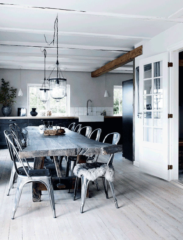
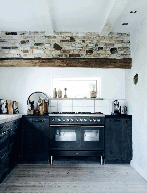
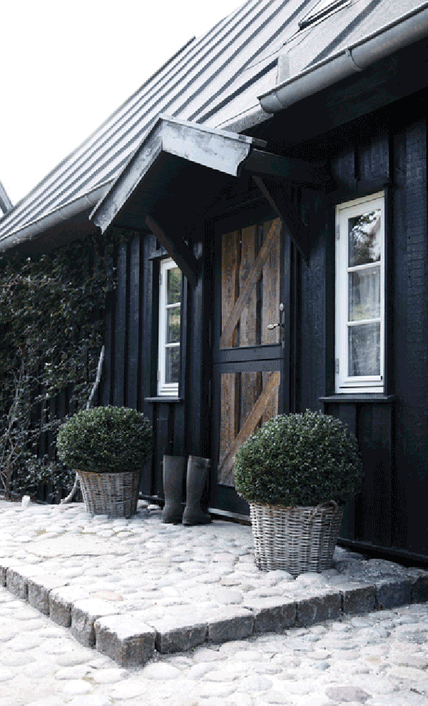
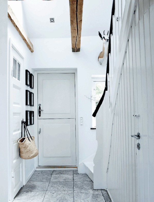
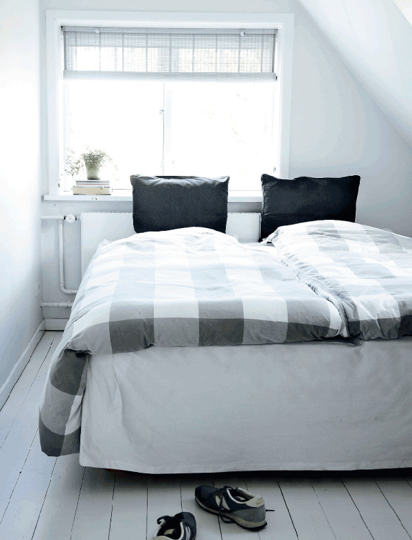
So, isn’t this place fabulous? Kitchens sell houses, right!? I would buy this one without even looking around the rest of the house. That heavy, handmade wooden dining table with organic curvy edges that still show the shape of the tree, those metal chairs with fluffy sheep skins, the muted shades of grey (no, haven’t seen the movie or read the books and don’t intend to) and exposed beams and brick wall – I’m all over that. Beautiful! And a perfect fit for the black clad cottage with it’s typical steep metal roof.

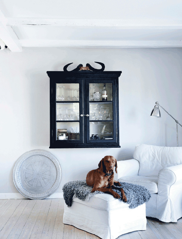
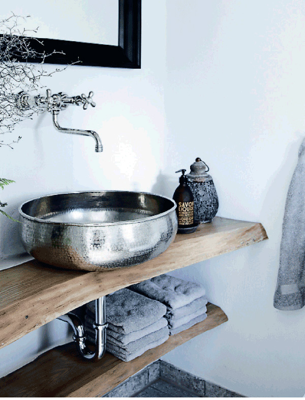
There are some more gems around the rest of the house like the curved wooden boards in the bathroom used as shelving and support for the sink. I also like the bull horns sitting on top of a traditional display cabinet and how cute is the dog sitting patiently underneath!?

Wishing you a great start to the week.


modern rustic, danish, denmark, cottage, kitchen, style, trend, interior design, styling, handmade, wooden, dining table, metal chairs, sheep skin, exposed beams, brick wall, muted, shades of grey, organic, curved, traditional display cabinet

modern rustic, danish, denmark, cottage, kitchen, style, trend, interior design, styling, handmade, wooden, dining table, metal chairs, sheep skin, exposed beams, brick wall, muted, shades of grey, organic, curved, traditional display cabinet

modern rustic, danish, denmark, cottage, kitchen, style, trend, interior design, styling, handmade, wooden, dining table, metal chairs, sheep skin, exposed beams, brick wall, muted, shades of grey, organic, curved, traditional display cabinet

modern rustic, danish, denmark, cottage, kitchen, style, trend, interior design, styling, handmade, wooden, dining table, metal chairs, sheep skin, exposed beams, brick wall, muted, shades of grey, organic, curved, traditional display cabinet

modern rustic, danish, denmark, cottage, kitchen, style, trend, interior design, styling, handmade, wooden, dining table, metal chairs, sheep skin, exposed beams, brick wall, muted, shades of grey, organic, curved, traditional display cabinet

modern rustic, danish, denmark, cottage, kitchen, style, trend, interior design, styling, handmade, wooden, dining table, metal chairs, sheep skin, exposed beams, brick wall, muted, shades of grey, organic, curved, traditional display cabinet

 
VIA | Femina
PHOTOGRAPHY | Mette Wotkjær with thanks
 
Follow Stylejuicer with Bloglovin