PLACES TO GO | THE KETTLE BLACK

3 June 2015

australia, the kettle black, melbourne, hip, trendy, interior design, studio you me, scandinavian influence, clena lines, warm oak, soft tones, mint green accents, material mix, textures, victorian, contemporary, urban, destination cafe, style, trend

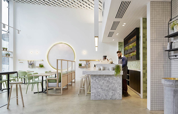
Another Aussie find today: The Kettle Black is one of Melbourne’s hippest addresses when it comes to coffee and breakfast and in a city that lives and breathes coffee snobbery that’s saying something!

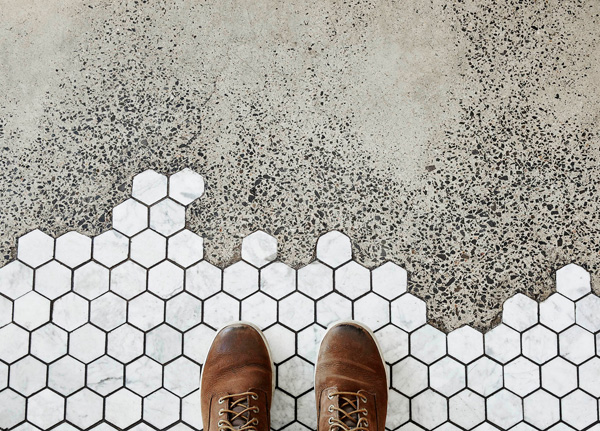
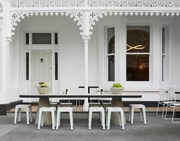
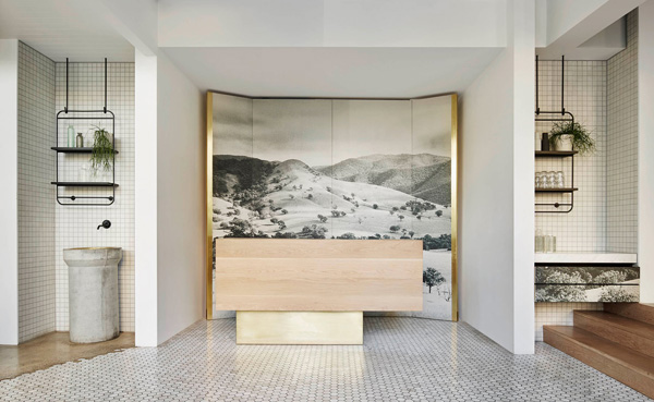
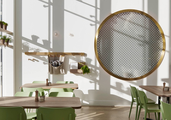
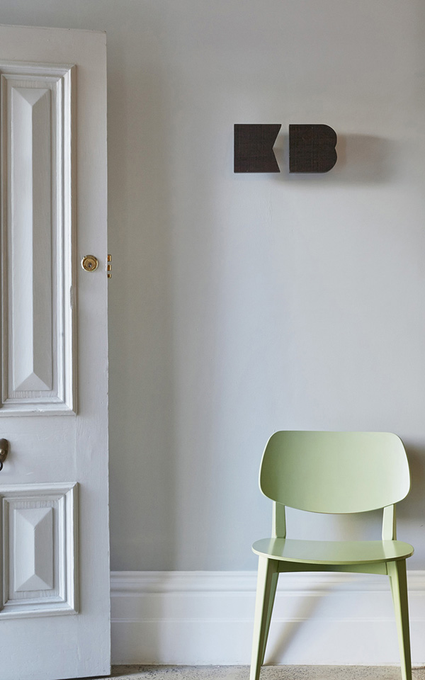
The elegant, light filled interior has been designed by Studio You Me and has strong Scandinavian influences with clean lines, warm oak and soft tones with mint green accents. I adore the mixture of textures that range from polished concrete and hexagonal tiles to wooden wall panelling and feature wallpaper. The material mix works extremely well combining the traditional Victorian facade with a contemporary urban vibe and creating a new genre of a destination cafe.

So, if you happen to be in the area, pop in and let me know if it’s true what they say about those pancakes. They’re meant to be quite something.


australia, the kettle black, melbourne, hip, trendy, interior design, studio you me, scandinavian influence, clena lines, warm oak, soft tones, mint green accents, material mix, textures, victorian, contemporary, urban, destination cafe, style, trend

australia, the kettle black, melbourne, hip, trendy, interior design, studio you me, scandinavian influence, clena lines, warm oak, soft tones, mint green accents, material mix, textures, victorian, contemporary, urban, destination cafe, style, trend

australia, the kettle black, melbourne, hip, trendy, interior design, studio you me, scandinavian influence, clena lines, warm oak, soft tones, mint green accents, material mix, textures, victorian, contemporary, urban, destination cafe, style, trend

australia, the kettle black, melbourne, hip, trendy, interior design, studio you me, scandinavian influence, clena lines, warm oak, soft tones, mint green accents, material mix, textures, victorian, contemporary, urban, destination cafe, style, trend

australia, the kettle black, melbourne, hip, trendy, interior design, studio you me, scandinavian influence, clena lines, warm oak, soft tones, mint green accents, material mix, textures, victorian, contemporary, urban, destination cafe, style, trend

australia, the kettle black, melbourne, hip, trendy, interior design, studio you me, scandinavian influence, clena lines, warm oak, soft tones, mint green accents, material mix, textures, victorian, contemporary, urban, destination cafe, style, trend

australia, the kettle black, melbourne, hip, trendy, interior design, studio you me, scandinavian influence, clena lines, warm oak, soft tones, mint green accents, material mix, textures, victorian, contemporary, urban, destination cafe, style, trend

australia, the kettle black, melbourne, hip, trendy, interior design, studio you me, scandinavian influence, clena lines, warm oak, soft tones, mint green accents, material mix, textures, victorian, contemporary, urban, destination cafe, style, trend

australia, the kettle black, melbourne, hip, trendy, interior design, studio you me, scandinavian influence, clena lines, warm oak, soft tones, mint green accents, material mix, textures, victorian, contemporary, urban, destination cafe, style, trend

australia, the kettle black, melbourne, hip, trendy, interior design, studio you me, scandinavian influence, clena lines, warm oak, soft tones, mint green accents, material mix, textures, victorian, contemporary, urban, destination cafe, style, trend

 
MORE INFORMATION | The Kettle Black
INTERIOR DESIGN | Studio You Me
PHOTOGRAPHY | Peter Clarke with thanks
 
Follow Stylejuicer with Bloglovin

HOUSE 3 | BY COY AND YIONTIS

1 June 2015

House3-by-Coy_and-Yiontis-01

It’s the first of June and still far too cold out there. I even wore my winter coat on the playground yesterday as the wind was so cold. Not happy!

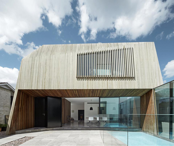
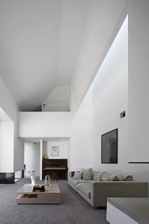
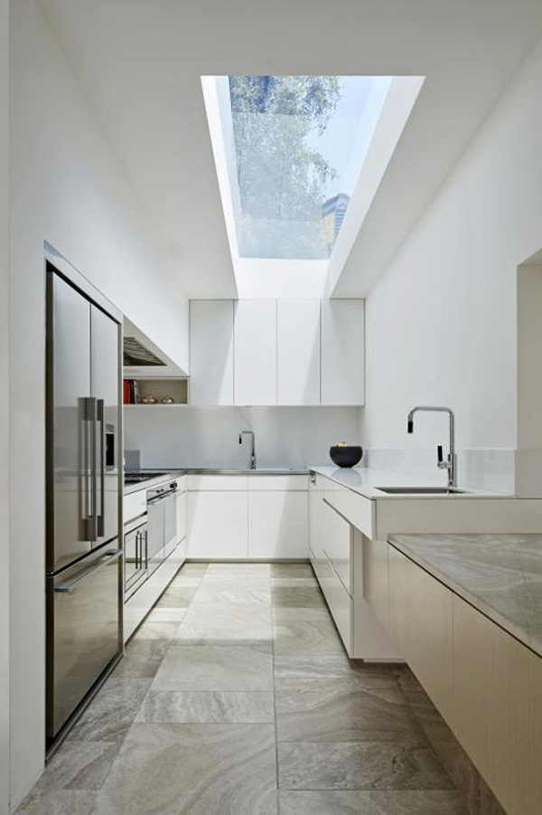
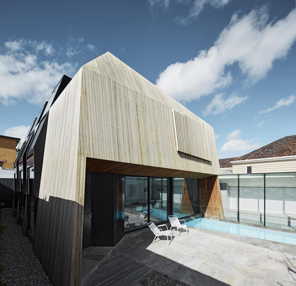
So, in the spirit of willing on warmer temperatures I’m going to share the amazing House 3 by Coy and Yiontis in Australia with you today. It’s essentially an extension to a Victorian townhouse in Balaclava, just outside Melbourne, accommodating the various needs of three generations living together.

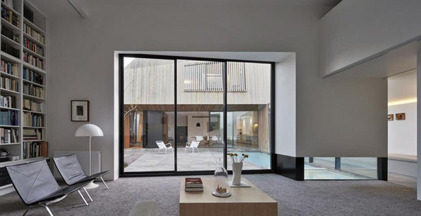
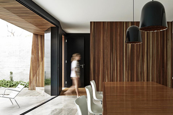
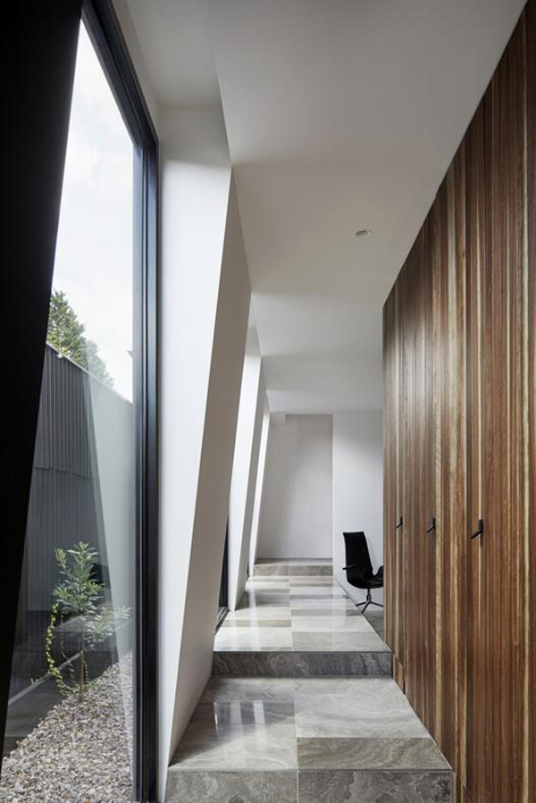
The architects cleverly divided the house into two discreet buildings, old and new, with a central courtyard and a glazed passage that connects the two. Despite the communal areas seeming so generous the architects claim:

This is not a big house. Considered planning and the integration of indoor and outdoor achieve a generosity and variety of communal spaces for the family at odds with the actual size of the building. Private areas are restrained and humble. It is an urban home that functions successfully for a multi-generational family and its evolving needs.

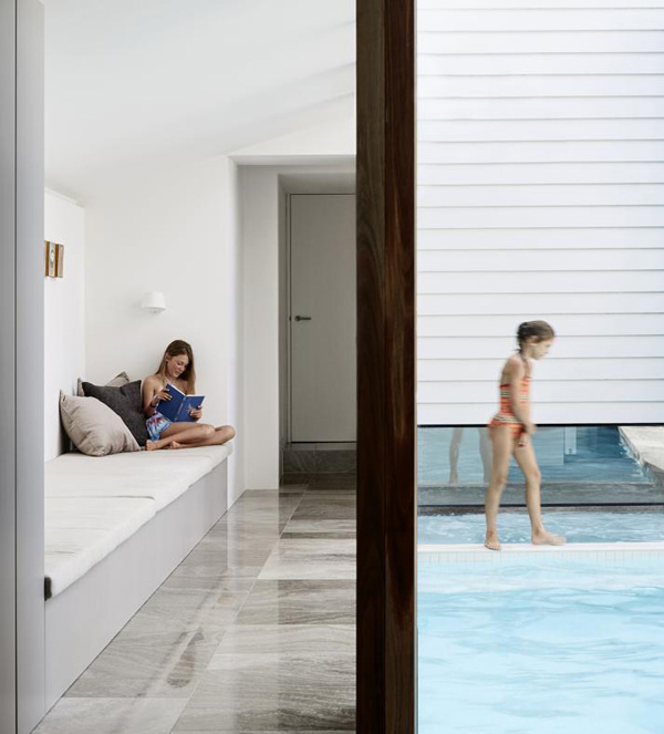
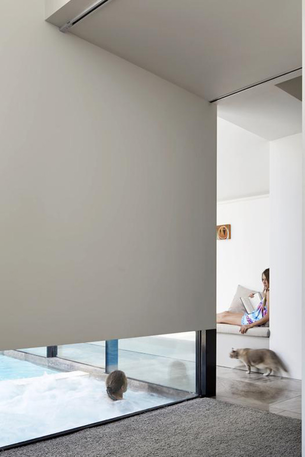
I have to say I really like the wooden cladding and the angled shapes of the new extension with it’s vast windows that never compromise privacy. There is some clever integrated seating in the passageway perfect for lounging and relaxing and I love how you can get glimpses of the pool through a low window from the reading room in the old part. Neat little touches that elevate the design from good to great.
 

House3-by-Coy_and-Yiontis-02

House3-by-Coy_and-Yiontis-03

House3-by-Coy_and-Yiontis-04

House3-by-Coy_and-Yiontis-05

House3-by-Coy_and-Yiontis-06

House3-by-Coy_and-Yiontis-07

House3-by-Coy_and-Yiontis-08

House3-by-Coy_and-Yiontis-09

House3-by-Coy_and-Yiontis-10

House3-by-Coy_and-Yiontis-11

House3-by-Coy_and-Yiontis-12

 
MORE INFORMATION | Coy and Yiontis
PHOTOGRAPHY | Peter Clarke with thanks
 
Follow Stylejuicer with Bloglovin
MY MONTH ON INSTAGRAM | MAY 2015

31 May 2015

instagram, my month, may, mymonthoninstagram, photo, photography, trend, style, daily, experiences, beauty, moments, spring, stylejuicer, kids, london, petersham nursery, hello fresh, milk magazine, national theatre, playtype, richmond, cereal, lotta agaton, zaradaily, zara fashion

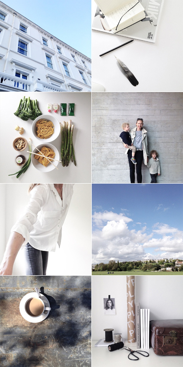
May has been a super exciting month for me! Not only did I manage to catch up with various girlfriends but I’ve been working on two really exciting projects and I can’t wait to tell you more about them. Let’s just say that over the coming months you’ll be able to catch sneak peeks on my Instagram so stay tuned.


PHOTOGRAPHY | Annie Kruse Please don’t take my shots without my permission. Instead follow me on Instagram.

 
Follow Stylejuicer with Bloglovin

ECLECTIC STYLE IN COPENHAGEN APARTMENT

29 May 2015

interior design, decor, style, trend, eclectic, vintage, modern rustic, copenhagen, apartment, upcycling, recycling, vintage, flea market finds, scandinavian, upholstered, biedermeier sofa, mix of old and new, Photography, Birgitta Wolfgang Drejer, Sisters Agency, styling, Irene de Klerk Wolters

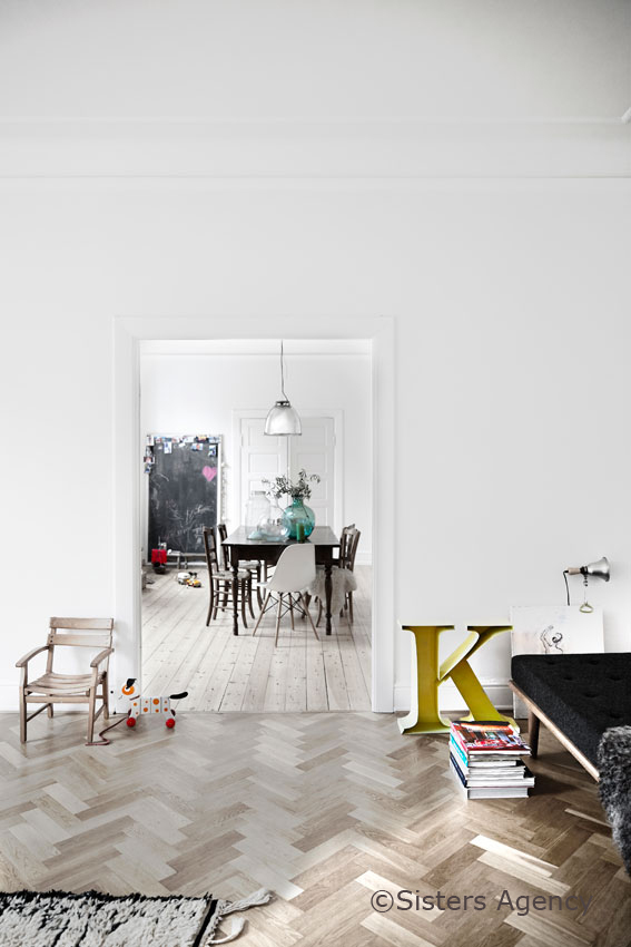
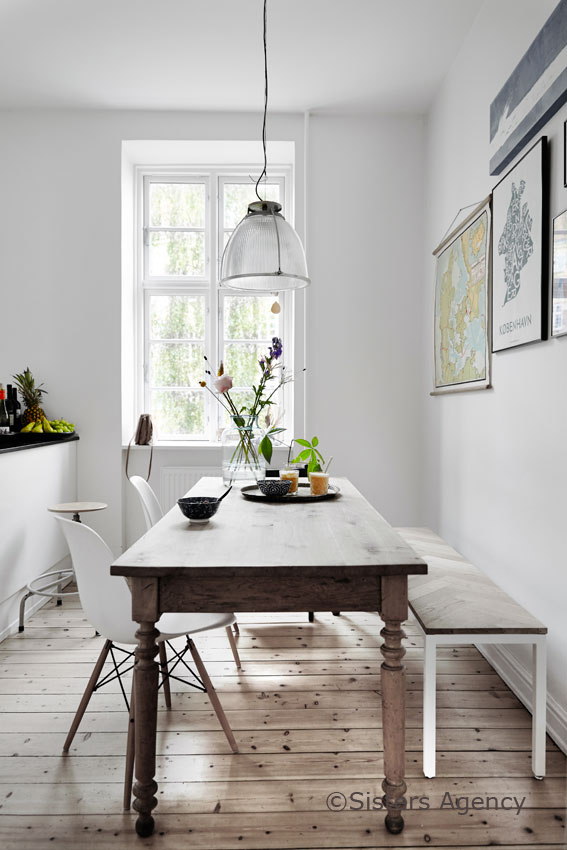
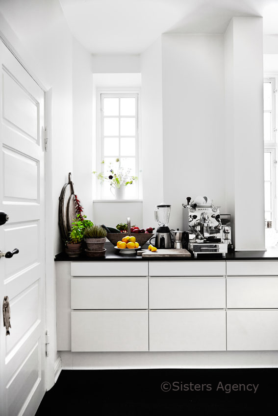
Just before this week is over I’d like to share a fabulously eclectic Copenhagen apartment with you that incorporates some cute upcycling and recycling ideas.

When Dutch couple Irene and Arjan moved from Amsterdam to Copenhagen with their two kids Irene quit her job as a lawyer and devoted herself to painting some of which can be seen in the living room and hall.

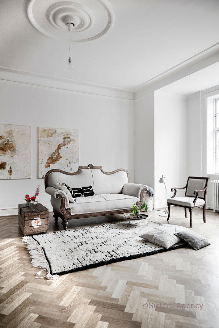
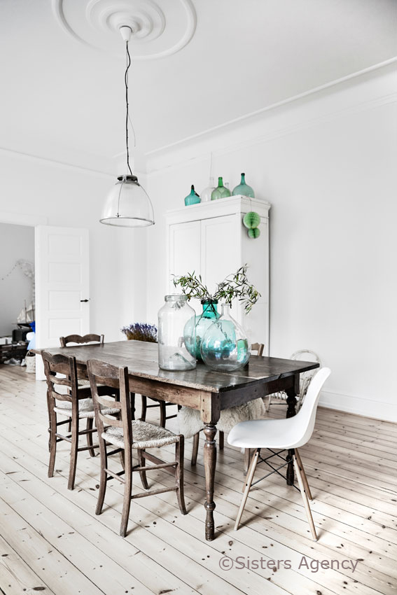
But her creativity also extends to decorating and she has managed to bring an intriguing eclectic style to their beautiful home. At first glance Irene’s style is typical Scandinavian but on closer inspection you can spot a lot of flea market finds and vintage furniture some of which has been painted, some scrubbed down to it’s bare bones and some newly upholstered like the Biedermeier sofa that sits comfortably next to an old wooden crate upcycled as a side table.

I particularly like the way Irene has decorated and styled the kids’ room keeping everything very tonal and natural with exposed floorboards, a painted old wardrobe and an old school desk. Throwing in a few splashes of colour with cushions, lighting, bedding and toys of course.

A great mix of old and new!


interior design, decor, style, trend, eclectic, vintage, modern rustic, copenhagen, apartment, upcycling, recycling, vintage, flea market finds, scandinavian, upholstered, biedermeier sofa, mix of old and new, Photography, Birgitta Wolfgang Drejer, Sisters Agency, styling, Irene de Klerk Wolters

interior design, decor, style, trend, eclectic, vintage, modern rustic, copenhagen, apartment, upcycling, recycling, vintage, flea market finds, scandinavian, upholstered, biedermeier sofa, mix of old and new, Photography, Birgitta Wolfgang Drejer, Sisters Agency, styling, Irene de Klerk Wolters

interior design, decor, style, trend, eclectic, vintage, modern rustic, copenhagen, apartment, upcycling, recycling, vintage, flea market finds, scandinavian, upholstered, biedermeier sofa, mix of old and new, Photography, Birgitta Wolfgang Drejer, Sisters Agency, styling, Irene de Klerk Wolters

interior design, decor, style, trend, eclectic, vintage, modern rustic, copenhagen, apartment, upcycling, recycling, vintage, flea market finds, scandinavian, upholstered, biedermeier sofa, mix of old and new, Photography, Birgitta Wolfgang Drejer, Sisters Agency, styling, Irene de Klerk Wolters

VIA | vtwonen
PHOTOGRAPHY | Birgitta Wolfgang Drejer / Sisters Agency
STYLING | Irene de Klerk Wolters

Follow Stylejuicer with Bloglovin
BREAKFAST WITH JOSEFIN HAAG

28 May 2015

breakfast, photography, styling, josefin haag, stylist, residence magazine, 20 kvadrat blog, blogging, northern germany, family breakfast, weekends, tradition, healthy food, american pancakes
 

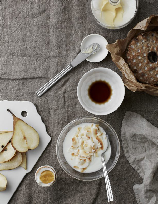
Wow, how delicious and healthy does this look!? Stylist and blogging buddy Josefin Haag from 20 Kvadrat shares some of her mouth-watering breakfast styling/photography over on Residence magazine.

It reminded me of my own childhood growing up in Northern Germany where breakfast is a much bigger deal and families take time to lay the table and eat together in the morning. Of course it’s usually a shorter event during the weekdays but at the weekend we would sit, chat and eat for hours which is such a nice and bonding experience and instils healthy eating habits in little ones.

I’m going to try and continue this tradition with my own family though the kids are still very small and certainly won’t sit down for very long I’m planning on coaxing them with different courses of fruit, cereal, cheeses and breads. Yeah right, Mama! Throw in some American pancakes and we’ll be there! *rolls eyes*

 
PHOTOGRAPHY | Josefin Haag with thanks
 
Follow Stylejuicer with Bloglovin