I’ve just finished work on a fantastic design project for a new client called Spectacle, a contemporary digital magazine for theatre, ballet and opera enthusiasts.
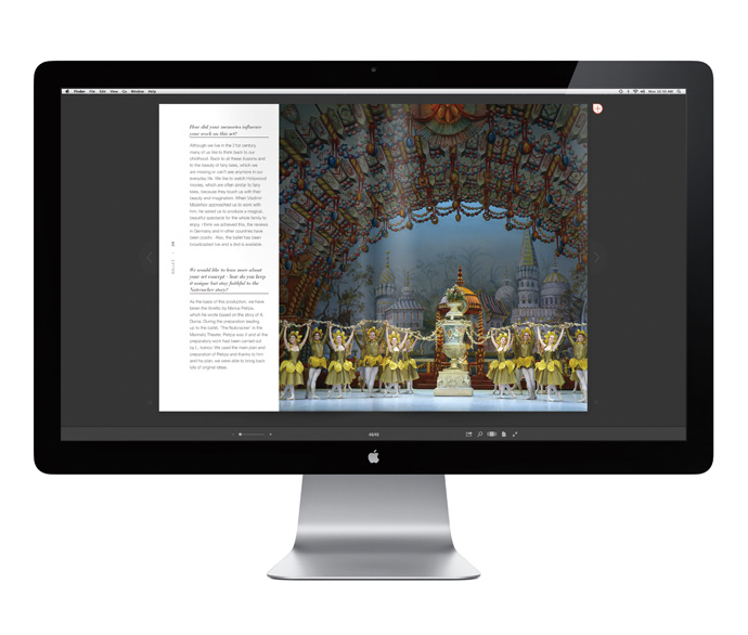
This is a modern take on the world of performing arts, often seen as elitist, with engaging behind-the-scenes stories, interviews with artists, directors and set designers supported by great photography and contemporary design equally.
This was my brief and I couldn’t have been happier.
Though the first edition of Spectacle is still being worked on I put a Special Edition together for the oh so Christmas-y ballet The Nutcracker which is now live on issuu.
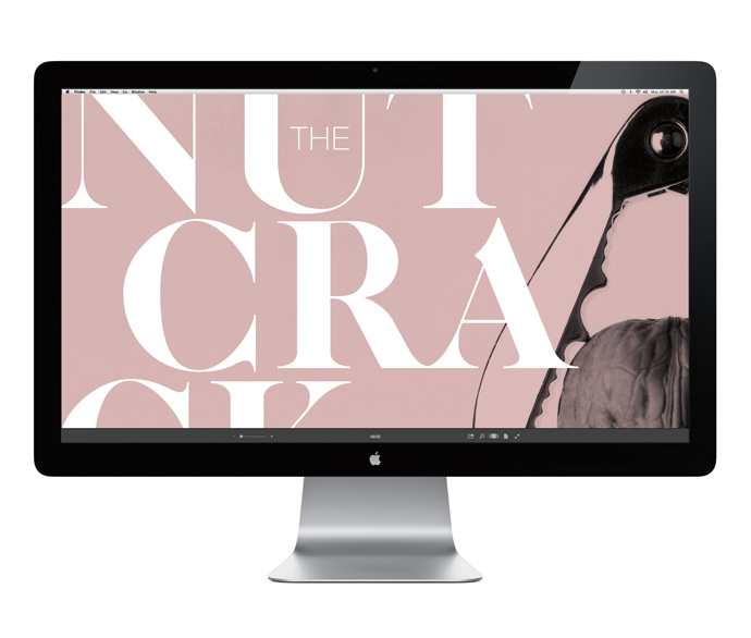
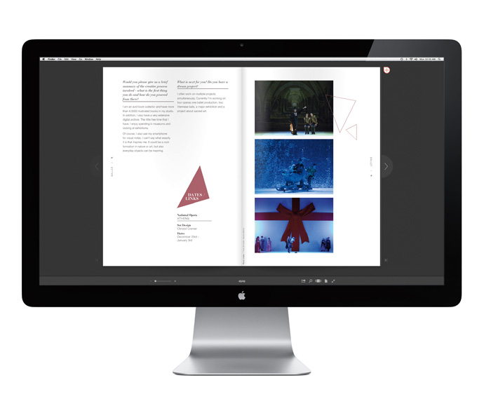
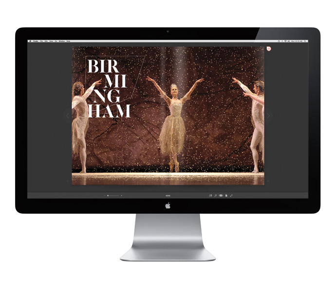
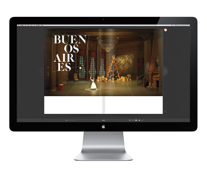
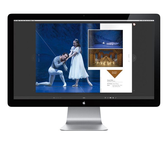
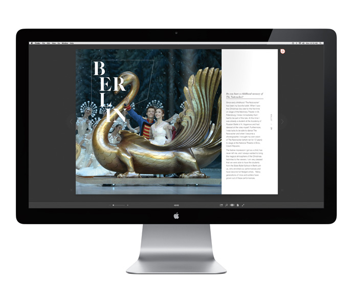
As Spectacle’s mission is to make culture more accessible and palatable to a modern – arguably younger – audience who are very visual and design conscious I decided to steer away from clichés of dancing ballerinas and wooden soldiers. Instead I used a strong visual contrast for the front cover displaying a plain household nutcracker and a cracked walnut on the last page.
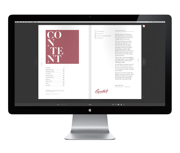
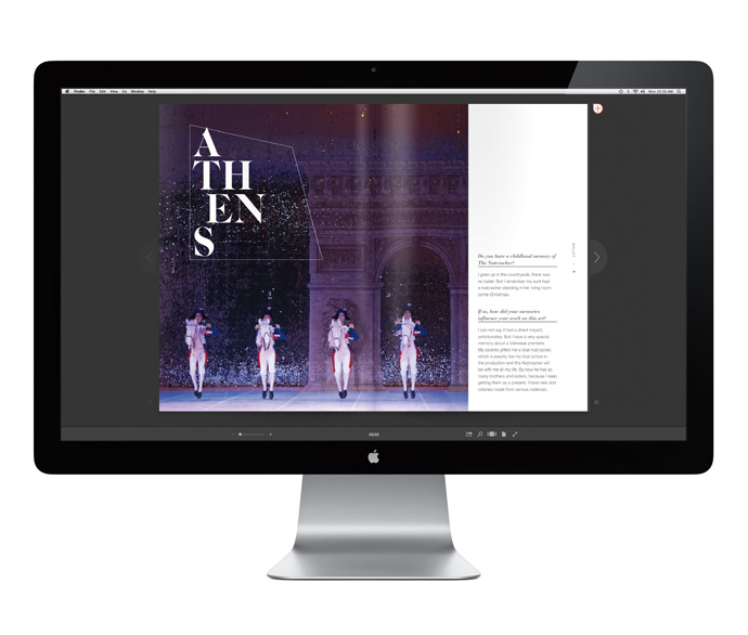
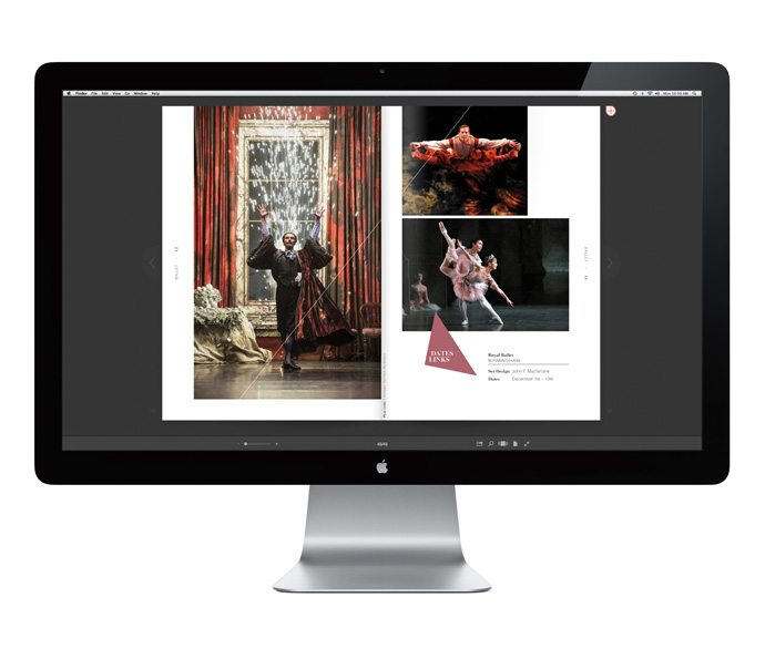
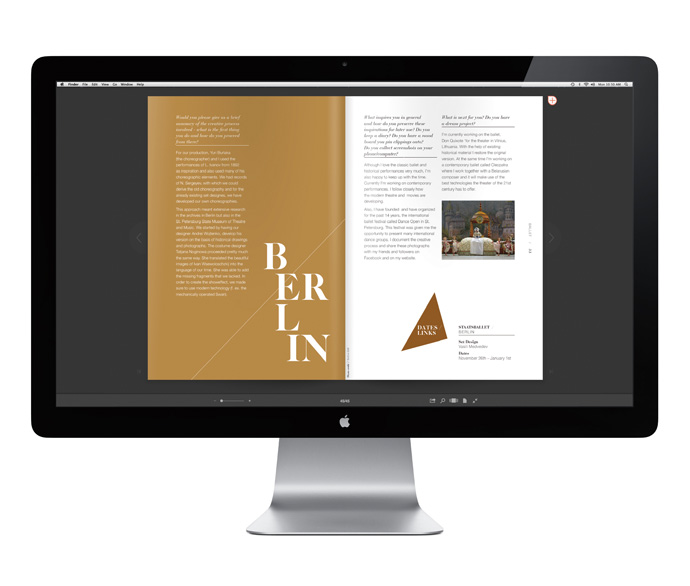
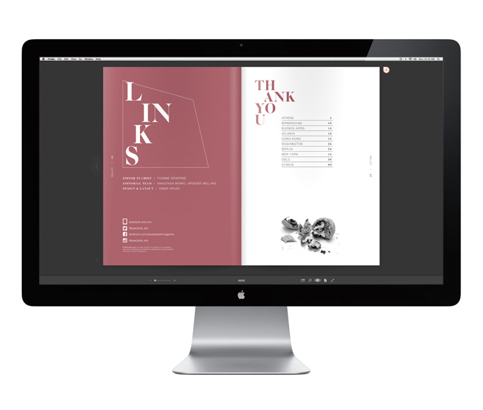
The headline font is very traditional with heavy serifs applied unconventionally by splitting up the word so to engage the reader and hint at the ‘cracking’ of nuts or typography in this case.
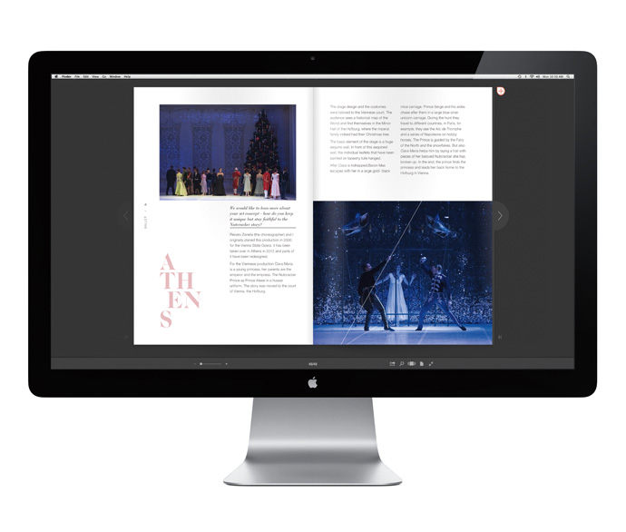
I also used strong graphic shapes like triangles and lines to break up some of the photographs and support the ‘cracking’ message. Important links to all the performances around the world are highlighted by a recurring triangle shape acting as a pointer.
As the images are so vibrant and dramatic I reduced the use of colour just hinting at some traditional shades associated with ballet like a ‘dirty’ pale pink and gold.
The overall effect of this Special Edition which features interviews with renowned set designers from around the world is one of calm elegance with a fresh spirit. Check it out below or on issuu and make sure you follow @spectacle_arts for more exciting projects.
MORE INFORMATION | Spectacle
DESIGN & LAYOUT | Annie Kruse
Follow Stylejuicer with Bloglovin

