FUNCTION AND FORM | OUR SECOND GATHERING PART II

9 May 2016

function and form, gathering, like-minded people, interiors, design, style, styling, form, function, london, east end, spitalfields, hugenots, silk weavers, chris dyson, architect, eclectic mix, restoration, houzz, art, objects, sculpture, roof terrace, lemon tree


Happy Monday peeps and hope you all managed to get some sunshine this weekend.

It was the hottest day of the year so far here in London yesterday and we celebrated in style by heading to the outdoor pool… just us and twenty thousand other people with floats, picnics, rugs, umbrellas, hats, cooler bags and everything but the kitchen sink. I’m just glad we came back with the same kids as there was a hell of choice.

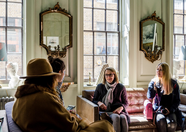
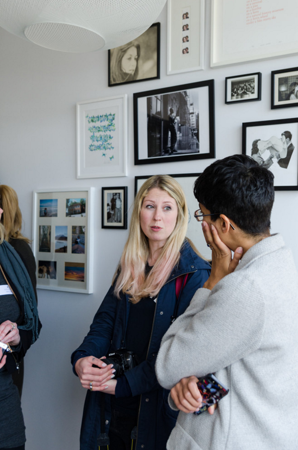
Well, back to Monday and I want to show you the second part of our Function And Form gathering from a few weekends ago with our sponsors Houzz who had arranged two very special tours of two of their members homes.


function and form, gathering, like-minded people, interiors, design, style, styling, form, function, london, east end, spitalfields, hugenots, silk weavers, chris dyson, architect, eclectic mix, restoration, houzz, art, objects, sculpture, roof terrace, lemon tree

function and form, gathering, like-minded people, interiors, design, style, styling, form, function, london, east end, spitalfields, hugenots, silk weavers, chris dyson, architect, eclectic mix, restoration, houzz, art, objects, sculpture, roof terrace, lemon tree

function and form, gathering, like-minded people, interiors, design, style, styling, form, function, london, east end, spitalfields, hugenots, silk weavers, chris dyson, architect, eclectic mix, restoration, houzz, art, objects, sculpture, roof terrace, lemon tree


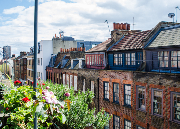
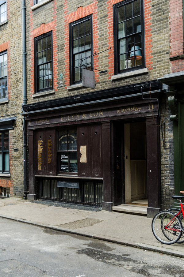
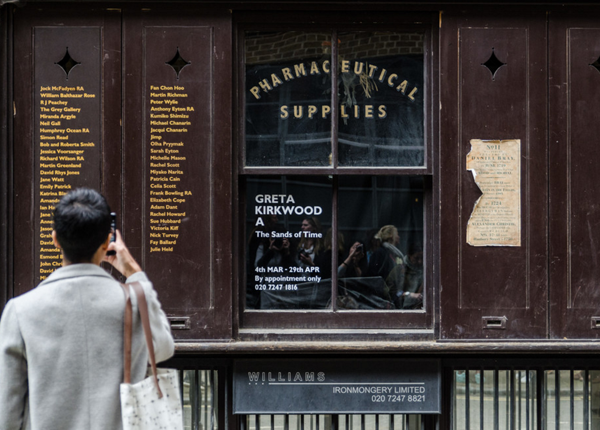
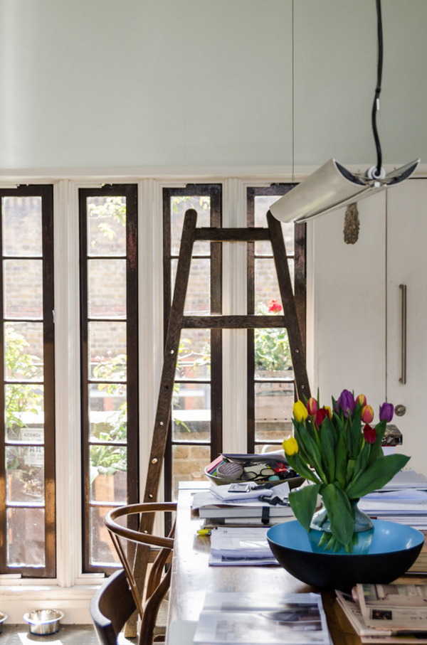
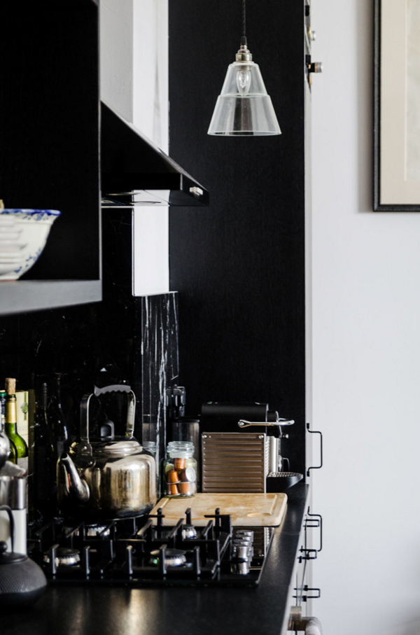
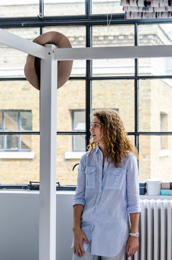
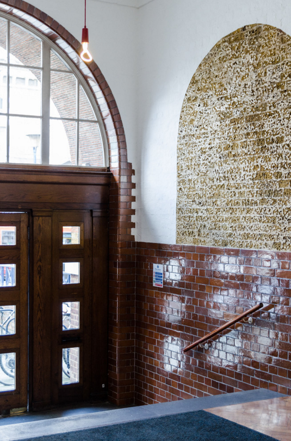
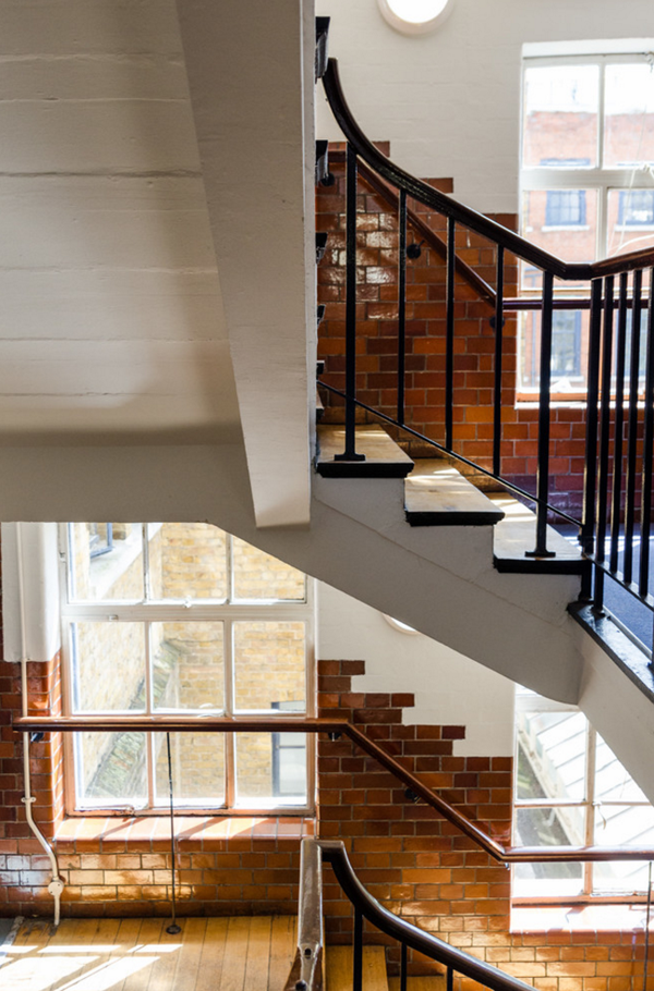
After meeting at Ottolenghi for hot drinks and cakes we took a short walk past Spitalfields market in London’s East End over to architect Chris Dyson’s house in Pricelet Street an area where tens of thousands of French Hugenots (Protestants) settled after Charles II gave them sanctuary from persecution. Their diligence and skills made them thrive as silk weavers and the wealthier families built elegant, distinct three storey town houses in and around Spitalfields with large windows in the attic to let in maximum light for the weavers.

We met with Chris Dyson outside his now family home in Princelet Street. He is passionate about this area and fell in love with the silk weavers houses years ago, restoring and selling a few properties in close proximity before winning a sealed bid for no 11 Princelet Street.


function and form, gathering, like-minded people, interiors, design, style, styling, form, function, london, east end, spitalfields, hugenots, silk weavers, chris dyson, architect, eclectic mix, restoration, houzz, art, objects, sculpture, roof terrace, lemon tree

function and form, gathering, like-minded people, interiors, design, style, styling, form, function, london, east end, spitalfields, hugenots, silk weavers, chris dyson, architect, eclectic mix, restoration, houzz, art, objects, sculpture, roof terrace, lemon tree


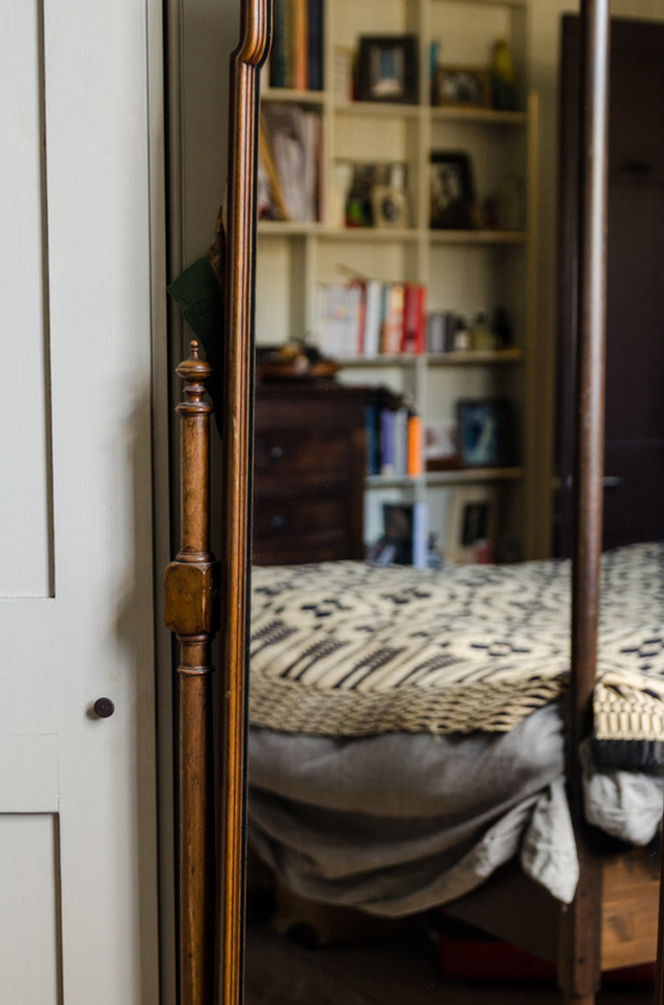
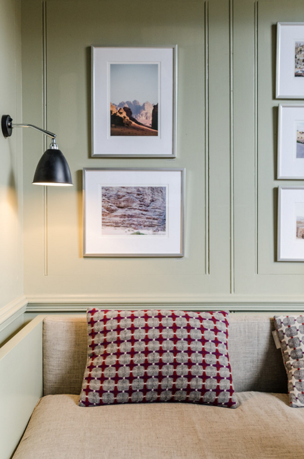
He told us about the history of the area and likened the restoration of the property to mending a ‘broken tooth’ in the streetscape adding a silk weavers loft as well as restoring the 3 distinct large windows on the first floor. The width of the house is a modest 6 meters and to accommodate modern family living – and arguably all the clutter that comes with it – cleverly concealed storage can be found behind most of the elegant wooden wall panelling letting the period features shine.

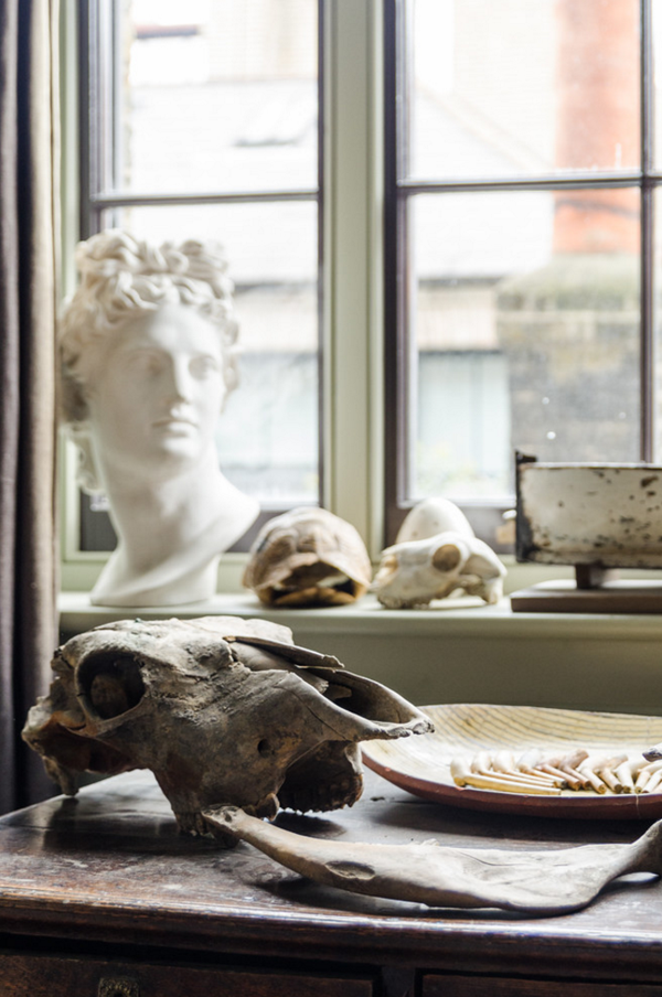
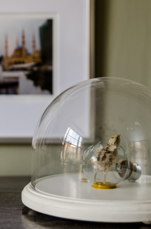
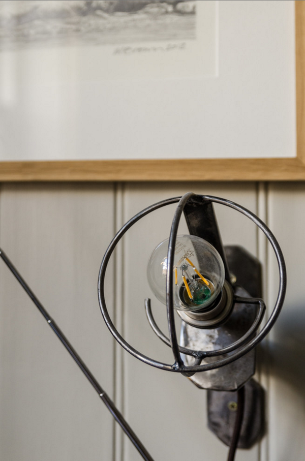
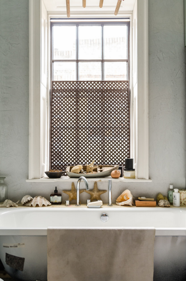
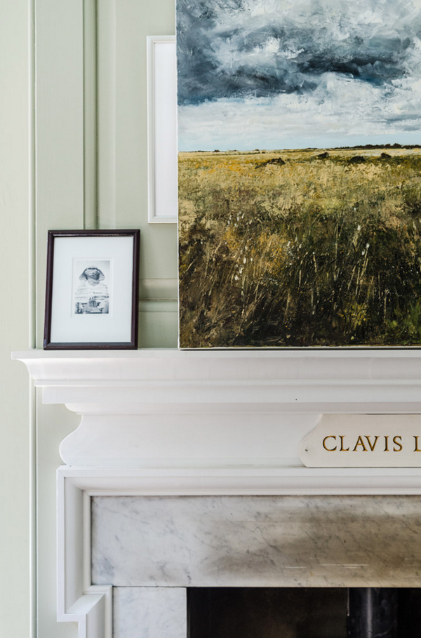
His first floor drawing room could be straight from a Jane Austen novel but what surprised me most was his eclectic mix and collection of art, sculptures, objects, lights and furniture. He’s somehow managed to gel it all together and has created a stunning home full of little discoveries and vignettes.

 
function and form, gathering, like-minded people, interiors, design, style, styling, form, function, london, east end, spitalfields, hugenots, silk weavers, chris dyson, architect, eclectic mix, restoration, houzz, art, objects, sculpture, roof terrace, lemon tree

function and form, gathering, like-minded people, interiors, design, style, styling, form, function, london, east end, spitalfields, hugenots, silk weavers, chris dyson, architect, eclectic mix, restoration, houzz, art, objects, sculpture, roof terrace, lemon tree
 

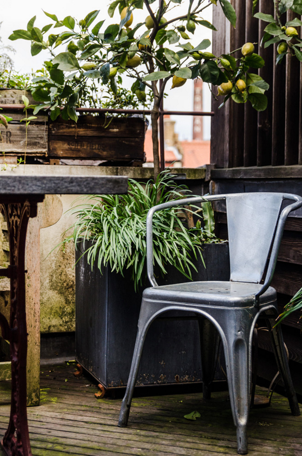
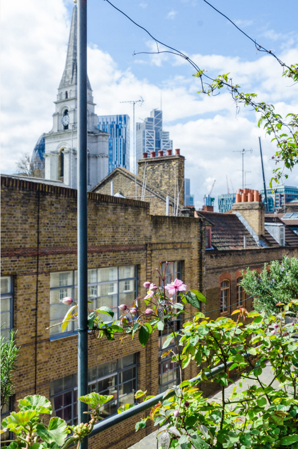
Walking further up the stairs we were all drawn to the top floor, the silk weavers loft, and the irresistible views across some of London’s landmarks. My favourite spot had to be the roof terrace, I could happily sit there under that lemon tree and dream myself back into 18th century London, without the smog though.

Find architects, interior designers and contractors on Houzz or simply be inspired by more pictures of Chris Dyson’s work.

 
function and form, gathering, like-minded people, interiors, design, style, styling, form, function, london, east end, spitalfields, hugenots, silk weavers, chris dyson, architect, eclectic mix, restoration, houzz, art, objects, sculpture, roof terrace, lemon tree

function and form, gathering, like-minded people, interiors, design, style, styling, form, function, london, east end, spitalfields, hugenots, silk weavers, chris dyson, architect, eclectic mix, restoration, houzz, art, objects, sculpture, roof terrace, lemon tree

function and form, gathering, like-minded people, interiors, design, style, styling, form, function, london, east end, spitalfields, hugenots, silk weavers, chris dyson, architect, eclectic mix, restoration, houzz, art, objects, sculpture, roof terrace, lemon tree

function and form, gathering, like-minded people, interiors, design, style, styling, form, function, london, east end, spitalfields, hugenots, silk weavers, chris dyson, architect, eclectic mix, restoration, houzz, art, objects, sculpture, roof terrace, lemon tree

function and form, gathering, like-minded people, interiors, design, style, styling, form, function, london, east end, spitalfields, hugenots, silk weavers, chris dyson, architect, eclectic mix, restoration, houzz, art, objects, sculpture, roof terrace, lemon tree

function and form, gathering, like-minded people, interiors, design, style, styling, form, function, london, east end, spitalfields, hugenots, silk weavers, chris dyson, architect, eclectic mix, restoration, houzz, art, objects, sculpture, roof terrace, lemon tree

function and form, gathering, like-minded people, interiors, design, style, styling, form, function, london, east end, spitalfields, hugenots, silk weavers, chris dyson, architect, eclectic mix, restoration, houzz, art, objects, sculpture, roof terrace, lemon tree

 
MORE INFORMATION | Function And Form
ARCHITECT | architect
SPONSORS | Houzz
PHOTOGRAPHY | Amelia Hallsworth
 
Follow Stylejuicer with Bloglovin

FUNCTION AND FORM | OUR SECOND GATHERING PART I

29 April 2016

function and form, gathering, like minded people, houzz, online community, home professionals, designers, resource, homeowners, visual community, architects, social media, east london, laura lakin, interior designer, converted warehouse apartment, tips, design your own home, small space living, industrial, scandi, monochrome, hackney


Sometimes things come together in mysterious ways, maybe the stars are aligned, maybe you get out of bed on the right foot, maybe your train is running on time, maybe your flat white is just how you like it, maybe you have a good hair day. Sometimes things just work.

Such was the case at our second Function And Form event last Saturday. As with our previous event Tiff from Curate & Display and myself had invited some like minded interior fanatics lovers for an informal gathering and thanks to our lovely sponsors Houzz we were able to snoop around two extraordinary homes in East London.

You might have come across Houzz the online platform for home renovation and design who bring homeowners and home professionals together in a unique visual community. Their site is vast and with more than 40 million users it has grown into a valuable resource for anybody who is looking to get inspired, discover products and to find and collaborate with the perfect architect, designer or contractor.

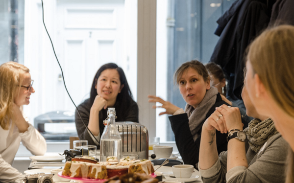
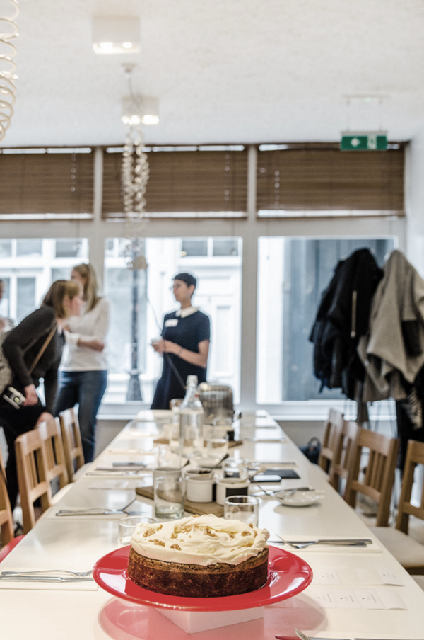
We kicked off around 10:30am at Ottolenghi in Spitalfields with hot drinks and delicious cakes in their beautiful contemporary Scandi meets Mediterranean dining room. A great mix of people all connected by their love for interiors. Some had known each other for years, some met for the first time in person after connecting through social media and some were totally new to the group. It didn’t matter – everybody was equally welcome and the atmosphere was relaxed from the start.


copyright Amelia Hallsworth Photography

copyright Amelia Hallsworth Photography

copyright Amelia Hallsworth Photography

copyright Amelia Hallsworth Photography


Through their community Houzz managed to give us access to tour two fabulous homes in East London and speak to their respective owners who also happen to be – in today’s feature – the interior designer Laura Lakin who gave us some great insights into how she planned to convert the space in an old school in Hackney.

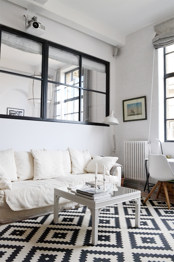
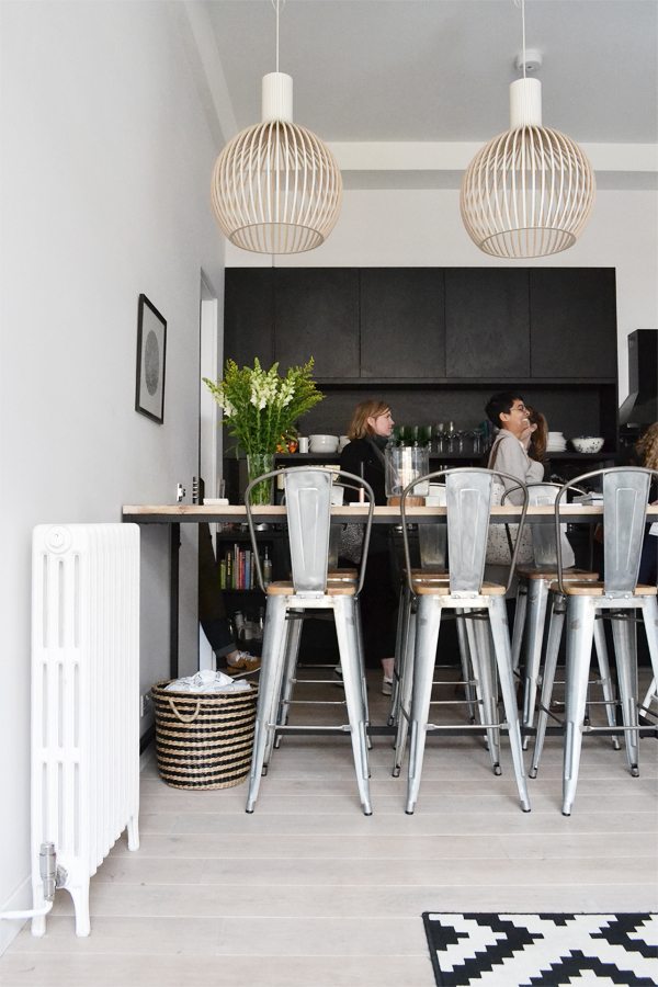
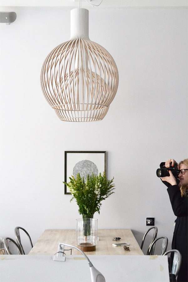
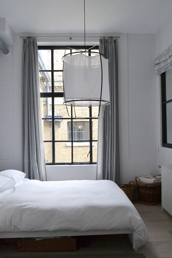
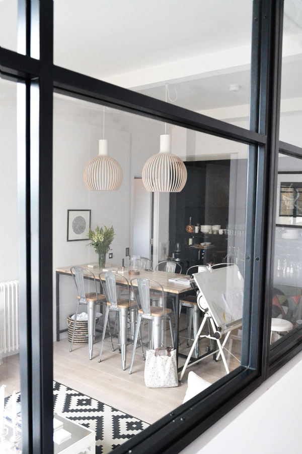
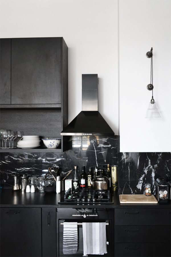
I wanted this space to feel contemporary, open plan with clean lines and a predominantly monochrome palette but still retain some of its industrial feel. I was inspired by Scandinavian design but it’s definitely a combination of different influences. I love introducing patterns and colour to interiors but for this flat I was drawn to a white and black palette – I didn’t want to be distracted, I wanted the architectural details such as the windows to be the focus and the feeling of space and openness to be highlighted.

In terms of the layout, I loved the idea of knocking all the walls down and having one big open space but I knew I would be sharing the space with a friend and didn’t want to lose one bedroom. To solve this I had internal steel windows made and the large one opened onto the living room from the second bedroom – this allowed the light to flow throughout but also made the space feel more open plan. I also wanted us to have our own space but then meet in the middle – literally – when we want to socialise or watch a movie on the projector.

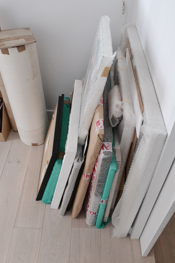
I knew art would play an important role here and would be changing fairly regularly so the black and white palette worked well as a background.


function and form, gathering, like minded people, houzz, online community, home professionals, designers, resource, homeowners, visual community, architects, social media, east london, laura lakin, interior designer, converted warehouse apartment, tips, design your own home, small space living, industrial, scandi, monochrome, hackney

function and form, gathering, like minded people, houzz, online community, home professionals, designers, resource, homeowners, visual community, architects, social media, east london, laura lakin, interior designer, converted warehouse apartment, tips, design your own home, small space living, industrial, scandi, monochrome, hackney

function and form, gathering, like minded people, houzz, online community, home professionals, designers, resource, homeowners, visual community, architects, social media, east london, laura lakin, interior designer, converted warehouse apartment, tips, design your own home, small space living, industrial, scandi, monochrome, hackney
 

Laura also had some great tips on how to design your own home and what to consider.

I think it’s important to consider artwork when designing your own home – do you have a lot of art? Do you plan on building a collection? If so, consider this when designing your home – make sure you leave enough wall space free and don’t forget about lighting if you want to make a real feature of it.

When designing your own home think about your average day and how you use your home. Where do you put your shoes on? When you leave the house or in your bedroom? Are you very active? Where are you going to store your tennis rackets/surfboards etc.? Do you read a lot in the daytime? Do you live to cook? Consider all these things when designing your space.

The kitchen is the heart of the home so I would always say if there’s one room you spend money on that should be it.
Open plan living may be ‘de rigour’ these days but if you cook a lot of curries and don’t particularly like food smells then you might prefer to have a separate dining/living room – don’t just follow trends, make sure it suits you and your lifestyle.

If you like mixing different styles, then I would suggest using something to tie it all together to make sure it’s cohesive. Working in the same colour palette is a nice way to make sure it all works well.

You can imagine how drawn I was to Laura’s home and I think she may have had just a little bit of a hard time getting everybody out of there.

The second part of our home tour will be up here next week so make sure you check back in to see a very different but equally inspiring property: An original Hugenot silk weavers house sensitively restored and brought into the 21st century by owner and architect Chris Dyson.


function and form, gathering, like minded people, houzz, online community, home professionals, designers, resource, homeowners, visual community, architects, social media, east london, laura lakin, interior designer, converted warehouse apartment, tips, design your own home, small space living, industrial, scandi, monochrome, hackney

function and form, gathering, like minded people, houzz, online community, home professionals, designers, resource, homeowners, visual community, architects, social media, east london, laura lakin, interior designer, converted warehouse apartment, tips, design your own home, small space living, industrial, scandi, monochrome, hackney

function and form, gathering, like minded people, houzz, online community, home professionals, designers, resource, homeowners, visual community, architects, social media, east london, laura lakin, interior designer, converted warehouse apartment, tips, design your own home, small space living, industrial, scandi, monochrome, hackney

function and form, gathering, like minded people, houzz, online community, home professionals, designers, resource, homeowners, visual community, architects, social media, east london, laura lakin, interior designer, converted warehouse apartment, tips, design your own home, small space living, industrial, scandi, monochrome, hackney


copyright Amelia Hallsworth Photography

copyright Amelia Hallsworth Photography

copyright Amelia Hallsworth Photography

copyright Amelia Hallsworth Photography

copyright Amelia Hallsworth Photography

copyright Amelia Hallsworth Photography

copyright Amelia Hallsworth Photography

copyright Amelia Hallsworth Photography

copyright Amelia Hallsworth Photography

copyright Amelia Hallsworth Photography

copyright Amelia Hallsworth Photography

copyright Amelia Hallsworth Photography


INTERIOR DESIGN | Laura Lakin
MORE INFORMATION | Houzz
PHOTOGRAPHY | Annie Kruse (unless indicated)

STYLING | BOTANICAL PORTRAITS BY VEE SPEERS

14 April 2016

styling, style, plants, botanica, botanical portraits, soft, pastel, vee speers, australian artist, danish, vissevasse, shop, shopping, thirteen, birthday party
 

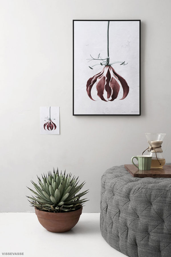
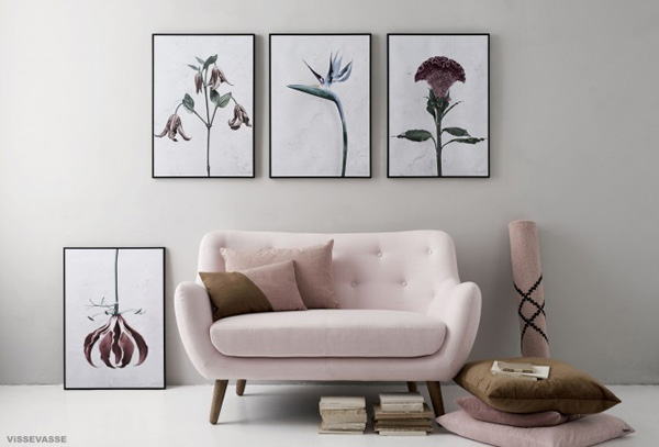
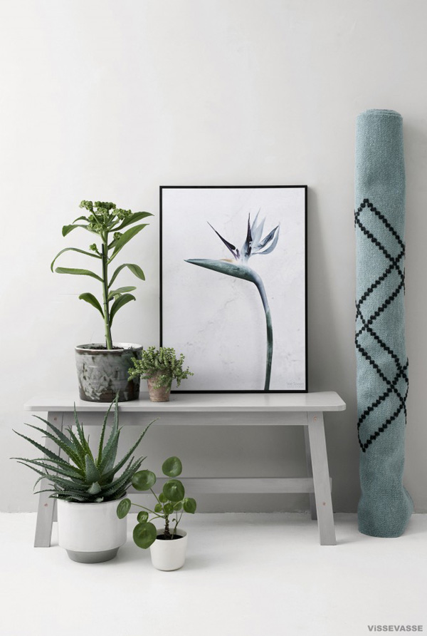
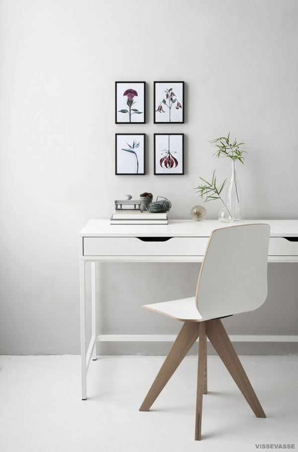
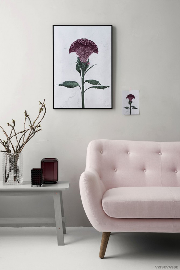
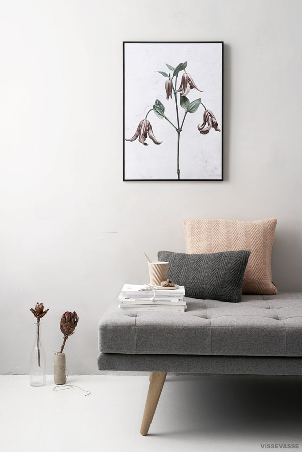
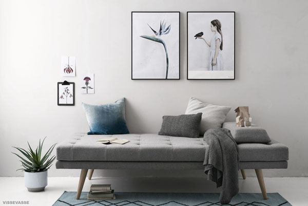
I’m not sure if I’m more in love with the beautiful styling by Gitte Christensen or the actual botanical portraits by Vee Speers. The soft lighting, pastel colours and simple modern styling sits perfectly with the detailed portrait of the four different plants and flowers.

The Australian artist is based in Paris and you might be familiar with her series Thirteen and The Birthday Party which seems to pop up in all the stylish spaces around the world.

Her new series titled Botanica is available through Danish company Vissevasse and you can purchase posters (50x70cm) as well as post cards (15x21cm) of these gorgeous portraits.

The best thing is they don’t need watering or any looking after – perfect for a plant phobe like myself.


styling, style, plants, botanica, botanical portraits, soft, pastel, vee speers, australian artist, danish, vissevasse, shop, shopping, thirteen, birthday party

styling, style, plants, botanica, botanical portraits, soft, pastel, vee speers, australian artist, danish, vissevasse, shop, shopping, thirteen, birthday party

styling, style, plants, botanica, botanical portraits, soft, pastel, vee speers, australian artist, danish, vissevasse, shop, shopping, thirteen, birthday party

styling, style, plants, botanica, botanical portraits, soft, pastel, vee speers, australian artist, danish, vissevasse, shop, shopping, thirteen, birthday party

styling, style, plants, botanica, botanical portraits, soft, pastel, vee speers, australian artist, danish, vissevasse, shop, shopping, thirteen, birthday party

styling, style, plants, botanica, botanical portraits, soft, pastel, vee speers, australian artist, danish, vissevasse, shop, shopping, thirteen, birthday party


MORE INFORMATION | Vissevasse
STYLING | Gitte Christensen
PHOTOGRAPHY | Pia Winther
 
Follow Stylejuicer with Bloglovin
PALMA | HIDDEN TREASURES

11 April 2016

Palma, palma de mallorca, hidden treasures, viveca, concept store, la molienda, coffee shop, plamas best coffee, aesthetic, interior, style, styling, trend, antiques, handcrafted, craftsmanship, artisan, location finding, restoration services, industrial lighting, stripped back interior, white washed, spanish
 

You may have noticed my absence on here over the last week or so but we went on a much longed for Easter break to one of our favourite places: Palma de Mallorca.

Not everything turned out as we expected – I’m going to spare you the details of our filthy townhouse and the stress it caused – but you’ve got to look on the bright side and not only did the boys love their unbridled time on the beach but Mama also got some precious time to herself and met up with local resident Mary whom I met on Instagram just over a year ago.

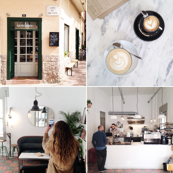
It’s always a little nerve wrecking to meet people in real life whom you’ve only ever shared friendly emojis and some jokes with but we got on great straight away and arranged to meet up at one of Palma’s cutest little coffee places, La Molienda.

Just a short stroll north of Placa del Rei on the corner of Carrer del Bisbe Campins is this tiny corner cafe with some shaded seating outside and a large antique sofa and some stools inside proudly serving Palma’s best coffee. I can absolutely vouch for their quality coffee and was totally enchanted by the stripped back white washed interior with a touch of industrial lighting and gorgeous original floor tiles.
 

Palma, palma de mallorca, hidden treasures, viveca, concept store, la molienda, coffee shop, plamas best coffee, aesthetic, interior, style, styling, trend, antiques, handcrafted, craftsmanship, artisan, location finding, restoration services, industrial lighting, stripped back interior, white washed, spanish

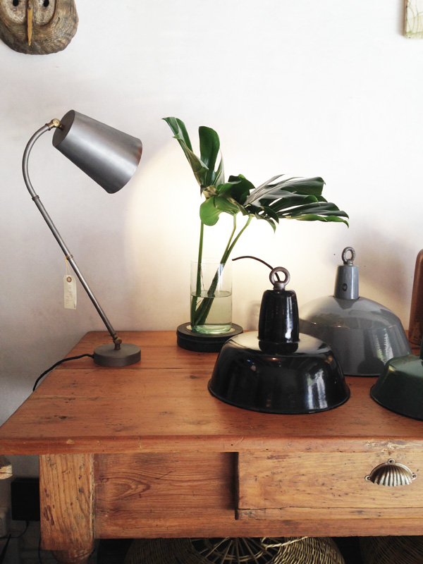
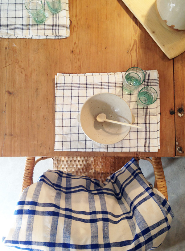
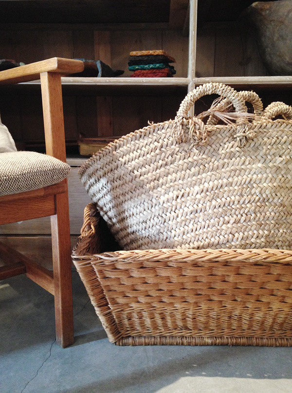
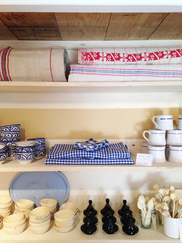
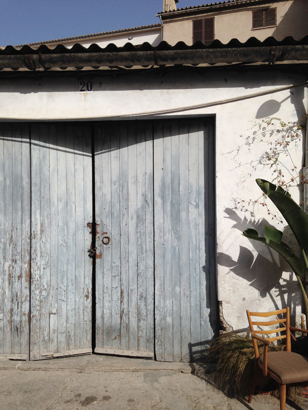
Mary runs her own online store Es Bolic and I figured out pretty quickly that we share a common aesthetic and love for everything interior related and artisan so she showed me one of her favourite haunts hidden away in the old town in a back yard of old garages that house a mix of small businesses from yoga studio, art gallery and bike repair shop to the enchanting ViVeCa with their selection of antiques and handcrafted textiles, ceramics and furniture.

It’s an amazing treasure trove of unique finds and carefully curated mostly Spanish goods run by sisters Camilla and Carla. But ViVeCa is much more than a shop it’s a concept that also offers location finding and restoration services as well as landscape design, be it in Palma’s city centre or in the country. Check out their Instagram account to see some of the gems they come across.

I loved their selection and whilst Mary and the girls had a chat in what sounded extra fast Spanish I couldn’t stop myself from snapping away.

If you’re ever in this wonderful city make sure you stop by.

 
Palma, palma de mallorca, hidden treasures, viveca, concept store, la molienda, coffee shop, plamas best coffee, aesthetic, interior, style, styling, trend, antiques, handcrafted, craftsmanship, artisan, location finding, restoration services, industrial lighting, stripped back interior, white washed, spanish

Palma, palma de mallorca, hidden treasures, viveca, concept store, la molienda, coffee shop, plamas best coffee, aesthetic, interior, style, styling, trend, antiques, handcrafted, craftsmanship, artisan, location finding, restoration services, industrial lighting, stripped back interior, white washed, spanish

Palma, palma de mallorca, hidden treasures, viveca, concept store, la molienda, coffee shop, plamas best coffee, aesthetic, interior, style, styling, trend, antiques, handcrafted, craftsmanship, artisan, location finding, restoration services, industrial lighting, stripped back interior, white washed, spanish

Palma, palma de mallorca, hidden treasures, viveca, concept store, la molienda, coffee shop, plamas best coffee, aesthetic, interior, style, styling, trend, antiques, handcrafted, craftsmanship, artisan, location finding, restoration services, industrial lighting, stripped back interior, white washed, spanish

Palma, palma de mallorca, hidden treasures, viveca, concept store, la molienda, coffee shop, plamas best coffee, aesthetic, interior, style, styling, trend, antiques, handcrafted, craftsmanship, artisan, location finding, restoration services, industrial lighting, stripped back interior, white washed, spanish

Palma, palma de mallorca, hidden treasures, viveca, concept store, la molienda, coffee shop, plamas best coffee, aesthetic, interior, style, styling, trend, antiques, handcrafted, craftsmanship, artisan, location finding, restoration services, industrial lighting, stripped back interior, white washed, spanish

Palma, palma de mallorca, hidden treasures, viveca, concept store, la molienda, coffee shop, plamas best coffee, aesthetic, interior, style, styling, trend, antiques, handcrafted, craftsmanship, artisan, location finding, restoration services, industrial lighting, stripped back interior, white washed, spanish

Palma, palma de mallorca, hidden treasures, viveca, concept store, la molienda, coffee shop, plamas best coffee, aesthetic, interior, style, styling, trend, antiques, handcrafted, craftsmanship, artisan, location finding, restoration services, industrial lighting, stripped back interior, white washed, spanish


MORE INFORMATION | La Molienda coffee shop, ViVeCa Palma concept store
PHOTOGRAPHY | Annie Kruse
 
Follow Stylejuicer with Bloglovin
STYLING TREND | BEIGE

1 April 2016

styling, trend, beige, josefin haag, residence, kristofer johnsson, photography, swedish design, craftsmanship, locally produced, style
 

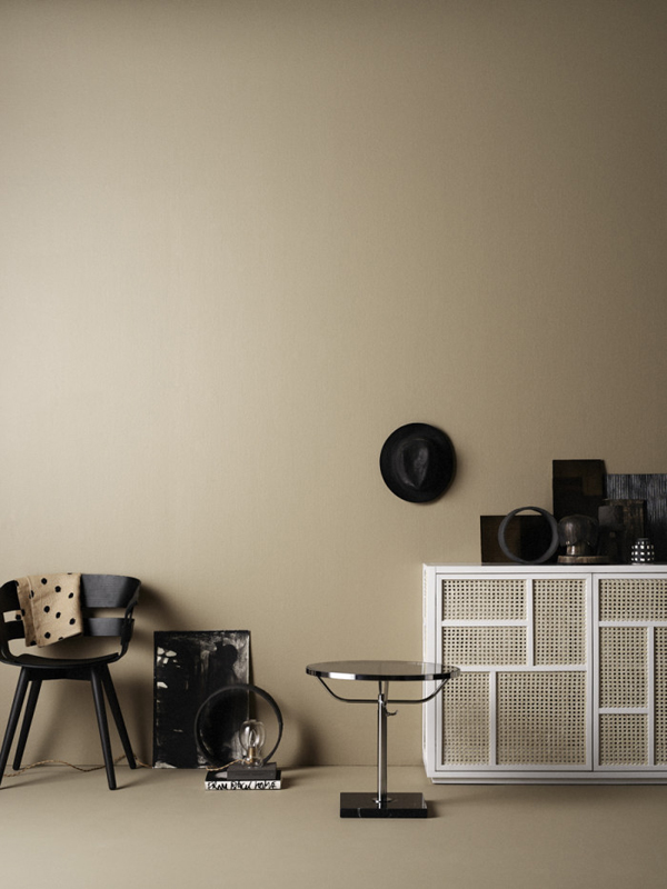
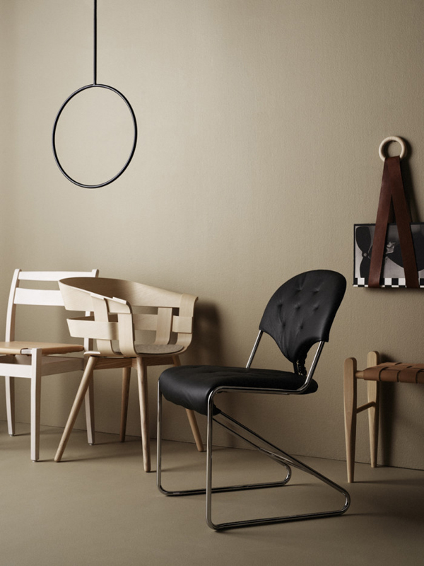
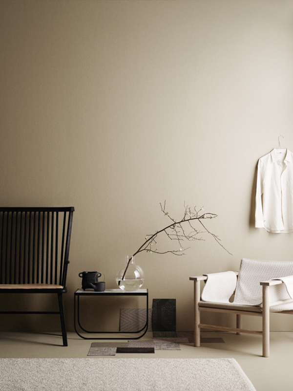
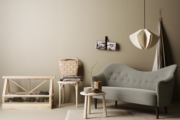
I’ve been seeing quite a bit of beige around lately which is not normally my favourite colour but I’m smitten with this styling by Josefin Haag for Residence.
Beige has been updated and used in a new and fresh way by adding black contrasting pieces and also sleek minimal designs in natural materials like birch. It has a very sophisticated and affordable luxury vibe to it and I might have to rethink my prejudice against beige.

The story was shot by Kristofer Johnsson for the Residence Bookazine and is titled Made in Sweden with every piece of furniture shown made by Swedish designers and craftsmen, mostly locally produced.

I dunno – they just got it the Scandis.

 
styling, trend, beige, josefin haag, residence, kristofer johnsson, photography, swedish design, craftsmanship, locally produced, style

styling, trend, beige, josefin haag, residence, kristofer johnsson, photography, swedish design, craftsmanship, locally produced, style

styling, trend, beige, josefin haag, residence, kristofer johnsson, photography, swedish design, craftsmanship, locally produced, style

 
STYLING | Josefin Haag
PHOTOGRAPHY | Kristofer Johnsson
 
Follow Stylejuicer with Bloglovin