INTERIORS CRUSH | LOFT IN BERLIN

15 June 2016

interiors crush, interior, style, styling, loft, loft love, berlin, fantastic frank, trend, textures, exposed brick, beams, leather sofas, animal skin rugs, soft bedding, throws, urban bike, van moof, achingly cool, eye candy
 

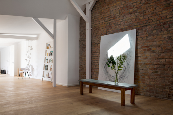
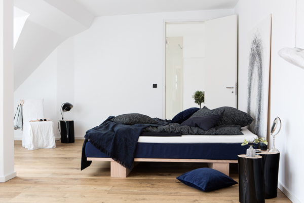
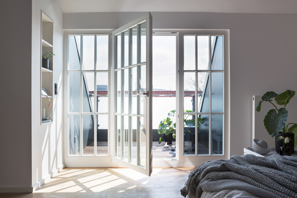
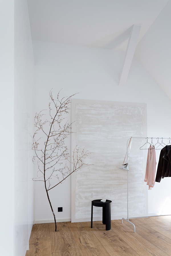
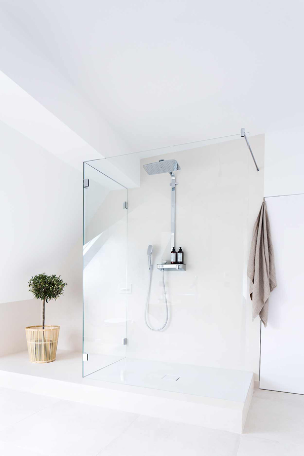
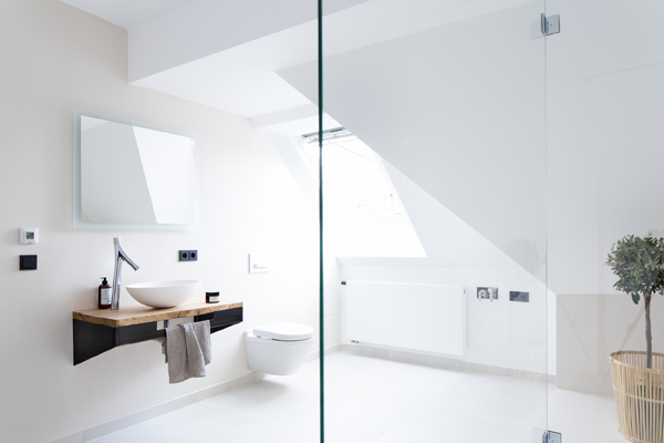
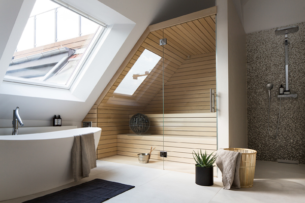
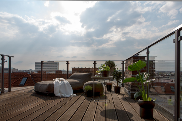
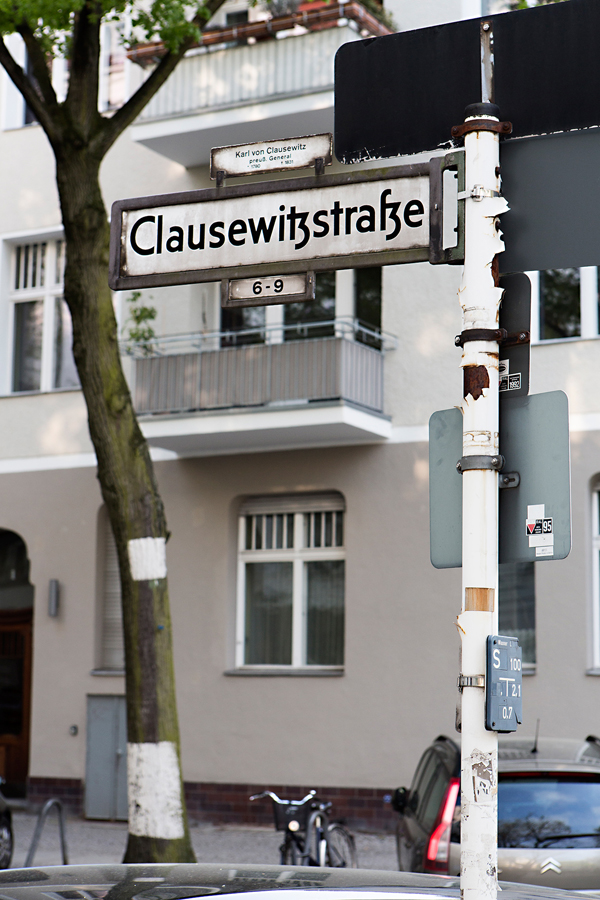
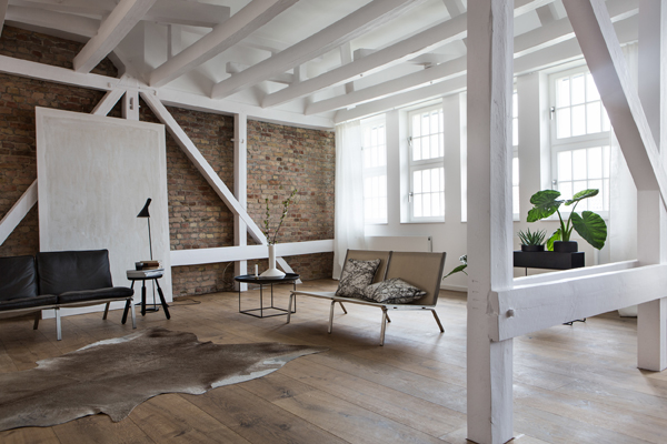
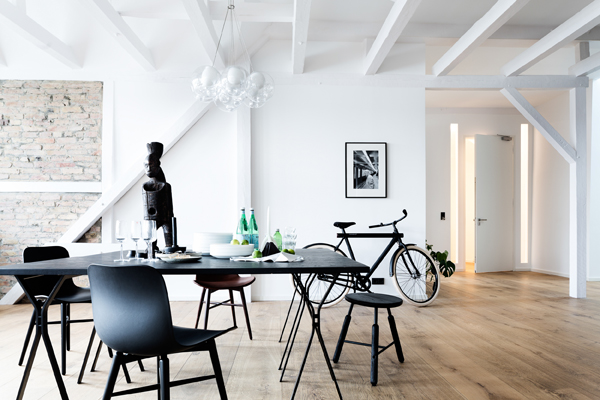
Hey peeps, I’m just popping my head up between unpacking boxes as it’s my birthday today and I found the perfect interiors crush for you: A loft in Berlin on the market for a mere 3.7m Euros via Fantastic Frank in case you’re on the lookout for a pied a terre. Haha!

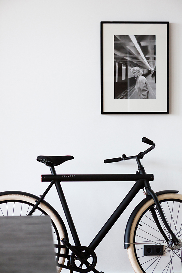
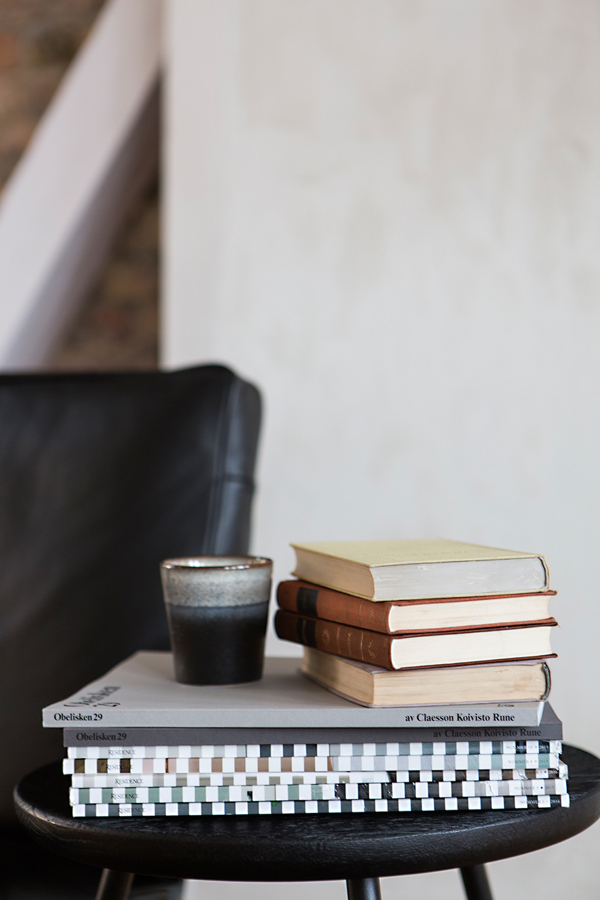
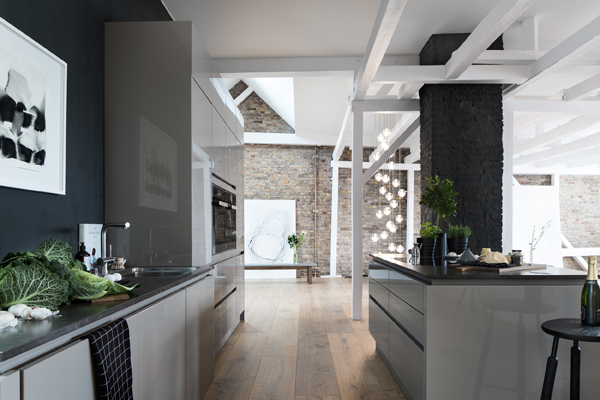
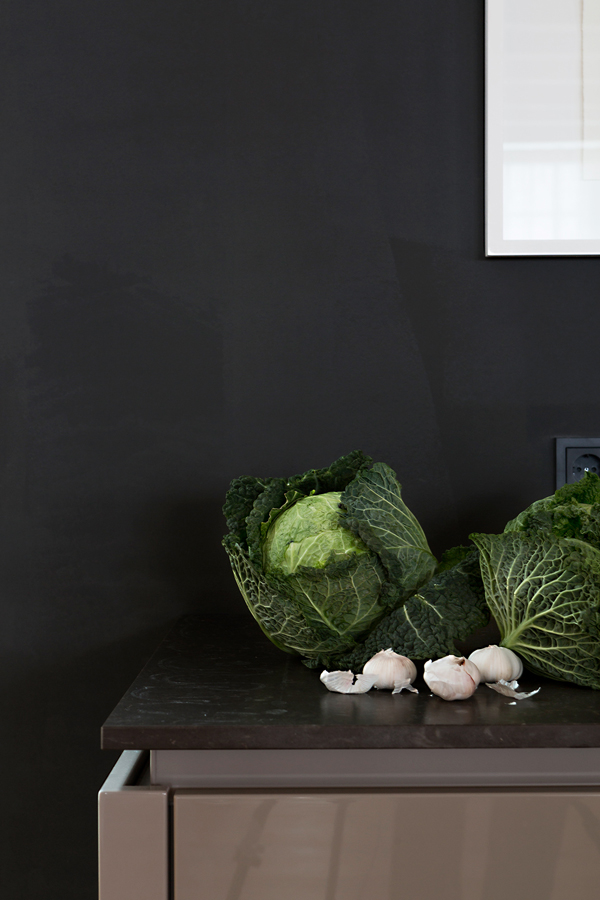
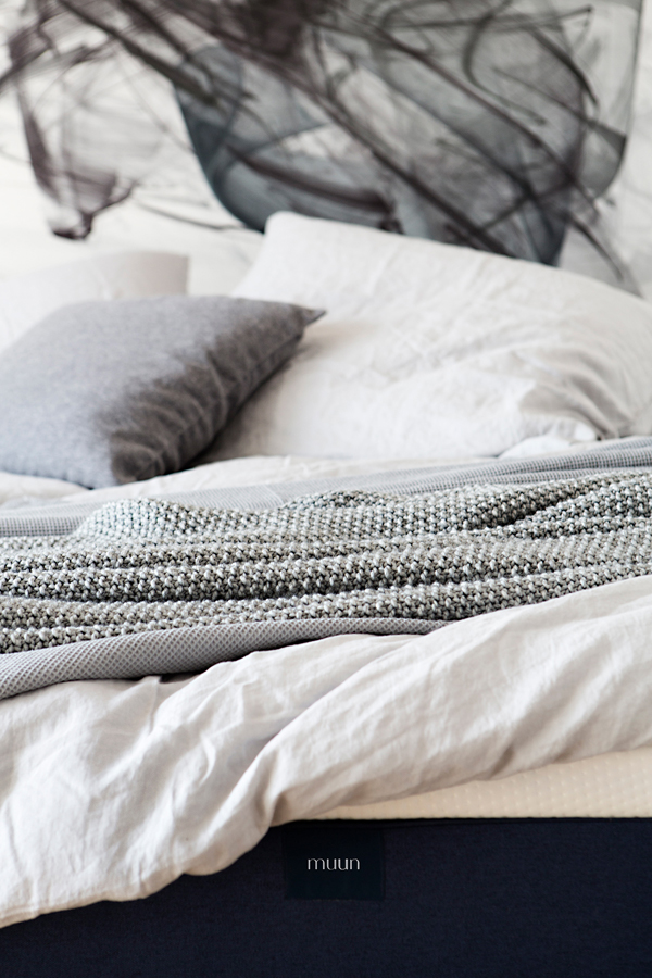
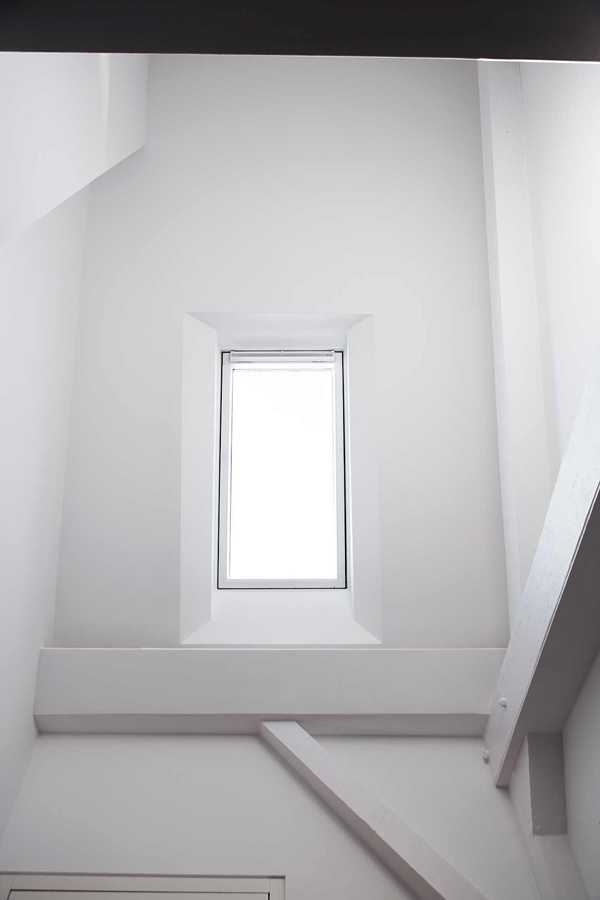
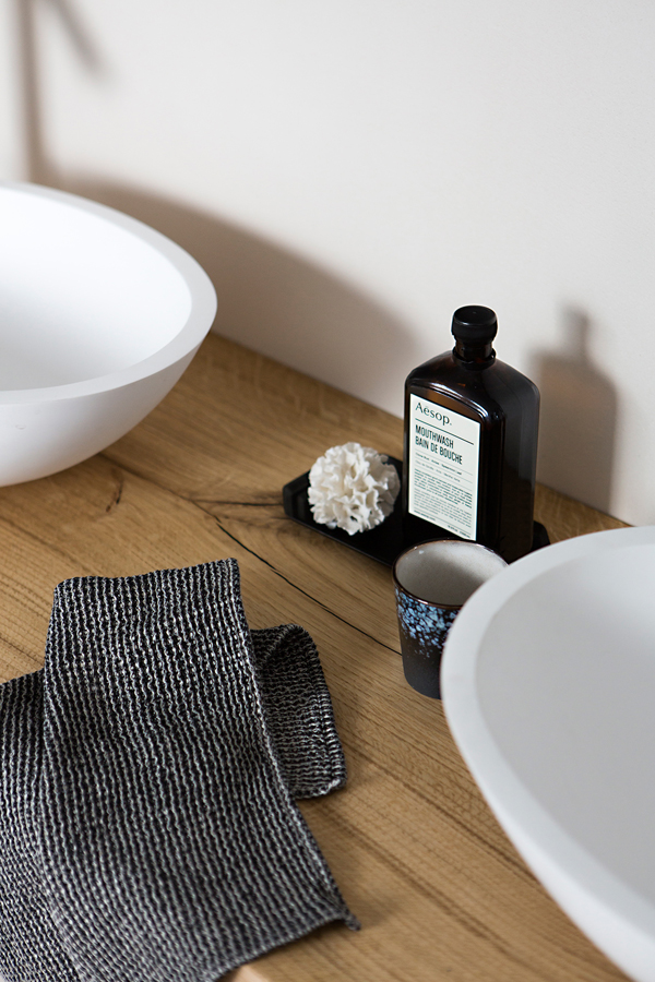
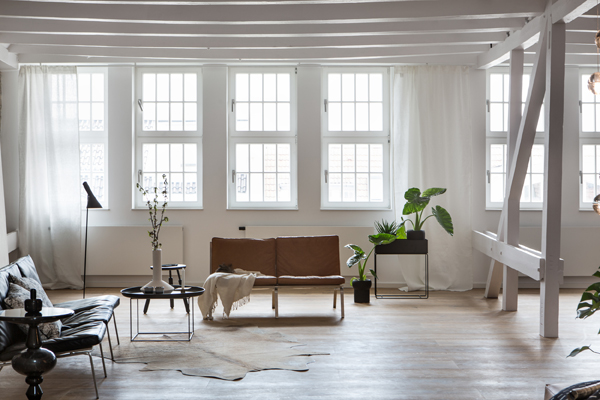
The interior pretty much sums up my dream home with exposed beams and bricks, high ceilings and all mod cons including a stunning sauna for that spa experience at home. I suspect the place has been staged for the shoot as the cabbage leaves are fast becoming a Fantastic Frank’s styling hallmark – not that I mind. Adding textures like leather sofas, lush plants, animal skin rugs, soft bedding and throws and an achingly cool urban Van Moof bike as the cherry on top really speak to all my senses and I’m left with an overwhelming desire to put in an offer. Though it might be slightly lower than the asking price.

Enjoy all the eye candy – for once I’m not going to apologise for the photo bombing.

 
interiors crush, interior, style, styling, loft, loft love, berlin, fantastic frank, trend, textures, exposed brick, beams, leather sofas, animal skin rugs, soft bedding, throws, urban bike, van moof, achingly cool, eye candy

interiors crush, interior, style, styling, loft, loft love, berlin, fantastic frank, trend, textures, exposed brick, beams, leather sofas, animal skin rugs, soft bedding, throws, urban bike, van moof, achingly cool, eye candy

interiors crush, interior, style, styling, loft, loft love, berlin, fantastic frank, trend, textures, exposed brick, beams, leather sofas, animal skin rugs, soft bedding, throws, urban bike, van moof, achingly cool, eye candy

interiors crush, interior, style, styling, loft, loft love, berlin, fantastic frank, trend, textures, exposed brick, beams, leather sofas, animal skin rugs, soft bedding, throws, urban bike, van moof, achingly cool, eye candy

interiors crush, interior, style, styling, loft, loft love, berlin, fantastic frank, trend, textures, exposed brick, beams, leather sofas, animal skin rugs, soft bedding, throws, urban bike, van moof, achingly cool, eye candy

interiors crush, interior, style, styling, loft, loft love, berlin, fantastic frank, trend, textures, exposed brick, beams, leather sofas, animal skin rugs, soft bedding, throws, urban bike, van moof, achingly cool, eye candy

interiors crush, interior, style, styling, loft, loft love, berlin, fantastic frank, trend, textures, exposed brick, beams, leather sofas, animal skin rugs, soft bedding, throws, urban bike, van moof, achingly cool, eye candy

interiors crush, interior, style, styling, loft, loft love, berlin, fantastic frank, trend, textures, exposed brick, beams, leather sofas, animal skin rugs, soft bedding, throws, urban bike, van moof, achingly cool, eye candy

interiors crush, interior, style, styling, loft, loft love, berlin, fantastic frank, trend, textures, exposed brick, beams, leather sofas, animal skin rugs, soft bedding, throws, urban bike, van moof, achingly cool, eye candy

interiors crush, interior, style, styling, loft, loft love, berlin, fantastic frank, trend, textures, exposed brick, beams, leather sofas, animal skin rugs, soft bedding, throws, urban bike, van moof, achingly cool, eye candy

interiors crush, interior, style, styling, loft, loft love, berlin, fantastic frank, trend, textures, exposed brick, beams, leather sofas, animal skin rugs, soft bedding, throws, urban bike, van moof, achingly cool, eye candy

interiors crush, interior, style, styling, loft, loft love, berlin, fantastic frank, trend, textures, exposed brick, beams, leather sofas, animal skin rugs, soft bedding, throws, urban bike, van moof, achingly cool, eye candy

interiors crush, interior, style, styling, loft, loft love, berlin, fantastic frank, trend, textures, exposed brick, beams, leather sofas, animal skin rugs, soft bedding, throws, urban bike, van moof, achingly cool, eye candy

interiors crush, interior, style, styling, loft, loft love, berlin, fantastic frank, trend, textures, exposed brick, beams, leather sofas, animal skin rugs, soft bedding, throws, urban bike, van moof, achingly cool, eye candy

interiors crush, interior, style, styling, loft, loft love, berlin, fantastic frank, trend, textures, exposed brick, beams, leather sofas, animal skin rugs, soft bedding, throws, urban bike, van moof, achingly cool, eye candy

interiors crush, interior, style, styling, loft, loft love, berlin, fantastic frank, trend, textures, exposed brick, beams, leather sofas, animal skin rugs, soft bedding, throws, urban bike, van moof, achingly cool, eye candy

interiors crush, interior, style, styling, loft, loft love, berlin, fantastic frank, trend, textures, exposed brick, beams, leather sofas, animal skin rugs, soft bedding, throws, urban bike, van moof, achingly cool, eye candy

interiors crush, interior, style, styling, loft, loft love, berlin, fantastic frank, trend, textures, exposed brick, beams, leather sofas, animal skin rugs, soft bedding, throws, urban bike, van moof, achingly cool, eye candy


MORE INFORMATION & PHOTOGRAPHY | Fantastic Frank with thanks
 
Follow Stylejuicer with Bloglovin

COURTYARD HOUSE AUSTRALIA

13 June 2016

courtyard house, robson rak, architects, japanese, greenery, calm, minimalist, flow, design, trend, greenery, nature, connection, garden design, australia
 

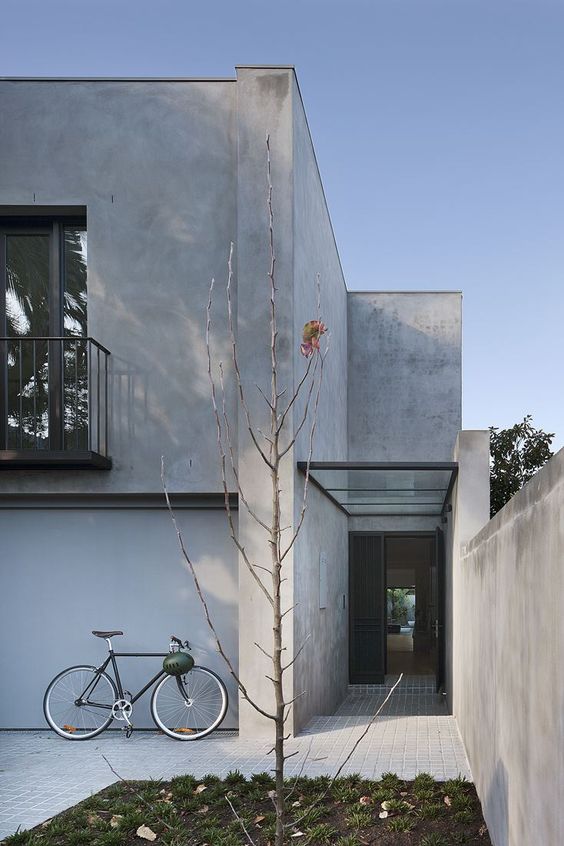
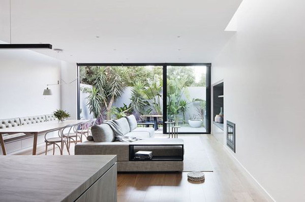
We moved last weekend and my mind is on unpacking boxes, locating toothbrushes, booking cleaners and baby-sitters which is just so… argh… tedious and boring. So it’s no surprise I am procrastinating and got distracted by this beautiful extended courtyard house in Australia designed by Robson Rak architects.

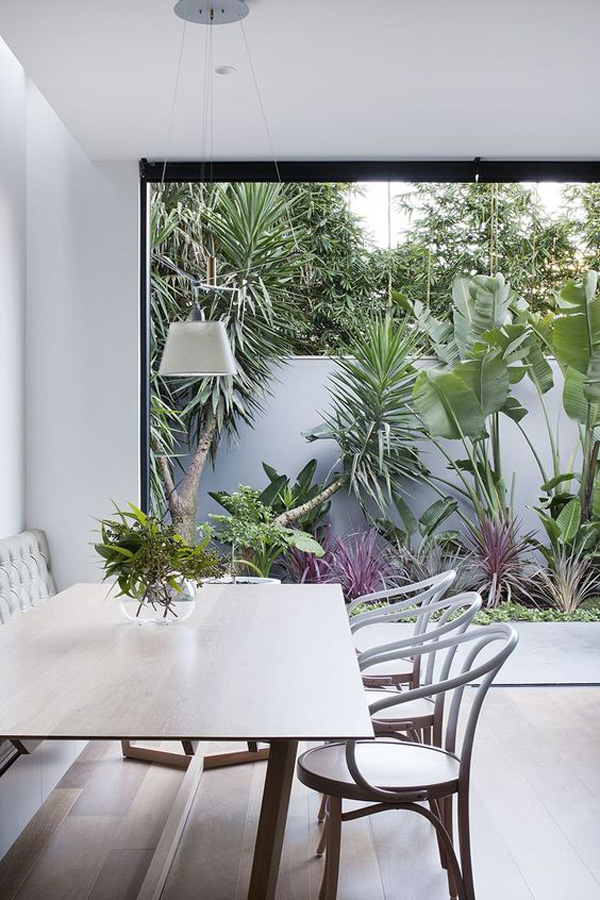
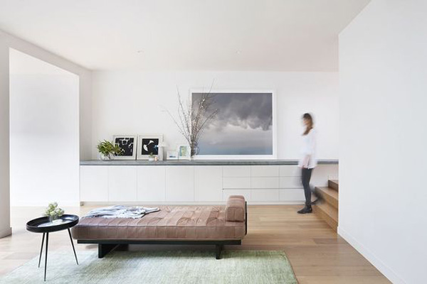
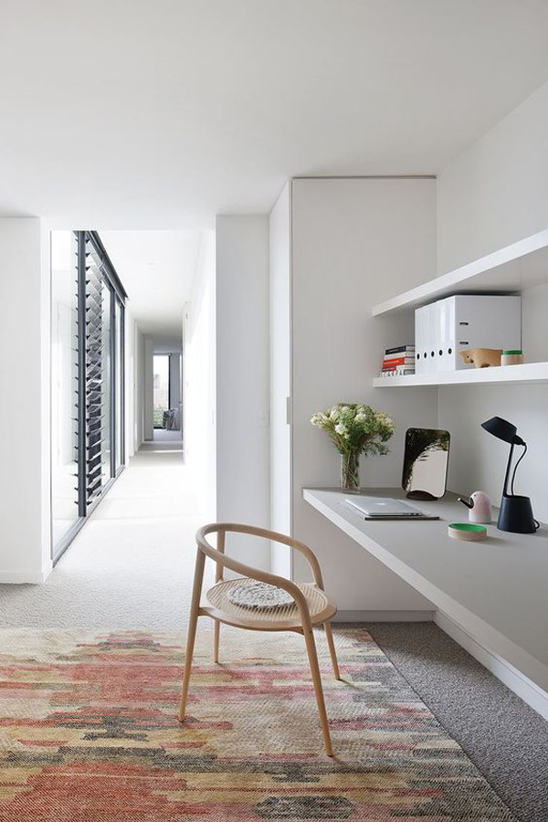
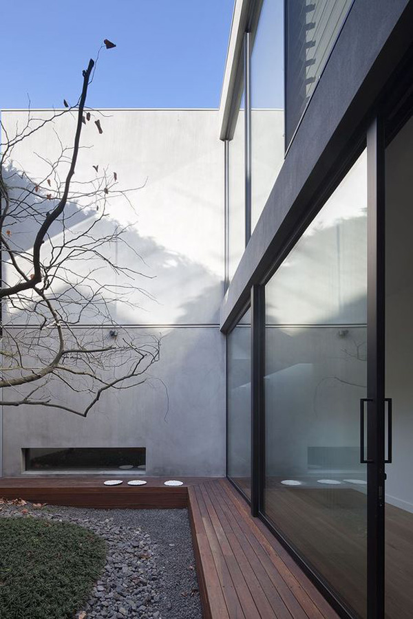
I love how the architects managed to bring light and greenery into this long and narrow plot wedged in between two large double storey residences. By reconfiguring this 80ies house they’ve added two courtyards which reveal cleverly designed living areas as you move through the space.

The clients love for Japanese architecture comes through in the garden design by Ed Purcey and the inbuilt furniture and seating areas which avoid interrupting the flow as you move through the house. Every room has a strong connection with nature; even the cellar where a low window looks out to the courtyard whilst also limiting sun exposure to the wine.

This calm minimalist space is pretty much the exact opposite to the chaos and boxes that surround me at the moment. #wishmeluck


courtyard house, robson rak, architects, japanese, greenery, calm, minimalist, flow, design, trend, greenery, nature, connection, garden design, australia

courtyard house, robson rak, architects, japanese, greenery, calm, minimalist, flow, design, trend, greenery, nature, connection, garden design, australia

courtyard house, robson rak, architects, japanese, greenery, calm, minimalist, flow, design, trend, greenery, nature, connection, garden design, australia

courtyard house, robson rak, architects, japanese, greenery, calm, minimalist, flow, design, trend, greenery, nature, connection, garden design, australia

courtyard house, robson rak, architects, japanese, greenery, calm, minimalist, flow, design, trend, greenery, nature, connection, garden design, australia

courtyard house, robson rak, architects, japanese, greenery, calm, minimalist, flow, design, trend, greenery, nature, connection, garden design, australia

courtyard house, robson rak, architects, japanese, greenery, calm, minimalist, flow, design, trend, greenery, nature, connection, garden design, australia


ARCHITECTS & PHOTOGRAPHY | Robson Rak with thanks
 
Follow Stylejuicer with Bloglovin
IKEA COLLABORATION WITH HAY AND TOM DIXON

9 June 2016

ikea collaboration, hay, tom dixon, scandinavian values, bringing the family together, design, brand, partnership, socialising, living room, historic values, design identity, pluralistic, production, technology, space, versatile, functional, smart construction, unconventional, behaviour, colour, manufacture, furniture, lighting, improvements, british designer, curiosity, trend, style, changes
 

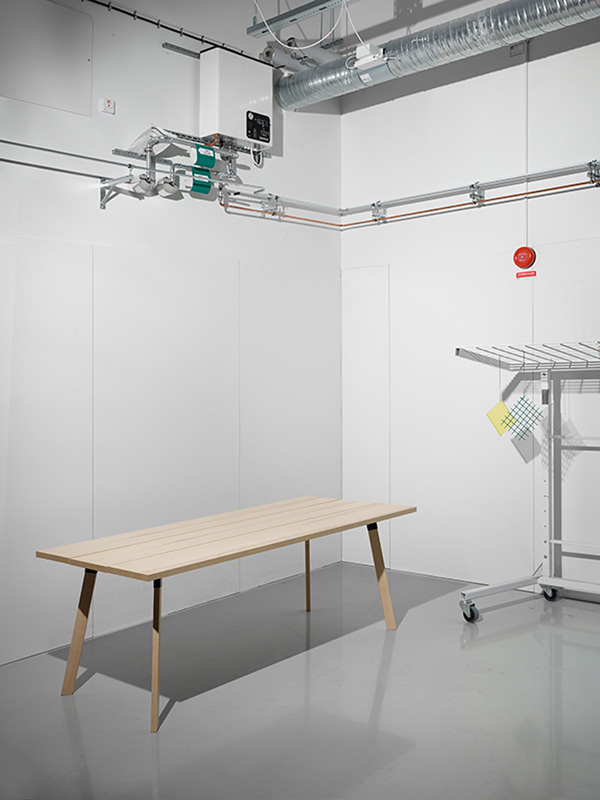
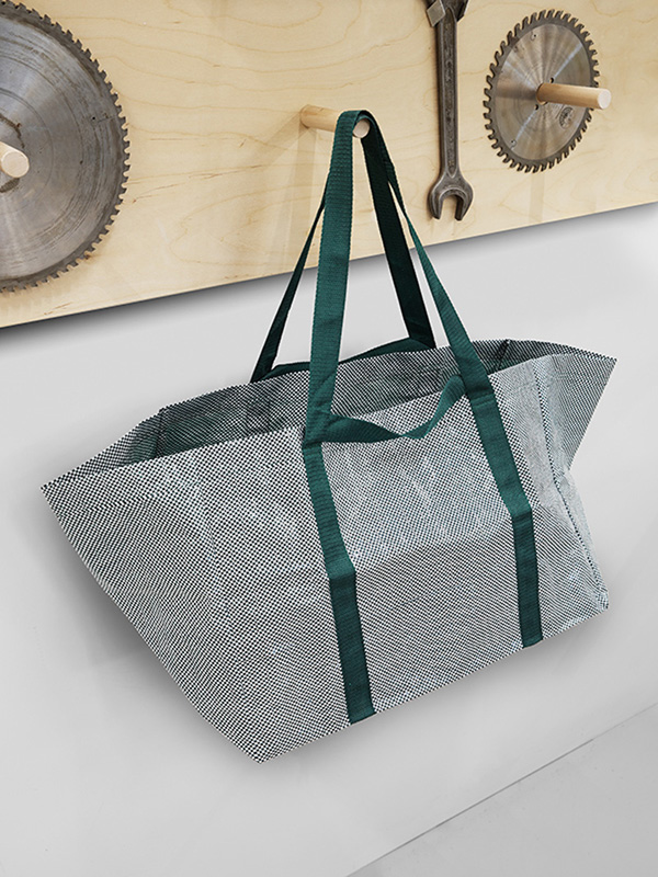
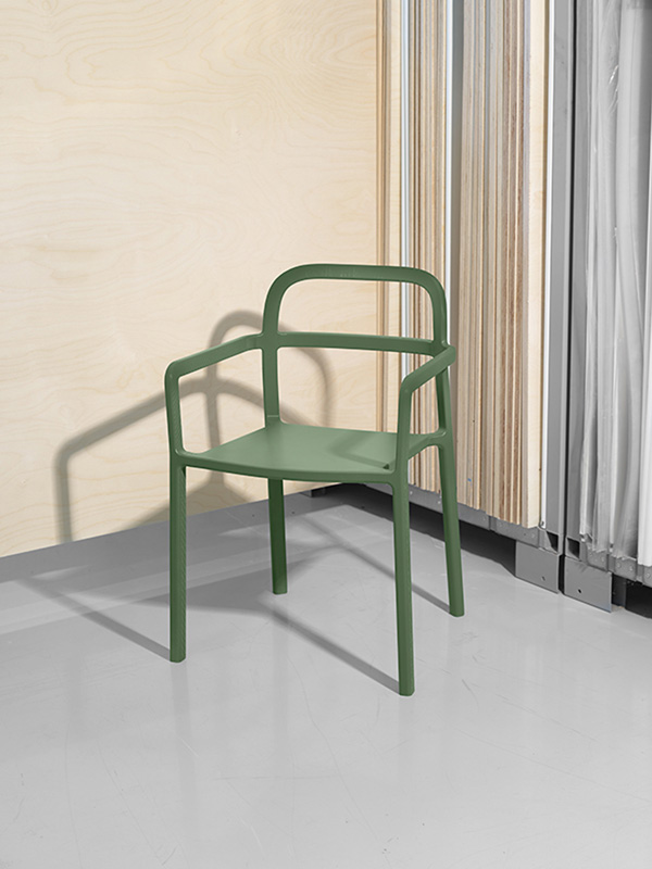
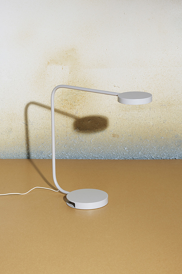
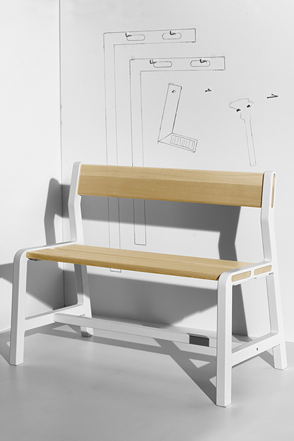
I was just a teeny tiny bit excited when I got wind of the latest IKEA collaborations for next year and lucky to get hold of some brand new images.

It’s no secret that I’m a fan of the Swedish furniture giant, after all their products have furnished my home as long as I can remember and I’m one of those freaks that actually enjoys putting their flatpacks together. My taste has of course evolved over the years and even though I’ve been drawn to other Scandinavian design brands for a looong time budget constraints due to doubling family size has meant that I always check what’s new in their stores.

Sooooo… I nearly fell off my chair when I found out that I can soon have BOTH, designer furniture at affordable prices. Yes, it’s true! I’m excited to tell you that IKEA is collaborating with HAY and Tom Dixon to explore the future of Scandinavian design through a collection for socialising in the living room. Talking about the reason behind the collaboration IKEA refer to the need to express their historic Scandinavian values and evolving their design identity in our new and changing society.

“The collection will have a classic Scandinavian feel with light colours, high quality and clean design. It will be updated and adapted to the new needs in the living room, with versatile and functional solutions for everyday life, based on smart constructions and using materials in unconventional ways.

The collaboration starts an IKEA exploration in to the future of Scandinavian design which has historically always reflected values in our society such as functionality, humbleness, simplicity and the importance of creating a family friendly home. The world around us is changing, it’s growing and shrinking at the same time. People’s homes are shrinking and their living spaces are being redistributed. It also means that existing values and behaviours are challenged and mixed with new ones.

This creates a need for expressing the Scandinavian values in a new way through an updated Scandinavian design identity. “In a more pluralistic Scandinavia filled with contrasts, there is a need to take the next step and start to define a new Scandinavian design identity. We go about this by opening up and playing with our values combined with materiality, with colours, with production technology, with functions – with our roots,” says Marcus Engman, Design Manager at IKEA of Sweden.

“I’m passionate about the way things are manufactured, I’m very interested in the opportunities in new technologies. People often ask what the world needs. I find it interesting to look at what we can achieve with the possibilities of tomorrow, in modern production, and by using that, making improvements,” says Rolf Hay, co-founder of HAY.


ikea collaboration, hay, tom dixon, scandinavian values, bringing the family together, design, brand, partnership, socialising, living room, historic values, design identity, pluralistic, production, technology, space, versatile, functional, smart construction, unconventional, behaviour, colour, manufacture, furniture, lighting, improvements, british designer, curiosity, trend, style, changes
 

Equally exciting is the news that British designer Tom Dixon will be helping IKEA explore what spacial challenges and increasing interaction with technology mean for the future of living and how to successfully resolve the tensions they create.

“We can see big changes in how the space in our homes is becoming more fluid and we are exploring what this means for both the design and production of furniture. Working with Tom is exciting because he shares our curiosity and drive to find new ways to make things better,” says Marcus Engman, Design Manager at IKEA.

“We are in the midst of a huge revolution in how people create, manufacture and consume – the furniture business has been slow to respond to the opportunities, but now is an amazing time to experiment in new ways of working. In this case in a fresh collaboration directly with the consumer, industry and global experts,” says Tom Dixon. 

Oh, it’s going to be a looooong queue when those products launch next year.
 

ikea collaboration, hay, tom dixon, scandinavian values, bringing the family together, design, brand, partnership, socialising, living room, historic values, design identity, pluralistic, production, technology, space, versatile, functional, smart construction, unconventional, behaviour, colour, manufacture, furniture, lighting, improvements, british designer, curiosity, trend, style, changes

ikea collaboration, hay, tom dixon, scandinavian values, bringing the family together, design, brand, partnership, socialising, living room, historic values, design identity, pluralistic, production, technology, space, versatile, functional, smart construction, unconventional, behaviour, colour, manufacture, furniture, lighting, improvements, british designer, curiosity, trend, style, changes

ikea collaboration, hay, tom dixon, scandinavian values, bringing the family together, design, brand, partnership, socialising, living room, historic values, design identity, pluralistic, production, technology, space, versatile, functional, smart construction, unconventional, behaviour, colour, manufacture, furniture, lighting, improvements, british designer, curiosity, trend, style, changes


MORE INFORMATION & PHOTOGRAPHY | IKEA with thanks
 
Follow Stylejuicer with Bloglovin
STYLING | MINNA JONES’ SUMMERHOUSE IN FINLAND

8 June 2016

minna jones, summerhouse, scandis, scandinavia, finland, finnish, interior stylist, designer, clean, minimal, home, style, plywood, contemporary, rustic, industrial, lake, woods, plants, trend, decor
 
No week goes by where I don’t come across a jaw-droppingly beautiful summerhouse – mostly in northern Europe. You’ve got to admire the Scandis they’ve got it sussed.

Today’s summerhouse belongs to interior stylist and designer Minna Jones who writes the blog time of the aquarius where she shares her work and glimpses of her enviably clean and minimal home – Finnish style at it’s finest.

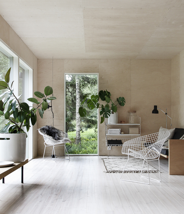
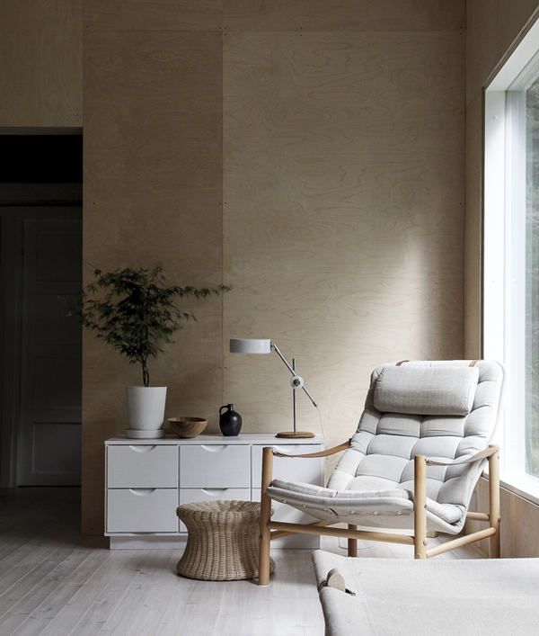
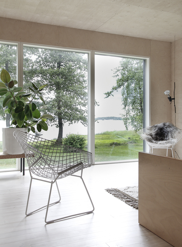
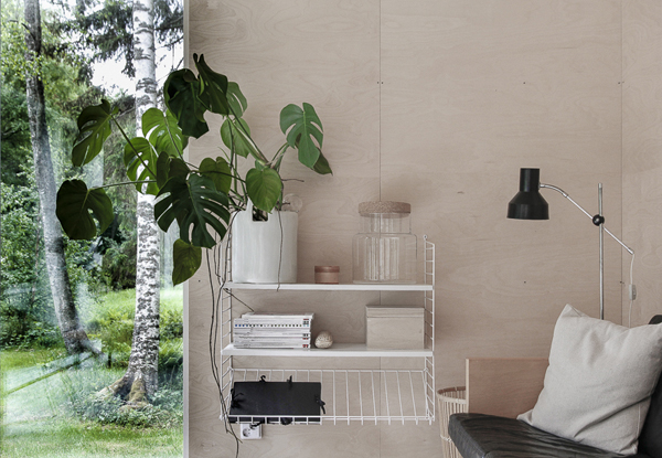
I’m a big fan of her work and blog and was blown away by these images of her summerhouse which is almost entirely clad in plywood on the inside giving a warm and contemporary feel as well as a bit of a rustic industrial edge. The view of the lake and surrounding woods takes centre stage of course but I love how she carefully and deliberately placed some large leaf plants inside adding some softness.

For more inspiration Finnish style check out her blog and her Instagram.
 
minna jones, summerhouse, scandis, scandinavia, finland, finnish, interior stylist, designer, clean, minimal, home, style, plywood, contemporary, rustic, industrial, lake, woods, plants, trend, decor

minna jones, summerhouse, scandis, scandinavia, finland, finnish, interior stylist, designer, clean, minimal, home, style, plywood, contemporary, rustic, industrial, lake, woods, plants, trend, decor

minna jones, summerhouse, scandis, scandinavia, finland, finnish, interior stylist, designer, clean, minimal, home, style, plywood, contemporary, rustic, industrial, lake, woods, plants, trend, decor


STYLING & PHOTOGRAPHY | Minna Jones with thanks
 
Follow Stylejuicer with Bloglovin
FOR THE HOME | WILD BOYS & GIRLS ADVENTURE PRINT

6 June 2016

adventure print, poster, wild boys and girls, tiffany grant-riley, curate and display, stylist, style, minimal, plants, botanical, journey, destination, photography, trend, wall art, decor, typographic
 

I’ve been meaning to share my new poster prints for Wild Boys & Girls with you for ages and finally I’ve got some great lifestyle shots of the adventure print to show you thanks to my stylist friend and Function+Form side kick Tiff from Curate & Display.

My brief to her was to show that the prints can work anywhere in the home – not just in the kids room – and I love how she styled and photographed them. Her minimalist approach and love for plants is evident and works so well with the typographic ADVENTURE message.
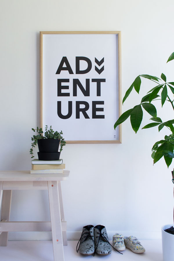
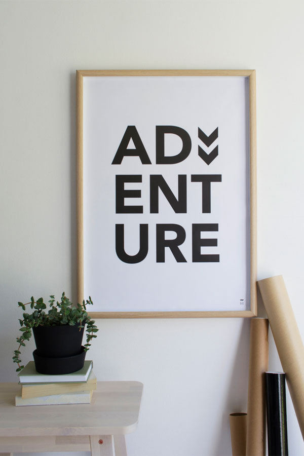
After all, it’s not the destination but the journey that counts so make the most of it and embrace your everyday adventures. You can purchase via my online shop here.


adventure print, poster, wild boys and girls, tiffany grant-riley, curate and display, stylist, style, minimal, plants, botanical, journey, destination, photography, trend, wall art, decor, typographic


PHOTOGRAPHY & STYLING | Tiffany Grant-Riley
MORE INFORMATION | Wild Boys & Girls
 
Follow Stylejuicer with Bloglovin